Income and Poverty

September 21, 2014

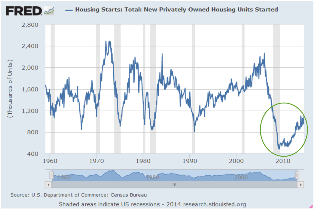
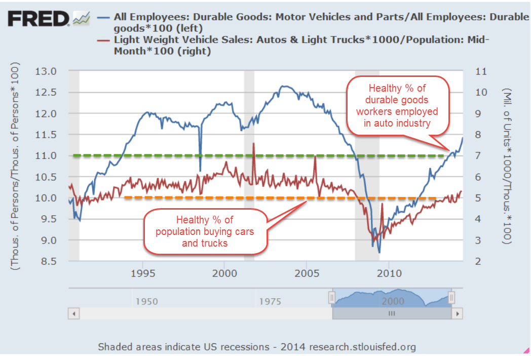
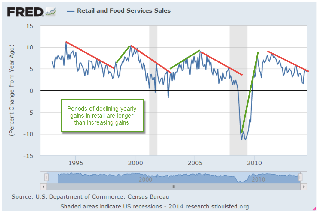
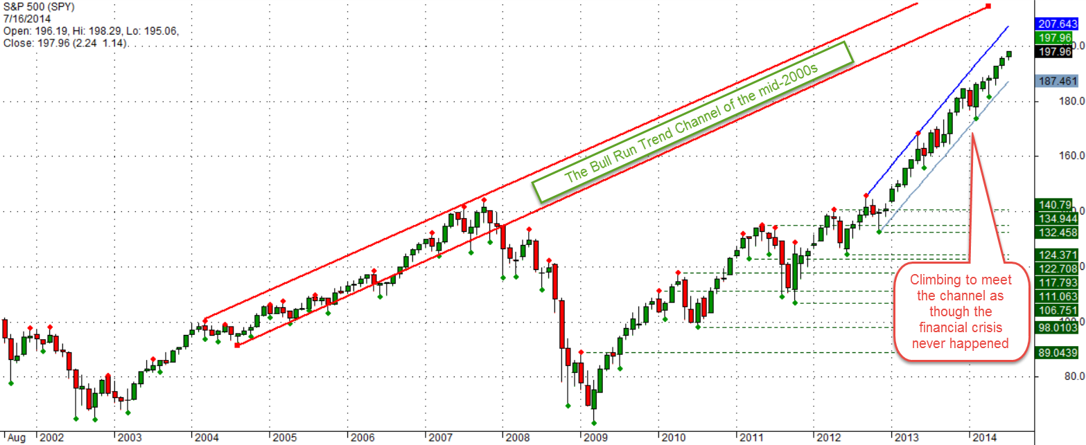
A steadily rising market supports our theory that we are astute investors.  Fed Chairwoman Janet Yellen reassured investors that the Fed intends to keep interest rates near zero till at least the middle of 2015. The stock market closed out the week at a new high, edging out the high set two weeks ago.  In an economy fueled largely by consumer spending, median household income is down 8% since 2007.  The Japanese yen broke below $90 this week, a seven year low.  At this week’s meeting in Australia, the financial heads of the G-20 countries are seeing increasing economic strains around the globe but particularly in Europe and Asia. (Bloomberg)  Housing starts and building permits are getting erratic, jumping up one month only to fall precipitously the next.  Using either idle cash or borrowing at historically low interest rates, companies are buying back their own stock at a steady clip to juice per share profits for stockholders.

In a candid moment, many researchers will admit the difficulty of overcoming their own biases.  Investors are subject to the same myopia that afflicts politics and compromises research.  Our biases lead us to ignore or discount some facts.  The most damaging bias most of us have is thinking we have made the right decision.  The justifications for our investment decisions are sound and logical – until later events reveal the folly underlying those decisions.  In the late 1990s, some envisioned the internet marketplace much like a chessboard.  The companies who dominated the center of the board, regardless of the cost, reaped hefty stock evaluations.  It made sense – until it didn’t. Costs matter.  Profits matter.

Soros Fund Management, founded in 1969 by George Soros, has a long track record of generating consistently high returns.  The secret to Soros’ success as an investor is not that he is right most of the time because he isn’t.  Several years ago, his firm estimated that his success ratio was only 53%.  George Soros’ success comes from the fact that he knows he is wrong about half of the time, recognizes when he is wrong, abandons his position and minimizes his losses.  While most of us are not active traders like Soros, we can pay a bit more attention to the balance in our portfolios.  Quarter ending statements will arrive in our mailbox or email inbox in the next few weeks.  It would be a good time to assess portfolio allocations and targets.  A composite bond index (BND as a proxy) is down a few percent since April 2013 while the stock market has risen 33%.  Have we adjusted the balances in our portfolios or is that one of the things that has been on the to-do list for several months?

********************

Census Report

The Census Bureau just released their annual estimate of household income and poverty in the U.S.  Measurements of household income must be taken with a grain of salt, so to speak.  Say that a married couple with $70K in household income split up.  The total income remains the same but the number of households is now two and household income is $35K.

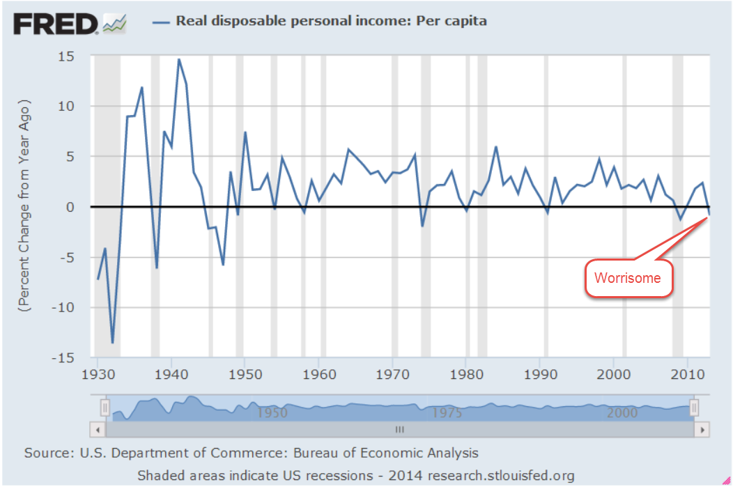
Given those caveats, there are some real bummer stats in the report as well as some surprises.  Real or inflation adjusted median household income was little changed in 2013 and is 8% lower than in 2007.  Median income of white households was $58K in 2013 but for black households, the annual figure was $34K.  The ratio of incomes between these two groups has changed little over the past five decades.  Since the mid 1980s, the income of white households has lost ground when compared to Asian households. Since the mid-90s, the ratio of Hispanic to white household income has risen.

One of the strengths of American society has been the income mobility that our economy generates. The Census Bureau groups incomes by quintiles, like steps on a ladder.  Each step is in 20% increments so that households are ranked in the bottom 20%, top 20% or in between. From 2009 – 2011, 30% of those who were on the lowest rung of the income ladder moved up the ladder.  During that same period, 32% of those at the top of the ladder moved down the ladder.

The poverty rate declined slightly but one in seven households, about 45 million people, is below the poverty threshold.  A continuing complaint about the methodology used in computing the poverty level is that non-cash benefits like subsidized housing, medical care, child care and food stamps are not included in the calculations.  In the early 60s, before the introduction of social welfare programs, almost one in five households were below the threshold.   Remember, the 60s were a boom decade. Various estimates of those who were chronically poor at that time ranged from 10% to 16% of households. In 1969,  several years after the introduction of the Great Society programs, the poverty rate was close to 14% (Source), about the same as it now.

Conservative commentators will make the case that, over the past fifty years, the U.S. has spent some $22 trillion (2013 dollars) on social welfare programs with little progress in alleviating poverty. During the three year period from 2009 – 2011, years of severe economic stress and political games of “chicken,” the Census Bureau reports that almost 32% of households had a spell of poverty lasting two months or more.

The Census Bureau also reports that only 3.5% of households were chronically poor, living under the poverty threshold during the entire three year period.  The low percentage of chronically poor is often ignored by those who are antipathetic to social welfare programs.  In the aftermath of this past recession, one of the most severe economic downturns of the past century, social welfare programs have provided a temporary helping hand up, a shelter against the economic storm, and cut the long term poverty rate to a quarter of what it was during the booming 60s.

Liberals will ignore this success, of course.  Instead they will point to the higher figure of temporary poverty to make the case for more welfare spending. More programs and more spending is the liberal brand.  Conservative pundits should point at the rather low 3.5% figure of the chronically poor and make the point that we don’t need more welfare spending.   But they won’t.  Opposed to income transfers as a matter of principle, conservatives don’t want to acknowledge the success of social welfare programs.

For those readers who don’t have the time to read the full report, a NY Times article provides a summary.
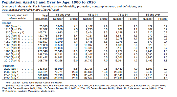
***************************

Lasting longer

When the Social Security system was enacted in the mid thirties, life expectancy for a 60 year old worker was 72.  (Bureau of Labor Statistics Monthly Labor Review, pg. 4)  Many of us don’t realize that the largest gains in life expectancy came in the first decades of 20th century with safer sanitation, drinking water and public health facilities. In 2006, the Census Bureau estimated life expectancy for a 60 year old at 82, an additional ten years of life – and retirement benefits and expenses. A 75 year old male today can expect to live to about 87.

In their 2014 survey of the costs of elderly care, Genworth Financial found that a home health aide in Colorado averages about $50K. A private room in a nursing home costs $92K per year.  At a 4% growth rate, that same private room could cost more than $130K in 2025, when the first cohort of baby boomers reaches 75.  How many seniors will be able to afford such an expense?  Many will push for ever more programs to subsidize the costs of living longer.  Seniors vote so politicians listen.  In Japan, the elderly segment of the population has grown from 5% of the population in the 1950s to 25% of the population. (Wikipedia)  This aging cohort commands an ever larger share of the nation’s resources, contributing to the stagnation in the Japanese economy for the past 20 years.

In the U.S. the growth of the elderly population has been less dramatic.  At 9% of the population in 1960, the elderly are expected to almost double to 17% of the population by 2020 (Census Bureau )

****************************
Takeaways

Pay attention to portfolio allocations.  Save money.  You’ll need it one of these days.

Central Banks

September 14, 2014

This week I’ll take a look at the latest JOLTS report from the BLS and an annual assessment of  global financial risks by the Bank of International Settlements.

********************

JOLTS

The BLS releases their Job Openings and Labor Turnover Survey (JOLTS) with a one month lag.  This past week’s release covered survey data for July.  The number of employees quitting their jobs is regarded as a sign of confidence in finding another job.  When it is rising, confidence is increasing.  The latest survey is optimistic.

The number of job openings have accelerated since the January lows.  In June, they passed the peak reached in 2007.

However, since May, the growth of job openings in the private sector has stalled.

The number of new hires continues to increase but we should put this in perspective.  The hire rate, of percentage of new hires to the total number of employees, has only just surpassed the lows of the early 2000s after the dot com bust and the 2001 recession.  This “churn” rate is still low, even below the level at the start of the 2008 Recession.

********************

Consumer Credit

Auto sales and the loans to finance them have been strong but consumers have been slow to crank up the balances on their credit cards.  Although the latest consumer credit report indicates that consumers have loosened their wallets in the past few months, the overall picture is rather flat.

*********************

China 

China reported growth in factory output that was below all estimates at 6.9% and below target growth of 7.5%.  The Purchasing Managers Index, a barometer of industrial production,  shows that both China and Brazil are hovering at the neutral mark while the global index shows moderate growth.  Home prices in China have fallen for 4 months in a row.  As growth momentum slows, the clamor quickens for more easing by the central bank.

*********************

Bank of International Settlements Annual Report

The Bank of International Settlements (BIS) is the clearing house for central banks around the world, including the Federal Reserve and the European Central Bank. It is the central banker’s central bank that facilitates and monitors money and debt flows among the nations.  The BIS has cast a particularly watchful eye on Asian economies, who are about 15 years into their financial cycle.

Their annual June 2014 report sounds a word of caution, emphasizing that central bankers should focus more on the financial cycle than the business cycle as they construct and administer monetary policy:

To return to sustainable and balanced growth, policies need to go beyond their traditional focus on the business cycle and take a longer-term perspective – one in which the financial cycle takes centre stage. They need to address head-on the structural deficiencies and resource misallocations masked by strong financial booms and revealed only in the subsequent busts. The only source of lasting prosperity is a stronger supply side. It is essential to move away from debt as the main engine of growth.

In Chapter 4 the BIS notes the high levels of private sector debt relative to output, particularly in emerging economies. In a low interest environment, households and companies “feast” on debt, leaving them particularly vulnerable when interest rates rise to more normal levels.  International companies in emerging markets can tap the global securities market for funding and much of this private debt remains off the radar of the central bank in a country’s economy.

Financial booms in which surging asset prices and rapid credit growth reinforce each other tend to be driven by prolonged accommodative monetary and financial conditions, often in combination with financial innovation. Loose financing conditions, in turn, feed into the real economy, leading to excessive leverage in some sectors and overinvestment in the industries particularly in vogue, such as real estate. If a shock hits the economy, overextended households or firms often find themselves unable to service their debt. Sectoral misallocations built up during the boom further aggravate this vicious cycle.

While there is no consensus on the definition of a financial cycle, the peak of each cycle is marked by some degree of stress that encompasses a region of the world and can have a global effect.  Emphasizing the global component of financial cycles, the BIS is indirectly encouraging central bankers to communicate with each other.  Money flows largely ignore national borders.  It is not enough for a central banker to sit back, confident in the sage and prudent policies of their nation. Each banker should ask themselves: what are the neighbors doing that could impact my nation’s economy and financial soundness?

Financial cycles tend to last 15 – 20 years, two to three times the length of the business cycle.  It takes time to build up high levels of debt, to lower credit standards and become complacent about downside risks. There may be no clearly identifiable cause that precipitates a financial crisis.

Different regions have different cycles.  More advanced western economies have been on a downward recovery phase after the crisis of 2008 while emerging economies in the east are near the apex of their cycle.  Asian economies experienced their last peak at the start of the millenium.  They have had 15 years to inflate asset and property prices, to lower credit standards and accumulate debt, all hallmarks of a developing environment for a financial crisis.

The report notes that borrowers in China are especially vulnerable to rising interest rates but that many economies in the region would be pushed into crisis should interest rates rise just 2.5%, as they did a decade ago.

*************************

Takeaways

Employee confidence and hiring are strong but private sector hiring may be stalling.  The next crisis?  Look east, young man.

Labor and Purchasing Managers Index

September 7, 2014

Labor Report

The Bureau of Labor Statistics (BLS) reported net job gains of 142K in August, much lower than the 200K+ expected.  The private payroll processor ADP reported 204K net private job gains earlier this week.  Some economists predicted that the number will be revised upwards in the next month.  Some point to the difficulties of the seasonal adjustment factor in August.  Below is the monthly net change in jobs with and without seasonal adjustments.

As usual, I average the private net job gains reported by BLS and the payroll processor ADP to come up with net job gains of 169K, add in the 8K job gains in the government sector to get a total of 177K. Another approach to take out the variability is to use the year-over-year change or percent change in employment.  As you can see in the chart below, the monthly seasonal adjustment (in red, overlayed on the blue non-seasonally adjusted figures) attempt to replicate this year over year change on a monthly basis.

As the year-over-year job gains topped the 2 million mark at the start of 2012, the “Golden Cross” – when the 50 day average of the SP500 crosses above the 200 day average – occurred shortly thereafter.  Zooming in on the past year, we can see that the difference between the two series is relatively slight.  In fact, the economy is nearing the levels of late 2005 to 2006 when the labor market was a bit overheated in some regions of the U.S.  The difference between now and then is that workers have relatively weak pricing power.  The average wage has increased just 2.1% in the past year.

A comparison of the monthly growth in jobs, as reported by the BLS, to the Employment index of the ISM Non-Manufacturing Survey shows that the ISM number charts a less erratic path through the variability of the employment data.  The index has been positive and rising since the hard winter dip.

The unemployment rate ticked down slightly in August, but the more significant trend is the decreasing number of involuntary part timers, those who are working part time because they can’t find full time work.

The widest measure of unemployment, which includes both these part time workers and those who have become discouraged and stopped looking for work, finally touched the 12% mark this month.

In short, this month’s employment report was good enough but not so good that it would shorten the period before the Federal Reserve begins to hike interest rates.

***********************

Constant Weighted Purchasing Index (CWPI)

Each month for the past year, I have been doing a little spreadsheet magic on the Purchasing Managers Index published by ISM to weight the employment and new orders components of this index more heavily.  This has proven to be a reliable and less erratic guide to the economic health of the country.

The manufacturing component of the ISM Purchasing Managers Index was particularly strong in August.  Because the CWPI weights new orders and employment heavily in its composition, the manufacturing component of the CWPI is at levels rarely seen in the past 34 years.  Levels greater than this have occurred only twice before – in November and December 1983 and December 2003.  Both of these previous periods marked the end of a multi-year malaise.

The services sector, which comprises most of the economic activity in the country, is strong and rising as well. New orders declined slightly but are still robust and employment is growing.  The composite of these two components is near robust levels.

This month the CWPI composite of manufacturing and service industries topped the previous high of 66.7 set in December 2003 and is now at an all time high in the 17 years that ISM has been publishing the non-manufacturing index. If the pattern of the past few years continues, this overall composite will probably decline in the next month or two.

Takeaways
Strong economic activity was muted somewhat by a lower than expected monthly labor report.

Economic Porridge

August 31, 2014

As summer comes to a close and the sun drifts south for the winter, the porridge is not too hot or too cold.

********************

Coincident Index

The index of Leading Indicators came out last week, showing increased strength in the economy.  Despite its name, this  index has been notoriously poor as a predictor of economic activity.  The Philadelphia branch of the Federal Reserve compiles an index of Coincident Activity in the 50 states, then combines that data into an index for the country.

This index is in the healthy zone and rising. When the year-over-year percent change in this index drops below 2.5%, the economy has historically been on the brink of recession.  The index turns up near the end of the recession, and until the index climbs back above the 2.5% level, an investor should be watchful for any subsequent declines in the index.

As with any historical series, we are looking at revised data.  When this index was published in mid-2011, the percent change in the index was -7% at the recession’s end in mid-2009.  Notice that the percent drop in the current chart is a bit less than 5%.  This may be due to revisions in the data or the methodology used to compile the index.

**************************

Disposable Income

The Bureau of Economic Analysis (BEA) produces a number of annual series, which it updates through the year as more complete data from the previous year is received.  2013 per capita real disposable income, or what is left after taxes, was revised upward by .2% at the end of July but still shows a negative drop in income for 2013.  While all recessions are not accompanied by a negative change in disposable income, a negative change has coincided with ALL recessions since the series began at the start of the 1930s Depression.

Many positive economic indicators make it highly unlikely that we are either in or on the brink of recession.  Clearly something has changed.  Something that has routinely not been counted in disposable personal income is having some positive effect on the economy.  In 2004, the BEA published a paper comparing the methodology they use to count personal income and a measure of income, called money income, that the Census Bureau uses.  What both measures don’t count in their income measures are capital gains.

Unlike BEA’s measure of personal income, CPS money income excludes employer contributions to government employee retirement plans and to private health and pension funds, lumps-sum payments except those received as part of earnings, certain in-kind transfer payments—such as Medicare, Medicaid, and food stamps—and imputed income. Money income includes, but personal income excludes, personal contributions for social insurance, income from government employee retirement plans and from private pensions and annuities, and income from interpersonal transfers, such as child support. (Source)

Analysis (Excel file) of 2012 tax forms by the IRS shows $620 billion in capital gains that year, about 5% of the $12,384 billion in disposable personal income counted by the BEA.  An acknowledged flaw in the counting of disposable income is that the total reflects the taxes that individuals pay on the capital gains (deducted from income) but not the capital gains that generated that taxable income.  Although 2013 data is not yet available from the IRS, total personal income taxes collected rose 16%.  We can suppose that the 30% rise in the stock market generated substantial capital gains income.

*************************

Interest

Every year the Federal Government collects taxes and spends money.  Most years, the spending is more than the taxes collected – a deficit.  The public debt is the accumulation of those annual deficits.  It does not include money “borrowed” from the Social Security trust fund as well as other intra-governmental debt, which add another third to the public debt.  (Treasury FAQ)  This larger number is called the gross debt.  At the end of 2012, the public debt was more than GDP for the first time.

The Federal Reserve owns about 15% of the public debt.  But wait, you might say, isn’t the Federal Reserve just part of the government?  Well, yes it is.  Even the so-called public debt is not so public.  How did the Federal Reserve buy that  government debt?  By magic – digital magic.  There is a lot of deliberation, of course, but the actual buying of government debt is done with a few dozen keystrokes.  Back in ye olden days, a government with a spending problem would have to melt down some of its gold reserves, add in some cheaper metal to the mix and make new coins.  It is so much easier now for a government to go to war or to give out goodies to businesses and people.

Despite the high debt level, the percent of federal revenues to pay the interest on that debt is relatively low, slightly above the average percentage in the 1950s and 1960s but far below the nosebleed percentages of the 1980s and 1990s.

As the boomer generation continues to retire, the Federal Government is going to exchange intra-governmental debt, i.e. the money the government owes to the Social Security trust funds, for public debt.  As long as 1) the world continues to buy this debt,  and 2) interest rates stay low, the impact of the interest cost on the annual budget is reasonable.  However, the higher the debt level, the more we depend on these conditions being true.

************************

Watch the Percentages

As the SP500 touched and crossed the 2000 mark this week, some investors wondered whether the herd is about to go over the cliff.  The blue line in the chart below is the 10 month relative strength (RSI) of the SP500.  The red line is the 10 month RSI of a Vanguard fund that invests in long term corporate and government bonds.  Readings above 70 indicate a strong market for the security. A reading of 50 is neutral and 30 indicates a weak market for the security. The longer the RSI stays above 70, the greater the likelihood that the security is getting over-bought.

Long term bonds tend to move in the opposite direction of the stock market.  While they may both muddle along in the zone between 30 and 70, it is unusual for both of them to be particularly strong or weak at the same time.  We see a period in 1998 during the Asian financial crisis when they were both strong.  They were both weak in the fall of 2008 when the global financial crisis hit.  Long term bonds are again about to share the strong zone with the stock market.

Let’s zoom out even further to get a really long perspective.  Since November 2013, the SP500 index has been more than 30% above its 4 year average – a relatively rare occurrence.  It happened in 1954 – 1956 after the end of the Korean War, again in December of 1980, during the summer months of 1983, the beginning of 1986 to the October 1987 crash, and from the beginning of 1996 through September 2000.

In the summer of 2000, the fall from grace was rather severe and extended.  In most cases, including the crash of 1987, losses were minimal a year after the index dropped back below the 30% threshold.  When the market “gets ahead of itself” by this much, it indicates an optimism brought on by some distortion.  It does not mean that an investor should panic but it is likely that returns will be rather flat over the following year.

The index rarely gets 30% below its 4 year average and each time these have proven to be excellent buying opportunities.  The fall of 1974, the winter months of 2002 – 2003, and the big daddy of them all, March 2009, when the index fell almost 40% below its 4 year average.

************************

GDP

The Bureau of Economic Analysis (BEA) released the 2nd estimate of 2nd quarter GDP growth and surprised to the upside, revising the inital 4.0% annual growth rate to 4.2%.  As I noted a month ago, the first estimate of 2nd quarter growth included a 1.7% upward kick because of a build up of inventory, which seemed a bit high.  The BEA did revise inventory growth down to 1.4% but the decrease was more than offset primarily by increases in nonresidential investment. A version of GDP called Final Sales of Domestic Product does not include inventory changes.  As we can see in the graph below, the year-over-year percent gain is in the Goldilocks zone – not strong, but not weak.

New orders for durable goods that exclude the more volatile transportation industries, airlines and automobiles, showed a healthy 6.5% y-o-y increase in July.  Like the Final Sales figures above, this is sustainable growth.

***********************

Takeaways

Economic indicators are positive but market prices may have already anticipated most of the positive, leaving investors with little to gain over the following twelve months.

Housing and Bond Trends

August 24, 2014

Housing

The week began with a bang as July’s Housing Market index notched its second consecutive reading of +50, growing a few points more than the 53 index of last month.  Readings above 50 indicate expansion in the market.  The index, compiled by the National Assn of Homebuilders, is a composite of sales, buyer traffic and prospective sales of both new and existing homes.  The index first sank below 50 in January and stayed in that contractionary zone for a few months before rising again in June and July.

Housing Starts rose back above the 1 million mark but the big gains were in multi-family dwellings.  Secondly, this number needs to be put in a long term perspective. We simply are not forming new households at the same pace as we did for the past half century.

After monthly declines in May and June, new home sales popped up almost 16% in July.  Existing home sales rose in July but have now shown 9 consecutive months of year-over-year decreases.

The number of existing home sales is at the same level as 1999-2000.  On a per capita basis, we are about 11-12% below the rather stable level of those years, before the housing bubble really erupted in the 2000s.

During the 1960s and 1970s, households grew annually by 2.1% (Census Bureau data).  That growth slowed to 1.4% in the 1980s and 1990s and has declined in the past decade to 1% per year.  During the 1960s and 1970s, the number of households with children headed by women exploded by over 3% per year, leading to a growing economic disparity among households.  During the 1980s, growth slowed but still hit 2.5%.  In the past two decades, this growth has stabilized at 1.2 to 1.3% per year, just a bit above the total rate of growth of all households.

The trend of slower growth in household formation shows no signs of changing in the near term.  We can expect that this will curtail any historically strong growth in the housing industry.  The price of an ETF of homebuilders, XHB, has plateaued since the spring of 2013.  The price has tripled from the dark days of 2009 but is unlikely to reach the formerly lofty heights of the mid-$40s anytime soon.

************************

Interest Rates

As the long days of summer wane and children return to school, central bankers gather in the majestic mountains of  Jackson Hole, Wyoming. Let’s crank up the wayback machine and return to those yester-years when fear and despondency continued to grip the hearts of many around the world.  In August 2010, the Chairman of the Federal Reserve, Ben Bernanke, announced that the Fed would continue to buy Treasuries and other bond instruments to maintain a balance sheet of about $2 trillion dollars, which was already far above normal levels. Bernanke hinted that the Fed would be ready to further expand the program should the economic recovery show signs of faltering. This speech would later be viewed as a pre-announcement of what would be dubbed QE2, or Quantitative Easing Part II, which the Fed announced in November 2010.  The promise of Fed support helped fuel a 30% rise in the market from August 2010 to the spring of 2011.

Like the announcement of a new pope, investors look toward the mountain and try to read the smoke signals rising up from this annual confab.  Financial gurus practiced at linear regressions and Bayesian probabilities struggle to  parse the words of Fed Chairwoman Janet Yellen. Did she use the word “likely” or “probably” in her speech? What coefficient of probability should we assign to the two words?  Did she use the present perfect progressive or the past perfect progressive verb tense?

Here’s the gist of Ms. Yellen’s speech – essentially the same gist that she has given in several testimonies before Congress:

monetary policy ultimately must be conducted in a pragmatic manner that relies not on any particular indicator or model, but instead reflects an ongoing assessment of a wide range of information in the context of our ever-evolving understanding of the economy.

Investors like simple forecasting tools – thresholds like the unemployment rate or the rate of inflation.  In 2012 and 2013, former chairman Ben Bernanke reminded investors that thresholds are benchmarks that may guide but do not rule the Fed’s decision making.  Ms. Yellen reiterated several points:

Estimates of slack necessitate difficult judgments about the magnitudes of the cyclical and structural influences affecting labor market variables, including labor force participation, the extent of part-time employment for economic reasons, and labor market flows, such as the pace of hires and quits….the aging of the workforce and other demographic trends, possible changes in the underlying degree of dynamism in the labor market, and the phenomenon of “polarization”–that is, the reduction in the relative number of middle-skill jobs.

 Each month I have encouraged readers to go beyond the employment report headlines, to look at these various  components of the labor market.  The Fed uses a complex model of 19 components:

This broadly based metric supports the conclusion that the labor market has improved significantly over the past year, but it also suggests that the decline in the unemployment rate over this period somewhat overstates the improvement in overall labor market conditions.

Long term bond prices are at all time highs, leading some to question the reward to risk ratio at these price levels.  Prices took a 10% – 12% hit in mid-2013 in anticipation of a rate hike in 2014, indicating that investors are that jumpy. Since the beginning of this year, prices have risen from those lows of late last year.  Will 2015 be the year when the Fed finally begins to raise interest rates? Investors have been asking that question for four years.

Since the spring of 2009, 5-1/2 years ago, an index of long term corporate and government bonds (VBLTX as a proxy) has risen 65%.  From the spring of 2000 to the spring of 2009, a period of nine years, this index gained the same percentage.  Perhaps too much too fast?  Only time will tell.

**************************

Takeaways

Housing growth will be constrained by the slower growth in household formation.  Further valuation increases in long term bonds seem unlikely.

Sales, Savings and Volatility

August 17, 2014

This week I’ll take a look at the latest retail sales figures, a less publicized volatility indicator, a comparison of BLS projections of the Labor Force Participation Rate, and the adding up of personal savings.

**********************

Retail Sales

Two economic reports which have a major influence on the market’s mood are the monthly employment and retail sales reports.  After a disappointing but healthy employment report this month, July’s retail sales numbers were disappointing, showing no growth for the second month in a row.  The year-over-year growth is 3.7%, which, after inflation, is about 1.5% real growth.  Excluding auto sales (blue line in the graph below), sales growth is 3.1, or about 1% real growth, the same as population growth.

As we can see in the graph below, the growth in auto sales has kicked in an additional 1/2% in growth during this recovery period. Total growth has been weakening for the past two years despite strong growth in auto sales, a sign of an underlying lack of consumer power.

Real disposable income rebounded in the first six months of this year after negative growth in the last half of 2013 but there does not seem to be a corresponding surge in sales.

*****************************

Labor Force Projections

While we are on the subject of telling the future…

All we need are 8 million more workers in the next two years to meet Labor Force projections made in 2007 by the Bureau of Labor Statistics (BLS).   8 million / 24 months = 300,000 a month net jobs gained. Hmmm…probably not.  In 2007, the BLS forecast slowing growth in the labor force in the decade 2006 – 2016.  Turned out it was a lot slower. Estimates then for 2016 projected a total of 164 million employed and unemployed.  In July 2014, the BLS put the current figure at 156 million employed.  The Great, or at least Big, Recession caused the BLS to revise their forecast a number of times.  The current estimate has a target date of 2022 to hit the magic 164 million.  In other words, we are 6 years behind schedule.

The Participation Rate is the ratio of the Civilian Labor Force to the Civilian Non-Institutional Population aged 16 and above.  The equation might be written:  (E + UI) / A = PR, where E = Employed, UI = Unemployed and Actively Looking for Work, and A = people older than 16 who are not in the military or in prison or in some institution that would prevent them from making a choice whether to work or not.  As people – the A divisor in the equation – live longer, the participation rate gets lower.  It ain’t rocket science, it’s math, as baseball legend Yogi Berra might have said.

The Participation Rate started rising in the 1970s as more women entered the work force, then peaked in the years 1997 – 2000.  Prior to the recession of 2001, the pattern of the participation rate was predictable, declining during an economic downturn, then rising again as the economy recovered.  The recovery after the recession of 2001 was different.  The rate continued to decline even as the economy strengthened.

In 2007, the BLS expected further declines in the rate from a historically high 67% in 2000 to 65.5% in 2016.  In 2012, the rate stood at 63.7%.  Current projections from the BLS estimate that the rate will drop to 61.6% by 2022.

Much of the decline in the participation rate was attributed to demographic causes in the 2007 BLS projections:

“Age, sex, race, and ethnicity are among the main factors responsible for the changes in the labor force participation rate.” (Pg. 38)

Comparing estimates by some smart and well trained people over a number of years should remind us that it is extremely difficult to predict the future.  We may mislead ourselves into thinking that we are better than average predictors.  Our jobs may seem fairly secure until they are not; a 5 year CD will get about 5 – 6% until it doesn’t; the stock market will sell for about 15x earnings until it doesn’t; bonds are safe until they’re not.

The richest people got rich and stay rich because they know how unpredictable the world really is.  They hire managers to shield them – hopefully – from that unpredictability.  They fund political campaigns to provide additional insurance against the willy-nilly of public policy.  They fight for government subsidies to provide a safety cushion, to offset portfolio losses and mitigate risk.  What do many of us who are not so rich do to insure ourselves against volatility?  Put our money in a safe place like a savings account or CD.  In real purchasing power, that costs us 1 – 2%, the difference between inflation and the paltry interest rate paid on those insured accounts.  In addition, we can pay a hidden “insurance” fee of 4% in foregone returns by being out of the stock and bond markets.  We stay safe – and not-rich.  Rich people manage to stay safe – and rich – by not doing what the not-rich people do to stay safe.  Yogi Berra couldn’t have said it better.

***************************

China

For you China watchers out there, Bloomberg economists have compiled a monetary index from several key factors of monetary policy.  After hovering near decade lows, China’s central bank has considerably loosened lending in the past two months.  The chart shows the huge influx of monetary stimulus that China provided in 2009 and 2010 as the developed world tried to climb up out of the pit of the world wide financial crisis.

The tug of war in China is the same as in many countries.  Politicians want growth.  Central banks worry about inflation.  The rise in this index indicates that the central bank is either 1) bowing to political pressure, or 2) feels that inflationary pressures are low enough that they can afford to loosen the monetary reins.  As is often the case with monetary policy, it is probably some combination of the two.

**************************
Personal Savings Rate

Over the past two decades, economists have noted the low level of savings by American workers.  While economists debate methodologies and implications, politicians crank up their spin machines. More conservative politicians cite the low savings rate as an indication of a lack of personal responsibilty.  As workers become ever more dependent on government programs, they do not feel the need to save.  Over on the left side of the political aisle, liberals cite the low savings rate as a sign of the growing divide between the middle class and the rich.  Many families can not afford to save for a house, or their retirement, or put aside money for their children’s education.  We need more programs to correct the economic inequalities, they say.

While there might be some truth in both viewpoints, the plain fact is that the Personal Savings Rate doesn’t measure savings as most of us understand the term.  A more accurate title for what the government calls a savings rate would be “Delayed Consumption Rate.”  The methodology used by the Dept. of Commerce counts whatever is not spent by consumers as savings.  “To consume now or consume later, that is the question.”

If a worker puts money into a 401K each month, the employer’s matching contribution is not counted.  If a consumer saves up for a down payment for a house, that is included in savings.  When she takes money out of savings to buy the house, that is a negative savings.  The house has no value in the “savings” calculation.  Many investors have a large part of their savings in mutual funds through personal accounts and 401K plans at work.  Capital gains in those funds are not counted as savings.  (Federal Reserve paper) In short, it is a poor metric of the aggregate behavior of consumers.  Some economists will point out that the savings rate indicates a level of demand that consumers have in reserve but because a significant portion of saved income is not counted, it fails to properly account for that either.

************************

Volatility – A section for mid-term traders

No one can accurately predict the future but we can examine the guesses that people make about the future.  In his 2004 book The Wisdom of Crowds (excerpt here) James Surowiecki relates a number of studies in which people are asked to guess answers to intractable problems, like how many jelly beans are in a jar.  As would be expected, respondents rarely get it right.  The surprising find was that the average of guesses was remarkably close to the correct answer.

Through the use of option contracts, millions of traders try to guess the market’s direction or insure themselves against a change in price trend.  A popular and often quoted gauge of the fear in the market is the VIX, a statistical measure of the implied volatility of option contracts that expire in the next thirty days.  When this fear index is below 20, it indicates that traders do not anticipate abrupt changes in stock prices.

Less mentioned is the 3 month fear index, VXV (comparison from CBOE). Because of its longer time horizon, it might more properly be called a worry index.  Many casual investors have neither the time, inclination or resources to digest and analyze the many economic and financial conditions that impact the market.  So what could be easier than taking a cue from traders preoccupied with the market?  Below is a historical chart of the 3 month volatility index.

Historically, when this gauge has crossed above the 20 mark for a couple of weeks, it indicates an elevated state of worry among traders.  The 48 month or 4 year average of the index is 19.76.  Currently, we are at a particularly tranquil level of 14.42.

When traders get really spooked, the 10 day average of this anxiety index will climb to nosebleed heights as it did during the financial crisis.  As the market calms down, the average will drift back into the 20s range, an opportunity for a mid-term trader to get cautiously back into the water, alert for any reversal of sentiment.

*********************

Takeaways

Retail sales have flat-lined this summer but y-o-y gains are respectable.  So-so income growth constrains many consumers.  The 3 month volatility index is a quick and dirty summary of the mid-term anxiety level of traders.  A comparison of BLS labor force projections shows the difficulty of making accurate predictions.  The personal savings rate under-counts savings.

Summer Swoon

August 10, 2014

Consistent Investing

After two unsettled weeks and a 6% drop in the market, let’s revisit a prediction made in August 2010 – impending doom.  Even when doom does show up as it did in late 2008, there are inevitably predictions of even more doom.  When doom does not show up as scheduled, it is a bubble which portends catastrophic doom.  Those who sound a cautionary note do not seem to get the same headlines as the doom predictors.

Each year the Employment Benefit Research Institute (EBRI) analyzes the activity of more than 20 million 401(K) participants.  In their most recent analysis of 2012 data,   EBRI found that a third of participants are “consistent participants”, i.e. employees who participate regularly in 401(K) programs despite the market environment. The portfolios of consistent participants overwhelmingly outperformed the two-thirds who were not as consistent.

Analysis of a consistent group of 401(k) participants highlights the impact of ongoing participation in 401(k) plans. At year-end 2012, the average account balance among consistent participants was 67 percent higher than the average account balance among all participants” in the EBRI/ICI 401(k) database. The consistent group’s median balance was almost three times [my emphasis] the median balance across all participants at year-end 2012.

This data did not include the 30% rise in the stock market in 2013, which only reinforces the point – it pays to participate regularly in a 401(K).   EBRI found that the superior returns of consistent participants was not due to any asset selection.  Their allocation was about the same as the entire group, about 60/40 stocks and bonds.

***********************

Investor Sentiment

An indicator of investor sentiment is the price reaction to upside and downside earnings reports.  If a company reports earnings that are better than average expectations, that is an upside.  Conversely, if a company’s quarterly earnings fall below mean estimates, that is a downside. As the majority of companies in the SP500 have reported earnings for the 2nd quarter that ended in June, FactSet compared investor reaction to this quarter’s  earnings surprises with the average reaction over the past five years.  The sentiment overall has been negative.  There has been little positive reaction to positive earnings surprises and a more than average negative reaction to disappointing earnings reports.

***********************

Target Funds

Some funds, called Target Funds, designate a specific year when an investor will need to start drawing some or all of the money from the investment.  As the fund approaches its target year, the fund adjusts its allocation to a more conservative blend of bonds and stocks.  A fund with a target year that is 12 – 15 years in the future may have a stock bond mix of 75/25.  A fund with a target date 5 years in the future may have a 60/40 stock bond mix. Vanguard’s VTHRX (2030) and VTWNX (2020) are examples which illustrate the difference in allocations.

The appeal of “set it and forget it” has helped these funds grow in popularity.  According to the Investment Company Institute (ICI) the number of target funds has grown from 6 in 1995 to almost 500 in 2013 (Table 53)  At the end of 2008, assets in target funds totaled $160 billion.  Five years later, in 2013, total assets had almost quadrupled to $618 billion.  New investment in these funds peaked in 2007 at $56 billion, then fell to $42 billion per year from 2008 through 2011.  New investment rose again to $52 billion in 2012 and 2013.

Because these funds have a blend of stocks and bonds, most investors would assume that the risk adjusted return (RAR) would be better than a fund fully invested in the stock market.  The Sharpe ratio, a common measure of RAR, computes a ratio of excess return to the volatility of the investment.  Excess return is the extra amount an investment earns compared to a risk free investment like Treasury bills.  If an investment has a Sharpe ratio of 1, then the investor got what they paid for in worry.  A ratio greater than 1 means that the investor got more than they paid for.  The 5 year Sharpe ratio of the SP500 is 1.24, meaning that an investor got about 25% more return than the volatility of the market. Keep in mind that the bull market is almost 5-1/2 years old. Over ten years, the Sharpe ratio of the SP500 was less than .5, meaning that an investor got half as much return for the amount of worry it cost them.  Many target funds do not have a long enough history to compute a ten year ratio.

An investor comparing the 5 year Sharpe ratio of their target fund may be surprised if their fund has a lower RAR than the SP500. Check the expense ratios on the fund.  Target funds that use indexes as their underlying investment may charge as little as $170 per year on a $100,000 investment in the fund. Some funds may charge $800 or more on the same investment. Lastly, what is the correlation between a target fund and the stock market?  A correlation of 1.00 means that the prices of two investments move in lockstep. Stockcharts.com let’s an investor compare the one year correlation of their fund with the SP500. A target fund with a correlation of .99, a high expense ratio and a lower than market Sharpe ratio might lead an investor to question the value of that fund.

***********************

Constant Weighted Purchasing Index

As anticipated, ISM reported strong numbers in July for both the manufacturing and service sectors.  Employment and New Orders, two key components of the Purchasing Managers Index (PMI), were robust in the manufacturing sector at a reading near 65.  In the service sectors, which comprise most of the nation’s economy, employment did not get the same high marks but remains strong at 56.  The combination of new orders and employment in the services sector stands just below 60.

The composite of both manufacturing and services rose to 63.3, continuing the upward climb in this part of a cyclic trend that has been in place for more than three years.

If this pattern continues, we could expect further strong reports into the fall, before declining in October or November.

**********************

Takeaways

Production and employment numbers are strong, causing some worry that the Federal Reserve may raise interest rates sooner than mid 2015.  A growing number of mid and short term investors feel that any near term upside has already been priced into the market.


Employment, GDP and Construction

August 3, 2014

Employment

The employment report for July was moderately strong but below expectations.  Year-over-year growth in employment edged up to 1.9%, a level it first touched in March of 2012.

The unemployment rate ticked up a notch after ticking down two notches last month.  Notches can distract a long term investor from the underlying trend, which is positive.  Comparing the year-over-year percent change in the unemployment rate gives a good overall view of the economy and  the mid term prospects for the stock market.

There was some slight improvement in the Civilian Labor Force Participation Rate this month.  The decline in the participation rate has been worrisome.  When we view the unemployment rate as a percentage of the Civilian Labor Force Participation Rate, we do see a continuing decline in this ratio, which is positive.  From early 2002 to early 2003, the market continued its decline even after the end of a fairly mild recession.  Employment gains were meager, prompting concerns of a double dip recession. Should this ratio start to increase over several months, investors would be wise to start digging their foxholes.

Employment numbers can hide weaknesses in the labor market. After falling to a low of 7.2 million this February, people working part time because they can’t find full time work has climbed up 300,000 to 7.5 million.  The good news is that the ranks of involuntary part-timers has dropped by 700,000, or 8.5%, from July 2013 to this July.

Employment in service occupations makes up almost 20% of the work force and usually peaks in July of each year after a January trough.  The numbers come from the monthly survey of business payrolls so it affects the job gains number to some degree, depending on the seasonal adjustments.  I expected this month’s report to show the normal pattern, rising up at least 50,000 from June’s total of 26.54 million.  I was surprised to see that employment in this composite had dropped by 170,000 in July.

Unlike the majority of years, this year’s trough occurred in February, one month later than usual.  This may be weather related.  1998, 2003, 2005, 2011 were also years in which the trough occurred one month late. Over the past twenty years, the peak has always come in July – until this year.

Hourly wages have grown 2% in the past twelve months, meaning that there is no gain after inflation.  That’s the bad news.  The good news is that weekly earnings for production and non-salaried employees this July bested July 2013 earnings by 2.9%.

************************

Auto Sales

July’s vehicle sales slipped 2.4% from June’s annualized pace of 16.9 million vehicles.  Robust vehicle sales are due in part to an increase in sub-prime loans, which have grown to 30% of new car loans.  A few weeks ago, the N.Y. Times published an article describing some auto loan application shenanigans.

The casual reader may not understand the significance of numbers in the millions so I created a chart showing numbers in the hundreds.  The manufacturing of cars is part of a broader category called durable goods.  If a 100 workers are employed making durable goods, we would like to see at least 11 of them making cars or parts for cars.  In a healthy economy, 5 people out of 100 buy a car or truck.  The chart below shows the relationship between the number of people buying cars and the percent of durable goods workers making cars.  The chart is a bit “busy” but I hope the reader can see that, despite talk of an auto bubble that could crash the market, the percent of the population buying cars is just barely above the minimum healthy level.

There may be a bubble in auto financing but not auto sales.  Secondly, a vehicle can be repossessed and resold much more easily than evicting a delinquent homeowner.

***********************

GDP

The first estimate of 2nd quarter GDP was 4% annualized growth, above the 3% consensus expectations.  Under the hood, we see that 1.7% of that 4% is a build up of inventories.  This mirrors the 1.7% negative change in inventories in the first quarter, as I noted in last month’s blog.  It is not a coincidence and should remind us that these are human beings making a first estimate of the entire economic activity of a country.

Let’s put this early estimate in perspective.  The year-over-year percent growth is 2.4%, above the 1.6% average y-o-y growth of the past ten years.  Let’s get out our magic wand and take away the recessionary four quarters in 2008 and two quarters in 2009.  Let’s add some good numbers in late 2003 and early 2004 as the economy recovered from the dot com boom period.  Presto chango!  Well, not so presto.  We see that the average over these 37 quarters, just a bit more than 9 years, is still only 2.3%.

From 1970 – 2007, the average is 3.1%, or almost double the 1.6% average of the past ten years.  The Federal Reserve and other central banks around the world have employed the tactics at their disposal to avert deflation and to spur lending.  While low interest rates and bond purchases have accomplished some of those goals, they have created some distortions in the markets, putting upward pressure on both equity and bond valuations.  Higher stock prices pressure companies to produce the profits – on paper, at least – that will justify the increased valuation.  In the past this has induced some companies to pursue a course of – an appropriate term might be “aggressive” accounting – to meet investor demands.

So this first estimate of GDP for the 2nd quarter is slightly above the magic wand average of the past decade and way above the real ten year average.  Not bad.  I’m guessing that the second estimate of 2nd quarter GDP, released near the  end of August, will be revised downward but even if it is, economic growth is better than average.

***********************

Construction Spending and Employment

Construction added 20,000 jobs in July, and are up 3.6% above July of 2013.  Total Construction spending includes residential and commercial buildings, public infrastructure and transportation. Spending in June declined almost 2% from a strong May but is up more than 5% from last year.  A casual glance at the spending numbers might lead one to observe that, after the housing boom and bust, the construction sector is on the mend.

The underlying reality is that further improvements in construction spending may be modest.  The chart below shows real, or inflation adjusted, per capita spending.  What was good enough in 1994 may be equally good in 2014 and beyond.

Residential construction has leveled off just slightly below what is probably a sustainable zone of $1200 to $1600 per person spending. At the height of the housing boom, per person spending was almost twice that of the midline $1400 per person.  Corrections to such severe imbalances are painful.

While many of us think that the boom was all in the residential sector, per person construction of public infrastructure had its own boom, growing almost 50% from the levels of the mid-90s.  Some economists and politicians continue to advocate more public construction as a Keynesian stimulus but we can see below that real per-capita public spending today is slightly more than the levels of the mid-1990s.

Spending on public infrastructure including highways helped buffer the downturn in residential construction.  As a percent of total construction spending, it is still contributing more than its share to the total.  If residential construction were just a bit stronger, this percentage would drop to a more normal range closer to 25%.

Workers in their thirties now came of age at a time when “normal” in the construction sector was far above normal. Policy makers grew to believe that this elevated level of spending was evidence of a strong economy.  They believed they were masters of the economy, ushering in a new normal of prudent fiscal policy that worked in tandem with assertive government policy to promote housing investment that would lift up those on the lower rungs of the economic ladder.

Today we don’t hear as much from those masters of economic and social engineering.  Their names include former Fed Chairman Alan Greenspan, former President George Bush, former Congressman Barney Frank, and current Congresswoman Maxine Waters.  Each of them might point to the mis-managers who helped pump up the housing balloon.  They include former Fannie Mae head Franklin Raines, and Kathleen Corbett, the former president of the ratings agency Standard and Poors which slapped a pristine AAA rating on the good and the bad. “Kathleen is an advocate of best practices, fiscal responsibility and effective management” reads Ms. Corbett’s page  at the New Canaan Town Council.

Then there are the crooks who knew what their companies were doing was dangerous, if not wrong. Topping that list is Angelo Mozilo, the head of Countrywide Financial, the largest originator of sub-prime loans.  “Crooks” is the term Mr. Mozilo once used to describe companies who wrote sub-prime mortgages.  If the suit fits, wear it.

A crook needs a fence to move the goods and there were two prominent ones in this side of the game: Dick Fuld, the former head of Lehman Bros, and Stan O’Neal, the former head of Merrill Lynch.  Both companies made a lot of sausage out of sub-prime mortgages.

Thank God that’s all behind us.  Hmmm, we said that after the savings and loan crisis of the late 1980s.  Well, thank God that’s all behind us till the mid-2020s, when we will repeat our mistakes.  A retiree should consider that during their retirement an episode of foolishness and downright dishonesty will likely have a serious impact on the value of their portfolio.

*************************

Takeaways

Continued strength in employment, with some weaknesses.  Estimate of 2nd quarter GDP growth probably a tad high.  Construction spending still just a bit below the historical per-capita channel of spending.

Homes

July 27, 2014

This week I’ll take a look at the latest home sales reports, a few trends in Social Security, and the latest reading in the Consumer Price Index.  Lastly, I’ll ask whether a home should be included in an investor’s bond allocation.

*************************

Home Sales

Existing home sales rose in June, topping 5 million but are still down 2.3% on  a year over year basis.  The Federal Housing Finance Agency reported that home price increases have slowed slightly, notching a 5.5% year over year gain.

The bad news this week was the 12% year-over-year drop in single family new homes sold in June, falling from 459,000 in June 2013 to 406,000 in June of this year.

The comparison was a tough one because June 2013 was the best month for new home sales in the post recession period.  However, the year-over-year comparison of the three month moving average of new home sales shows a falling trend as well, down 6% from last year.  The decline began in January and shows little signs of improvement.

I will remind readers of a 2007 paper presented by economist Ed Leamer in which he demonstrated that falling new home sales tends to precede a recession by three to four quarters.  I wrote about it in February this year.

************************

Jobless Claims

In contrast to the disappointing report on new home sales, jobless claims fell unexpectedly to 284,000, dropping the 4 week moving average to a post-recession low of 302,000.  No doubt this will raise expectations for a strong employment report next Friday.

*************************
Social Security Trust Funds

When the U.S. Treasury collects more in Social Security taxes than the Social Security Administration (SSA) pays out in benefits, the Treasury “borrows” the money from the Social Security Trust Fund by selling it non-marketable Treasury bonds that the SSA holds.  The interest rate for each new bond is an average of the yields on intermediate and long term Treasuries. The Treasury credits this interest to the trust funds every month.  SSA has a web page where a reader can select a year and month and see the average interest rate that the trust funds were earning on that date.  In December 2013, the average annual yield was about 3.6%, down significantly from the 5.25% being credited at the end of 2005, when interest rates were higher.  At the end of 2012, the trust funds had a balance of about $2.7 trillion, earning about $100 billion annually, enough to make up the $75 billion shortfall each year projected by the Trustees of the fund.

The Disability Insurance (DI) portion of the trust fund is projected to run out of money by 2016.  This Do-Nothing Congress will not resolve the problem in this mid-term election year,  promising to make the issue a contentious one for the 2016 election cycle.  If the problem is not resolved by then, current law requires that benefits be reduced accordingly.  The Trustees estimate that Disability beneficiaries will get about 80% of their scheduled benefit.  Democrats will likely use the issue to paint Republicans as Meanies who care only about the rich and big corporations while Republicans portray Democrats as tax-and-spenders who buy votes with government charity.  It’s all coming to a TV screen in our homes.  Can’t wait.

************************

Consumer Price Index

June’s inflation numbers from the BLS notched a 2.1% year-over-year gain, slightly above the Fed’s 2% target.  The core CPI, which excludes more volatile energy and food prices, is up 1.9% y-o-y.  Gasoline jumped 3.3% in June but year over year gains are at target levels of 2%.

Over the next few years, we will hear increasing calls for a switch to what is called a chained consumer price index, or C-CPI.  The chained index attempts to more closely replicate a cost of living index by taking into account the substitutions that consumers make in response to changes in price.  The CPI may calculate that the Jones Family bought the same amount of hamburger meat even when it rises 20% in price.  The Chained CPI calculates that the Jones Family may buy a little bit less hamburger meat and a bit more chicken if chicken remains relatively stable in price.  The two indexes closely track each other but the CPI tends to be slightly higher than the Chained CPI.

At various times in budget negotiations with the Republican controlled House over the past two years, President Obama has said that he was open to a discussion on transitioning from the CPI as it is currently calculated to the chained CPI.  Social Security payments are one of the many benefits indexed to the CPI.  The current political climate and the upcoming mid-term elections undermine the chances of any adult conversation on the topic.   Republicans are likely to retain the House and want to take the Senate.  A discussion of the CPI invites accusations from Democrats that Republicans – yes, The Cold Heartless Ones – are going to throw seniors under the bus if Social Security payments are decreased by even $5 a month because of a change in the calculation of the CPI.

The reason younger people don’t vote much may be that they hear the rhetoric of most political campaigns and realize that the discussions are much like those they heard in middle school.

***********************

House = Bond?

Let’s crank up the wayback machine and travel to those heady days of 1999 when the stock market was booming.  Current profits did not matter.  New metrics were invented. Customers were revenue streams whose future value could be used to justify the present value of customer acquisition costs. Investments were made to position a company as the dominant player in the sector space of the internet frontier.  These metrics have some validity but the stumbling block was the simple fact that current profits do matter.

About that time some finance professors made the case in a Wall St. Journal editorial (sorry, no link.  WSJ doesn’t go back that far) that most households were overweighted in bonds. How so? A house is like a bond, they argued, relatively stable in price and pays the owner the equivalent of 6% – 7% annually.  House prices do average about 15 – 16 times annual rents according to the real estate analytics firm Jacob Reis.  At the height of the housing boom in the mid-2000s, houses were selling for 25x annual rents.

Secondly, it did not matter whether the house was paid for or not.  To illustrate this rather dubious viewpoint, let’s consider a renter who pays $12,000 annually in rent for an apartment.  She has a $500,000 portfolio, $300,000 of it in stocks, $200,000 in bonds, a 60/40 allocation split.  The bonds generate a 6% annual return of $12,000 which she uses to pay her rent.  A responsible financial advisor would not say “Oh, those bonds don’t count to your allocation mix because the income they earn is used for rent.”

Now, let’s look at a homeowner with the same $500,000 portfolio and the same allocation, 60% stocks, 40% bonds.  She owns a home valued at $200,000 which, if she rented it out, would net her $12,000 annually.  Her PITI  (mortgage payment and taxes) and maintenance repairs is also $12,000 annually.  Like the renter, the homeowner uses the $12,000 in income from her bonds to pay the house costs.  Unlike the renter, she is building some equity in the house by paying down principal.  On average, the value of her house is gaining about 3 – 4% per year based on historical patterns.  In short, the house is generating an unrealized gain that is ignored in conventional allocation models.

So, how would one compute the asset value of the house?  By imputing it from the income and unrealized gains that the house generated.  So, if a homeowner paid $3000 annually toward principal reduction and the house appreciated 3%, or $6000, the house generates a value to the homeowner of $9,000.  Using the historical 6% average return on a house, this would make the asset value of the house $150,000.  Adding that to the stock and bond portfolio gives a new total of $650,000, $350,000 of which is in bonds and the house, a bond-like asset.  Using this method, the allocation mix is 46% stocks, 54% bonds, perhaps more conservative than the homeowner desired.

After reappraising their portfolio in this manner, the professors suggested that homeowners might sell some bonds and buy more stocks to get the desired allocation mix.  To achieve a true 40% bond mix in this example, the target total would be $260,000 in the house and bonds.  Subtracting the $150,000 house value, the homeowner would want to have $110,000 in bonds.  To achieve this, the homeowner would sell $90,000 in bonds and invest in the stock market.  The investor would then have $390,000 stocks and $110,000, slightly above a 75/25 stock/bond allocation mix.  Older readers may shudder at this mix, thinking that it is quite risky.

So, let’s come back to the present day, after the housing bubble.  The calculations are not based on the actual price of the house but 1) on the income that it would generate if it were rented out and, 2) the principal pay down.  The finance professors did not factor in homeowners who were “under water,” i.e. owing more on the house than its current market value, because the debt on a house or any asset did not count in this model.

Let’s say that a homeowner bought at the height of the market in 2005, paying an inflated $300,000 for a house that would later be valued for $200,000.  The principal paydown is so small in the early years of a mortgage that it has only a small effect on the calculation.  Secondly, rent prices were under pressure during the housing boom, making the calculation of the asset value of the house lower.  In fact, a person using this method and contemplating the purchase of a house at that time might have asked themselves “Why am I paying $300,000 for an asset whose income and unrealized gain generates an asset value of $200,000 at most?”

As to the timing, whoa, boy!  What a bad call, selling $90,000 in bonds and putting it into the stock market right before the dot-com bubble popped.  By June 2001, long term bonds (VBLTX as a proxy) had gained almost 10% in value and were paying about 6%.  Our homeowner was not a happy camper.  Over two years, she had lost about $9K in value and another $10K in dividends on that $90,000 in bonds that she sold.  At mid-2001, she had lost an additional  $4,000 in value on the $90K that she invested in stocks near the height of the dot-com boom.

By the end of 2013, twelve years later, she still had not made up for those initial losses.

By including a housing value in the allocation calculations, our investor had an approximately 75/25 mix of stocks and bonds.  During those 14 years, a 75/25 stock/bond mix had about the same total return as a 60/40 stock/bond mix.  There is one clear advantage to the 60/40 mix, however: the risk adjusted return is much better.  The average annual return as a percentage of the maximum drawdown, or the CAR/MDD ratio,  was much higher and the higher the better.

This ratio could be called the sleep ratio.  Let’s say an active investor makes $50K profit in a year on a $500,000 portfolio, but during the year, the investor’s portfolio lost half its value before recovering.  Then the sleep ratio is $50K/$250K, or .2.  Not much sleep for all that activity.  As a benchmark, a buy and hold strategy in the stock market had a CAR/MDD ratio of .2 from 2001 – 2013.

The conventional 60/40 mix had a sleep ratio of .6 during this period.  The 75/25 mix had a sleep ratio of .35, making it the poorer risk adjusted model.  Interestingly, a buy and hold strategy in long term bonds had a sleep ratio of .48, showing that some balance between bonds and stocks produces a better risk adjusted return.

While the rationale for including a house in one’s bond portfolio mix might seem to be a good one, there was a timing disadvantage over this 14 year period.  Long term investors should remember that the past 15 years have been a rather unique combination of two severe downturns in the stock market and a housing bubble.  Such a combination is sure to test even the soundest theory.

***********************

Takeaways

New home sales are down while existing home sales continue their moderate growth trend.  Jobless Claims are at a post-recession low.  Fixes to the Disability trust fund and any transition to a chained CPI are off the discussion table till 2015, at least.  An allocation model that includes a home’s value in an investor’s bond portfolio may have merit over a long time horizon.

Next week come four reports that are sure to fire up the market if any of them surprises to either the upside or downside:  GDP growth for the 2nd quarter, Employment gains, Motor Vehicle Sales, and the Purchasing Manager’s Index for the manufacturing sector.  

Retail Sales and the Stock Market

July 20th, 2014

This week I’ll take a look at the latest retail sales numbers and revisit a familiar valuation metric for the stock market.

*******************

Retail Sales

Retail sales were a bit of a disappointment this week because of a monthly decline in auto sales.  As strong as vehicle sales have been, we can see a pattern that echoes a trend in employment – the best of this post-recession period is near the low of past recessions.  As a percent of the population, the number of cars and light trucks sold is tepid at best.

In total, retail sales gained more than 4% year-over-year but here again we can see a familiar pattern – declining yearly percentage gains.  Periods of rising gains are about half the length of periods of falling gains.  Over the next several months, we would like to see higher highs in the yearly gains.  Further declines, i.e. lower highs, would be a cause for concern.

*************************

Malaysian Airline Disaster

Oil prices had fallen more than 5% over the past three weeks.  The news of an apparent missile strike on a Malaysian passenger jet over a conflict zone in eastern Ukraine sent oil prices up about 2.5% over two days this week before falling back slightly on Friday.  As families mourn the deaths of almost 300 people on the plane, a fusillade of accusations and denials were launched.  Some accuse Russia of launching the missile that struck the passenger jet flying at 33,000 foot altitude, some blame Russian-backed separatists in eastern Ukraine, others hold Ukranian forces accountable.  Economic sanctions already in place against Russia may be broadened.

Unrest in Ukraine, Iraq and Libya puts upward pressure on oil prices but the effect is moderated by a global supply that is able to meet demand with a safety buffer capable of absorbing these geopolitical conflicts.

***************************

Stock Market Valuation

The stock market continues its two year run to try and meet up with the trend channel of the mid-2000s as though the financial crisis never happened.

Last month I wrote about the Shiller CAPE ratio, introduced by economist Robert Shiller in his book Irrational Exuberance. Some writers also refer to the CAPE ratio as PE10 or the Shiller P/E ratio.

Portfolio Visualizer (PV) has a free tool that lets viewers backtest portfolios using various strategies. An optional timing model based on the CAPE ratio flips the allocation of a portfolio from 60% stocks and 40% bonds (60/40) to a 40/60 mix when the CAPE is high, as it is today.  In the model, “high” is a CAPE above 22, but as I wrote last month, the CAPE has averaged 22.91 for the past 30 years.  In the relatively low interest environment of the past thirty years, investors are willing to pay more for stocks.  The 50 year average is 19.57, within the normal range of the timing model. One could make the point that “high” should be set upward about 3 points, which is the spread between the 30 and 50 year averages (22.91 – 19.57).  In that case, the trigger high would be 25.

Below is a chart of the CAPE ratio and the inflation adjusted or real price of the SP500 index.  As you can see we are far below the nosebleed valuation levels of the late 90s and early 2000s.

The current CAPE ratio is about 26, above even the modified high point.  Using this model, an investor with a $500,000 portfolio with $300,000 in stocks and $200,000 in bonds, would sell $100,000 of stocks and buy bonds with the proceeds.  Over the past twelve years, the Shiller model would have generated an 8.44% annual return vs the 7.21% return of a 50/50 balanced portfolio.  I included an additional two years to capture half of the downturn in the early 2000s when stocks lost 43% of their value.  More importantly, the risk adjusted return of the Shiller model is much better than the 50/50 portfolio.

The Shiller model also did better than the 8% annual returns of a crossing strategy. This is a variation of the 50 day/200 day “Golden Cross” strategy, which I wrote about in February 2012, a week or so after the occurrence of the last Golden Cross.  In this monthly variation using the Shiller model, an investor exits the market when the SP500 monthly index drops below its 10 month moving average.

Keep in mind that a backtested portfolio generates higher than actual returns since they often don’t include trading fees, slippage or a real life re-balancing.  In backtest simulations, an investor may re-balance all in one day following the signal day.  While that may be the case sometimes, many investors are not so quick and some financial advisers will recommend making a gradual transition when re-balancing.  Still, backtests can be useful in comparing strategies.

An investor who puts money into the stock market today is – or should be – more concerned about what that money will be worth 5, 10 and 20 years from today when they might need the money for retirement, children’s college, or other events in a person’s lifetime.

There is a definite negative correlation between the CAPE and the 10 year return, without dividends, of an investment in the SP500.  Since World War 2, the correlation is -.70.  Since 1902, the correlation is -.65, reflecting the greater portion of earnings that were paid out as dividends to investors before WW2.  In short, it is likely that an investor will experience lower returns the higher this CAPE ratio.

*****************************

How much can I take each year from the piggy bank?

There is also a Shiller model for sustainable withdrawals from a portfolio based on the CAPE ratio.  You can read about it here.  Keep in mind that this model uses a 30 year horizon for retirement.  The same author, Wade Pfau, has a separate article on the various time horizons used in withdrawal models.

*****************************

Takeaways

Two steps forward, one step back is a familiar trend in this post-recession period.  Retail sales are healthy but below the 5% threshold of a strong upward trend.

Using the Shiller CAPE ratio as a metric of market valuation, stocks are overvalued.