Personal Income

On Friday, the Bureau of Economic Analysis (BEA) released their monthly report of personal income, the total of income from wages, salaries, government benefits, interest and dividend payments and rental income. 

Total personal income rose just .1% for the month of September but wages and salaries showed a more healthy .3% monthly increase after declining .1% in August.  Interest income and government benefits remained flat.  Year over year, income increased 4.4% – more than the seasonally adjusted 3.6% increase in inflation.

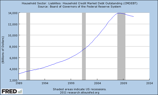
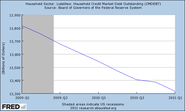
In this country there is a feeling that something fundamental is wrong. Many are waking up to the fact that the national myth of Equal Opportunity may be just that – a myth. For decades, people have started small businesses using the equity in their homes to survive the cash flow crunch of the first years of a small business. The decline in housing prices has left many without that traditional capital cushion.

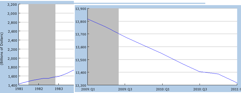
A few weeks ago I wrote about the decline in the median income over the past decade.  Today, let’s look at the big picture of personal income.  Below is a Federal Reserve chart of inflation adjusted personal income for the past fifty years. (Click to enlarge in separate tab)

After a big dip in the past recession (shaded on the chart above), total personal income has returned to about the level it was at the start of the recession in December 2007.  Below is that same chart zoomed on the past five years of inflation adjusted income.

To see the underlying strength or weakness of income, we need to take out transfer payments, which are government checks for benefits of all types.  After all, this is just tax money taken from Paul to pay Peter. The Federal Reserve conveniently gives us that data.

A zoom in on the last five years of inflation adjusted personal income shows the economic sickness that many people vaguely know in their hearts.  After rising from a trough in the 3rd quarter of 2009, real personal income has stagnated the past year.

What this data doesn’t do is adjust for the increase in population.  Although the Federal Reserve charts per capita disposable personal income, they do not chart real personal income less transfer payments on a per capita basis.  Using population figures from the Census Bureau, I was able get a picture of the income data, one that has serious implications for the future.

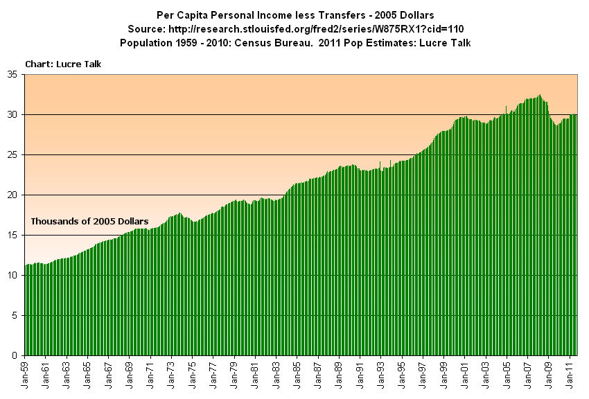
In 2011, we have finally reached the 2001 level of income.  Despite all the productivity gains of the past decade, we are back to where we started.  As I have pointed out before, the productivity gains are going to the very top incomes.  Below is that same chart, but focused on the past ten years.

As the boomers retire in ever increasing numbers they will be receiving Social Security checks, a transfer payment, which will put downward pressure on personal income less transfer payments.  The long term chart of personal income less transfer payments reveals a familiar and disturbing pattern familiar to stock chart watchers – the head and shoulders pattern – which indicates a dramatic drop in the future.  Confirming this ominous sign are the uncompromising unemployment figures – over 16% of the working age population is either un- or under-employed.  How are these fewer workers with relatively stagnant real incomes in the production of goods and services going to generate enough tax revenues to pay for the increasing transfer payments?

Retail Sales

A week ago the Census Bureau released the Advance Monthly Retail Sales report for September.  When adjusted for seasonal factors and holidays in the reporting period, September sales showed a slight 1.1% increase from August and an almost 8% increase over September 2010 sales.  A tepid – but better than expected – employment report the previous week and growing consumer sales has countered fears that the U.S. might be entering a double dip recession. Hopes that Europe will reach some resolution to their debt crisis and the reduced fears of another recession have helped power the stock market almost 15% higher from its October 4th lows.

Has the U.S. consumer come back?  Below is a 20 year chart of seasonally adjusted retail sales in inflation adjusted dollars.  As you can see, we are still struggling to reach the levels of 2007.

The Christmas season can account for 40% of many retailers annual sales.  The other nine months of the year, from January to September, show the underlying resilience of the consumer economy. I pulled up the September Advance Monthly reports from the Census Bureau for recent years to get a comparison. I used Bureau of Labor Statistics CPI data to show sales in real dollars.

Although we have finally surpassed the nine month total of 2008 in current dollars (violet bars), the inflation adjusted sales figures show that we are still below the levels of 2007 and 2008.  State and local governments rely on sales taxes for about a third of their tax revenue.  The Census Bureau reported that sales tax revenue for state and local government in 2010 was $17 billion less than 2007, a 4% decrease.  In inflation adjusted dollars, the decrease in sales tax revenues is almost 12%.

How have state and local governments made up the shortfall in sales tax revenues?  Corporate income taxes increased 50% from 2007 to 2010, more than making up for the decline in sales tax revenues.

Property taxes make up 30% of tax revenues for state and local governments.  Given the sharp decrease in house prices, I would have expected that property tax revenues would have declined but changes in property taxes lag changes in the market price of houses.  In 2010, property tax revenues were 10% above 2007 levels, double the 5% inflation rate for that period.  Although 2011 figures are not available yet, I would expect that property taxes declined this past year.  State and local governments are praying that there is a pickup in retail sales to compensate for reduced property tax revenues.

The bottom line?  The pressure points may shift but the pressures on the economy as a whole remain constant.  Private industry continues to add enough jobs to compensate for population growth and reductions in the workforce of state and local governments but not enough to bring down the unemployment rate.  Revenues to state and local governments may show slight improvement but not enough to keep up with inflation, and certainly not enough to rehire these lost government jobs in the near future.

Earnings

The headline from a recent report by the Census Bureau revealed that the men’s median (50% made more, 50% made less) inflation adjusted income is now less than it was in 1968.  Looking behind the headline at half a century of data uncovers some trends that surprised me.(Click to enlarge in separate tab)

Men’s median earnings during this mother of all recessions have actually been better than the recessions of the early nineties and early eighties.  What distinguished the recession of the early 2000s was that median earnings did not decline, probably due to the growing boom in the construction industry at the time – a boom that would blow up the economy in 2008.  What is apparent is the two decade “Camelot” period of the post war period when median male incomes steadily increased.

1979 was a historic year when there were more women in the workplace than men. How have full time employees of both sexes done in the past thirty years? Data from the Bureau of Labor Statistics shows a overall slight increase in median inflation adjusted earnings during the past decade.

The increased production of workers during those thirty years has been strong – far more than the slight increase in earnings.

As I noted a few weeks ago top incomes have been growing far more than the median income.  Productivity gains produce greater profits. Those profits have largely gone to employers, not the employees. 

Social Security COLA

Many seniors receiving Social Security pay attention to the Consumer Price Index (CPI) once a year in November when the Social Security Administration (SSA) sends its annual notice of the cost of living adjustment (COLA) for the next calendar year. Although Social Security payments are set for a calendar year, the adjustment is based on the change in the CPI during the Federal Government’s fiscal year, which runs from October thru September.  On October 19th, the Bureau of Labor Statistics (BLS) will announce their monthly CPI figure for September, effectively giving Federal agencies their annual COLA figure.

Following this announcement from the BLS, the SSA will start drafting their notices, which they will send out in November.  Based on previous CPI data from the BLS and a seat of the pants estimate for September, I would guess that the COLA adjustment will be about 4.1%, an increase of $50 a month for the someone who receives an average monthly benefit of $1200.

What is good for seniors is not so good for Federal budget makers.  In August of this year, SSA paid out almost $60 billion in Social Security benefits to 55 million beneficiaries.  Multiply that monthly figure by 12 to get an annual payout of about $720 billion, or about 20% of the total amount of money the Federal government will pay out this year.  Now add a 4.1% COLA, which is about $30 billion extra that will need to be paid out next year.  Social Security taxes collected will just about cover the payments, leaving nothing extra for the Federal government to “borrow” from the Social Security trust funds.

Defense spending, including benefits, medical care and job training for retired vets totals more than a $1 trillion, or almost a third of the total federal budget, far more than the 25% spent during the years of the Reagan administration.  In a speech this past week at the Citadel, a military academy,  Mitt Romney, the leading Republican presidential contender, announced that, if elected in 2012, he would expand military spending even more than current levels.  How will he pay for this further build up?  If there is a Republican congress, there won’t be any tax increases.  That leaves only two alternatives:  drastically increase the federal debt more than Bush and Obama have already done, or get the money where he and the Republican congress can get it from – Social Security beneficiaries.  The bond market won’t let Romney run up too much more debt so that leaves only one alternative – reduce benefits to seniors.  Unlike younger people, seniors vote so the plan will be along the lines that Eric Cantor, the House Majority Leader, proposed this past year: keep benefits the same for those already retired and soon to retire and reduce future benefits for those 55 and younger.  That will be the starting place.  Next will come an adjustment to the calculation of the COLA.  As you can see above, a reduction in the annual Social Security COLA may be the weekly food cost for a thrifty retiree but means billions of dollars in money to the Federal government – billions that Romney can spend with defense companies.

Voters have two choices:  Get angry before the politicians screw us when we have some chance to change the outcome, or get angry after they screw us. 

Debt Comparison

As this past quarter began in July, Greece’s debt was a concern but the countries of the EU were in negotiations to work it out.  QE2, the Federal Reserve’s program of bond buying, had just ended, prompting some to worry about a negative effect on the economy as that stimulus.   Early second quarter earnings reports in mid July were strong and the balance sheets of major companies showed that they had accumulated ample reserves of cash to weather any small downturns. Manufacturing was slumping a bit but that was attributed to supply chain disruptions from the March Japanese tsunami and was expected to grow again in the third quarter.  The moribund housing sector and stubbornly high unemployment remained a concern but the stock market is a pricing of future company earnings.  The companies in the S&P500 which have any foreign earnings receive the majority of their earnings from countries other than the U.S.  This global sales and revenue base makes these large U.S. companies less vulnerable to economic weakness in any one country.

Japan’s recovery in GDP in the second quarter surprised many, testifying to the resilience and industry of the Japanese people and Japanese industry.  China, Indonesia, India and Brazil were showing strong growth, perhaps a bit too much growth, as inflation in those countries and regions was prompting central banks to take steps to cool that growth.  Growth in the EU countries was a concern but German manufacturing was holding steady.

Toward the end of July, the EU reached an agreement to provide financing to Greece and, in the U.S., President Obama and House Speaker Boehner supposedly reached an agreement – dubbed the “grand bargain – for debt reduction.  On July 22nd, the S&P500 closed near 1350.  At the end of September, the S&P500 stood at 1130, a drop of 17%.  What happened?

The weekend after the “grand bargain” came news that there was no bargain.  During August, the American people stared in befuddlement at a dark comedy in which lawmakers and the President brought the country to the brink of default, prompting one rating agency to downgrade U.S. government debt. 

Computing the Gross Domestic Product (GDP) of an entire nation is a complex affair, one that requires an early estimate and two revisions. In the late days of July, the Bureau of Economic Analysis (BEA) revised the GDP growth for the 1st quarter of 2011 (ending in March) from a weak 1.9%  to an almost recessionary .4%.  This was a large revision and shook the markets, swiftly dropping the S&P500 index to about 1100. 

Germany reported strong manufacturing data for July but China showed a stalled growth in their manufacturing, adding to worries about a global slowdown.  Since early August, the market has behaved like a small boat in the Mid Atlantic, rising and falling dramatically with both news and worries about Greece’s debt as well as the debt of Italy, Spain, Ireland and Portugal.  Investors have fled from the stocks of banks holding the debt of those countries as well as larger banks which might have indirect exposure to that debt.  An index of large banks has fallen 28% since April of this year.  Many developed countries are wallowing in debt.  A slowdown in growth leads to less tax revenue to pay down that debt.  Worries of a global recession or a severe slowing of growth provoke fear of bank defaults, government defaults, and growing pressure on small and medium sized businesses, who are least able to withstand downturns in an economy.

Fractious meetings among EU member countries, among the various branches of the U.S. government leads many to regard politicians on both sides of Atlantic as dysfunctional, unable to resolve their ideological differences to make any functional policy decisions.  Investors worry about the viability and future of the euro currency, fleeing the Euro and parking their money in U.S. Treasuries, causing the price of Treasuries to rise and the yield (interest) on those bonds to fall to historically low levels.

In September, an HSBC index of small and medium Chinese manufacturers reported a slight contraction.  German manufacturing declined from strong numbers in July to a neutral stall speed in September, confirming fears of a global slowdown. 

In the U.S. and Eurozone, governments at all levels have instituted austerity measures to cope with declining tax revenues.  Government employee layoffs increase the demand for social support programs, prompt civilians to curb their spending, resulting in less tax revenues for government, prompting more government cuts, ad nauseum.  Cautious companies hoard what cash they have, reduce their investments in anticipation of further slowdowns in consumer demand.

Weighing on the economies of the U.S, Japan and Europe are a decades long accumulation of debt.  Below is a chart of OECD data on the total debt of developed countries.  Debt in the U.S. doesn’t look bad compared to some of these other countries. (Click to enlarge in separate tab)

For the past thirty years, all of us in the U.S. have been running up debt.  People, companies and governments at the Federal, State and local levels have borrowed…and borrowed…and borrowed some more. 

The severely slumping U.S. housing market is a strong headwind to any GDP growth.  Lower valuations lead to less property taxes for local governments and schools, reduced government services, houses that are difficult for homeowners to sell without bringing cash to the sale. A recent report by the Commerce Dept. showed that housing has contributed an average of 4.7% to GDP for the past half century.  Last year, housing contributed only 2.2% to GDP.  If the health of the housing sector was just average, GDP growth in this country would be 2.5% higher.   Some in the industry anticipate that it will be another five years for housing to recover from the excesses of the past decade.

Crossing

On July 4th, I cautioned about dramatic weekly moves in the market.  This past week we again had a dramatic surge upward, fueled in part by the Federal Reserve’s commitment to backstop European banks with dollars for the rest of the year. On July 4th, I wrote “If there are some positive surprises this week, then this could be the start of the third leg up in stock prices.  If there are negative surprises, watch out below…”

We indeed had a big surprise that following Friday when the Labor Dept (BLS) reported a mere 18,000 jobs created in June. In August, BLS reported 117,000 jobs created in July but the Household Survey showed little change in employment levels or what is called the EMRATIO, the ratio of working people to the entire population. In September, the BLS reported a historic zero jobs created in August.

In a June 20th blog I wrote about the convergence of several moving averages (MA).  This week I will highlight the crossing of two averages, the 50 day and the 250 day.  10 days ago, the 50 day average of SPY, an ETF that tracks the S&P500, crossed below its 250 day MA, a sell signal for longer term investors.  For the past 17 years, if you had bought this index when the 50 day MA crossed above the 250 day MA and sold when it crossed below, you would have made 455%, buying and selling only 5 times in those 17 years.  Buy and hold would have resulted in a 356% return over those years. (Click to enlarge in a separate tab)
 

QQQ is an index that tracks the top Nasdaq stocks.  Using this same formula, you would have made a 74% profit since January 2000.  During that period, the index has lost 38% of its value from the heyday of the tech stock boom.  The 50 day MA is about to cross the 250 day MA.

ISM – not just another ism

Each month the Institute of Supply Management surveys several hundred firms in both the non-manufacturing and manufacturing sectors of the economy and compiles an index based on the survey responses to questions regarding both current and near future conditions.

The overall index is widely published each month but a closer inspection of the components reveals developing strengths and weaknesses in the economy.  The two component indexes I will look at are New Orders and Employment. 

 Manufacturing is only about 10% of the overall economy but it is a leading indicator of the underlying health of the overall economy. The recession officially ended in June 2009 and as the chart below shows new orders for goods started growing.

With new orders growing, manufacturers began hiring – the Employment index started increasing from a sick level of 40.

There were two key causes for this improvement:  The weakening dollar made manufactured goods attractively valued for businesses and consumers in other countries, thereby boosting our exports.  The auto bailouts and “Cash for Clunkers” program that were part of the stiumulus program initiated in the spring of 2009 helped revive the mortally wounded car manufacturers.

New orders in the non-manufacturing or services sector, the largest part of our economy, also started growing, but not as rapidly.

A large part of the construction trade is included in this sector.  The lack of new housing starts – about half what it was just five years ago – has crippled this industry, serving as a dead weight on the sector as a whole.  The non-manufacturing employment index lagged behind, not reaching a state of expansion till late summer of 2010.

Since the beginning of this year, new orders in both sectors have declined. 

The Japanese earthquake and tsunami in March of this year was blamed for the slowdown in manufacturing.  In June of this year, Japan appeared to have overcome much of the damage that the tsunami had done to their supply chain, leading economists and stock traders to predict a stronger second half of this year for the U.S.  However, the manufacturing new orders index has edged into contraction territory, hardly a sign of increased demand.

As the growth in new orders approaches the midway mark between contraction and expansion, so too does the employment index.  In both the manufacturing and service sectors of the economy, growth is minimal, leading some to predict and many to worry about a “double dip” recession.

Unemployment remains stubbornly high as demand softens.  The various stimulus programs by the Federal Reserve and the Obama and Bush administrations have had some effect but have not produced the robust recovery hoped for because this is the mother of all deleveraging recessions when both consumers and businesses pay down or restructure their debt and asset prices (housing prices) decline.  In the past decades, we accumulated debt the way a house accumulates water when flooded during heavy rains.  The Fed and both presidential administrations have been pumping hard to keep the floodwaters from causing even more damage.  What do they get for their efforts?  Some blame the pumpers for causing the flood.

Reaganomics vs. Obamanomics

In a Aug. 25th Wall St. Journal op-ed editorial board member Stephen Moore compared Obamanomics and Reaganomics.  Both Presidents inherited crippled economies but after 2.5 years in each President’s term there is a sharp contrast in GDP growth.  In 1983, growth was about 5%.  In 2011, it is about 1%.  Mr. Moore attributes the healthy growth of the Reagan administration to Reagan’s focus on the supply side of the economy.  Obama’s policies, on the other hand, focus on the demand side of the economy.  I argue that Mr. Moore has neglected a major component of the economy that accounts for the differences in growth – household debt.  Consumer purchases account for roughly 70% of GDP.  When consumers go on a decades long buying binge, GDP growth is strong.  When consumers get choked with debt, as they had toward the end of this past decade, they pay down that accumulated debt and GDP shrinks accordingly or grows much more slowly. 

In the late 70s, consumer borrowing began a rapid rise that would soon skyrocket in the following decades.  The first half of the Boomer generation were in their early 30s and late 20s.  Rampant inflation created a dangerous attitude of “buy now, pay later” as a way to save money as prices roses more than 10% per year.  Not in wide use in previous decades, credit cards began growing in popularity among this new generation.  This largest generation began settling down to start families, buying houses and cars with easy credit.

From 1973 to 1981, household debt grew 2.5 times, from $578 billion to $1422 billion.  As the chart below shows, household debt more than doubled again to $3110 billion, or $3.1 trillion, during the Reagan administration. (Click to enlarge in separate tab)

During the next eight years from 1989 to 1997, the growth rate of household debt slowed to 168% but topped $5 trillion.  This slowdown was due mostly to the recession of the early nineties.  As we pulled out of the recession in 1993, we returned to bingeing on debt. In the eight years from 1997 to 2005, that debt doubled again to almost $11 trillion.

In Jan. 2008, household debt outstanding stood just shy of $14 trillion dollars, or about the total nation’s GDP. 

After growing for almost 6 decades, the debt burden on families had reached an unsustainable peak and it began to fall.  In January 2011, the total is still over $13 trillion but has fallen 4.4% since January 2008.

The composite chart below gives a clearer picture of an important contrast between the early eighties and the past 3 years.

Supply side economic policies which offer greater support to suppliers, i.e. less regulation and lower taxes, won’t have much effect when buyers are overextended and the demand is not there.  The greatest asset base of most households is their home, a base that has severely eroded.  House foreclosures continue to climb and there is a large pool of delinquent mortgages that are waiting to be foreclosed on.  The large loss of jobs has slashed the credit card borrowing capacity of many households.  New car sales contributed to the growth in household debt but have plummeted in the past few years.  They have improved over the past few months but are still 70% of 2007 levels. Many consumers are wary of taking on more debt.  Without that consumer demand, companies are understandably reluctant to invest in new buildings, to build inventory, to expand their business capacity.  This is why American companies are sitting on almost $2 trillion in cash.

Why did so many of us run up so much debt?  The income of the middle class, in inflation adjusted dollars, stopped growing after 2000 (same Census Bureau table as above).  To make up for the lack of growth, households borrowed against their houses and ran up credit card debt and car loans and leases.  The real growth in middle class incomes over the past 30 years is only 15%, or 1/2% per year average.

During the past thirty years, the distibution of income has favored the top 5% of households, those making more than $180K (in 2009 dollars).  Below is a chart of the growing ratio of the top 5% of incomes to the median, or middle, income.

That ratio has grown 36% over the past 42 years.  The fortunes of the top income earners are pulling away from the rest of the country and will continue to do so as we continue to import far more than we export. Exports produce American jobs.  Imports reduce American jobs. Below is a chart of the Balance of Accounts for the past 60 years showing the balance of exports minus imports.  In the 1990s, the North American Free Trade Agreement (NAFTA) moved many jobs to Mexico but the real exodus of jobs from the U.S. occurred after China was admitted into the World Trade Organization in 2001.  Since then, 4 million manufacturing jobs have been lost in the U.S.

Due to increased productivity, manufacturing has been declining for the past forty years (U.N. chart here) in both the U.S. and the world. Both industrialized and newly industrializing nations are relying more on the service sector of their economies for the bulk of their GDP.  In this country, manufacturing jobs produced greater income relative to educational experience.  A person with a high school education could earn an income that would put them at the median income level or above.  Today, the construction industry is the only large sector that can consistently provide that kind of income with only a high school education. The decline in housing has crippled that industry and slashed the incomes and job prospects of many.

The growth of the early eighties was fueled by the advent into the workplace and marketplace of the largest generation ever, the newly maturing Boomers who built families and businesses and borrowed and borrowed but who are now near retirement.  Reagan stands near the beginning of that economic expansion fueled by debt.  Obama stands at the collapse of that runaway debt explosion.  Reagan’s policies did not jump start the growth process nor do Obama’s policies hinder it.  The sociological and economic forces of a generation surpasses either’s politics or policies.

Debt Ceiling

As Congress and the White House spend a summer weekend wrestling with negotiations over the debt limit, it helps to step back and look at the overall U.S. debt picture.

Since mid 2008, we have been on a dangerous trajectory, borrowing for TARP, stimulus plans of both spending and tax cuts, two wars, extended unemployment benefits, more tax cuts this past December and more and more defense spending.

Some argue that the only legitimate function of government is defense. Since we can never be safe enough, in principle there is no upper limit to how much we should spend on defense. Friday’s BEA report on GDP shows a 7.3% increase in defense spending.

“We can not abandon the most vulnerable members of our society” is a mantra repeated by some. As the population grows, so too will the vulnerable members of any society. As the population ages, that vulnerability will increase exponentially. In principle, there is no upper limit on our caring and generosity.

In reality, of course, there are limits. In our individual lives, in our communities and in the nation as a whole, we must struggle with the contradictions between our loftier principles and the harsher realities of living. For a while we can delay the reconciliation of principle and reality by putting off the inevitable compromises.

We have a natural knack for prognostication – one that we exhibit at an early age when we don’t clean up our room, do our homework or some other petty chore. Peoples of the future may label us “Homo Prognosticator”, not “Homo Sapiens.”

Debt is one indication of prognostication. We are getting really good at putting things off in the hopes that, one day, it will start getting better.

Below is a chart of federal debt since 2004, showing the increasing change in slope of the debt owed by all of us – our future selves, our kids and grandkids.

As I have noted in previous blogs, we have both a spending and revenue problem. To deny that we have both is more than prognostication – it’s delusion. Neither problem has broadly palatable solutions but the longer we delay implementing solutions, the worse it will get – exponentially worse. Anyone who has charged way too much on credit cards is well aware of that. The interest on the debt increasingly worsens any solution until bankruptcy is the only answer.

National bankruptcy is the sum of over 300 million personal bankruptcies.