Personal Debt

April 15, 2018

by Steve Stofka

Until the financial crisis, I thought that other people’s debt was their problem. In 2008, debt became a nation’s problem and a national conversation with two aspects – the moral and the practical. Moral conversations are not confined to church; they drive our politics and policy. Many laws contain some language to contain moral hazard, which is the danger that language loopholes in a law or policy promote the opposite of the intended effect of the law. This is particularly true of many entitlement policies. Let’s leave the moral conversation for another day and turn to the practical aspects of current policy.

Bankers learned their lesson during the financial crisis, didn’t they? Maybe not. A decade of absurdly low interest rates has starved those who depend on the income earned by owning debt. Even a savings account is money loaned to a bank, a debt that the bank must pay to the account holder. In their hunger for income, investors have turned to less prudent debt products. So long as the economy remains strong, no worries.

A fifth of conventional mortgages are going to people whose total debt load, including the mortgage, is more than 45% of their pre-tax income. By comparison, at the market’s exuberant peak in late 2007, 35% of conventional mortgages were going to such households, who were especially vulnerable when monthly job gains turned negative in early 2008.

The real estate analytics firm Core Logic also reports that Fannie Mae has started backing mortgages to those with total debt loads up to 50%. FICA, federal, state and local income taxes can amount to 25% of a paycheck (Princeton Study). Add in 45% of that gross pay for mortgage and debt payments, and there is only 30% left for food, gas, home repairs and utilities, child care, etc.

I’ll convert these percentages to dollars to illustrate the point. A couple grossing $80,000 might have a take home pay of $60,000. The couple has $36,000 in mortgage and other debt payments (45% of $80,000). They have $24,000, or $2000 a month for everything else. This couple is vulnerable to a change in their circumstances: a layoff or a cut back in hours, some unexpected expense or injury.

For those who get a conventional loan despite their heavy debt load, where is the money coming from? Banks suffered huge losses during the financial crisis. The Federal Reserve tightened capital requirements for banks’ loan portfolios, forcing them to improve the overall quality of their debt. As a result, banks turned away from their most lucrative customers – subprime borrowers and those with heavy debt loads who must pay higher interest on their loans. Profits in the financial industry fell dramatically. A broad composite of financial stocks (XLF) has still not regained the price levels of 2007.

The banking industry employs some very smart people. What solution did they create? The big banks now loan money to non-financial companies who loan the money to subprime borrowers. After bundling the consumer loans into securities, the non-financial companies use the proceeds to pay the big banks back. In seven years this kind of borrowing has expanded seven times to $350 billion. Doesn’t this look like the kind of behavior that almost took down the financial system in 2008? The banks say that this system isolates them from exposure to subprime borrowers. If large scale job losses cause a lot of loan defaults, it is the investors who will bear the pain, not the banks. Same song, different lyrics.

The 2008 financial crisis is best summed up with a chart from the Federal Reserve. In the post WW2 economy, the weekly earnings of British workers rose steadily. The growth is especially strong when compared to the earlier decades of the 19th and 20th centuries. In 2008, earnings peaked.
WeeklyEarnUK

Developed countries depend on the steady growth of tax receipts generated by weekly earnings. An assumption of 3% real GDP growth underlies the health and continuation of post-war social welfare policies. For more than a decade, the U.S. and U.K. have had less than 2% GDP growth.  Both governments have had to borrow heavily to fund their social support programs.  How long can they increase their debt at such a rapid pace?

I am reminded of a time more than 40 years ago when New York City held a regularly scheduled auction to sell  bonds to fund their already swollen debt load.  None of the banks showed up to bid for the bonds.  The city is the financial center of the world.  The lack of interest stunned city officials.  To avoid a messy bankruptcy, the city turned to the Federal government for a loan (NY Times).

The Federal government is not a city or state, of course. It has extraordinary legal and monetary power, and its bonds are a safe haven around the world.  But there could come a time when investors demand higher interest for those bonds and the rising annual interest on the debt squeezes spending on other domestic programs.

Debt causes stress.  Stress causes anxiety.  Anxiety weakens confidence in the future and causes investment to shrink. Falling investment leads to slower job growth. That causes profits and weekly earnings to fall which reduces tax receipts to the government.  That increases debt further, and the cycle continues.  Other people’s debt is everyone’s problem after all.

Trade Wind Turbulence

April 8, 2018

Remember the clip of Jack Nicholson In the 1980 movie The Shining? Jack hacks his way through a door with an axe, then presses his face to the jagged hole and announces, “It’s Johnny!” Substitute “Trade Wars” and we get a dramatic portrayal of the stock market this past week. On several days, the Dow swung 700+ points, or more than 2%, in response to fears of a tariff feud between the U.S. and China.

The share of global commodities that China consumes far exceeds its share of the world’s population (1/5) or the global economy (1/6). Here’s a chart from Visual Capitalist.

On Thursday, the market opened almost 2% down in response to comments from the chief Tweety Bird in the White House. Later that morning, Larry Kudlow, Trump’s new NEC Director, did a quite effective job of easing market jitters. Kudlow has been a host of CNBC and his own radio program for many years and is savvy to shifting sentiments. No, he said, Trump is a free trader in disguise. This is just a bargaining tactic. The market started the day 500 points down and finished up 240 points.

This is a trader’s market. Much of the price action is taking place in the last hour of the trading day. Each price recovery since mid-March has failed, so the overall sentiment is negative and Friday’s trading was near the 200-day average. For an investor who has not yet made their 2017 IRA contribution, buying now is somewhat equivalent to dollar cost averaging over the past nine months. For those with shorter time horizons, cash looks good till the market finds its head.

The Labor Report for March showed job gains of just 103,000. This was below the 175,000 anticipated gains and far below ADP’s 240,000 estimate of job gains. Mid-March weather on the east coast may have had a negative effect on this month’s survey. The average of the BLS and ADP surveys is 172K, and I find that average to be a more accurate long-term estimate.

The BLS recently released a report on unemployment rates and weekly earnings classified by degree. This chart is a dramatic picture of the advantages of higher education.

UnemplEarnByDegreeBLS
VividMaps released a map showing the income needed to buy an average home in each state. Because the data uses average house prices, the map overstates the affordability problem for many families but does reveal the underlying trend. Why do I say overstates? The average home price is far above the median price because extremely expensive homes raise the average.

First quarter earnings to be released in the next two weeks are expected to show strong annual growth. Will the confirmation of rosy expectations overcome the darker fears of a global trade war? Stay tuned.

Work

April 1, 2018

by Steve Stofka

This week I’ll look at several aspects of work, from cryptocurrencies like Bitcoin, to the minimum wage.

What is work? In general science or physics, the subject of “work” pictured a horse hitched to a pulley lifting a weight (an example). In one minute, the horse could lift so many pounds a foot in the air and that equaled so much horsepower. Thus we could reduce our definition of work to three components: weight, distance and time.

Even this mechanical definition of work illustrates a problem. If the horse lifted the weight, then let it down again, how would we know that the horse did any work? Should we give the horse a few cups of oats, or have we got a lazy horse?

A variation on that problem – I cut my lawn. My neighbor looks at my lawn and sees that work was done. In a week or two the grass has grown and time has erased any sign that I did work.

Thus, we need a way of recording work done. The product of the work performed may serve as a record. A big pyramid sitting on a desert is a permanent record that work was done. If workers dig holes in the ground, then fill the holes, how do we know any work was done? If they have dug up gold from those holes.

Bitcoin and other cryptocurrencies (crypto) are assets like gold. They recognize that some work was done. Equipment, technology and workers were needed to dig up gold. Likewise, electricity was an important resource needed to generate a bitcoin, and even more electricity will be needed to generate a replacement bitcoin if one were lost.

This Politico article is an account of a crypto mining boom in a rural area in Washington state. The electricity consumed is enormous. The mighty Columbia River nearby provides electricity at a fifth of the average cost in the country. By the end of this year, there will be enough electrical capacity in this small area to power the equivalent of a tenth of the homes in Los Angeles. Shipping containers house computer servers which generate so much heat that the exhausted air melts the snow around the containers. As gold records the digging of dirt, a bitcoin records the expenditure of some quantity of electricity.

Assets can represent past work, future work, or a combination of the two. Precious metals, jewels, books and artistic works represent work done in the past. On the other hand, a machine represents future work. Other assets include stocks and bonds, both of which are claims on future work. A bond is a fixed limit claim on a company’s assets. In contrast, a share of stock is an undying claim on a portion of a company’s assets.

The blockchain algorithm behind crypto requires agreement among many parties to confirm a property right to the crypto. The recording of property rights might seem rather ordinary to a reader in the U.S. In some countries, however, property deeds are more easily altered by those in power. In contrast, a blockchain system of recording property rights prevents forgery and alteration.

As a record of work done, money relies on a relatively stable value. High inflation damages the money record of work done. Consequently, high inflation can fracture the social bonds among people. As an example, I cut someone’s lawn on Saturday and am paid. When I spend the money on Sunday, it is worth half the amount. In effect, the money has only recorded that I cut half a lawn. Examples of this hyper-inflation are Zimbabwe in the 2000s, and Yugoslavia in the 1990s (Wikipedia article). Look no further than Venezuela for a current example of the destruction that inflationary policies can have on a society.

Let’s turn from the recording of work done to the doing of it. New unemployment claims are at a 45 year low. A decade ago, job seekers despaired. In contrast, employees today are confident they will quickly find new employment. To illustrate, the quit rate is at the same pace as the mid-2000s, at the height of the housing boom. As a percent of the labor force, new unemployment claims are the lowest ever recorded. Last week’s numbers broke the record set in April 2000 at the height of the dot-com boom.

Equally important to the strength of a job market is the fate of marginal workers who are most vulnerable to the shifting tides of the economy. This includes disabled people who want to work. During the recession, the unemployment rate for disabled men of working age reached almost 20%. Today it is half that.

Let’s turn to another disadvantaged sector of the job market – those who work for minimum wage. The 1930s depression put many employers at an advantage in the job market. The Fair Labor Standards Act of 1938 (FLSA) enacted a wage floor, but many workers were not subject to the new law. In 1955, almost twenty years after passage of the law, “retail workers, service workers, agricultural workers, and construction workers were still not required to be paid at least the minimum wage” (article).

The minimum wage affects many lower paid workers who are making more than minimum wage. In some union jobs, starting wages for helpers are set by contract at a percentage above minimum wage. The understanding may be non-written in some cases. In 1966, the rate was increased from $1.25 per hour to $1.60 per hour. Non-union clerks at a NYC hospital who had been making $1.70 per hour now complained that they were making minimum wage. As a result of their pressure on management, they got a raise within a few months.

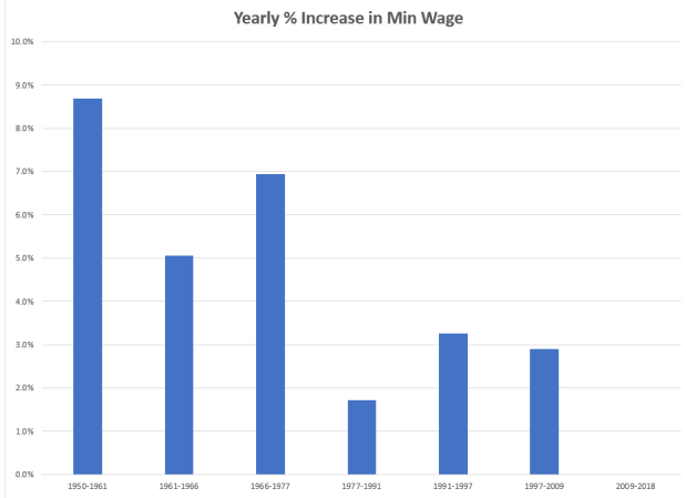
Here’s a chart showing the annual increases in the minimum wage for each period since 1950.

MinWagePctInc

In the three decades after World War 2, annual increases in the minimum wage exceeded inflation. Since 1977, the minimum wage standard has not kept pace with inflation.

MinWageLessCPI

If Congress truly represented all of their constituents, they would make the minimum wage adjust automatically with inflation. On the contrary, Congress represents only a small portion of their constituents, and the minimum wage is used as a political football.

Finally, there is the destruction of the record of past work by war. Every minute of every day, living requires calories, another measure of work. Therefore, each of us is a record of work done.  War destroys too many human records, and the unliving records of work like buildings, roads and bridges. Perhaps one day we will fight our battles in video games and stop destroying all those work records.

Lots of Changes

March 25, 2018

by Steve Stofka

What a week it was. A glance at the headlines would lead someone to believe that it was all about tariffs and an impending trade war between the U.S. and China. On Thursday and Friday, the Dow Jones Industrial Average lost more than 1000 points, or almost 5%. Was that all about tariffs? Hardly.

As expected, the Federal Reserve raised interest rates ¼% on Wednesday.  This put the Fed rate at 1.5% – 1.75%. Half of the members of the interest setting committee (FOMC) indicated that it might be necessary to raise interest rates four times this year. The market has been pricing in three interest rate increases for 2018. Until Thursday, a fourth increase had not been fully priced in.

Further, the Fed is projecting an unemployment rate below 4% by late 2018 and early 2019. The current rate is 4.1%. Many industries are already struggling to find qualified workers. Rarely does the unemployment rate dip below 4%, and each time, inflation has risen and the stock market has fallen – sometimes substantially.

CPIUnemploy

The downturn following the Korean War was short and shallow, but the other two periods of low unemployment were followed by steep corrections in the market.

On Thursday night, the White House tweety bird announced another change in the roster. Out with the old National Security Adviser, General H. R. McMaster. In with the new adviser, John Bolton, an old school war hawk who avoided military service in Vietnam by joining the National Guard. Bolton’s first instinct is war and regime change as a solution to global disputes. In choosing Mike Pompeo as his new Secretary of State and John Bolton as his new National Security Advisor, Trump has assembled a war cabinet. The market has still not priced in the heightened chances of conflict with North Korea or Iran. Nor has it recognized a greater likelihood of armed conflict with China in the South China Sea. That might come in the next few weeks.

On Thursday, Trump enacted tariffs on imported steel and aluminum from China as promised. Stronger action against China’s trade policies are overdue, as it has long violated the spirit, if not the letter, of the WTO global agreements. Car manufacturers wanting to set up a plant in China must have a Chinese business partner with a 25% stake and – surprise – access to industrial trade secrets. The national government heavily subsidizes key industries so that they can support their own industries and workers. They avoid labor and environmental regulations, and when caught, pledge to do better. They issue a national change in regulation, but the change is only published and enforced in a few local areas.

The theft of intellectual property is a hallmark of most developing nations like China. In the 18th and 19th century, the U.S. was notorious for copying products made by companies in England and France. Article 1, Section 8 of the Constitution added some promise of patent and copyright protection, but the laws instituted protected only U.S. citizens. A half century later, Charles Dickens was “one of the chief victims of American literary piracy” (Source). A foreign inventor had to establish citizenship or residency in the U.S. for two years to gain any patent protection. In 1887, the U.S. joined a 19th century version of the WTO called the Paris Convention. As China does today, the U.S. skirted international agreements for at least a decade (Patent history).

Older Chinese citizens may have watched patrolling U.S. naval ships from the shores of the Yangtze River. The nation remembers the century of U.S. gunboat diplomacy (Wikipedia article). Despite American free market rhetoric, Chinese leaders understand that mercantilism still retains a strong political influence in the trading policies of many developed countries, including the U.S.

When NAFTA was signed in the early 1990s, subsidies of American corn farmers enabled them to sell cheap corn to Mexico. Unable to compete, many farmers in northern Mexico went out of business. As farming jobs decreased in Mexico, many laborers journeyed north to the U.S. to pick crops so that they could support their families. The U.S. is partially responsible for creating the very environment that led to so much illegal immigration from Mexico.

Around the world, developed countries cry foul when another country subsidizes goods that are exported at a lower cost into their countries. Since 1963, the U.S. has imposed a protectionist tariff of 25% on imported light duty trucks, the so called “chicken tax”. Protected for over fifty years by this tariff, domestic truck manufacturers like Ford and Chevy had made few substantial changes to their work vans in the past few decades. In 2015, Ford finally made a substantial change to its F-150 pickup. Notice those Mercedes tall work vans on the road? They are built in Germany, disassembled to avoid the tariff, shipped to the U.S. and reassembled by U.S. workers. Ford uses the same process with its Transit Connect van.

Boeing imports parts from all over the world to build its Dreamliners. Chinese companies use southeast Asia as a manufacturing supply, then assemble and ship thousands of products to the U.S. and around the world. In the truly global manufacturing economy, a trade war is a threat to the profits of many large businesses. They have tuned their operations to the contradictory rules of international trade.

Business leaders understand the political strut of free trade. Each business wants free trade when it wants to compete in someone else’s market. Each business lobbies for more regulations, tariffs and barriers to protect its competitive position within its own market. Yes, it’s all lies, so it’s important that the rules underlying this game not change too much. Trade wars change the rules and that’s bad for business.

Debt and Housing

March 18, 2018

by Steve Stofka

Republicans used to care about yearly budget deficits when Obama was President. Since Obama left office, the budget deficit is up 20%. As a percentage of GDP, 2017’s deficit was above the forty-year average of deficits (Treasury Dept press release).  At the end of the Obama term, the gross federal debt was 77% of GDP. In ten years, the Congressional Budget Office estimates that percentage will be over 90%. (Spreadsheet ) That estimate does not include the lower revenues from the tax cuts passed in December.

During the two Bush terms, Republican deficit hawks, genuinely concerned about budget deficits, were overruled by a majority of Republicans who paid only political lip service to common sense budgeting.

The Federal Government’s fiscal year runs from October to September. At the end of February, the fiscal year was five months old. According to the Treasury’s monthly budget statement, this fiscal year’s deficit has gone up 10%. Because of the tax cut passed in December, payroll tax collections are down. Because of higher interest rates, the government paid an extra $40 billion on the federal debt in the first five months of this fiscal year, which began October 2017. $40 billion is half of the food stamp program. Debt matters. The government is going into more debt to pay the interest on the existing debt.

The government paid $550 billion in interest last year and is estimated to pay over $600 billion this year. That is just a $100 billion less than the defense budget. Because interest rates are historically low, the interest as a percent of GDP is low. We cannot expect that they will remain low.

InterestPctGDP

Interest rates were low in the 1950s. By 1970, they were over 7% and had climbed to 14% by 1980. Since the financial crisis ten years ago, central banks in China, Europe and the U.S. have been buying government debt. Central banks don’t demand higher interest. As their role diminishes, price-sensitive buyers like pension funds and households will demand higher interest rates (Bloomberg article). Recent Treasury debt auctions have been lightly subscribed, and the Fed is having to step in as a buyer to artificially make a market. Remember, the Fed is just another pants pocket of the Federal Government. In essence, the Federal Government is buying its own debt.   What can’t continue forever, won’t.

///////////////////

Housing

Have you gotten the impression that the housing market is going gangbusters? As a percent of GDP, housing investment is double what it was at the lows of the recession. The bad news is that current levels are near the historic lows of the post WW2 economy.

ResInvest

On the other hand, housing affordability has hit all time lows. A prudent rule of thumb is that a person or family should not spend more than 25% of their income on housing. A corollary of that rule is that a household should not buy a home that is more than 4 times their annual income. At 5.2, the current ratio is far above a prudent rule of thumb.

HousingIncomeRuleOf4

Government debt levels make the government, and us, vulnerable to any loss of confidence.  Low housing investment makes the economy less resilient.  High housing costs make it more difficult for families to save.  In a downturn, more families must turn to government for benefits.  Saddled with high debt levels and interest payments, government is less able and willing to extend benefits. The cycle turns vicious.


Spring Cleanup

March 11, 2018

by Steve Stofka

Today time springs forward. Tufts of grass turned green, and some trees are beginning to bud. It was still light after 6 P.M. even before the time change. Great flocks of cranes fly north. In the springtime evening we can hear the siren call of the booby headed tax deadline.  2017 IRA contributions are due by April 15th.

This is a good time to check our game plans. Are we saving enough? In the accumulation, or pre-retirement, phase, 10% or more of our income is a good savings goal. 5% is an absolute minimum. Savings should be used to pay down any debt that has an interest rate more than 5%. High interest rate loans are a weight we must drag around with us. Consider working part time for a while and using that money to pay down high interest rate debt.

New car loans now average over $30K with an average maturity (length of payment period) of 67 months. The average interest rate is 4.21% but anyone with less than a FICO score of 690 is paying 5% or more. This article has breakdowns by credit score, lending institution, length of loan, and other factors.

Of the money we have saved – any annual portfolio realignments to be done? This is a good time to not only think about it but to do it.

In the distribution phase of a portfolio, we begin to withdraw funds from the portfolio that we have accumulated through a lifetime of saving.  Using Portfolio Visualizer, I’ve compared two portfolios with a 60/40 mix – 60% stocks, 40% bonds and cash.  These backtests include an annual rebalancing that may be more difficult for funds in a taxable account because buying and selling may generate taxable capital gains.

Let’s pretend a person retired in May of 1998 at the age of 68 and just died last year. During this twenty years, there were two times when the stock market fell 50%. The beginning year 1998 is near a high point in the stock market. The ending year 2017 was the 8th year of the current bull market. The test begins and ends at strong points in the market cycle, a key feature of a test like this.  Beginning a backtest with a trough in the market cycle and ending with a peak only distorts the results.

Portfolio

At the time of retirement, our retiree had a $1 million portfolio, although the amount could have been $100,000 or $10 million.

Portfolio6040

Although the stock allocation is the same for both portfolios, Portfolio 2 is totally simple. Put all the money in Vanguard’s Total Stock Market fund and forget about it. Portfolio 1 manually diversifies the 60% stock portion of the portfolio among four classes: Large capitalization, mid cap, small cap value stocks in the U.S., and European large cap stocks. Think of Goldilocks sitting down to a table with four bowls of soup – big, medium, small and European.  If that person retired today, a diverse stock portfolio would include an emerging markets index fund like Vanguard’s VEIEX.  In 1998,  emerging markets were not part of a core portfolio as they are today.  For this test, I left out emerging markets.

The bond portion of the portfolio is an index fund of the total bond market. Both portfolios hold 10% in cash for emergencies and living expenses.

Income

A portfolio is like snow in the Rocky Mountains that melts and flows toward the Pacific Ocean. Will the water make it to the ocean? Each year this retiree withdrew 4% of their portfolio balance for expenses. That percentage is considered safe during most twenty-year retirement periods. Note that some advisors are using a thirty-year retirement period to test a portfolio mix. As the years go by and the purchasing power of a $1 erodes, will 4% be enough to meet a retiree’s income needs? The more diverse portfolio allowed the retiree to withdraw a larger amount every year, and the annual withdrawal did keep up with inflation.  Secondly, the ending balance was about the same as the beginning balance after adjusting for inflation.

PortfolioWithdrawal6040

Return

The more diverse Portfolio 1 (marked complex in graphic below) has a better return over this twenty-year period. See the Internal Rate of Return (IRR) column, which adjusts for the withdrawal amounts each year.

PortfolioReturns6040
The drawdown, or greatest decline in value, in the time series is a critical test of a portfolio mix. The retiree needs that portfolio to generate a certain amount of income every year. If the portfolio falls to zero, the income stream has dried up. In the chart below, look at the dip in the portfolio value during the 2008 Financial Crisis. The more diverse Portfolio 1 (blue line) dipped below the starting $1 million figure, but not by much. The investor who was 100% invested in the stock market, the 500 Index portfolio (yellow line), fared the worst during most of the twenty-year period.  In a sign that the bull market has matured, the 500 Index has overtaken the simple 60/40 mix (red line) and is about to overtake the diversified 60/40 mix (blue line).

PortfolioGrowth6040
The diverse portfolio is not complex. There are no gold or commodity assets, no energy or natural resource funds, and no real estate REITs to manage.  If emerging markets were added to the Goldilocks mix, there would now be five equal bowls of soup, each of them taking 12% of the portfolio. This portfolio would have earned 4/10% better each year.

PortfolioEM6040

We could add a Pacific stock index like Vanguard’s VPACX to the mix, but when do we stop adding indexes? In this time period, that index had a slight negative effect on returns. As the number of indexes grow, we are less likely to adjust our allocation.

Our portfolios can get cluttered and too complicated to be effective and easily managed.  Can we simplify?  It’s worth a look see. In taxable accounts, de-cluttering and re-balancing can generate taxable capital gains, so it might not be advisable to make any changes.

Labor Languishes

March 4, 2018

by Steve Stofka

Next week, the White House intends to impose tariffs on imported steel and aluminum. China subsidizes their core building industries. When global demand for China’s products wanes and inventories build, Chinese industries can sell at reduced costs, a practice known as “dumping.” Although the Commerce Dept. has warned China about dumping, the lower prices do benefit a range of U.S. industries but hurt U.S. steel manufacturers, who have endured both lower demand and unfair pricing competition from China.

Following the announcement, the Dow fell back 3%, wiping out Thursday morning’s gains. The prospect of tariff wars sent global stocks down later that night and the following morning. China’s stock index fell 6.5% for the week and Japan was down more than 4%. On Friday, the U.S. market experienced wide swings but settled nearly flat for the day and down 3% for the week.  Opinions vary on the long term consequences.

Let’s turn to a trend that has developed since China was admitted to the World Trade Organization (WTO) in 2001. A year ago two BLS economists presented a historical estimate of labor’s share of yearly GDP since World War 2. If GDP is $100, how much went to the people who produced that output?

The authors describe it: “The labor share is the percentage of economic output that accrues to workers in the form of compensation. It is calculated by dividing the compensation earned during a certain period by the economic output produced over the same period.” The paper is intended for an academic audience, but I will extract some disturbing highlights. First of all, the graph.

LaborShareOfGDP

Note the sharp decline after China was admitted into the World Trade Organization (WTO) in 2001. Some economists have concluded that half of the decline can be attributed to the mobility of computerized capital. Firms can produce a $100 of output with less labor and more of this mobile capital.

Labor in the U.S. is gradually being converted into capital. A business owner may be able to cut his labor costs by buying a machine. A rule of thumb in some industries is a two-year payback period for an investment of this type. Let’s say an owner can save $50,000 per year in labor costs with a machine. Using the two-year rule of thumb, they would not want to pay more than $100K for that machine.

During the past two decades, Asian factories have greatly improved their manufacture of such production machinery and the lower labor costs in Asian makes the machines cheaper. Quality up, costs down. It makes economic sense for more American business owners to replace some of their workers with machines. Before replacement: $100 output by the firm took $65 of labor and $20 of capital and included a profit of $15. After buying the machine, the figures might look like this initially: $100 of output by the firm costs $60 of labor, $25 capital, $15 profit. The $5 that used to go to an American worker now goes to a company in Japan and a bank in America that financed the purchase of the machine.

That laid off American worker bought stuff in their local community. Their sales and property taxes supported the services provided by the community. Although the machine may need maintenance and repairs, it doesn’t spend money regularly in the community, nor require community services like schools, police and medical care.

Donald Trump was elected President based on his claim that his administration would reverse this two decade trend.  The tariffs announced this week will have a small beneficial effect on workers in those industries because steel and aluminum manufacturing have become much more automated in the past twenty years.  The aluminum tariff will add about 1 penny to the cost of a can of beer. The tariffs are a symbolic nod to a campaign pledge that Trump made to those in the rust belt.

I applaud Trump for remembering his campaign pledges.  Professional politicians have long understood that campaign pledges are rhetoric that must fall to conflicting political alliances. Six months after taking office, most pledges have been broken or quietly slipped to the rear of an administration’s porfolio.  Trump has not forgotten the voters who put him in office, but he does have trouble maintaining a consistent stance on gun policy or immigration.  Keep those seat belts buckled.

The Puff

February 25, 2018

by Steve Stofka

Each week I’m hunting scat, the data droppings that a society of human beings leaves behind. This week I’m looking for a ghost ship called the Phillips Curve, a relationship between employment an inflation that has had some influence on the Federal Reserve’s monetary policy. The ideas and policies of others, some long dead, have a daily impact on our lives. I’ll finish up with a disturbing chart that may be the result of that policy.

A word on the word “cause” before I continue. As school kids we learned a simplistic version of cause and effect. Gravity caused my ball to fall to the ground. As kids, we like simple. As adults, we long for simple. As we grow up, we learn that cause-effect is a very complex machine indeed. The complexity of cause-effect relationships in our lives are the chief source of our disagreements.

So, “cause” is nothing more than shorthand for “has an important influence on.” The dose-response mechanism is a key component of a causal model in biology. If A causes B, I should be able to give more of A, the dose, and get more of B, the response, or a more frequent response.

Let’s turn to the Phillips Curve, an idea that has influenced the Federal Reserve’s monetary policy since it was proposed sixty years ago by economist A.W. Phillips. Simply stated, the lower the unemployment rate, the higher the inflation rate. There is an inverse relationship between unemployment and inflation.

Inverse relationships are everywhere in our lives. Here’s one. The lower the air temperature, the more clothes I wear. I don’t say that air temperature is the only cause for how many clothes I wear. There is wind, humidity, sex, age and fitness, my activity level, social protocols, etc. While there is a complex mechanism at work, I can say that air temperature has an important effect on how many clothes I wear. If I measure the varying air temperatures throughout the year and weigh the amount of clothes that people have on, I will get a strong correlation. High temps, low clothes.

Now what if the temperature got colder and people still wore the same amount of clothes? I would need to come up with an explanation for this discrepancy. Perhaps there never was much of a relationship between air temperature and clothes? That seems unlikely. Perhaps clothes fabrics have been improved? I would need to look at all the other factors that I mentioned above. If I could find no difference, then I would have to conclude that air temperature had little to do with clothes wearing. Headlines would herald this new discovery. Important areas of our economy would be upended. Retail stores would stop stocking coats or bathing suits a few months in advance of the season. Businesses around the country who depend on warm weather clothing would go out of business.

Unlike air temperature and clothes, the relationship between inflation and employment is two-way. The change in one presumably has some influence on the other. During the 1970s, inflation and unemployment both rose. The hypothesis behind the Phillips curve posits that one should go up when the other goes down. Some economists threw the Phillips curve in the trashcan of ideas. Milton Friedman, an economist popular for his lectures and his work on monetary policy, proposed a concept we now call NAIRU. This is a “natural” level of unemployment. If unemployment goes below this level, then inflation rises.

Some economists complained that NAIRU was a statistical figment designed to fit the Phillips curve to existing data. Economic predictions based on the Phillips curve have been consistently wrong. Still, the Congress has mandated that the Federal Reserve maintain “maximum employment, stable prices, and moderate long-term interest rates” (Federal Reserve FAQs). Economists at the Fed must consider both employment and inflation when setting interest rates. The models may not accurately describe the relationship, but many will instinctively feel that the relationship, in some form or another, is valid.

For the past several years, the economy has been at or near maximum employment. In January 2018, the unemployment reading was 4.1%. Whenever that rate has been this low, the country has either been at war or within a year of being in recession. The puzzlement: only lately have there been signs of an awakening inflation.

Because inflation was below the Fed’s 2% benchmark while unemployment declined, the Fed kept its key interest rate near zero for seven years. For its 105 year history, the Fed has never kept interest rates this low for as long as it did. Low interest rates fuel asset bubbles. Such low rates cause people and institutions who depend on income to take inappropriate risks to earn more income. The financial industry develops and markets new products that hide risk and provide that extra measure of income. We can guess that these products are out in the marketplace, waiting to blow up the financial system if a set of circumstances occurs. What set of circumstances? We will only know that in the rear view mirror.

Here’s a chart that tracks price movement of the SP500 ETF SPY for the past twenty years. I’ve shown the tripling in price that has occurred during the past five years.  Notice the long stalk of rising prices. That growth has been nurtured by the Fed’s policy.  Well, maybe this time is different.  Maybe not.

SPYPF20180223

The Un-Crash

February 18, 2018

by Steve Stofka

The stock market did not go down 4% this past Wednesday.  It could have. The annual inflation reading for January was above expectations and confirmed fears that inflation forces are heating up. January’s retail sales report was also released Wednesday. It showed the second weakest annual increase in the past two years. If consumers are moderating their spending a bit, that would counteract inflation pressures.  Instead of dropping 2 – 4% on Valentine’s day, the SP500 went up 2.7%.

The labor report and the retail sales report each month have a significant sway on the market’s mood because they measure how much people are working and getting paid, and how much they are spending.

On a long-term basis, I think (and hope) that consumers will remain relatively cautious in their use of credit. Families today carry a higher debt burden relative to their income. By 2004, household debt levels had surpassed their annual level of income. As housing prices continued to rise, many families overextended themselves further and paid a horrible price when jobs and housing prices declined during the recession.

Families during the 1960s and 1970s carried far less debt relative to their income. People saved their income and bought many items when they could afford it. High inflation in the late 1970s and more relaxed lending standards in the 1980s helped cause a shift in thinking. Why wait? Charge it. Businesses learned that consumers are more likely to spend plastic money than real money. Consumers were encouraged to take another credit card. Buy that new car. Your family deserves it. We have a good interest rate for you.

Following the recession, families have kept the ratio of debt to income at a steady level, so that their debt is slightly below the level of their annual income. Prudent consumers will help keep inflation in check.  Here’s a chart of the debt to income ratio.  See how low it was during the decades after World War 2.

BuyingPower

/////////////////////

Housing

In the past year, tenant groups in California have been lobbying to loosen rent control laws in that state. You can read about it here (Sacramento Bee). To illustrate the economic pressures on many middle-class California residents, I’ll show you a few graphs. The first one is per capita income in six cities. All of them are above the national average. San Francisco and New York top the income list, followed by Denver, Chicago, Los Angeles and Dallas.

PerCapIncomeMSA

Now I’ll divide these income figures by an index of housing costs, the largest expense in most household budgets. In the past few years Chicago has edged into the top spot.  San Francisco is still in the top 3, but has shifted downward as housing costs have climbed.  The housing adjusted income of Los Angeles has dropped even further below the national average.

PerCapitaIncomeHousingMSA

Feeling the fatigue of keeping up with escalating costs, some Angelenos are reaching out to their local politicians for help. Some have thrown up their hands and left the state.

Stress Test

February 11, 2018

by Steve Stofka

The recent market correction, defined as a 10% decline, has been a real time stress test for our portfolios. There hasn’t been a stock market correction since the 11% drop in December 2015 to January 2016. Because the end of January was near the height of the stock market, you can more easily find out how much your portfolio declined relative to the market. As of the close Friday, the SP500 had fallen 7.2% since the end of January. That is your benchmark. Later in this blog, I’ll review a few reasons for the decline.

You can now compare the decline in your portfolio to that of the market.  If you use a personal finance program like Quicken, this is an easy task. If you don’t, then follow these steps:
1) Write down your January ending balances at your financial institutions, including any savings accounts or CDs that you own.
2) Write down the current balances and calculate the difference in value since the end of January.
3) Divide that difference by the balance at the end of January to get a percentage decline.

For instance, let’s say your balances at the end of January added up to $100K and your current balance is $95K (Step 1). The difference is $5K (Step 2). Your portfolio has declined 5% (Step 3) compared to the market’s 7.2%, or about 70% of the market. If the market were to fall 50% as it did from 2000-2002 and 2007-2009, you could expect that your portfolio would fall about 35%. Are you emotionally and financially comfortable with that? A safety rule of investing is that any money you might need for the next five years should not be invested in the stock market.

The next step is to compare the gains of your portfolio in 2017 to the market’s gain, about 24%. The gain should be approximately the same as the loss percentage you calculated above. If the gain is slightly more than the losses, you have a good mix.

The chart below compares two portfolios over the past ten years: 1) 100% U.S. stock market and 2) 60% stocks/ 40% bonds (60/40 allocation). Notice that the best and worst years of the 60/40 portfolio are nearly the same while the best year of the 100% stocks is 10% less than the worst year.

StressTest2008-2017
The 60/40 portfolio captured 80% of the profits of the 100% stock portfolio ($101,532 / $128,105) but had only 60% of the drawdown, or decline in the portfolio. Compare that with the chart below, which spans only nine years and leaves out most of the meltdown of value during the Financial Crisis. There is no worst year! La-di-da! Investors who are relatively new to the stock market may underestimate the degree of risk.

StressTest2009-2017
The 60/40 portfolio captured 58% of the profits of the 100% stock portfolio ($152,551 / $262,289) but the drawdown was 63% (11.15% / 17.84%).  If the drawdown is more than the profits, that doesn’t look like a very good deal for the 60/40 portfolio, does it?  That is how bull markets entice investors to take more risk than might be appropriate for their circumstances.  Come on in, the water’s fine!  An investor might not see the crocodiles. Markets can be volatile. This has been a good reminder to check our portfolio allocation.

///////////////////

Why?

So, why did the market sell off? Let me count the ways. It began on Friday, February 2nd, when the monthly labor report showed an annual gain of 2.9% in hourly wages. For much of this recovery, economists have been asking why wage growth was sluggish as unemployment fell. Economists who like their idealized mathematical models don’t like it when reality disagrees with those models. Finally, wage growth showed some healthy gains and the market got spooked. Why?

As wages take more of the economic pie, profits decline. Companies respond by raising prices, i.e. higher inflation. As interest rates rise, there are several negative consequences. Companies must pay more to borrow money. Fewer consumers can afford mortgages.  Homebuilders and home improvement centers like Home Depot and Lowe’s may see a decline in sales. Car loans become more expensive which can cause a decline in auto sales. There is one caveat: even though hourly wages increased, weekly earnings remained stable because weekly hours declined slightly.  Next month’s reports may show that inflation concerns were overestimated.

This past Monday, ISM released their monthly survey of  Non-Manufacturing businesses and it was a whopper. 8% growth in new orders in one month. Over 5% growth in employment. These are two key indicators of strong economic growth, and confirmed  the fears stirred up the previous day’s labor report. Inflation was a go and traders began to sell, sell, sell.

For the past year, market volatility was near historic lows. Volatility is a measure of the predictability of the pricing of SP500 options. A profitable tactic of traders was to “short” volatility, i.e. to bet that it would go lower. There were two exchange traded funds devoted to this: XIV and SVXY. Traders who bought XIV at the beginning of 2017 had almost tripled their money by the end of the year. When volatility tripled this past week, the whole trade blew up. People who had borrowed to make these bets found that their brokers were selling assets to meet margin calls.  Within days, XIV was closed and investors were given 4 cents on the dollar. SVXY may soon follow. Investors had been warned that these products could blow up. Here’s one from 2014.

The stock market is both a prediction of future profits and a prediction of other investor’s predictions of future profits! The prospect of stronger interest rate growth caused traders to reprice risks and returns. Much of the impact of the selling this past week was in the last hour on Monday and Thursday, when machine algorithms traded furiously with each other. The last hour of trading on Monday saw an 800 point, or 3% , price swing in just a few minutes. In the closing ten minutes of that hour, Vanguard’s servers had difficulty keeping up with the flow of orders.

Contributing to the decline were worries over the government’s debt.  The new budget deal signed into law this week will likely increase the yearly deficit to more than $1  trillion.  There was soft demand for government debt at this week’s Treasury bill auction.  Even without a recession in the next ten years, the accumulation of deficits will increase the total debt level to about $33 trillion.

This correction is an opportunity for the casual investor to make some 2017 or 2018 contributions to their IRA. Profit growth is projected to be strong for the coming year. The correction in prices this week has probably brought the forward P/E ratio of the SP500 to just below 20, a more affordable level that we haven’t seen in few years.