It’s Never Happened Before

July 24, 2016

It’s often been said that everyone is entitled to their own opinion but not to their own facts.  Repeated experiments have shown that, through a process of cognitive filtering, we do form our own set of facts. First we filter what we recognize, then we assign different degrees of importance to what we do recognize.  The world is a big lump of Play-Doh that we pull parts from then shape it into a personal ball that we call reality.

Several decades ago when computer development and design was still fairly primitive, computer scientists envisioned the develpment of algorithms that allowed computers to act with the mental versatility of human beings. Many hoped that this new technology, called artifical intelligence, or simply AI, would be implanted in robots which would handle menial or dangerous tasks, making our lives both safer and less tedious.  Soon robots were deployed on factory floors and were highly effective at repetitive tasks.  The deployment of AI was but a few years distant, it seemed.

The AI project soon ran into difficulties when robots tried to navigate a room with only a few obstacles.  What was a routine task for a two year old toddler was extremely difficult for a robot.  Programmers struggled to write algorithms to distinguish and describe just the shadows of objects, and were especially frustrated that a puppy a few weeks out of the womb could do a better job at navigating a room than the most beautifully complex algorithm they could devise.

A decade or so later, Google and other tech firms are test driving cars with autonomous navigation.  How have AI algorithms progressed from negotiating the obstacles in a room to navigating a highway at 65 MPH?  Working with behavioral scientists and psychologists, programmers began to uncover a rather unflattering but powerful model of human learning, one that philosopher David Hume had posited almost three hundred years ago.

Hume was just a teenager when Isaac Newton, perhaps the greatest scientist that ever lived, died in 1726.  Newton formulated the fundamental laws of motion and gravitation.  Hume, on the other hand, put forth the radical notion that we can not know cause and effect, only the correlation of events. We can imagine that Newton rolled over in his grave a few times at this proposal. Hume contended the forces of motion that Newton had proposed were highly probable correlations only.

Scientists dismissed Hume’s skepticism.  For all practical purposes, the universe was bounded by the laws of classical mechanics that Newton had devised.  Scientists went on to develop a model of a clockwork universe created by God that obeyed a set of rules invented by God and thank you very much.  There was apparently little more to discover until two scientists, Albert Michelson and Edward Morley, went to measure the aether, a fundamental component of the clockwork universe.  They couldn’t measure it.  This “undiscovery” rocked the world of physics because it undermined the theories of planetary motion, of gravitation, and the behavior of light.  Undiscoveries are as important as discoveries.  A hundred years before the Michelson-Morley experiment, chemists were unable to find phlogiston, the supposed fundamental cause of combustion, and caused a radical revision of chemical theory.

Twenty years after the Michelson-Morley experiment, Albert Einstein presented his Special Theory of Relativity but even that theory could not fully explain gravity.  A decade later and a hundred years ago, Einstein theorized that our perception of falling was an illusion based on our perspective, a vantage point as we were falling along the surface, or field, of space time.  The system of relative motion that he introduced has radically altered the science of physics since.  Einstein had introduced the same skepticism to the physical sciences that Hume had introduced to philosophical inquiry.

During the past two hundred years mathematicians have developed a number of statistical tools to measure not only the correlation between events, but the correlation of our past predictions based on correlation. As processors became more powerful and memory storage more compact, programmers turned to those statistical tools to enrich their AI algorithms. A baby can not find its own hands at first.  Through trial and error the baby develops a sensory system called proprioception that is not confused by the conflicting data from the baby’s eyes.  When the baby moves both hands in opposite directions to the center of her vision, the hands have more of a chance of colliding together.  The sense of touch confirms the contact of the two hands.  There may be a slight sound. The brain learns the coincidence, the correlation of these phenomena and forms a learning model of cause and effect.

Shortly after the financial crisis in 2008, the former head of the Federal Reserve, Alan Greenspan, testified before Congress about his personal set of beliefs of cause and effect in finance. Because this set of circumstances had not happened before, Mr. Greenspan thought that it could not happen.  Didn’t he see the dangers of 30-1 leverage ratios by major banks in the U.S.?, Greenspan was asked.  Yes, he saw them but did not fully appeciate the degree of danger.  The rash stupidity of bank officers, the disregard for their own welfare, surprised and disturbed him most.  He could not understand that intelligent people could act with such utter disregard for their own self-interest.  Of course, the bankers didn’t have to look our for themselves.  They paid politicians in Washington to do that for them.

Greenspan is a very smart man, as are most of the economists and financial wizards who did not understand the dangers of the synthethic debt instruments that were being created and traded.  Why?  Because it had not happened before.  We are all subject to this fault in judgment.  We are so guided by past experience that it skews our judgment, our ability to assess both risk and opportunity.

 It has been seven years since the market low in March 2009, seven years since the official end of the recession that began in December 2007 and ended in June 2009.  The Shiller price earnings ratio of the SP500 index is very much higher than average.  Even the conventional P/E ratio, the TTM or Trailing Twelve Months ratio, is about 23; the historical average is less than 17. Here is an excellent recent review of P/E ratios.  Low oil prices have helped cripple earnings growth for the SP500 index as a whole but even when excluding energy stocks, both revenue and earnings growth has shrunk.  Yardeni Research has put together several graphs to illustrate the trend.

The Money Flow Index (MFI) is an oscillating measure of buying and selling pressures based on both volume and price.  This index usually ranges from 20 to 80 on a scale of 0 to 100.  This month, the 12 month reading of the SP500 fell below 40.  Such a low reading has been associated with a long period of a rather flat market as happened in 1994-1995.  More often, a low reading is associated with subsequent falls in equity prices, as in early 2000 and late 2007.  Toward the end of 2008, this index fell below 20, indicating extreme selling pressure.  We only have past correlations to guide us.

Bond prices are high.  Vanguard’s ETF of intermediate term bonds, those with maturities of five to ten years, are now yielding less than 2%.  As bond and stock valuations have climbed, have we adjusted our portfolio allocation to stay within our guidelines?  Oops, did we kind of forget to even look anymore?  Did we get lulled into a sense of security?

Saving money is a gamble on the fact that we will get older.  Most of us will experience some reduction in our physical abilities, and a corresponding decrease in the amount of income we earn from our labor.  Saving money therefore seems like a really safe bet.  Once the money is saved, though, another series of gambles begins and these bets are far less certain.  Where to put those savings so that we can get a reasonable balance of return and risk?

 For a short time both the stock and bond markets can experience a surge in selling as they did in 2008. When investors are scared, they run like deer into the safety of cash. After the initial reaction, one or the other of these asset groups will continue to feel selling pressure.  This is why most advisors recommend some balance of stocks and bonds. If the stock market were to drop 50%, or the bond market drop 20%, and stay down for five years, would we be able to meet our income needs?  Such a downturn might be welcome to a 35 year old who can buy equities at a lower price.  For seniors near or in retirement who might have planned to convert some of those higher valuations into income, such a downturn can be devastating.  If such a scenario would be a crisis for you, then it is time to assess your situation and perhaps make changes.

All Aboard!

July 17, 2016

I have changed the blogger template to make it easier to read on a mobile phone. On my Android phone, the dynamic template defaulted to classic view without all the widgets on the side and was easier to read. The graphs are easier to see in landscape mode, when the long part of the phone is horizontal to the ground. Perhaps some readers can give me some feedback if there are problems viewing on an Apple phone.  Now on to this week’s business!

As I noted last week, things can get a bit ugly when both stocks and Treasuries surge upward at the same time, as they have in the past few weeks following the sharp downward response to the Brexit vote in the U.K.  The buying of stocks signals that investors have more of an appetite for risk.  The buying of Treasuries and gold signal a desire for safety.  At the beginning of the week the world woke up to the news that the Japanese central bank was going to provide a lot of stimulus to goose economic growth.  This gave a boost to Asian stocks and the rally in equities was on.  By the end of the week, the Japanese stock market had risen 8% during the week and it’s currency, the yen, had fallen the most since 1999.

Economist Paul Krugman has called on Japanese policy makers to set higher inflation targets and provide even more stimulus to spur an economy now lethargic for two decades.  According to Krugman’s own textbook, the roles of an economist are 1) to describe the economic and market mechanisms; and 2) form predictions of how the economy and market would react if certain policy actions were adopted.

However, Krugman has a lot of visibility as an op-ed writer in the NY Times.  In this role, he often offers prescriptive solutions, and this week’s call is yet another prescription from Dr. Krugman.  Japan has been basing their policies on Krugman’s predictions for a decade with mixed or muted results. More stimulus seems to be the eternal cry from Krugman, a smart man who seems to have but one or two solutions for the majority of social and economic problems.

Most economists are rather circumspect, arguing among themselves the mechanisms and validation of varied predictions.  But there are a few stand outs who reach out to the general public, ready and willing to engage in the political debate.  The subfield of economics called macroeconomics forms a beautiful mud pit for the struggle of political policies, for politicians often cite macroeconomic rationale when championing a set of policies.  For thirty years, Nobel winner Milton Friedman espoused a more conservative and monetary model of the economy, emphasizing montetary, not fiscal, policy by the central bank as the chief intervention in the market economy.  Search YouTube and you will find many of his talks and lectures and they are both informative and entertaining.

Krugman is one of the more vocal macroeconomists who diagnose economic maladies, build a predictive model based on policy or monetary fixes, then diagnose their model when their predictions are in error.  The patient didn’t take enough of the medicine or there is some response lag or the full extent of the problem was not known or was disguised by something or other.  The descriptive aspect of macroeconomics doesn’t seem to help develop a predictive model.  Perhaps the study of economic phenomenon on a national and international scale is just too difficult to have much predictive ability. Let’s hope not.  For the past decade, so many really smart people have been wrong.

Once again this week, central bankers signalled that they were ready to adopt what are called accommodative policies to reassure markets.  If stock markets were an athlete with a knee injury, central bankers would be the good doctor who drains the knee then injects a bit of pain medication and cortisone into the joint before sending the athlete back onto the field.

////////////////////

Retail Sales

Wildlife scientists may study herds of grazing animals to gain insight into both the seasonal behaviors of the herd and its response to conditions that alter the animals’ environment.  These include drought, war, or the burning of forests for farmland.  Economists follow a different kind of herd – people.

Macroeconomists focus on the behavior of the entire herd; microeconomists analyze the behavior of individuals acting within the herd.   Two telltale signs of human behavior are paycheck stubs and sales receipts, which act in tandem like entangled particles in a quantum dance.  In this consumerist economy, retail sales are fueled by the earnings of 140 million workers; the monthly reports on each activity guide the analysis of economists.

Each month a sample of paycheck stubs is gathered and reported by the Bureau of Labor Statistics.  The Census Bureau produces an estimate of retail sales based on a survey of almost 5000 companies.  (For those interested in the methodology.) Year-over-year growth in real, or inflation adjusted, sales fell below 1% in March this year and spurred some concern that consumption power was being eroded by slow income growth. Following the extraordinary labor report a week ago, the monthly retail sales report, released this past Friday, was stronger than the consensus.  Inflation adjusted sales rose 1.67% over last year, rising up a 1/2% from May’s year-over-year reading.  2% real growth would be ideal but anything over 1.5% is a sign of a growing economy. Why the 1.52% threshold?  1% of each year’s growth can be discounted as simply population growth.
 
On a sobering note, the year-over-year growth in retail sales is gradually declining as we can see in the graph below.

What negative signs should an ordinary investor watch for?  Where is the herd going?  Investors should get cautious when year-over-year growth in real retail sales consistently falls below 1.5%.  After December 2006, growth remained below this threshold and did not cross back above it till March 2010 – a period of 3-1/4 years that darkened the lives and hopes of many Americans.  During that period January 2007 through March 2010, the SP500 index fell from about 1440 to 1170, a decline of 19%.  We are part of the herd but with some observant caution we may be able to move some of our savings to the fringes of the herd movement and avoid getting trampled.

///////////////////////

MyRA

Earlier this year the U.S. Treasury introduced a Roth IRA tool called myRA for employees who work at a company that does not offer a retirement savings account.  This is a fully guaranteed account similar to a savings account that grows tax free.  The maximum one can save in this kind of account is $15,000 and part of the contribution amount is entitled to a tax credit.  This can be a good way to get started with retirement savings.  The Federal Reserve has an article on the subject here.

///////////////////

Amtrak Train Trance

On vacation in California recently, I rode Amtrak’s Pacific Surfliner several times on day trips from Los Angeles.  Unlike the east-west Amtrak routes, these north south routes along the coast are more frequent, running several times a day sometimes only two hours apart. Part of the route is along the beach, part along a highway, and part travels the urban backcountry – the backyards of businesses, farms and homes that most of us do not see from a car.  The experience was a sightseeing delight, a meditative trance of motion.

Most of Amtrak’s lines do not make money and rely on government subsidies.  Like so much of our transportation infrastructure in this country, railroad infrastructure needs upgrade and repair.  Opponents of government subsidies often don’t realize how much of what they personally use is subsidized.  Here is a link to a Business Insider article on Amtrak’s operations and the political debate over federal subsidies for Amtrak.  The debate crosses party lines because rural politicians of both parties tend to support subsidies for Amtrak when the rail service crosses through their geographic region.

Air travel, the most frequent mode of long distance transporation, is heavily subsidized by the federal government.  Here is a USA Today article on that subject and the $2 billion in subsidy for one airport alone, LaGuardia airport in New York City.  Likewise are the massive amount of indirect subsidies for automobile transporation, which rely on roads maintained by federal, state and local tax dollars.  These repairs are only partially paid for with dedicated gasoline tax dollars; state and local taxes must make up the difference.  Let us also include the multi-billion dollar bailouts of the industry that arise every few decades because of poor planning by industry executives in response to market demand or foreign competition.

Amtrak subsidies look miniscule in comparison. The railroad suffers from a chicken and egg problem of investment and revenue.  Which comes first?  Without more investment the railroad can only offer once a day service on east-west routes, which does not attract strong ridership.  Without a show of rider demand, there is little incentive to provide investment. The California Zephyr leaves a major city like Denver enroute to the west coast at 8 A.M. only once a day.

Boarding times in a particular region may be inconvenient.  Barstow, CA is a city of 23,000 north of Los Angeles that is serviced by the southern east-west Amtrak route called the Southwest Chief.  Like the Zephyr, this train starts in Chicago but heads southwest through Kansas, Colorado and New Mexico before heading west through northern Arizona to the west coast.  The Barstow railroad station, if it can be called that, consists of a bench and a slight overhang typical of urban bus stops.  There is no bathroom or other facilities.  The 4-1/2 hour trip to Union Station in Los Angeles arrives and departs once a day in Barstow at 3:40 AM, a unwelcoming time for a train jaunt into the big city.  The large city of San Bernadino, CA has a slightly more hospitable departure time of 5:30 AM.

In the early 19th century, before the refinement of petroleum deposits into gasoline, railroads were developed and built in Britain, then spread to Europe.  Early investment in rail transportation both for goods and people embedded the concept and the technology in European politics, its economies and cultures.

Many decades ago, this country chose to subsidize the movement of people by car, reserving the rails for the transportation of goods.  The land was big, and population centers west of the Mississippi were distant.  Steam locomotives run on wood,  a precious commodity west of the 100th meridian (central Nebraska), where there was not enough rainfall for trees to grow on the vast plains.  Oil deposits were plentiful in several regions within the country and gasoline is portable and a rich source of energy, packing a lot of BTUs per volume.

We love our cars, the hum of tires on blacktop as we run down the highway. But a train has another quality that is difficult to get in a car – a reduced sense of movement, a trance like floating through space while staring out the picture window of a rail car at a movie in motion.  If you have a few days and you are not in a rush, take a seat and let the landscape unroll before you.

Small Hope Amid Tragedy

July 10, 2016

The horrific news from Dallas on Thursday night and Friday morning understandably drowned out this month’s extraordinary employment report. No one anticipated job gains of 287,000 that were far above the consensus average estimate of 170,000.  Like last month, the BLS numbers are way off from those from the private payroll processor ADP, which reported gains of 172,000.

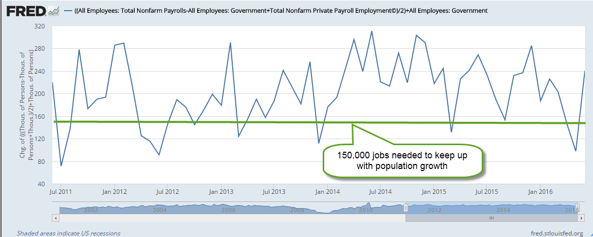
The strike at Verizon that started in May and ended in June involved 38,000 workers and skewed the BLS numbers down in May, then reversed back up again in June.  BLS methodology does not adjust for a strike involving so many workers, leading some to criticize such a widely followed methodology.  Because these estimates are prone to error, I think we get a more reliable picture by averaging the two estimates from the BLS and ADP.  As we can see in the graph below, economic growth during the past five years has been strong enough to stay ahead of the 150,000 monthly gains needed to keep up with population growth.

Those working part time because they couldn’t find full time work have dropped by 1.4 million in the past year – a positive sign. Although the supposed recovery is seven years old, it is only since the spring of 2014 that the ranks of involuntary part timers have consistently decreased.  Today’s level is almost 7 million less than it was two years ago but is still 2/3rds more than pre-Crisis levels.

This month’s 1/10th uptick in the participation rate was a welcome sign that more people are coming back into the workforce.  Although the unemployment rate ticked up two notches to 4.9% this was probably due to more people actively looking for work. An important component of the economy is the core work force aged 25 – 54, which continued to show annual growth in excess of 1%, a healthy sign.

////////////////////////////

CWPI (Constant Weighted Purchasing Index)

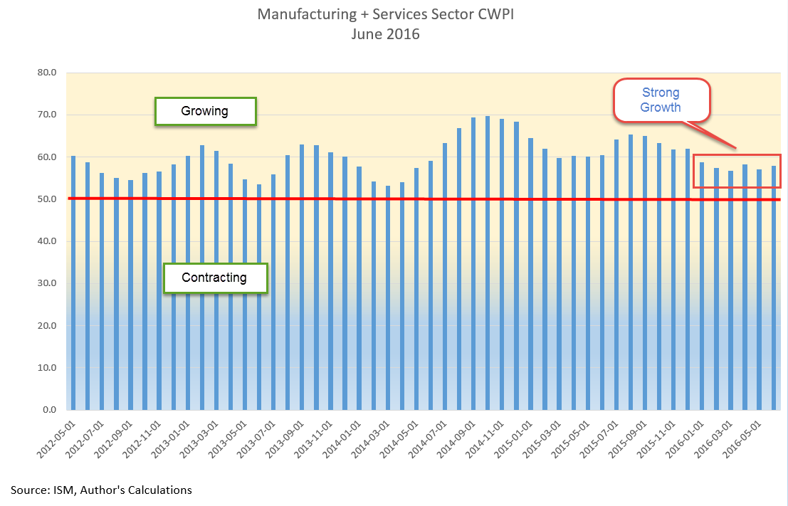
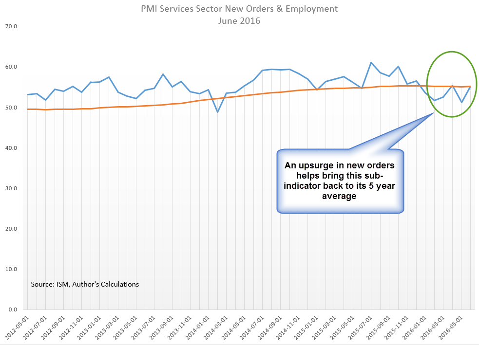
Earlier in the week, the monthly survey of Purchasing Managers (PMI) foreshadowed a positive employment report. A surge in new orders in the services sector and some healthy growth in employment helped lift up the non-manufacturing PMI to strong growth.  The Manufacturing index grew as well.  The CWPI composite of both surveys has a reading of almost 58, indicating strong growth.  The familiar peak and trough pattern that has continued during the recovery has changed to a steadier level.  New Export Orders in both manufacturing and services reversed direction this month.  The strong dollar makes American made products more expensive to buyers in other countries and presents a significant obstacle to companies who rely on exports.

Last month’s survey of purchasing managers in the services sector indicated some worrying weakness in employment.  This month’s reading suggests that a surge in new orders has reversed the decline in employment, a trend confirmed by the BLS report later released at the end of the week.

A few months ago I was concerned that the familiar trough that had developed in the spring might continue to weaken.  This month’s survey put those fears to rest.

//////////////////////////

Housing Bubble?

Soaring home prices in some cities has led to speculation that, ten years after the last peak in the housing market, we are again approaching unaffordable price levels.  Heavy migration into the Denver metro area has made it the third hottest housing market in the U.S., just behind San Francisco and Vallejo (northeast of SF) in California (Source). Despite bubble indications in these hot markets, the Case Shiller composite of the twenty largest metropolitan areas does not indicate that we are at excessive levels.

In the period 2000 through mid-2006 when housing prices peaked, annual growth was more than 10%.  Ten years have passed since then.  In the 16.5 years since the start of 2000, annual growth has averaged 4%.  While this is almost twice the 2% rate of inflation, it is approximately the same as the rate of growth during the past century.

//////////////////////////////

In the past two weeks following the Brexit vote in the U.K. the S&P500 has rebounded 6%, recovering all the ground lost and then some. It is near all time highs BUT so are Treasuries.  When both “risk on” (stocks) and “risk off” (Treasuries) both rise to new highs, it creates a tension that usually resolves in a rather ugly fashion as the market chooses one or the other.

Midpoints

July 3, 2016

A week after crash-go-boom in the stock market following Brexit, the British vote to leave the European Union, the market recovered most of the 5 – 6% lost in the two days following the vote.  The reaction was a bit too intense, inappropriate to an exogenous shock, the vote, whose consequences would take several years to develop. In last week’s blog I had suggested that the market drop was a good time to put some IRA money to work for 2016.  This was not some kind of magic insight.  Each year’s IRA contribution amount is a small percentage of our accumulated  retirement portfolio.

Buying on market dips can be an alternative strategy to regular dollar cost averaging since the market recovers within a few months after most dips, although the recovery is at a slower pace than the fall.  Fear can cause stampedes out of equities; confidence grows slowly.  As an example of an abrupt price decline, the SP500 index fell almost 7% in five days last August, then took more than two months to regain the price level before the fall.  The 12% price drop at the beginning of this year was more gradual, occurring over six weeks.  The recovery to regain that lost ground also took two months, from mid-February to mid-April. In the latter quarter of 2012, the market also took two months to erase a 7% price decline from mid-October to mid-November.

The price level of the SP500 is near the high mark set in May 2015, more than a year earlier.  Only in the past year has the inflation-adjusted price of the SP500 surpassed its summer 2000 level (Chart and table).  Nope, I’m not making that up. The stock market has just barely kept up with inflation for the past 15 years. The inability of the stock market to move higher indicates that buyers are not attracted to the market at current price levels.  The absurdly low interest yields on bonds makes this caution especially puzzling.  As stock prices recovered this past week, prices on long term Treasury bonds should have fallen as traders moved into more risky assets.  Instead, bond prices have risen.  As the price of long term Treasuries (ETF: TLT) broke through its January 2015 high  on Friday, the last day of June, traders began betting against treasuries (ETF: TBF).

Those who are concerned about the return OF their money, the safety searchers buying bonds, are competing against those seeking a return ON their money.  VIG is a Vanguard ETF that focuses on company stocks with dividend appreciation, and is favored by those seeking some safety while investing in stocks. TLT is an ETF of Treasury bonds for those seeking safety and, as expected, pays more in dividends than VIG.  Rarely do we see a broad stock ETF like VIG have a yield, or interest rate, that is close to what a long term Treasury bond ETF like TLT has.  At the end of this week, VIG had a dividend yield of 2.15%, just slightly below TLT.  Why are investors/traders bidding up the price of Treasury bonds?  Some 10 year government bonds in the Eurozone have recently crossed a dividing line and now have negative interest rates.  The low, but positive, interest rates of U.S. Treasury bonds look like big open flowers to the busy bees of institutional investors around the world.

In a large group of investors, buy and sell decisions tend to counterbalance each other.  Occasionally there are periods when such decisions reinforce each other and create a precarious imbalance that all too often rights itself in an abrupt fashion.  Bubbles and – what’s the opposite of a bubble? – are iconic examples of this kind of self-reinforcing behavior.

In another week we will mark the middle of the summer season.  The All-Star game on July 12th occurs near the halfway mark in the baseball season and advises parents in many states that there are still five to six weeks before the kids head back to school.  Our mid-40s is about the midpoint of our working years, a reminder that we need to start saving for retirement if we have not done so already.  It has been seven years since the market trough in March 2009.  Let’s hope that this is the midpoint of a 14 year bull market but I don’t think so.

Next week will be chock full of data before the start of earnings season for the second quarter. We will get the June employment report as well as the Purchasing Managers Index.  In this time of short, sharp reactions to news events, we can expect continued volatility.

/////////////////////////


Earnings


Pew Research just released a comparison of earnings by racial group and sex that is based on Census Bureau surveys, the same data that the BLS compiles into their monthly employment reports.  My initial criticism of the Pew Research comparison was that they used the earnings of full and part time workers.  Women tend to work more part time jobs so that would skew the earnings comparison, I thought. Thinking that a comparison of full time workers only would show different results, I pulled up the BLS report which groups the data by sex, only to find out that the differences between the earnings of men and women was about the same.  At the median, women earn 82% of men.


An even more depressing feature of the BLS report is that median weekly earnings have barely kept ahead of inflation during the past decade.  This wage stagnation provides a base of support for the criticisms voiced by former Presidential contender Bernie Sanders in a recent NY Times editorial.
Like a truck stuck in the mud, households are spinning their wheels without making much progress.  In the coming months, Donald Trump and Hillary Clinton will try to sell themselves as the tow truck that can pull average American families out of the mud. Well, it would be nice if they would conduct their campaigns in such a positive light.  The truth is that each candidate will try to convince voters that voting for the other candidate will get American families stuck deeper in the mud.  The conventions of both parties are later this month.  Expect the mud to start flying soon after they are over.  By election day in November, we will all be buried in mud.

Brexit

June 26, 2016

“Should I Stay Or Should I Go?” was a 1982 song by the Clash.  For months, Brits have debated the question of whether to stay in the European Union (EU) ahead of a referendum vote held just this past week and nicknamed “Brexit,” a mashup of British Exit.  Germany and Britain are the two strongest members of the EU and the loss of either from the union would weaken it’s political and economic ties. In the U.K., the campaigns turned vicious and sparked the murder of an MP (story) earlier this month.  In the British Parliamentary system, an MP is similar to a Congressperson in the U.S. House.

In recent polling the advocates of separation, or Leave, appeared to be gaining momentum so that the outcome of the referendum vote seemed deadlocked at 50-50.  A poll in the last days before Thursday’s vote reassured many that cooler heads would prevail and Britain would remain with the EU. Leaders from both the right and left belonged to this coalition, appropriately named “Remain.”

At about 3-4 AM London time, 11 PM New York City time on Thrusday night, a third of the vote had been counted and it was eerily close, with the Leave group having a teensy-weensy lead.  Then half of the vote was counted and the Leavers were up 1% over the Remainers.  As the vote tally continued, it became apparent that – surprise, surprise – the Remainers had won the vote.

Asian markets were active at that time and responded with a severe sell off of risky assets like stocks and rushed into the safe haven of bonds, cash and gold.  Stocks were down as much as 12% initially on some Asian exchanges.  Gold shot up 6%. Neither the U.S. or European markets were open but the Futures markets in the U.S. sank 6% and European futures plunged 9%.

While most Americans were sleeping European markets opened about 8- 9% down. Market makers in Italy could not establish an opening price for a number of Italian bank stocks, which had already been under pressure in recent weeks.  When they did, these stocks had lost a third of their value.  Everyone was selling, few were buying.

The referendum vote still needs to be codified into law before the Brits formally notify the EU that the country is leaving. After that negotiations begin over the trade and diplomatic terms of exit, a process that could take two years.  A rational person might wonder why the panicked selling?  The worry is that this vote may provoke similar votes in other EU countries, which might lead to the eventual dissolution of the EU.  When in doubt, get out.  Traders did.

Earlier this month the WSJ reported that legendary (and semi-retired) investor and billionaire George Soros had returned to his trading desk to make a series of bearish bets on global markets in anticipation of both political and economic turmoil.  Soros became a household name when he made a $1 billion on a bet against the British pound in 1992.  In several hours Thursday night/Friday morning, the British pound lost 10% of its value.  Was this also another killing for Soros?  Soros thinks the break-up of the EU is inevitable (Story)

What should the long term investor do?  January’s dip of 5% was a good time to make an IRA investment.  This may be an equally good opportunity.

Income Growth

June 19, 2016

A few weeks ago (here) I wrote about trends in income growth and the difficulties of measurement because the growth of employee benefits and insurances are not included.  As a follow up, I thought I would show you a chart of per capita income using a natural log scale, which shows a growth trend more clearly.  In the graph below, we can see three distinct periods of growth:

1) the late 1960s through the mid-1980s, a period of strong growth following WW2;
2) a more moderate period of growth from the mid-1980s to the mid-2000s; and
3) a much more muted cycle of growth after the financial crisis and recession of 2007-2009.

On the right hand scale is the natural log of the Employment Cost Index, an index of total employee costs calculated quarterly by the BLS.  This series is only sixteen years old but it does show the steep growth of these hidden costs.

Our government at all levels chooses to pay for social programs by sliding the costs under the rug.  Politicians could tax everyone for the dozens of social support programs but Americans do not like paying taxes.  As a rule, Europeans are more willing to make sacrifices for programs that benefit the group, although attitudes are changing as European populations become more diversified.  People in general are less willing to pay into the group kitty when a society is less homogenous.

In America, there are fewer protests when politicians add program costs to the total value of a paycheck where employees do not see most of the costs. Workmen’s compensation insurance is a good thing but would voters be willing to pay 5% of their pay for it?  Maybe not.  The law is written so that the employer pays it and the employee never knows the amount.

The cost for workmen’s comp may be 10-20% or more in service and construction trades but only 1% for an office worker.  Some people argue that such a disparity is appropriate; those who work in more dangerous jobs pay more into the insurance system.  Employers are incentivized to create a safe environment for their workers in order to reduce costs.

On the other hand, the health of workers is a public cost.  If all employees were taxed equally, the danger premium would be spread evenly across all employees.

//////////////////////////

Savings Glut

Interest rates are near zero.  One year CDs from major banks pay 1% or less.  Interest rates have been falling since the early 1980s when savings accounts were earning an astronomical 12% or so. Interest rates are a price of sorts, the price a bank is willing to pay for someone’s savings.  Lower interest rates = lower price = less demand for savings.  So, people will respond to that lowered demand by putting less money in savings accounts and CDs, right?  Wrong.

As interest rates decline, people actually increase the supply of savings they want to give to banks. Why?  It seems counterintuitive till we take into account that the population is aging, and older people tend to get more conservative with their savings.  Secondly, a larger pool of savings is needed to earn the same interest income.

So we would expect that “safe money” savings would increase somewhat in the past decade.  However, the difference in the amount of savings is dramatically higher.  In the 15 year period from 1980 to 1995,  Money Market, savings accounts, and CDs grew by 50% per person.  In the subsequent 15 year period from 1995 to 2010, safe savings grew by 150%, triple the increase of the previous fifteen year period.

By keeping interest rates low, the Federal Reserve is trying to force the public to take more chances with their money.  Like the mule who resists going down a steep path in soft dirt, the American public stubbornly refuses to go where the Fed wants.  It may take at least another ten years before Americans forget the financial crisis and are willing to take on more risk.  The slow growth of this seven year recovery will persist until Americans lose their aversion to risk.

Caution: Under Construction

June 12, 2016

As we travel the highways this summer we are likely to encounter many construction zones as crews repair wear and tear, and the damage that results from the temperature cycle of freeze and thaw. There are a few hitches on the economic road as well.

CWPI

I look to the Purchasing Manager’s (PM) Survey each month for some advance clues about the direction of the economy.  Like the employment report, this month’s survey contains some troubling signs.  I had my doubts about the low numbers in the employment report until I saw the results from this survey.  PMs in the services sectors reported a 3.3% contraction in employment growth so that it is now neutral, matching the lack of growth in manufacturing employment.

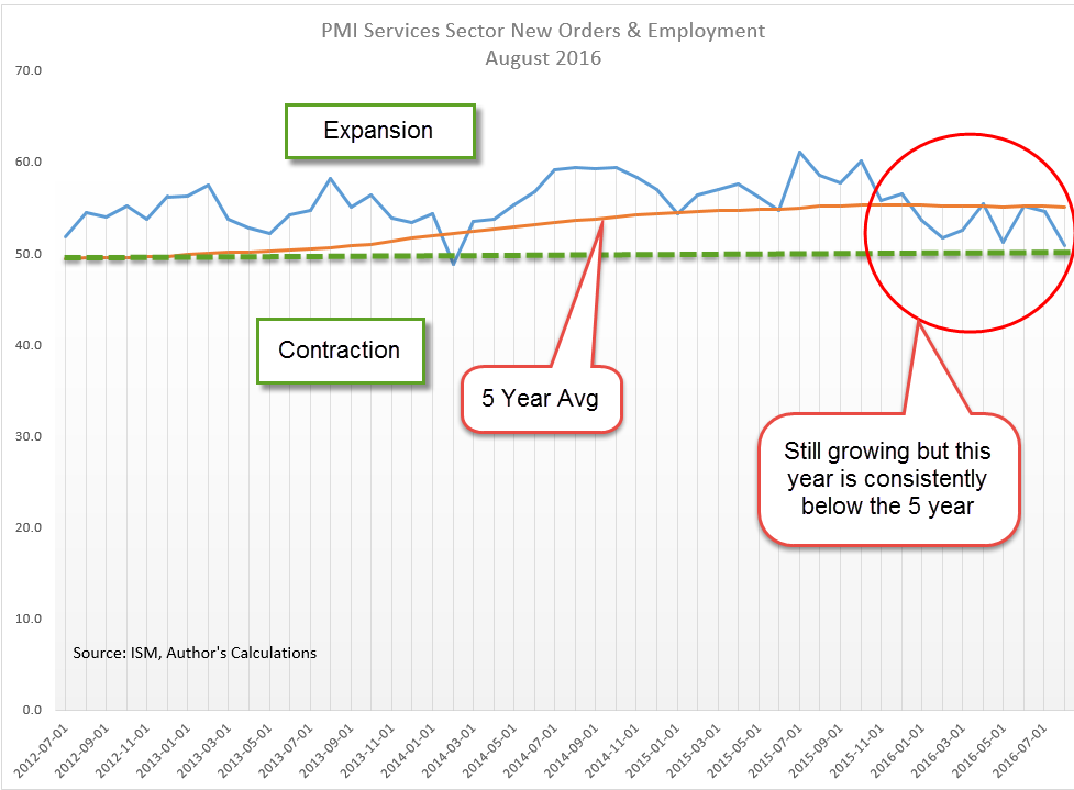
New orders in both manufacturing and services are still growing but slowed considerably in the services sectors.  The slowdown in both employment and new orders in the services sectors is apparent from the graph below.  While this composite is still growing (above 50), it has been below the five year average for four out of five months.

This recovery has been marked by, and hampered by, a familiar peak and trough pattern of growth. Last month I wrote:

 “A break in this pattern would indicate some concern about a recession in the following six months. What is a break in the pattern? An extended trough or a continued decline toward the contraction zone below 50.”

The CWPI, a custom blend of the various parts of the ISM surveys, shows a continued weakening that is more than just the periodic trough.  If there are further indications of weakness this summer, get concerned.

///////////////////////

LMCI

A few years ago the Federal Reserve introduced the Labor Market Conditions Index, or LMCI, a composite analysis of the labor market based on about twenty indicators published each month by several agencies. Because the report is released a week after the headline employment report, this composite does not receive much attention from policy makers, which is a bit of puzzle.  Janet Yellen, chair of the Fed, has indicated that she and others on the rate setting committee of the Fed, the FOMC, rely on this index when determining interest rate policy.

One business day after the release of this month’s unexpectedly weak employment report, the LMCI showed an almost 5% decrease and is the 5th consecutive monthly decrease in the index.

Although this composite is fairly new, many of the underlying indicators have long histories and enable the Fed to provide several decades of this index.  As a recession indicator, the monthly changes in this index tend to produce a number of false positives.  However, if we shift the graph upwards by adding 7 points to the changes, we see a familiar 0 line boundary.  When the monthly change in the index drops below 0 on this adjusted basis (actually -7), a recession has followed shortly.

We are not at the zero boundary yet, but we are getting close and the pattern looks ominously familiar.  Don’t play the Jaws music yet, though.

Housing Heats Up

June 5, 2016

In parts of the country, particularly in the west, demand for housing is strong, causing higher housing prices and lower rental vacancy rates.  For the first quarter of 2016, the Census Bureau reports that vacancy rates in the western U.S. are 20% below the national average of 7.1%.  At $1100 per month, the median asking rent in the west is about 25% above the national average of $870 (spreadsheet link).

With a younger and more mobile population, home ownership rates in the west are below the national average (Census Bureau graph). Housing prices in San Francisco have surprassed their 2006 peaks while those in L.A.are near their peak.  Heavy population migration to Denver has spurred 10% annual home price gains and an apartment vacancy rate of 6% (metro area stats).

From 1982 through 2008, the Census Bureau estimates that the number of homeowners under age 35 was about 10 million. These were the “baby bust” Generation X’ers who numbered only 70% of the so-called Boomer generation that preceded them.

Shortly before the financial crisis in 2008, a new generation came of age, the Millenials, born between 1982 and 2000, and now the largest age group alive in the U.S. (Census Bureau). Based on demographics, homeownership should have increased to about 13 million in this younger age group, but the financial crisis was particularly hard on them.  Starting in 2008, homeownership in this younger demographic began to decline, reaching a historic low of 8.8 million in 2015, a 15% decline over seven years, and a gap of almost 33% from expected homeownership based on demographics.

In response to lower homeownership rates, builders cut back and built fewer homes.  I’ll repost a graph I put up last week showing the number of new homes sold each year for the past few decades.

Look at the period of overbuilding during the 2000s, what economists would euphemistically call an overinvestment in residential construction.  Then, financial crisis, Great Recession and kerplooey!, another technical term for the precipitous decline in new homes built and sold. As the economy has improved for the past two years, the demand for housing by the millennial generation, supressed for several years by the recession, has shifted upwards.  More demand, less supply = higher prices.  This younger generation prefers living closer to city amenities, culture and transportation, causing a revitalization of older neighborhoods.  In Denver, developers are buying older homes, scrapping them off, and building two housing units where there was one. Gentrification influences the rental market as well as affordable single family homes and pushes out families of more modest means in some parts of town.

The housing market really overheats when rentals and home prices escalate at the same time. During the housing boom of the 2000s, many tenants left their apartments to buy homes and cash in on the housing bonanza.  Rising vacancies put downward pressure on monthly rents.  Move-in specials abounded, announcing “No Deposit!”, “First Month Free!” or “Free cable!” to attract renters. This time it’s different.

Rising rents and home prices put extraordinary pressure on working families who find they can barely afford to live in central city neighborhoods which offered low rents and affordable transportation.  They consider moving to a satellite city with lower costs but face longer commute times and additonal transportation costs to get to work.  Demographic trends shift more slowly than building trends but neither moves quickly so we can expect that housing pressures will not abate soon until the supply of multi-family rental units and single family homes increases to meet demand.

////////////////////////

Incomes

For the past four decades, household income has declined, as Presidential contender Bernie Sanders is quick to point out.  Some economists also note that household size has declined greatly during that time as well so that comparisons should take into account the smaller household size.  A recent analysis  by Pew Research has made that adjustment and found that middle class incomes had shrunk from 62% of total income in 1970 to 43% in 2015.

But, again, comparisons are made more difficult because some categories of income, which have risen sharply in the past few decades, are not included.  Among the many items not included are “the value of income ‘in kind’ from food stamps, public housing subsidies, medical care, employer contributions for individuals (ACS data sheet).  Generally, any form of non-cash or lump sum income like inheritances or insurance payments are excluded.  There is little dispute with the exclusion of lump sum income but the exclusion of non-cash benefits is suspect.  An employer who spends $1000 a month on an employee health benefit is paying for labor services, whether it is cash to the employee or not.

The lack of valid comparison provokes debate among economists, confusion and contenton among voters.  The political class and the media that live off them thrive on confusion. Those who want the data to show a decline in middle class income cling to the current methodology regardless of its shortcomings.

//////////////////////////

Employment

The BLS reported job gains of only 38,000 in May, far below the gain of 173,000 private jobs reported by the payroll processor ADP and below all – yes, all – the estimates of 82 labor economists. The weak report caused traders to reverse bets on a small rate increase from the Fed later this month.

Almost 40,000 Verizon employees have been on strike since mid-April and just returned to work this past week. On the presumption that a company will hire temporary workers to replace striking workers, the BLS does not adjust their employment numbers for striking workers.  However, most employers of striking employees hire only as many employees as they need to, relying on salaried employees to fill in.  Do strikes contribute to the spikes in the BLS numbers?  A difficult answer to tease out of the data. In the graph below we notice the erratic data set of the BLS private job gains (blue line; spikes circled in red) compared to the ADP numbers (red line; spike circled in blue).

Each month I average the BLS and ADP estimates of job gains to get a less erratic data swing.  The 112,000 average for May follows an average of 140,000 job gains in April – two months of gains below the 150,000 new jobs needed to keep up with population growth.  Let’s put this one in the wait and see column.  If June is weak, then I will start to worry.

Subsidies

May 29, 2016

Housing

On Tuesday came the announcement that new one family homes sold in April had jumped to 619,000, just beating the low point set in 1995.  Yes, you read that right.  The high point of this recovery just passed a 20 year ago low.  The spring season certainly contributed to the jump, but the prospect of higher interest rates may have spurred many buyers to close the deal. Here’s a graph of new home sales for the past two decades:

The housing boom took a decade to build but the total damage of overinvestment is only now being felt in the slow growth that has characterized this recovery.  I’ll turn to the monetary economists at Alt-M.org:

“During the housing boom, investible resources that could have gone into augmenting human capital, building useful machines and sustainable enterprises, and conducting commercial research and development, were instead diverted to housing construction.  In the crisis it became evident that the housing built was not worth the opportunity cost of the resources allocated to it.” (Source )

/////////////////////

Energy Subsidies, or Not?

Many of us don’t like subsidies to giant oil companies like Exxon and Chevron. Why are taxpayers subsidizing these rapers of the environment?  The marketing of this idea is that bad, bad oil companies get good taxpayer money that could be put to better uses. But then we find out that when a poor family gets heating oil for a very reduced amount, the folks in Washington call that a “Consumer Subsidy” to the oil company  (Source).  Why is this not classified as a subsidy for poor families?  Welcome to the ugly politics of Washington where subsidies are  allocated across several departments, and House and Senate committees, so that our elected representatives can feel important and wield influence in order to collect more campaign money.  If the voters are confused, that’s the point.  Politicians use a technique ommon in used car sales: baffle the customer with B.S.

In 2010, Federal (not including states) subsidies totaled $11.6 billion for coal, natural gas and oil. Coal got $3.9 billion for R&D. (Source spreadsheet)  Much of that money was to develop technologies for carbon capture and sequestration, which is what we told politicians in Washington we wanted. (Source)  The energy companies didn’t want the money because they didn’t want to develop the technology. Now we blame the energy companies for spending the money?

Unfortunately, fracking has produced so much natural gas at such a low cost that many energy companies find it more cost efficient to simply shut down power stations that rely on coal.  The largest coal company in the U.S., Peabody Energy, recently declared bankruptcy after 130 years in business (WP article)

Let’s turn to the oil and natural gas portion of this sector since that accounts for 2/3rds of Federal subsidies.  $7.6 billion in subsidies includes:
$3.5 billion, almost half of the total subsidy, is for the LEAP program, which pays for heating fuel for low income families, not a subsidy for the oil companies;
$1 billion for fuel used by farmers, who lobby heavily for their subsidy, and it helps to keep food prices down for consumers across the country;
$1.1 billion for the Federal gov’t to buy oil for the Strategic Petroleum Reserve.  Why is this called a subsidy to the oil companies?
$1 billion for accelerated write-offs on development costs, land, equipment.

Providing consistent, reliable energy in any form is messy.  Every year, wind power kills thousands of eagles, a threatened species, yet there seems to be little outcry because wind power is a favorite of the environmental community and gets a pass.

Many years ago, I was selling tools to the mechanics at San Juan Coal Co. in a remote area of New Mexico and Arizona.  Giant earth movers with tires that were twice as high as a man dug up the coal deposits there.  Reaching up to the blue sky were giant erector set towers hung with huge cables that sizzled and spit with the sound of electricity surging through them.  Stretching toward the western horizon, I asked where the wires went. Southern California, I was told.  California wanted the electricity but not the pollution from creating the energy so they paid to have the electricity produced in this remote area and “shipped” hundreds of miles away.  The process was very wasteful and expensive.  The additional cost though was counted as a subsidy to the energy company because the accounting that is done in government has little to do with the day to day reality of most households and businesses.

Timing Models

May 22, 2016

Long term moving averages can confirm the shifting trends of market sentiment and market watchers customarily watch for crossings of two averages.  The 50 week (1 year) average of the SP500 index just crossed below the 100 week (2 year) average, indicating a  broad and sustained lack of confidence.  Falling oil prices since mid-2014 have led to severe earnings declines at some of the large oil companies in the SP500.  The index is selling for about the same price as the two year average.

What to do?  These crossings or junctions can mark a period of some good buying opportunities – unless they’re not – and that’s the rub with indicators like this one.  Downward crossings typically occur after there has already been a 5 – 15% decline from a recent high.  If an investor sells some stocks at that time, they wind up selling at an interim low, and regret  their action when the market rises shortly thereafter.  They should have bought instead of sold.  AAAARGHHH, a false positive!  Twice in the 1980s, the sentiment shift was less than a year long and an investor who did act lost 10 – 20% as the market climbed after several months.

Conversely, after a 10-15% decline, some investors do buy more stocks, figuring that the excess optimism, or “fluff,” has been shaken out of the market.  Then comes that sinking feeling as the market continues to decline, and decline, and decline.  In April 2001 and July 2008, the 50 week average crossed below the 100 week average.  Investors who lightened up on stocks at those times saved themselves some pain and a lot of money as the broader market continued to lose another 30% or so.

There are not one but two problems with timing models: timing both the exit from and entry back into the market.  Over several decades the majority of active fund managers – professionals who study markets – did not get it right.  They underperformed a broad index like the SP500 because the index is actually a composite of the buying and selling decisions of millions of market participants.  John Bogle, the founder of the now gigantic Vanguard Funds, made exactly this point in his dissertation in the 1950s.  A half century later, this “wacky idea” of index investing has taken over much of the industry.

Consistently successful timing is very difficult and has tax consequences in some accounts.  Investors are encouraged to focus instead on their investment allocation to match their tolerance for risk and volatility, and to consider any prospective income that they might need from a portfolio.

Since 1960, the average annual price gain of the SP500 index has been 6.7%.  Add in an average yield (dividend) of 3% and the total return is almost 10% that an investor gains by doing nothing, a formidable hurdle for any timing model.

Within an allocation model, though, is the idea that an investor might shift a small portion of a portfolio from stocks to bonds and back in response to market signals.  In several previous articles I have looked at a Case-Shiller CAPE10 model (here, here, here, and here) as well as another crossing model using the 50 day and 200 day moving averages, dramatically named the Golden Cross and Death Cross (here, here, and here.)  As already mentioned, we want to avoid some of the false signals of crossing averages.

Instead of a crossing, we can simply use a change in direction of both averages.  When not just one, but both, long term averages turn down, we would move a portion of money from stocks to bonds, and in the opposite direction when both averages turned up.

Over the course of several decades, this strategy has been suprisingly successful.  The market sometimes experiences a decade when prices may be volatile but are essentially flat.  From 2000 – 2012 the SP500 index went up and down but was the same price at the beginning and end of that 12 year period.  1967 to 1977 was another such period, a stagnant period when an investor’s money would be better put to use in the bond market rather than the stock market.

In recent decades, this long term weekly model would have favored stocks from 1982 to March 2001 while the market gained 850%, an annual price gain of 11%.  The model would have shifted money back to stocks in August 2003 at a price about 25% less than the exit price in March 2001. In March 2008, the model would have favored an exit from stocks to bonds.  The stock market at that time was about the same price that it had been 7 years earlier in March 2001.  The model captured a 30% gain while the index went nowhere.

In the 1967 – 1977 period, the model did signal several entries and exits that produced a cumulative 8% price loss over the decade but the model favored the bond market for half of that period when bonds were earning 8% per year, a net gain.

In almost two years, the SP500 has changed little; the yield is less than 2%, far lower than the 3% average of the past 50 years.  However, the broader bond market has also changed little in that time and is paying just a little over 2%.  There are simply periods when strategies and alternatives have little effect. Although the 50 week average crossed below the 100 week average earlier this month, they are essentially horizontal.  The 100 week average is still rising, but barely so, a time of drift and inertia.  In hindsight, we may say it was the calm before a) the storm (1974), or b) the surge (1995). Usually the calm doesn’t last more than two years so we can expect some clear direction by the end of the summer.

/////////////////////////////

It’s the economy, stupid!

One of the myths of Presidential politics is that Presidents have a lot to do with the strength or weakness of the economy, a superhero narrative carefully cultivated by the two dominant parties.  Here’s a comparison of GDP growth during Democratic and Republican administrations. The Dems have it up on the Reps since 1928, chiefly because the comparison starts near the beginning of the Great Depression when the Reps held the Presidency.

For several reasons, GDP data is unreliable during the Depression and WW2 years.  First, the GDP concept wasn’t formalized till just before the start of WW2 so data collection was new, primitive and after the fact.  Secondly, this 14 year period includes an extraordinary amount of government spending which warped the very concept of GDP.  The WPA program that put so many to work during the depression years was a whopping 7% of GDP (Source), like spending $2 trillion dollars, or half the Federal budget, in today’s economy.

The Federal Reserve begins their GDP data series after WW2 when data collection was much improved. If you’re a Dem voter, don’t mention this unreliable data.  Just tell friends, family and co-workers that the Dems have averaged 4% GDP growth since 1927; the Reps only 1.7%.  If you’re a Republican voter, exclude the 20 year period from 1928 to 1947 and begin when the Federal Reserve trusts the data. Starting from 1947,  Republicans have presided over economies with 2.75% annual growth during 36 Presidential years.  During the 30 years Dems have held the Presidency, there has been a slighly greater growth rate of 3.1%.

In short, economic growth is about the same no matter which party holds the Presidency.  Shhhh! Don’t tell anyone till after the election is over.  Legislation by the House and Senate has a much greater impact on the economy.

///////////////////////////

Small Business

“If America is going to dominate the world again, the country has to fix the spirit of free enterprise. Small-business startups are in serious decline.”

“Gallup finds that one-quarter of Americans say they’ve considered becoming business owners but decided not to. ”

These foreboding quotes are from a recent Gallup poll.  Small businesses employ more than 50% of employees and are responsible for the majority of job growth yet many politicians and most voters pay little attention to the concerns of small business owners.  The giant corporations get most of the press, praise and anger.  Could the lack of small business growth be responsible for the lackadaisical growth of the entire economy during this recovery?  As the population  continues to age, growth will be critical to fund the dedication of community resources to both the old and young.

The BLS routinely tracks the Employment-Population Ratio, which is the percentage of people over 16 who are working, currently 60%.  But this ratio does not fully capture the total tax pressures on working people since it excludes those under 16, who require a great deal of community resources.  When we track the number of workers as a percent of the total population, we see a long term decline.  As this ratio declines, the per-worker burdens rise for it is their taxes that must support programs for those who are not working, the young and the old.

Regulatory burdens hamper many small businesses. A recent incident with a Denver brewery highlights the sometimes arbitrary rulemaking that business owners encounter.  Agencies protest that their mission is to ensure public safety.  An unelected manager or small committee in a department of a state or local agency may be the one who decides what is the public safety.  As the rules become more onerous and capricious, fewer people want to chance their savings, their livelihood to start a small business.  As fewer businesses start up, tax revenues decline and the debate grows ever hotter: “more taxes from those with money” vs “less generous social programs.”  Policy changes happen at a glacial pace, further exacerbating the problems until there is some crisis and then the changes are instituted in a haphazard fashion. Since we are unlikely to change this familiar pattern, the issues, anger and contentiousness of this election season are likely to increase in the next decade.  Keep your seat belts buckled.