Diminished Expectations

February 3rd, 2014

The SP500 has been hovering over a support trendline in the 1760-1775 range, with buyers coming in at 1775.  At 1750, the market would have corrected 5%, a fairly normal occurrence.  Market watchers have been concerned that the market has not experienced one of these small “shaking of the tree” corrections since May/June of 2012.  Disappointing earnings and revenue reports from bellweather companies, together with selling pressure on some emerging market currencies, have made traders nervous.

The market is composed of buyers and sellers responding within varying time frames.  In a short to mid term time horizon, one person might pay more attention to turbulence in emerging markets or the latest corporate reports.  A mid to long term investor might pay more attention to rising industrial production, healthy GDP numbers, consumer spending and income, and declining unemployment.

*****************************************

Apple forecast lower than expected revenues for the coming quarter in the China market.  The announcement prompted an 8% decline in the company’s stock.  Facebook reported blow out revenue growth of 63% in the past quarter, causing the stock to rise about 16%.  FB’s active user base has more than doubled in two years.  Despite the robust growth, the sky high valuation of the company reminds me of some internet stocks in the late 1990s.  The stock has a Price to Sales – not Price to Earnings – ratio of about 15 to 1.  Google has a track record of strong revenue and earnings growth and sports a richly valued price to sales ratio of 6.4.  Does Facebook’s short track record deserve a valuation that is more than twice Google’s?  In 2000, Microsoft had a price-sales ratio of 23 to 1. Fourteen years later, Microsoft’s stock sells for 30% less than it did in 2000.  In 2000, Cisco had a price to sales ratio of 30 to 1.  Cisco’s revenues were growing 50% a year.  “The stock is cheap,” some said.  Fourteen years later, Cisco sells for less than a third of what it did in the heady days of rapid growth.  A word of caution to long term investors.

Amazon reported “only” a 20% increase in quarterly revenue during the busy 4th quarter Christmas season. This is five times the sales growth of the overall retail industry so a casual observer might think that the stock enjoyed a healthy bump up in price, right?  Wrong. After rising 50% over the past year, the company’s stock was priced to perfection. The disappointing growth particularly in overseas markets prompted a lot of selling and an 8% decline in price on Friday.

As I noted last week, many retailers will report quarterly earnings in February.  Many companies get a sense of the bottom line that they will report before the official release of quarterly data.  If there are material differences between consensus expectations and forecast results, a company will issue a revised forward guidance.  Wal-Mart did so this past week, revising its revenue and earnings forecast down for the fourth quarter and lowering earnings projections for the coming year.  The company cited a much greater than forecast impact from November’s reduction of the food stamp program.  The severe storms in December also had a material impact on sales.

In the past two months, Wal-Mart’ stock has declined 8%.  Let’s think about that for a moment.  The market value of Apple and Amazon declined 8% in one day.  It takes two months for Wal-Mart’s stock to decline by the same percentage.  Individuals who invest in companies like Apple and Amazon have to be able to take abrupt market gyrations in stride.  Companies are essentially stories.  Some like Apple and Amazon are stories of growth.  There comes a time when the story changes, as it did for Microsoft and Cisco more than a decade ago.  Apple’s story has been “under construction” in the past 18 months. Since the beginning of 2008, Wal-Mart’s stock has risen 56%, Apple’s is up 150%, and Amazon’s market price has soared more than 6 times.  Growth companies offer rich rewards for the investor who has the time to  follow the story, but it can be difficult to know when the story is changing.

During the past 3 weeks, Home Depot has lost about 6% after gaining 35% since the beginning of 2013.  This giant has one foot in the home construction and remodeling sectors, one foot in the retail sector.  The decline reflects lowered near term expectations for both construction and retail.  Consumer spending has risen steadily but incomes are flat.

*****************************************

December’s report of new homes sold was disappointing.  After rising above an annual level of 450,000 in the fall, sales have fallen closer to the 400,000 mark.

 Some blame the particularly harsh December in the east, some blame the weak labor report released in early January, others blame the low supply, still others blame rising mortgage rates. The Case Shiller home price index shows a year over year gain of almost 14% in metro area homes, indicating relatively healthy demand.  However, the latest Consumer Confidence survey reports a decline in the number of people planning to buy a home.  On an ominous note, pending home sales in December declined more than 8%, the worst monthly decline in almost four years.  Without a doubt, the severe winter weather in the eastern U.S. was a big factor but it is difficult to assess how much of a change.  This is the second report – employment was the first – that was far below even the lowest of estimates.

The link between employment and new home sales is counterintuitive; changes in new home sales anticipate changes in employment.
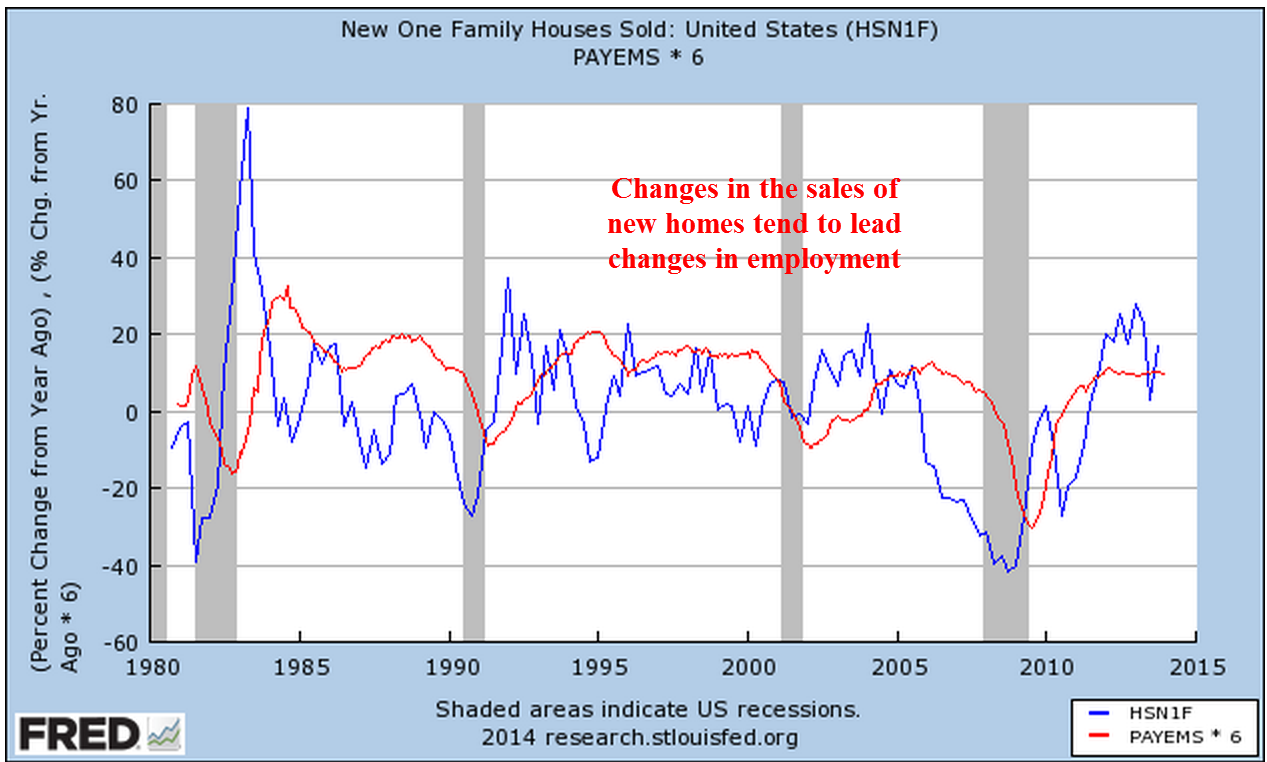
In a 2007 paper presented at a Federal Reserve conference, economist Ed Leamer demonstrated that changes in residential investment, a relatively small component of the economy, indicate coming recessions and recoveries.  The National Assn of Homebuilders estimates that each new home generates a bit more than three full time jobs.

Residential investment includes new homes, remodels, furniture and appliances.  Eventually residential investment reaches a point where it is contributing too much to the economy. As that percentage begins to correct to more normal levels, the contraction tugs on the total of economic growth.

As you can see in the chart above, a sustainable “sweet spot” is in the 4 to 4-1/2% of GDP range but residential investment is still less than 3% of GDP.  In past recessions, residential investment has helped recovery.  This time is different.  Housing’s less than normal contribution to the nation’s GDP has dampened overall growth.

*****************************************

The first estimate of GDP growth for the fourth quarter was a rather remarkable 3.1%.  Although this was in line with estimates, I was concerned that the severe winter weather in the east might have more of a negative impact.  A version of GDP that reflects domestic consumption, Final Sales of Domestic Product, showed a modest 2.1% growth in the 4th quarter, reflecting the impact of the weather, I think. The third quarter growth rate was revised to 4.1%, up substantially from the initial estimate of 2.8%.  The hope is that this is now a 4% growth economy and the first quarter of this year may hold some welcome surprises as delayed economic activity in the 4th quarter is rolled into this year’s first quarter.  As I noted a few weeks ago, the wave like trend of the CWI composite index of manufacturing and non-manufacturing indicated a slight lull in these winter months before another peak in early to mid-spring.

****************************************

Consumer Confidence rose to 80, the lower bound of what I consider healthy.  This index fell below 80 in the early part of 2008 and did not get above that mark till this past summer, then fell back in the fall.  A separate Consumer Sentiment survey from the U. of Michigan showed a similar reading at slightly above 81.

*****************************************

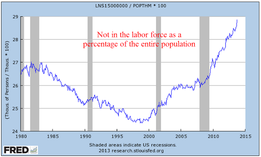
January’s monthly employment numbers will be released next Friday.  I ran a chart of those not in the labor force as a percent of those working.  Thirty years ago, the economy was coming out of the most severe employment recession since the Depression.  It is rather disturbing that this ratio continues to climb to the nose bleed levels of that recession thirty years ago.

******************************************

The harsh winter weather may be affecting consumers more than businesses.  Chicago and the upper Midwest region got creamed with cold snap after cold snap in December yet industrial production figures for the month are still robust, declining somewhat from the incredibly strong readings of the past few months.

Market Bumps

January 26th, 2014

In a holiday shortened week, the market opened higher than the previous Friday but fell a bit more than 3% by week’s end.  On this same week in 2012, the market lost 2.5% in 3 trading days.  As I mentioned last week, there were few economic reports this past week to detract from the focus on corporate earnings.

IBM opened up the week by beating profit estimates but missed revenue estimates by $1 billion, or about 3%, and were about $1.5 billion less than the final quarter of 2012.  The 4th quarter is usually IBM’s strongest quarter each year; lower revenues from this giant indicate a cautious business investment outlook.  IBM is selling for the same price now that it did in mid 2011, a price earnings ratio of 12.

The following day, China announced that the country’s industrial production has fallen just below the neutral mark.   The reaction to the news was exaggerated by sharp declines in some emerging market currencies, which started a cascade of selling. See SoberLook blog for some charts. Similar weakness out of China last summer prompted a much more subdued reaction.

On Thursday, McDonald’s reported weak sales growth, which added to concerns.  After a run up of 30% last year, many traders were on high alert for any negative news.  The U.S. stock market has enjoyed a tail wind from Federal Reserve stimulus policy, but a global economy is largely outside of the Fed’s influence.

A 14 month support trend line that has been in place since November 2012 sets a mark at about 1760.  Dropping below that would signal a short to mid term shift in market sentiment.  The SP500 index closed at 1790 on Friday, 1.7% above that support trend line.  The 10 month average of the index is 1700.  A drop below that mark would signify a change in mid to long term sentiment. A few weeks ago, I noted that the market was close to 10% over its 10 month average.  This week’s decline puts that percentage at a bit over 5%.

******************************

Existing home sales notched up a bit in December but the yearly percent gains were relatively flat.  The 4 week average of new claims for unemployment declined to 331,000.  Several weeks ago it was close to the psychological 350,000 mark.  Mitigating the decline in new claims, continuing claims have been rising lately and are approaching the 3 million mark.

To put that 3 million people in historical perspective, take a look at the chart below.

The number of long term unemployed is ever a concern.

*************************

In early October I noted the relative sluggish performance of retail stocks vs the larger market index of the SP500 ahead of the Christmas buying season.  Below is an updated chart of a retail index ETF vs the larger market.

Shortly after that post, renewed hopes for a strong Christmas season led to higher prices for the group.  Disappointing sales gains announced as the season ended deflated that balloon.  Since the new year began, a composite of retail stocks has lost 8%.

Typically retailers report their earnings in mid to late February.  Traders have already priced in a rather disappointing earnings season for the retailers.  In the context of a longer time frame, retail stocks are still up 25% year over year.  If an investor had bought this composite on this date seven years ago when the economy was strong and retail stocks were at a high, she would still have doubled her money, easily outpacing the 38% gains in the larger market since then.  The resilience of consumer demand, despite an extremely severe downturn when unemployment and falling house prices put a brake on consumer spending, has helped make this sector a sure footed long term winner.  

Housing, Unemployment and CPI

January 19th, 2014

A strong retail report for December and an improvement in sentiment among small business owners buoyed the market at the start of the week.  Both reports continue a trend that indicates a healthy economy:  results are at at the upper bound or above expectations.

The latest report of  jobless claims at 325,000 pulled the 4 week average further down away from the psychological mark of 350,000.  This is sure to reassure short to mid term traders.  The weak BLS employment report released a week ago may have just been an anomaly.  Other employment indicators, as well as retail sales and business production simply do not confirm the headline numbers from the BLS.

The Consumer Price Index for December showed a mild 1.5% year over year increase and will reassure the Fed that its stimulus program poses little danger of igniting inflation.

The National Assn of Homebuilders reported continued strong growth in their Housing Market Index.

******************************
Featured on one of the blogs that I link to is a chart of the annual returns of the SP500.  Double digit gains in the index, like the one we had last year, are rather common, occurring about 40% of the time.  A reassuring takeaway for the longer term investor is that the market goes up in 75% of the years for the past eighty years.

******************************
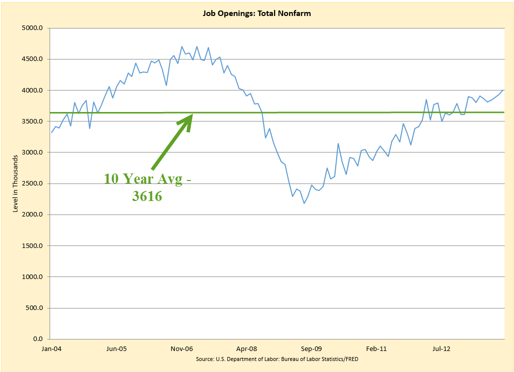
The number of unfilled job openings in November was the highest since March of 2008, indicating continuing strengthening in the labor market.  Job openings have been above the ten year average for over a year now.

The number of people who voluntarily quit their jobs continues to climb over the past year.  Employees quit when they feel more confident about job prospects. While this metric has been improving, it is only at the lowest levels of the past decade.

******************************
Housing starts declined slightly in December to a million but is still growing from the lows of the bust.

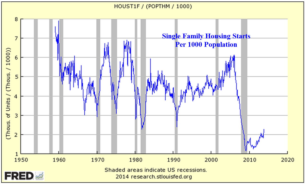
Let’s get a bit of perspective. There is a decided shift downward from the post war building boom.  Below is a graph of  housing starts adjusted for population growth.

Adjusted for population growth, the multi-family component of housing starts has reached the normal levels of the past two decades.  This is the more stable component of housing starts.

Starts of single family homes have not yet reached the lows of past recessions.  The words “improvement” and “recovery” should be viewed in the context of these abysmal lows.

*******************************
The Consumer Price Index (CPI) for December showed a year over year increase of 1.5%.  I believe this understates current inflationary pressures on consumers but it is the official rate, one that the Federal Reserve will use to guide policy.  The low rate will help allay fears that continuing stimulus will spur inflation in the near term.

*******************************
Stock prices will be driven largely by earnings reports at this time.  About 10% of SP500 companies have reported this past week, too few to get a solid feel yet for the past quarter.  62% of companies have beat expectations, a bit less than the more normal 70%.  The market is largely trading sideways as it digests both the past quarter’s results and the forward guidance that companies give when they report.  IBM, Johnson and Johnson, and Verizon kick off this holiday shortened week when they report earnings on Tuesday. McDonald’s, Microsoft, Proctor and Gamble, and Netflix are due to report this week as well.  There don’t appear to be any significant market moving economic reports coming up this week.  Existing Home Sales on Thursday might have some minor impact and traders will be watching the continuing trend in new unemployment claims.

Labor’s Journey

January 12th, 2014

A dramatic decrease in new orders, mostly for export, for the non-manufacturing sector of the economy offset other positives in the December ISM report.  The composite non-manufacturing index dropped slightly but is still growing.  A blend of the manufacturing and non-manufacturing indexes, what I call the CWI, declined from its peak as expected. A month ago I noted the cyclic pattern in this index, and the shorter time between peaks as the economy has formed a stronger base of growth. Most businesses are reporting expansion, or strong growth.  Some respondents to the survey noted that the severe winter weather in December had an impact on their business.

*****************************

Ringing in the New Year, the private payroll firm ADP issued a strong report of employment growth before the release of the BLS figures on Friday.  The reported gain in jobs was above the best of expectations.  In the past few months,  several reports in production and now in employment have exceeded expectations or come in at the upper bounds of estimates.

*************************

Wells Fargo announced that they will be offering non-conforming mortgages to selected buyers who present a low risk.  Non-conforming mortgages may be interest only, or have loan to values that don’t meet guidelines. Reminiscent of the “old days,” Wells Fargo intends to hold onto the mortgages instead of selling the paper in the secondary market.

************************
The Gallup organization announced their monthy percentage of adults who are working full time, what Gallup calls the P2P.  I call this the “Carry the Load” folks, those people whose taxes are supporting the rest of the population.  At 42.9%, it is down a percentage point or two from previous winters.

************************
The 4 week average of new unemployment claims is still below 350,000 but 20,000 higher than a month ago.  As I mentioned last week, this metric will be watched closely by traders in the coming weeks.  Although there is little statistical significance between a 349,000 average and a 355,000 average, for example, there is a psychological boundary marked in 50,000 increments.

************************
Friday I woke up and found that somebody stole the ‘1’s at the Bureau of Labor Statistics.  The BLS reported net job gains were 74,000 and I thought that there was a smudge on my computer screen blocking the ‘1’ of 174,000 and reached out to wipe it off.  There was no smudge.  It is difficult to interpret the discrepancy between the ADP report and the BLS report.  Some say that the particularly harsh winter weather in the midwest and east caused many people to stop looking for work or that many businesses returned their BLS survey late.  If so, we may see some healthy upward revisions to the employment data when the February report comes out. Here’s a look at total private employment as reported by BLS and ADP.

As you can see there is a growing divergence between the two series.  As a percentage of 120 million or so employed in private industry, the divergence of a few hundred thousand is slight.  The BLS assumes a statistical error estimate of 100,000.  But people closely watch the monthly change in employment as a forecast of developing trends in the overall economy, changes in corporate profits and consequently the price of stocks.  Here is a chart of the difference in private employment as measured by the BLS and that measured by ADP.  A positive number means that the BLS is reporting more employment than ADP.

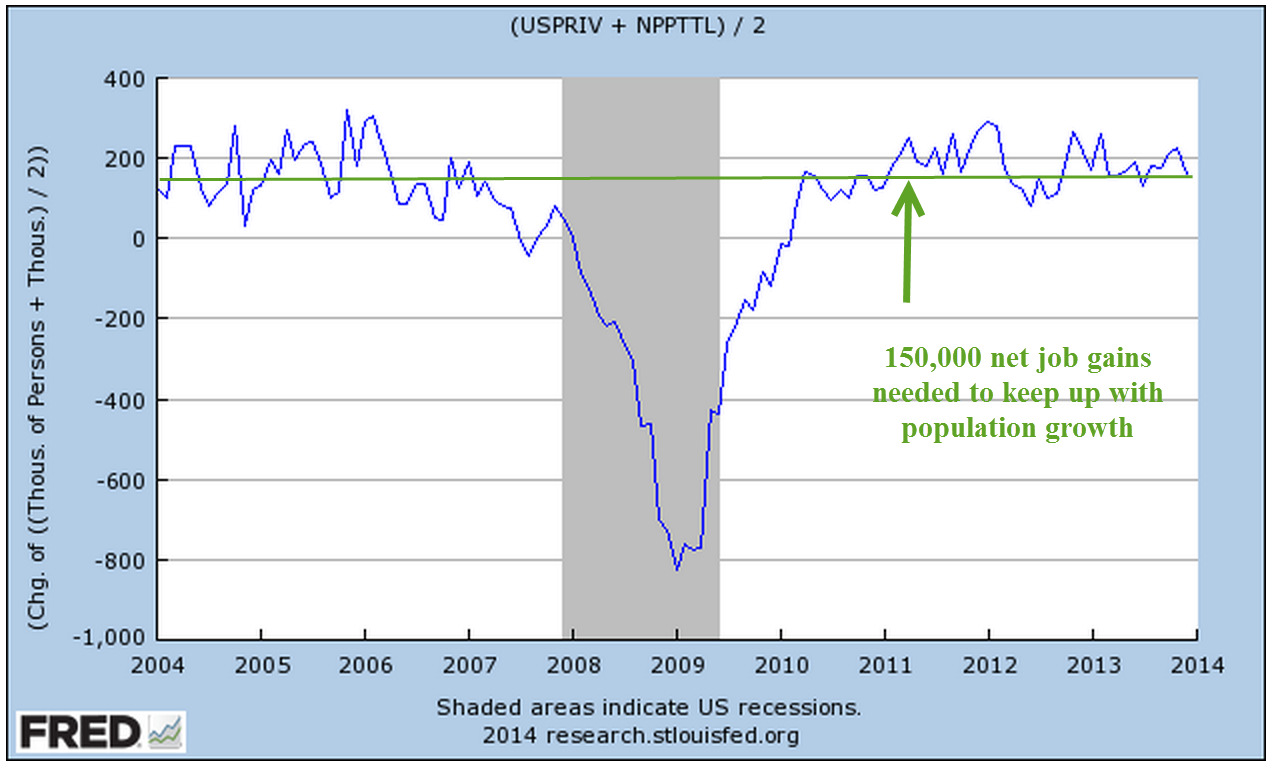
As with any estimates, I tend to average the estimates to get what I feel is a more accurate estimate.  This averaging works well when bidding construction jobs and some statistical experiments have proven the method reliable.  Averaging the two estimates for private payrolls gives us an estimate of job growth that is still above the replacement threshold of about 150,000 net job gains per month needed to keep up with population growth.

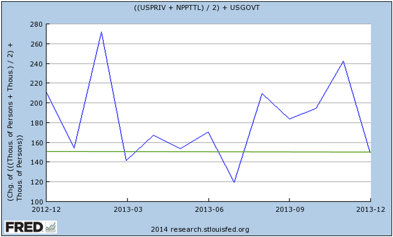
The figures above do not include 22 million government employees, or about 14% of total employment.  Flat or declining employment in this sector has dragged down the headline job gains each month.  Adding in net job gains or losses in the government sector gives us a net job gain of about 150,000 in December.

For those of you interested in more analysis of the employment report, Robert Oak at the Economic Populist presents a number of employment charts similar to the ones I have been doing in past months.

********************************
For the past 5 – 10 years, much has been written about the growth in income inequality during the past 30 to 40 years. I’ll call income inequality “Aye-Aye” because the abbreviation  “II” looks like the Roman numeral for “2” and because Ricky Ricardo used to exclaim “Aye, Aye, Lucy!” on that much loved comedy series.  Those on the left blame former President Reagan,  British Prime Minister Thatcher, and deregulation for Aye-Aye.  Those on the right blame increasing regulation that disincentivises businesses from taking chances, from making capital and people investments to pursue robust growth. The expansion of social welfare programs makes people ever more dependent on government and less likely to take jobs that they don’t want.  Economists cite the aging of the population as a cause of the growth of Aye-Aye.  Few I know of seriously challenge the idea that Aye-Aye has been happening.  The argument is over the causes and the solutions.

Thomas Piketty’s Capital in the 21st Century will add to the debate.  The English translation will be published in March.  A book review in the Economist outlines some of the ideas in the book.  Piketty’s analysis of almost 150 years of data from several countries indicates that the slower an economy grows, the more unequal the distribution of income.  One might think that the U.S. would have the most unequal income distribution, but Piketty reveals that it is France that tops the list.

Piketty’s rule of thumb is that the savings rate divided by a country’s growth rate will approximate the ratio of capital wealth to gross income.  As this ratio increases, more of the national income goes to those with capital wealth. So, if the savings rate is 8% and the growth rate is 2%, then capital wealth will be about four times gross national income.  Furthermore, he finds that population growth accounts for about half of economic growth over the past century and half.  Slowing population growth in the developed nations therefore leads to greater inequality of income.  If this rule of thumb is fairly accurate, stronger economic growth is the only way to lessen the inequality of income that has grown steadily over the past thirty to forty years.

If you are familiar enough with French, you can read a preview here or pre-order the English version here.  The book is sure to spark some lively discussion between those in the economic growth camp and those in the demographic camp.  The topic has long been a topic of discussion in emerging economies.  I will quote from an Asian Pacific policy journal published in 2003, “The most important determinant of inequality is not [emphasis mine] economic growth, however, but rather changes in demographic age structure.”

Year In Review

January 5, 2013  2014

The start of any year presents an opportunity for reflection on the past year as well as the upcoming one.  At the start of the year, few, if any, analysts called for such a strong market in 2013.  The S&P500 closed the year at 1850, a 30% gain. After a correction in May – June of this year, the index rose steadily in response to better employment data, industrial production, GDP increases, and the willingness of the Federal Reserve to continue  buying bonds and keep interest rates low.

I was one of many who were mildly bullish at the beginning of the year but got increasingly cautious as the index pushed past 1600.  Yet, month after month came not only positive or mildly positive reports but a notable lack of really negative reports.  Leading economies in the Euozone, teetering on recession, did not slip into recession.  Fraying monetary tensions in the Eurozone did not explode into a debt crisis.  China’s growth slowed then appeared to stabilize.  Although the attention has been on the Eurozone the past few years, the sleeping dragon is the Chinese economy, its overbuilt infrastructure, the high vacancy rate in commercial buildings in some areas of the country and the high housing valuations relative to the incomes of Chinese workers.

A year end review is an exercise in humility for most investors.  Some fears were unfounded or events unformed which confirmed those fears.  People are story tellers – stories of the past, imaginings of the future.  An investor who keeps all their money in CDs or savings accounts is predicting an unsafe investing environment for their savings.

Perhaps the best strategy is the one that John Bogle, the founder of Vanguard, advocates.  He doesn’t try to predict the future or be the best investor.  He aims for that allocation of stocks, bonds and other investments that, on average, forms a suitable mix of risk and reward for his goals, his age and the financial situation of his family.  He looks at his portfolio once a year.  I do think that a good number of individual investors had adopted the same outlook as Mr. Bogle advocates – until the 2008 financial crisis.

Since the financial crisis, too many investors have adopted a paralyzed strategy, a “deer in the headlight” reaction to the financial crisis that has been hugely unrewarding. Part of this year’s rise in the stock mark can be attributed to individual investors moving cash back into the stock market but I would guess that many of those investors are ready to pull it back out at the first sign of any trouble.  This shows less a confidence in the market but a frustrating lack of alternatives.

Long term bond prices took a significant hit in the middle of the year on fears of an impending rise in interest rates.  Bond prices had simply become too high, driving down the yield, or return, on the investment. Lower bond yields and meager CD and savings rates provided little return for investors, leaving many investors with little choice but to venture back into the stock market.

*************************************
The Coincident Index of Economic Indicators remains level and strong.  A decline in this index below the 1% average growth rate of the population indicates the start of or an impending recession.

Note the index in 2002 – 2003 as it fell back, never rising above the 1% level.  I have written about this economic faltering before.  Much of the headlines were focused on the lead up to and start of the Iraq war.  The recovery from the recession of 2001 and 9-11 was very sluggish.  Fears that the country was entering a double dip recession similar to that of the early 1980s prompted Congress to pass the Bush tax cuts in 2003.  It was only the increased defense spending of 2003 that offset what would have been a decline in GDP and another recession.

***********************************
A worrisome rise in new unemployment claims has puzzled some analysts.  Typically, new claims for unemployment decline at the end of the year, particularly in a year such as this one when reports of strong economic growth have been consistent.  Since 2000, rises in claims at the end of the year have been a cautionary note of things to come.  Mid-term investors and traders will be paying attention to this in the weeks to come.

However, the decline this year may be more of a leveling process that has been forming for most of the year.  On a year over year basis, the long term trend is down – which is up, or good.

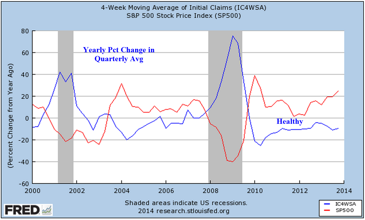
In March 2013, I wrote “when unemployment claims go up, the stock market goes down … On a quarterly basis, this negative correlation has proved to be a reliable trading signal for the longer term investor.  When the y-o-y percentage change in new unemployment claims crosses above the SP500 change, sell.  When the claims change crosses below the SP500 change, it’s safe to buy. ”  The percent change in SP500 is still floating above the change in unemployment claims.

**********************************
Sales of motor vehicles in November were above even the most optimistic expectations.  The ISM manufacturing index showed a slight decline but is still in strong growth mode and the already robust growth of new orders continues to accelerate.  The manufacturing component of the composite index I have been following since last June is at the same vigorous levels of late 1983 and 2003 when the economy finally breaks free of a previous recession.  I’ll update the chart when the non-manufacturing report is released this coming Monday.

*********************************
In a healthy economy, the difference between real GDP and Final Sales Less the Growth in Household Debt (Active GDP) stays above 1%, which incidentally is the annual rate of population growth.  As the chart below shows, this difference dropped below 1% in late 2007.  Finally, six long years later, the difference has risen above 1%, indicating a healthy, growing economy.

**********************************
And now a brief look at the year in review.

At the end of 2012, the price of long term bonds had declined slightly from the nose bleed levels of the fall but there was more to come.  I wrote “As this three decade long upward trend in bond prices begins to turn, bond prices can fall sharply as investors turn from bonds to stocks and other investments. We are approaching the lows of interest yields on corporate bonds not seen since WW2. Investors are loaning companies money at record low rates and companies are sucking up all that they can while they can. Sounds a lot like home buying in the middle of the last decade, doesn’t it?”

During the past year, long term bonds declined another 10%.  They seem to have formed a base over the past several months.  Intermediate term bonds are less sensitive to interest rate changes so they are the safer bet.  They lost about 6% in price over the past year.  Short term corporate bonds are a good alternative to savings accounts.  They pay about 1% above the average savings account and they usually vary very little in price so that the principal remains stable.

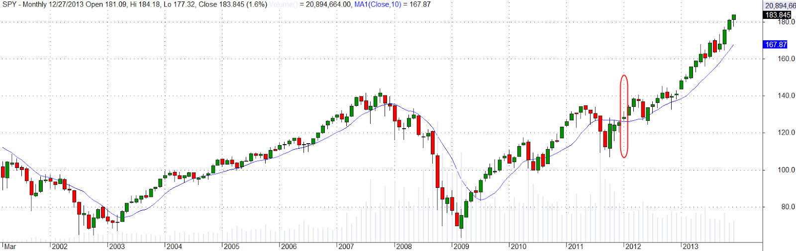
At the end of 2012, I wrote “the underlying fundamentals of the economy give reason for cautious optimism.” A month later, “As the saying goes, ‘The trend is your friend.’ When the current month of the SP500 index is above the ten month average, it’s a good idea to stay in the market.”  In January 2012, the monthly close broke above the 10 month average. This is a variation of the Golden Cross that I wrote about in January and February 2012.

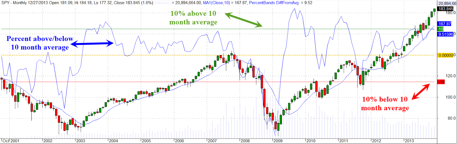
Let’s look at this crossing above and below the 10 month average.    When this month’s close of the SP500 index crosses above the 10 month average of the index, it indicates a clear change in market sentiment.  I have overlayed the percent difference between each month’s close and the ten month average.

As you can see, the close near the end of December is near 10% above the 10 month average.  If the above chart is a bit too much information for you, here is a graph of the percent difference only.

Is the market overheated?  As you can see the market has sustained a robust (or some might call it exuberant) 10% for 6 – 9 months in 2003, 2009, and 2010-2011.  From 1994 to 1999, the market spent a lot of time in the 10% percent range. Some pundits are talking about this market as a bubble but we can see that this market has not penetrated the 10% mark.  At the end of January 2013, the market closed at more than 7% above it’s 10 month average, over the 4 year positive average of 5.6% (the average when the difference is positive).  The market is 20% up since then.

******************************
In March I introduced the “Craigslist Indicator,” the number of work trucks and vans for sale in a local area, as a gauge of the health of the construction industry.  It was a funny little indicator that indicated a growing strength in the construction industry at the beginning of the year.  Now for the amended version of the Craigslist Indicator: when there are a lot of older work trucks and vans advertised for sale on Craigslist, that indicates a robust construction market.

*****************************

On March 24th, 2013 I wrote ” For the past year, the Eurozone has been in or near recession, yet some are hopeful that increased demand in this country and some emerging markets are helping to balance the contractionary influence of decreased demand in the Eurozone. Let’s hope that this surge in the first part of the year does not fade as it did in 2012.”  Instead, emerging markets began to contract and the Eurozone expanded slightly. Investors who bought emerging markets in March 2013 witnessed a more than 10% decline during the summer but the index ended the year at about the same level as nine months ago.

******************************
I thought that home prices in the early spring has reached a peak and wrote on March 31st, “The upturn in home prices is still above the trend line growth of disposable income and until personal income can resume or surpass a 3% growth rate, any rise in home prices will be constrained.” The Purchase Only House Price Index (HPIPONM226S) rose steadily throughout the year.
In late summer, I noted the falloff in single family home sales that began in the spring.  But prospective buyers were incentivized to make the deal as interest rates began to climb from their historically low levels.  Home sales surged upward; a lack of inventory in many cities also formed a support base that propped up prices.

A sobering note in September, “Rising home values are good for those who own a home but increasing valuations make it that much more difficult for buyers trying to buy their first home.  People in their twenties and early thirties who are most likely to be first home buyers have been hit hard by the recession.”

*******************************
After a decline in the stock market in June, I wrote “For the long term investor, periods of negative sentiment can be an opportunity to put some cash to work.”  Although I took my own advice, I wished I had acted with more conviction.  Of course, if the market had declined 10%, I would have been patting myself on the back for my cautious stance.  Smiley Face!!

*******************************
In July I noted the rather dramatic decrease in the value of securities held at the nation’s largest banks “Recently rising bond yields have contributed to banks’  operating profit margins but the corresponding value of banks’ bond portfolios has fallen quite dramatically.  This decline in asset value affects bank capital ratios, which makes them less likely to increase their lending … [and] will be an impediment to economic growth.”  The rising stock market and a respite in the decline of bond prices helped stabilize those portfolios in the second half of the year.

********************************
In September, I noted “Despite all the daily and weekly responses to political as well as economic news, the SP500 stock market index essentially rides the horse of corporate profits.”  Profits have more than tripled in the past ten years.  We should stay mindful of that stock price to profit correlation as we look out on the investment horizon.

********************************
From time to time I comment on the venality of our elected representatives.  Although they might appear to be idle rants to some readers, they are a caution.  Politicians make promises to get votes.  People become more dependent on those promises.  Inevitably, the day comes when the promises can not be met – as promised.  Those nearing or in retirement become increasingly dependent on political promises and should leave themselves a cushion – some wiggle room – if possible, when they make income and expense projections.  This Washington Post article on proposed budget cuts to military pensions is a case in point.  As long as “they” come for the other guy, we don’t pay too much attention – until they come for us.  Over the next ten to twenty years, we can expect many small cuts to promised benefits.  The cuts have to be small or target a small sector of the population so that they don’t anger voters too much.  In several blogs, I have shown how a simple recalculation of the Consumer Price Index eats away at the incomes of workers and retirees.  Expect more of these “recalculations” in the future as politicians follow a long standing tradition of making promises to win votes and bargain patronage to gather financial support for their campaigns.

We have the midterm elections to look forward to this year!  OK, calm down. Republicans will be hoping to take the Senate and make President Obama’s life miserable for the following two years.  I am guessing that the political campaigns for some Senate seats will vacuum in more money than the GDP of a lot of small and poor countries.

Employment Growth

December 29th, 2013

In several past blogs here and here, I have noted a “rule of thumb” guide to recessions based on the unemployment rate.  When the year over year percentage change in the unemployment rate goes above 0, recession smoke alarms go off.  Sorry, no phone app for this alarm. This metric sometimes indicates a recession that doesn’t quite materialize in the economic data, a false positive, although the market may react to the possibility of a recession.  Employment is but one factor in a complex economy and no one indicator can stand as a fail safe predictor of a serious enough decline in the economy that it gets labelled “recession” by the NBER.

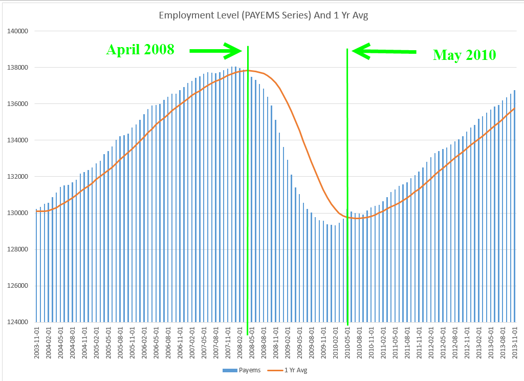
Another related measure is the total employment level.  This employee count comes from the Establishment Survey conducted by the BLS and is the source for the monthly headline job gains or losses. To show the correlation between payroll and economic activity, I took a measure of GDP – I’ll call it active GDP – that excludes changes in business inventories and net exports.  From this I subtracted the change in real household debt in each quarter.  This measure of economic activity reflects what consumers can actually pay for.  Below is a chart of the yearly change in this adjusted measure of GDP and the number of people working.  There is a remarkable correlation.

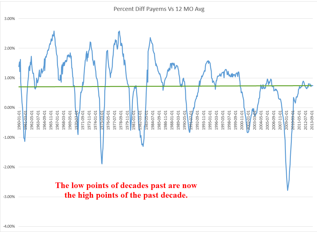
As I will show below, the employment market has not fallen into an unsafe zone but the decline in growth of domestic demand indicates a fragility that should not be overlooked.  Comparing the number of people working to the 12 month average reveals trends and weaknesses in the economy.  Historically, when the number of workers falls below its 12 month average we are almost certainly in a recession.  As of now employment is maintaining a healthy but not robust growth rate.

When the difference between the monthly count of people working and its 12 month average (I’ll call it DIFF) falls below 1% (I’l call it WEAK), it shows a pre-recession weakness in the economy. In past decades, this DIFF might fall to .75% before recovering, a temporary weakness.  Since June 2000, employment growth has been in a WEAK state, never recovering above 1%.  Following the dot com bust in 2000, 2001 included an 8 month recession, the admittance of  China to the World Trade Organization and the sucking up of low skilled manufacturing jobs, and the horrific events of 9-11.  For two years the country endured a painfully slow and fitful recovery, prompting a Republican Congress to pass  what are called the Bush tax cuts.  Neither tax cuts or the overheated housing market of the mid 2000s could kick the DIFF above 1% although it got very close for a number of months in late 2005 and early 2006 as the housing market peaked.

When the DIFF falls below 500, we can mark fairly closely the beginnings and ends of recessions as they are called by the NBER many months later.

It is important to note that historical data is already revised data.  We must make investment decisions with the data available at the time. (See an earlier blog for some examples of revisions to payroll data.)

**************************
This week’s reports were generally better than expected.  These included durable goods orders, sales of new homes, personal income and spending.  Housing prices, as shown by the FHFA purchase only index, are maintaining an 8% year over year change.  Over the past quarter century, housing prices have followed a 3.2% annualized growth rate.

**************************
In previous blogs, I have examined the PCE inflation measure that routinely produces the lowest rate of inflation.  This is not the headline CPI index but is used to produce what is called a chain type price index.  Inflation estimates based on this indicator showed 0% inflation in November and less than 1% for an entire year.  Isn’t that great?  Rents, food, utility bills, insurances have barely increased over the past year.  Yes, I know you are ROFL until you realize that the joke is on you, on all of us.

***************************

Let’s get in the wayback machine and go back to early 2007 when the Bush administration released their estimate of GDP for the years 2007 – 2013.  Every Presidential budget indulges in the folly of predicting the future economic growth of the largest economy in the world.  When we dig into the figures, the process is rather simple.  These estimates simply take actual figures from 2006 and calculate 5% annual growth in nominal GDP.  Any of us could do this with an Excel spreadsheet.   An unemployment rate below 5% is rather infrequent and unlikely to continue for very long but the Bush Administration projected that this sub-5%level would continue for another six years.  If your 12 year old came to you with these calculations, you would probably praise them for their effort and smile inwardly at the innocence of the projections.  You wouldn’t tell your twelve year old that things don’t stay rosy indefinitely because they will find that out in due time.  This kind of middle school mentality is what passes for wisdom in Washington.

In the course of our lives, how many times do we come to a carefully calculated answer only to step back and say “Well, that can’t be.  Something’s wrong.”  It seems that there are few in Washington who doubt themselves.  The polarization in Washington means that everyone in any position of responsibility has many critics on the other side of an issue.  Each one then surrounds themselves with others who support their position, their values, their calculations.  There is no stepping back and saying, “Wait, is that right?” The revolving door in Washington ensures that many politicians have little to lose even if they lose their seats.  Many soon find an even more lucrative position in the private lobbying industry.  What they do lose is the ability to wake up in the morning, look in the mirror and say, “I’m important.”  Lose a bit of arrogance, gain a bit of humility.  Not such a bad tradeoff.

The investor who puts his own money at risk, who has skin in the game, as the economist Nassim Taleb calls it, can not afford to NOT step back and take a second look at their investment strategies and allocations.  As we complete another lap, this is a good time to recheck and rebalance.  The 25+% gains in the stock market have probably skewed the allocations of many an individual’s portfolio.  Here’s hoping everyone has a good year!

GDP, Profits, Inflation

December 22nd, 2013

Merry Christmas!

Last week I reviewed several decades of trends in corporate profits, as well as the 1990 change in measuring inflation that has helped increase corporate profits as a share of GDP.   (For those of you interested in the inflation controversy, here is an article that provides some additional insight.)  This week I’ll look at patterns in the economic growth of this country that sheds some light on recent events and provides some context to understand ongoing trends.

During the 30 years following World War 2, the economy grew at an annual rate of 3.7% after inflation.  Population growth was about 1% per year.  Productivity growth was about 1 – 1.5%.  Government spending, including debt, grew a bit more than 1%.  The chart below shows the compounded annual growth rate.

But I think the story is more clearly told by a different chart constructed from the same data.  The growth rate trend is more easily visible and it is the change in this trend that I will be focusing on.

During the 1970s, an economic trend known as staflation increasingly took hold. This period of high inflation, coupled with slowing growth and growing unemployment, was not thought possible by economists using theories proposed by John Maynard Keynes in the 1930s, during the Great Depression.  In 1974, economist Arthur Laffer first sketched out a theory that tax cuts would stimulate the economy.  As the Federal debt began to rise in the mid to late 1970s, few wanted to take a chance that lower tax rates would produce more revenue for the Federal Government.

The 1980s began with back to back recessions and the highest unemployment since the 1930s Depression. Big spending and tax cuts during the 1980s dramatically increased the federal debt but did little  to spur growth.

During this 13 year period, profit growth slowed to 2.4%.  The myth that the 1980s was a high growth era continues to live in the minds of political pundits.  In a WSJ op-ed on Dec. 18th, Daniel Henninger referred to “the high-growth years of the Reagan presidency.”  Myths live on because they serve a purpose to those who cherish them.  The cardinal rule of politics is “Disregard the Data.”

In 1990, economists at the BLS adopted what is called a hedonic methodology to computing the CPI.  Used by other OECD countries, this supposedly more accurate assessment of the growth of inflation shows a lower growth rate of inflation.  This naturally increases the growth rate of inflation adjusted GDP. (GDP dollars each year are divided by the inflation rate to get the real growth rate.)

The conventional narrative is that the 1990s was an explosive growth period of new technology and growing globalization.  From the beginning of 1990 to the start of 2000, stock market values grew four times.  After the bursting of the internet bubble, 9-11, and the recession of 2001, the economy recovered.  By the mid-2000s, the unemployment rate was less than 5%.  While that may be the conventional narrative, the growth of the economy from 1990 to 2007 was just as slow as the period 1978 – 1989.

Remember that this slow growth would have been even slower if the BLS had not changed their methodology for measuring inflation.  To recap, the 30 year real growth rate of GDP after WW2 was 3.7%.  The following 30 year growth rate was 2.3%.  But that later 30 period is marked by a sharp rise in consumer borrowing.   Without that escalation in borrowing, growth would have been meager.

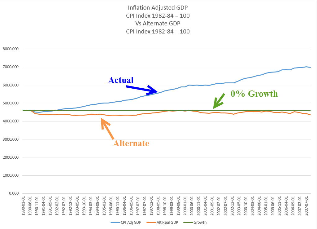
Families with two incomes borrowed against their homes, drove up the balances on their credit cards and still GDP growth was slow.  Let’s construct a fairy tale, what economists call a counterfactual.  What if the BLS had not changed to this new methodology in 1990?  What would be the growth rate of GDP using an alternate measure of inflation?

The resulting growth pattern is 0% for the 18 year period and is more consistent with the experiences of many workers and families in this economy.  The change in the measurement of inflation has greatly helped mid-size and large size companies.  An understated inflation rate reduces labor costs by reducing cost of living adjustments to salaries and wages.  In addition, companies can borrow at lower rates since many corporate bonds are tied to the inflation rate.  American companies did not engineer this revised methodology of measuring inflation but they have been the largest beneficiaries of the new policy.

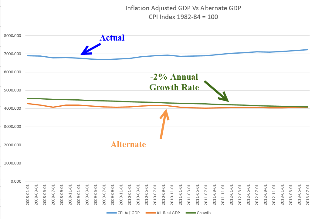
In 2008, the financial poop in the popcorn popper began to pop.  In the past 5+ years, we have experienced less than 1% real growth, not enough to keep up with population growth.  Of course, most people are wondering “what growth? It sure doesn’t feel like growth!”

The story may be told more accurately by looking once again at a comparison of inflation adjusted GDP with an alternate version of GDP, one that more realistically reflects inflationary pressures.  This chart shows a decrease of 2% per year.

Did the BLS adopt this methodology under political pressure?  Perhaps.  More likely, it was an alignment of econometric theory with political and corporate interests.  The reduction in published inflation rates did slow the growth of payments to Social Security recipients and reduced Medicare payouts to physicians and hospitals, thus shrinking budget deficits.  The government saves money, corporations make extra money, but – quietly and slowly – families lose money.

Annual cost of living adjustments to Social Security checks have been reduced but the decreased income has forced more seniors to seek assistance through the food stamp program, now called SNAP.  A politically neutral change in the measurement of inflation thus becomes a way for politicians to introduce a means testing component to Social Security income.  Instead of reducing payments based on income, payments are reduced to all recipients and poor seniors are targeted for additional benefits.  Congress has increased eligibility for the food stamp program so that seniors who are dependent on that extra income can receive it in the form of food stamps.  If the BLS had not changed their methodology, seniors would receive appoximately 60% more each month and many wouldn’t need the food stamps in the first place.

With this history in mind, let’s turn to this week’s revisions of GDP and corporate profits for the third quarter ending in September.  The real, or inflation-adjusted, growth of 3rd quarter GDP was raised to a 4.1% annualized growth rate in the third quarter, largely on upward revisions of consumer spending.  Contributing to stronger GDP growth has been a worrisome increase in company inventories, which probably influenced the Federal Reserve’s decision this week to keep any tapering of their QE bond purchases to a minimum.

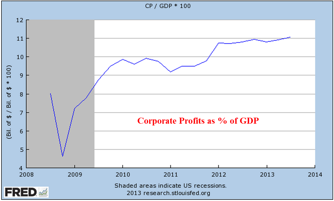
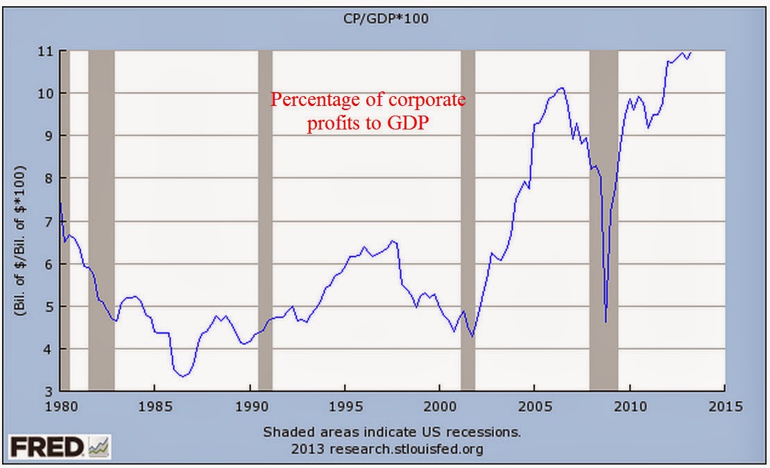
Corporate profits for the third quarter were revised higher as well.  As a share of GDP, corporate profits continue to reach all time highs.

How likely is it that economists at the BLS will change their methodology to reflect inflationary pressures before we make choices in response to rising prices?  The subject is not easily encapsulated in a sound bite or a short slogan on a placard.  In the 1992 presidential race, independent candidate Ross Pierot was able to use charts to make a point with many voters but few politicians are very good at the easel and unlikely to bring up the subject in the public forum.  Families and workers will continue to suffer and politicians will create more social benefit programs to help those hurt by problems that politicians themselves have either created or failed to address.  Large and mid sized businesses will continue to enjoy the additional slice of pie.

Retail Sales and Inflation

December 15th, 2013

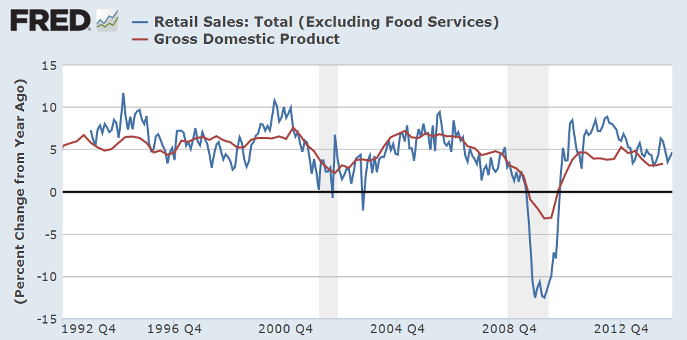
Retail sales rose .7% in November, posting year over year (y-o-y) gains of almost 5%.  The twenty year average of y-o-y gains is 4.6%.  When we remove the eleven monthly outliers with gains of more than 10% or less than -10%, the average is 5.0%

Now let’s compare the percentage change in GDP with the change in retail sales.

The change in GDP is like a smoothed average of the change in retail sales, so the continuing willingness of consumers to spend is a positive for both GDP growth and the market in the mid-term outlook.

*******************************

In March 2009, incoming President Obama pledged that his administration was going to support small businesses which employ 1/2 the workforce and contribute 40% to GDP. (CBS News article  Note: The article incorrectly states that small businesses employ 70% of the workforce.) A recent report, short and written in plain English, by the Cleveland Federal Reserve compares levels of lending to small businesses in 2013 vs 2007.  Five years after the financial crisis, six years after the start of the recession, loans to small businesses are only 80% of 2007 levels.  Impacting the start up of small companies has been the decline in home values.  Home equity provides the funding for most small business start ups.

A graph from the report illustrates the long term decline of small business lending.  As the banking sector has consolidated over the past twenty years, the mega-banks have less incentive to “take a chance” on small businesses.

As I watch Senate and House hearings on C-Span (yes, I know I have a problem), I am struck by how many members of Congress appear to be on a mission.  While at times Washington seems to be a town of political prostitutes, it may be more accurate to describe it as a town of missionaries.  These dedicated men and women come to Washington with a plan to save the souls of the American people – or at least that’s the way they like to present themselves.  Nancy Pelosi and other prominent Democrats give voice to the plight of the long term unemployed but rarely mention small business owners.  A 50 year old guy who can’t find a job because his skills are out of date is a topic of concern to Democrats.  But what about the 50 year old who can’t start up a business because the drop in housing prices has diminished the equity of many home owners?  Republicans mention small businesses only when bashing Obamacare.  Why has there been so little attention paid to this rather large part of the economy?  Why aren’t the banks being subpoenaed to appear before a Congressional subcommittee?  Many Presidents seem to spend their second terms answering for the broken promises of their first term.  Finally, after eight years, voters turn to a new guy, hoping that this one will be different.  Hope, or foolishness, triumphs in the hearts of voters.

********************************

Now I’ll take a look at a contentious subject, the measurement of inflation.  A comprehensive review of the inflation measurement is far beyond my skills and a blog.  The CPI produced by the Bureau of Labor Statistics is the official measurement of inflation to adjust Social Security payments each year.  I want to come at the subject from a different viewpoint – corporate profits. Starting in 1990, the Bureau of Labor Statistics (BLS) adopted a new way of measuring inflation, introducing what is called a hedonic adjustment. Coincidentally, corporate profits began to surge shortly thereafter.  Below is a graph showing inflation adjusted profits.

Adjusting for population growth, the surge in per capita profits confirms the trend.

As I noted in September, corporate profits as a percent of GDP are at historically high levels.

In a FAQ sheet, the BLS explains their methodology in plain language and refutes the claim that hedonic adjustments have any significant impact on the CPI measurement. I have also discussed another measure of inflation, the PCE deflator.  Here is a working paper by an economist at the Federal Reserve on the PCE measurement.

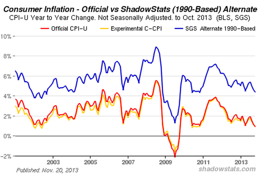
For years, John Williams of Shadow Government Statistics (SGS) has painstakingly maintained an alternate data set of the CPI.  Here’s a graph from that page to give you an idea.

As you can see, the official measure of inflation is about 2 – 3% below the CPI that Williams produces using the pre-1990 methodology.  Essentially, hedonic adjustments measure inflation after consumers have adjusted to inflationary price pressures.  Let’s say that a family eats steak twice a week.  Steak then goes up in price by 20%.  To stay within their budget, a family might substitute hamburger for one of those meals.  The old method of measuring inflation would capture the 20% rise in the price of steak.  The post-1990 method does not capture all of that rise because it allows for the substitution effect.

Several reasons have been given for the dramatic rise in corporate profits since 1990.  These include globalization, technology, and increased productivity of both labor and capital.  As I wrote about in August, multi-factorial productivity has only increased 12% in the 12 years from 2000 – 2012, an annual gain of less than 1%.  Technological progress occurred in almost every decade of the past century, yet average economic growth is about 3% over those one hundred years – a remarkable consistency.  Globalization has helped and hurt domestic companies, enabling them to reduce costs but also increasing the competition from firms around the world.  Have companies found some magic key in the past twenty years?

The magic key may be the change in the CPI methodology. What if the CPI understates inflationary pressures by 2 – 3% each year?  What effects would that have?  Interest rates would be reduced, lowering the costs of borrowing for companies.  There would be less pressure from labor for wage increases.  These two factors figure heavily in the profits of many large companies. (Interest expense for GE is more than a third of their operating income ).  There is yet another effect: real profits adjusted for this higher inflation rate, would simply not be so dramatic.

Since 1990, per capita corporate profits have risen about 7.6% per year.

Now let’s adjust per capita profits for inflation using the official CPI and a higher inflation rate that is closer to the inflation measures that SGS compiles.

What we see is approximately 3% real growth in per capita profits since 1990.  This is quadruple the .75% growth rate of corporate profits for the thirty year period from 1959 – 1989.

The 30 year average was hurt by the 4% decline in inflation and population adjusted profits during the 1980s.  This decline undermines the conventional narrative that the 1980s were a big growth boom for companies.  The 50 year average of this real profit growth is 2.5%.  As a rule of thumb then, we can guesstimate inflationary pressures on consumers as the nominal rate of profit growth less 2.5%.  Let’s look at a chart I showed earlier.

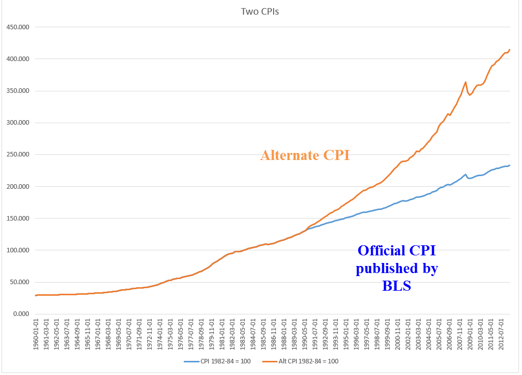
The 7.6% nominal growth rate of profits less 2.5% gives us an average inflation rate of close to 5% for the past 23 years.  This different methodology lends more credence to the higher CPI calculations that SGS presents. Compare this to the 2.5% average that the BLS calculates for this time period.

Small changes in methodology add up over time.  While this “back of the envelope” method of computing inflation does not meet the rigor that Williams brings to his calculations, it does illustrate the difference in inflationary pressures that many families feel.  Here’s a comparison of the two indexes.

Now comes the juicy part and I will keep my voice low.  There is a conspiracy theory floating around that, in the late 1980s, the politicians in Washington were pressured by businesses to have the BLS revise their methodology to reduce rising labor costs which were hurting profits. Another theory says that Congress wanted to curb the annual CPI increases in Social Security and Medicare payments and secretly ordered the BLS to come up with a way to revise the CPI down.  In 50 years, financial historians may discover that both of these theories have some substance.

Whatever the “real” reason for the change in methodology, those who are dependent on retirement income indexed to the CPI should keep in mind that unmeasured inflationary pressures may eat an additional  2 – 3% out of their retirement savings base and income.

Winter Wonderland

December 8th, 2013

The Bureau of Labor Statistics rode down like Santy Claus on the arctic front that descended on a large part of the U.S. The monthly labor report showed a net gain of 203,000 jobs in November, below the 215,000 private job gains estimated by ADP earlier in the week, but 10% higher than consensus forecasts.  Thirty eight months of consecutive monthly job growth shows that either:

1) President Obama is an American hero who has steered this country out of the worst recession – wait, let me capitalize that – the worst Recession since the Great Depression, or

2) American businesses and Republican leadership in the House have overcome the policies of the worst President in the history of the United States. 

Hey, we got some Hyperbole served fresh and hot courtesy of our radio and TV!

The unemployment rate dropped to 7.0% for the right reasons, i.e. more people working, rather than the wrong reasons, i.e. job seekers simply giving up.  The combination of continued strong job gains and a big jump in consumer confidence caused the market to go “Wheeee!”

***********

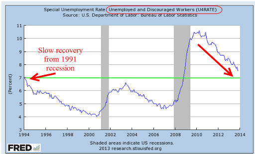
A broader measure of unemployment which includes those who want work but haven’t looked for a job in the past four weeks declined to 7.5%.  This is still above the high marks of the recessions of the early 90s and 2000s.

***********

Construction employment suffered severe declines after the collapse of the housing bubble.  We are concerned not only with the level of employment but the momentum of job growth as the sector heals.  A slowing of momentum in 2012 probably factored into the Fed’s decision to start another round of QE in the fall of last year.

********

Job gains were broad, including many sectors except federal employment, which declined 7,000. Average hours worked per week rose by a tenth to 34.5 hours and average hourly pay rose a few cents to $24.15.

Discouraged job seekers are declining as well.  The number of involuntary part time workers fell by 331,000 to 7.7 million in November.  As shown in graph below, the decline is sure but slow.

***********

There are still some persistent trends  of slow growth.  Job gains in the core work force aged 25 -54 are practically non-existent.

**********

The percentage of the labor force that is working edged up after severe declines this year but the trend is down, down and more down.

*********

The number of people working as a percent of the total population has flatlined.

**********

Let’s turn to two sectors, construction and manufacturing, which primarily employ men.  The ratio of working men to the male population continues to decline.  Look at the pattern over 60 years: a decline followed by a leveling before the next decline, and so on.  Contributing to this decline is the fact that men are living longer due to more advanced medical care and a fall in cigarette smoking.

************

The taxes of working people have to pay for a lot of social programs and benefits that they didn’t have to pay for thirty years ago.  Where will the money come from?  A talk show host has an easy solution: tax the the Koch Brothers, cut farm subsidies to big corporations and defense.  Taking all the income from the Kochs and cutting farm subsidies and defense by half will produce approximately $560 billion, not enough to make up for this year’s budget deficit, the lowest in 4 years.  What else?

***********

In a healing job market, those aged 16 and up who are not in the labor force as a percent of the total population  continues to climb.

********************************

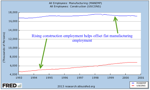
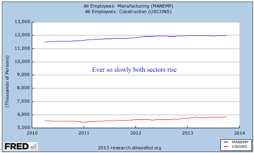
A familiar refrain is the steady decline in manufacturing employment.  Recently the decline has been arrested and there is even slight growth in this sector.  Although construction is regarded as a separate sector, construction is a type of manufacturing.  Both employment sectors appeal to a similar type of person.  Both manufacturing and construction have become more sophisticated, requiring a greater degree of specialized knowledge.  Let’s look at employment trends in these two sectors and how they complement each other.

During the 90s, a rise in construction jobs helped offset moribund growth in manufacturing employment.

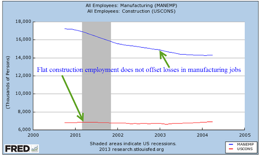
In 2001, China became a member of the World Trade Organization (WTO) , enabling many manufacturers to ship many lower skilled jobs to China.  At the same time, a recession and the horrific events of 9/11 halted growth in the construction sector so that there was not any offset to the decline in manufacturing jobs.

As the economy began recovering in late 2003, the rise in construction jobs more than offset the steadily declining employment in the manufacturing sector.  People losing their jobs in manufacturing could transition into the construction trades.

As the housing sector slowed, construction jobs declined and the double whammy of losses in both sectors had a devastating effect on male employment.

In the past three years, both sectors have improved.

Although the Labor Dept separates two sectors, we can get a more accurate picture of a trend by combining sectors.

*********************************

In the debate over the effectiveness of government stimulus, there is a type of straw man example proposed:  what if the government were to pay people to dig holes, then pay other people to fill in the holes?  Proponents of Keynesian economics and government stimulus argue that such a policy would help the economy.  Employed workers would spend that money and boost the economy. Those of the Austrian school argue that it would not.  Digging and filling holes has no productive value.  Ultimately it is tax revenues that must pay for that unproductive work.  Therefore, digging and filling holes would hurt the economy.

So, let’s take a look at unemployment insurance through a different set of glasses.  Politicians and the voters like to attach the words “insurance” and “program” to all sorts of government spending.  Regardless of what we call it, unemployment insurance is essentially paying people to dig and fill holes – except that the holes are imaginary.  IRS regulations state that unemployment benefits are income, that they should be included in gross income just as one would include wages, salaries and many other income.

If unemployment is income, how many workers do the various unemployment programs “hire” each year?  Unemployment benefits  vary by state, ranging from 1/2 to 2/3 of one’s weekly wage. (Example in New Jersey)  As anyone who has been on unemployment insurance can verify, it is tough to live on unemployment benefits. I used the average weekly earnings for people in private industry and multiplied that by 32 weeks to get an average pay, as though governments were hiring part time workers.  I then divided unemployment benefits paid each year by this average.  Note that the divisor, average pay, is higher than the median pay, so this conservatively understates the number of workers that are “hired” each year by state and federal governments.

What is the effect of “hiring” these workers?  I showed the adjusted total (blue) and the unadjusted total of unemployed and involuntary part time workers.  The green circle in the graph below illustrates the effect that extensions of unemployment insurance had on a really large number of unemployed people.

At its worst in the second quarter of 2009, the unemployed plus those involuntary part timers totaled 24 million, almost 16% of those in the labor force.  8 million were effectively “hired” to dig imaginary holes.  In the long run, what will be the net effect of paying people to dig holes and fill them?  First of all, a politician can’t indulge in long run thinking.  In a crisis, most politicians will sacrifice long run growth so that they can appease the voters and keep their own jobs.

In the long run, ten years for example, paying people to do nothing productive will hurt the economy.  The argument is how much?   Keynes himself wrote that his theory of stimulus and demand only worked when there was a short run fall in demand.  At the time Keynes wrote his “General Theory,” the world economy was floundering around in a severe depression.  The severe crisis of the Depression birthed a theory that divided the economists into two groups: the tinkerers and the non-tinkerers.  Keynesian economists believe in tinkering, that adjusting the carburetor of the economic engine will get that baby purring.  Austrian or classical economists keep asking the Keynesians to stop messing with the carburetor; that all these adjustments only make the economy worse in the long run.

***********************************

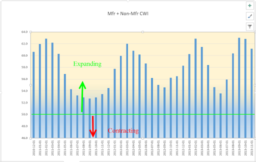
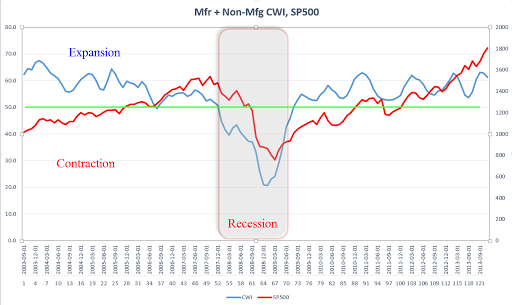
The November report from the Institute for Supply Management (ISM) showed strong to robust growth in the both the manufacturing and services sectors.  As I noted this past week, I was expecting the composite CWI index of these reports that I have been tracking to follow the pattern it has shown for the past three years.  Within this expansion, there is a wave like formation of surging growth followed by an easing period that has become shorter and shorter, indicating a growing consistency in growth.  The peak to peak time span has decreased from 13 months, to 11 months to 7 months.  The index showed a peak in September and October so the slight decline is following the pattern.   IF – a big if – the pattern continues, we might expect another peak in April to May of 2014.

To get some context, here’s a ten year graph of the CWI vs the SP500 index.

**********************************

As the stock market makes new highs each week, some financial pundits get out of bed each morning, saddle up their horses, load up their latest book in the saddle bags and ride through TV land yelling “The crash is coming, the crash is coming.”  Few people would listen to them if they shouted “Buy my book, buy my book.”  They sell a lot more books yelling about the crash.

How frothy is the market?  I took the log of the SP500 index since January 1980 and adjusted it for inflation using the CPI index.  I then plotted out what the index would be if it grew at a steady annualized rate of 5.2%.   Take 5.2%, add in 3% average inflation and 2% dividends and we get the average 10% growth of the stock market over the past 100 years.  The market doesn’t look too frothy from this perspective.  In fact, the financial crisis brought the market back to reality and since then, we have followed this 100 year growth rate.

Now, let’s crank up the wayback machine.  It’s November 1973.  Despite the signing of the Paris Peace accord and an act of Congress to end the Vietnam war, thousands of young American men are still dying in Vietnam.  The Watergate hearings continue to reveal evidence that President Nixon was involved in the break in of the Democratic National Committee and the subsequent attempts to cover it up.  Rip Van Winkle is disgusted.  “This country is going to the dogs,” he mutters to himself.  He lies down to take a nap in an alleyway of the theater district of New York City.  The SP500 index is just below 100.  Well, Rip doesn’t wake up for 20 years.  In November 1993, he wakes up, walks out on Broadway and grabs a paper out of nearby newspaper machine.  The SP500 index is 462.  Rip doesn’t have a calculator but can see that the index has doubled a bit more than twice in that time.  Using the rule of 72 (look it up), Rip estimates that the stock market has grown about 8% per year.  Which is just about normal.  But normal is what Rip left behind in 1973.  “Normal” is SNAFU.  So he goes back into the alleyway and goes back to sleep for another twenty years, waking up just this past month.  He walks out on Broadway and reads that the index has passed 1800.  “Harumph” Rip snorts.  That’s two doublings in twenty years, a growth rate of a little over 7%.  Rip reasons that eventually he’ll wake up, the country will have mended its ways and Rip will notice a growth rate of 9 – 10% in the market index.  He goes back to sleep.

In the 40 years that Rip has been asleep, we have had three bad recessions in the 70s, 80s and 2000s, a savings and loan crisis in the 80s, an internet bubble, a housing bubble, and the mother of all financial crises.  Yet the market plods along, slowing a bit, speeding up a bit.  Long term investors needs to take a Rip Van Winkle perspective.

***********************************

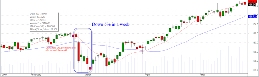
And now, let’s hop in the wayback machine – well, a little ways back.  Shocks happen.  During periods when the market is relatively well behaved as it has been this year, investors get lulled into a sense of well being.  From July 2006 through February 2007, the stock market rose 20%.  Steadily and surely it climbed.  Housing prices had already reached a peak and the growth of corporate profits was slowing. Some market watchers cautioned that fundamentals did not support market valuations. At the end of February 2007, the Chinese government announced steps to curb excessive speculation in the Shanghai stock market (CNN article).  The stocks of Chinese companies tumbled almost 10%, sending shocks through markets around the world.  The U.S. stock market dropped more than 5% in a week.

“Here comes the crash” was the cry from some. The crash didn’t come.  Over the next six months, the market climbed 16%.  Finally, continuing declines in home sales and prices, growing mortgage defaults and poor company earnings began to eat away at the market in October 2007.  Remember, there is still almost a year to the big crash in September and October of 2008.

**************

Next week I’ll put on a different shade of glasses to look at inflation.  Cold air, go back to the North Pole.

Investing, New Orders, Small Business

December 4th, 2013

This will be a mid-week post of various items I thought were interesting.  The private payroll processor ADP is showing private employment growth 215,000, about 15% above expectations.  This weekend, I’ll cover the employment situation and some long term trends.

***************************
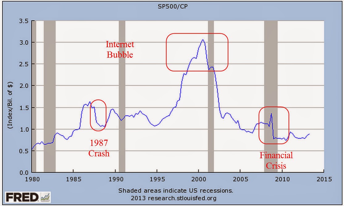
When we buy bonds, we are buying someone’s debt. Really what we are buying is the likelihood that they will pay that debt.  When we buy stocks, we are buying someone’s profits – or the future prospects of those profits.  The S&P500 is an index of the 500 largest domestic corporations.  The BEA tracks the profits of all domestic corporations, not just the 500 largest, before tax adjustments. It is rather interesting to look at the ratio of the SP500 index to corporate profits, in billions.

Using this metric, the exuberance of the internet bubble is striking, far surpassing the housing bubble of the 2000s. It was a time when investment was high in the new digital economy.  The ingenuity of man had finally overcome the business cycle.   The ratio of stock prices to profits didn’t matter because profits were about to go through the roof, man!

Well, it would take a while but eventually profits did go through the roof.  It took a few years.  As a percentage of the nation’s GDP, corporation profits are near 11%.

So pick the story you want to tell.  1) Stocks are undervalued based on historical ratios of prices to profits.  2) Stocks are going to crash because corporate profits are too much a percentage of the economy, an unsustainable situation.  Both narratives are out there in the business press.

*************************************************

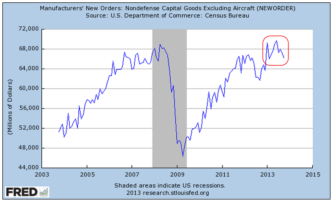
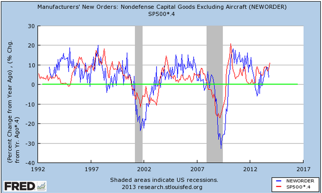
New orders for non-defense capital goods excluding aircraft has been declining of late.

Below is a chart showing the year over year percent gains in new orders and the SP500 index.  There is a loose correlation.  The stock market is usually responding to predictions of future activity as well as political and financial news.   I modified the changes in the SP500 by a little more than half to show the overall trend.

******************************************

In 2012, households finally surpassed 2007 levels of net worth.   In the past five years, household assets have risen by a third, more than $14 trillion dollars. More than half of that increase is the rise in stock asset values. In that same period, liabilities have decreased slightly from the $20 trillion.  All of the decrease and more is in mortgages.  This table shows the unsustainable growth in net worth during the housing boom.

Check out the growth in household debt during the housing boom.  Over 10% per year!  Now look at the growth in Federal debt.  There are only two years where it falls below 5%.  Someone once said something like “What can’t go on forever, won’t”.  How long can a government increase its debt 4x, 5x, 10x the rate of inflation or the rate of economic growth?

***********************************

A short and very informative book on investing by William Bernstein.

Deep Risk: How History Informs Portfolio Design (Investing for Adults)
William Bernstein

*************************************

Words of caution:

“A government big enough to give you everything you want is a government big enough to take from you everything you have.” – Gerald Ford

****************************************

Gallup’s survey of consumer spending in November was the strongest November in 5 years.  On the other hand, early reports of the y-o-y gains in retail spending over the 4 day Thanksgiving weekend indicated a meager 2.3%, barely above inflation.  Same store sales at department stores declined -2.8% in the Thanksgiving/Black Friday week, although they are up 2.5% year over year.  As I wrote about two weeks ago, online shopping is now a significant portion, 20%, of total retail sales.  A more complete feel for the consumer’s mood must include sales on Cyber Monday, the Monday after Thanksgiving.  These showed exceptional gains of 17% over last year’s numbers.

****************************************

ISM’s Manufacturing index was 57.3, the strongest in 2-1/2 years.  I’ll update the CWI after I input today’s numbers from the non-manufacturing report.  I was expecting a slight tapering in the composite.  As we saw a few weeks ago, there has been a positive wavelike action and it appeared as though the economy had hit a crest in October.

****************************************

In 2010, the Census Bureau reported that there were 5.7 million employers (those with payroll, as opposed to sole proprietors), a decrease of 300,000 from the 6 million employers the Census Bureau counted in 2007.  About 5.1 million employers had less than 20 employees and accounted for 14% of the $5 trillion in payroll. Those small to mid-size companies with 20 to 99 employees accounted for another 14% of payroll.  Mega-employers, those with 500 or more employees, paid out about 57% of total payroll in 2010 and constitute a little more than half of private employment.  These large employers naturally have more influence on policy makers in Washington and in state capitols throughout the nation.

 *****************************************

The National Federation of Independent Businesses’ (NFIB) recent monthly survey reported a fairly sharp decline in sentiment among small business owners. A hopeful sign in this report is the improvement in expectations for future sales.  Sentiment was particularly depressed over the shenanigans in Washington and pessimism towards the regulatory environmnent is near all time highs. A blend of small cap stocks has risen about 36% in the past year.  Small cap value stocks have soared 40%.

*****************************************
An interesting historical note from the Social Security administration.  As  preamble, Social Security taxes are collected and put in a “separate” accounting fund before they are immediately “borrowed” for the general spending needs of the Federal government.

 President Roosevelt strenuously objected to any attempt to introduce general revenue funding into the program. His famous quote on the importance of the payroll taxes was: “We put those payroll contributions there so as to give the contributors a legal, moral, and political right to collect their pensions and unemployment benefits. With those taxes in there, no damn politician can ever scrap my social security program.” 

In 1937, the Supreme Court ruled that the Social Security Act was constitutional.  The majority opinion, penned by Justice Cardozo: “The hope behind this statute [the Social Security Act] is to save men and women from the rigors of the poor house as well as from the haunting fear that such a lot awaits them when journey’s end is near.”

**************************************

Quite often, our auto or homeowner’s insurance company changes insurance plans on us.  The insurance company sends us a notice that, due to legislative changes or revised company policy, there is a new codicil to all insurance contracts.  Premiums may go up.  The insurance company’s liability may be reduced. Your old plan is being cancelled and reissued with a “-1A” after the policy number. Some of us may skim read the new changes, most of us shrug and sign the new contract and that is the end of the story.  Imagine the headlines: “MINIMUM DEDUCTIBLE RAISED TO 1% OF HOME’S VALUE.  ALL HOMEOWNERS’ INSURANCE CONTRACTS CANCELLED.”  This is what happens.  The old insurance contract is no longer available.

What is the response when the same thing happens to private health insurance  plans under Obamacare?  “Obamacare Forces over 800,000 in N.J. to change insurance plans” is the bold caption of one news story.  People who are unsympathetic to the new health care law will not make the distinction between “insurance plan” and “insurance carrier.”