Home Sweet Home

September 22nd, 2013

The monthly report of new housing starts was released Wednesday morning, the second day of a much anticipated meeting by Federal Reserve. On an annualized basis, builders started 891,000 homes, a 19% year over year increase. This figure includes both single family homes and apartment buildings. Starts were below expectations and may cause some Fed officials to postpone or soften their quantitative easing program.  (Note:  later that day, the Federal Reserve announced that they would not start tapering their bond buying program, a surprise that spurred a surge upward in the  stock market)

A 19% increase sounds great until we take a birds eye view of housing starts.

The 5 month average of housing starts has been declining since the spring. A decline in the volume of new homes sold is an early warning of recession.  Builders are motivated sellers and respond to changes in demand.  Because builders borrow money, called “bridge” loans, to manage their cash flow they are motivated sellers and respond more readily to changes in demand.


A common metric heard on the nightly news is the months supply of new homes for sale.  This is the inventory of new homes in a particular area.  More months is bad, less months is good but too little inventory puts upward pressure on prices.  New home inventory is low.

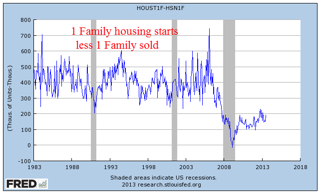
The months supply is a ratio of home sales to starts and can be misleading. The components of housing starts and sales tell another story.  Starts indicate confidence of builders in future home sales in their region. A thirty year graph of new one family homes started less one family homes sold shows a deep underlying caution among builders.  They got burned in this last downturn and are not sticking their necks out.

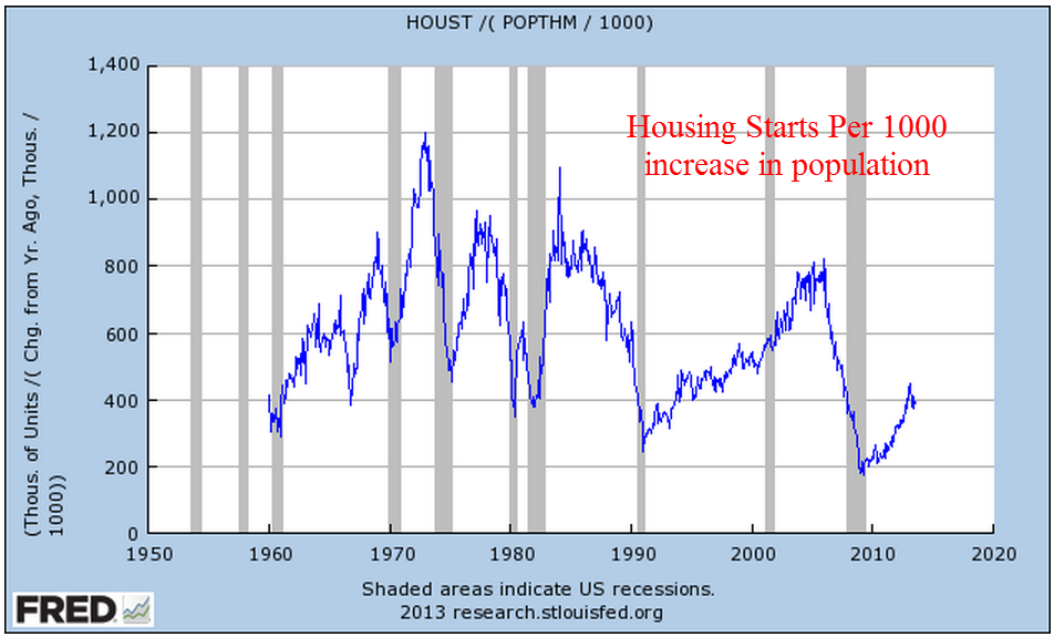
As the population grows, people need to live somewhere.  Below is the number of new privately owned housing starts per 1000 increase in the population.

This graph tells a different story than the usual “too many houses built” narrative.  The height of the 2000s boom was less than the heights of the 1970s and 1980s.  There were not too many houses being built but too many houses being bought by people who could not afford them.  Mortgage companies sold adjustable financing products designed to earn fees when homeowners refinanced every few years to avoid large interest rate increases.  Buyers were enticed by a hop-on-the-gravy-train mentality as housing prices rose dramatically, particularly in low income areas.

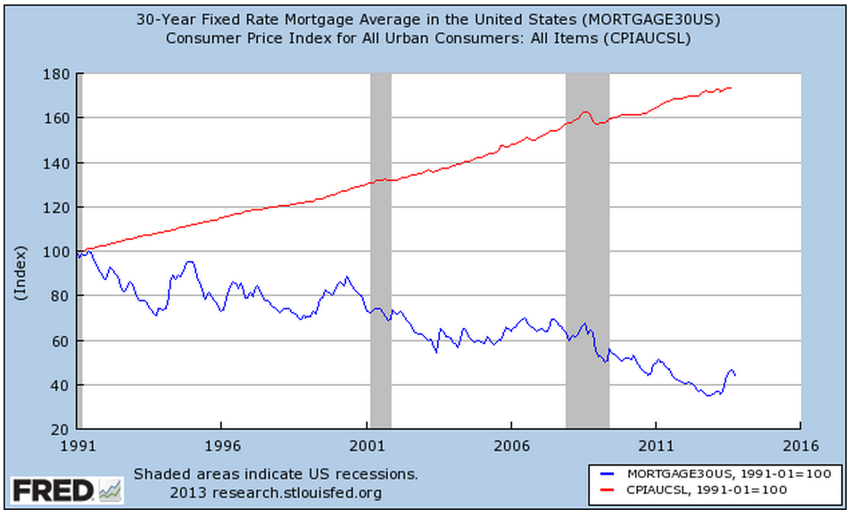
After the 2000 census, the Census Bureau summarized decades long shifts both in the type of housing and the characteristics of homeowners.   While there is a wealth of 2010 census data, I was unable to find a similar table that incorporated data from the recent census.  The Census Bureau notes that privately held housing starts do not include mobile homes, which grew to 7.6% of the housing stock in this country.   So the surge in housing per change in population of the 1970s and 1980s is understated.  This suggests that the new home market is not overbuilt but that people are less able or less willing to commit to owning a home than they were thirty and forty years ago.

Sales of existing homes, released Thursday, showed a recovery high of almost 5.5 million units on an annualized basis.  Realtors reported continuing strong demand in anticipation of rising mortgage rates.  The “churn” of existing homes is not a productive investment in and of itself since the home has already been built.  Sales in this category do generate fees for banks and realtors at the time of sale, and increased sales for Home Depot and remodelers as buyers remodel following the sales or sellers spruce up homes before they put them on the market.

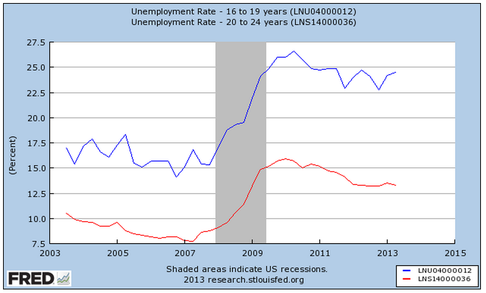
The ratio of new spending per existing home is very small compared to the material and labor involved in building a new home.  The brisk pace of existing home sales does raise the valuation of existing homes, which leads people to feel that they are wealthier, which may induce them to loosen their purse strings.  Rising home values are good for those who own a home but increasing valuations make it that much more difficult for buyers trying to buy their first home.  People in their twenties and early thirties who are most likely to be first home buyers have been hit hard by the recession.

As the economy continues its muddling recovery and home prices rise, does this generation practice a stoic resignation as they look to the future?
Crises

September 16th, 2013

September marks two anniversaries that we wish had not happened.  One of those is the financial crisis and the meltdown of the economy in September 2008.  In the fourth quarter of 2008, GDP fell about $250 billion.  By itself, this was not a disaster.  However, it came on the heels of a decline in the 2nd quarter and flat growth in the 1st quarter.

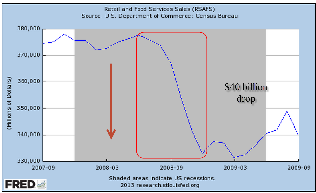
Almost overnight, consumers cut back on their spending.  Retail sales dropped $40 billion, a bit more than 10%.

There was little drop in food sales – people gotta eat.  All of the drop was in retail sales excluding food.

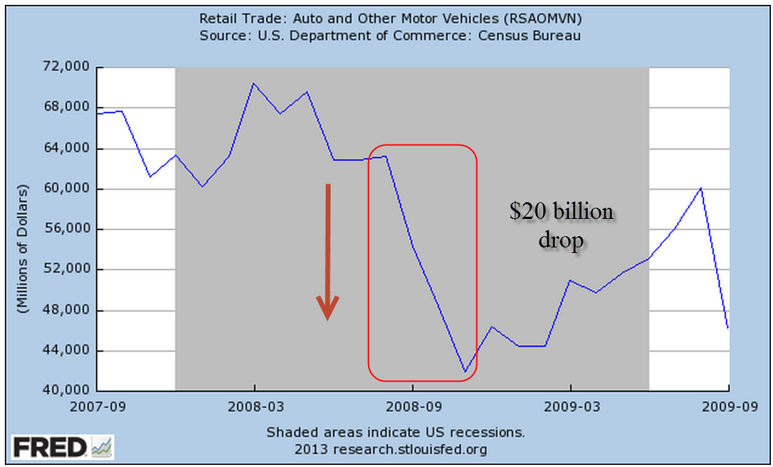
Retail sales are less than 3% of GDP.  Contributing to the GDP decline was the 33% fall in auto sales, about $20 billion.

Offsetting the decline in retail sales, however, total Government spending increased $40 billion in the 4th quarter.

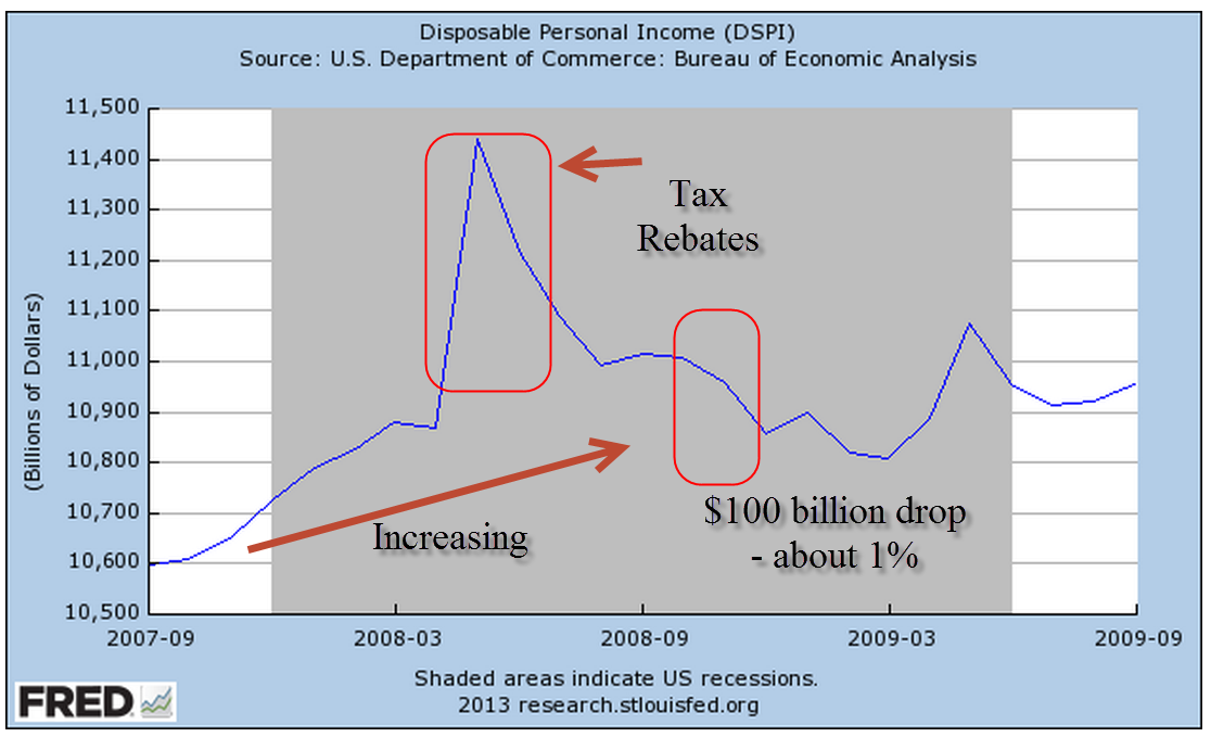
Disposable Personal Income (income after taxes) fell $100 billion, about 1%, but was still on a healthy upward trajectory during the year preceding the crisis.

We routinely import more goods and services than we export.  In the national accounts of domestic production, imports are naturally treated as a negative number, while exports are positive. The difference, called net exports, is negative and reduces GDP.  For all of 2008, we had about the same net exports as 2007.

Gross Private Domestic Investment declined $200 billion or 9% over the year.  This includes investments in buildings, equipment and housing.  Housing accounted for $150 billion of the change.

The TV news media, a visual medium, focuses on crises because it is not well suited for more thoughtful analysis.  On camera interviews in a crisis do not have to be very detailed or accurate.  Viewers understand that it is a crisis.  But viewers are also an impatient bunch with trigger fingers on their remote controls. Video footage has to be loaded, sequenced and edited.  On air interviews and several short video clips run repeatedly during a news hour will have to do.  The recent flooding in Colorado is a reminder that there is only so much video footage available.  TV stations simply reran the same sequences over and over.  On the 9 PM local news, the station featured an on site reporter in front of a driveway heaped full with damaged belongings and furniture.  At 10 PM, a different local station featured their reporter in front of the same house.

In September 2008, the media focused on the financial crisis and the implosion of stock prices.  When the stock market opens up on a September morning 300 points down, what else is there to cover?  It is important to understand that the economy is a big organism with a lot of moving parts.  The housing decline was already two years old before the financial crisis hit in September 2008.

Fast forward to this September.  A day ahead of the ISM Manufacturing report on September 4th came the news that China’s manufacturing sector has strengthened, a positive note in the Asian region where capital outflows from emerging nations have weakened the economies of other nations.  The prospect of higher interest rates in the U.S. has sparked a change in money flows to the U.S., strengthening the dollar against the currencies of emerging countries.  This change in flows promises to put pressure on companies in developed nations who had earlier borrowed money in U.S. dollars to take advantage of low interest rates.  The stream of capital follows the deepest channel.  The combination of risk and reward in each country can largely determine the depth of the channel.  Countries can, by central bank policy or law, control the flows of foreign investment into and out of their country.  China and India exercise some degree of control in an attempt to maintain some stability in their economies.  Like other developed nations, the U.S. has few controls.  In the run up of the housing bubble, foreign flows into the U.S. provided the impetus for investment banks like Goldman Sachs to initiate and bundle many thousands of mortgages into tradable financial products that met the demand by foreign investors.

Manufacturing data in the Eurozone was a big positive with several countries recording their strongest growth in over two years.  The Purchasing Managers Indexes (PMI) are not strong but are showing some expansion, a turn about from the slight contraction or neutral growth of the past two years.   The fragile economic growth of the Eurozone has been exacerbated by the concentration of growth in France and Germany, particularly Germany.  Recent strong gains in some of the peripheral countries, those in the former Communist bloc and southern Europe, suggest that economic activity is becoming more dispersed.  Dramatic differences in the economies of countries that share the same currency make the setting of monetary policy difficult and it is hoped that more even growth will take pressure off central banks in the Eurozone.

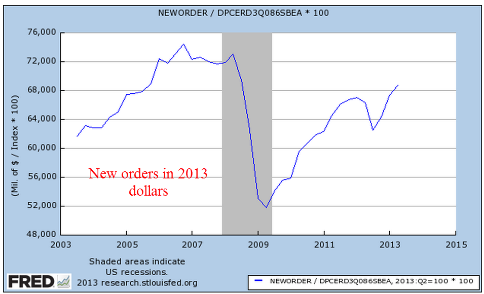
At an overall reading of 55.7, the ISM Manufacturing report released a week ago Tuesday showed even stronger growth than the previous month’s index of 55.4.  50 is the neutral mark that indicates neither expansion or contraction of manufacturing activity.  New orders began a worrisome decline in  the latter part of 2012 that persisted into the spring of this year, and the turnaround of the past few months forecasts a healthy manufacturing sector for the next several months.  Levels above 60 in any of the components of this index indicate robust growth;  both new orders and production are above that mark.

A few days later ISM reported their Non-Manufacturing composite was 58.6, indicating strong expansion in service industries which make up the bulk of the economy.  The Business Activity index came in at a robust 62.2.  ISM also reported that their figures for June had an incorrect seasonal adjustment.  The New Orders Index for June was revised up a significant 2%.  Prices were revised up 4.3%.  Other changes were relatively insignificant.

The constant weighted index I have been tracking smooths the ISM data so that it responds less strongly to one month’s data but it is showing strong upward movement in both manufacturing and non-manufacturing.

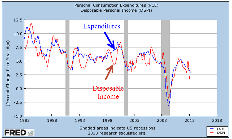
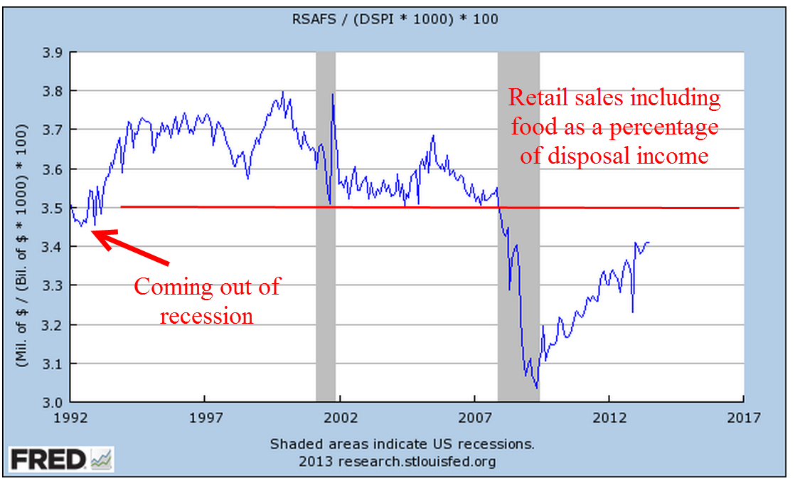
The Commerce Dept reported last Friday that Retail Sales continue to grow at a modest pace.  However, let’s look at retail sales as a percent of disposable income.  Consumers are still cautious.

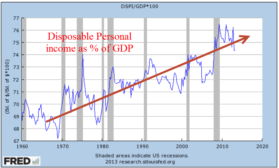
Speaking of disposable income.  As we import more and export less, disposable income as a percent of GDP continues to rise.  This percentage rises sharply at the onset of recessions.  It is a bit troublesome that the 40 year trend is rising.

Labor Patterns

September 8th, 2013

On Thursday, the payroll firm ADP released their estimate of monthly growth of private payrolls, showing a net job gain of 178,000.  The weekly report of new unemployment claims was also a positive, a steady decline that indicated that the labor market is healing – but slowly.  On Wednesday, the National Federation of Independent Businesses issued their monthly survey of small businesses. For the fourth month in a row employment growth has been negative.  Slowing layoffs have contributed to the decline in unemployment claims, but new hiring has also slowed.  What to make of that?  The market paused on Thursday in advance of Friday’s release of the BLS employment report.   Caution mixed with confidence – sounds like a weather report.  But there was hope that BLS job gains might approach the 200,000 mark.

The BLS composite picture of employment in August was a both a jaw dropper and a head scratcher, two actions which are difficult to do at the same time.  The headline number of 169,000 net job gains was disappointing, but the revisions to July’s job gains was a huge slash – from 162,000 as reported last month to a meager 104,000.  About a 150,000 net job gains are needed each month to keep up with population growth.

In a tumultuous job market when the flows of people within the labor market are undergoing a lot of change, downward revisions of this size are understandable.  In a supposedly stabilizing labor market, such revisions hint at an underlying fragility.

Is this large downward revision typical of the summer months?  In September 2012 the BLS reported upward revisions of over 80,000 jobs for June and July.  This year, revisions are down almost that amount so these wild swings may be typical.  Businesses may neglect to return the BLS survey on time because they are down at the lake 🙂 In perspective, a revision of 70 – 80,000 jobs is an insignificant percentage of the total working force of over 136 million.  But there is no doubt that it affects the mood of investors.

Once again, the usual industries contributed the most to employment gains:  professional and business services, retail and drinking establishments and health care workers.  I’ll look at some disturbing long term patterns later on in this blog post.

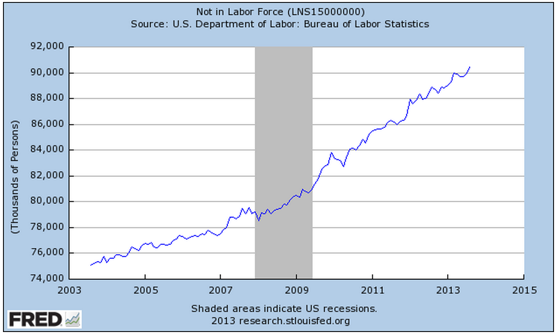
The unemployment rate dropped 1/10th percent to 7.3% but the decline is more a matter of attrition than strength in the labor market. Retirees and others continue to leave the labor force.

A bright note in this month’s report is the decline in the number of involuntary part-timers, those people who are working part time but want and can’t find a full time job.

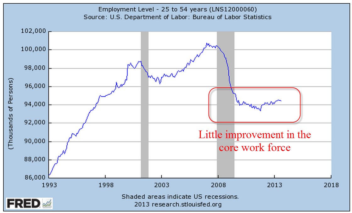
The core work force aged 25 – 54 shows little improvement.

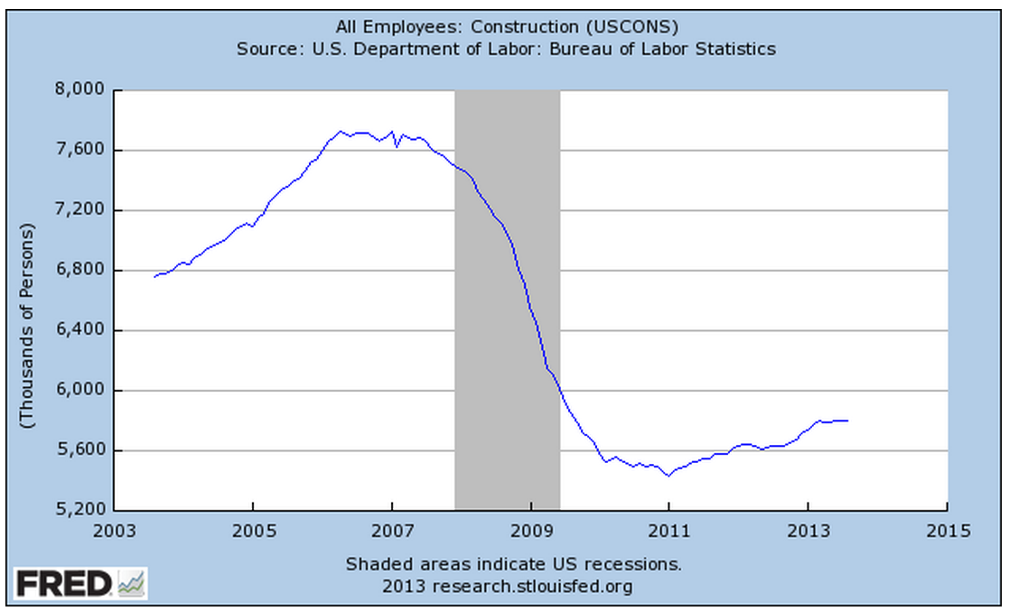
Gains in construction employment have moderated recently.

Government employment at the local level is providing a slight boost to the employment gains.  Yearly changes in Federal employment continue to show a decline.

As the economy increasingly focuses on services, employees in those industries have become a greater percent of total workers.

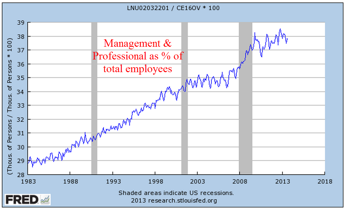
Let’s take a look at the labor mix, or the percent of some occupations of workers to the total work force.  During the past thirty years, the ratio of management and professional workers has increased by approximately a third.

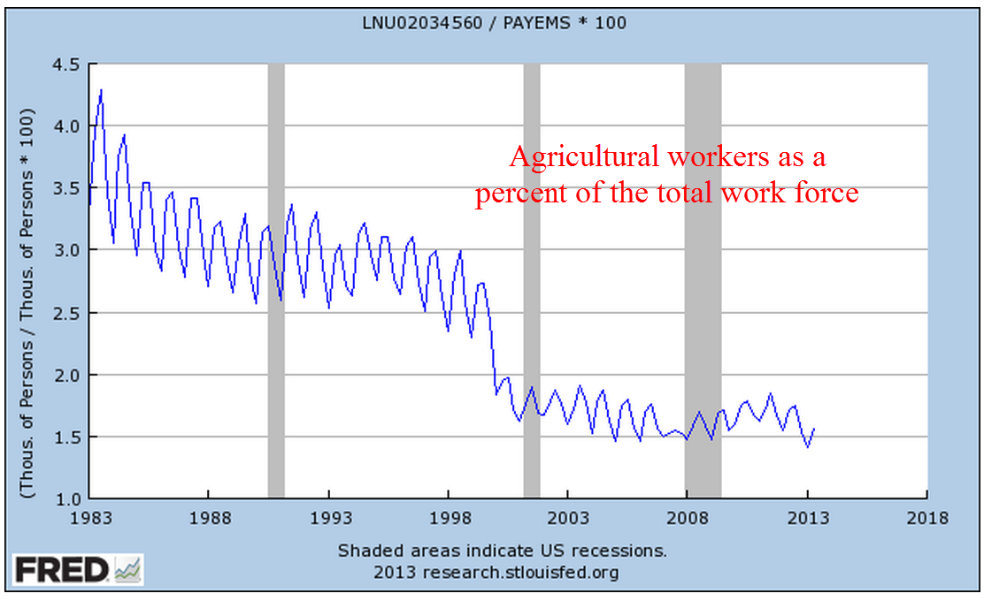
In the early decades of the 20th century, agricultural workers made up about 45% of the work force.  In the first decades of the 21st century, they have declined to less than 2% of the work force.

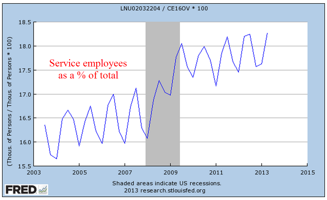
A decline in manufacturing and construction has caused a gear shift in the components of the labor force.  Service occupations as a percent of the work force have risen steadily.

The conventional narrative says that this has been a natural long term shift from manufacturing to service.  But a longer term perspective calls that into question and shows that we are returning and surpassing – this is not new – to a more service oriented labor force.

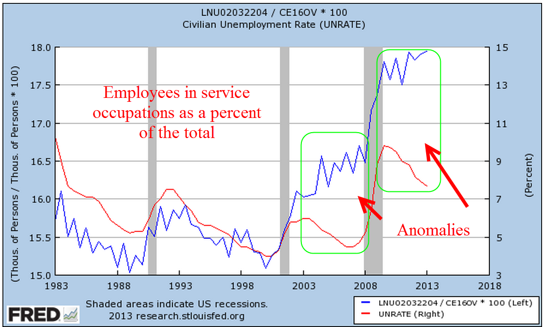
The BLS does not have data before 1983 for this composite of service occupations but the trend indicates that the labor market is much healthier when service occupations are less than about 16.5% of total workers.  I’ll call this the Service Occupation Ratio, or SOR.  Let’s now look at this thirty year trend and add the unemployment rate.

Until the housing bubble of the early 2000s, the unemployment rate followed increases and declines in the SOR.  Largely fed by robust employment related to housing, the unemployment rate parted company with the trend line of the SOR.  As the recession sparked large job losses, the unemployment rate snapped back into trend with the SOR.  Since the recovery, declines in the unemployment rate have not been accompanied by a decline in the SOR.

The trend patterns are even more closely aligned when we look at the wider unemployment rate that includes those who want full time work but can’t find it and discouraged job seekers – or the U-6 rate.

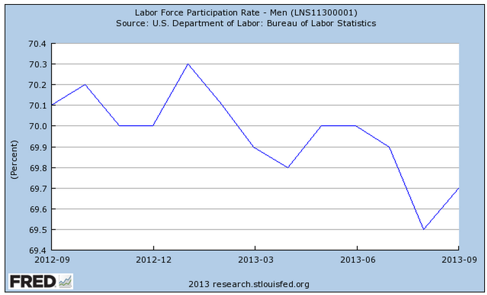
How long will this imbalance last?  In the early 2000s, the imbalance lasted about five years.  This current imbalance is about three years old, meaning that we may have a few years before the unemployment rate returns to the SOR trend line.  What is particularly worrisome is the degree of imbalance.  As the unemployment rate drops further away from the SOR trend line, as it did in the early 2000s, it signifies greater tension between these two labor “plates.”  Like the movement of land mass tectonic plates, the greater the tension, the more severe the “snap back” to trend.  We see the same pattern developing in these past few years.  A lower participation rate and more people working part time out of necessity have contributed to a decline in the unemployment rate but the SOR has plateaued.

History is a river; history repeats itself; pick your aphorism.  An old Chinese maxim says that a man never crosses the same river twice.  History does not repeat itself exactly so that it is unlikely that the current anomaly will resolve itself in the same way as it did in 2008.  We can hope that the SOR starts to decline, indicating a healthier labor market.  These anomalies can take years to develop but we may find that the correction is as abrupt as 2008.

Each month starts off with a wealth of data. Next week I’ll cover industrial production, retail sales and an update of the CWI composite of manufacturing and non-manufacturing data that I have been charting the past few months.

Labor and Money Flows

September 1st, 2013

On this Labor Day weekend, I’ll review some things that caught my attention this past week.

The employment picture has shown steady but slow improvement.  The weekly survey of new unemployment claims continues to show downward movement.  In a survey that is about 13 years old, called the JOLTS, the BLS gathers data on Job Openings, Layoffs and Turnovers.  A component of this survey includes the number of employees who have quit their jobs, referred to as the “JOLTS quit rate.” In the aggregate, it indicates a hive intelligence, the estimation of millions of people about the prospects of getting another job.  Decades ago, researchers asked a number of people to estimate the number of jelly beans in a jar.  Each estimate has very small chances of getting close to the actual number, but the average of all estimates was found to be almost exactly the number of jelly beans in the jar.  I don’t know whether this experiment has been replicated but it is interesting.

After recent months of surging new orders for durable goods, July’s report, released Monday, showed signs of caution and a “return to the mean” of a positive upswing this year.

Although this past month’s data was negative, industrial production shows a clear uptrend.

In an analysis released a few months ago, the Federal Reserve examined data from the 2010 triennial (every 3 years) survey of households and estimated that inflation adjusted net worth per household (green line in the graph) has just climbed back to the level it was almost ten years ago.


On the positive side, average net worth is not less than it was ten years ago.  On the negative side for those nearing retirement, it is not more that it was ten years ago.

On Friday, the Personal Consumption and Expenditures (PCE) report showed a 1.4% year over year percent gain, indicating the tepid growth in household spending.  Below I’ve charted the percent gain in PCE vs the percent gain in GDP for the past thirty years.

We are still below the low points of the 1980s, 1990s and early 2000s.  The Federal Reserve is projecting GDP growth of 3 – 3.5% in 2014 but this may be another in a string of rosy forecasts by the Fed, who have repeatedly revised earlier rosy forecasts.  If the Fed were a contractor, it would be out of business due to poor estimating.  A $16 trillion economy is not a kitchen remodel by any means, but it does illustrate how difficult it is for the best minds to make even short term predictions of the economy from the vast amounts of sometimes conflicting data.  Consider then the folly of the Government Accountability Office (GAO), the economic watchdog created by Congress and mandated by Congress to come up with ten year estimates of economic growth and the consequences of existing and proposed legislation.  Those in Congress continue to trot out these fantasy numbers to support or criticize policy and legislation.

Washington continues to vacuum in money and talent from the rest of the country.  Of the richest counties in per capita income in the U.S., the Washington metro area has two of the top three.  The other county in the top three is a stone’s throw from the metro area.  As Washington politicians convince the rest of us that they have the solutions, lobbyists and graduates flock to the concentration of power, jobs, money and influence.
 
Bond yields have increased more than 1% since the spring, meaning that the prices of the bonds themselves have fallen dramatically.  Most of this change has been a reaction to forecasts for stronger growth and a tapering of the Fed’s stimulus program called Quantitative Easing.  Washington is sure to get in the way of stronger growth for the economy as a whole.  Policy out of Washington is designed to promote strong economic growth for Washington.

The market research firm Trim Tabs regularly monitors money flows into and out of the stock and bond markets.  They  reported today that outflows from the stock market in August were half of the record inflows in July.

The blood spilled this year has been in the bond market.  Trim Tabs reports that outflows from bond funds and ETFs have totalled more than $123 billion in the past three months.  Flows into bond funds and ETFs were about $750 billion in 2012, almost a doubling from the $400 billion invested in 2011. (Fed Flow of Funds tables F.120, F.121)

While the prospect of higher rates may have been the trigger that caused a reversal of bond inflows, the underlying current is also an overdue correction of the surge of investment in bonds in 2012.

Households continue to shed debt in one form or another so that total liabilities continue to decline. However, every man, woman and child in this country is carrying, on an inflation adjusted basis, 2-1/2 times the amount of debt they carried thirty years ago.  This level of household liability will continue to put downward pressure on growth.

This next week will kick off with the ISM manufacturing report on Tuesday and finish the week with the monthly employment report.  Year over year percent gains in employment have been steady and guesstimates are for maybe 200,000 net job gains.  150,000 net jobs are needed to keep up with population growth.

The Fed meeting is coming up in mid-September so this employment report will be watched closely to guess the next steps the Fed will take. 

Productivity

August 25th, 2013

(First a little housekeeping: an anonymous reader commented that when they clicked the “back” button after viewing a larger sized graph they were returned to the beginning of the blog post instead of where they had left off when they clicked on the smaller image within the text.  I suggest that, after viewing a graph, try clicking the ‘X’ button on the top right of the graph page to return to where you left off.   This works in the Chrome browser.)

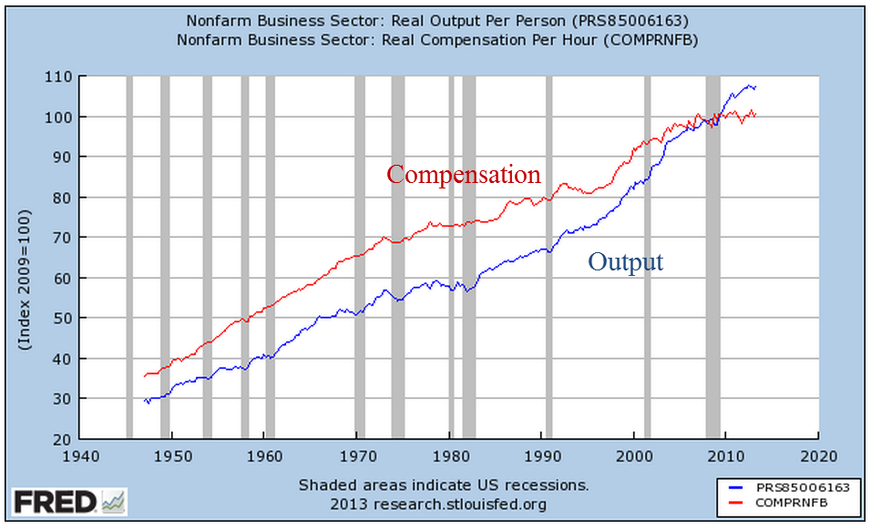
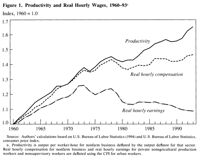
Since the onset of the recession in late 2007, I have read many articles on the lack of wage growth despite big gains in productivity.  Ideas become popular when they have a narrative, one that I took for granted.  Each quarter, the Bureau of Labor Statistics (BLS) issues a report on productivity and labor costs that I have taken at face value.

The 2001 manual of the OECD manual states “Productivity is commonly defined as a ratio of a volume measure of output to a volume measure of input use.”  They frankly admit that “while there is no disagreement on this general notion, a look at the productivity literature and its various applications reveals very quickly that there is neither a unique purpose for, nor a single measure of, productivity.” (Source)

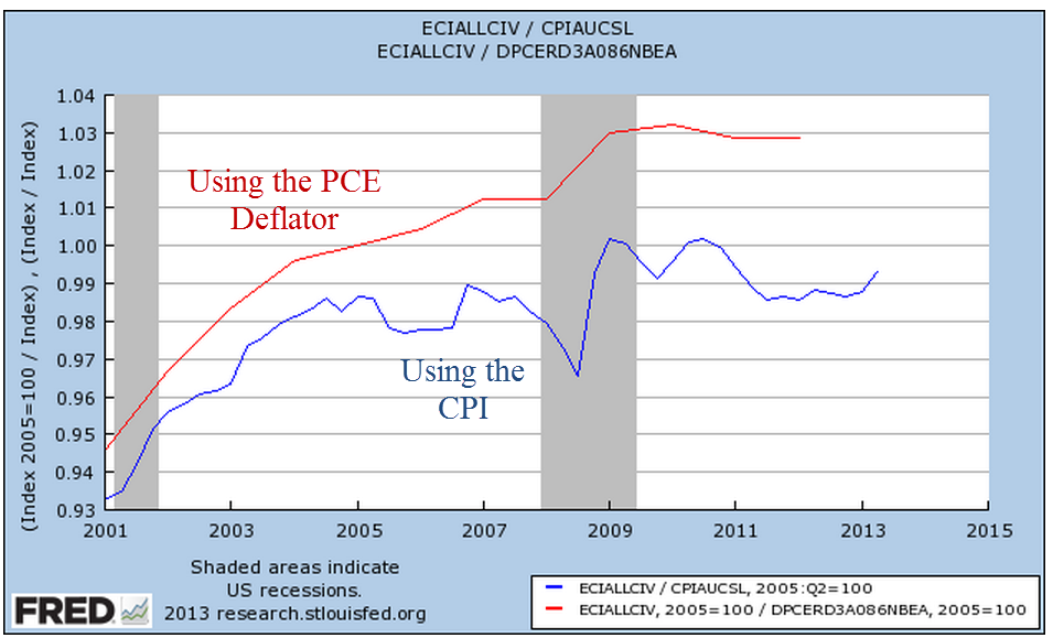
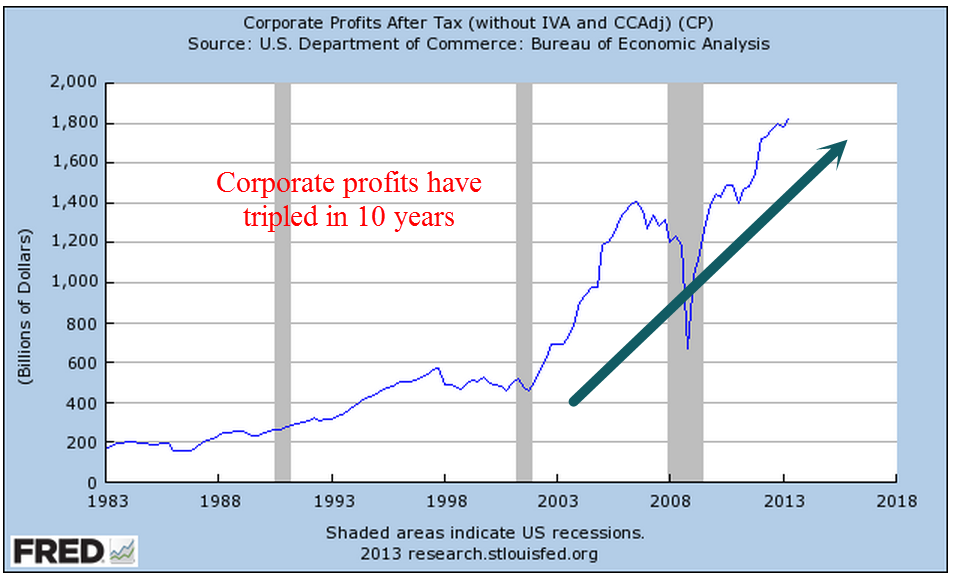
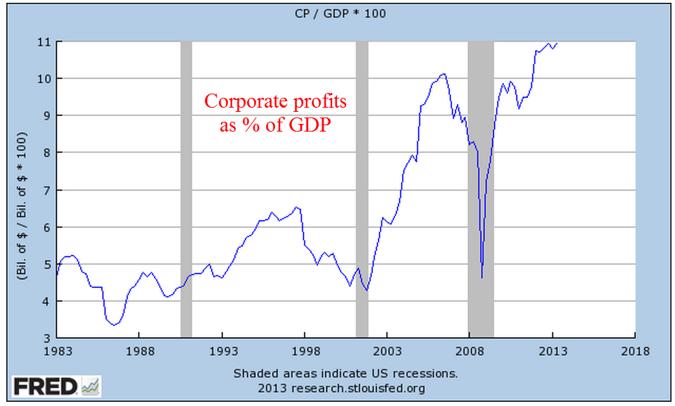
The authors of a recent paper at the Economics Policy Institute cite BLS data showing that productivity has grown “by nearly 25 percent” in the period 2000 – 2012 while the median real, that is inflation adjusted, earnings for all workers has essentially remained flat.   Company profits are at all time highs and workers are struggling.  The narrative is familiar but I wondered: how does the BLS calculate productivity growth?

What the “headline” productivity numbers describe is labor productivity, the output in dollars divided by the number of hours worked.  The BLS Handbook of Methods, page 92, gives a detailed description of its methodology.  As the BLS notes, this often cited productivity figure disregards capital investments in output like machinery and buildings.  For this reason, the BLS also calculates a less publicized multifactor  productivity measure using methodologies which do incorporate capital spending.  How does capital investment influence the productivity of a worker?

Consider the simple case of a man – I’ll call him Sam – with a handsaw who can make 20 cuts in a 2×4 piece of lumber in an hour.  His company charges customers a $1 for each cut, the going rate, so that the company can sell Sam’s labor for $20 per hour. Due to increased demand for wood cutting, the company invests $1000 to buy an electric chop saw.  The company calculates that Sam’s productivity will rise enough that they can undercut their competition and charge 75 cents a cut.  With the chop saw, Sam can now make 60 cuts per hour at .75 per cut = $45 dollars in revenue per hour to the company.  Sam’s labor productivity has now risen 150%.  In our simple case, this would be the headline labor productivity gain – 150%.

A more complete measure of productivity including capital investments is quite complex.  The latest edition of the OECD handbook notes that “there is a central practical problem to capital measurement that raises many empirical issues – how to value stocks and flows of capital in the absence of (observable) economic transactions.”  To illustrate the point further, the asset subgroup listed in the BLS handbook includes “28 types of equipment, 22 types of nonresidential structures, 9 types of residential structures (owner-occupied housing is excluded), 3 types of inventories (by stage of processing), and land.”

You want simple?  Let’s go back to our kindergarten example.  At this rate of production, let’s say that the saw’s useful life is only 10 months.  The company has an investment of $100 per month in the saw, plus additional costs like electricity, a bigger workbench, etc.  To round out the numbers, let’s say that equipment related costs are $150 a month.  If Sam’s output is 8 hours a day x $45 an hour, Sam is producing $360 per day in revenue for the company, or close to $8000 a month. The $150 a month in equipment costs is trivial and multi-factor productivity is very close to labor productivity.

Sam knows he is making much more money from the company and goes to his boss and says he wants a raise.  Not only is he producing more for the company but the electric saw is much more dangerous than a handsaw.  The company gives Sam a raise from $7 an hour to $8 an hour, an almost 15% increase that Sam is happy with.  In addition to the raise, the company has an additional $2 in mandated labor costs, bringing the total costs for Sam’s labor to $10 an hour.  Even with the higher labor costs, the company is raking in huge profits – $35 an hour – from Sam’s labor.

But now an inspector comes in and tells the company that, because an electric saw makes much more dust than a handsaw, the company will have to install a ventilation and filtering system so that the employees and neighbors won’t have to breathe sawdust.  The company gets bids that average $100,000 to install this system and the company estimates that the system will equal $1000 a month in additional capital costs.  Despite the additional costs, the company still continues to make substantial profits from Sam’s labor.  To the company, the capital costs for this new system represents about 60% of an additional worker’s labor costs, yet that additional cost is largely not included in measuring labor productivity because Sam’s hours and the revenue generated by Sam’s labor remain the same.

A multifactor productivity comparison of handsaw vs. chopsaw production would show a percentage growth of 40%, far below the 150% labor productivity growth.

All of us have our biases (except my readers who are perfectly rational beings) which cause us to look no further than the narrative that clearly supports our previous conceptions.  If we generally agree with the narrative of companies taking advantage of workers, we read of 25% productivity gains for companies and 0% gains for workers in the past twelve years, and we look no further – for the data has confirmed what we previously had concluded.  Big companies = bastards; workers = victims.

In June 2013, the BLS released revisions to their productivity figures for 2012 and included historical productivity gains for various periods since 1987.  During the past 25 years, multifactorial productivity, including capital investment, has averaged .9% per year – less than 1%.

While labor productivity has grown 25% since 2000, multifactorial productivity has been half that, at about 12%.   Dragging the 25 year average down is a meager .5% growth rate since 2007.  Even more striking is the growth rate of input into that recent tepid productivity growth; the BLS calculates 0% net input growth since 2007.  For the past 25 years, capital investment has grown at more than 3% but since the recession capital growth has slowed to 1.3% per year.  I wrote last week that there is an underlying caution among business owners and this further confirms that caution; companies have been cutting back on both labor and capital investment.

If multifactorial productivity rose by 12+ percent over the past 12 years, and the profits did not go to workers, where did the money go?  For a part of the puzzle, let’s look to inflation adjusted dividends of the SP500.

From the beginning of 2000 through 2007, when the recession began, inflation adjusted dividends grew at an annual rate of almost 3.8%, eating up most of the profits from productivity growth.  As bond yields continued to decline, I would guess that investors pressured companies for more of a share of the profits from productivity growth.

As workers lost manufacturing jobs during the 2000s, many were able to switch to construction jobs in the overheating real estate market and unemployment stayed low.  This should have pressured management to give into labor demands for an increased share of the productivity growth but it didn’t.  I suspect that the labor mix contributed to the lack of pressure on management.  Fewer manufacturing jobs meant fewer union jobs; a reduced labor union influence meant less demand on management.

Looking past the headline labor productivity gains, overall productivity is slow.  Capital and labor investment is slow, which means that future overall productivity is likely to remain slow.

While walking a trail in the Colorado Rockies years ago, my brothers and I complained about having to dodge moose poop on the trail.  Then we ran into the bull moose that made the poop.

Investment, Savings and Income

August 18th, 2013

Gross Private Domestic Investment (GPDI) consists of capital spending on factories and equipment, improvements in rental properties, and changes in inventory.  Changes in GPDI reflect expectations by the business community.  Companies and landlords continue to increase investment after the precipitous fall of 2008.  Below is the long term view.

Let’s zoom in on the past five years to show some comparisons.  In 2010 there was a slight decline in investment.  In 2011 and 2012 came short periods of a levelling off of investment.  So far this year, the trend is upward.

l

Declines in investment accompany recessions but do not consistently precede recessions.  However, declines in the year over year (y-o-y) percent change do signal an aggregate caution among businesses.  The attentive investor would do well to notice these signals.  Investment growth remains positive.

Percentage changes in investment and the market loosely track each other, as we can see below.  Both investment and the market ride on anticipation of future business conditions but the market reacts and overreacts much more than investment. I dampened the percent change of the market to show a bit more clearly both the correlation and the divergences.

The y-o-y gain in investment has been positive since the latter part of 2009, indicating that business owners and managers have enough confidence in future business to increase their investment. A key component of the business landscape is the willingness of consumers to buy.  This past Tuesday came the monthly report on Retail Sales showing a .2% monthly gain for total retail sales, including food services.  At an annualized growth rate of 2.4%, sales  are positive but annualized gains of 3% or more would indicate strong consumer demand.  So far this year, earlier forecasts of negative real retail sales growth in response to sequestration policies have proved unfounded.  Below I’ve excluded the food services component which accounts for approximately 10% of retail sales.

When we look at retail sales as a percent of GDP, the total economic activity of the country, retail sales excluding food is still below 20 year averages.

Adjusting for inflation and population, we can see that it is food services that continues to show strong growth over a two decade period.  While the recession put a dent in that growth, it is more than 25% higher than it was two decades ago.

Each month the U. Of Michigan releases a consumer sentiment survey.  This past Friday’s report showed a surprising fall in sentiment from 85 to 80.

In the U.S. we can take a rough reading of the willingness of consumers to spend by looking at savings patterns – we don’t save as much.

We are down below a 5% savings rate again, indicating that people are confident enough to spend most of their income.  That is one reading.  Another is that many households have responded to the increase in the Social Security tax this year by reducing their savings.  The lack of savings by Americans has a long history.  Before the Social Security Act was passed in the 1930s, George Washington Carver wrote: “We have become ninety-nine percent money mad. The method of living at home modestly and within our income, laying a little by systematically for the proverbial rainy day which is due to come, can almost be listed among the lost arts. ”  Perhaps that is why some felt that Americans had to be put on a mandatory retirement program called Social Security.

The upward spike in savings at the end of 2012 has been attributed to higher dividend payouts and bonuses in anticipation of the “Fiscal Cliff” in 2013.  Per capita Disposable Personal Income continues its subdued but steady march upward, also rising dramatically in the last part of 2012 as a one time anomaly before the onset of higher taxes and sequestration.

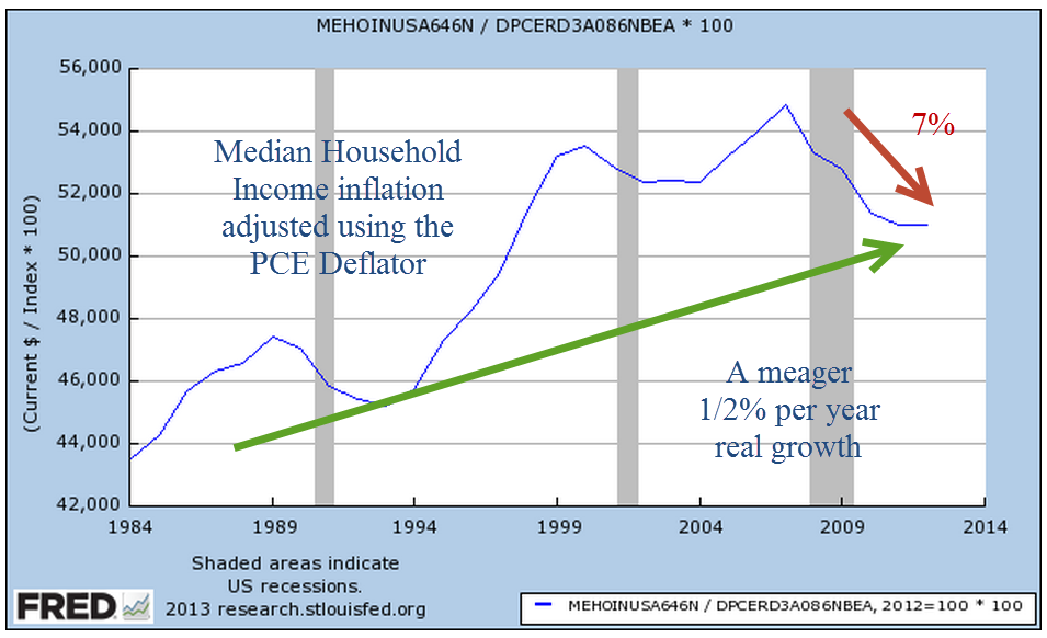
On an inflation-adjusted basis, we are 10% higher than we were ten years ago.

But a longer term picture is a bit more sobering.  The decades longs rising trend of real income has clearly plateaued since the recession began at the end of 2007, over five years ago.

The recession has been a sobering experience for everyone, including the business community. While the growth signs are mildly positive, an underlying watchfulness seems to be the order of the day.

Price Dividend and CWI

August 11th, 2013

Last week I wrote about viewing trends in the market through the lens of hard cold cash; that is, the dividends paid by the companies in the SP500.  Today, I’ll revisit that subject in a bit more depth.  Beginning in the last quarter of 2008, reported earnings of companies in the SP500 dropped precipitously, plunging about 90% in the first two quarters of 2009.

The portion of those earnings paid as dividends fell 24% from peak to trough, far less than earnings.

Robert Shiller, a Yale economist and co-developer of the Case-Shiller housing index, uses a smoothing technique for calculating a Price Earnings ratio and graciously makes his data available.  He calculates the 10 year average of real, or inflation-adjusted, earnings and divides the inflation adjusted price of the SP500 by that average.  Because of the low inflation environment for most of the past decade, the difference between the two earnings figures, nominal and real, is slight.

The drop in corporate earnings was extreme, more so than any recession, including the Great Depression of the 1930s.   In the 2001 recession, earnings declined to about half of their prerecession peak.  In the recession of the early nineties, it was about 30%.  In the back to back recessions of the early 1980s, corporate earnings fell about 25%.

While Shiller’s method evens out earnings, it has one drawback, one that no one could have foreseen until 2008 simply because it had never occurred.  The severity of the decline in earnings skewed the ten year average of earnings down over the 2002 – 2012 period.  Since the earnings average is the divisor in the Shiller P/E ratio, it correspondingly makes the ratio of the price of stocks a bit higher than it might otherwise be.

For that reason, I’ll look at a less volatile ten year average of dividends; that is, the inflation adjusted price of the SP500 divided by the ten year average of inflation adjusted dividends.

Today’s market prices are at the twenty year average of the real price dividend ratio, which is about 61.  For a number of factors, market prices as measured by this dividend ratio are higher for the past twenty years than the thirty year average of 51.  The tech and real estate bubbles over-inflated prices but investors have been willing to pay more for stocks as bond yields have declined steadily from their nosebleed levels of thirty years ago.

Let’s crank up the time machine and go back a year.  Here are a few quotes from an October 13, 2012 Reuters article after the market had dropped about 2%:

“Central bank-fueled gains took markets within reach of five year highs in September, but now U.S. stock market participants are shifting their focus back to corporate outlooks, and the picture is not pretty.”

The article quoted the director of investment strategy at E-Trade Financial, Michael Loewengart: “The overall tone is so pessimistic that we may see some upside surprises, but we could still suffer considerable losses if the news is bad.”

“Profits of SP500 companies are seen dropping 3% this quarter from a year ago, the first decline in three years”

It was close to being almost the end of the world.  As you read various comments in the news, keep in mind that these remarks are coming from active traders who see a 5% drop as catastrophic if they have not anticipated it through options and other hedging strategies.  For longer term investors, a 5% drop after a 5% rise over several months is more yawn provoking than cataclysmic.

Through the middle of November 2012, the market would drop another 5%.  Slowing corporate profits and the looming – yes, looming – fiscal cliff spooked investors.  Then, on the hopes that the Fed would do something to offset these negatives, the market regained the 5% lost in the previous month.  In mid-December, the Fed announced that it would double its bond purchasing program and the market has been rising since, gaining 20%.  Has this been a new bubble, one we’ll call the “Fed Bubble?”  Some say yes, some say no.

As we read the daily news, let’s keep in mind that in ten years we will have forgotten most of it.  Some fears will seem silly, some may seem prescient.  Each day there are many predictions, some like this one from December 30, 2001: “By the year 2003, there will be 2 types of businesses, those doing business on the internet and those out of business.” (Sorry, I didn’t write down the attribution).  Some predictions will seem rather silly like the one in March 2009 that the SP500 would be below 500 in a month.

Farmers and businessmen in ancient Rome consulted soothsayers who threw chicken bones and read the pattern in the bones to tell their clients whether there would be rains in the spring and how hot the summer would be.  Sometimes they were right, sometimes they were wrong.

Each day the market goes up – or it goes down.  For the past twenty years it has gone up 54% of the time, down 46% of the time.  Going up seems like an odds on favorite but this is complicated by the fact that the market usually goes down faster than it goes up.  There is also a well documented behavioral phenomenon of risk aversion; people respond more emotionally to loss than we do to gains.

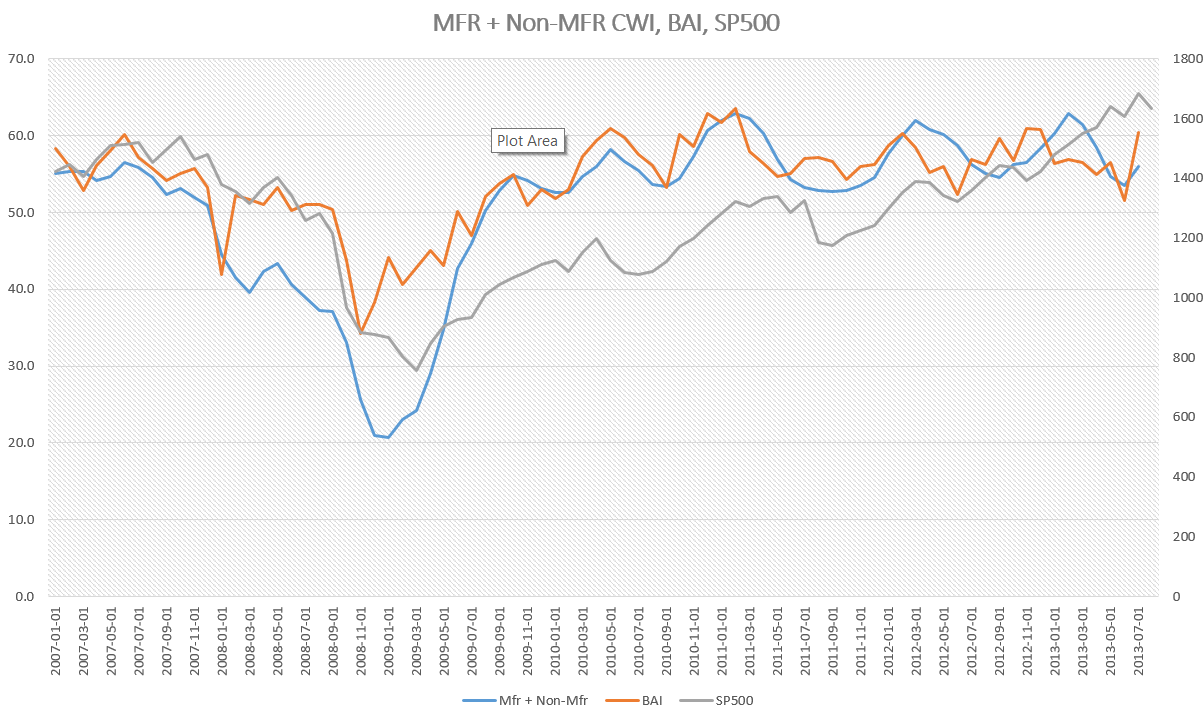
This past Monday came the release of the ISM monthly survey of Non-Manufacturing businesses.  Like the manufacturing survey released a few days earlier, this index also surged upward in July, a welcome relief after the declining numbers in June.  I’ve updated the composite CWI that I introduced a while back and compared it to the SP500 and the Business Activity Index of the Non-Manufacturing Survey.

This composite index is weighted 70% to non-manufacturing, 30% to manfacturing.  Because this CWI relies on past months’ activity as a predictor of future conditions, it responds with less volatility to a one month surge in survey data.  As we can see, the tepid growth that began appearing this past spring is still showing in this index, although it is a strong 55.5, indicating sure footed, if not surging, growth.  It has been above the neutral mark of 50 since August 2009.

The Price is Right?

August 4th, 2013

First week of the month and several good monthly reports helped propel the SP500 through the 1700 mark this week, making an all time high.  Last week I wrote that the market would be cautious and the first few trading days of the week was exactly that, drifting sideways.  On Thursday the release of a suprisingly strong ISM Manufacturing report gave an upward jolt to the market.  In several recent blogs on the ISM and an alternative composite called the CWI, we could see that manufacturing has been sliding toward the neutral mark of 50 for the past several months.  On Monday, the ISM non-manufacturing index will be released and next week I hope to update the CWI.

Ultimately, the market rides up or down on the anticipation of future earnings.  However, earnings can be “managed,” to put it politely.  Further confusing the earnings picture for a casual investor are the several different types of earnings: operating, pro-forma and GAAP to mention a few.  There are two types of “future”, or projected, earnings: bottom up and top down.

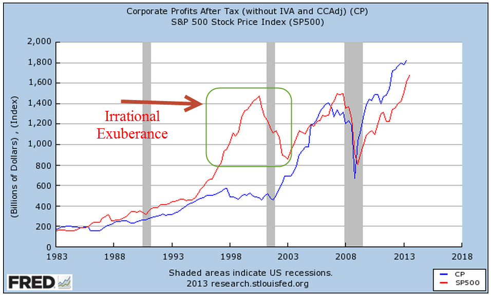
A simpler approach that some investors use is to calculate the Price Dividend ratio.  There is no fudging of cash dividends to investors.  Robert Shiller, author of  the 2005 book “Irrational Exuberance”, updates the data used in his book.   These include the SP500 index, earnings, dividends, the CPI and a Price Earnings ratio that is based on the past ten years of earnings.  The current ratio of 23.80 is lower than the 2006 ratios which were in the high twenties.

But let’s look at the Price Dividend, or PD, ratio.  For the past ten years that ratio has averaged a bit less than 52, meaning that investors have been willing to pay almost 52 times the amount of the dividend to own the stock.  As of June 30th, the PD ratio stood at a bit more than 48, which means that stocks were a bit cheaper than average at this date.  Since then the market has gone up about 6% so that the PD ratio is now about 51, or just about average.

As the market makes new highs, investors are prone to ask themselves if the price they are paying for stocks is too high.  The long term investor might take a different perspective and ask themselves, “How will I feel in ten years if I continued to put money into the stock market now?”  Ten years from now, in the year 2023, the answer will be “Well, I didn’t get a deal and I didn’t overpay based on the information available at the time.  I paid about average.”

McGraw-Hill, the publisher of the SP500 market index, also keeps an index of dividends.

Dividend growth has plateaued and is about a third of earnings, which means that companies are paying a third of their earnings back to investors in the form of dividends.  This is just slightly more than the median for the past ten years.

There was a lot of data to digest in this past week.  The GDP estimates for the 2nd quarter was a sluggish 1.7%, more than the expectation of 1.1%.  But – always that but – the 1st quarter GDP growth was revised down from 1.7% to 1.1%.

On Thursday, the same day as the ISM manufacturing report, came the monthly report on auto sales.  Total sales of light weight vehicles, which includes cars and pickups, increased about 4% this past month to an annualized amount of 16 million vehicles.

When we look at auto sales on a per capita basis, auto sales are still below 5% of the population, a level that would show me that consumer demand and the construction industry (pickup trucks) is healthy.  As we can see from the chart below, the sale of autos stayed consistently above that 5% level for more than 20 years – until the last recession began.

Employment in the production of motor vehicles and related parts is very  weak.

Although vehicle sales includes both imports and domestics, I wanted to see how many autos are sold per person employed in automotive production.  Advances in manufacturing and the mix of import and domestically made vehicles have impacted employment.

And with that, I’ll look briefly at the Employment Report for July released this past Friday.  On Wednesday, ADP reported 200,000 private jobs gained, giving a brief upward impetus to the market.  As I noted last week, caution would be the watchword of this week and that caution showed in later trading on Wednesday.  The ADP report did give some hope that the BLS employment report would show an approximate gain of that many jobs.  Instead, the employment gains from the BLS were disappointing, at 162,000.   A further disappointment were the small downward revisons in May and June’s employment gains, totalling -26,000.

The unemployment rate declined, from 7.6% to 7.4%, but for the wrong reasons.  For any number of reasons – disappointment, frustration, going back to school, retirement – 240,000 people dropped out of the work force.  This is close to the reduction of 257,000 in the ranks of the unemployed.  After declines or relative stability in the number of “drop outs” in recent months, this month’s surge was particularly disappointing.

Job gains in the core work force aged 25 -54 remains relatively flat.

While older workers continue to add jobs

Business Services and Health Care jobs continued their strong job gains but gains in the health care field have slowed from 27,000 per month in 2012 to only 16,000 in 2013.  Sit down for this one – government workers, mostly at the local level, actually gained 1,000 in July.

Despite the decline in unemployment, the tepid employment and GDP growth reports likely reassured many that the Fed is unlikely to stop or reduce their quantitative easing program in the next few months.

Credit Patterns

July 28, 2013

Economic growth is hampered when credit growth declines.  In 2008, we experienced a sharp decline in confidence and lending that has only now reached the levels before the decline.

When we look at the big picture, we can see that we are now at more sustainable growth trends.

The amount of outstanding commercial and industrial loans is almost at the level last seen in 2008.

A smiliar slow recovery in business loans occurred during the 2001 recession.

Although housing evaluations have been rising, the amount of revolving equity lines of credit (HELOC) continues to decline.  The total outstanding is still high but approaching a more reasonable trendline of growth.

Recently rising bond yields have contributed to banks’  operating profit margins but the corresponding value of banks’ bond portfolios has fallen quite dramatically.

This decline in asset value affects bank capital ratios, which makes them less likely to increase their lending. which will be an impediment to economic growth.

This Wednesday the first estimate of 2nd quarter GDP will be released.  Real GDP growth is expected to be about 1.1%, less than the meager 1.8% growth of the 1st quarter.  Slowing growth may revive interest in bonds.  The recent sell off in bonds has probably been an over reaction incited by fears that the Federal Reserve will reduce its bond buying program dubbed “Quantitative Easing.”  While there are positive signs in the economy, they do not indicate any impending robust growth.

In addition to Wednesday’s release of GDP figures, the payroll firm ADP will show their monthly report of private employment growth, guesstimated to be slightly below the 188,000 gain predicted for June.  The BLS monthly labor report follows on Friday and will be watched closely.  Unemployment has been stuck in the mid-7% range since March and reductions in unemployment have been largely due to people either leaving the work force or taking part time jobs because they could not find full time work.

The Federal Reserve has said that its target for withdrawing its quantitative easing program is an unemployment target of 6.5%, with a caveat that inflation remains tame. A slow economy will naturally reduce inflationary pressures and improvements in the labor market are slowing as well.  In short, the Fed is likely to continue its monetary support for another year at least.

For a month now, the stock market has risen steadily in small increments, making up the losses that began in the third week of May.  Volume typically declines during summer months but this year’s volume of trading in SPY, the ETF that tracks the SP500 index, is 20% lower than this same time last year.  This week, we may see a market hesitation before the release of both the GDP and labor reports.

Continuing Unemployment Claims

July 21st, 2013

Since I’m on the road this will be a short piece.  Every week the Bureau of Labor Statistics (BLS) releases their estimate of new unemployment claims based on a compilation of state filings for unemployment.  Labor market analysts pay more attention to the 4 week moving average of this series because the weekly numbers can be volatile or affected by weather and holidays.

Each month the BLS releases their estimate of the number of unemployed and the percent of unemployment but this figure comes from a survey of households.  People surveyed report that they are unemployed and BLS interviewers substantiate responses by asking additional questions. However, there really is no independent verification that someone who says they are unemployed is actually unemployed.

As the states update their tally of those unemployed who continue to claim benefits, the BLS reports the number as Continuing Unemployment Claims.  While no number is entirely accurate, there is a greater degree of accuracy in this number of unemployed.  It does not include those who have not filed for unemployment or those who have run out their benefit period and are no longer eligible for benefits.

I wanted to compare this fairly reliable number with another somewhat reliable number – the number of employed from the Establishment survey.  This total is based on a survey of companies who report the number of employees on their payroll.  While this total has some problems it has proven to be more reliable than the employed number from the Household Survey.

Below is the number of continuing unemployment claims.  Four years after the official end of the recession in June 2009, continuing claims are still at levels seen in the earlier two recessions.  This indicates the persistent underlying weakness in the labor market.

Comparing continuing claims to the total employed reveals some surprises.

This metric shows the severity of unemployment in the recession of the early 1980s; the percentage surpassed the peak in this past recession.  We can see that current levels are high but not dangerously so.  We have seen higher levels during periods of robust growth in the mid to late 1980s and in the recovery years in the mid 1990s.  What we want to see is a continued decline in this percentage.