Debt Comparison

As this past quarter began in July, Greece’s debt was a concern but the countries of the EU were in negotiations to work it out.  QE2, the Federal Reserve’s program of bond buying, had just ended, prompting some to worry about a negative effect on the economy as that stimulus.   Early second quarter earnings reports in mid July were strong and the balance sheets of major companies showed that they had accumulated ample reserves of cash to weather any small downturns. Manufacturing was slumping a bit but that was attributed to supply chain disruptions from the March Japanese tsunami and was expected to grow again in the third quarter.  The moribund housing sector and stubbornly high unemployment remained a concern but the stock market is a pricing of future company earnings.  The companies in the S&P500 which have any foreign earnings receive the majority of their earnings from countries other than the U.S.  This global sales and revenue base makes these large U.S. companies less vulnerable to economic weakness in any one country.

Japan’s recovery in GDP in the second quarter surprised many, testifying to the resilience and industry of the Japanese people and Japanese industry.  China, Indonesia, India and Brazil were showing strong growth, perhaps a bit too much growth, as inflation in those countries and regions was prompting central banks to take steps to cool that growth.  Growth in the EU countries was a concern but German manufacturing was holding steady.

Toward the end of July, the EU reached an agreement to provide financing to Greece and, in the U.S., President Obama and House Speaker Boehner supposedly reached an agreement – dubbed the “grand bargain – for debt reduction.  On July 22nd, the S&P500 closed near 1350.  At the end of September, the S&P500 stood at 1130, a drop of 17%.  What happened?

The weekend after the “grand bargain” came news that there was no bargain.  During August, the American people stared in befuddlement at a dark comedy in which lawmakers and the President brought the country to the brink of default, prompting one rating agency to downgrade U.S. government debt. 

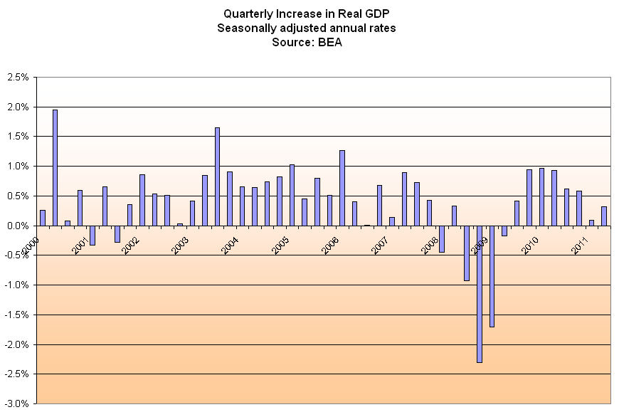
Computing the Gross Domestic Product (GDP) of an entire nation is a complex affair, one that requires an early estimate and two revisions. In the late days of July, the Bureau of Economic Analysis (BEA) revised the GDP growth for the 1st quarter of 2011 (ending in March) from a weak 1.9%  to an almost recessionary .4%.  This was a large revision and shook the markets, swiftly dropping the S&P500 index to about 1100. 

Germany reported strong manufacturing data for July but China showed a stalled growth in their manufacturing, adding to worries about a global slowdown.  Since early August, the market has behaved like a small boat in the Mid Atlantic, rising and falling dramatically with both news and worries about Greece’s debt as well as the debt of Italy, Spain, Ireland and Portugal.  Investors have fled from the stocks of banks holding the debt of those countries as well as larger banks which might have indirect exposure to that debt.  An index of large banks has fallen 28% since April of this year.  Many developed countries are wallowing in debt.  A slowdown in growth leads to less tax revenue to pay down that debt.  Worries of a global recession or a severe slowing of growth provoke fear of bank defaults, government defaults, and growing pressure on small and medium sized businesses, who are least able to withstand downturns in an economy.

Fractious meetings among EU member countries, among the various branches of the U.S. government leads many to regard politicians on both sides of Atlantic as dysfunctional, unable to resolve their ideological differences to make any functional policy decisions.  Investors worry about the viability and future of the euro currency, fleeing the Euro and parking their money in U.S. Treasuries, causing the price of Treasuries to rise and the yield (interest) on those bonds to fall to historically low levels.

In September, an HSBC index of small and medium Chinese manufacturers reported a slight contraction.  German manufacturing declined from strong numbers in July to a neutral stall speed in September, confirming fears of a global slowdown. 

In the U.S. and Eurozone, governments at all levels have instituted austerity measures to cope with declining tax revenues.  Government employee layoffs increase the demand for social support programs, prompt civilians to curb their spending, resulting in less tax revenues for government, prompting more government cuts, ad nauseum.  Cautious companies hoard what cash they have, reduce their investments in anticipation of further slowdowns in consumer demand.

Weighing on the economies of the U.S, Japan and Europe are a decades long accumulation of debt.  Below is a chart of OECD data on the total debt of developed countries.  Debt in the U.S. doesn’t look bad compared to some of these other countries. (Click to enlarge in separate tab)

For the past thirty years, all of us in the U.S. have been running up debt.  People, companies and governments at the Federal, State and local levels have borrowed…and borrowed…and borrowed some more. 

The severely slumping U.S. housing market is a strong headwind to any GDP growth.  Lower valuations lead to less property taxes for local governments and schools, reduced government services, houses that are difficult for homeowners to sell without bringing cash to the sale. A recent report by the Commerce Dept. showed that housing has contributed an average of 4.7% to GDP for the past half century.  Last year, housing contributed only 2.2% to GDP.  If the health of the housing sector was just average, GDP growth in this country would be 2.5% higher.   Some in the industry anticipate that it will be another five years for housing to recover from the excesses of the past decade.

Crossing

On July 4th, I cautioned about dramatic weekly moves in the market.  This past week we again had a dramatic surge upward, fueled in part by the Federal Reserve’s commitment to backstop European banks with dollars for the rest of the year. On July 4th, I wrote “If there are some positive surprises this week, then this could be the start of the third leg up in stock prices.  If there are negative surprises, watch out below…”

We indeed had a big surprise that following Friday when the Labor Dept (BLS) reported a mere 18,000 jobs created in June. In August, BLS reported 117,000 jobs created in July but the Household Survey showed little change in employment levels or what is called the EMRATIO, the ratio of working people to the entire population. In September, the BLS reported a historic zero jobs created in August.

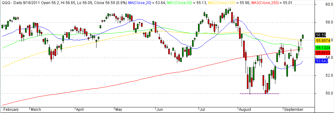
In a June 20th blog I wrote about the convergence of several moving averages (MA).  This week I will highlight the crossing of two averages, the 50 day and the 250 day.  10 days ago, the 50 day average of SPY, an ETF that tracks the S&P500, crossed below its 250 day MA, a sell signal for longer term investors.  For the past 17 years, if you had bought this index when the 50 day MA crossed above the 250 day MA and sold when it crossed below, you would have made 455%, buying and selling only 5 times in those 17 years.  Buy and hold would have resulted in a 356% return over those years. (Click to enlarge in a separate tab)
 

QQQ is an index that tracks the top Nasdaq stocks.  Using this same formula, you would have made a 74% profit since January 2000.  During that period, the index has lost 38% of its value from the heyday of the tech stock boom.  The 50 day MA is about to cross the 250 day MA.

ISM – not just another ism

Each month the Institute of Supply Management surveys several hundred firms in both the non-manufacturing and manufacturing sectors of the economy and compiles an index based on the survey responses to questions regarding both current and near future conditions.

The overall index is widely published each month but a closer inspection of the components reveals developing strengths and weaknesses in the economy.  The two component indexes I will look at are New Orders and Employment. 

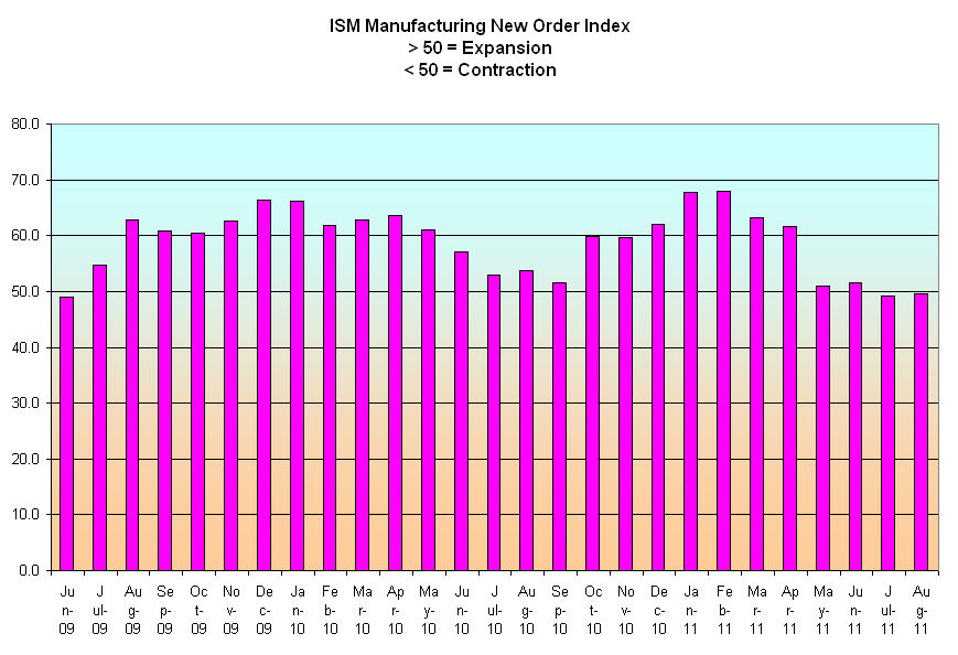
 Manufacturing is only about 10% of the overall economy but it is a leading indicator of the underlying health of the overall economy. The recession officially ended in June 2009 and as the chart below shows new orders for goods started growing.

With new orders growing, manufacturers began hiring – the Employment index started increasing from a sick level of 40.

There were two key causes for this improvement:  The weakening dollar made manufactured goods attractively valued for businesses and consumers in other countries, thereby boosting our exports.  The auto bailouts and “Cash for Clunkers” program that were part of the stiumulus program initiated in the spring of 2009 helped revive the mortally wounded car manufacturers.

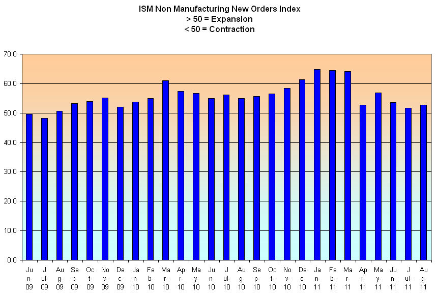
New orders in the non-manufacturing or services sector, the largest part of our economy, also started growing, but not as rapidly.

A large part of the construction trade is included in this sector.  The lack of new housing starts – about half what it was just five years ago – has crippled this industry, serving as a dead weight on the sector as a whole.  The non-manufacturing employment index lagged behind, not reaching a state of expansion till late summer of 2010.

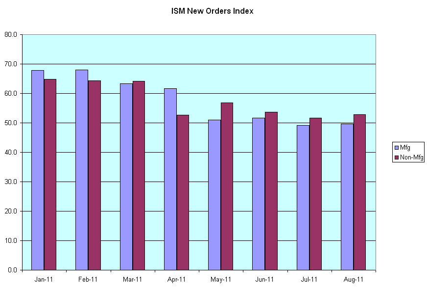
Since the beginning of this year, new orders in both sectors have declined. 

The Japanese earthquake and tsunami in March of this year was blamed for the slowdown in manufacturing.  In June of this year, Japan appeared to have overcome much of the damage that the tsunami had done to their supply chain, leading economists and stock traders to predict a stronger second half of this year for the U.S.  However, the manufacturing new orders index has edged into contraction territory, hardly a sign of increased demand.

As the growth in new orders approaches the midway mark between contraction and expansion, so too does the employment index.  In both the manufacturing and service sectors of the economy, growth is minimal, leading some to predict and many to worry about a “double dip” recession.

Unemployment remains stubbornly high as demand softens.  The various stimulus programs by the Federal Reserve and the Obama and Bush administrations have had some effect but have not produced the robust recovery hoped for because this is the mother of all deleveraging recessions when both consumers and businesses pay down or restructure their debt and asset prices (housing prices) decline.  In the past decades, we accumulated debt the way a house accumulates water when flooded during heavy rains.  The Fed and both presidential administrations have been pumping hard to keep the floodwaters from causing even more damage.  What do they get for their efforts?  Some blame the pumpers for causing the flood.

Reaganomics vs. Obamanomics

In a Aug. 25th Wall St. Journal op-ed editorial board member Stephen Moore compared Obamanomics and Reaganomics.  Both Presidents inherited crippled economies but after 2.5 years in each President’s term there is a sharp contrast in GDP growth.  In 1983, growth was about 5%.  In 2011, it is about 1%.  Mr. Moore attributes the healthy growth of the Reagan administration to Reagan’s focus on the supply side of the economy.  Obama’s policies, on the other hand, focus on the demand side of the economy.  I argue that Mr. Moore has neglected a major component of the economy that accounts for the differences in growth – household debt.  Consumer purchases account for roughly 70% of GDP.  When consumers go on a decades long buying binge, GDP growth is strong.  When consumers get choked with debt, as they had toward the end of this past decade, they pay down that accumulated debt and GDP shrinks accordingly or grows much more slowly. 

In the late 70s, consumer borrowing began a rapid rise that would soon skyrocket in the following decades.  The first half of the Boomer generation were in their early 30s and late 20s.  Rampant inflation created a dangerous attitude of “buy now, pay later” as a way to save money as prices roses more than 10% per year.  Not in wide use in previous decades, credit cards began growing in popularity among this new generation.  This largest generation began settling down to start families, buying houses and cars with easy credit.

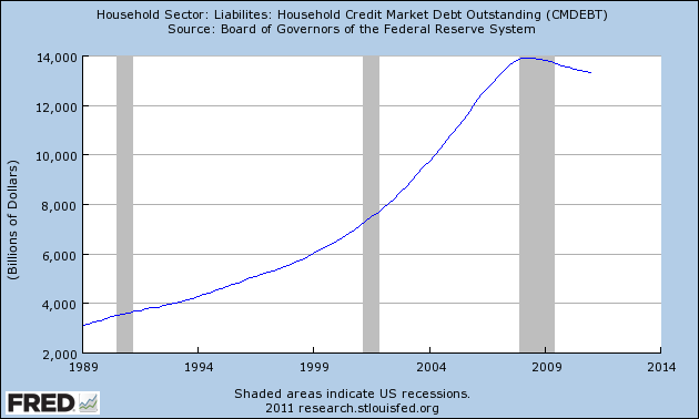
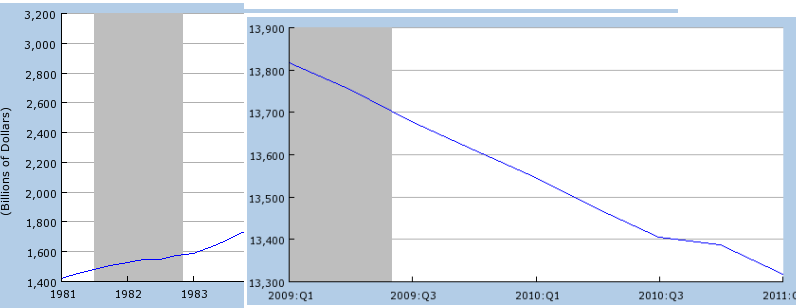
From 1973 to 1981, household debt grew 2.5 times, from $578 billion to $1422 billion.  As the chart below shows, household debt more than doubled again to $3110 billion, or $3.1 trillion, during the Reagan administration. (Click to enlarge in separate tab)

During the next eight years from 1989 to 1997, the growth rate of household debt slowed to 168% but topped $5 trillion.  This slowdown was due mostly to the recession of the early nineties.  As we pulled out of the recession in 1993, we returned to bingeing on debt. In the eight years from 1997 to 2005, that debt doubled again to almost $11 trillion.

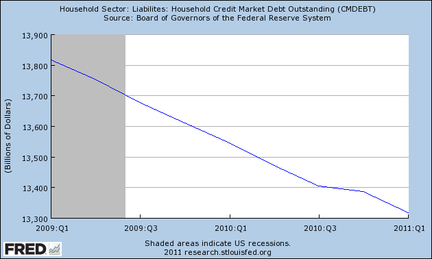
In Jan. 2008, household debt outstanding stood just shy of $14 trillion dollars, or about the total nation’s GDP. 

After growing for almost 6 decades, the debt burden on families had reached an unsustainable peak and it began to fall.  In January 2011, the total is still over $13 trillion but has fallen 4.4% since January 2008.

The composite chart below gives a clearer picture of an important contrast between the early eighties and the past 3 years.

Supply side economic policies which offer greater support to suppliers, i.e. less regulation and lower taxes, won’t have much effect when buyers are overextended and the demand is not there.  The greatest asset base of most households is their home, a base that has severely eroded.  House foreclosures continue to climb and there is a large pool of delinquent mortgages that are waiting to be foreclosed on.  The large loss of jobs has slashed the credit card borrowing capacity of many households.  New car sales contributed to the growth in household debt but have plummeted in the past few years.  They have improved over the past few months but are still 70% of 2007 levels. Many consumers are wary of taking on more debt.  Without that consumer demand, companies are understandably reluctant to invest in new buildings, to build inventory, to expand their business capacity.  This is why American companies are sitting on almost $2 trillion in cash.

Why did so many of us run up so much debt?  The income of the middle class, in inflation adjusted dollars, stopped growing after 2000 (same Census Bureau table as above).  To make up for the lack of growth, households borrowed against their houses and ran up credit card debt and car loans and leases.  The real growth in middle class incomes over the past 30 years is only 15%, or 1/2% per year average.

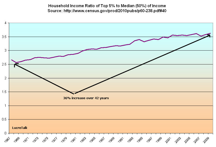
During the past thirty years, the distibution of income has favored the top 5% of households, those making more than $180K (in 2009 dollars).  Below is a chart of the growing ratio of the top 5% of incomes to the median, or middle, income.

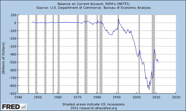
That ratio has grown 36% over the past 42 years.  The fortunes of the top income earners are pulling away from the rest of the country and will continue to do so as we continue to import far more than we export. Exports produce American jobs.  Imports reduce American jobs. Below is a chart of the Balance of Accounts for the past 60 years showing the balance of exports minus imports.  In the 1990s, the North American Free Trade Agreement (NAFTA) moved many jobs to Mexico but the real exodus of jobs from the U.S. occurred after China was admitted into the World Trade Organization in 2001.  Since then, 4 million manufacturing jobs have been lost in the U.S.

Due to increased productivity, manufacturing has been declining for the past forty years (U.N. chart here) in both the U.S. and the world. Both industrialized and newly industrializing nations are relying more on the service sector of their economies for the bulk of their GDP.  In this country, manufacturing jobs produced greater income relative to educational experience.  A person with a high school education could earn an income that would put them at the median income level or above.  Today, the construction industry is the only large sector that can consistently provide that kind of income with only a high school education. The decline in housing has crippled that industry and slashed the incomes and job prospects of many.

The growth of the early eighties was fueled by the advent into the workplace and marketplace of the largest generation ever, the newly maturing Boomers who built families and businesses and borrowed and borrowed but who are now near retirement.  Reagan stands near the beginning of that economic expansion fueled by debt.  Obama stands at the collapse of that runaway debt explosion.  Reagan’s policies did not jump start the growth process nor do Obama’s policies hinder it.  The sociological and economic forces of a generation surpasses either’s politics or policies.

Debt Ceiling

As Congress and the White House spend a summer weekend wrestling with negotiations over the debt limit, it helps to step back and look at the overall U.S. debt picture.

Since mid 2008, we have been on a dangerous trajectory, borrowing for TARP, stimulus plans of both spending and tax cuts, two wars, extended unemployment benefits, more tax cuts this past December and more and more defense spending.

Some argue that the only legitimate function of government is defense. Since we can never be safe enough, in principle there is no upper limit to how much we should spend on defense. Friday’s BEA report on GDP shows a 7.3% increase in defense spending.

“We can not abandon the most vulnerable members of our society” is a mantra repeated by some. As the population grows, so too will the vulnerable members of any society. As the population ages, that vulnerability will increase exponentially. In principle, there is no upper limit on our caring and generosity.

In reality, of course, there are limits. In our individual lives, in our communities and in the nation as a whole, we must struggle with the contradictions between our loftier principles and the harsher realities of living. For a while we can delay the reconciliation of principle and reality by putting off the inevitable compromises.

We have a natural knack for prognostication – one that we exhibit at an early age when we don’t clean up our room, do our homework or some other petty chore. Peoples of the future may label us “Homo Prognosticator”, not “Homo Sapiens.”

Debt is one indication of prognostication. We are getting really good at putting things off in the hopes that, one day, it will start getting better.

Below is a chart of federal debt since 2004, showing the increasing change in slope of the debt owed by all of us – our future selves, our kids and grandkids.

As I have noted in previous blogs, we have both a spending and revenue problem. To deny that we have both is more than prognostication – it’s delusion. Neither problem has broadly palatable solutions but the longer we delay implementing solutions, the worse it will get – exponentially worse. Anyone who has charged way too much on credit cards is well aware of that. The interest on the debt increasingly worsens any solution until bankruptcy is the only answer.

National bankruptcy is the sum of over 300 million personal bankruptcies.

Pass the Dip

On Friday, the Bureau of Economic Analysis (BEA) released their first estimate of GDP growth for the second quarter ending in June.  Not only was it an anemic 1.3%, but the 1st quarter’s growth was lowered to .4%.  Revisions to quarters in 2009 and 2010 showed that the recession was deeper than earlier estimates.

This raises the sinister spectre – again – of a double dip recession.  Yet Warren Buffett has said that he would bet heavily against the country going into a double dip.  What is Buffett looking at?

It might be corporate profits.  As the charts below show, corporate profits usually dip or level before a recession starts.  The last double dip was in the early 80s when the decline in corporate profits signalled the coming recession.

However, corporate profits briefly rose for two quarters before the 2001 recession.  The key indicator here is that profits barely surpassed the profit peak in 1999.  These graphs are in current dollars – they are not adjusted for inflation which was averaging 3% at the time.  This repeats a pattern prior to the double dip recession of 1981 – profits may rise for a quarter or two after a year or more of decline but they are relatively lackluster.

Prior to the recession that began in late 2007, corporate profits declined and leveled.

Let’s look closer at the past year, particularly the downturn in profits in the middle of 2010.  This was surely what Federal Reserve Chairman Ben Bernanke was looking at when the Fed instituted QE2 last September – an ominous prelude to a double dip.

Although this graph doesn’t show it, corporate profits have been rising – year over year – in the 1st quarter and apparently that is also the case for the 2nd quarter, as almost half of the S&P500 have reported in the past two weeks.

That year over year rise may be why Bernanke is reluctant to inject more money into the system.  Higher gasoline and commodity prices have taken a toll on corporate profits; the Japanese tsunami – 3/11 they call it in Japan – caused major disruptions in the supply chain; a high unemployment rate has led to a tepid consumer demand.  All this and yet companies have managed to increase profits.  This may be what prompts Buffett’s conviction that we will not slip into another recession – rising profits despite substantial headwinds.

Treasury Bonds

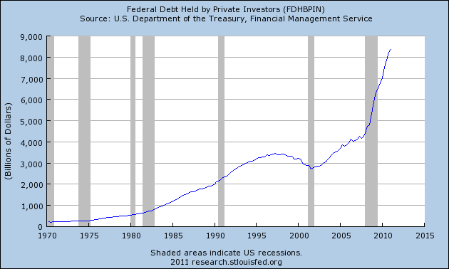
Einstein famously quipped that the most powerful force in the universe was compound interest.  An equally powerful force is reversion to the mean, or average.  As discussions go on in Washington about raising the debt ceiling, let’s look at the $8+ trillion dollars of Federal Debt held by private investors.

How much more debt can investors buy?  Since the financial crisis of 2008, investors have gobbled up federal debt just as they gorged on mortgage debt in the years previous to the financial crisis.  Below is that same data with a 10 year moving average, showing just how far above the average federal debt has climbed.

As the Euro-Debt crisis continues to unfold, investors keep lining up to buy Treasury bonds that pay little in interest but offer some perceived refuge for their money.

Below is an ETF, SHY, that tracks the Barclays Short Term Treasury Bond index.  It is close to all time highs, leaving little room to move up and plenty of room to move down as demand for the safety of Treasury Bonds eventually returns to its average.

Bubbas get caught up in bubbles.  Eventually – maybe not this month or the next six months – investors will want to sell some – or a lot – of these Treasury Bonds.  When that happens, watch out below. 

Flying Car

This blog entry is not about unemployment, the posturing and tantrums in Washington about the debt ceiling, or monetary policy at the Federal Reserve.  This is about flying cars.  When I was a kid, I planned on going to work in a flying car.  To escape the humid hot NYC summers, I would fly out to the beach or up to the Catskill mountains in my flying car.  In 1956, Chuck Berry wrote a song, “You Can’t Catch Me” about riding an air-mobile down the Jersey Turnpike.  Somehow it never happened – until now.

Employment Cycles

Last week I cautioned about negative surprises in the coming week’s data and on Friday the BLS (Bureau of Labor Statistics) dumped a big turd – the monthly Labor Report.   How close can one get to zero jobs created?  Out of a civilian labor force of 150+ million, 18,000 jobs is pretty darn close to zero.  The country needs about 150,000+ new job creations a month to keep up with population growth and reduce the unemployment rate.  It was no wonder, then, that the unemployment rate went up yet again for the 3rd month in a row.

Very troubling is a longer term pattern – the average number of weeks that people are unemployed continues to rise. At almost 40 weeks, it is double the number of weeks in 2003 as we pulled out of the relatively light recession of the early 2000s.

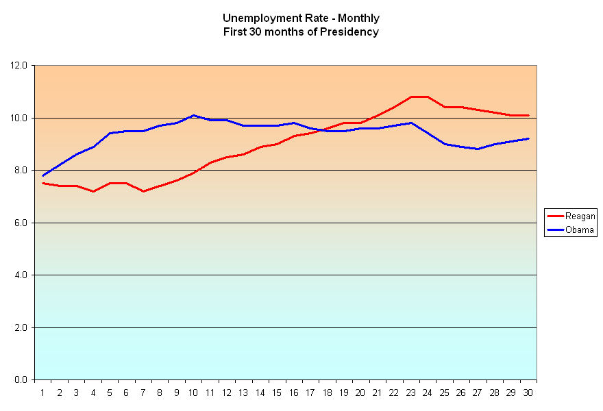
In previous blogs, I have compared this current recession to the recession(s) of the early eighties when Ronald Reagan was president.  Obama has been in office for 30 months and I wondered what the unemployment rate was for Reagan’s first 30 months. (Click to enlarge in separate tab)

Although the unemployment rate at this point in Reagan’s tenure was higher, it was steadily, although incrementally, declining.  The current unemployment rate is lower but creeping higher like an ocean tide.  In 1982, Democrats used the rising unemployment rate to advantage, winning an additional  27 House seats to command a whopping 61% majority in the House.  In 2010, Republicans were able to do the same, turning a 58% – 42% Democratic majority in the House to a 56% – 44% Republican majority.  In the off-year election of 1986, voters handed both the Senate and the House to Democrats. Politicians of both parties know that it is difficult to keep your job when unemployment is high. 

 Let’s step back and look at a more disturbing trend that surpasses political parties – the lack of growth in the civilian labor force, which is the total of all people working full and part time and those who are not working but still looking.

 Not since the post WW2 years has this country seen a comparable lack of growth.  In the late 40s and early fifties, the labor force stalled out at approximately 60 million for several years.  In the past three years, it has topped and declined, hovering around the 153 million mark.

While unemployment rates vary from month to month, a more structural view of the economy is revealed by the Civilian Employment to Population ratio (EMRATIO), which compares the Civilian workforce, employed, unemployed and underemployed, to the total population that is not institutionalized in some form or other.

I have highlighted the booms of the past decades on this Federal Reserve chart.  The decline from this last boom is dramatic.  Why?  Any student of the stock market will recognize a familiar reversal pattern in the chart above – the Head and Shoulders.  The peak of 1990 is the left shoulder, the tech peak of 2000 is the head and the housing peak of 2007 forms the right shoulder.  While there is not a consistent “neckline” component to this graph, that is probably due more to tax cut and housing legislation passed in 2003, which prevented a further decline in the ratio.  What does the head and shoulders pattern signify?  A painful return to normal or “reversion to the mean.” In order to get to the average, there is a period when we have to go below the average.  That’s the painful part.

The average of this ratio over 60+ years is 59.2%.  From January 1981 to December 2007, the average was 62.0%.  This past June, this ratio declined further to 58.2%.  The excruciating job of this recession is to take out the remaining excesses of the past three booms.   An ideal ratio is probably closer to 60 – not too hot and not too cold.  If we were to have that ratio, the civilian labor force would be 158 million, almost 5 million more than we have currently.  If only 85% of those almost 5 million people were employed, we would have 4 million extra jobs and the unemployment rate would be just under 6%.

The Reagan and Obama administrations stand as bookends to a larger generational pattern.  While Presidents do play a key role in negotiating economic policies with Congress, they take far too much credit and blame for broad changes in the economy.  As the multitudes of the Boomer generation entered their late twenties and early thirties in the 1980s, they (we) bought more stuff, kickstarting the dramatic rise in household credit which started the first boom.  The “mini-boomers” born in the nineties and 2000s will repeat the pattern.  In the early part of this decade we will continue wringing out the excesses of credit that the boomers rang up over the past decades, preparing the way for this second wave of boomers who will start buying more stuff in the latter part of this decade and into the next decade.

Rinse and repeat.