GDP Growth Curve

In the 10 months till the election in November, we are going to hear a lot of rhetoric about economic issues because this election will be mainly about the economy.  Obama will say that his administration inherited a bad situation, which is true.  How did it get so bad?  Obama will blame greed and a lack of regulation.  He and others of his political beliefs will insist that, given the severity of the crisis, the federal government should have done more – more stimulus, more programs.  He will make the case that these programs are working – just not as fast as hoped.

The Republican nominee will assert that the Obama administration simply does not understand how our economy works.  More policies and regulations only dampen growth by making the economic climate even more uncertain. The nominee will assert that his administration will unleash the entrepreneurial growth that is embedded in the American spirit.

You may believe the former or the latter or believe in a mixture of these two points of view. 

To help understand the big picture, let’s climb high on our flying carpet and look at GDP growth these past sixty years.  From 1947 to mid-2007 we have enjoyed a 3.42% annualized growth rate of real GDP.  According to Census Bureau, our population has grown just a smidge more than 1% per year since 1952.

Using data from the Federal Reserve, below is a chart of actual annualized real GDP and the curve of growth since 1947.  During the 60s, robust manufacturing to supply a recovering Europe and government spending on the Vietnam War helped fuel a higher growth rate.  Democrats ushered in a new era of federal social programs, including Medicare, Medicaid and other social welfare programs.  Prosperity and compassion bred promises.
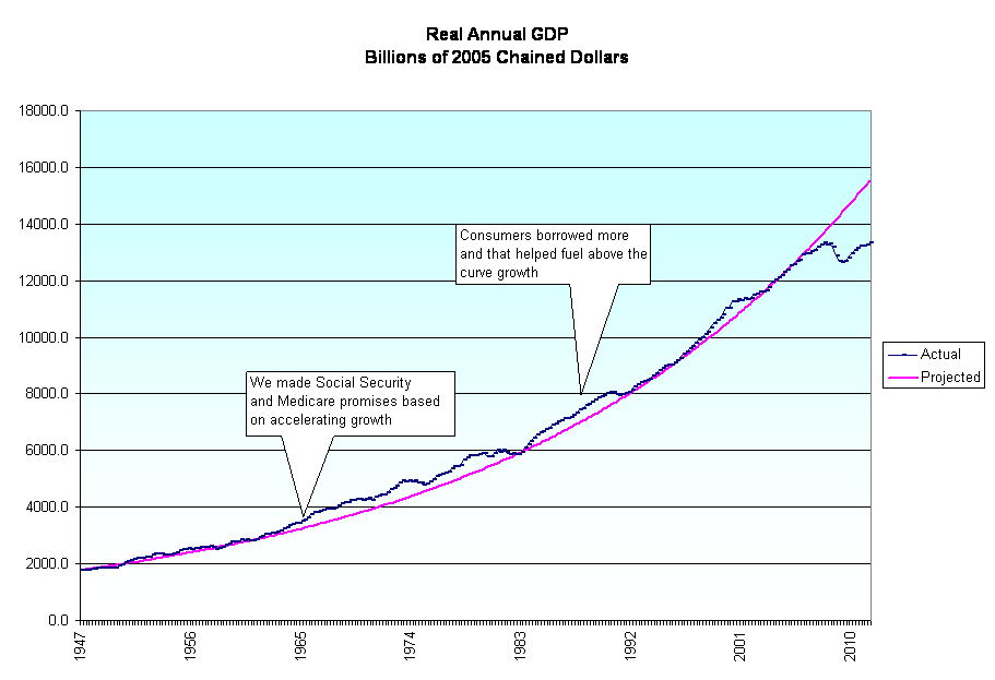
We’ll come down a bit from the heights and zoom in on the past thirty years.  For some of those years, GDP growth ran slightly above the longer term growth trend.  Consumers increased their borrowing as a percentage of their disposal income, contributing to the above the curve GDP growth.

The recession of the early nineties led to lower taxes for states and municipalities in the middle of the decade.  To balance the books, local politicians negotiated with state and local government employee unions, substituting employee health and retirement benefits – future costs – for pay increases.  Thus, penny pinching bred more promises.

Social Security, Medicare, Medicaid, the Food Stamp program (SNAP), WIC and other transfer programs sprang forth from what is one of the best attributes of human  beings – our compassion. 

In the 1930s, many watched in horror as older people lived their last few years in destitution.  Through no fault of their own, many had lost their life savings when banks had gone under at the start of the Depression. At the time, few lived past 70 years.  Why not create a fund that would collect money from all workers so that a small pension would be available to seniors in their last years? Who would have predicted that social security payments would grow from less than 1% to over 20% of federal spending in 70+ years?

Who knew that spending on a health program for seniors, Medicare, would grow a 100-fold from $5B in 1967 to $500B in 2009?(Source)

How are we going to pay for these promises?  Each year, the administration makes projections when it presents its budget to the Congress.  For the 2012 budget, the Office of Management and Budget (OMB) at the White House projected real GDP for the next 10 years. The chart below is based on those figures.
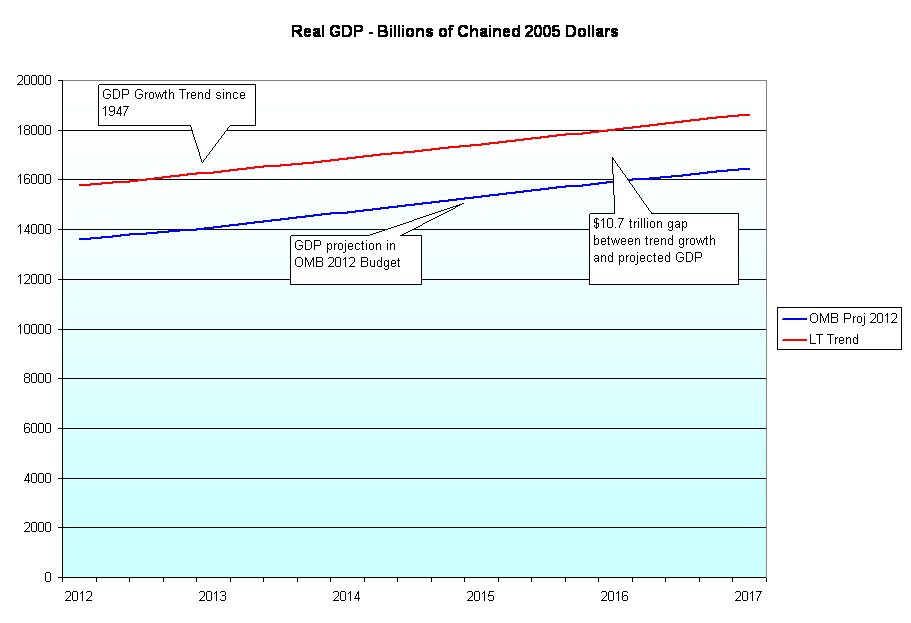
As you can see, these are not rosy or dour predictions.  They simply follow the same growth curve this country has had since WW2.  But the implications are enormous.  In the past four years, we have had a $6.5 trillion gap between where the economy should be at and where we are at.  The gap during the next five years will be over $10.7 trillion so that in the space of almost ten years we will have “lost” over $17 trillion in real GDP.

During the election cycle we will hear promises of policies designed to kick start growth but they will be empty promises.  How is anyone running for election or re-election going to significantly increase a growth curve that has been in place for 70 years?  Such a change would require some structural changes to the economy and politics of this country. 

In the past year, the Congress has proved that they are incapable of even small change – other than name changes to their local Post Office.  Each Congressperson, each Senator is loyal to principles, to their party, to their constituents, to the special interests that help them stay in office and, as a body, are not capable of making big changes very quickly.  Yet in the next ten months we will hear how one man – yes, one man, the next President of the U.S. – will make those changes happen.  Millions of Americans will vote, hoping that somehow, some magic way, it could be true.  Millions of Americans won’t vote, disgusted with our political process and despairing that there is any hope for constructive, sensible change in this country.  For those Americans who do vote, it will be a 2 for 1 special.  As in most elections, only half of eligible voters vote, effectively giving each voter a free extra vote.

We are going to have to find a way to talk constructively about graduated spending cuts on programs of compassion as well as programs of fear (defense).  Secondly, we need to have sensible discussions of policy changes which will help nudge the GDP growth curve up just a tiny bit.  The economy of this country is like the Titanic.  No one man or woman, no one Congress can make a big change in course – although there is a machinery of political pundits whose job is to convince you that it is so – just like in the movies. Long term trends are powerful forces, difficult to overcome.  I vote for the person who acknowledges that fact and is willing to sit down at the table and talk turkey.    
New Year Rising

As we start off the new year, things should start to improve in the U.S. economy.  As I mentioned in my “Year in Review” blog last week, the recession is finally almost over.  Real GDP has finally surpassed the level it was back in 2007.

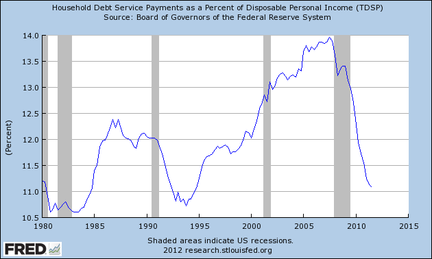
Another indicator that the recession is almost over – household debt as a percentage of disposable income, or income after taxes.  Household debt includes mortgages, car payments, student loans and credit cards.  As the chart below shows, U.S. households have finally paid down, cut back or defaulted on a lot of debt since 2007.  We started to  reduce our debt load during the recession of 2001 but the 9/11 attacks prompted a wave of patriotic purchasing encourged by the Bush administration and aided by easy home refinancing. (Click to enlarge in separate tab)

We are still short of a healthy 14 million in sales of cars and light trucks but sales continue to increase from the depressed levels of late 2009.

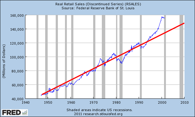
As I noted last week, retail spending is still not back to the levels of 2006 – 2007 but those retail sales were fueled by people charging far more than they could reasonably pay for.  When I look at inflation adjusted, or real, retail sales from 1947 – 2001, the trend line (mine) projects real retail sales in 2011 of about $160B. 

What did we have in 2011?  Over $170B!

Last week I was rather dour in my assessment of this half-assed economy but I was taking a short term view, comparing sales and GDP today to the bloated bubble levels of 2007, an unrealistic comparison.

Construction spending has cratered in the past four years as we wring out the excesses of the past decade.

But when I draw trend lines showing growth we can see just how inflated the construction bubble was from the mid-90s till 2007.

In the past two years we have formed a “bottoming” pattern that indicates that the downward slide in spending has ended.

Well meaning but bad policies, poorly regulated mortgage brokers, consumers eager to get in on the housing gravy train, banks playing 3 card monte with bundled mortgage security products, politicians eager to please and get re-elected – so many factors that led to an overgrown forest.  And then the fire.  Now there are green shoots emerging.

Before you get to singing “Happy Days Are Here Again”, there are some fundamental long term – decades long, long term – concerns and trends that I will look at this weekend after I sharpen my red pencil. 🙂

Year in Review

Jerry and Steve passed on some links to some interesting charts. At the Atlantic is an assortment of graphs of both the European and U.S. economies from a group of economists surveyed by the BBC. Featured on WonkBlog and in the Washington Post is a compendium of graphs more focused on the U.S. economy.

But the most telling chart of all is the end of the recession! After 4 painful years, Real (or inflation adjusted) GDP has finally reached and surpassed the level it was in 2007, before the recession. The official end of the recession was – cue the laugh track – in July 2009.

While this is not the “official” end of the recession marked by the Bureau of Economic Analysis, it is a more pragmatic one used by many traders, investors and market watchers, including Warren Buffett.

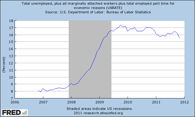
Unemployment still sucks (a technical economic term). The real unemployment rate is about 17% and that picture does not look bright.

Residential housing starts still suck. The market for multi-unit housing has been strong because so many people can not afford or qualify to buy a home despite the fact that there are hundreds of thousands of vacant homes littering the country.

The Euro Zone may implode in 2012 and the political indecision both in the U.S. and Europe have caused many companies to be cautious in their investments and capital spending. The Coincident Economic Activity index sucks but is getting better.

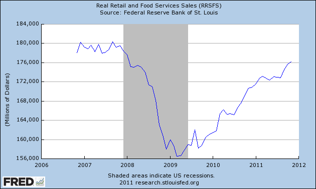
The U.S. consumer is still not back. Below is a graph of real retail sales.

This is going to be a long slog. Keep your head down and move forward.  If you have a job and are not upside down on your mortgage and you broke even in the market this year, you should have a Merry Christmas.  Give to those who may have lost their merry along the way.

Scorecard

It’s been a tough trading or investing year.  So what investments have done relatively well this year?  The names below are either in the Dow Jones, S&P100 or are a group of investments.  The following are within 95% of their 200 day highs:

Abbott Labs
Bonds, Corporate – Short, Mid and Long Term
Home Depot
IBM
McDonald’s
Altria (Tobacco)
U.S. Treasuries
Wal Mart
Utility Stocks

And the not so well.  The following are more than 20% below their 200 day highs.  Those with an asterisk are down more than 35%:

Alcoa*
Blackrock (Investment)
Citigroup*
Caterpillar
Disney
Eastman Kodak*
Emerging Market Index
China, Brazil, Australia, Canada, Latin America Stock Indexes
Goldman Sachs*
Hewlett Packard*
JP Morgan*
Silver
European Index
Financials Index
Mining Stock Index

Deficit Commission

Today the “Super Committee,” charged with finding $1.2 trillion in deficit reduction over the next ten years, announced that they had failed to reach an agreement.  This failure triggers a set of automatic cuts to entitlement programs and defense spending starting in January 2013, over a year away and after the 2012 election.

$1.2 trillion dollars over ten years equals $120 billion dollars per year.  While that is a lot of money, it is only 3.3% of this year’s $3.6 trillion dollar budget.  This super committee could not find 3.3% in spending cuts and/or tax increases.  This was a bi-partisan committee, meaning that either side only had to give up less than 2% in spending cuts/revenue increases to come to the center of an agreement. 

Cash strapped cities and states across this nation are having to make hard choices on taxes, education, police, fire safety,  and community outreach programs that are 5%, 10%, 15%, 20% of their budgets.  Many families are having to make similar cuts in their budgets. Yet our elected representatives in Washington can not come together to find 3.3% in annual spending reductions and revenue. 

Let’s be grateful that these men and women in Washington are not working on our local police force, are not repairing our cars or taking care of our kids, are not putting out fires or fixing our plumbing, are not teaching our kids or doing electrical repairs in our homes. Could these elected representatives change a light bulb?
  

Earnings 2011

Over 80% of S&P500 companies have reported earnings for the 3rd quarter.  80% have beat earnings estimates that were previously lowered, an indication of how well companies are managing the estimates of the analysts who cover them.  In the third quarter of 2009, how many companies beat estimates?  79% (source) – pretty close to this year’s third quarter.

In September of this year, Standard and Poors reported that 2011 earnings estimates for the S&P500 fell below $100 after peaking at about $105 in early August.  2012 earnings estimates have been lowered from $111 to $108.  The S&P index closed about $1250 this past Friday, giving a forward P/E ratio of almost 12, a fairly conservative ratio.  These estimates, however, do not take into account any debt contagion from Europe. In a recent interview Nick Raich, Director of Research at Key Private Bank, projected an estimate of $85 in 2012 if there are no solutions found to the debt crisis in Europe.

Investors Friend has an article summarizing past S&P500 earnings and the difficulty of estimating earnings as there are several versions of earnings – GAAP and operating being two of the most frequently cited.

Yesterday Standard and Poors issued an update of third quarter earnings results.  Pay particular attention to the downward revisions for next year’s earnings in each sector.

Personal Income

On Friday, the Bureau of Economic Analysis (BEA) released their monthly report of personal income, the total of income from wages, salaries, government benefits, interest and dividend payments and rental income. 

Total personal income rose just .1% for the month of September but wages and salaries showed a more healthy .3% monthly increase after declining .1% in August.  Interest income and government benefits remained flat.  Year over year, income increased 4.4% – more than the seasonally adjusted 3.6% increase in inflation.

In this country there is a feeling that something fundamental is wrong. Many are waking up to the fact that the national myth of Equal Opportunity may be just that – a myth. For decades, people have started small businesses using the equity in their homes to survive the cash flow crunch of the first years of a small business. The decline in housing prices has left many without that traditional capital cushion.

A few weeks ago I wrote about the decline in the median income over the past decade.  Today, let’s look at the big picture of personal income.  Below is a Federal Reserve chart of inflation adjusted personal income for the past fifty years. (Click to enlarge in separate tab)

After a big dip in the past recession (shaded on the chart above), total personal income has returned to about the level it was at the start of the recession in December 2007.  Below is that same chart zoomed on the past five years of inflation adjusted income.

To see the underlying strength or weakness of income, we need to take out transfer payments, which are government checks for benefits of all types.  After all, this is just tax money taken from Paul to pay Peter. The Federal Reserve conveniently gives us that data.

A zoom in on the last five years of inflation adjusted personal income shows the economic sickness that many people vaguely know in their hearts.  After rising from a trough in the 3rd quarter of 2009, real personal income has stagnated the past year.

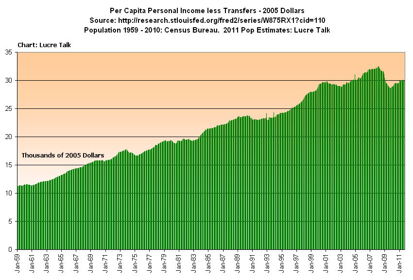
What this data doesn’t do is adjust for the increase in population.  Although the Federal Reserve charts per capita disposable personal income, they do not chart real personal income less transfer payments on a per capita basis.  Using population figures from the Census Bureau, I was able get a picture of the income data, one that has serious implications for the future.

In 2011, we have finally reached the 2001 level of income.  Despite all the productivity gains of the past decade, we are back to where we started.  As I have pointed out before, the productivity gains are going to the very top incomes.  Below is that same chart, but focused on the past ten years.

As the boomers retire in ever increasing numbers they will be receiving Social Security checks, a transfer payment, which will put downward pressure on personal income less transfer payments.  The long term chart of personal income less transfer payments reveals a familiar and disturbing pattern familiar to stock chart watchers – the head and shoulders pattern – which indicates a dramatic drop in the future.  Confirming this ominous sign are the uncompromising unemployment figures – over 16% of the working age population is either un- or under-employed.  How are these fewer workers with relatively stagnant real incomes in the production of goods and services going to generate enough tax revenues to pay for the increasing transfer payments?

Retail Sales

A week ago the Census Bureau released the Advance Monthly Retail Sales report for September.  When adjusted for seasonal factors and holidays in the reporting period, September sales showed a slight 1.1% increase from August and an almost 8% increase over September 2010 sales.  A tepid – but better than expected – employment report the previous week and growing consumer sales has countered fears that the U.S. might be entering a double dip recession. Hopes that Europe will reach some resolution to their debt crisis and the reduced fears of another recession have helped power the stock market almost 15% higher from its October 4th lows.

Has the U.S. consumer come back?  Below is a 20 year chart of seasonally adjusted retail sales in inflation adjusted dollars.  As you can see, we are still struggling to reach the levels of 2007.

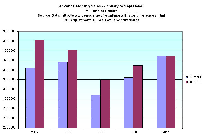
The Christmas season can account for 40% of many retailers annual sales.  The other nine months of the year, from January to September, show the underlying resilience of the consumer economy. I pulled up the September Advance Monthly reports from the Census Bureau for recent years to get a comparison. I used Bureau of Labor Statistics CPI data to show sales in real dollars.

Although we have finally surpassed the nine month total of 2008 in current dollars (violet bars), the inflation adjusted sales figures show that we are still below the levels of 2007 and 2008.  State and local governments rely on sales taxes for about a third of their tax revenue.  The Census Bureau reported that sales tax revenue for state and local government in 2010 was $17 billion less than 2007, a 4% decrease.  In inflation adjusted dollars, the decrease in sales tax revenues is almost 12%.

How have state and local governments made up the shortfall in sales tax revenues?  Corporate income taxes increased 50% from 2007 to 2010, more than making up for the decline in sales tax revenues.

Property taxes make up 30% of tax revenues for state and local governments.  Given the sharp decrease in house prices, I would have expected that property tax revenues would have declined but changes in property taxes lag changes in the market price of houses.  In 2010, property tax revenues were 10% above 2007 levels, double the 5% inflation rate for that period.  Although 2011 figures are not available yet, I would expect that property taxes declined this past year.  State and local governments are praying that there is a pickup in retail sales to compensate for reduced property tax revenues.

The bottom line?  The pressure points may shift but the pressures on the economy as a whole remain constant.  Private industry continues to add enough jobs to compensate for population growth and reductions in the workforce of state and local governments but not enough to bring down the unemployment rate.  Revenues to state and local governments may show slight improvement but not enough to keep up with inflation, and certainly not enough to rehire these lost government jobs in the near future.

Earnings

The headline from a recent report by the Census Bureau revealed that the men’s median (50% made more, 50% made less) inflation adjusted income is now less than it was in 1968.  Looking behind the headline at half a century of data uncovers some trends that surprised me.(Click to enlarge in separate tab)

Men’s median earnings during this mother of all recessions have actually been better than the recessions of the early nineties and early eighties.  What distinguished the recession of the early 2000s was that median earnings did not decline, probably due to the growing boom in the construction industry at the time – a boom that would blow up the economy in 2008.  What is apparent is the two decade “Camelot” period of the post war period when median male incomes steadily increased.

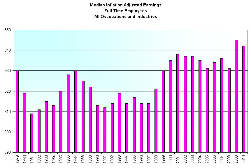
1979 was a historic year when there were more women in the workplace than men. How have full time employees of both sexes done in the past thirty years? Data from the Bureau of Labor Statistics shows a overall slight increase in median inflation adjusted earnings during the past decade.

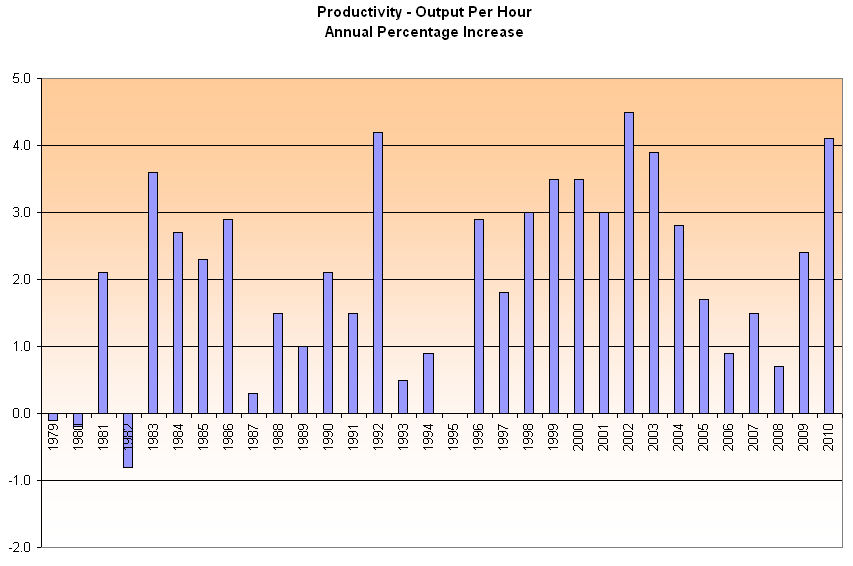
The increased production of workers during those thirty years has been strong – far more than the slight increase in earnings.

As I noted a few weeks ago top incomes have been growing far more than the median income.  Productivity gains produce greater profits. Those profits have largely gone to employers, not the employees. 

Social Security COLA

Many seniors receiving Social Security pay attention to the Consumer Price Index (CPI) once a year in November when the Social Security Administration (SSA) sends its annual notice of the cost of living adjustment (COLA) for the next calendar year. Although Social Security payments are set for a calendar year, the adjustment is based on the change in the CPI during the Federal Government’s fiscal year, which runs from October thru September.  On October 19th, the Bureau of Labor Statistics (BLS) will announce their monthly CPI figure for September, effectively giving Federal agencies their annual COLA figure.

Following this announcement from the BLS, the SSA will start drafting their notices, which they will send out in November.  Based on previous CPI data from the BLS and a seat of the pants estimate for September, I would guess that the COLA adjustment will be about 4.1%, an increase of $50 a month for the someone who receives an average monthly benefit of $1200.

What is good for seniors is not so good for Federal budget makers.  In August of this year, SSA paid out almost $60 billion in Social Security benefits to 55 million beneficiaries.  Multiply that monthly figure by 12 to get an annual payout of about $720 billion, or about 20% of the total amount of money the Federal government will pay out this year.  Now add a 4.1% COLA, which is about $30 billion extra that will need to be paid out next year.  Social Security taxes collected will just about cover the payments, leaving nothing extra for the Federal government to “borrow” from the Social Security trust funds.

Defense spending, including benefits, medical care and job training for retired vets totals more than a $1 trillion, or almost a third of the total federal budget, far more than the 25% spent during the years of the Reagan administration.  In a speech this past week at the Citadel, a military academy,  Mitt Romney, the leading Republican presidential contender, announced that, if elected in 2012, he would expand military spending even more than current levels.  How will he pay for this further build up?  If there is a Republican congress, there won’t be any tax increases.  That leaves only two alternatives:  drastically increase the federal debt more than Bush and Obama have already done, or get the money where he and the Republican congress can get it from – Social Security beneficiaries.  The bond market won’t let Romney run up too much more debt so that leaves only one alternative – reduce benefits to seniors.  Unlike younger people, seniors vote so the plan will be along the lines that Eric Cantor, the House Majority Leader, proposed this past year: keep benefits the same for those already retired and soon to retire and reduce future benefits for those 55 and younger.  That will be the starting place.  Next will come an adjustment to the calculation of the COLA.  As you can see above, a reduction in the annual Social Security COLA may be the weekly food cost for a thrifty retiree but means billions of dollars in money to the Federal government – billions that Romney can spend with defense companies.

Voters have two choices:  Get angry before the politicians screw us when we have some chance to change the outcome, or get angry after they screw us.