Turning Points

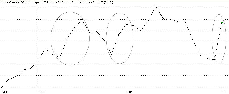
In late January, it took 3 weeks of trading for the S&P index to rise up 5% from a brief drop at 1270 to its mid-February peak of 1340. (Shown above and below is a chart of an ETF, SPY, that tracks the index – ETF prices are 1/10th of the index) After the Japan tsunami, the index once again touched that 1270 low before rising up again to that 1340 level.  That upward move again took 3 weeks.  This past week the index again rose from the 1270 low to the same 1340 level in ONE week.

A 5% upward move in a broad index in one week is dramatic.  When did we last see such a dramatic move?  In early July of last year, the index rose about the same amount.

Since 2000, the history of these abrupt upward moves reveals that they come in two varieties:  the first is an underlying argument about the long term health of our economy and corporate profits; the second are crises. (Click to show larger graph in a separate tab)

There were several closely clustered sharp upward moves in the spring of 2000 as the long bull market of the 1990s was coming to a close.  After 9/11 the market rose sharply in a week after crashing the week before.  In the last half of 2002 there were two such abrupt moves as early hopes that the country could pull out of recession were dashed in the first two moves.  The final move up in late March 2003 marked the beginning of the 5 year bull market of the 2000s.  Not until February 2008 did we see another weekly surge, shortly after the recession began in December 2007.  The next event occurred in October 2008 during the ongoing financial crisis when there was a sudden rise in prices following a breathtaking 20% decline the previous week as equity holders ran for cover after the financial crisis exploded.  For the next several months in late 2008 and early 2009, we had five steep upward price moves as buyers and sellers scrambled for safety or bargains.  Three more spikes occurred in March, April and July of that year as the country pulled its way up from the depths of the financial mudpit.

After the July 4th holiday in 2010, the market rose steeply, canceling out the abrupt drop of the week before.  This past week, 51 weeks after the spike of 2010, the index spiked again, canceling out not a week’s worth of decline but a month of gradual decline.

Does this past week’s surge mark the beginning of a third leg up in the 2 year old bull market or a fakeout “relief rally” by buyers hopeful that the economy’s growth is not faltering?  Why have 3 of these price surges happened around the July 4th holiday? 

The end of June marks the end of the 2nd quarter.  Many traders have taken an early holiday.  The market is left to retail investors, you and me, and fund managers adjusting their holdings before the end of the quarter, when they publish their holdings.  After eight weeks of steadily declining prices, retail investors may overreact to a few pieces of good news.  The delay of Greece’s default – it is only a delay – was the first piece of good news.  The Chicago Purchasing Manager’s Index and the monthly ISM manufacturing report, while not boffo, were encouraging to those hoping that the recent signs of a manufacturing slump were temporary.  This coming Wednesday’s ADP Employment report will give a sneak preview of the Labor Dept’s monthly Employment Report next Friday.  Also on Wednesday, the ISM Non-Manufacturing survey will take the pulse of the service sector of the economy.  If there are some positive surprises this week, then this could be the start of the third leg up in stock prices.  If there are negative surprises, watch out below…
Jobs, Jobs, Jobs

Jerry sent me an article from the Orange County register on the number of companies moving out of California.  As we’ll see, other states should be examining the jobs environment in their state and determining whether their state invites business.

A National Review article, often quoted by conservative pundits, repeats the fact that Texas has created the majority of new jobs in this country during 2010.  This net new job growth may be coming at the expense of other states.

Latest BLS (Bureau of Labor Statistics) data shows that Texas had net job growth of 251,000 jobs from March 2010 to March 2011.   Some might dismiss job growth in Texas as oil related but the data tells a different tale. While other states were laying off government employees, Texas added 15,000 government jobs  (pg. 9)  The gains were spread among all categories but the 42,000 job increase in health and education services was second only to the 88,000 jobs created in the Professional and Business Service category. 

During that same time, California had net job growth of 171,000.  California has 38 million people compared to Texas’ 25 million.  New York, with a population of 20 million, created only 56,000 jobs.  Florida’s 19 million population created just 51,000 jobs. Arkansas, with a relatively small population of 3 million, created 69,000 jobs, more than either New York or Florida.  Illinois net job growth was 77,000 with a 13 million population.  New Jersey, another populous eastern state, had a small job loss. (Population estimates)

States announce programs that tout how many jobs they are creating but is anyone actually keeping count? An investigation in North Carolina reveals that the published numbers are suspicious, at best.

The federal government announces jobs created or saved by the stimulus program but they rely on the states to keep track of the numbers attributable to stimulus dollars.  Here’s a tale of keeping count – or not – of jobs created through the stimulus program.

Some people in an industry – medical marijuana – that are keeping count of jobs created in Montana.
As Frank would say, “Doobie-doobie-doo”

Next Friday the BLS releases its monthly job data report.  Let’s hope that it is not as disappointing – and market rattling – as this last month’s data.

Unemployment

Obamanomics, Reaganomics, Clintonomics – we love our monikers, our taglines that we lay on a President and his administration.  We don’t need to bother with facts or complexity when we have a simple moniker.  Proctor and Gamble have known that for years.

The conservative media often paints the Reagan years as a time of economic prosperity, appealing to romantic idealists with a highly selective memory of the facts.

Is the unemployment rate too high now?  Yes.  Were the Reagan years the Golden Age of Unemployment?  No.  During Reagan’s two terms the average unemployment rate was 7.5%, according to the Bureau of Labor Statistics. No post WW2 president has done worse, although Obama is trying.

Is 3 – 4% unemployment rate normal?  No.  Until the late nineties, the guideline was that an unemployment rate less than 5% was inflationary or indicated a bubble of some sort in the making. In the late 90s, there was supposedly a new paradigm, a new economy and those old guidelines no longer applied. We now know that the low unemployment rate of the late 90s was a tech bubble in the making. During the 2000s, the low unemployment rate was a housing bubble in the making. As a rule of thumb, the “ideal” UI rate would probably be 5.5% – not too hot, not too cold.

During the two Clinton administrations, the UI rate averaged 5.2%.  George W. Bush maintained that same average.  The single term of his Dad was marked by a 6.3% average, slightly lower than the 6.5% average of the four years under President Carter in the late 70s. 

The winner in the unemployment department was Johnson, with a 4.4% average UI rate during his 6 year tenure.  Not only did the Vietnam war take a lot of working age men out of the workforce but the defense spending was a boom to the economy.  Within 2 years after Johnson left office, the stock market bubble deflated, losing 25% of its value.

Second place for lowest unemployment goes to Eisenhower whose 8 year term enjoyed a 4.9% unemployment rate.  Eisenhower takes first place among post WW2 administrations for the number of recessions – 3.  The chief reason for these were changes in monetary policy by the Federal Reserve.

Selective memory is a cornerstone of both progressive and conservative media. 

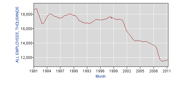
Did Reagan begin the destruction of manufacturing in this country?  No.  Did Clinton and the signing of NAFTA in 1993 destroy manufacturing?  No. As the chart below shows, manufacturing jobs actually increased after NAFTA was signed.  The dramatic decline began at the beginning of the first G.W. Bush administration.

BLS Source

Where did those 4,271,000 manufacturing jobs go?  Some of them went overseas. Almost a million of them, or 20%, went into Construction.  1.4 million went into state and local government.  The majority of them went to various service industries, where the pay, on average, is lower.

BLS Source

With the wave of my hand, I am going to magically undo the housing bust and add back the 2 million construction related jobs lost since the height of the real estate bubble.  What is the unemployment rate in this fairy land?  Still a high and unacceptable 7.7%.  With another wave of my hand, I am going to add back in the 4 million manufacturing jobs that have disappeared during the past decade.  What is the UI rate in this Never-Never Land?  5.3%.  6 million jobs magically added to the nation’s payrolls and the unemployment rate is STILL over 5%.

That is what most in the conservative and progressive media don’t get.  Stop bashing or praising Bush, Clinton, or Reagan.  We have a much more serious problem in this country – structural unemployment.  Broad technological changes dawned during the Reagan years, then accelerated during the Clinton and Bush administrations, sparking a widespread use of the computer, the internet and other electronic technologies.  Millions of bookkeepers, cashiers, phone receptionists, stock brokers, salespeople and highly skilled fabricators are no longer needed in this economy because sophisticated machines and  programming have eliminated their jobs.  No political philosophy by either party, no President, no international cabal put these people out of work.  Efficiency and imagination put them out of work.

Our job, as a people, is to figure out how we are going to reconfigure our society when we can anticipate having a UI rate of 7% or more.  As the boomer generation phases out of the workforce, that percentage might come down to 6% for a few years but, as they are drifting out of the workforce, the “Echo Boomers” are now entering the workforce. The lower UI rates of the bubble years in the late 90s and 2000s are over, yet I occasionally talk to people in their twenties and thirties who think 4% unemployment is “normal” because it’s all they have known.  4% is not normal.  Until we accept this structural unemployment and deal with it, we are doomed to escalating deficits and strained social programs which try to cope with the needs of those who are not employed, both seniors and the unemployed.

The relatively high unemployment of the Reagan years will be the standard for the coming decade and beyond.  The Obama administration is on track to surpass the record that the Reagan administration set for unemployment and wishes that presidential history would repeat itself.  In 1984, the Democrats put up a tired and uninspiring party hack, Walter Mondale, and Geraldine Ferraro, the wife of a possible mob boss, as competition against Ronald Reagan, who swept the vote.  Obama probably wishes that the Republican party would do him the same favor.  Presidents with high unemployment need help from the other party.

Convergence

There are four commonly used moving averages used to gauge stock prices.  The 20 day (20MA) average is about a month’s market activity.  Common longer term averages used are 50, 100 and 200 days.  Why these particular numbers?  Why not a 60 day moving average or a 65 day average – about 3 months of market activity? In a high frequency trading environment of one minute intervals, a 200MA is about half a trading day. 

Whatever the reason, the movement of these averages triggers buying and selling decisions.  A long term investor may sell a stock when the price falls below the 200 day MA (9 months of market action), hoping to avoid a catastrophic crash in the stock’s price.  The reasoning is that something has fundamentally changed in either the company or the market if a stock falls below its 9 month average.  After a period of rising prices, a long term cautious investor or the manager of a pension fund who does not want to be whipsawed by daily price changes might wait till the 20 day MA crosses below or comes close to touching the 200 day MA before selling some holdings.  If the 20 day MA crosses back above the mid term 100 day MA, the investor or manager then re-enters the market.  They may have lost a few percent of profit but it is a relatively small “insurance” fee to protect against a more severe downturn and loss of value.

When these four common averages converge, it indicates that there is an underlying argument between short term and long term investors.  It marks a time of indecision, of conflicting economic indicators, and signals an impending move, either up or down.  These averages for the S&P500 index converged or clustered in September 2010, in December 2007, in August 2006, October 2004, April 2003, April 2002 and October 2000.

In September 2010, the market headed up after a summer of turbulent price swings.  This was precipitated by the Federal Reserve’s decision to introduce more stimulus by buying $600 billion of Treasury bonds over the following months.

December 2007 marked the end of a 4 year bull market and a gradual decline into the shock of the financial crisis.

In August 2006 another less turbulent summer ended and the bull market resumed its rise.  In October 2004, the market finally shook off its herky jerky range bound price action of the entire year and continued the rise that had started in April 2003, which was another convergence.  In April – May 2002, it started becoming apparent that the recession had not ended the previous October and the market started its descent after rising from the previous 9/11 lows. 

September – October 2000 marked the end of the strong bull market of the 90s.

When these averages converge, the prudent long term investor might do well to wait a few weeks to a month to see where the market is headed before making any portfolio shifts.  That initial move after the convergence usually signals where the market is going over the next year or several years.  Many sites have stock charts.  A free site with good charts is stockcharts.com.  They allow 3 moving averages overlaid on the price chart.  An ETF that captures almost all of the S&P500 index is SPY.

Convergences of 3 of these averages may accompany or occur near a convergence of 4 averages.  These usually signal a shorter term shift of sentiment that is not yet confirmed by economic and company earnings data.  A recent example was a minor cluster of the shorter averages in April 2009 when optimism about a stimulative recovery prompted some optimism that faltered slightly in June 2009 before the shorter term averages moved decisively above the longer 200 day MA.  An investor taking a long position (buying) at these minor convergences should be ready to exit their position if optimism proves unfounded. After the rescue of Bear Stearns in March 2008, a similar cluster of 3 rising shorter term averages in late May – early June of 2008 was not able to cross the long term 200 day MA in the weeks after the cluster.  This failure to confirm was a sign to the investor that something was amiss.  The following months proved the point.

The three shorter term averages of the S&P500 converged this past week, the shortest term averages shifting down toward the 200 day MA.   Stay alert during the coming weeks.

Reading Tea Leaves

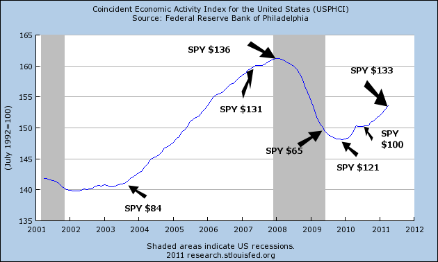
Each month the Federal Reserve in Philadephia compiles a Coincident Index (CI) for each state, then combines state information to get a picture of the U.S. economy.  The Federal Reserve at St. Louis publishes this composite which provides an overall economic picture for the nation. (Click to view larger graphs in separate tab)

The graph shows clearly why this is the Mother of All Recessions.

These coincident indexes rely primarily on labor and production statistics and a decline in the index correlates pretty closely with the official start of recessions as set forth by the National Bureau of Economic Research (NBER).  The CI gives a more accurate picture of the underlying economic strength of the country.  The NBER calls an end to a recession long before it feels like the end of a recession, leading some economists and market watchers to scoff lightly when the NBER pronounces that a recession is over as it did in the middle of 2009.

When is a recession really over?  In my view, it is when the index reaches the level it was at when the recession began.  Using this criteria as a guide, the relatively shallow recessions of the early 90s and 2000s were longer lived than the official NBER  dates.  Those of us who lived through them can concur that the CI gives the more accurate picture.

Those earlier recessions look like mere wrinkles compared to this last recession and using my criteria, we are still in recession.  The millions of unemployed would confirm that.

Combining some of the same labor and production data, together with fear and greed, the stock market tries to anticpate the earnings of publicly traded companies.  Since earnings are based largely on the strength of economic activity in this country and abroad, the stock market is a divination of sorts.  Like augurers of ancient Rome, sometimes they get it right, sometimes they don’t.

Below is a chart of the CI following the recession of the early 90s to the height of the “dot com” era in the early part of 2000.  The growth of the personal computer and the advent of the internet helped usher in a decade like the 1920s when the telephone and telegraph prompted both investment and speculation.  Below is a chart of the CI with a few price flags of a popular ETF, SPY, that mimics the movement of the S&P500 index.

With the rise in economic activity and the stock market, we began to take on ever more debt during that period, continuing and accelerating a trend that started in the early 1980s.  In anticipation of a continuing boom in economic activity, we borrowed against the rising equity in our homes and in our stocks.  That borrowing fueled ever more economic activity as we remodeled our homes, bought new cars and took more expensive vacations.

As the froth of the dot com era blew away, overall economic activity was still rising and so was household debt.  The stock market may have experienced a correction but the American family was still riding the rocket of rising home prices.  In his campaign, George W. Bush had warned of an impending recession and soon after he took office, the recession began.  The recession officially lasted 8 months, about average, but was exacerbated by the 9/11 disaster.  The true length of that recession is marked more clearly by the CI, which shows how truly weak the recovery was.

On the whole, Republicans believe that government can boost the economy by taking less in taxes out of the private sector.  Democrats believe that government can boost the economy by more government spending.  With a slight majority in both the House and Senate, Republicans and Democrats crafted an elegant solution – tax less and spend more.  Never mind that such a solution is a long term recipe for economic disaster.

By the beginning of 2004, the CI had risen to the level of early 2001, finally ending an almost 3 year recessionary period.  The stock market was beginning a strong upward move.  House prices were still on the rise and accelerating, prompting homeowners to trade up to bigger houses and renters to become homeowners.  It was a period of Buy, buy, buy and Borrow, borrow, borrow.

In a November 2005 research paper by the St. Louis Fed, the authors write,  “Real U.S. house prices, on average, have appreciated by 6 percent annually since 2000, a historically high rate when compared with the 2.7 percent annual rate between 1975 and 1999.” But, the authors concluded, “if bubble conditions do exist, they appear only on the two coasts and in Michigan.”  In the same month this research paper was published, the peak of the housing boom occurred, using the Case Shiller index as an indicator.

Fueled by borrowing and a rising stock market, economic activity continued to climb until it peaked in December 2007 – January 2008.  The stock market had stumbled in August 2007 as the unemployment rate edged up toward 5% (the good old days!) and softness in the housing market became more pronounced.

An investor who simply took a cue from the rise and fall of the CI over the past 20 years would have done very well.   The market anticipates an upturn or downturn in economic activity just as the CI is turning up or down EXCEPT for 2009.  What did the market respond to when it turned up in the spring of 2009?  It was not economic activity because activity was still falling and showed no signs of bottoming.  The market was hoping that massive government spending would spur increased economic activity.  As stimulus spending flowed through the economy throughout 2009, economic activity did pick up but stalled in the spring of 2010 as the greatest part of the stimulus had already been spent and the underlying weakness of the economy became apparent.  Enter the Federal Reserve in September with another round of stimulus via its QE2 program of Treasury bond purchases, which again spurred an uptick in activity and the stock market.

As the CI shows, the recessionary period isn’t over.  Over the past 3 years, we have shifted household debt

and bank debt

to the federal government – that’s you, me, our kids and grandkids.

It is going to be a bumpy ride.  The CI has proven to be a fairly reliable road map.

Sell In May Revisited

Last month I compared three approaches to IRA investing and found that the “turtle” strategy of steady investments produced better returns.

Sell in May and Go Away is a mantra repeated in those years when the stock market experiences a summer roller coaster ride as it did in 2010.  May and June of this year have seen a progressively steady decline in the market, prompting market commentators to repeat this time worn refrain.

Is it true?  I looked at the S&P500 Composite for the past 11 years, running a “What If” scenario in which an investor bought the S&P500 index on the first trading day of September and sold on the first trading day of May.  In the four months that the investor is out of the market, the money is invested in a CD, bond fund or Treasury bill that pays 2% on average.   The scenario started in September 2000 and ended on May of this year.  Prices are adjusted for dividends and splits.

This approach (purple bars in the graph below) produced a modest 36% profit over 11 years but it beat the “Buy N Hold” (maroon bars) approach simply because the inital investment of $10,000 was made at a relative high mark for the market over the past decade.  John Bogle, the founder of Vanguard Group, has long been an advocate for a steady investing approach – that regular investments in the market produce better returns. 

I ran a scenario (green bars) in which an investor invested only 20% of his cash balance (initially $10,000) each September, earning the same 2% interest on the remaining money.  This strategy earned slightly more than the “Sell In May” approach but the “drawdown” (reduction in principal or value) remained consistently lower than the “Sell in May” approach.

This past decade has been a particularly tough one, including a recession in the beginning of the decade and the Mother of All Recessions starting in 2008.  Will the next decade bring hubris or heartache?  Who knows.  This comparison of scenarios may justify a more measured approach when adjusting our portfolios.  An advisor may tell us that we are too much in stocks and not enough in bonds.  What do we do?  Sell some stocks or stock mutual funds and buy bonds.  It might be more prudent in the long run to make that adjustment gradually, averaging our way out of one allocation model as we transition into another.

Tidbits

This week is a “tidbit dump” of information that I thought was interesting.

– Local governments, municipal and county, employ 14.2M people, about 10% of the workforce.  Local government employs more people than the entire manufacturing sector does.  Less than half of the population of the U.S. works.

– The National Ass’n of Realtors offers assessments of local real estate markets, including employment, occupation mix, mortgage defaults.  Current reports are available by subscription but recent reports are free.

Federal and state governments have large pension and employee costs that are tied to the CPI or inflation rate.  Social Security payments rise with the CPI.  Federal, State and local government employees receive annual cost of living adjustments (COLA) to their pay that is based on the CPI.  The amounts of money involved are staggering.  Retirement benefits will total about $500B this year.  A 1% increase in the CPI is an additional $5B paid under this program alone.

– Doug Short is a retired IT consultant whose web site contains various commentaries on markets and personal economics.  Here is a historical overview and explanation of the Consumer Price Index.  It includes a decade long chart of the percentage rise of the various components of the CPI.  The rather steady rise of the food component over the past 10 years contradicts the Federal Reserve’s assertion that food is a volatile component.  The Fed leaves this supposedly volatile component out of it’s calculation of “core CPI” to get what the Fed considers a more accurate assessment of inflation pressures.  This methodology understates inflation, in my opinion, and contributes to the poor monetary policy that the Fed has adopted in the past 15 years.

– In an interview with former President Bill Clinton after the shooting of Congressperson Gabrielle Giffords :
These words[political invective] fall on the serious and delirious alike, they fall on both those who are connected and unhinged.

– Each year U.S. national parks receive as many visitors as the population of the U.S.

– Should a person nearing retirement take an early Social Security payout or wait? Steve Vernon with CBS Money Watch examines the pros and cons in this article.  The reader comments are as interesting as the article.

Money Machine

Investors who consider themselves to be conservative will sometimes keep a relatively small amount of money aside for riskier assets to “juice” overall returns.  This riskier pool may be 5% or less of a total portfolio and can be targeted toward smaller companies with higher growth rates and potentially higher returns.

What could be more enticing than investing in a Chinese natural resources company that is listed on the Nasdaq global exchange?  China is a fast growing economy, a growing middle class and a major manufacturing center which uses natural resources.

A Yahoo Finance article and video reviews one particular pitfall of investing in a company whose “home” is in a country that has less stringent financial oversight of publicly listed firms.  As on a “wet vac”, money machines that entice investors with the promise of higher returns have two ports, one for suction and one for blowing.

Ka-Ching to the Future

“Sell in May and go away” is an old maxim for stock traders and is based on the sentiment that in most years the summer stock market either goes down or sideways.  For the long term investor, would the summer “doldrums” be a good time to make one’s annual IRA contribution? 

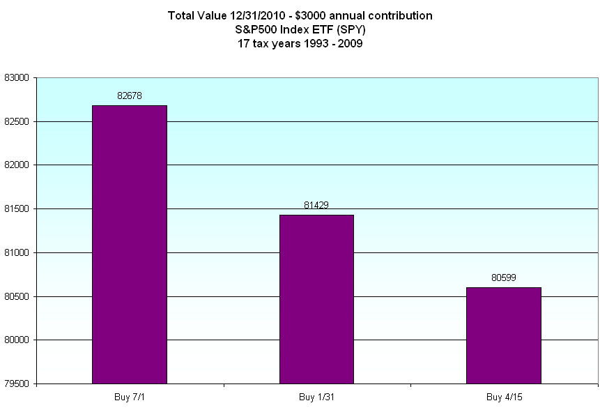
The S&P500 index is a familiar benchmark for the U.S. stock market as a whole.  I ran three scenarios: 1) investing $3000 on July 1st of each tax year; 2) investing $3000 on Jan. 31st of the following year for the previous tax year (year end bonus?); and 3) waiting till the last minute, April 15th, to make one’s contribution.

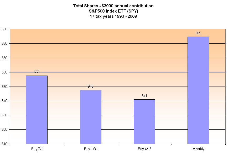
I expected a big KA-CHING! for those investing on July 1st of each year.  Not only would an investor capture a supposed lull in the market  in July but would have the additional benefit of having one’s money invested several months longer each year.  I was surprised at the relatively small advantage that a July 1st contribution gives the investor.  Below is the number of shares an investor would have accumulated during the 17 tax years 1993 – 2009. (Click to open in separate tab)

At the end of 2010, the value of the shares bought during those 17 tax years is shown below.  The investor contributing each July has 2.5% more value than the person waiting till the deadline the following April.  But no Ka-Ching!

For nine tax years, an investor contributing on July 1st, got a good deal.  There were six years in which the investor got a better deal by waiting till January or April of the following year to make their contribution.  In two years, it didn’t matter which of the three dates an investor made the contribution.

Then I examined the frumpy, boring method of IRA investing – a monthly contribution to a mutual index fund that mimics the performance of the S&P500 index. Below is a chart of the shares accumulated by investing $250 each month.

KA-CHING!  While the July investor accumulated 2.4% more shares than the April investor, the monthly investor has 7% more shares than the wait-till-the-last-minute investor.  At the end of 2010, those extra shares totaled $3400 more than the July investor, and almost $9000 more than the April investor, an extra return of  three years of contributions!

It may be possible for an investor to gain additional return by “timing” one’s contributions to a retirement account.  One could backtest any number of longer term trading systems, keep a vigilant watch on the market and possibly achieve higher returns.  That would be the exciting way to build an IRA nest egg.  Waiting till April 15th each year to fund an IRA is another dramatic approach.  These solutions make for good stories to tell family and friends.  The third approach – I’ll call it the Third Way to make it sound more exciting – may be the (yawn) monthly system.

Whatever system one chooses, the charts above illustrate the returns provided by regular investment.  An investment of $51K during the 17 years of this example returned an additional $30K to $35K if valued at the end of 2010.   Even at the market low of July 2010, the monthly investor would still have “made” $18K, or six years worth of contributions, on their savings. A good scout helps old people across the street, don’t they?  Regular, disciplined contributions to a retirement account is like being a good scout to our future selves, a helping hand across the street of retirement. No, there is no badge, just some ease of mind.

Oil Suck

After rising to almost $115 a barrel (42 gallons per barrel), oil slid to $98 a barrel in this past week.  Across the country prices at the pump approach and in some states exceed $4 per gallon.  When gas prices rise, presidents call for an investigation into speculative trading and market manipulators and this president is no different.  This past week President Obama called on his Attorney General, Eric Holder, to lead a “Fraud Squad” which will root out those nefarious speculators and bring them to justice. 

There’s only one problem – the speculators are state, local and private pension funds buying “paper oil”, Joe and Mary hoping to grow their college fund by buying a few hundred shares of an oil related ETF.  Frank hopes to pay off his student loans with a proven timing system on the Proshares Ultra Oil and Gas ETF (DIG).  Hedge fund managers include oil as part of a commodity exposure mathematically designed to mitigate inflation risks to their clients’ portfolios.  None of these speculators either produce or want delivery of any oil.  The companies – airlines, for example – that do use lots of oil and trade oil futures to lock in operating costs probably daydream that some administration or some Congress or the feeble Securities Exchange Commission or the Chicago Mercantile Exchange would keep those who buy and sell “paper oil” out of  the market.

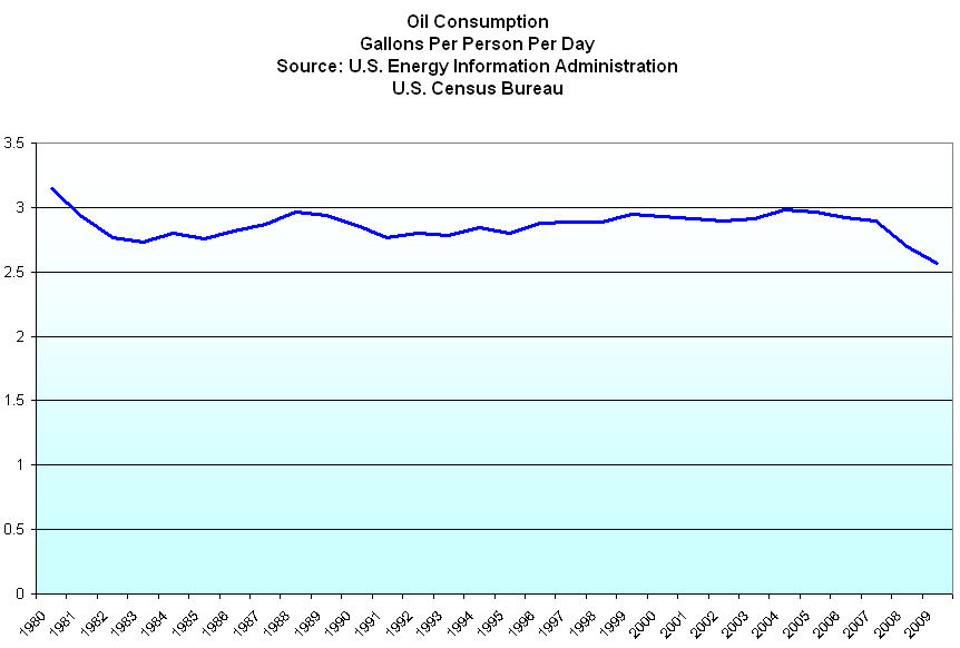
For the past half century this country has sucked on oil.  Below is the daily U.S. crude oil consumption during the past 30 years as reported by the U.S. Energy Informaton Administration (EIA) (Source) Consumption has declined slightly in the past two years, thanks to the recession.  Recent quarterly figures from the EIA, however, show that 2010 consumption was already up to 2008 levels.

Since 1980, we have introduced more fuel efficient cars and “cut” our gasoline with ethanol.  Our population has concentrated more in urban areas, and we have spent billions of taxpayer dollars on new and improving public transportation.  I combined data from the EIA and the Census Bureau to get a per person per day consumption rate.  All this hard work and we still suck up gas.

Each day all the people on the planet use about 85 million barrels of oil.  The U.S. uses almost 20 million barrels a day, a bit less than a quarter of the world total.  Ten years ago, we consumed a bit more than a quarter.  Growing prosperity in developing countries is increasing the demand for oil.

In the 1970s, President Nixon spoke about developing a comprehensive energy policy and every president since then has repeated the pledge.  Do we have such a policy?  Not a chance.  This country sits on top of vast reservoirs of natural gas yet there is no comprehensive plan to increase the use of this clean burning fuel.  In other countries, Ford and GM make cars that use Compressed Natural Gas (CNG) but the lack of any cohesive U.S. policy to promote this technology and delivery system has forced carmakers to abandon this country, the largest oil market in the world.  For more info on CNG vehicles.

Federal and state politicians will likely continue to twiddle their thumbs as they have done for the past 40 years. Exxon Mobil is the largest oil company in the world and will likely benefit from increasing global demand for its products.  When  President Nixon spoke about a comprehensive energy policy, Exxon’s stock traded at an adjusted closing price of less than $1.  Today the stock trades at $83 and they pay a dividend, currently about 2.3%. 

As shown above, our consumption has changed only slightly despite reduction measures.  Older people generally drive less and as the population ages, miles driven will likely decrease during the next 20 years.  But will our overall consumption decrease?  We like big in our cars.  We like trucks and SUVs.  We like to drive.