Post-Election Bounce

January 1, 2017

Happy New Year!  How many days will it take before we remember to write the year correctly as 2017, not 2016? It is going to be an interesting year, I bet.  But let’s do a year end review.

Homeownership

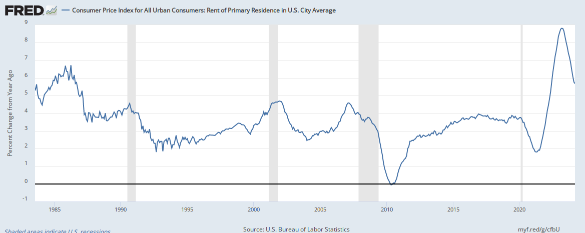
The home ownership rate has fallen near the lows set in 1985 and the mid-1960s at about less than 64%. (Graph)  In 2004, the rate hit a high of 69%.  For the U.S., the sweet spot is probably around 2/3 or 66%.  Most other countries have higher rates of home ownership, including Cuba with a rate of 90%. (Wikipedia article)  Rents in some cities have been growing rapidly.  In the country as a whole, rents have increased almost 4%, about twice the growth in the CPI, the general rate of inflation for all goods and services. (Graph)

Earnings

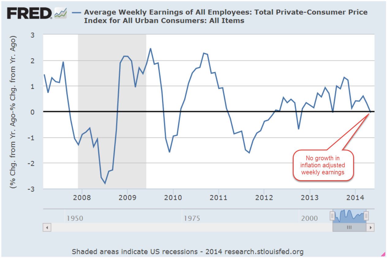
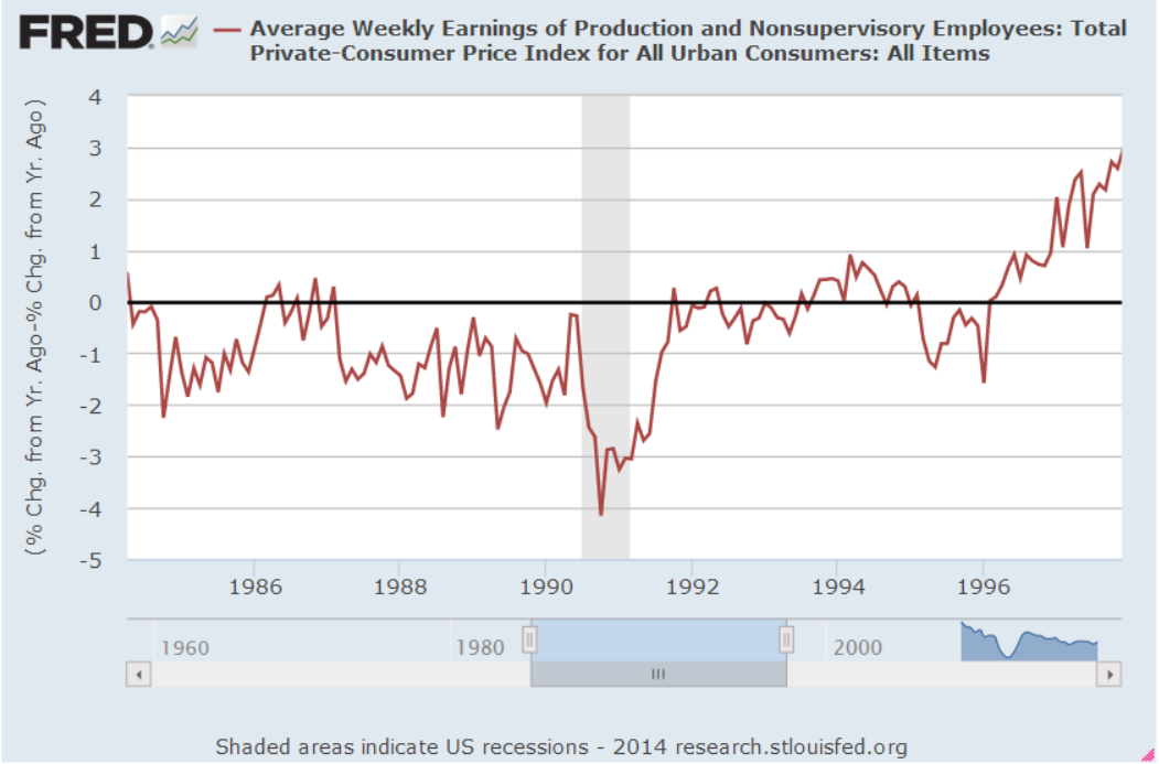
Real, or inflation-adjusted, weekly earnings of full time workers spiked up during the recession as employers laid off lower paid and less productive workers.  By late 2013, weekly earnings had fallen to 2006 levels and have risen since, finally surpassing that 2009 peak this year.
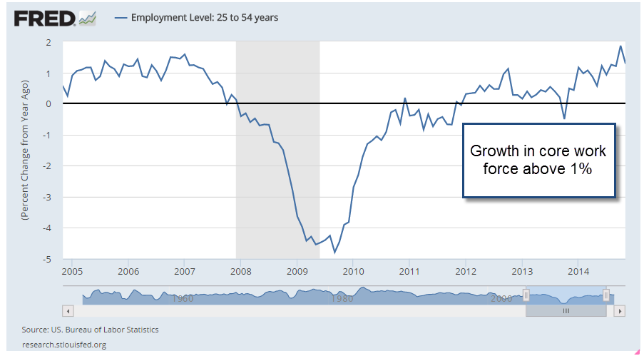
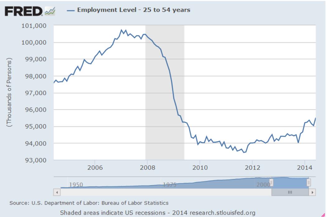
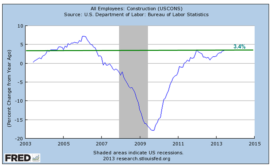
Core Work Force

Almost every month I look at the changes in the core work force of those aged 25-54 who are in their prime working years, who buy homes for the first time and have families.  These are the formative years when people build their careers, and form product preferences, making them a prime target for advertisers.  The economy depends on this age group.  They fund the benefit systems of Social Security and Medicare by paying taxes without collecting a benefit.  In short, an economy dependent on intergenerational transfers of money needs this core work force to be employed.

For two decades, from 1988 to 2008, the labor participation rate of this age group remained steady at 82% – 83%. (BLS graph) By the summer of 2015, it had fallen to 80%.  A few percent might not seem like much but each percent is about a million workers.  For the past year it has climbed up from that trough, regaining about half of what was lost since the Great Recession.

Consumer Confidence

A post-election bounce in consumer confidence has put it near the levels of 2001, near the end of the dot-com boom and just before 9-11. (Conference Board)  In 2012, the confidence index was almost half what it is today.

Business Sentiment

Small business sentiment has improved significantly since the November election (NFIB Survey).  Almost a quarter of businesses surveyed expect to add more employees, a jump of 2-1/2 times the 9% of businesses who responded positively in the October survey.  In October, 4% of companies expected sales growth in the coming year.  After the election, 20% responded positively.  This jump in sentiment indicates the degree of hope – and expectation – that business owners have built on the election of Donald Trump.

Hope leads to investment and business investment growth has turned negative (Graph). Recession often, but not always, accompanies negative growth. Since 1960, investment growth has turned negative eleven times.  Eight downturns preceded or accompanied recessions.  Let’s hope this renewed hope and some policy changes reverses sentiment.

On the other hand, those expectations may present a challenge to the incoming administration, which has promised some tax reform and regulatory relief. Small business owners will lobby for different reforms than the executives of large businesses.  Regulations of all types hamper small business but large businesses may welcome some regulation which acts as a barrier to entry into a particular market by smaller firms.

Publicly held firms will continue to lobby for repeal or reform of Sarbane Oxley reporting provisions.  For six years, the Obama administration has wanted to roll back these regulations but has been unable to come up with a compromise between the SEC, which regulates publicly traded companies, and Congress.  A Trump administration may finally reform a law that was rushed into place by George Bush and a Republican Congress in response to the Enron scandal.  That scandal grew in part from the Bush administration’s push to deregulate the energy market.

Voters Veer From Side To Side

We have stumbled from an all Republican government in 2002 to an all Democratic government in 2008 and now come full circle again to an all Republican government. Once in power, neither party can resist using economic policy to pick winners and losers.  Every few years the voters throw out the guys in charge and bring the other guys in, hoping that the party that has been out of power will be chastened somewhat.  Within a few months of taking power, each party digs up their old bones and begins to gnaw on them again.  Tax reform, prison reform, justice and fairness for all, climate change, more regulation, less regulation – these bones are well chewed.

Still we keep trying.  The priests and prophets of long ago kingdoms could not govern.  Neither could the kings and queens of empires.  So we have tried government of the people, by the people and for the people and it has been the bloodiest two centuries in human history.  Still we keep hoping.

The Presidential Test

Most presidents are tested in their first year in office.  Kennedy had to grapple with the Soviet threat and Cuba almost as soon as he took office.   Johnson struggled with urban violence, social upheaval and the war in Vietnam.

Nixon confronted a newly resurgent Viet Cong army when he first took office.  His second term began with the Arab oil embargo.  Ford dealt with the aftermath of Watergate and Nixon’s resignation under the threat of impeachment.

Jimmy Carter began his term with the challenges of high inflation and unemployment, and an energy crisis to boot.  Ronald Reagan wrestled with sky-high interest rates and a back to back recession in his early years.  His successor, H.W. Bush, met a Soviet Union near the end of its 70 year history as Gorbachev loosened the reins of Soviet control of eastern European countries and the Berlin Wall collapsed.

After an unsuccessful attempt to reform health care in his first year of office, Clinton suffered in the off year election of 1994.  G. W. Bush had perhaps the worst first year of any modern President – the tragedy of 9-11.  Obama entered office under a full blown global financial crisis.

Despite Putin’s bargaining rhetoric regarding President-elect Donald Trump, every President has to learn the lesson anew – Russia is not our friend.  Trump will have to learn  the same lesson.  China’s territorial claims in the South China sea may prompt an international incident.  N. Korea could launch a missle at S. Korea and start a small war.  Iran, Afghanistan, Iraq and Syria, Israel’s settlements, Palestinian independence – the crises may come from any of these tinderboxes.  We wish the new President well as he hops into the fire.

Small Hope Amid Tragedy

July 10, 2016

The horrific news from Dallas on Thursday night and Friday morning understandably drowned out this month’s extraordinary employment report. No one anticipated job gains of 287,000 that were far above the consensus average estimate of 170,000.  Like last month, the BLS numbers are way off from those from the private payroll processor ADP, which reported gains of 172,000.

The strike at Verizon that started in May and ended in June involved 38,000 workers and skewed the BLS numbers down in May, then reversed back up again in June.  BLS methodology does not adjust for a strike involving so many workers, leading some to criticize such a widely followed methodology.  Because these estimates are prone to error, I think we get a more reliable picture by averaging the two estimates from the BLS and ADP.  As we can see in the graph below, economic growth during the past five years has been strong enough to stay ahead of the 150,000 monthly gains needed to keep up with population growth.

Those working part time because they couldn’t find full time work have dropped by 1.4 million in the past year – a positive sign. Although the supposed recovery is seven years old, it is only since the spring of 2014 that the ranks of involuntary part timers have consistently decreased.  Today’s level is almost 7 million less than it was two years ago but is still 2/3rds more than pre-Crisis levels.

This month’s 1/10th uptick in the participation rate was a welcome sign that more people are coming back into the workforce.  Although the unemployment rate ticked up two notches to 4.9% this was probably due to more people actively looking for work. An important component of the economy is the core work force aged 25 – 54, which continued to show annual growth in excess of 1%, a healthy sign.

////////////////////////////

CWPI (Constant Weighted Purchasing Index)

Earlier in the week, the monthly survey of Purchasing Managers (PMI) foreshadowed a positive employment report. A surge in new orders in the services sector and some healthy growth in employment helped lift up the non-manufacturing PMI to strong growth.  The Manufacturing index grew as well.  The CWPI composite of both surveys has a reading of almost 58, indicating strong growth.  The familiar peak and trough pattern that has continued during the recovery has changed to a steadier level.  New Export Orders in both manufacturing and services reversed direction this month.  The strong dollar makes American made products more expensive to buyers in other countries and presents a significant obstacle to companies who rely on exports.

Last month’s survey of purchasing managers in the services sector indicated some worrying weakness in employment.  This month’s reading suggests that a surge in new orders has reversed the decline in employment, a trend confirmed by the BLS report later released at the end of the week.

A few months ago I was concerned that the familiar trough that had developed in the spring might continue to weaken.  This month’s survey put those fears to rest.

//////////////////////////

Housing Bubble?

Soaring home prices in some cities has led to speculation that, ten years after the last peak in the housing market, we are again approaching unaffordable price levels.  Heavy migration into the Denver metro area has made it the third hottest housing market in the U.S., just behind San Francisco and Vallejo (northeast of SF) in California (Source). Despite bubble indications in these hot markets, the Case Shiller composite of the twenty largest metropolitan areas does not indicate that we are at excessive levels.

In the period 2000 through mid-2006 when housing prices peaked, annual growth was more than 10%.  Ten years have passed since then.  In the 16.5 years since the start of 2000, annual growth has averaged 4%.  While this is almost twice the 2% rate of inflation, it is approximately the same as the rate of growth during the past century.

//////////////////////////////

In the past two weeks following the Brexit vote in the U.K. the S&P500 has rebounded 6%, recovering all the ground lost and then some. It is near all time highs BUT so are Treasuries.  When both “risk on” (stocks) and “risk off” (Treasuries) both rise to new highs, it creates a tension that usually resolves in a rather ugly fashion as the market chooses one or the other.

Pickup and Letdown

May 8, 2016

Based on ISM’s monthly survey of Purchasing Managers, the CWPI blends both service and manufacturing indexes and gives additional weight to a few components, new orders and employment.  Last month we were looking for an upward bend in the CWPI, to confirm a periodic U-shaped pattern that has marked this recovery. This month’s reading did swing up from the winter’s trough and we would expect to see further improvement in the coming few months to confirm the pattern. A break in this pattern would indicate some concern about a recession in the following six months. What is a break in the pattern? An extended trough or a continued decline toward the contraction zone below 50.

Since the services sectors constitutes most of the economy in the U.S., new orders and employment in services are key indicators of this survey.  A sluggish winter pulled down a composite of the two but a turn around in April has brought this back to the five year average.

Rising oil prices have certainly been a major contributor to the surge in the prices component of the manufacturing sector survey. The BLS monthly labor report (below) indicates some labor cost increases as well.  Each month the ISM publishes selected comments from their respondents.  An employer in the construction industry noted a severe shortage of non-skilled labor, a phenomenon we haven’t seen since 2006, at the height of the housing bubble.

Last week the BEA released a first estimate of almost zero growth in first quarter GDP, confirming expectations.  Oddly enough, the harsh winter of 2015 provided an even lower comparison point so that this year’s year over year growth, while still anemic, is almost 2%.

////////////////////////////

Employment

April’s employment data from the BLS was a bit disheartening.  Earlier this week, the private payroll processor ADP reported job growth of 150,000 in April and lowered expectations for the BLS report released on Friday.  While the BLS estimate of private job growth was slightly better, the loss of about 10,000 government jobs, not included in the ADP estimate, left the total estimate of jobs gained at 160,000. The loss of government jobs is slight compared to the total of 22 million employed at all levels of government but this is the fourth time in the past eight months that government employment has declined.

A three month average of job growth is still above 200,000, a benchmark of labor market health that shows job growth that is more than the average 1% population growth  With a base of 145 million employees in the U.S, a similar 1% growth rate in employment would equal 1.5 million jobs gained each year, or about 125,000 per month.  To account for statistical sampling errors, the churn of businesses opening and closing, labor analysts add another 25,000 to get a total of 150,000 minimum monthly job gains just to keep up with population growth.  The 200,000 mark then shows real economic growth.  In March 2016, the growth of the work force minus the growth in population was 1.2%, indicating continued real labor market gains.

Job growth in the core work force aged 25 -54 remains above 1%, another good sign.  It last dipped briefly below 1% in October.  This core group of workers buys homes, cars, and other durable goods at a faster pace than other age groups; when this powerhouse of the economy weakens, the economy suffers. In the chart below, there is an almost seven year period, from June 2007 through January 2014 where growth in this core work force group was less than 1%.  From January 2008 through January 2012, growth was actually negative.  The official length of the recession was 17 months, from December 2007 through June 2009.  For the core work force, the heart of the economic engine, the recession lasted much longer.

In 2005, a BLS economist estimated that the core work force would number over 105 million in 2014.  In December 2014, the actual number was 96 million, a shortage of 9 million workers, or almost 10% of the workforce.  In April 2016, the number was almost 98 million, still far less than expectations.

Some economists and pundits mistakenly compare this recovery from a financial crisis with recoveries  from economic downturns in the late 20th century.  For an accurate comparison, we must look to a previous financial, not economic, crisis – the Great Depression of the 1930s.

The unemployment rate in April remained the same, but more than a half million people dropped out of the labor force, reversing a six month trend of declines.  It is puzzling that more people came back into the labor force during the winter even as GDP growth slowed.

Average hourly earnings increased for the second month in a row, upping the year over year increase above 2.5%.  For the past ten years, inflation-adjusted weekly earnings of production and non-supervisory workers have grown an anemic .75% per year.  In the sluggish winter of January and February 2015, earnings growth notched  a recovery high of 3%, leading some economists and market watchers to opine that lowered oil costs, on the decline since the summer of 2014, would finally spur worker’s pay growth in this long, subdued recovery.  A year later, earnings growth is about 1.2%, a historically kind of OK level, but one which causes much head scratching among economists at the Federal Reserve.  When will worker’s earnings begin to recover?

/////////////////////////

Hungry

A reader sent me a link to a CNBC article  on food insecurity in the U.S. The problem is widespread and not always confined to those who fall below the poverty benchmark. Contrary to some perceptions, food insecurity is especially prevalent in rural areas, where food costs can be 50% higher than urban centers.  How does the government determine who is food insecure? The USDA publishes a guide with a history of the project, the guidelines and questions.  To point out the highlights, I’ll include the page links within the document. The guidelines have not been revised since this 1998 revision.

In surveys conducted by the Census Bureau, respondents are asked a series of questions.  The answers help determine the degree of household food insecurity.  The USDA repeatedly emphasizes that it is household, not individual, insecurity that they are measuring.  The ranking scale ranges from 0, no insecurity, to 10, severe insecurity and hunger. An informative graph of the scale, the categories and characteristics is helpful.

In 1995, a low .8 percent were ranked with severe food insecurity (page 14) . To be considered food insecure, a household must rank above 2.3 (household without children), or above 2 .8 (with children) on the scale.  Above that are varying degrees of insecurity and whether it is accompanied by hunger. (Table)

The USDA admits that measuring a complex issue like this one can provoke accusations that the measure either exaggerates or understates the number of households.  What are they measuring?  Page 6 contains a formal definition, while page 8 includes a list of conditions that the survey questions are trying to assess, and that a condition arose because of financial limitations like “toward the end of the month we don’t have enough money to eat well.”

Page 9 describes the rather ugly pattern of progressively worse food insecurity and hunger.  At first a household will buy cheaper foods that fill the belly.  Then the parents may cut back a little but spare the kids the sensation of hunger.  In its most severe stage, all the family members go hungry in a particular day.

Those of you wanting additional information or resources can click here.

////////////////

Earnings

Almost a month ago the giant aluminum manufacturer Alcoa kicked off the first quarter earnings season.  87% of companies in the SP500 have reported so far and FactSet calculates a 7% decline in earnings.  They note “the first quarter marks the first time the index has seen four consecutive quarters of year-over-year declines in earnings since Q4 2008 through Q3 2009.”  Automobile manufacturers have been particularly strong while the Energy, Materials and  Financial sectors declined.  Although the energy sector gets the headlines, there has also been a dramatic decrease in the mining sector.  The BLS reports almost 200,000 mining jobs lost since September 2014.

The bottom line for long term investors: the economic data supports an allocation that favors equities.  The continued decline in corporate earnings should caution an investor not to go too heavily toward the equity side of the stock/bond mix.

/////////////////

(Edited May 11th in response to a reader’s request to clarify a few points.)

A Change Is Gonna Come

December 6, 2015

A horrible week for many families.  When we count the dead and injured in mass shootings, we often neglect to include the family and friends of each of these victims.  If we conservatively estimate 20 – 30 people affected for each victim, we can better appreciate the emotional and economic impact of these events. Shooting Tracker lists the daily mass shootings (involving four or more victims) in the U.S. in 2015.  What surprised me is that, in most cases, the shooter/assailant is unknown.

A strong November jobs report sent equities, gold and bonds soaring higher on Friday.  Markets reacted negatively on Thursday following a lackluster response from the European Central Bank(ECB) and comments by Fed chair Janet Yellen indicating that a small rate increase was in the cards at the mid-December Fed meeting.  The SP500 closed Thurday evening below November’s close.  Not just the close of November 2015, but also the monthly close of November 2014!

Overnight (early Friday morning in the U.S.), the ECB said that they would do whatever it took to support the European economy. Shortly after the cock crowed in Des Moines, the Bureau of Labor Statistics released November’s labor report, confirming an earlier ADP report of private job gains.  By the end of trading on Friday, the SP500 had jumped up 2%.  However, it  is important to step back and gain a longer term perspective.  The index is still slightly below February 2015’s close – and May’s close – and July’s close.

Extended periods of price stability – let’s call them EPPS – are infrequent.  Markets struggle constantly to find a balance of asset valuation. Optimists (bulls) pull on one end of the valuation rope.  Pessimists (bears) pull on the other end.  Every once or twice in a decade, neither bears nor bulls have a commanding influence and prices stabilize. Markets can go up or down after these leveling periods: 1976 (down), 1983 (up),  1994 (up), 2000 (down), 2007 (down), 2015 (?)

**************************

Year End Planning

Mutual funds must pass on their capital gains and losses to investors.  Investors who have mutual funds that are not in a tax-sheltered retirement account should take the time in early December to check on pending capital gains distributions either with their tax advisor or do it themselves.  Most mutual fund companies distribute gains in mid to late December.  Your mutual fund will have a list of pending December distributions on their web site.  For those retail investors in a rush, you might just scan through the list and look for those funds that have a distribution that is 5% or more of the value of the fund, then look and see if it is one of your funds.

An EPPS tends to produce relatively small capital gains but this year some mid-cap growth funds and international funds may be declaring gains of 7 – 10% of the value of the fund.  An investor who had $50,000 in some mid-cap growth fund might see a capital gain distribution of $4,000 on their December statement.  When an investor receives the statement in January 2016, it is too late to offset this gain with a loss.  Depending on the taxpayer’s marginal tax rate, they could be on the hook to the tax man for $700 – $1200.

Let’s say an investor is anticipating a $4000 capital gain distribution in a taxable mutual fund in late December.  Most mutual fund companies list the cost basis of each fund in an investor’s account. An investor who had a cost basis that was higher than the current value of the fund could sell some shares in that fund to offset some or all of the capital gain distribution in the other fund.  This is called tax loss harvesting.  Again, remind or ask your tax advisor if you are unclear on this.

Here is an IRS FAQ sheet on capital gains and losses.  Here is an article on the various combinations of short term and long term gains and losses.

**************************
CWPI

The latest ISM Survey of Purchasing Managers (PMI) showed that the manufacturing sector of the economy contracted in November.  October’s reading was neutral at 50.1.  November’s reading was 48.6.

The services sector, which is most of the economy, is still growing strongly.  Both new orders and employment are showing robust growth.   

However, manufacturing inventories have contracted for five months in a row.  For now, this decline is more than offset by inventory growth in the service industries.  However, the drag from the manufacturing sector is affecting the services sector.  The trough and peak pattern of growth in employment and new orders since the recession recovery in 2009 has begun to get a bit erratic.  Nothing to get too concerned about but something to watch.

The Constant Weighted Purchasing Index combines the manufacturing and service surveys and weights the various components, giving more weight to New Orders and Employment.  Both components anticipate future conditions a bit better than the equal weight methodology used by ISM, which conducts the surveys.  In addition, there is a smoothing calculation for the CWPI.

During this six year recovery, the CWPI has shown a wave-like pattern of growth.  Since the summer of 2014, growth has remained strong but there has been a leveling in the pattern as the manufacturing sector no longer contributes to the peaks of growth.

Despite the underlying growth fundamentals, there are some troubling signs.  In response to activist investors, to boost earnings numbers and maintain dividend levels, companies have bought back shares in their own company at an unprecedented level.  In some cases, companies are taking advantage of low interest rates to borrow money to make the share buybacks. (U.S. Now Spend More on Buybacks Than Factories, WSJ 5/27/15)

*******************************

Labor Report

46,000 jobs gained in construction was a highlight of November’s labor report and was about a fifth of all job gains.  Rarely do gains in construction outweigh gains in professional services or health care. This is more than twice the 21,000 average gains of the past year. The steady but slow growth in construction jobs is heartening but a long term perspective shows just how weak this sector is.

Involuntary part-timers, however, increased by more than 300,000 this past month, wiping out a quarter of the improvement over the past year.  These employees, who are working part time because they can not find full time work, have decreased by almost 800,000 over the past year.

The core work force, those aged 25-54, remains strong with annual growth above 1%.

Other notable negatives in this report are the lack of wage growth and hours worked.  Wage growth for all employees is a respectable 2.3% annual rate, but only 1.7% for production and non-supervisory employees.  This is below the core rate of inflation so that the income of ordinary workers is not keeping up with the increase in prices of the goods they buy.

Hours worked per week has declined one tenth of an hour in the past year, not heartening news at this point in what is supposed to be a recovery.  Overtime hours in the manufacturing sector has dropped 10% in the past year.

******************************

Inflation

The core CPI is a measure of inflation that excludes the more volatile price changes of food  and energy.  While the headline CPI gets the attention, this alternative measure is one that the Federal Reserve looks at to get a sense of the underlying inflationary forces in the economy.  The target annual rate that the Fed uses is 2%.

October’s annual rate was 1.9%.  November’s rate won’t be released till mid-December. However, Ms. Yellen made it pretty clear that the Fed will raise interest rates this month, the first time since the financial crisis. I suspect that prelimary reports to the Fed on November’s reading showed no decline in this core rate.  With employment gains and inflation stable, the FOMC probably felt comfortable with a small uptick in the bench mark rate.

Wage and Industrial Growth

July 6, 2014

This week I’ll take a look at the monthly employment report, update the CWPI and introduce a surprising medium term trading indicator.

***********************

Employment

On Wednesday, the private payroll processor ADP gave an early forecast that this month’s labor report from the BLS would be robust, near the tippy-top of estimates of job gains that ranged from 200K to 290K.  The BLS reported $288K i net job gains, including 26K government jobs added. 17,000 of those jobs were in education at the local level.  Rising sales and property tax revenues have enabled many city and county governments to replace education jobs that were lost during the recession.

Job gains may be even better than the headline data shows.  ADP reports that the large majority of hiring is coming from small and medium sized firms.  The headline number of job gains each month comes from the BLS Establishment Survey, which underestimates job growth in really small firms.  The Household Survey estimated about 400K job gains this past month.  Usually, the Establishment Survey is thought to be the more reliable estimate but in this case, I would give a bit of a bump up toward the Household Survey estimate and guesstimate that job gains were closer to 330K this past month.  The BLS also revised April and May’s job gains upward.

The unemployment rate decreased .2% to 6.1% and the y-o-y decline in the rate has accelerated.

Excellent news, but let’s dig a bit deeper. The BLS tracks several unemployment rates.  The headline rate is the U-3 rate.  The U-4 rate includes both the unemployed who have looked for work in the past month, and those who have not, referred to as discouraged workers.  The trend in discouraged workers has been drifting down, although it is still above the normal range of .2 to .3% of the work force.

I would be a whole lot more optimistic about the labor market if the employment rate of the core work force aged 25 – 54 were higher.

Slowly and inexorably the employment level of this core has been rising in the past few years but the emphasis is on the word slowly.

The number of workers who usually work part time seems to have reached a high plateau, close to 18% of the Civilian Labor Force (CLF).  The CLF includes most people over the age of 16.  June’s Household Survey shows a historic jump of 800,000 additional part time jobs added in the past month.

A closer look at the BLS data makes me doubt that number. The unseasonally adjusted number of part timers shows only a 400,000 gain, leading me to question any seasonal adjustment that doubles that gain.  Secondly, the BLS did not seasonally adjust last month’s tally of part time workers, leading me to guess that June’s figure includes two months of seasonal adjustment.

That same survey shows a one month loss of more than 500,000 full time jobs lost (Table A-9 BLS Employment Situation).  The year-over-year percent change in full time workers is 1.8%.  As you can see in the graph below this is in the respectable range.  The unseasonally adjusted y-o-y gains is close to the seasonally adjusted gain, leading me to believe that the losses, if any, have been overstated due to month-to-month fluctuations in seasonal adjustments.

However, if you are selling a newsletter that says the stock market is grossly overvalued and the end is coming, then you would want to highlight the change in June’s seasonally adjusted numbers, to wit:  500,000 full time jobs lost;  800,000 part time jobs gained.

While the Civilian Participation Rate has steadied, it is rather low.  The Participation Rate is the number of people working or looking for work as a percent of most of the population above 16. Below is a chart showing the declining participation rate and the unemployment rate.

Now let’s divide the Participation Rate by the Unemployment Rate and we see that this ratio is still below the 34 year average.

                                                                                      
********************

Wage Growth

Each month the BLS reports average weekly earnings as part of the labor report. Year-over-year inflation adjusted wage growth is flat but has probably declined below zero.

An investor would have done very well for themselves if they had paid attention to this one indicator.  (There is a week lag between the end of the month price of SP500 and the release of the employment report for that month but it is close enough for this medium to long term analysis.)

The SP500 has gained almost 50% since the first quarter of 2006.  An investor going in and out of the market when inflation-adjusted wage growth crossed firmly above and below 0% would have made 134% during that same period.  “Ah, ha!  The crystal ball that will give me a glimpse into the future!” The problem with any one indicator is that it may work for a period of time.  This one has worked extremely well for the past eight years.  This series which includes all employees goes back only to March 2006.  The series that includes only Production and Non-Supervisory employees goes back to 1964.  The two series closely track each other.  I have left the CPI adjustment out of both series to show the comparison.

However, an investor using this strategy in the mid-1990s would have been out of the market during a 33% rise.  She would have been in the market during half of the 2000-2002 downturn and been mostly out of the market during an almost 50% rise from 2003-2005.  In approximately twenty years, she would have made half as much as simply staying in the market.

The ups and downs of wage growth may not be a reliable indicator of the market’s direction but it does indicate positive and negative economic pressures.  Poor wage growth in the mid-2000s probably fueled speculation in real estate and the stock market.

From the mid-1980s to the mid-1990s, a decade of negative inflation adjusted wage growth exerted downward pressure on labor income, which naturally led to a stratospheric increase in household debt.

The stock market quintupled as inflation adjusted wages stagnated.  During this period an investor would have been better to do the opposite: buy when wage growth fell below zero, sell when it crossed above.  As long as workers were willing and able to borrow to make up for the lack of wage growth, company profits could continue to grow and it is profits that ultimately drive stock market valuations.

Wage growth ultimately influences retail sales which impacts GDP growth.  The difference between the growth in retail sales and wage growth roughly tracks changes in GDP.

If retail sales growth is more than wage growth for a number of years, the imbalance has to eventually correct.  We are in a period of little wage growth and modest sales growth which means that GDP growth is likely to remain modest as well.

**********************

Constant Weighted Purchasing Index (CWPI)

Purchasing Managers surveyed by the Institute for Supply Management continue to report strong growth.  The CWPI index, based on both the Manufacturing and Services surveys, continues to rise as expected.

A composite of new orders and employment in the services sector remains strong.  February’s dip below 50 was an anomaly caused by the severe winter weather which coincided with inventory adjustments.

We see that this is a cyclic indicator, responding to the push and tug of new orders, employment, deliveries and inventories.  If the pattern continues, we would expect a decline in activity in the several months before the Christmas shopping season, a cycle that we have not seen since 2006.

The CWPI generates buy and sell signals when the index crosses firmly above and below 50 and has generated only 8 trades, or 16 separate transactions, in the past 17 years.  It is suited more to the long term investor who simply wants to avoid a majority of the pain of a severe downturn in the market.  Because it charts a composite of economic activity, it will not generate a signal in response to political events like the budget disagreement in July 2011 that led to an almost 20% drop in the market.  A strategy based on the CWPI gained 180% over the past 17 years as the market gained about 110%.

************************

Takeaways

Strong employment report but wage growth is flat and declining on a year over year basis.  CWPI indicator continues to rise up from the winter doldrums and should peak in two months.

Employment, New Orders, CWPI

CWPI (Formerly CWI)

The Constant Weighted Purchasing Index (CWPI) that I introduced last summer was designed to be an early or timely warning system of weakening elements of the economy.  It is based on a 2003 study by economist Rolando Pelaez on the monthly Manufacturing Purchasing Managers Index (PMI) published by the Institute for Supply Management (ISM).  ISM also produces a Non-Manufacturing index for service industries each month but this was not included in the 2003 study.

The CWPI focuses on five factors published by ISM:  employment, new orders, pricing, inventory levels and the timeliness of supplier deliveries.

The CWPI assigns constant weights to the components of both indexes, then combines both of these indexes into a composite, giving more weight to the services sector since it is a larger part of the economy.  Both the CWPI and PMI are indexed so that 50 is neutral; readings above 50 indicate growth; readings below 50 indicate contraction.  In previous months (here and here), I anticipated that the combined manufacturing and services sector index would move into a trough at this time before rising again in March and April of this year.

A longer term chart shows the wave like formation in this expansionary phase that began in the late summer of 2009.

February’s ISM manufacturing index climbed slightly but the non-manufacturing, or services, index slid precipitously, more than offsetting the rise in manufacturing.  Particularly notable was the huge 9% decline in services employment, from strong growth to contraction.  The service sector portion of the CWPI shows a contraction which some blame on the weather.  A slight contraction – a reading just below 50 – can be just noise in the survey data.  The past two times when the employment component of the services sector has dropped below 48, as it did in this latest report, the economy was already in recession; we just didn’t know it till months later.

A close comparison of the current data with the previous two episodes may sound a cautionary tone.   At this month’s reading of 48.6, the CWPI services portion is not showing as severe a contraction as in April 2001 (43.5) and January 2008 (33.1), when the employment component also dropped below 48.

New orders and employment in both portions of the CWPI are given extra weight. In January 2008, new orders and employment both fell dramatically.  The current decline is similar to the onset of the recession beginning in early 2001, when employment declined severely in April but new orders remained about the same.  Let’s isolate just these two factors and weight them proportionate to their respective weights in the services portion of the CWPI.

Notice that the decline below 50 signaled the beginning of the past two recessions.  Here’s the data in a different graph with a bit more detail.

Some cite the historically severe weather in the populous eastern half of the country as the primary cause for the decline in the services sector employment indicator and it well may be.  If so, we should expect to see a rebound in this component in March.  Basing a prediction on one month’s reading of one or two components of an indicator is a bit rash.  However, we often mistakenly attribute weakness in some parts of the economy to temporary factors and discount their importance because they are temporary – or so we think.

In the early part of 2008, many thought that a healthy correction in an overheated housing market was responsible for the slowdown in economic growth.  In the spring of that year, the bailout of bankrupt Bear Stearns, an undercapitalized investment firm which had made some bad bets in the housing market, confirmed the hypothesis that the corrective phase was nearing its end. As weakness continued into the late spring of that year, some blamed temporarily high gasoline and commodity prices for exacerbating the housing correction.  In the fall of 2008, the financial crisis exploded and only then did many realize that the problems with the economy were more than temporary.

In the early part of 2001, a healthy correction to the internet boom was responsible for the slowdown – a temporary state of affairs.  When the horrific events of 9-11 scarred the country’s psyche, the recession was almost over.  Many were not listening to the sucking sound of manufacturing jobs leaving for China or giving enough importance to the increasing competitiveness of the global market.  Employment would not reach the levels of early 2001 till the beginning of 2005.

This time the slowdown in employment and new orders in the services sector may be a temporary response to the severe winter weather.  Let’s hope so.

********************************

Private Sector employment and new unemployment claims

ADP released their February employment report this week and eyes rolled.  January’s benign reading of 175,000 private job gains was so at odds with the BLS’ reported gains of 113,000.  “Oh, wait,” ADP said this week, “we’ve revised  January’s gains down to 127,000.”  In a work force of some 150 million, 50,000 jobs is rather miniscule.  As the chief payroll processor in this country, ADP has touted its robust data collection from a large pool of employers.  A revision of this magnitude leads one to question the robustness and reliability of their methodology, and the timeliness of their data collection.  For its part, the BLS admits that its current data is based on surveys and that each month’s estimate of job gains is largely educated guesswork.  ADP is actually processing the payrolls, which should reduce the amount of guesswork.

Private job gains in February were 10,000 below the consensus 150,000 but this week’s report of new unemployment claims dropped 27,000, bringing the 4 week average down a few thousand.  As a percent of workers, the 4 week average of continuing claims is below the 33 year average and has been since March 2012.  In this case, below average is good.

********************************

Employment – Monthly Labor Report

This week’s labor report from the BLS carried a banner caveat that the cold weather in February may have affected employment data.  With that in mind, the headline job gains of 175K were above expectations for 150K job gains.  The unemployment rate ticked up a bit.  If we average the ADP job gains with the private sector job gains reported by the BLS, we get 150K plus 13K in government jobs added for a total of 163K total jobs.  The year over year growth in the number of workers is above 1%, indicating a labor market healthy enough to preclude recession.

A big plus this year is the growth in the core work force, those aged 25 – 54, which finally surpassed the level at the end of the recession in the summer of 2009. 

However, there are some persistent trends independent of the weather that underscore the challenges that the current labor market is struggling to overcome.

As I pointed out last week, there are several unemployment measures, from the narrowest measure – the headline unemployment rate – to wider measures which include people who are partially employed.  The U-6 rate includes discouraged workers and those who are working part time jobs because they can’t find full time jobs.  For a different perspective, let’s look at the ratio of the widest measure to the narrowest measure. The increase in this ratio reflects a growing disparity in the economic well being of the work force.

Contributing to the rise in this ratio is the persistently high percentage of workers who are involuntary part timers.  Looking back over several decades, we can see that the unwelcome spike in this component of the work force can take a number of years to decline to average levels.  Following the back to back recessions in the early 1980s, levels of involuntary part timers took 8 years to recover to average, then quickly climbed again as the economy sputtered into another recession.  We are almost five years in recovery from this recession and have still not approached average.

There are more discouraged workers today than there were at the end of the recession in the summer of 2009.  Discouraged workers are included in the wider measure of unemployment but not in the narrow headline unemployment figure.

The median duration of unemployment remains at levels not seen since the 1930s Depression.  Someone who becomes unemployed today has a 50-50 chance of still being unemployed four months from now.  That would make a good survey question:  “In your lifetime, have you ever been involuntarily unemployed for four months?”

Despite all the headlines that the housing market is rebounding, the percent of the work force working in construction is barely above historic lows.

A recent report by two economists at the New York branch of the Federal Reserve paints a disappointing job picture for recent college graduates.  On page 5 of their report is this telling graph of a higher percentage of recent college graduates accepting low wage jobs.

Low wage and part time jobs do not enable a graduate to pay back education loans.  Almost two years ago, the total of student loans surpassed the trillion dollar mark.  According to the Dept. of Education, the default rate in 2011 was 10%.  I’ll bet that the current default rate is higher.

******************************

Takeaways

As is often the case, data from one source partially contradicts data from a different source.  The employment decline reported by ISM bears close watching for further signs of weakness.  The yearly growth in jobs reported by the BLS indicates a relatively healthy job market.

Job Trends

July 7th, 2013
A better than expected June labor report released this week prompted some speculation that the Federal Reserve may begin tapering its quantitative easing program as early as this fall.  The employer survey reported a net gain of 195,000 jobs and the gains of earlier months were revised up 70,000.  Government workers continue to decline. We will see that the modest strength in the labor market is part of a mixed employment picture.    The unemployment rate remained steady at 7.6%; the year over year percent change in this headline index continues to chug along in the “good” territory.

70% of workers – about 95 million – are employed in private service jobs, most of which showed strong gains in the past quarter.

14% of workers are government employees; federal, local and state governments continue to shed workers.

As the number of workers declines, the number of people served by each worker continues to rise, approaching levels last seen in the early 1980s and mid-1970s.  The government work force would need to decline a further two million, or 10%, to reach the level of 15 people per government worker.  That level is still far below the comparatively lean government worker levels of the 1960s and earlier.

The major part of the attrition in government jobs seems to be over.  Local governments are adding employees while the federal government continues to shed employees.

Job gains continue to come in lower paying retail and food service jobs.  In 2013, employment finally surpassed early 2008 levels.  The average wage of $14 to $17 per hour in these industries is far below the $24 average of all workers and the $20 average of private production and non-supervisory workers.

Much higher paying jobs in Professional and Business Service industries continued to show strong gains and have also climbed above 2008 levels.  The average wage in this category is 15% higher than that of all workers.

Over seven million people not counted in the labor force or in the headline unemployment rate say they want a job now.  Four years after the official end of the recession, the number of “kind of unemployed” remains high.

The number of involuntary part-time workers increased by 322,000, or about 4%, to 8.2 million, over 5% of the total labor force.  These are workers who are working part time but want full time jobs.  A healthier labor market would have about 3% of these unwilling part timers.

As the number of housing starts increases, the unemployment rate among construction workers continues to decline and dipped below 10% this month.  Lower lows in this unseasonally adjusted index of unemployment is a good sign.

But the year-over-year percent change in construction employment is still not robust enough to reverse the heavy job losses since the onset of the recession.

The core work force aged 25 – 54 dropped by 100,000 and continues its slight upward struggle above the recession depths.

A decline in this prime working age population is partly responsible, but the 1.6 million decline in population is but a third of the 5 million plus decline in employment for this age group.

A 2004 paper by a BLS economist, Jessica Sincavage, provides an interesting historical perspective on multi-decade generational trends in the unemployment rate.  She noted “The characteristics of today’s younger workers differ from those of their baby-boomer counterparts in several ways that may affect the former group’s impact on the labor force and the unemployment rate now and in the future. Among the relevant characteristics affecting both groups are school enrollment patterns, race and Hispanic origin, and women’s labor force participation.”

In 1979, over 42% of the last of the boomer generation aged 20 – 24 were enrolled in school.  In 2002, under 37% of the “echo boomer” generation aged 20 -24 were enrolled.  Easy job availability, the growth of the internet and the sustained rise of the stock market during the 1990s persuaded many younger workers that the opportunity cost of going to college was simply not worth it.

The onset of this recession has divided the prime work force into two groups.  For those with a degree unemployment has remained low.  For those without the higher education, unemployment is almost double.  In a curious correlation, the unemployment rate for three groups is about the same – the general labor force,  workers above 25 years with a high school only education, and Hispanics.

The third factor noted by Ms. Sincavage is the participation rate of women in the labor force. In her 2004 paper she observed “In 1979, the participation rate of women 16 to 34 years was about 63 percent; by 1999, it was 70 percent.” By the mid 2000s, this cultural and demographic bulge began to decline.  The rate for all women has now declined below the levels of the early 1990s.

Although there was a lot to like about this month’s labor report, recent job gains are swimming against an undertow of shifting demographics and labor demands from employers.  A casual reading of the headline numbers might lead one to discount these long term negative trends.