Housing Heats Up

June 5, 2016

In parts of the country, particularly in the west, demand for housing is strong, causing higher housing prices and lower rental vacancy rates.  For the first quarter of 2016, the Census Bureau reports that vacancy rates in the western U.S. are 20% below the national average of 7.1%.  At $1100 per month, the median asking rent in the west is about 25% above the national average of $870 (spreadsheet link).

With a younger and more mobile population, home ownership rates in the west are below the national average (Census Bureau graph). Housing prices in San Francisco have surprassed their 2006 peaks while those in L.A.are near their peak.  Heavy population migration to Denver has spurred 10% annual home price gains and an apartment vacancy rate of 6% (metro area stats).

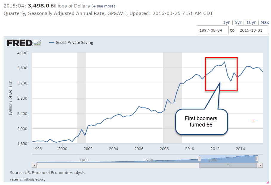
From 1982 through 2008, the Census Bureau estimates that the number of homeowners under age 35 was about 10 million. These were the “baby bust” Generation X’ers who numbered only 70% of the so-called Boomer generation that preceded them.

Shortly before the financial crisis in 2008, a new generation came of age, the Millenials, born between 1982 and 2000, and now the largest age group alive in the U.S. (Census Bureau). Based on demographics, homeownership should have increased to about 13 million in this younger age group, but the financial crisis was particularly hard on them.  Starting in 2008, homeownership in this younger demographic began to decline, reaching a historic low of 8.8 million in 2015, a 15% decline over seven years, and a gap of almost 33% from expected homeownership based on demographics.

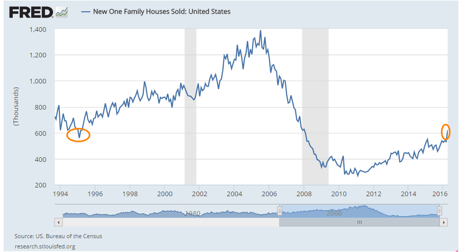
In response to lower homeownership rates, builders cut back and built fewer homes.  I’ll repost a graph I put up last week showing the number of new homes sold each year for the past few decades.

Look at the period of overbuilding during the 2000s, what economists would euphemistically call an overinvestment in residential construction.  Then, financial crisis, Great Recession and kerplooey!, another technical term for the precipitous decline in new homes built and sold. As the economy has improved for the past two years, the demand for housing by the millennial generation, supressed for several years by the recession, has shifted upwards.  More demand, less supply = higher prices.  This younger generation prefers living closer to city amenities, culture and transportation, causing a revitalization of older neighborhoods.  In Denver, developers are buying older homes, scrapping them off, and building two housing units where there was one. Gentrification influences the rental market as well as affordable single family homes and pushes out families of more modest means in some parts of town.

The housing market really overheats when rentals and home prices escalate at the same time. During the housing boom of the 2000s, many tenants left their apartments to buy homes and cash in on the housing bonanza.  Rising vacancies put downward pressure on monthly rents.  Move-in specials abounded, announcing “No Deposit!”, “First Month Free!” or “Free cable!” to attract renters. This time it’s different.

Rising rents and home prices put extraordinary pressure on working families who find they can barely afford to live in central city neighborhoods which offered low rents and affordable transportation.  They consider moving to a satellite city with lower costs but face longer commute times and additonal transportation costs to get to work.  Demographic trends shift more slowly than building trends but neither moves quickly so we can expect that housing pressures will not abate soon until the supply of multi-family rental units and single family homes increases to meet demand.

////////////////////////

Incomes

For the past four decades, household income has declined, as Presidential contender Bernie Sanders is quick to point out.  Some economists also note that household size has declined greatly during that time as well so that comparisons should take into account the smaller household size.  A recent analysis  by Pew Research has made that adjustment and found that middle class incomes had shrunk from 62% of total income in 1970 to 43% in 2015.

But, again, comparisons are made more difficult because some categories of income, which have risen sharply in the past few decades, are not included.  Among the many items not included are “the value of income ‘in kind’ from food stamps, public housing subsidies, medical care, employer contributions for individuals (ACS data sheet).  Generally, any form of non-cash or lump sum income like inheritances or insurance payments are excluded.  There is little dispute with the exclusion of lump sum income but the exclusion of non-cash benefits is suspect.  An employer who spends $1000 a month on an employee health benefit is paying for labor services, whether it is cash to the employee or not.

The lack of valid comparison provokes debate among economists, confusion and contenton among voters.  The political class and the media that live off them thrive on confusion. Those who want the data to show a decline in middle class income cling to the current methodology regardless of its shortcomings.

//////////////////////////

Employment

The BLS reported job gains of only 38,000 in May, far below the gain of 173,000 private jobs reported by the payroll processor ADP and below all – yes, all – the estimates of 82 labor economists. The weak report caused traders to reverse bets on a small rate increase from the Fed later this month.

Almost 40,000 Verizon employees have been on strike since mid-April and just returned to work this past week. On the presumption that a company will hire temporary workers to replace striking workers, the BLS does not adjust their employment numbers for striking workers.  However, most employers of striking employees hire only as many employees as they need to, relying on salaried employees to fill in.  Do strikes contribute to the spikes in the BLS numbers?  A difficult answer to tease out of the data. In the graph below we notice the erratic data set of the BLS private job gains (blue line; spikes circled in red) compared to the ADP numbers (red line; spike circled in blue).

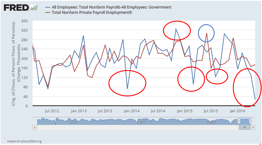
Each month I average the BLS and ADP estimates of job gains to get a less erratic data swing.  The 112,000 average for May follows an average of 140,000 job gains in April – two months of gains below the 150,000 new jobs needed to keep up with population growth.  Let’s put this one in the wait and see column.  If June is weak, then I will start to worry.

Subsidies

May 29, 2016

Housing

On Tuesday came the announcement that new one family homes sold in April had jumped to 619,000, just beating the low point set in 1995.  Yes, you read that right.  The high point of this recovery just passed a 20 year ago low.  The spring season certainly contributed to the jump, but the prospect of higher interest rates may have spurred many buyers to close the deal. Here’s a graph of new home sales for the past two decades:

The housing boom took a decade to build but the total damage of overinvestment is only now being felt in the slow growth that has characterized this recovery.  I’ll turn to the monetary economists at Alt-M.org:

“During the housing boom, investible resources that could have gone into augmenting human capital, building useful machines and sustainable enterprises, and conducting commercial research and development, were instead diverted to housing construction.  In the crisis it became evident that the housing built was not worth the opportunity cost of the resources allocated to it.” (Source )

/////////////////////

Energy Subsidies, or Not?

Many of us don’t like subsidies to giant oil companies like Exxon and Chevron. Why are taxpayers subsidizing these rapers of the environment?  The marketing of this idea is that bad, bad oil companies get good taxpayer money that could be put to better uses. But then we find out that when a poor family gets heating oil for a very reduced amount, the folks in Washington call that a “Consumer Subsidy” to the oil company  (Source).  Why is this not classified as a subsidy for poor families?  Welcome to the ugly politics of Washington where subsidies are  allocated across several departments, and House and Senate committees, so that our elected representatives can feel important and wield influence in order to collect more campaign money.  If the voters are confused, that’s the point.  Politicians use a technique ommon in used car sales: baffle the customer with B.S.

In 2010, Federal (not including states) subsidies totaled $11.6 billion for coal, natural gas and oil. Coal got $3.9 billion for R&D. (Source spreadsheet)  Much of that money was to develop technologies for carbon capture and sequestration, which is what we told politicians in Washington we wanted. (Source)  The energy companies didn’t want the money because they didn’t want to develop the technology. Now we blame the energy companies for spending the money?

Unfortunately, fracking has produced so much natural gas at such a low cost that many energy companies find it more cost efficient to simply shut down power stations that rely on coal.  The largest coal company in the U.S., Peabody Energy, recently declared bankruptcy after 130 years in business (WP article)

Let’s turn to the oil and natural gas portion of this sector since that accounts for 2/3rds of Federal subsidies.  $7.6 billion in subsidies includes:
$3.5 billion, almost half of the total subsidy, is for the LEAP program, which pays for heating fuel for low income families, not a subsidy for the oil companies;
$1 billion for fuel used by farmers, who lobby heavily for their subsidy, and it helps to keep food prices down for consumers across the country;
$1.1 billion for the Federal gov’t to buy oil for the Strategic Petroleum Reserve.  Why is this called a subsidy to the oil companies?
$1 billion for accelerated write-offs on development costs, land, equipment.

Providing consistent, reliable energy in any form is messy.  Every year, wind power kills thousands of eagles, a threatened species, yet there seems to be little outcry because wind power is a favorite of the environmental community and gets a pass.

Many years ago, I was selling tools to the mechanics at San Juan Coal Co. in a remote area of New Mexico and Arizona.  Giant earth movers with tires that were twice as high as a man dug up the coal deposits there.  Reaching up to the blue sky were giant erector set towers hung with huge cables that sizzled and spit with the sound of electricity surging through them.  Stretching toward the western horizon, I asked where the wires went. Southern California, I was told.  California wanted the electricity but not the pollution from creating the energy so they paid to have the electricity produced in this remote area and “shipped” hundreds of miles away.  The process was very wasteful and expensive.  The additional cost though was counted as a subsidy to the energy company because the accounting that is done in government has little to do with the day to day reality of most households and businesses.

Timing Models

May 22, 2016

Long term moving averages can confirm the shifting trends of market sentiment and market watchers customarily watch for crossings of two averages.  The 50 week (1 year) average of the SP500 index just crossed below the 100 week (2 year) average, indicating a  broad and sustained lack of confidence.  Falling oil prices since mid-2014 have led to severe earnings declines at some of the large oil companies in the SP500.  The index is selling for about the same price as the two year average.

What to do?  These crossings or junctions can mark a period of some good buying opportunities – unless they’re not – and that’s the rub with indicators like this one.  Downward crossings typically occur after there has already been a 5 – 15% decline from a recent high.  If an investor sells some stocks at that time, they wind up selling at an interim low, and regret  their action when the market rises shortly thereafter.  They should have bought instead of sold.  AAAARGHHH, a false positive!  Twice in the 1980s, the sentiment shift was less than a year long and an investor who did act lost 10 – 20% as the market climbed after several months.

Conversely, after a 10-15% decline, some investors do buy more stocks, figuring that the excess optimism, or “fluff,” has been shaken out of the market.  Then comes that sinking feeling as the market continues to decline, and decline, and decline.  In April 2001 and July 2008, the 50 week average crossed below the 100 week average.  Investors who lightened up on stocks at those times saved themselves some pain and a lot of money as the broader market continued to lose another 30% or so.

There are not one but two problems with timing models: timing both the exit from and entry back into the market.  Over several decades the majority of active fund managers – professionals who study markets – did not get it right.  They underperformed a broad index like the SP500 because the index is actually a composite of the buying and selling decisions of millions of market participants.  John Bogle, the founder of the now gigantic Vanguard Funds, made exactly this point in his dissertation in the 1950s.  A half century later, this “wacky idea” of index investing has taken over much of the industry.

Consistently successful timing is very difficult and has tax consequences in some accounts.  Investors are encouraged to focus instead on their investment allocation to match their tolerance for risk and volatility, and to consider any prospective income that they might need from a portfolio.

Since 1960, the average annual price gain of the SP500 index has been 6.7%.  Add in an average yield (dividend) of 3% and the total return is almost 10% that an investor gains by doing nothing, a formidable hurdle for any timing model.

Within an allocation model, though, is the idea that an investor might shift a small portion of a portfolio from stocks to bonds and back in response to market signals.  In several previous articles I have looked at a Case-Shiller CAPE10 model (here, here, here, and here) as well as another crossing model using the 50 day and 200 day moving averages, dramatically named the Golden Cross and Death Cross (here, here, and here.)  As already mentioned, we want to avoid some of the false signals of crossing averages.

Instead of a crossing, we can simply use a change in direction of both averages.  When not just one, but both, long term averages turn down, we would move a portion of money from stocks to bonds, and in the opposite direction when both averages turned up.

Over the course of several decades, this strategy has been suprisingly successful.  The market sometimes experiences a decade when prices may be volatile but are essentially flat.  From 2000 – 2012 the SP500 index went up and down but was the same price at the beginning and end of that 12 year period.  1967 to 1977 was another such period, a stagnant period when an investor’s money would be better put to use in the bond market rather than the stock market.

In recent decades, this long term weekly model would have favored stocks from 1982 to March 2001 while the market gained 850%, an annual price gain of 11%.  The model would have shifted money back to stocks in August 2003 at a price about 25% less than the exit price in March 2001. In March 2008, the model would have favored an exit from stocks to bonds.  The stock market at that time was about the same price that it had been 7 years earlier in March 2001.  The model captured a 30% gain while the index went nowhere.

In the 1967 – 1977 period, the model did signal several entries and exits that produced a cumulative 8% price loss over the decade but the model favored the bond market for half of that period when bonds were earning 8% per year, a net gain.

In almost two years, the SP500 has changed little; the yield is less than 2%, far lower than the 3% average of the past 50 years.  However, the broader bond market has also changed little in that time and is paying just a little over 2%.  There are simply periods when strategies and alternatives have little effect. Although the 50 week average crossed below the 100 week average earlier this month, they are essentially horizontal.  The 100 week average is still rising, but barely so, a time of drift and inertia.  In hindsight, we may say it was the calm before a) the storm (1974), or b) the surge (1995). Usually the calm doesn’t last more than two years so we can expect some clear direction by the end of the summer.

/////////////////////////////

It’s the economy, stupid!

One of the myths of Presidential politics is that Presidents have a lot to do with the strength or weakness of the economy, a superhero narrative carefully cultivated by the two dominant parties.  Here’s a comparison of GDP growth during Democratic and Republican administrations. The Dems have it up on the Reps since 1928, chiefly because the comparison starts near the beginning of the Great Depression when the Reps held the Presidency.

For several reasons, GDP data is unreliable during the Depression and WW2 years.  First, the GDP concept wasn’t formalized till just before the start of WW2 so data collection was new, primitive and after the fact.  Secondly, this 14 year period includes an extraordinary amount of government spending which warped the very concept of GDP.  The WPA program that put so many to work during the depression years was a whopping 7% of GDP (Source), like spending $2 trillion dollars, or half the Federal budget, in today’s economy.

The Federal Reserve begins their GDP data series after WW2 when data collection was much improved. If you’re a Dem voter, don’t mention this unreliable data.  Just tell friends, family and co-workers that the Dems have averaged 4% GDP growth since 1927; the Reps only 1.7%.  If you’re a Republican voter, exclude the 20 year period from 1928 to 1947 and begin when the Federal Reserve trusts the data. Starting from 1947,  Republicans have presided over economies with 2.75% annual growth during 36 Presidential years.  During the 30 years Dems have held the Presidency, there has been a slighly greater growth rate of 3.1%.

In short, economic growth is about the same no matter which party holds the Presidency.  Shhhh! Don’t tell anyone till after the election is over.  Legislation by the House and Senate has a much greater impact on the economy.

///////////////////////////

Small Business

“If America is going to dominate the world again, the country has to fix the spirit of free enterprise. Small-business startups are in serious decline.”

“Gallup finds that one-quarter of Americans say they’ve considered becoming business owners but decided not to. ”

These foreboding quotes are from a recent Gallup poll.  Small businesses employ more than 50% of employees and are responsible for the majority of job growth yet many politicians and most voters pay little attention to the concerns of small business owners.  The giant corporations get most of the press, praise and anger.  Could the lack of small business growth be responsible for the lackadaisical growth of the entire economy during this recovery?  As the population  continues to age, growth will be critical to fund the dedication of community resources to both the old and young.

The BLS routinely tracks the Employment-Population Ratio, which is the percentage of people over 16 who are working, currently 60%.  But this ratio does not fully capture the total tax pressures on working people since it excludes those under 16, who require a great deal of community resources.  When we track the number of workers as a percent of the total population, we see a long term decline.  As this ratio declines, the per-worker burdens rise for it is their taxes that must support programs for those who are not working, the young and the old.

Regulatory burdens hamper many small businesses. A recent incident with a Denver brewery highlights the sometimes arbitrary rulemaking that business owners encounter.  Agencies protest that their mission is to ensure public safety.  An unelected manager or small committee in a department of a state or local agency may be the one who decides what is the public safety.  As the rules become more onerous and capricious, fewer people want to chance their savings, their livelihood to start a small business.  As fewer businesses start up, tax revenues decline and the debate grows ever hotter: “more taxes from those with money” vs “less generous social programs.”  Policy changes happen at a glacial pace, further exacerbating the problems until there is some crisis and then the changes are instituted in a haphazard fashion. Since we are unlikely to change this familiar pattern, the issues, anger and contentiousness of this election season are likely to increase in the next decade.  Keep your seat belts buckled.

Global Portfolio

May 15, 2016

Picture the poor investor who leaves a meeting with their financial advisor followed by a Pig-Pen tangle of scribbled terms. Allocation, diversification, small cap, large cap, foreign and emerging markets, Treasuries, corporate bonds, real estate, and commodities. What happened to simplicity, they wonder?  Paper route or babysitting money went into a savings account which earned interest and the account balance grew while they slept.

For those in retirement, it’s even worse. The savings, or accumulation, phase may be largely over but now the withdrawal phase begins and, of course, there needs to be a withdrawal strategy.  Now there’s a gazillion more terms about withdrawal rates,  maximum drawdowns and recovery rates, life expectancy, inflation and other mumbo jumbo that is more complicated than Donald Trump’s changing interpretations of his proposed tax plans.

Seeking simplicity, an investor might be tempted to put their money in a low cost life strategy fund or a target date fund, both of which put investing on automatic pilot.  These are “fund of funds,” a single fund that invests in different funds in various allocations depending on one’s risk tolerance. There are income funds and growth funds and moderate growth funds within these categories.  For a target date fund, what date should an investor use?  It is starting to get complicated again.

Well, strap yourself into the mind drone because we are about to go global.  Hewitt EnnisKnupp is an institutional consulting group within Aon, the giant financial services company.  In 2014, they estimated the total global investable capital at a little over $100 trillion as of the middle of 2013. Let’s forget the trillion and call it $100.

Could an innocent investor take their cues from the rest of the world and invest their capital in the same percentages?  Let’s look again at the categories presented by the Hewitt group.  The four main categories, ranked in percentages, that jump off the page are:

Developed market bonds (23%),
U.S. Equities (18%),
U.S. Corporate Bonds (15%),
and Developed Market equities (14%).

The world keeps a cushion of investable cash at about 5% so let’s throw that into the mix for a total of 75%.   Notice how many categories of investment there are that make up the other 25% of investable capital!

In the interest of simplification let’s consider only those four primary categories and the cash. Adjusting those percentages so that they total 100% (and a bit of rounding) gives us:

Developed Market bonds 30%,
U.S. Corporate Bonds 20%,
U.S. Equities 25%
Developed Market equities 19%,
Cash 6%.
Notice that this is a stock/bond mix of 44/56, a bit on the conservative side of a neutral 50/50 mix.  Equities make up 44%, bonds and cash make up 56%.

I’ll call this the “World” portfolio and give some Vanguard ETF and Mutual Fund examples.  Symbols that end in ‘X’, except BNDX, are mutual funds. Fidelity and other mutual fund groups will have similar products.

International bonds 30% –  BNDX, and VTABX, VTIBX
U.S. Corporate Bonds 20% – BND and VBTLX, VBMFX
U.S. Equities 25% – VTI and VTSAX, VTSMX
Developed Market equities 19% – VEA and VTMGX, VDVIX

According to Portfolio Visualizer’s free backtesting tool this mix would have produced a total return of 5.41% over the past ten years, and had a maximum drawdown (loss of portfolio value) of about 22% during this period.  For a comparison, an aggressive mix of 94% U.S. equities and 6% cash would have generated 7.06% during the same period, but the drawdown was almost 50% during the financial upheaval of 2007 – 2009.

There have been two financial crises in the past century:  the Great Depression of the 1930s and this latest Great Recession.  If the balanced portfolio above could generate almost 5-1/2% during such a severe crisis, an investor could feel sure that her inital portfolio balance would probably remain intact during a thirty year period of retirement.  During a horrid five year period, from 2006-2010, with an annual withdrawal rate of 5%, the original portfolio balance was preserved, a hallmark of a steady ship in what some might call the perfect storm.

Finally, let’s look at a terrible ten year period, from January 2000 to December 2009, from the peak of the dot com bubble in 2000 to the beaten down prices of late 2009, shortly after the official end of the recession.  This period included two prolonged slumps in stock prices, in which they lost about 50% of their value.  A World portfolio with an initial balance of $100K enabled a 5% withdrawal each year, or $48K over a ten year period, and had a remaining balance of $90K. Using this strategy, one could have withdrawn a moderate to aggressive 5% of the portfolio each year, and survived the worst decade in recent market history with 90% of one’s portfolio balance still intact.

Advisors often recommend a 4% annual withdrawal rate as a conservative or safe rate that preserves one’s savings during the worst of times and this strategy would have done just that during this worst ten year period.  Retirees who need more income than 4% may find the World portfolio a conservative compromise.

{ For those who are interested in a more granular breakdown of sectors within asset classes, check out this 2008 estimate of global investable capital.}

////////////////////////////

Productivity

In a recent article, Jim Zarroli with NPR compared productivity growth with the weak growth of only the wages component of employee compensation.  He did leave out an increasingly big chunk of total employee compensation: Federal and State mandated taxes, insurances and benefits.  Since these are mandated costs, the income is not disposable. A term I have never liked for this package of additional costs and benefits is “employer burden.”  The burden is really on the employee as we will see.

In the graph below are two indexes: total compensation per hour and output per hour.  At the end of the last recession in the middle of 2009, the two indexes were the same.  Seven years later, output is slightly higher than total compensation but the discrepancy is rather small compared to the dramatic graph difference shown in the NPR article. As output continues to level and compensation rises more rapidly, we can expect that compensation will again overtake output.

Over the past several decades, employees have voted in the politicians who promised more tax-free insurances and benefits.  While the tax-free aspect of these benefits is an advantage, some employees may think they are freebies.  Payroll stubs produced by more recent software programs enable employers to show the costs of these benefits to employees, who are often surprised at the amount of dollars that are spent on their behalf.  While these benefits are welcome, they don’t pay school tuition, the rising costs of housing or repairs to the family car.

Many voters thought they could have it all because some politicians promised it all: more tax-free insurances and benefits, and higher disposable income.  Total employee compensation, though, must be constrained by productivity growth. In the coming decade, legislators will put forth alternative baskets of total compensation.  More benefits and insurances means less disposable income but a politician can not just say that outright and get re-elected. More disposable income means less insurances and benefits, which will anger other voters.  In short, the political discourse in this country promises to only get more contentious.

Pickup and Letdown

May 8, 2016

Based on ISM’s monthly survey of Purchasing Managers, the CWPI blends both service and manufacturing indexes and gives additional weight to a few components, new orders and employment.  Last month we were looking for an upward bend in the CWPI, to confirm a periodic U-shaped pattern that has marked this recovery. This month’s reading did swing up from the winter’s trough and we would expect to see further improvement in the coming few months to confirm the pattern. A break in this pattern would indicate some concern about a recession in the following six months. What is a break in the pattern? An extended trough or a continued decline toward the contraction zone below 50.

Since the services sectors constitutes most of the economy in the U.S., new orders and employment in services are key indicators of this survey.  A sluggish winter pulled down a composite of the two but a turn around in April has brought this back to the five year average.

Rising oil prices have certainly been a major contributor to the surge in the prices component of the manufacturing sector survey. The BLS monthly labor report (below) indicates some labor cost increases as well.  Each month the ISM publishes selected comments from their respondents.  An employer in the construction industry noted a severe shortage of non-skilled labor, a phenomenon we haven’t seen since 2006, at the height of the housing bubble.

Last week the BEA released a first estimate of almost zero growth in first quarter GDP, confirming expectations.  Oddly enough, the harsh winter of 2015 provided an even lower comparison point so that this year’s year over year growth, while still anemic, is almost 2%.

////////////////////////////

Employment

April’s employment data from the BLS was a bit disheartening.  Earlier this week, the private payroll processor ADP reported job growth of 150,000 in April and lowered expectations for the BLS report released on Friday.  While the BLS estimate of private job growth was slightly better, the loss of about 10,000 government jobs, not included in the ADP estimate, left the total estimate of jobs gained at 160,000. The loss of government jobs is slight compared to the total of 22 million employed at all levels of government but this is the fourth time in the past eight months that government employment has declined.

A three month average of job growth is still above 200,000, a benchmark of labor market health that shows job growth that is more than the average 1% population growth  With a base of 145 million employees in the U.S, a similar 1% growth rate in employment would equal 1.5 million jobs gained each year, or about 125,000 per month.  To account for statistical sampling errors, the churn of businesses opening and closing, labor analysts add another 25,000 to get a total of 150,000 minimum monthly job gains just to keep up with population growth.  The 200,000 mark then shows real economic growth.  In March 2016, the growth of the work force minus the growth in population was 1.2%, indicating continued real labor market gains.

Job growth in the core work force aged 25 -54 remains above 1%, another good sign.  It last dipped briefly below 1% in October.  This core group of workers buys homes, cars, and other durable goods at a faster pace than other age groups; when this powerhouse of the economy weakens, the economy suffers. In the chart below, there is an almost seven year period, from June 2007 through January 2014 where growth in this core work force group was less than 1%.  From January 2008 through January 2012, growth was actually negative.  The official length of the recession was 17 months, from December 2007 through June 2009.  For the core work force, the heart of the economic engine, the recession lasted much longer.

In 2005, a BLS economist estimated that the core work force would number over 105 million in 2014.  In December 2014, the actual number was 96 million, a shortage of 9 million workers, or almost 10% of the workforce.  In April 2016, the number was almost 98 million, still far less than expectations.

Some economists and pundits mistakenly compare this recovery from a financial crisis with recoveries  from economic downturns in the late 20th century.  For an accurate comparison, we must look to a previous financial, not economic, crisis – the Great Depression of the 1930s.

The unemployment rate in April remained the same, but more than a half million people dropped out of the labor force, reversing a six month trend of declines.  It is puzzling that more people came back into the labor force during the winter even as GDP growth slowed.

Average hourly earnings increased for the second month in a row, upping the year over year increase above 2.5%.  For the past ten years, inflation-adjusted weekly earnings of production and non-supervisory workers have grown an anemic .75% per year.  In the sluggish winter of January and February 2015, earnings growth notched  a recovery high of 3%, leading some economists and market watchers to opine that lowered oil costs, on the decline since the summer of 2014, would finally spur worker’s pay growth in this long, subdued recovery.  A year later, earnings growth is about 1.2%, a historically kind of OK level, but one which causes much head scratching among economists at the Federal Reserve.  When will worker’s earnings begin to recover?

/////////////////////////

Hungry

A reader sent me a link to a CNBC article  on food insecurity in the U.S. The problem is widespread and not always confined to those who fall below the poverty benchmark. Contrary to some perceptions, food insecurity is especially prevalent in rural areas, where food costs can be 50% higher than urban centers.  How does the government determine who is food insecure? The USDA publishes a guide with a history of the project, the guidelines and questions.  To point out the highlights, I’ll include the page links within the document. The guidelines have not been revised since this 1998 revision.

In surveys conducted by the Census Bureau, respondents are asked a series of questions.  The answers help determine the degree of household food insecurity.  The USDA repeatedly emphasizes that it is household, not individual, insecurity that they are measuring.  The ranking scale ranges from 0, no insecurity, to 10, severe insecurity and hunger. An informative graph of the scale, the categories and characteristics is helpful.

In 1995, a low .8 percent were ranked with severe food insecurity (page 14) . To be considered food insecure, a household must rank above 2.3 (household without children), or above 2 .8 (with children) on the scale.  Above that are varying degrees of insecurity and whether it is accompanied by hunger. (Table)

The USDA admits that measuring a complex issue like this one can provoke accusations that the measure either exaggerates or understates the number of households.  What are they measuring?  Page 6 contains a formal definition, while page 8 includes a list of conditions that the survey questions are trying to assess, and that a condition arose because of financial limitations like “toward the end of the month we don’t have enough money to eat well.”

Page 9 describes the rather ugly pattern of progressively worse food insecurity and hunger.  At first a household will buy cheaper foods that fill the belly.  Then the parents may cut back a little but spare the kids the sensation of hunger.  In its most severe stage, all the family members go hungry in a particular day.

Those of you wanting additional information or resources can click here.

////////////////

Earnings

Almost a month ago the giant aluminum manufacturer Alcoa kicked off the first quarter earnings season.  87% of companies in the SP500 have reported so far and FactSet calculates a 7% decline in earnings.  They note “the first quarter marks the first time the index has seen four consecutive quarters of year-over-year declines in earnings since Q4 2008 through Q3 2009.”  Automobile manufacturers have been particularly strong while the Energy, Materials and  Financial sectors declined.  Although the energy sector gets the headlines, there has also been a dramatic decrease in the mining sector.  The BLS reports almost 200,000 mining jobs lost since September 2014.

The bottom line for long term investors: the economic data supports an allocation that favors equities.  The continued decline in corporate earnings should caution an investor not to go too heavily toward the equity side of the stock/bond mix.

/////////////////

(Edited May 11th in response to a reader’s request to clarify a few points.)

Saving Trends

May 1, 2016

Macroeconomists define saving as Income Less Consumption and Taxes.  There are two distinctions – public, or government savings, and private, or household, savings.

From 1986 to 2000 inclusive, a 15 year period, gross private savings grew 78%.  In the same length of time, from 2001 to 2015, it grew 112%.  So why the higher savings rate?

Lower interest and inflation rates have persisted during this later period.  One would think that consumers would be more likely to save when interest rates were higher in the earlier period.  However, the reverse is true.  Households respond to lower interest rates by saving even more.  Why?  Because their savings will grow more slowly at lower interest rates, they must save more, which only keeps interest rates low.  Like so much of human activity, the process is self-reinforcing.

What else contributes to higher savings rates?  80 million Baby Boomers is more than a third of the population.  As they neared retirement age, they saved more of their income.  In 2012, the first boomers turned 66, a high point in the chart of savings below.

Richard Koo is the chief economist at Nomura, a gigantic Japanese financial holding company similar to Goldman Sachs.  He introduced the idea of a balance sheet recession instigated by a large number of people and businesses paying down their debts to repair their balance sheets.  Here is a recent paper.

Because trends in savings are affected by the decisions of mutiple generations, the primary causes can be difficult to establish.  As the Boomers begin to spend down their savings in retirement, the equally large Millennial generation will start saving but it is unlikely that they will completely offset the spending rate of the Boomers.  The glut of savings will be slowly draw down until new investment puts enough demand for savings, which will spur interest rates higher.

///////////////////

Cadillac Purchasing Power

Last week, I looked at the relative purchasing power to buy a Ford F-150 pickup.  In a trip to a car museum lately, I learned that a new 4 door Cadillac model cost $2000 in 1913.  The average hourly wage was $2 per hour per the NBER, so it took the average person 1000 work hours, about half a year, to buy that Cadillac.  A 2016 Cadillac 4 door ATS Sedan costs about $40,000, an amount that would take 1573 hours, about nine months, at an average $25.43 per hour (BLS).

//////////////////

College Bound

A recent BLS study found that 70% of 2015 HS grads enrolled in college.  Recent NAEP results show that only 37% of test takers are prepared for college reading and math.

//////////////////

Pickup Purchasing Power

April 24, 2016

Relatively stagnant wages and income inequality have become a frequent theme on the campaign trail.  Let’s look at what I’ll call pickup purchasing power to understand the problem.  Sorry.  No graph from the Federal Reserve on this one.

A favorite vehicle among construction workers is the F-150 pickup, a reliable vehicle with room for a toolbox and a trip to the local lumberyard for supplies.  The MSRP of a standard bed 1998 model, available to the public in September 1997, was $14,835 (Source ) In 2016, the MSRP of that same model is $26,430 (Source), a 78% increase, about 3.2% per year.  There have certainly been improvements in that truck model in the past two decades but customers can not order the model without the improvements.  The basic model is the basic model.

Let’s look now at the wages needed to buy that pickup.  In May 1997, shortly before the 1998 F-150 was released to the public, the BLS survey reported average carpenters’ wages of $30,800.  At that time, wages and salaries were about 70.5% of total compensation, or about $43,700 (BLS report).  In the decade before that, wages as a percent of total compensation had declined from 73.3% in 1988 to 70.5% in 1997.  Rising insurance costs and other direct benefits to employees were slowly eating into the net compensation of the average carpenter.

In 2015, the average wage for carpenters was $43,530.  The BLS reported that wages were now 67.7% of the total employment cost, or about $64,300.  In that 18 year period, carpenters’ wages grew 41% but total compensation grew 47%, or 2.1% per year.  The price of that pickup truck, though, grew at 3.2% per year.  That seemingly small difference of 1% per year adds up to a big difference over the years.  That’s the sense of anger that underlies the current election season.  The growth in price of that pickup is only slightly above the average post WW2 inflation rate of 3%.  It is the wages that have fallen behind.

Trump blames the politicians who have given away American jobs with badly negotiated trade agreements that disadvantage Americans.  Trump’s promise to bring those manufacturing jobs back home wins him popular appeal in those communities impacted by the decline in manufacturing.  The loss of manufacturing jobs has left a larger pool of job applicants for construction jobs.  Some of those displaced workers did not have the carpentry skills needed but some were able to work in roles supervised by an experienced carpenter.  The more the supply of job applicants the less upward pressure on wages. If – a big if – some manufacturing jobs do come back to the U.S., it will help spur more growth in carpenter’s wages.

Bernie Sanders blames the fat cats and proposes taxing all but the poorest Americans to distribute income more evenly. His remedies to promote his programs of fairness are far ranging.  Employers who are currently providing health insurance for their employees will probably welcome a 6.2% payroll tax.  On a forty year old employee making $50,000 a year, the $3100 tax is far less cost than an HMO plan. Employers who do not provide such coverage will resent the imposition of more taxes but at least it will be across the board, affecting all competitors within an industry or local market.  Sanders’ healthcare plan also relies on 10% cuts in payments to doctors and hospitals, who are projected to save at least that much in reduced billing costs.

While Trump addresses a specific demographic, a particular segment of the labor market, Sanders proposes broad remedies to a number of problems.  Trump’s appeal will be to those who want a specific fix.  Bring back jobs to our community.  We’ll figure out the rest.  Sanders’ proposals will appeal to voters who have more confidence in government as a problem solver.

///////////////////////////

Oil Stocks

Readers who put some money to work in oil stocks (XLE, VDE for example) in late February, when I noted the historical bargain pricing, might have noticed the almost 20% increase in prices since then.  There are a number of reasons for the surge in price but the buying opportunity has faded with that surge.  Inventories are still high relative to demand.  Recent comprehensive market reports from the IEA require a subscription but last year’s report is available to those interested in a historical snapshot of the supply and demand trends throughout the world.  Until 2014, total demand had slightly exceeded supply.  A glance at the chart shows just how tightly coordinated supply and demand are in this global market. A “glut”in supply may be less than 1% of daily worldwide consumption and it is why prices can shift rather dramatically as traders try to guess both short and long term trends in demand and supply.

Inequality

April 17, 2016

In a 1996 article in Mother Jones magazine economist Paul Krugman (now a N.Y. Times editorial writer) explored the possible causes for growing income inequality.  Yes, twenty years ago income inequality was a “thing.”  A more recent study using hard granular data contradicts a widely held belief that income inequality has grown substantially in the past four decades.

I’ll look first at the older piece by Krugman.  I should note that Krugman was writing for a popular magazine, not an academic journal.  As with his weekly column for the N. Y. Times, Krugman’s goal is to sell his audience a story, to stir up the pot.  Critics who judge an editorial column with the same rigor as an academic paper should be forced to write “I will be kinder to my fellow human beings” one thousand times with a #2 Ticonderoga pencil till they get little pencil indentations in the pads of their fingertips.

Some, including a few contenders in the current Presidential campaign, sound the alarm.  “We’re shipping jobs overseas!”  Well, Krugman considered imports to be a possible cause for inequality but found that imports of goods from third world countries, where wages are markedly lower than the U.S., were only 2% of national income.  Stopping imports from those countries would have but a small effect on workers’ wages.

What about technology? Krugman asked.  As an example of technology, Krugman noted that the educational level of schoolteachers and corporate CEOs are approximately the same yet there is a wide chasm between the compensation of those in these two professions.  If Krugman were my brother-in-law at a Thanksgiving dinner, I’d have argued with him on this one.  “Hey, Paul, whaddayatawkin?!” I would have said, “CEOs are managing way more employees and capital than any teacher!”  Paul would have agreed with me, of course, and apologized for the error of his ways and I would have passed him the cranberry sauce.

 A 2013 study by Faleye, et. al., published in the Journal of Banking and Finance, used a systematic analysis of a salary and pay database to calculate the ratio of CEO pay to the average pay of an employee in the ranks of the company.  They identified and ranked a number of factors to explain the Pay Ratio, as I’ll call it. They found that three factors, ranked in effect, were most important, and by a wide margin:
1) size of the firm, or market cap;
2) tenure of the CEO;
3) return on assets, or profitability of the firm in a given year (Table 3).
Of those three factors, the first two factors, size and longevity, influenced the Pay Ratio far more – three times – than the third factor, the return on assets.

Let’s look at the first factor: the size of the firm.  We’ll use the stock market capitalization (CAP) as an indicator of size.  In the post war period from 1957 to 1980, 23 years, the CAP in the U.S. increased by 2.5 times.  In the subsequent 35 years since 1980, that CAP shot upwards over 13 times, even after two severe market downturns!!

So, CEOs are being paid to be responsible for the deployment of a lot of capital.  Remember, the return on assets (#3 factor) was much less important, so CEOs are being paid even if they don’t do particularly well with that capital in a given year.  Factor #2 was longevity so we can guess that CEOs who do perform well stay in the post.  Those who don’t get the proverbial boot.

Let’s turn to “Fee for service” financial advisors for a comparison.  Advisors typically charge 1 – 2% to manage money for their clients.  Naturally, an advisor – or CEO – who manages a combined $100 million will make more than one who manages $10 million.  The workers at each firm may earn approximately the same but the CEO of the larger firm should make more money and greatly increase the Pay Ratio.

What else can skew the ratio upward?  Using a mean, or average, rather than the median, the halfway number in a data set. The authors of this study found that average CEO pay was almost twice the median CEO pay, indicating that a relatively small number of very well paid CEOs skewed the average upward.  Krugman and other economists (Robert Reich, for example) touting inequality in the popular press use average, not median, CEO pay simply because the average shows a higher ratio than the median. “Whaddayadoin?!” I’d have to challenge Paul at the dinner table.   “In this case, an average gives a distorted view of the data,” I would protest.  Paul might smirk knowingly and grab the last helping of mashed potatoes while I was protesting his dirty, no good argumentative trick.

This study included 447 firms whose total revenues averaged almost $2 billion.  Apple had $600B in revenue last year so the study included both mega firms and large firms.  They found that the median Pay Ratio was 52, not 331 as the AFL-CIO claims, or 150 times, as Krugman claimed in this 1996 article.  Why are there so many different CEO ratios?  The mega companies like Apple, GE and Microsoft will naturally have the highest CEO ratios.  Organizations like the AFL-CIO who want to promote the idea of inequality might use only the pay data from the SP100, the top companies in the world.  In a popular magazine article, the writer doesn’t have to share the characteristics of the data set as one would do in an academic paper so it is relatively easy to convince readers of a particular point of view by careful selection of the data.

As companies have grown in size over the past three decades, the number of named executive officers (NEOs) in each of these large companies have grown.  As companies get bigger, the duties of these NEOs begins to approach that of the CEOs of yesteryear. To compare apples to apples, then, we would do better to compare the salaries of today’s NEOs with the CEOs of 1970. The 2013 study found that the NEO ratio was 23 times the average worker pay, much less than the Pay Ratio of 35 in 1970.  If we average the Pay Ratio (CEO) of 52 in this study and the NEO ratio of 23, we get an average of 37, just about the same as in 1970.

Regardless of the data, most of us are either convinced or not convinced that the Pay Ratio has increased dramatically in the past fifty years.  Our convictions are similar to our tastes – white meat or dark – in turkey.  We can only agree to disagree and know deep down in our hearts that we are, of course, right.

The Weathervane of Growth

April 10, 2016

CWPI (Constant Weighted Purchasing Index)

March’s survey of Purchasing Managers showed a big upsurge in new orders for the manufacturing (MFR) sector. Export orders were up 5.5% in both the manufacturing and services (SVC) sectors and overall output increased 2% or more.  After contracting for several months, MFR employment may have found a bottom.  The total of new orders and employment is still growing but below five year averages.

The broader CWPI is still expanding but at a slightly slower pace for the past seven months.  The cyclic pattern of declining growth followed by a renewal of activity has changed. While there is no cause to make any strategic changes to allocation, it does bear watching in the months ahead.

////////////////////////

IRA Standard of Care

Financial agents – investment advisors, stock brokers and insurance agents – have had different standards of care when they deal with their clients.  The first and highest standard is fiduciary: the agent should operate with the best interests of the client in mind.  Registered Investment Advisors (RIA) are registered with the SEC and follow this strict standard. The second and more lax standard is suitability: the agent should not sell the client anything that is not suitable for the client based on what the client has told them about their circumstances.  Here’s a short paper on the difference between the two standards.

This week the Obama administration issued new guidelines for agents servicing IRA account holders, requiring agents to maintain the higher fiduciary standard starting in 2017.  This requirement was left out of the Dodd-Frank finance reform bill because many in the investment industry lobbied against it.  Here is the first rule proposal in February.

Opponents will criticize the Obama administration for this “new” set of regulations but this policy has been recommended by some in the industry, on both sides of the political aisle, for at least 25 years.  During the 1980s Congress made several changes that made IRA accounts available to a wide swath of savers, most of whom were unfamiliar with the marketplace of financial products now available to them.

Some in the insurance and investment industries fought against the imposition of a stricter fudiciary standard because it would require more training and would likely reduce the sales commissions of agents.  The growing volume of tax deferred employee retirement plans has generated a steady stream of fees for those in the financial industry.

Keep in mind that the new policy only applies to retirement accounts.

////////////////////////

Debt

Banks are in the business of loaning money, meaning that they must loan money to stay in business.  Most of the time some part of the economy wants to borrow money.  Borrowers come in three types:  Household, Corporate and Government.  If households cut back on their borrowing, corporations may increase theirs.

A historical look at total debt as a percent of GDP shows several trends.  Keep in mind the leveling of debt since the financial crisis.  We’ll come back to that later.

In the thirty years following World War 2, debt levels remained fairly consistent with the pace of economic activity.  The three types of borrowers offset each other.  Households and corporations increased their borrowing while government, particularly the Federal government, paid down the high debt incurred to fight WW2.

In 1980 the Reagan administration and a Democratic House began running big deficits, contributing to a spike in the the total level of debt.  By 1993, when President Clinton took office, Federal and State Debt as a percent of GDP was about the same as it was at the end of WW2.

A combination of higher tax rates and cost cutting by a Republican House elected in 1994 led to a reduction in government spending as household and corporations increased their spending.  Total debt levels flattened during the late 1990s.

Following the 9/11 tragedy and a recession, government debt levels increased but now there was no offset in household borrowing as mortgage debt climbed.  Helping to curb the pronounced rise in total debt levels, a Democratic House at odds with a Republican president dampened the growth of government borrowing in the two years before the financial crisis.

Arguably the most severe crisis in eighty years, the financial crisis caused both households and corporations to cut back on their borrowing.  Offsetting this negative borrowing, the Federal government assumed an often overlooked role – the Borrower of Last Resort.  We are accustomed to the role of the Federal Reserve Bank as the Lender of Last Resort, but we might not be aware that some part of the economy has to be the Borrower.  That role can only be filled by the Federal government because the states and local governments are prohibited from running budget deficits.

Look again at the second chart showing the huge spike in government borrowing following the financial crisis.  Now remember the leveling off of total debt shown in the first graph.  The Federal government has increased its debt level by more than $10 trillion.  Almost $4 trillion of that has come from the lender of last resort, the Fed, but the rest of that borrowing has offset a significant deleveraging by corporations and households.  Had the Federal government not borrowed as much as it did, many banks would have experienced significant declines in profits to the point of going out of business.

There is a potential bombshell waiting in the $2 trillion in corporate profits that businesses have parked overseas to delay taxes on the income.  If Congress and the President were to lower tax rates so that corporations could “repratriate” these dollars, two things would happen: 1) corporations could lower their debt levels, using the cash to pay back the rolling short term loans they use to fund daily operations; and 2) the Federal government would lower its debt levels as the corporations paid taxes on those repatriated profits.

Great.  Lower debt is good, right?  Unless households were to step up their borrowing, total debt could fall significantly, causing another banking crisis.  Although politicians on both sides like to talk about bringing profits home, such a move will have to be done slowly so that the economy and the banking system can adjust in slow increments.

Partisans cheer when candidates express strong sentiments in rousing words, but cold caution must quench hot spirits. We can only trust that candidates for public office will temper their campaign rhetoric with prudence if entrusted with the office.

Home Sweet Asset

April 3, 2016

Normally we do not include the value of our home in our portfolio.  A few weeks ago I suggested an alternative: including a home value based on it’s imputed cash flows.  Let’s look again at the implied income and expense flows from owning a home as a way of building a budget.  The Bureau of Labor Statistics and the Census Bureau take that flow approach, called Owner Equivalent Rent (OER), when constructing the CPI, and homeowners are well advised to adopt this perspective.  Why?

1) By regarding the house as an asset generating flows, it may provide some emotional detachment from the house, a sometimes difficult chore when a couple has lived in the home a long time, perhaps raised a family, etc.

2) It focuses a homeowner on the monthly income and rent expense connected with their home ownership.  It asks a homeowner to visualize themselves separately as asset owner and home renter. It is easy for homeowners to think of a mortgage free home as an almost free place to live. It’s not.

3) Provides realistic budgeting for older people on fixed incomes.  Some financial planners recommend spending no more than 25% of income on housing in order to leave room for rising medical expenses.  Some use a 33% figure if most of the income is net and not taxed.  For this article, I’ll compromise and use 30% as a recommended housing share of the budget.

A fully paid for home that would rent for $2000 is an investment that generates an implied $1400 in income per month, using a 70% net multiplier as I did in my previous post. Our net expense of $600 a month includes home insurance, property taxes, maintenance and minor repairs, as well as an allowance for periodic repairs like a new roof, and capital improvements.

Using the 30% rule, some people might think that their housing expense was within prudent budget guidelines as long as their income was more than $2000 a month.  $600 / $2000 is 30%.

However, let’s separate the roles involved in home ownership.  The renter pays $2000 a month, implying that this renter needs $6700 a month in income to stay within the recommended 30% share of the budget for housing expense.  The owner receives $1400 in net income a month, leaving a balance of $5300 in income needed to stay within the 30% budget recommendation. $6700 – $1400 = $5300.  Some readers may be scratching their heads.  Using the first method – actual expenses – a homeowner would need only $2000 per month income to stay within recommended guidelines.  Using the second method of separating the owner and renter roles, a homeowner would need $5300 a month income. A huge difference!

Let’s say that a couple is getting $5000 a month from Social Security, pension and other investment income.  Using the second method, this couple is $300 below the prudent budget recommendation of 30% for housing expense.  That couple may make no changes but now they understand that they have chosen to spend a bit more on their housing needs each month.  If – or when – rising medical expenses prompt them to revisit their budget choices, they can do so in the full understanding that their housing expenses have been over the recommended budget share.

This second method may prompt us to look anew at our choices.  Depending on our needs and changing circumstances, do we want to spend $2000 a month for a house to live in?  Perhaps we no longer need as much space.  Perhaps we could get a suitable apartment or townhome for $1400?  Should we move?  Perhaps yes, perhaps no.  Separating the dual roles of owner and renter involved in owning a home, we can make ourselves more aware of the implied cost of our decision to stay in the house.  A house may be a treasure house of memories but it is also an asset.  Assets must generate cash flows which cover living expenses that grow with the passage of time.

/////////////////////

The Thrivers and Strugglers

“Bravo to MacKenzie. When she was born, she chose married, white, well-educated parents who live in an affluent, mostly white neighborhood with great public schools.”

In a recent report published by the Federal Reserve Bank at St. Louis, the authors found that four demographic characteristics were the chief factors for financial wealth and security:  1) age; 2) birth year; 3) education; 4) race/ethnicity.

While it is no surpise that our wealth grows as we age, readers might be puzzled to learn that the year of our birth has an important influence on our accumulation of wealth.  Those who came of age during the depression had a harder time building wealth than those who reached adulthood in the 1980s.

Ingenuity, dedication, persistence and effort are determinants of wealth but we should not forget that the leading causes of wealth accumulation in a large population are mostly accidental.  It is a humbling realization that should make all of us hate statistics!  We want to believe that success is all due to our hard work, genius and determination.

//////////////////////

Employment

March’s job gains of 215K met expectations, while the unemployment rate ticked up a notch, an encouraging sign.  Those on the margins are feeling more confident about finding a job and have started actively searching for work.  The number of discouraged workers has declined 20% in the past 12 months.

Employers continue to add construction jobs, but as a percent of the workforce there is more healing still to be done.

The y-o-y growth in the core workforce, aged 25-54, continues to edge up toward 1.5%, a healthly level it last cleared in  the spring of last year.

The Labor Market Conditions Index (LMCI) maintained by the Federal Reserve is a composite of about 20 employment indicators that the Fed uses to gauge the overall strength and direction of the labor market.  The March reading won’t be available for a couple of weeks, but the February reading was -2.4%.

Inflation is below the Fed’s 2% target, wage gains have been minimal, and although employment gains remain relatively strong, there is little evidence to compel Chairwoman Yellen and the rate setting committee (FOMC) to maintain a hard line on raising interest rates in the coming months.  I’m sure Ms. Yellen would like to get Fed Funds rate to at least a .5% (.62% actual) level so that the Fed has some ability to lower them again if the economy shows signs of weakening.  Earlier this year the goal was to have at least a 1% rate by the end of 2016 but the data has lessened the urgency in reaching that goal.

ISM will release the rest of their Purchasing Manager’s Index next week and I will update the CWPI in my next blog.  I will be looking for an uptick in new orders and employment.  Manufacturing lost almost 30,000 jobs this past month – most of that loss in durable goods.  Let’s see if the services sector can offset that weakness.

///////////////////////////

Company Earnings

Quarterly earnings season is soon upon us and Fact Set reports that earnings for the first quarter are estimated to be down almost 10% from this quarter a year ago.  The ten year chart of forward earnings estimates and the price of the SP500 indicates that prices overestimated earnings growth and has traded in a range for the past year.  March’s closing price was still below the close of February 2015.  Falling oil prices have taken a shark bite out of earnings for the big oil giants like Exxon and Chevron and this has dragged down earnings growth for the entire SP500 index.