Crossings

September 6, 2015

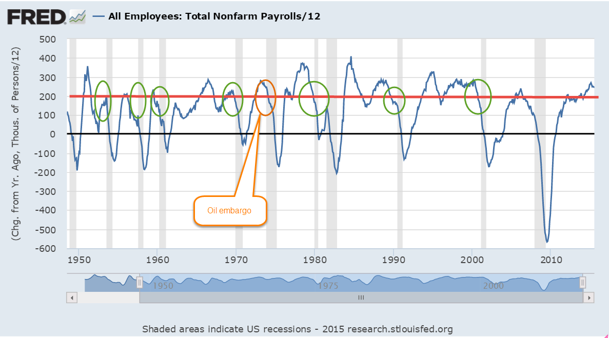
I am not going to say a lot about the August employment numbers, reported at 173,000,   since August’s numbers are routinely revised.  The BLS survey was 20,000 less than the ADP survey of private payrolls.  The revised figure will probably be closer to 210,000 jobs gained in August.  We can see the more important trends when we look at the annual job gains averaged over 12 months.

The slowdown in China and other markets and the selloff in markets around the world inevitably prompts talk of recession.  Since WW2 there has been only one recession – the one that followed the 1973 oil embargo –  that occurred when monthly job gains were above 200,000.   There have been 12 recessions since WW2. The work force was very much smaller fifty years ago.  There has been only one exception to this “rule” and when we look at this exception in closer detail we see that it was very much like the prelude to other recessions. Averaged monthly job gains were declining sharply as they do before every recession.  Job gains are NOT declining sharply today.

******************************

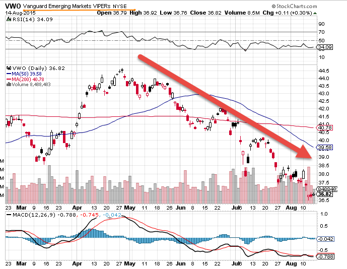
Resource Countries On Sale

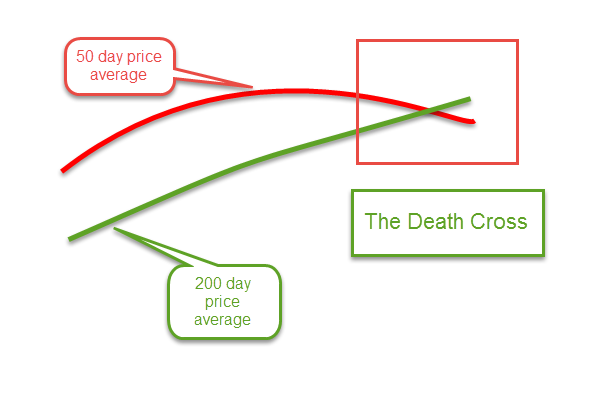
Monday came the news that the Canadian economy was officially in recession.  California, the most populous of fifty U.S. states, has two million more people than all of Canada, whose economic vitality relies on its vast stores of timber, oil, gas and minerals.  Australia, Russia, Norway and New Zealand also ride the roller coaster of commodity prices. (WSJ article )  An ETF that captures a composite of Canadian stocks, EWC, is down almost 30% from its high of August 2014.  The 50 week (not day, but week) average is about to cross below the 200 week average.

These long term downward crossings are often bullish, indicating that prices are near a low point in the multi-year cycle.  An ETF composite of Australian stocks, EWA, is down a bit more than 30% and its 50 week average just crossed below the 200 week average.

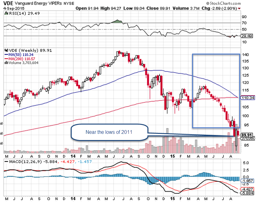
A Vanguard ETF composite of energy stocks is near the lows of 2011.

********************
Subprime Mortgages

Conventional wisdom: subprime mortgages started the recent financial crisis in 2008.  A recent National Bureau of Economic Research (NBER) analysis (A short summary ) of home foreclosures overturns that misconception.  The authors found that twice as many prime borrowers lost their homes to foreclosure as subprime borrowers.
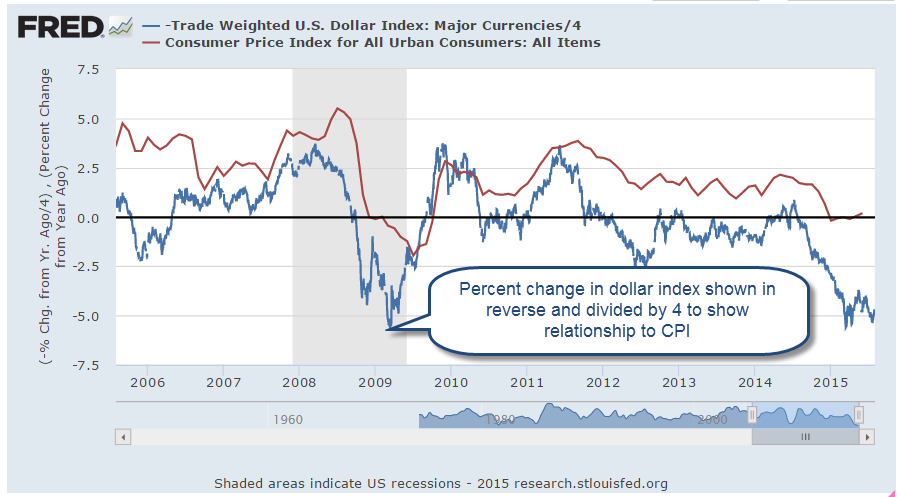
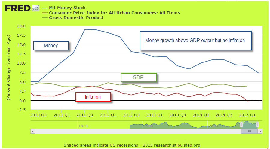
********************
Inflation

In 2007, the Social Security Administration estimated that prices would be 20% higher in 2015. Then came the severe recession of 2008-09 and persistently low inflation.  Prices this year are only 15% higher than those in 2007.  Social Security payments will total almost $900 billion this fiscal year (FRED series), more than 20% of Federal spending, and are indexed to inflation.  Low inflation “saves” the Federal government about $40 billion each year when compared with earlier projections.  Sounds good?  Life is a trade-off.  The 60 million (SSA) people who receive social security spend most of it.  That savings of $40 billion is money not spent.  In addition, low interest rates have reduced income for many retirees, who depend on safer investments for an income stream.  These safer accounts, which include savings, CDs, short and mid-term bond funds, have paid historically low interest rates since the Federal Reserve lowered its target interest rate to near-zero (ZIRP) in 2008.

A Pause On the Road

August 30, 2015

For the past few weeks, the volatility in the stock market has been front and center.  I finished last week’s blog with a note that the market would be conducting a vote of confidence in the coming weeks.  In the opening minutes last Monday morning, the Dow Jones index dropped a 1000 points, almost 6%.  No doubt many investors had spent the weekend worrying and put their sell orders in the night before.  By Friday’s close, however, the SP500 had gained almost 1% for the week.

A few weeks ago the Dow Jones index, composed of just 30 large company stocks, marked a death cross. The death cross is the crossing of the 50 day price average below the 200 day average.  See last week’s blog if you are unfamiliar with this.  This week the broader SP500 index, composed of the largest 500 U.S. companies, marked it’s own death cross.

Two weeks ago, I noted the attitude of one Wall St. Journal reporter to the dreaded death cross. In one word: blarney.  In two words: hocus-pocus.  So why do some investors and the press give this any attention?  Used as a trading system in the broader SP500 the death cross (sell) and it’s companion golden cross (buy) signal have produced a winning trade 4 out of 5 times.  Where do I sign up?, you might be thinking.  In an almost sixty year period of the SP500, however, the extra annual return is slight – about  8/100ths of a percent, or 8 basis points  – over no timing strategy, i.e. buy and hold.  To the average small investor, taxes and other fees more than offset this negligible advantage.

In contrast to any technical stock market price indicators, the fundamentals of the U.S. economy are mostly strong or expanding. Consumer Confidence rose above 100 this past month, surpassing the optimism of the benchmark set in 1985.  The second estimate of GDP growth released this past week was above some of the high estimates.  After inflation, real GDP growth continues at 2.65%.

Corporate profits are growing at 7.3%, home prices are up 5%.  Real, or inflation-adjusted, consumption spending and income is  growing at more than 3%, equaling the heights of pre-recession spending and income growth in early 2007.

Housing prices are increasing for a good reason.  Inventory of homes for sales is relatively low.  In the middle of the 2000s, prices rose even though inventory of homes for sale were going up, a sign of a speculative bubble.  Ah, things look so clear in the rear view mirror.

New jobless claims remain at historically low levels and job growth has been consistently solid.  There are more involuntary part-timers than we would like to see and the participation rate is low.  Gloom and doomers will tend to focus on the relatively few negative points in an otherwise optimistic economic panorama.  Gloom and doomers think that those who disregard  negative signs are Pollyannas.  Eventually, years later, the gloom and doomers are right.  “My timing was off but, see, I was right!” they exclaim. The lesson of the death cross and the golden cross are this: a person can be right most of the time.  The secret to successful investing is knowing when we are wrong and acting on it.

For the individual investor, signals like the death cross can be calls to check our assets and needs.  Older investors may depend on some stability in their portfolio’s equity value for income, selling some equities every quarter to generate some cash.   Financial advisors will often recommend that these investors keep two to five years of income in liquid, low volatility investments.  These include cash, savings accounts, and short to medium term corporate bonds and Treasuries.  Younger investors may see this price correction as an opportunity to put some cash to work.

The China Syndrome

August 23, 2015

Some of you may have spent the summer vacation on a small island in the Pacific where there was no access to the news.  So a quickie catch up.  The new Mission Impossible movie Rogue Nation is edge of the seat great fun and its still on the big screen.  And, yeh, almost two weeks ago the central bank of China devalued the Yuan a bit over 3%. Yes, that was a bit unusual.  An unexpected 8% drop in July’s exports spooked economists in the Chinese government.

That brought some additional pressure on oil stocks but the larger market eked out a .7% gain at the close of the week on August 14th.  But – cue up the going down the dark stairs into the basement music – the 50 day average of the Dow Jones crossed below the 200 day average during that week.

Yep, the death cross of doom.  Of course, the Dow Jones is only 30 stocks, weighed down by the plunging fortunes of oil giants like Chevron and Exxon.  The 50 day average of the broader SP500 index was still above the 200 day average so there was cause for concern, but not panic.

For the first two days of this past week, the market was essentially flat.  USO, a commodity ETF that tracks West Texas Intermediate crude oil (WTI) rose more than 1% on Tuesday.  Then came the news that crude oil inventories were continuing their relentless advance upwards. On the good side, lower oil prices are leading to higher demand but sometimes investors focus on the bad news.  WTI oil dropped 4.4% on Wednesday.  Whispers of disappointing manufacturing production out of China added fuel to the fire. On Thursday, the broader market fell 2%, joining the continuing downturn in energy stocks and emerging markets.  A PMI (Purchasing Managers Index) survey of Chinese manufacturers confirmed a slight contraction in the Chinese economic machine. That spooked investors, leading to a 3% drop in the broader market on Friday.

By the time the smoke cleared at the end of the week’s battle, the broader index had lost 5.6% for the week.  Energy and emerging market indexes were down 8%.  Weekly volume in the popular SP500 ETF SPY was the highest this year, an indication that this concern may be more than a temporary blip.

The 50 day average of the SP500 is still above the 200 day average.  No feared death cross yet.

After four years without a 10% correction, the SP500 crossed below that mark this week, falling 10% from the recent high in late May.  Time to sell? Did you get out of the market last October when the broader market fell more than 6% in a month?  Remember that one? The market was going to fall by 50%, according to some market gurus.  Friday’s close is 5% above that October low.

Some long term traders use a 50 week average as a guideline.  As long as it is rising, why worry?  Until this week, the 50 week average had been substantially rising since September 2009.  Why do I use the word “substantially?”  There were a few weeks in late 2011 and early 2012 when the average dipped a few cents.  This week’s decline was like those little dips – a mere 5  cents in SPY, the popular ETF that tracks the SP500.

The world’s economy has come to depend on the growth of two stalwarts – the U.S. and China. For the past eight years, the Eurozone has fumbled and floundered through a cobweb of of political and economic problems. When the U.S. economy cratered in 2008 – 2009, the economic burden shifted to China, whose expansionist growth truly saved the world from a Great Depression.  Although the U.S. economy is showing strong growth, can it offset the economic weakness in China?  The stock market is holding an election, a vote of confidence on that very question.

A Bull In A China Shop

August 16, 2015

The big news this week was China’s decision to devalue its currency, the yuan, by 3.5% in two days.  At week’s end, the yuan was about 3% less than what it was at the start of the week.

The decline in value came abruptly in  a market that moves in hundredths of a percent, called basis points, each day.  Since the beginning of the year, the euro has lost more than 8% against the dollar but it has done so in little teeny tiny moves.

What prompted China’s central bank to make this devaluation?  China expected a small drop in exports in July, but 8% was far more than expected. (Bloomberg )  The timing of the devaluation couldn’t be worse.  Emerging markets in southeast Asia have had sluggish growth in the past year and depend on exports.  The devaluation of the Yuan makes Chinese exports more competitive.  Vietnam and Malaysia devalued their currencies this week to maintain a competitive edge with China.

Emerging markets have had a rough ride this year.  A popular Vanguard Emerging Markets ETF is down 18% from its high in April.  However, today’s price level is barely below the price in mid-December.

While the SP500 has gone nowhere for the past nine months, emerging markets went on a tear in the beginning of the year, rising about 20% before falling back.  Talking about the SP500…

Dow Jones Death Cross alert!!! This past week the 50 day moving average of the Dow Jones Index crossed below the 200 day average.  The sky is falling.  Run for the hills.  The rhetoric does get a bit dramatic.  Should an investor disregard this signal as so much hocus-pocus?  Brett Arends at MarketWatch suggests that this “indicator” is hogwash. Yes and no.  The Dow Jones is a narrow index composed of just 30 stocks (CNN Money on component performance YTD).  Although it is meant to capture the essentials of the U.S. market, its narrowness makes it an unreliable indicator in some environments.  The oil giants Chevron and Exxon have dropped 23% and 15% respectively, dragging the index down.  There has still not been a death cross in the broader SP500 index.

To investors now over 60, the equity markets of the past 15 years have told a sobering message.  Investors need to either pay some attention or pay someone to pay some attention.  The SP500 stock market index has only recently recovered the inflation adjusted value that it had in 2000.

In nominal, or current, dollars, recoveries from major price declines can often take seven years.  Past recovery periods were 1968 – 1972, 1973 – 1980, 2000 – 2007, and 2007 to early 2013.

Long term trending indicators may be able to help an investor avoid some – emphasize some – of the pain.  For the casual investor, a death cross is a signal to pay a bit more attention to the market on a weekly basis.  All death crosses are not created equal.  Some death crosses are wonderful buying opportunities.  In July 2010, after a two month drop of almost 20%, the 50 day average of the SP500 dropped below the 200 day average, a death cross.  Good time to buy.  Why?  Because it is a death cross coming after a sharp recent drop in price.  The same type of death cross occurred in August 2011 after a steep drop in stock price in late July after the “budget battle” between Obama and Boehner went unresolved.  Good buying opportunity.

In December 2007, a death cross was not a good buying opportunity?  Why?  Because it came after six months of the market seesawing with indecision and no net change in price.  That indicates that there is a shifting sentiment, a lack of confidence among investors.

Some mid-term to long-term strategists use a weekly chart which measures the price at the end of each week, that price that short term traders feel comfortable with as they head into the weekend.  In a bullish or positive market the 12 week, or 3 month, price average stays above the 50 week, or one year, average.  As indecision creeps in the two averages will get close.  Finally, the 50 week average will top out, either gaining nothing or losing just a tiny bit as the 12 week average crosses below.  We’re not there.  We may get there.  Who knows?

Once that weekly cross happens, a long term investor might look at a daily chart.  What is a good rule(s) of thumb to determine whether a death cross is a good buying opportunity, a negative signal, or a palms up, who knows what the heck is going on, signal?

1) Has there been a decline of 15 – 20% (high price to low price) in the past 2 – 3 months? Is today’s price several percent below the 50 day average? Then it is probably a good buying opportunity as I noted above.  It is not always clear cut.  In September 2000, the SP500 began a 12% slide in price that would mark the beginning of a downturn lasting several years.  In mid-October 2000 a death cross occurred.  Was that a large enough slide in price to present a good buying opportunity?  Not really.  The price that day was almost the same as the 50 day average.  The recent drop in price had contributed to the death cross but a longer term re-evaluation of value was also taking place that would cut the SP500 index by 45% toward the end of 2002.

2) If there has been no substantial decline in the past few months, look at the closing price on the day of the death cross.  How many months can you go back to find the same price level and how many times has that price level been tested?  If just a few months, then this is an indeterminate period of indecision that may resolve itself.  Prices may move either higher or lower depending on the resolution.  But, if you can go back six to nine months of price flipping and flopping, then it is a bit more serious.  There may be a spreading questioning of value, a re-positioning of asset balances.  Does it mean sell tomorrow?  No.  It means pay attention.

After several years of declining prices in the years from 2000 – early 2003, the market had a Golden Cross (50 day average rises above 200 day) in May of 2003.  A death cross occurred more than a year later, in August 2004, at the 1095 price level.  That day’s price was close to the 50 day and 200 day average and so was not a standout buying opportunity. The market had first crossed above that price level in December 2003, then retested that level three times on market declines only to rise again.  Might it have been worth waiting a few weeks to check the market’s short term sentiment and see if that price level would hold again?  Probably. As it turned out, the market continued to rise for three more years.

These are not ironclad rules but act as guidelines to help an investor gauge the underlying mood of the market to make more informed investing decisions.

Which Way Sideways?

August 9, 2015

As we all sat around the Thanksgiving table last November, the SP500 was about the same level as it closed this week.  Investors have pulled off the road and are checking their maps to the future.  After forming a base of good growth in the past few months, July’s CWPI reading surged upwards.

Despite years of purchasing managers (PMI) surveys showing expanding economic activity, GDP growth remains lackluster.  Every summer, in response to more complete information or changes to statistical methodologies, the Bureau of Economic Analysis (BEA) revises GDP figures for the most recent years.  A week ago the BEA revised real annual GDP growth rates for the years 2011 – 2014 from 2.3% to 2.0%.  “From 2011 to 2014, real GDP increased at an average annual rate of 2.0 percent; in the  previously published estimates, real GDP had increased at an average annual rate of 2.3 percent.”

A composite of new orders and rising employment in the service sectors showed its strongest reading since the series began in 1997.  The ISM reading bested the strong survey sentiments of last summer. We can assume that the PMI survey is not capturing some of the weakness in the economy.

This level of robust growth should put upward pressure on prices but inflation is below the Federal Reserve’s benchmark of 2%.  Energy and food prices can be volatile so the Fed uses what is called the “core” rate to get a feel for the underlying inflationary pressures in the economy.

The stronger U.S. dollar helps keep inflation in check.  There is less demand from other countries for our goods and the goods that we import from other countries are less expensive to Americans. .  Because the U.S. imports so much more than it exports, the lower cost of imported goods dampens inflation.  In effect, we “export” our inflation to the rest of the world.

When the economy is really, really good or very, very bad we set certain thresholds and compare the current period to those benchmarks.  When the financial crisis exploded in late 2008, the world fled to the perceived safety of the dollar in the absence of a exchange commodity of value like gold.  Because oil is traded in U.S. dollars and the U.S. is a stable and productive economy and trading partner, the U.S. dollar has become the world’s reserve currency.  The conventional way of measuring the strength of a currency like the dollar has been to compile an index of exchange rates with the currencies of our major trading partners.  This index, known as a trade weighted index, does not show a historically strong U.S. dollar.  In fact, since 2005, the dollar has been extremely weak using this methodology and only recently has the dollar risen up from these particularly weak levels.

As I mentioned earlier, a strong dollar helps mitigate inflation pressures; i.e. they are negatively correlated. When the dollar moves up, inflation moves down.  To show the loose relationship between the dollar index and a common measure of inflation, the CPI, I have plotted the yearly percent change in the dollar (divided by 4) and the CPI, then reversed the value of the dollar index.  As we can see in the graph below, the strengthening dollar is countering inflation.

What does this mean for investors?  The relatively strong economy allows the Fed to abandon the zero interest rate policy (ZIRP) of the past seven years and move rates upward.  A zero interest rate takes away a powerful tool that the Fed can employ during economic weakness: to stimulate the economy by lowering interest rates.

The strong dollar, however, makes Fed policy makers cautious. Higher interest rates will make the dollar more appealing to foreign investors which will further strengthen the dollar and continue to put deflationary pressures on the economy.  The Fed is more likely to take a slow and measured approach.  Earlier this year, estimates of the Effective Federal Funds Rate at the end of 2015 were about 1%.  Now they are 1/2% – 3/4%.  In anticipation of higher interest rates, the price of long term Treasury bonds (TLT) had fallen about 12% in the spring.  They have regained about 7% since mid-July.

DBC is a large commodity ETF that tracks a variety of commodities but has about half of its holdings in petroleum products.  It has lost about 15% since May and 40% in a year.  It is currently trading way below its low price point during the financial crisis in early 2009.  A few commodity hedge funds have recently closed and given what money they have left back to investors.  Perhaps this is the final capitulation?  As I wrote last week, there is a change in the air.

*************************

Labor Report

Strong job gains again this month but labor participation remains low.  A key indicator of the health of the work force are the job gains in the core work force, those aged 25 – 54.

While showing some decline, there are too many people who are working part time because they can’t find a full time job.  Six years after the official end of the recession in the summer of 2009, this segment of the work force is at about the same level.

In some parts of the country job gains in Construction have been strong.  Overall, not so much.  As a percent of the work force, construction jobs are relatively low.  In the chart below I have shown three distinct phases in this sector since the end of World War 2.  Extremes are most disruptive to an economy whether they be up or down.    Note the relatively narrow bands in the post war building boom and the two decades from 1975 through 1994.  Compare that to the wider “data box” of the past two decades.

For several months the headline job gains have averaged about 225,000 each month.  The employment component in the ISM Purchasing Managers’ Index (on which the CWPI above is based) is particularly robust.  New unemployment claims are low and the number of people confident enough to quit their jobs is healthy.  The Federal Reserve compiles an index of many factors that affect the labor market called the Labor Market Conditions Index (LMCI).  They have not updated the data for July yet but it is curiously low and gives more evidence that the Fed will be cautious in raising rates.

China, Oil, Treasuries and Stuff

August 2, 2015

An exciting and unnerving ride this past week as the Chinese market fell 8% on Monday and finished out the week about 10% down (Guardian here  and analysis here).  If trading had not been halted in a number of companies, the damage could have been much worse.  In the past year the Shanghai Composite has shot up 150% as individual investors piled into the market with both their own savings and borrowed money. Despite the loss of 14% for the entire month of July, investors in the Shanghai index are still up 13% for the year.

Let’s turn to the U.S. where the SP500 index has gained 6% since the downturn in October 2014.  Below is a chart of SPY, an ETF that tracks the SP500 index.  MACD is a common technical indicator that follows market trends.  The most common setting is to compare 12-day and 26-day price averages (the MA in MACD) and measure the convergence and divergence (the C and D in MACD)  Comparisons of longer time periods can clarify overall trends in sideways markets like we have experienced this year.  The chart below compares the 30-day and 72-day averages (blue line). The red line is a signal line, a 15-day average of the blue line.  The market seems to be at the end of a mildly positive cycle  that has been in place for nine months.

We may see a renewed move upwards but the near zero reading of the past few weeks indicates the uncertainty in the market.  Earlier this year, the price of long term bonds went down (yields went up) in anticipation of rate increases from the Federal Reserve. Counteracting that trend in the past month, long-term bond yields have gone down (U.S. Treasury) as investors bid up treasuries in the hopes that the Fed will delay raising rates till after September.

On July 22, the price of of a barrel of West Texas Intermediate (WTI) oil broke below $50 (NYMEX). Two previous times this year the price has come close to the psychologically important $50 mark only to rise back up.  Now traders are concerned that the U.S. Energy Information Administration’s (EIA) short term estimates of oil reserves and rig counts may not be accurate.  “When in doubt, get out” has been a recent refrain.

Let’s  go up in our time balloon to see why the breaking of this price point has some traders worried.  The last time WTI broke $50 was in the 2008 meltdown.

China’s growth is slowing.  Europe is idling in neutral.  Forecasts for global economic growth are subdued = low demand and this is why commodity prices are at ten year lows. Positive economic growth in the U.S.  may be the only bright spot in this global forecast.

Post War Productivity

July 26, 2015

Each year, the Council of Economic Advisors (CEA) submits the Economic Report of the President  to the Congress.  They compile a number of data series to show some long term trends in household income, wages, productivity and labor participation.  Readers should understand that the report, coming from a committee acting under a Democratic President, filters the data to express a political point of view that is skewed to the left.  When the President is from the Republican Party, the filters express a conservative viewpoint.  Has there ever been a neutral economic viewpoint?

In this year’s report the Council identifies three distinct periods since the end of WW2: 1948-1973, 1973-1995, and 1995-2013.  In hindsight, this last period may not be a single bloc, as the report acknowledges (p. 32).

The most common measure of productivity growth is Labor Productivity, which is the increase in output divided by the number of hours to get that increase.  Total Factor Productivity, sometimes called Multi-Factor Productivity (BLS page), measures all inputs to production – labor, material, and capital.  As we can see in the chart below (page source), total factor productivity has declined substantially since the two decade period following WW2.

In the first period 1948-1973, average household income grew at a rate that was 50% greater than total productivity growth, an unsustainable situation.  This post war period, when the factories of Europe had been destroyed and America was the workshop of the world, may have been a singular time never to be repeated.  What can’t go on forever, won’t.  In the period 1973-1995, real median household income that included employer benefits grew by .4% per year, the same growth rate as total productivity.

The decline in the growth rate of productivity hinders income growth which prompts voters to pressure politicians to “fix” the slower wage growth.  If households enjoyed almost 3% income growth in the 1950s and 1960s, they want the same in subsequent decades.  If the rest of the world has become more competitive, voters don’t care.  “Fix it,” they – er, we – tell politicians, who craft social benefit programs and tax programs which shift income gains so that households can once again enjoy an unsustainable situation: income growth that is greater than total productivity growth.

“Where Have All The Flowers Gone?” was a song written by legendary folk singer Pete Seeger in the 1950s. It was  a song about the folly of war but the sentiment applies just as well to politicians who think that they can overcome some of the fundamental forces of economics.  Seeger asked: “When will they ever learn?”

Spending Flows

July 19, 2015

In the past few weeks I have been unfolding an origami of sorts. In the past 7 years, the Federal Reserve has created almost $4 trillion of new money.  Contrary to centuries of history that this would cause prices to rise dangerously, inflation has been muted during the five years of this recovery.  Core inflation, which excludes more volatile food and energy items, has been below the 2% target inflation rate that helps guide monetary policy decisions at the Federal Reserve.

In a standard expenditures or spending model, personal saving is presumed to flow through the banking system into business investment.  This approach can be helpful in understanding changes in investment spending and the difference between planned and unplanned investment.  However, that model presumes that consumers have little choice in the direction of their personal savings; that these savings flows are controlled entirely by the investment spending decisions made by business owners. I proposed a different way of looking at savings – as a form of spending shifted backwards in time.  We anticipate different rates of return based on the amount of time we shift investment forward or backward in time.

Economist John Maynard Keynes proposed that one person’s income is some else’s spending.  In the private domestic economy then, consumption spending, investment and savings are forms of spending.  We can combine them into one simple accounting identity.

If these components of total spending add up to 1, then

If we subtract yesterday’s and tomorrow’s spending from total spending we get the percentage that is today’s spending.

This concept was proposed by Keynes as the Marginal Propensity to Consume, or MPC.  In the example below the MPC is .9.  If there is an extra $1 of spending in the economy, people will tend to spend 90 cents of that extra $1 on today’s consumption.

Where does that extra $1 of spending come from?  Keynes proposed that the government could step in and spend money when there was a lack of consumption spending in the economy.  Last week I said that I would cover the role that government plays in the economy but I will leave that for next week.

Keynes, Income, Spending

July 12, 2015

In the past few weeks, I have looked at savings and investment as forms of spending shifted in time.  Now let’s examine the idea of income.  We earn money, spend most of it, and hopefully save a little of it.

In the 1930s John Maynard Keynes proposed an income expenditure model to explain business cycles. (More here) Although Keynes’ model was mathematically simple by today’s standards, it showed an interlocking relationship between employment, interest rates and money.  Keynes popularized his ideas in lectures, debates and magazine articles.  Although he died shortly after World War 2, financial institutions and economic policies still bear his mark.  It was he who first proposed and then co-developed the framework for the International Monetary Fund (IMF) and World Bank.

One of Keynes many seminal insights was that one person’s income is another person’s spending.  If I decide to save $5 by not buying a latte at the neighborhood coffee shop, I am in effect putting my $5 in a savings account at my local bank.  But the coffee shop owner has $5 less in income.  $5 less in income is $5 less profit, keeping all else the same.  The owner of the coffee shop must go to the local bank and take $5 out of their savings account to make up for the lost income.  There is no net savings when a person decides to not spend money and we see the relationship between savings and profit; namely, savings = profit.

We are now ready to develop that insight of Keynes, that income = spending.  As we discussed in previous weeks, the amount that we don’t spend on current consumption is savings.  Savings = spending, either yesterday’s spending, i.e. an investment in someone’s debt, or tomorrow’s spending, i.e. an investment in someone’s future profits, or savings.  When we spend for tomorrow, we are effectively moving our savings into the future.  Likewise, when we spend for yesterday, we move our savings into the past to replace the savings that someone else did not have at the time they borrowed the money.

All of these categories – income, spending, saving, investment – are all forms of spending shifted in time.  Next week we’ll look at the GDP accounting identity and the government component of that equation.

*****************************

CWPI

The manufacturing sector stumbled during the harsh winter and strengthening dollar.  The service sectors fell somewhat but remained strong.  In June, the manufacturing sector regained strength, helping offset a slight slackening in the service economy.  The composite index remains strong in a several month growth trough.

Some are of the opinion that the stock market can be overvalued or undervalued.  In my opinion, liquid markets are usually fairly valued.  Expectations of buyers and sellers change, causing a recalculation of future growth and a change in valuations.  Comparing an index like the SP500 to a valuation model can help identify periods of investor optimism and pessimism.

I built a model based on a 930 average price of the SP500 in the 3rd quarter of 1997.  At the end of 2014, the 10 year total return of the SP500 was 7.67% (Source) which I used as a base growth rate modified by the change in growth shown by the CWPI index.  The CWPI measures a number of factors of economic growth but measures profits indirectly as a function of that economic growth.  Profit growth may outpace or lag behind economic growth and investors try to anticipate those varying growth rates when they value a company’s stock.

Until mid-2013, the SP500 lagged behind the model, indicating a degree of pessimism.  In 2013, the SP500 gained 30% and it is in that year that we see the crossover of investor sentiment from pessimism to optimism.  In the first six months of this year, the SP500 has changed little and we see the index drifting back toward the model, which was only 4% less than the closing price of the SP500 index at the end of June.

In hindsight, we can identify periods when investors were too exuberant and miscalculated future growth.  But we can only do so because in that future, profits and growth were not as hoped for.  That is the problem with futures.  We never know which one we are going to get.

Independence is Money

July 5th, 2015

In past weeks I have been digging into a perplexing problem.  Since early 2008, the Federal Reserve has heaped almost $4 trillion of government debt on its books and the supply of money has doubled, yet inflation remains subdued.  Why?

There are several measures of money. For several decades the Federal Reserve branch published Modern Money Mechanics (book or PDF). M1 is a measure of transactional money, and includes cash and money held in checking accounts. This category of money has doubled in the past 7-1/2 years.

Supply of money goes up.  Inflation goes up, right? From the Federal Reserve paper:

Assuming a constant rate of use, if the volume of money grows more rapidly than the rate at which the output of real goods and services increases, prices will rise. This will happen because there will be more money than there will be goods and services to spend it on at prevailing prices. [emphasis added]

If inflation is not going up, then the output of goods and services must be going up as much as the supply of money, right?  It’s not.

Some economists have argued that the various measures of money don’t measure demand for goods and services.  Rather, the money supply measures uncertainty.  Shown in the chart below is the annual percent change in both GDP and the M1 money supply.

The first thing we notice about the M1 chart above – when the growth in the money supply falls below zero, get worried.  People are too confident in the future.  It would be nice if we could craft a long term trading rule like “Buy stocks when the blue line crosses below the red line” but that has not been a successful strategy.  What does stand out is that money growth, the blue line, crossed above GDP growth, the red line, in the summer of 2008 and has not crossed below.  That is the longest period of time since this money measure began. Clearly, there is a lack of confidence among families and businesses.

In the quote from the Federal Reserve paper above, I passed over a key phrase that began the paragraph.  Yes, very sneaky of me to do that. The phrase is “Assuming a constant rate of use.” I wanted to focus separately on the growth in the money supply and the growth in GDP.  Economists often look at the rate of use of money to produce a given level of GDP.  They call it the velocity of money.  In the chart below, I have included the velocity of money, the ratio of GDP/MONEY (red line in the chart), and the amount of money in the system as a percentage of output, MONEY/GDP (blue line) to show how the two are mirror images of each other.

When economists worry that the velocity of money (red line) continues to fall during this recovery, they are worried that there is simply too much money sitting around for the amount of output in the economy (blue line).  Why are people and businesses holding over 17% of output in readily available money today? We are in a low inflation, low growth economy.  In the 1970s we held the same percentage of money but the ’70s was a high inflation, low growth economy.  The similarity of then and now is low growth.

In these past weeks I have looked at two places to put savings – yesterday’s spending, debt, and tomorrow’s spending, equity.  When people and businesses hold onto more money, which kind of spending are they investing in?  They are concerned about tomorrow’s income.  What does tomorrow’s income pay for?  Both tomorrow’s AND yesterday’s spending.

Next week – if saving is just a form of spending, what is income?

***********************

Employment

Good job numbers. Not good labor participation numbers.  Bill McBride at Calculated Risk did a good job this week of putting a long term perspective on the job numbers.  Underscores the theme I just touched on.  Low growth.  For 12 years, from 2000 – 2012, there was almost NO job growth and the effect of that does not pass quickly as things improve.  Caution prompts us to hold onto more money just to be on the safe side.