Heatlh Care

November 29, 2015

Obamacare

United Healthcare (UNH), the largest health insurance carrier in the U.S., announced that they may drop out of the state health care exchanges at the end of 2016.  The CEO indicated that it would review costs again in mid-2016 but was concerned that continuing losses on the state exchange plans would simply make it uneconomical for UNH to continue to offer these plans.

UNH says it has evidence of many individuals gaming the system by coming into and out of the health insurance system when they need medical services. {Bloomberg and Market Watch} It is not clear how patients would do this since the health care exchanges have enrollment rules similar to Medicare.  These restrictions are designed to make it difficult for individuals to game the system.  Are those rules being implemented consistently on the state level?  If the policy rules are in place, have the screening algorithms been reviewed?  Poor implementation and oversight have plagued some exchanges.

At the heart of Obamacare is the projection that costs for the newly insured stabilize after approximately two years, a metric derived from long experience with Medicare patients.  Individuals who have not had regular medical care often have chronic unattended conditions which need to be stabilized.  Medicare costs typically rise during this initial stage before leveling off.

Obamacare will certainly be an issue in the upcoming Presidential election.  The debate will intensify if other insurers express doubts about the economic feasibility of the system,

************************

Productivity and Policy

Economists and policy makers continue to debate the causes, and solutions, for the slowdown in labor productivity that has occurred over the past several decades.  Larry Summers served as Treasury Secretary under President Clinton, Director of the National Economic Council under President Obama, and Chief Economist at the World Bank.  In other words, the guy’s got some chops.

In a recent speech Summers noted several trends:

1)  Dis-employment of unskilled workers.  The participation rate of those aged 25 – 54 has declined from 95% in 1965 to 85% now. (p. 3)  While this is often attributed to technical improvements, Mr. Summers makes the case that labor productivity should go up, not down, due to technical change.  That is not the case.  Summers says he doesn’t have the answer either but the contradiction between theory and data indicates that economists still don’t understand the underlying processes. (p. 4)

2) Mismeasurement.  Productivity measures are based on the calculation of real GDP which is dependent on the measure of inflation.  Summers asks whether differences in quality, or what are called hedonic measures, are captured in CPI data.  He asks “Which would you rather have for you and your family, 1980 healthcare at 1980 prices or 2015 healthcare at 2015 prices?  How many people would prefer 2015 healthcare at 2015 prices?”  If people prefer the 2015 variety at 2015 prices then inflation has been negative in healthcare.  As a percent of GDP, healthcare spending has increased.  Mismeasuring inflation in healthcare may negate all or most of this increase. (p. 5)

3) As we have transitioned to an economy dominated by services, mismeasurement of inflation has probably increased.  A leading technocat in Democratic administrations, Summers casts doubts on a staple of liberal rhetoric – that median family income has not changed since 1973.  This idea is a central tenet of Bernie Sanders presidential campaign.  What if the measurement of median family income is flawed?  This doubt is more often raised by conservative economists and policy makers.  Summers’ remarks crossed the ideological and political divide and surely raised a few eyebrows. (p. 6)

4) Developing the theme of measurement as it pertains to different types of economies, Summers refers to several statistical terms like “unit root” stationarity that may challenge casual readers.

When a time series (data observations over time like GDP) has a unit root it exhibits more deterministic behavior; it is more likely to adopt an altered path or trendline when shocked off its previous path.

Series without a unit root are more likely to exhibit stochastic behavior when subjected to some shock; that is, they will tend to return to their former path or trendline, not form a new trendline.

At mid-century, when our economy was much more reliant on manufacturing, it behaved in a stochastic way when subjected to economic shocks.  It rebounded to a previous trendline.  Our economy is now overwhelmingly service oriented, about 88%.  Summers makes the case (p. 9) that unbalanced economies like ours behave differently than a more balanced economy.  The growth path of GDP changes permanently in response to an economic shock like the financial crisis of 2008.  If that is the case, policy changes will be ineffective in returning GDP and employment back to the former trendline. (For more info on testing the deterministic and stochastic components of time series processes, see this).

Summers adds to the number of voices calling for a more accurate – but also objective – measurement of inflation. Poor measurement leads to imprecise data leads to inaccurate conclusions leads to ineffective policy leads to more problems leads to…

Policy debates often involve complicated issues of identification, measurement, and methods of analysis that are not readily explainable in a campaign speech.  On our way home from work, a complicated system of algorithms based on traffic data determines whether the traffic lights continue to trip green as we maintain a constant speed.  Much of this is hidden from us and incomprehensible to most of us.  All of that complexity is boiled down to a simple heuristic: we go when it’s green, stop when it’s red.

Voters like simple.  The job of a politician is to convince voters and donors that if they are elected, they will implement the right policies, the correct algorithms that will move traffic, i.e. the economic fortunes of the families of America, faster.
Credit Spreads

November 22, 2015

The behavior of bonds, their pricing and their yields (the interest or return on the bond), can seem like a mystery to many casual investors.  As this Money magazine writer notes, the language is backwards.  Yields rise but that’s bad because prices are falling.  Prices rise but that’s bad for new buyers who are getting a low yield on their investment.   The article mentions a little trick to help keep it straight – convert the yield to a P/E ratio, something more familiar to many investors.

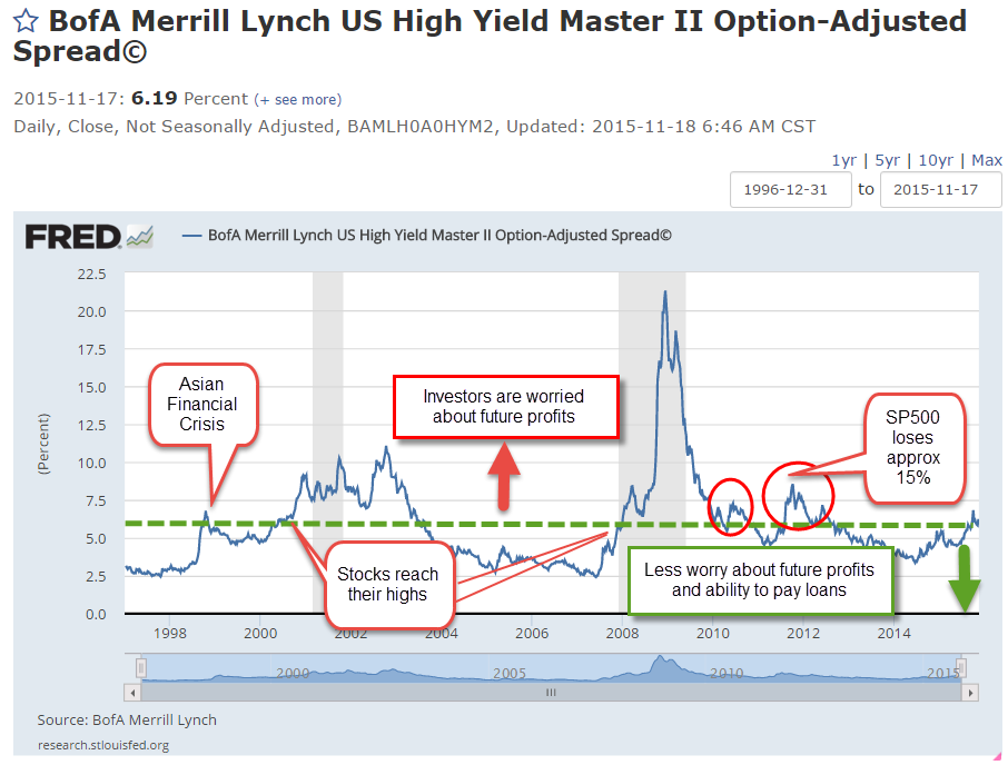
In Montana, a “spread” might be a large ranch but on Wall Street the term often refers to the difference in yield between a safe investment like a 10 year Treasury bond and an index of lower rated corporate bonds, or “junk” bonds. Investors want to be paid for the extra risk they are taking.  As investors get more worried about the economy and the growth of profits, they worry about the ability of some companies to pay their debts.  Debts are paid from profits.  Less profit or no profit increases the chance of default.

Some call the spread a “risk premium,” and when that premium is less than 5 – 6%, it indicates a relatively low to moderate sense of worry among investors.  Anything greater than 6% is a note of caution.  In the chart below a rising spread above 6% often signals the coming of stock market swoons.  When I pulled this chart earlier in the week, the rate was 6.19%.  On Friday, the rate was climbing toward 6.3%.

This 2004 paper from the research division of the Federal Reserve gives a bit more depth on credit spreads and their movements.

*********************************

Inventory-To-Sales Ratio

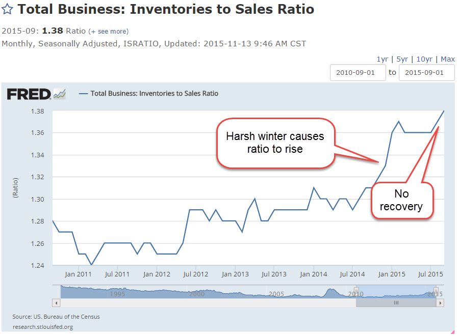
In a September blog post I noted the elevated inventory to sales ratio, meaning that manufacturers, merchants and wholesalers had too much product on hand relative to the amount of sales.  There is a bit of lag in this series; September’s figures were released only a week ago.  At 1.38, the ratio continues to climb.

*******************************

The Social Security Annuity

In the blog links to the right is an article by Wade Pfau comparing the “annuity” that Social Security provides with those available on the commercial market.  He also analyzes the extra return one can achieve by delaying Social Security until age 70.

Portfolio Allocation and Timing

November 15, 2015

Gone Fishin’ Portfolio

I found this portfolio in a pile of old paperwork.  The idea is to allocate investment dollars in a number of buckets, then more or less forget about it, rebalancing once a year.  The portfolio is 60% stocks, 30% bonds, 10% other

I compared this broadly balanced portfolio #1 with a simpler version #2: 60% stocks, 40% bonds.  Because the Vanguard mutual fund VTSMX is weighted toward U.S. large cap stocks, I split the stock portion of the portfolio with an index of small cap value stocks VISVX.  The 40% bond component is an index of  intermediate-term corporate grade bonds VFICX.  I also included a very simple portfolio #3 without the split in the stock portfolio.  The 60% stocks is represented by one fund VTSMX.  The results from Portfolio Visualizer  include dividends.

Note that there is little difference between Portfolios #2 and #3 over this time period.  Although the Gone Fishin’ portfolio lagged the other two during this time period, it did do better during the period 2000 – 2006.

*****************************

Market timing

Another approach is a fairly simple market timing technique as shown in this paper “A Quantative Approach to Tactical Asset Allocation”  There is no heavy math in the paper.  The timing rule is simple:  buy the SP500 when the monthly close is above the 10 month moving average; sell when the monthly close is below the 10 month average.  Using this system, an investor would have sold an ETF like SPY on the first trading day of September this year  because August’s close was below the ten month average.  After the index rebounded in October and closed above the 10 month average, an investor would have bought back in on the first trading day in November. The average “turnaround,” a buy and a sell signal, is less than one a year.  These short term swings are sometimes called “whipsaws,” where an investor loses several percent by selling after a quick downturn then buying in after prices recover quickly.  The payoff is that an investor avoids the severe 50% drawdowns of 2008 and 2000.

The author of the paper performed a 112 year backtest on this system. He excluded taxes, commissions and slippage in the calculations and used the closing price on the final day of the month as his buy and sell price points. He notes some reasons for these omissions later in the paper which I found inadequate. I recommend using the opening price (ETF) or end of the day price (mutual fund) of the day following the end of the month as  a practical real world backtesting strategy.  Very few individual investors can buy or sell at the closing price and there can be a lot of price movement, or slippage, in the final trading minutes before the close.

Commissions can be estimated at some small percentage.  To exclude commissions is to estimate them at 0% and present an investor with unrealistic returns, a common backtesting fault of many trading or allocation systems.  The same can be said for taxes.  Even if the guesstimate is a mere 1%, it is better than the 0% effective estimate of tax costs when excluded from the backtest.

The difference in annual real, or inflation-adjusted, return between this timing model and “buy and hold” is 4/100ths of 1% per year (p. 23) Because the timing model avoids the severe portfolio drawdowns of a buy and hold stratgegy (p. 28), that tiny difference translates into a difference in compounded return that is less than 1% which produces a huge 250%+ difference in portfolio balances at the end of the 112 year testing period.  None of us will be investing for that long a period but it does illustrate the effect of small incremental differences.

The author then combines an allocation model with the timing model using five global asset classes: US stocks, foreign stocks, bonds, real estate and commodities, assigning 20% of the portfolio to each class.  He backtested this allocation with the same timing strategy vs a buy and hold strategy (p. 30-31).  The advantages of the timing strategy are apparent during severe downturns as in 1973, 2000 and 2008.  A buy and hold strategy took eight years after 1973 to recover and catch up to the timing strategy.  The buy and hold strategy never caught up to the timing strategy after the 2000-2003 downturn in the market.  In 2008, it fell even further behind, highlighting the superiority of the timing strategy.

Returns are important, of course, but volatility and drawdown are especially critical for older investors who do not have as many years to recover.  From 1973 – 2012, the timing model has only one losing year – 2008 – and the loss for the entire portfolio was a mere 6/10ths of a percent (p. 32).

*****************************

October jobs report

A few weeks ago I linked to an article on Reagan’s former budget director David Stockman.  On his web site, he presented a sobering and thorough analysis of the October jobs report.

Stockman breaks down the numbers into “breadwinner” higher paying jobs and the relatively lower paying leisure and hospitality jobs that account for too much of the jub creation in the past fifteen years.  Goods producing jobs – those in manufacturing, construction, mining and timber – are still far below 2000 levels.

“massive money printing and 83 months running of ZIRP [zero interest rate policy of the Federal Reserve] have done nothing for the goods producing economy or breadwinner jobs generally.”

*****************************

Obama’s numbers

A president has far less effect on the economy than the political rhetoric would have one believe.  Despite that fact, each President is judged on his “numbers” as though he were a dictator, a one man show.  With one year to go in his second term, here are the latest numbahs from the reputable FactCheck.

Oh My Gawd!

November 8, 2015

There is the famous Tarzan yell by Carol Burnett and the iconic “Oh my Gawd” exclamation of Janice Lipman in the long running TV series “Friends.”  That’s what Janice would have said when October’s employment report was released this past Friday.

Highlights:

271,000 jobs gained – maybe. That was almost twice the number of job gains in September (137,000).  Really??!! ADP reported private job gains of 182,000.  Huge difference.  Job gains in government were only 3,000 so let’s use my favorite methodology, average the two and we get 228,000 jobs gained, awfully close to the average of the past twelve months.  Better than average gains in professional business services and construction.  Both of these categories pay well.  Good stuff.

At 34.5 hours, average hours worked per week has declined by 1/10th of an hour in the past year.  The average hourly rate rose 2.5%, faster than headline inflation and giving some hope that workers are finally gaining some pricing power in this recovery.

For some historical perspective, here is a chart of monthly hours worked from 1921 to 1942.  Most of those workers – our parents and grandparents – have passed away.  At the lows of the Great Depression people still worked more hours than we do today.  They were used to hard work.  There were few community resources and social insurance programs to rely on.

The headline unemployment rate fell slightly to 5%.  The widest unemployment rate, or U-6 rate, finally fell below 10% to 9.8%, a rate last seen in May 2008, more than seven years ago.  This rate includes people who are working part time because they can’t find a full time job (involuntary part-timers), and those people who have not actively looked for a job in the past month but do want a job (discouraged job seekers).  Macrotrends has an interactive chart showing the three common unemployment rates on the same chart.

The lack of wage growth during this recovery, coupled with rising home prices, may have made owning a home much less likely for first time buyers.  The historical average of new home buyers is 40%.  The National Assn of Realtors reported that the percentage is now 32%, almost at a 30 year low.

2.5% wage growth looks a bit more promising but the composite LMCI (Labor Market Conditions Index) compiled by the Federal Reserve stood at a perfect neutral reading of 0.0 in September.  The Fed will probably update the LMCI sometime next week.  This index uses more than twenty indicators to give the Fed an in-depth reading of the labor market.

**********************************

Bonds and Gold

The strong employment report increased the likelihood that the Fed will raise interest rates at their December meeting and this sent bond prices lower.  A key metric for a bond fund is its duration, which is the ratio of price change in response to a change in interest rates.  Shorter term bond funds have a smaller duration than longer term funds. A short term corporate bond index like Vanguard’s ETF BSV has a duration of 2.7, meaning that the price of the fund will decrease approximately 2.7% in response to a 1% increase in interest rates.  Vanguard’s long term bond ETF BLV has a duration of 14.8, meaning that it will lose about 15% in response to a 1% increase in rates.  In short, BLV is more sensitive than BSV to changes in interest rates. How much more sensitive?  The ratio of the durations – 14.7 / 2.7 = 5.4 meaning that the long term ETF is more than 5 times as sensitive as the short term ETF.

What do we get for this sensitivity, this higher risk exposure?  A higher reward in the form of higher interest rates, or yield.  After a 2.5% drop in the price of long term bond funds this week, BLV pays a yield close to 4% while BSV pays 1.1%.  The reward ratio of 4 / 1.1 = 3.6, less than the risk ratio.   On September 3rd, the reward ratio was much lower, approximately 3.27 / 1.3 = 2.5, or half the risk ratio.

Professional bond fund managers monitor these changing risk-reward ratios on a daily basis.  Retail investors who simply pull the ring for higher interest payments should be aware that not even lollipops at the dentist’s office are free.  Higher interest carries higher risk and duration is that measure of risk.

The prospect of higher interest rates has put gold on a downward trajectory with no parachute since mid-October.  A popular etf  GLD has lost 9% and this week broke below July’s weekly close to reach a yearly low.  Investors in gold last saw this price level in October 2009.  Back then  gold was continuing a multi-year climb that would take its price to nosebleed levels in August 2011, 70% above its current price level.

**********************************

CWPI (Constant Weighted Purchasing Index)

Manufacturing is hovering at the neutral 50 mark in the ISM Purchasing Manager’s Index but the rest of the economy is experiencing even greater growth after a two month lull.  No doubt some of this growth is the normal pre-Christmas hiring and stocking of inventories in anticipation of the season.

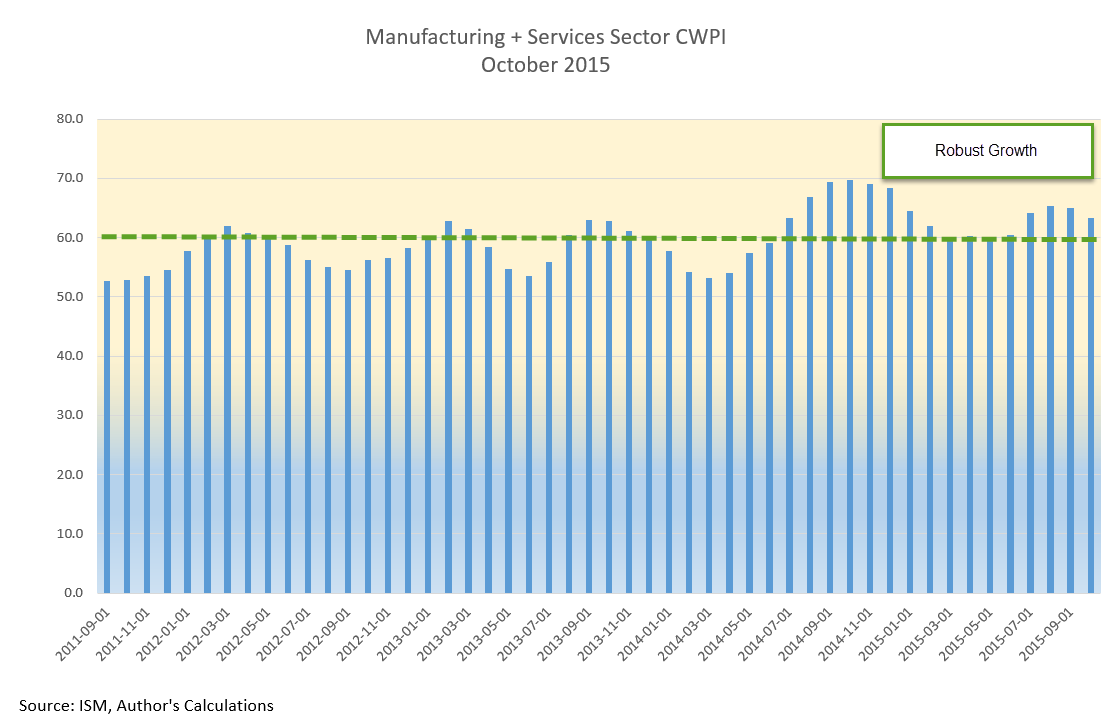
The CWPI composite of manufacturing and service sector activity has drifted downward but is within a range indicating robust growth.

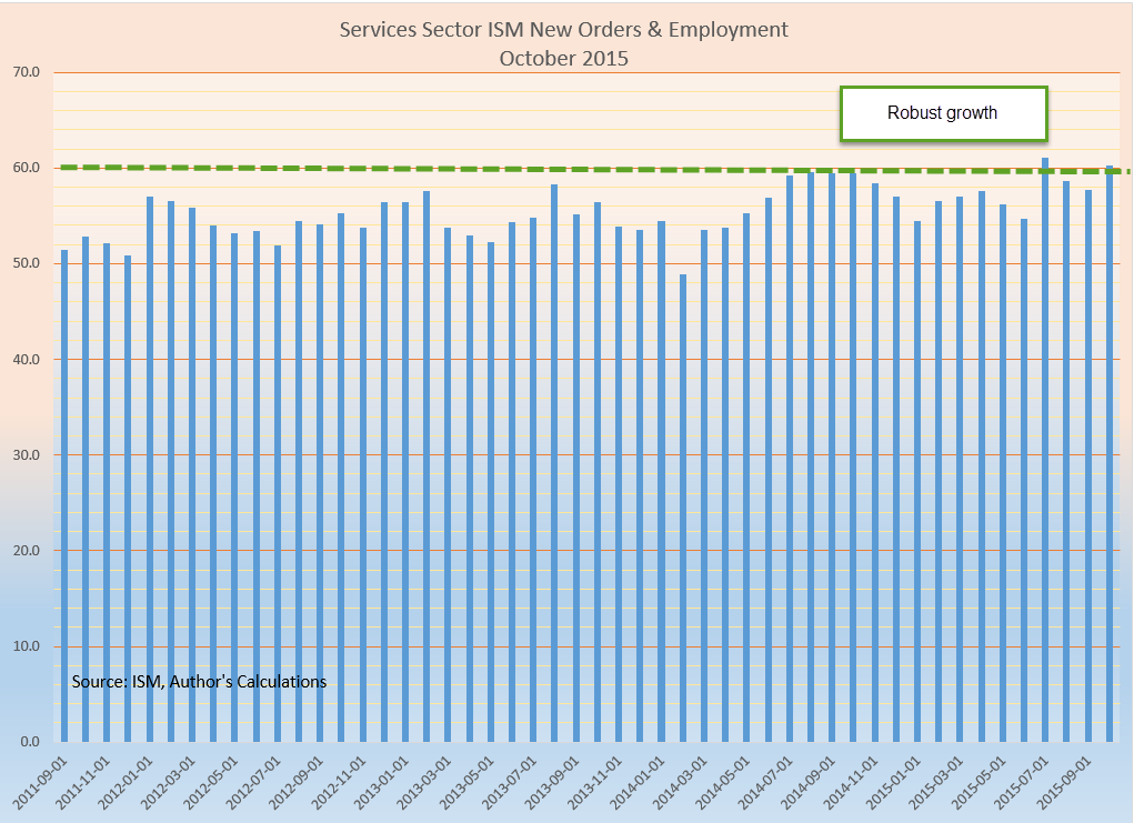
Employment and New Orders in the non-manufacturing sectors – most of the economy – rose up again to the second best of the recovery.

Economists have struggled to build a mathematical model that portrays and predicts the rather lackluster wage growth of this recovery in a labor market that has been growing pretty strongly for the past few years.

*************************************

Social Security

The Bipartisan Budget Act of 2015, passed and signed into law this past week, curtails or eliminates a Social Security claiming strategy that has become popular.  (Yahoo Finance – can pause the video and read the text below the video).  These were used by married couples who were both at full retirement age.  One partner collected spousal benefits while the “file and suspend” partner allowed their Social Security benefits to grow until the maximum at age 70.  On the right hand side of this blog is a link to a $40 per year “calculator” that helps people maximize their SS benefit.

************************************

Tax Cuts Anyone?

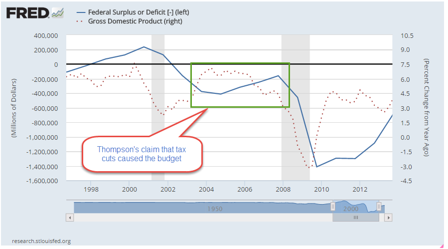
Former Senator, Presidential contender and actor Fred Thompson died this past week.  The WSJ ran a 2007 editorial by Thompson arguing that the “Bush tax cuts” that the Republican Congress passed in 2001 and 2003, when he was a Senator, had spurred the economy, causing tax revenues to increase, not decrease, as opponents of the tax cuts claimed.  Like others in the tax cut camp, Thompson looked at a rather small slice of time to support his claim: 2003 -2007.

Had tax cut advocates looked at an earlier slice of time – also small – in the late 1990s they would have seen the opposite effect.  Higher tax rates in the 1990s caused greater economic growth and higher tax revenues to the government, thereby shrinking the deficit entirely and producing a surplus.

Tax cuts decrease revenues.  Tax increases increase revenues.  That tax cuts or increases as enacted have a material effect on the economy has been debated by leading economists around the world for forty years.  At the extremes – a 100% tax rate or a 0% tax rate – these will certainly have an effect on people’s behavior.  What is not so clear is that relatively small changes in tax rates have a discernible impact on revenues.  A hallmark of belief systems is that believers cling to their conclusions and find data to support those conclusions in the hopes that they can use that to help spread their beliefs to others.

The evidence shows that economic growth usually precedes tax revenue changes; that tax policy advocates in either camp have the cart before the horse.  A downturn in GDP growth is followed shortly by a decline in tax revenues.

Thompson’s editorial notes a favorite theme of tax cut advocates – that the “Kennedy” tax cuts, initiated into law in memory of President Kennedy several months after his assassination in November 1963, spurred the economy and increased tax revenues. Revenues did increase in 1964 but the passage of the tax act occurred during that year so there is little likelihood that the tax cuts had that immediate an effect.  Revenues in 1965 did increase but fell in subsequent years.  A small one year data point is all the support needed for the claims of a believer.

The question we might ask ourselves is why do tax policy and religion share some of the same characteristics?

Still Worried

November 1, 2015

Today is the day that U.S. readers fall back.  Let’s hope it’s the only thing that falls back!

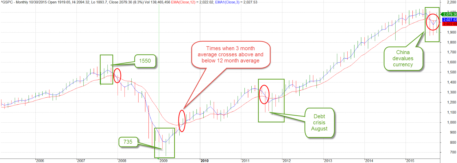
Eight years ago, in October 2007, the SP500 index reached a pre-recession high of 1550. After this month’s 8% recovery the index stands at 2079, more than a third above that long ago high.  A decade long chart of the SP500 shows the inflection points of sentiment.  We can compare two averages to understand the shifts in investor confidence.  A three month average, one quarter of a year, captures short term concerns and hesitations.  A one year average reflects doubts or optimisms that have strengthened over time.  The crossing of one average above or below the other gives us a signal that a change may be coming.  Concerns may be temporary – or not.

After falling below the 12 month average, the 3 month average strained and groaned to pull its chin above that long average, notching five consecutive weekly gains.  Both China and the EU central banks have announced plans for lower interest rates or QE to spur their economies.  Oil prices continued to bounce around under the $50 mark.  OPEC suppliers announced they could not agree on production cuts.  Fearing a continuing oversupply of crude, oil prices fell 4 – 5%.  Then came the news that the number of oil rigs in the U.S. had fallen.  Prices went back up.

Commodities and mining stocks remain under pressure.  After falling over 18% in September, mining stocks gained back most of those losses in the first two weeks of October, then fell back in the last half of this month, closing the month with a 3% gain.  15 to 20% gains and losses in a sector during a month looks like so much scurrying and confusion.

Emerging market indexes lost ground this past week, slipping more than 4%.  Worries of a global recession continue to haunt various markets.  For large and medium U.S. companies, a slowdown in European and Asian markets is sure to have a negative effect on the bottom line.

The first estimate of 3rd quarter GDP growth was a paltry 1.5%, far below the 3.9% annual rate of the 2nd quarter.  Two-thirds of the SP500 companies have reported earnings for the 3rd quarter and FactSet estimates a decline of 2.2% for the quarter, the second consecutive quarter of earnings declines.

***********************

The Causes of Depression

The economic kind, not the emotional and psychological variety.  Economics history buffs will enjoy David Stockman’s critique of the extraordinary amount of monetary easing under former Fed chairman Ben Bernanke.  As President Reagan’s budget director, Stockman was at the forefront of supply side economics, a theory which promised an answer to the stagflation of the 1970s that drove many to question the assumptions and conclusions of Keynesian economics.

At first a champion of this new approach to economic policy making, Stockman grew disillusioned and later coined the term “voodoo economics” to describe the contradictory thinking of his boss and others in the Republican Party who stuck by their beliefs in supply side economics in spite of the evidence that these policies generated large budget deficits and erratic economic cycles.

In 2010, Stockman penned an editorial  that held some in the Republican Party, his party, culpable for the 2008 fiscal crisis.  He understands that politicians and policy makers become welded to their ideological platforms, disregarding any input that might upset their model of the world.

For those who have a bit of time, an Atlantic magazine December 1981 an article acquainted readers with David Stockman in his first year as budget director.  The budget process seems as broken today as it was 35 years ago when Stockman assumed the task of constructing a Federal budget.

 These “internal mysteries” of the budget process were not dwelt upon by either side, for there was no point in confusing the clear lines of political debate with a much deeper and unanswerable question: Does anyone truly understand, much less control, the dynamics of the federal budget intertwined with the mysteries of the national economy?

Stockman understands the political gamesmanship that permeates Washington.  He criticizes Bernanke’s analysis of the 2008 Great Recession as well as the 1930s Great Depression. Faulty analysis produces faulty remedies. Stockman goes still further, finding fault with Milton Friedman’s monetary analysis of the causes of the Great Depression.  In a 1963 study titled A Monetary History of the United States Friedman and co-author Anna Schwartz found that monetary actions by the Federal Reserve deepened and lengthened the 1930s Depression.  Friedman became the leading spokesman of monetarism in the late 20th century, the thinking that governments can more effectively guide a national economy by adjusting the money supply rather than employing an ever changing regime of fiscal policies.

Students of the great debate of the past 100 years – bottom up or top down? – will enjoy Stockman’s take on the matter.

Rebound

October 25, 2015

Last week we looked at two components of GDP as simple money flows.  In an attempt to understand the severe economic under-performance during the 1930s Depression, John Maynard Keynes proposed a General Theory that studied the influences of monetary policy on the business cycle (History of macoeconomics).  In his study of money flows, Keynes had a fundamental but counterintuitive insight into an aspect of savings that is still debated by economists and policymakers.

Families curtail their spending, or current consumption, for a variety of reasons.  One group of reasons is planned future spending; today’s consumption is shifted into the future.  Saving for college, a new home, a new car, are just some examples of this kind of delayed spending.  The marketplace can not read minds.  All it knows is that a family has cut back their spending.  In “normal” times the number of families delaying spending balances out with those who have delayed spending in the past but are now spending their savings.  However, sometimes people spend far more than they save or save far more than they spend, producing an imbalance in the economy.

When too many people are saving, sales decline and inventories build till sellers and producers notice the lack of demand. To make up for the lack of sales income, businesses go to their bank and withdraw the extra money that families deposited in their savings accounts.  Note that there is no net savings under these circumstances.  Businesses withdraw their savings while families deposit their savings.  After a period of reduced sales, businesses begin laying off employees and ordering fewer goods to balance their inventories to the now reduced sales.  Now those laid off employees withdraw their savings to make up for the lost income and businesses replace their savings by selling inventory without ordering replacement goods.  As resources begin strained, families increasingly tap the several social insurance programs of state and federal governments which act as a communal savings bank,   Having reduced their employees, businesses contribute less to government coffers for social insurance programs.  Governments run deficits.  To fund its growing debt, the Federal government sells its very low risk debt to banks who can buy this AAA debt with few cash reserves, according to the rules set up by the Federal Reserve.  Money is being pumped into the economy.

As the economy continues to weaken, loans and bonds come under pressure.  The value of less credit worthy debt instruments weakens.  On the other side of the ledger are those assets which are claims to future profits – primarily stocks.  Anticipating lower profit growth, the prices of stocks fall.  Liquidity and concern for asset preservation rise as these other assets fall.  Gold and fiat currencies may rise or fall in value depending on the perception of their liquidity.

Until Keynes first proposed the idea of persistent imbalances in an economy, it was thought that imbalances were temporary.  Government intervention was not needed.  A capitalist economy would naturally generate counterbalancing motivations that would auto-correct the economic disparities and eventually reach an equilibrium.  Economists now debate how much government intervention. Few argue anymore for no intervention.  What we take for granted now was at one time a radical idea.

While some economists and policymakers continue to focus on the sovereign debt amount of the U.S. and other developed economies, the money flow from the store of debt, and investor confidence in that flow, is probably more important than the debt itself.  As long as investors trust a country’s ability to service its debt, they will continue to loan the country money at a reasonable interest rate.  While the idea of money flow was not new in the 1930s, Keynes was the first to propose that the aggregate of these flows could have an effect on real economic activity.

***********************

Stock market

A very good week for the market, up 2% for the week and over 8% for October.  A surprising earnings report from Microsoft lifted the stock -finally – above its year 2000 price.  China announced a lower interest rate to spur economic activity.  ECB chair Mario Draghi announced more QE to fight deflation in the Eurozone. Moderating home prices and low mortgage rate have boosted existing home sales.

The large cap market, the SP500, is in a re-evaluation phase.  The 10 month average, about 220 days of trading activity, peaked in July at 2067 and if it can hold onto this month’s gains, that average may climb above 2050 at month’s end.

The 10 month relative strength of the SP500 has declined to near zero.  Long term bonds (VBLTX) are slightly below zero, meaning that investors are not committing money to either asset class.  The last time there was a similar situation was in October 2000, as the market faltered after the dot-com run-up.  In the months following, investors swung toward bonds, sending stocks down a third over the next two years.  This time is different, of course, but we will be watching to see if investors indicate a commitment to one asset class or the other in the coming months.

Investment Flows

October 18, 2015

When economists tally up the output or Gross Domestic Product (GDP) of a country, they use an agreed upon accounting identity: GDP = C + I + G + NX where C = Consumption Spending, I = Investment or Savings, G = net government spending, and NX is Net Exports, which is sometimes shown as X-M for eXports less iMports. {Lecture on calculating output}

In past blogs I have looked at the private domestic spending part of the equation – the C.  Let’s look at the G, government spending, in the equation.  Let’s construct a simple model based more on money flows into and out of the private sector.  Let’s regard “the government” as a foreign country to see what we can learn.  In this sense, the federal, state and local governments are foreign, or outside, the private sector.

The private sector exchanges goods and services with the government sector in the form of money, either as taxes (out) or money (in).  Taxes paid to a government are a cost for goods and services received from the government. Services can be ethereal, as in a sense of justice and order, a right to a trial, or a promise of a Social Security pension.  Transfer payments and taxes are not included in the calculation of GDP but we will include them here.  These include Social Security, Medicare, Medicaid, food stamps and other social programs.  If the private sector receives more from the government than the government takes in the form of taxes, that’s a good thing in this simplified money flow model. There are two types of spending in this model: inside (private sector) and outside (all else) spending.

Let’s turn to investment, the “I” in the GDP equation.  In the simplified money flow model, an investment in a new business is treated the same as a consumption purchase like buying  a new car.  Investment and larger ticket purchase decisions like an automobile depend heavily on a person’s confidence in the future.  If I think the stock market is way overpriced or I am worried about the economy, I am less likely to invest in an index fund.  If I am worried about my job, I am much less likely to buy a new car.  In its simplicity this model may capture the “animal spirits” that Depression era economist John Maynard Keynes wrote about.

We like to think that an investment is a well informed gamble on the future.  Well informed it can not be because we don’t know what the future brings.  We can only extrapolate from the present and much of what is happening in the present is not available to us, or is fuzzy.  While an investment decision may not be as “chanciful” as the roll of a dice an investment decision is truly a gamble.

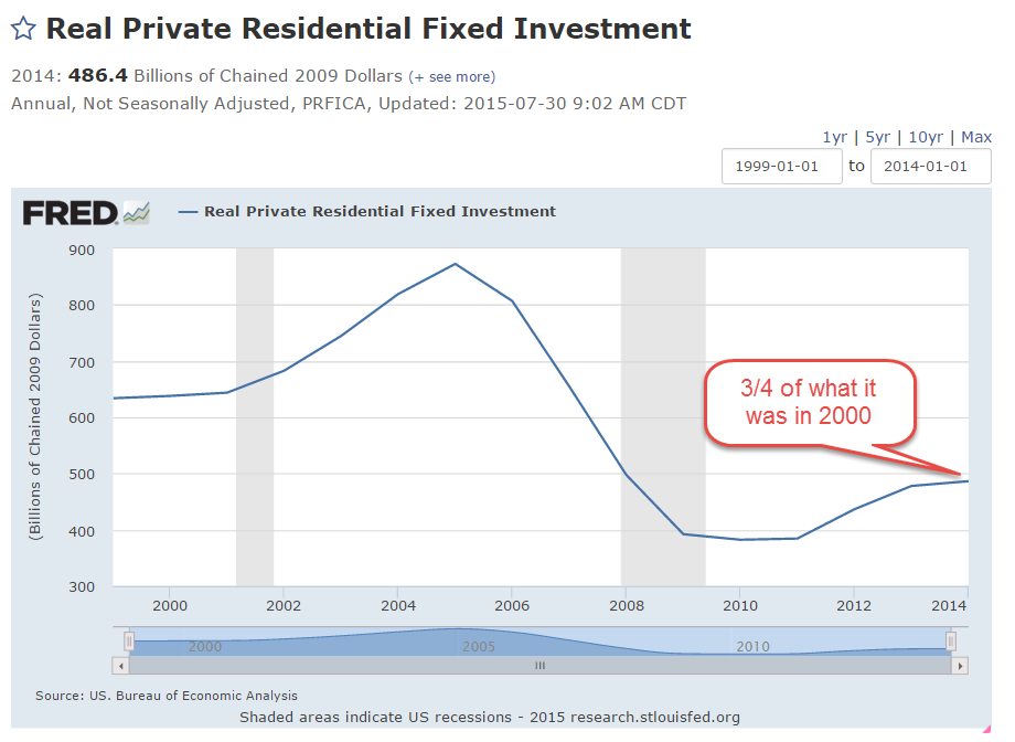
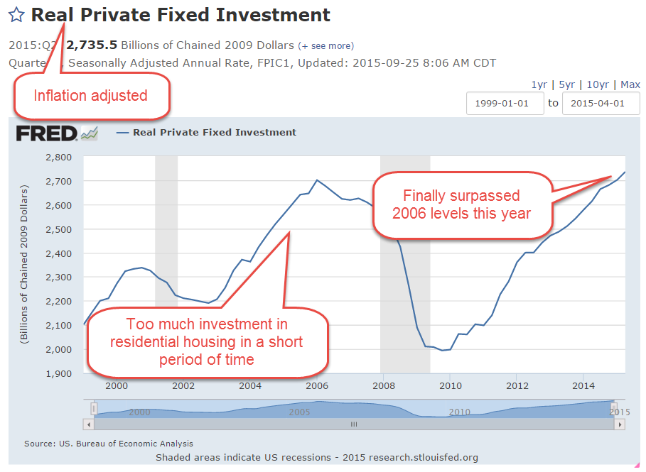
Remember, in the GDP equation GDP = C + I + G + NX, investment (the I in the equation) is a component of GDP and includes investments in residential housing. In the first decade of this century, people invested way too much in residential housing.

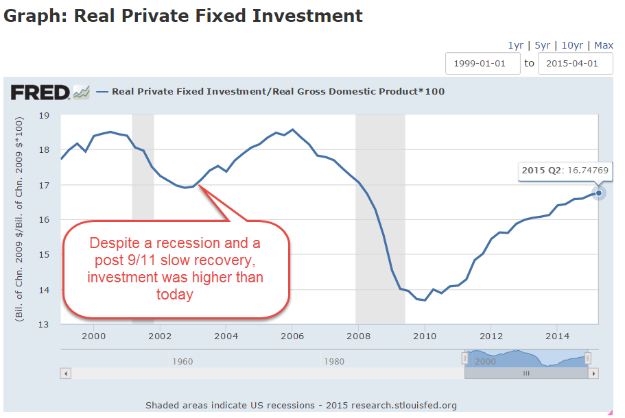
In the recession following the dot-com bust and the slow recovery that followed the 9-11 tragedy, private investment was a higher percentage of GDP than it is today, six years after the last recession’s end.  Much of this swell was due to the inflow of capital into residental housing.

The inflation-adjusted swell of dollars is clearly visible in the chart below.  It is only in the second quarter of this year that we have surpassed the peak of investment in 2006, when housing prices were at their peak.

Investment spending is like a game of whack-a-mole.  Investment dollars flow in trends, bubbling up in one area, or hole, before popping or receding, then emerging in another area.  Where have investment dollars gone since the housing bust?  An investment in a stock or bond index is not counted as investment, the “I” in the equation, when calculating GDP.  The price of a stock or bond index can give us an indirect reading of the investment flow into these financial products.  An investment in the stock market index SP500 has tripled since the low in the spring of 2009 {Portfolio Visualizer includes reinvestment of dividends}

Now, just suppose that some banks and pension funds were to move more of those stock and bond investments back into residential housing or into another area?

October Surprise

October 11, 2015

A good week for stocks (SPY), up over 3%.  Emerging markets (VWO) were up over 5%, but are still down 18% from spring highs and are on sale, so to speak, at February 2014 prices.

On news that domestic crude oil production had fallen 120,000 barrels per day, about 15%, in September, an oil commodity ETF (USO) rose up 8% this week.  On fears, and confirmations of fears, of an economic slowdown in much of the world, commodities have taken a beating in the past year, falling 50% or more.  A broad basket of commodities (DBC) was up 4% this week but are still at ten year lows.  An August 2010 Market Watch commentary recounted the evils of commodity ETFs as a place where the pros take the suckers’ money.  Not for the casual investor.

The Telegraph carried a brief summary of the latest IMF assessment of credit conditions around the world.  There is an informative graphic of the four stages of the macro credit cycle and which countries are at what stage in the cycle.

**************************

Social welfare

Some people say they dislike redistribution schemes on moral grounds.  The government takes money from some people based on their ability and gives it to other people based on their need, a central tenet of Communism.

In a 2014 paper IMF researchers have found that redistribution is a hallmark of developed economies.  Why?  Because advanced economies have the most income inequality.  Why?  Developed economies have greater income opportunity and opportunity breeds inequality.  A sense of human decency prompts the voters in these developed countries to even the playing field a bit.

In countries with greater equality, living standards and median income are lower.  There is less income to redistribute.  In the real world where the choices are higher income and redistribution vs an equality of poverty, I’ll take the more advanced economies.

****************************

CWPI

Since the beginning of this year the manufacturing component of the Purchasing Managers’ Index has continued to expand.  The strong dollar has made U.S. products more expensive around the world and this has hurt domestic manufacturers.  Growth has slowed from the strong expansion of the last half of 2013 and all of 2014.  September’s survey of manufacturers is right at the edge between expansion and contraction.  The CWPI weights the new orders and employment portions of each index more heavily.  Using this methodology, the manufacturing side of the equation looks stronger than the headline index indicates.

The services sector, most of the economy, is still enjoying robust growth and this strength elevates the combined CWPI.

How much will the substandard growth in the rest of the world affect the U.S. economy?  Industrial production in Germany declined last month.  China’s growth is slowing.  GDP growth in the Eurozone is barely positive.  Emerging markets are struggling with capital outflows.  Developed economies that are dependent on natural resources – Canada and Australia – are struggling.  The GDP growth rate of both countries is very slightly negative. The U.S. is probably the one economic ray of hope.  September’s lackluster labor report and the Fed’s decision to delay a rate increase has attracted capital back into the stock market. This past Monday, volatility in the market (VIX – 17) dropped down below its long term historical average of 20 but is a tiny bit above its 200 day average.  I’d like to see another calm week before I was convinced that the underlying nervousness in the market has abated.  Third quarter earnings season is here and estimates by Fact Set  are for a 5% decline in earnings, the second consecutive quarter of declines since 2009.

The Active and the Inactive

October 4, 2015

A disappointing September jobs report capped off a third week of losses a rescue from a third week of losses in the stock market.  The initial reaction on Friday morning was a 1.5% drop in the SP500. Over the past several weeks, the stock (SPY) and long term Treasury market (TLT) have become little more than speculative gambles on when the Fed will raise interest rates.  Until Friday’s jobs report, the choices were mainly restricted to October or December 2015. Janet Yellen voiced a commitment to raising interest rates this year in comments (see last week’s blog) at the U. of Massachusetts.  However, the lackluster jobs report ushered in another choice – March of 2016.  By the closing bell on Friday, the SP500 had gained 1.5%, a reversal of 3% on the day and a gain of 1% in the index for the week.

Emerging markets bounced up almost 5% this week, showing that there are enough buyers who are willing to invest at these low price levels.  The Vanguard ETF VWO formed a “W” pattern on a weekly chart and strong volume.

Despite the tepid job growth of 142,000, the unemployment rate remained steady because more than 300,000 left the work force.  Probably the biggest surprise was that July and August’s job gains were revised downward as well.  I had been expecting an upward revision in August’s numbers.

The Labor Force Participation Rate (CLF) declined .2% to 62.4%.  The CLF rate measures the (number of people working or looking for a job) / (number of people who can legally work).  There is another measurement that I have used before on this blog: the ratio of (people not working or looking for a job) / (the number of people working).  Let’s call it the Inactive Active ratio, or IARATIO.

Visually, the blue CLF rate doesn’t show us much; it is a relatively monotonic data series.  In contrast, the decades long fluctuations in the red IARATIO present some useful information.  We can see a simple answer for the federal budget surplus at the end of the 1990s, when the ratio of inactive to active workers was very low. Although politicians like to claim and blame for every data point, the simple truth is that there were almost as many adults working as not working in the late ’90s. Working people tend to put in more than they take out of the kitty.  For two decades there was a striking correlation between the Federal Surplus/Deficit and the IARATIO.

At about .75, the ratio of this past recovery was similar to that of the first half of the 1980s.  In the past two years, the IARATIO has dropped to .72, a good sign,  similar to the readings of 1986, a time of economic growth.

The ever greater number of Boomers retiring over the next decade will put upward pressure on this IARATIO.  The fix?  More jobs. Jobs solve a lot of problems, both for families and government budgets.

The Phillips Curve

September 27, 2015

Worries about economic growth in China, in the EuroZone and in emerging markets have prompted fears of a recession in the U.S.  It could happen – it will happen – at some point in the future but not in the near future.  The Fed likes to use a Personal Consumption chain weighted inflation index called the PCE Price Index which more reliably captures underlying inflation trends.  Preceding each recession we see the rate of economic growth fall below the annual growth rate of the PCE index, multiplied by a 1.5 factor.  While GDP growth is not robust, it is far above the growth of the PCE price level.

Speaking of growth, inflation-adjusted GDP growth for the second quarter was revised upwards to a 3.9% annual rate.  Consumer spending was revised higher and inventory growth – a bit worrisome, as I noted earlier – was revised lower.

The SP500 index began the year at a price level ($2068) that was just a bit above the inflation adjusted price level ($2018) of 2000 (Graph here).  Oops! we’re back below that year 2000 level. A sense of pessimism since mid-August has led to an 8% decline in the broad stock index, or 6% below the price level at the beginning of 2015.  A broad composite of bonds, Vanguard’s BND ETF, is also down -about 1.5% – since early 2015.

Some sectors of the market can not find a bottom.  XME, a blend of mining stocks, is down 45% for the year.  Brazil’s index, EWZ, is down a similar amount – about 40%.  Emerging Market stocks (VWO) in general have lost about 17% this year, and are at June 2009 prices.  After losing 5% of their value in the first week of September, they appeared to have found a bottom, regaining that lost 5% in the next two weeks.  This past week they gave up those gains, touching the bottom again.  The second time is a charm.  If this market draws in buyers a second time, this might be a good time to put some long term money to work.

*******************************

Phillips – the curve, not the screwdriver

In a speech/lecture at U. of Massachusetts this week, Federal Reserve Chair Janet Yellen voiced her desire to raise interest rates sometime this year.  She included in her remarks some comments on the Phillips curve, a mainstay of economics textbooks during the past 50 years.  In the 1950s Bill Phillips presented one hundred years of unemployment and inflation data in the United Kingdom and showed that there was a trade-off between unemployment and inflation.  Higher inflation = lower unemployment.  Lower inflation = higher unemployment.  When the number of unemployed workers are low, workers can press employers for higher wages.  Higher wages lead to a higher inflation rate.

As you can see in the graph above (included in the Wikipedia article on the Phillips curve), the regression estimate, the red line, shows a tenuous inverse relationship between unemployment and inflation.  The standard error S of the regression estimate is a guide to the reliability of the estimate to predict future relationships in the data. The S in this regression is not shown but looks to be rather large; a lot of the data points are pretty far away from the red estimate line and so the regression model is unreliable.

Within fifteen years after the Phillips curve became an accepted tenet of economics, the stagflation of the 1970s disproved the central thesis of the Phillips curve.  During that decade, there was both high inflation and high unemployment.  This led economists to revise their thinking; the relationship described by the Phillips curve may have some validity in the short run but not in the long run.

For those of you who might like to go down the rabbit hole on this issue, there are several fascinating but challenging perspectives on the relationship between unemployment, the labor market, and inflation, the price level of goods in an economy.  One is Jason Smith’s Information Transfer model version of the Phillips curve.  Jason is a physicist by education and training who uses the tools of information theory to bring fresh insights to economic data, trends and models.

Roger Farmer (whose blog I link to in my blog links on the right hand side) has developed another perspective based on a sometimes overlooked insight in Keynes’ General Theory published in 1936. Roger is the Department Chair at UCLA’s Dept of Economics.  For the general reader, I heartily recommend his book “How the Economy Works”, a small book which presents his ideas in clear, simple terms. His history of the development of central economic theories weaves a concise narrative of ideas and people that may be the best I have read.

For those of you with the background and math chops, his paper “Expectations, Employment and Prices” (also a book) contains a well-developed mathematical model of longer term economical and business cycles that find an equilibrium at various levels of unemployment. Roger undermines an idea predominant in economics and monetary policy: the so called natural rate of unemployment, or NAIRU, that guides policy decisions at the Fed and is often mentioned by Yellen and others at the Fed.