Summer Signs

July 13, 2014

Small Business

Optimism has been on the rise among small business owners surveyed monthly by the National Federal of Independent Businesses (NFIB).  Anticipating a growing confidence, consensus estimates were for a reading of 97 to 98, topping May’s reading of 96.8.  Tuesday’s disappointing report of 95 dampened spirits.  The fallback was primarily in expectations for an improving economy.  Mitigating that reversal of sentiment was a mildly positive uptick in hiring plans. The majority of job growth comes from small and medium sized companies.

*******************************
Job Openings and Labor Turnover Survey (JOLTS)

Speaking of job growth…There is a one month lag in the JOLTS report from the Bureau of Labor Statistics so this week’s report summarized May’s data.  The number of job openings continues to climb as does the number of people who feel confident enough to voluntarily quit their job.  Job openings have surpassed 2007 levels. If I were President, I would greet everyone with a hand shake and “Hi, job openings have surpassed 2007 levels.  Nice to meet you.”

Still, the number of voluntary quits is barely above the low point of the early 2000s downturn.  Let’s not mention that.

We can look at the number of job quits to unemployment, or the ratio of voluntary to involuntary unemployment.  This metric reveals a certain level of confidence among workers as well as the availability of jobs.  That confidence among workers is relatively low.  The early 2000s look like a nirvana compared to the sentiment now.  The country looks positively depressed using this metric.

If I were President, if I were a Congressman or Senator, I would post this chart on the wall in my office and on the chambers of Congress where it would remind myself and every other person in that chamber that part of my job is to help that confidence level rise.  Instead, most of our elected representatives are voicing or crafting a position on immigration ahead of the midterm elections.  Washington is the site of the largest Punch and Judy show on earth.  Like the little train, I will keep repeating to myself “I think I can, I think I can…stay optimistic.”

*******************************

Government Programs

Most social benefit programs are on autopilot, leaving Congress with little discretion in determining the amount of money that flows out of the U.S. Treasury.  These programs include Social Security, Temporary Assistance to Needy Families, Food Stamps, Unemployment Benefits, etc.   Enacted over the past eighty years, the ghosts of Congresses past are ever present in the many Federal agencies that administer these programs.

During the recent recession, payments under social programs shot up, consuming more than 70% of all revenues to the government.  Political acrimony in this country switched into high gear as the U.S. government became the largest insurance agency in the world. As the economy improved, spending fell below the 60% threshold but has hovered around that level.

 That percentage will surely rise as the boomer generation retires, taking an ever increasing share of revenues to pay out Social Security, Medicare and Medicaid benefits.  As the percentage rises again toward the levels of the recession, we can expect that social benefit spending will take center stage in the 2016 Presidential election.

*******************************
Indicators

Back in ye olden days, soothsayers used chicken bones and tea leaves to foretell the future.  We now have powerful computers, sophisticated algorithms and statistical techniques to look through the foggy glass of our crystal ball.  Less sophisticated algorithms are called rules of thumb.  In the board game Monopoly, a good rule of thumb is that it is wiser to build hotels on St. James, Tennessee and New York Ave than on the marquee properties Park Place and Boardwalk.

I heard a guy mention a negative correlation between early summer oil prices and stock market direction for the rest of the year. In other words, if one goes up the other goes down. I have a healthy skepticism of indicators but this one intrigued me since it made sense.  Oil is essentially a tax on our pocketbooks, on the economy.  If oil goes up, it is going to drive up supplier prices, hurt the profits of many companies, reduce discretionary income and drag down economic growth. The market will react to that upward or downward pressure in the next few quarters. But a correlation between six weeks of trading in summer and the market’s direction the rest of the year? Is that backed up by data, I wondered, or is that just an old saw?   I used the SP500 (SPY) as a proxy for the stock market, the U.S. Oil Fund (USO) as a proxy for the oil market and threw in Long Term Treasuries (TLT) into the mix.  I’ll explain why the treasuries in a minute.

A chart of recent history shows that there is some truth to that rule of thumb.  When oil (gray bars) has dropped in price in the first six weeks of summer trading, the stock market has gained (yellow bars) during the rest of the year in five out of the past seven years.   A flip of a coin will come up heads 50% of the time, tails 50% of the time. An investor who can beat those 50/50 chances by a margin of 5 wins to 2 losses will do very well.

Whether this negative correlation is anything but happenstance is anyone’s guess.  If you look at the chart again, you’ll see that there is also a negative correlation between long term Treasuries (TLT) and oil the the first half of summer trading. When one is up, the other is down.  The last year these two moved in tandem was – gulp! – in the summer of 2008.  Oh, and this year.  We know what happened in the fall of 2008.  So, is this the sign of an impending financial catastrophe?  Let me go throw some chicken bones and I’ll let you know.

*************************

Takeaways

Small business sentiment eased back from its recent optimism.  Spending on government social programs exacerbates political tensions and aging boomers will add fuel to the fire.  Job openings and confidence continue to rise from historically low levels.  Do summer oil prices signal market sentiment?

Wage and Industrial Growth

July 6, 2014

This week I’ll take a look at the monthly employment report, update the CWPI and introduce a surprising medium term trading indicator.

***********************

Employment

On Wednesday, the private payroll processor ADP gave an early forecast that this month’s labor report from the BLS would be robust, near the tippy-top of estimates of job gains that ranged from 200K to 290K.  The BLS reported $288K i net job gains, including 26K government jobs added. 17,000 of those jobs were in education at the local level.  Rising sales and property tax revenues have enabled many city and county governments to replace education jobs that were lost during the recession.

Job gains may be even better than the headline data shows.  ADP reports that the large majority of hiring is coming from small and medium sized firms.  The headline number of job gains each month comes from the BLS Establishment Survey, which underestimates job growth in really small firms.  The Household Survey estimated about 400K job gains this past month.  Usually, the Establishment Survey is thought to be the more reliable estimate but in this case, I would give a bit of a bump up toward the Household Survey estimate and guesstimate that job gains were closer to 330K this past month.  The BLS also revised April and May’s job gains upward.

The unemployment rate decreased .2% to 6.1% and the y-o-y decline in the rate has accelerated.

Excellent news, but let’s dig a bit deeper. The BLS tracks several unemployment rates.  The headline rate is the U-3 rate.  The U-4 rate includes both the unemployed who have looked for work in the past month, and those who have not, referred to as discouraged workers.  The trend in discouraged workers has been drifting down, although it is still above the normal range of .2 to .3% of the work force.

I would be a whole lot more optimistic about the labor market if the employment rate of the core work force aged 25 – 54 were higher.

Slowly and inexorably the employment level of this core has been rising in the past few years but the emphasis is on the word slowly.

The number of workers who usually work part time seems to have reached a high plateau, close to 18% of the Civilian Labor Force (CLF).  The CLF includes most people over the age of 16.  June’s Household Survey shows a historic jump of 800,000 additional part time jobs added in the past month.

A closer look at the BLS data makes me doubt that number. The unseasonally adjusted number of part timers shows only a 400,000 gain, leading me to question any seasonal adjustment that doubles that gain.  Secondly, the BLS did not seasonally adjust last month’s tally of part time workers, leading me to guess that June’s figure includes two months of seasonal adjustment.

That same survey shows a one month loss of more than 500,000 full time jobs lost (Table A-9 BLS Employment Situation).  The year-over-year percent change in full time workers is 1.8%.  As you can see in the graph below this is in the respectable range.  The unseasonally adjusted y-o-y gains is close to the seasonally adjusted gain, leading me to believe that the losses, if any, have been overstated due to month-to-month fluctuations in seasonal adjustments.

However, if you are selling a newsletter that says the stock market is grossly overvalued and the end is coming, then you would want to highlight the change in June’s seasonally adjusted numbers, to wit:  500,000 full time jobs lost;  800,000 part time jobs gained.

While the Civilian Participation Rate has steadied, it is rather low.  The Participation Rate is the number of people working or looking for work as a percent of most of the population above 16. Below is a chart showing the declining participation rate and the unemployment rate.

Now let’s divide the Participation Rate by the Unemployment Rate and we see that this ratio is still below the 34 year average.

                                                                                      
********************

Wage Growth

Each month the BLS reports average weekly earnings as part of the labor report. Year-over-year inflation adjusted wage growth is flat but has probably declined below zero.

An investor would have done very well for themselves if they had paid attention to this one indicator.  (There is a week lag between the end of the month price of SP500 and the release of the employment report for that month but it is close enough for this medium to long term analysis.)

The SP500 has gained almost 50% since the first quarter of 2006.  An investor going in and out of the market when inflation-adjusted wage growth crossed firmly above and below 0% would have made 134% during that same period.  “Ah, ha!  The crystal ball that will give me a glimpse into the future!” The problem with any one indicator is that it may work for a period of time.  This one has worked extremely well for the past eight years.  This series which includes all employees goes back only to March 2006.  The series that includes only Production and Non-Supervisory employees goes back to 1964.  The two series closely track each other.  I have left the CPI adjustment out of both series to show the comparison.

However, an investor using this strategy in the mid-1990s would have been out of the market during a 33% rise.  She would have been in the market during half of the 2000-2002 downturn and been mostly out of the market during an almost 50% rise from 2003-2005.  In approximately twenty years, she would have made half as much as simply staying in the market.

The ups and downs of wage growth may not be a reliable indicator of the market’s direction but it does indicate positive and negative economic pressures.  Poor wage growth in the mid-2000s probably fueled speculation in real estate and the stock market.

From the mid-1980s to the mid-1990s, a decade of negative inflation adjusted wage growth exerted downward pressure on labor income, which naturally led to a stratospheric increase in household debt.

The stock market quintupled as inflation adjusted wages stagnated.  During this period an investor would have been better to do the opposite: buy when wage growth fell below zero, sell when it crossed above.  As long as workers were willing and able to borrow to make up for the lack of wage growth, company profits could continue to grow and it is profits that ultimately drive stock market valuations.

Wage growth ultimately influences retail sales which impacts GDP growth.  The difference between the growth in retail sales and wage growth roughly tracks changes in GDP.

If retail sales growth is more than wage growth for a number of years, the imbalance has to eventually correct.  We are in a period of little wage growth and modest sales growth which means that GDP growth is likely to remain modest as well.

**********************

Constant Weighted Purchasing Index (CWPI)

Purchasing Managers surveyed by the Institute for Supply Management continue to report strong growth.  The CWPI index, based on both the Manufacturing and Services surveys, continues to rise as expected.

A composite of new orders and employment in the services sector remains strong.  February’s dip below 50 was an anomaly caused by the severe winter weather which coincided with inventory adjustments.

We see that this is a cyclic indicator, responding to the push and tug of new orders, employment, deliveries and inventories.  If the pattern continues, we would expect a decline in activity in the several months before the Christmas shopping season, a cycle that we have not seen since 2006.

The CWPI generates buy and sell signals when the index crosses firmly above and below 50 and has generated only 8 trades, or 16 separate transactions, in the past 17 years.  It is suited more to the long term investor who simply wants to avoid a majority of the pain of a severe downturn in the market.  Because it charts a composite of economic activity, it will not generate a signal in response to political events like the budget disagreement in July 2011 that led to an almost 20% drop in the market.  A strategy based on the CWPI gained 180% over the past 17 years as the market gained about 110%.

************************

Takeaways

Strong employment report but wage growth is flat and declining on a year over year basis.  CWPI indicator continues to rise up from the winter doldrums and should peak in two months.

GDP and Education

June 29, 2014

This week I’ll review some of this week’s headlines in GDP, personal income, spending and debt, housing and unemployment.  Then I’ll take a look at some trends in education, including state and local spending.

**************************
Gross Domestic Product First Quarter 2014

The headline this week was the third and final estimate of GDP growth in the first quarter, revised downward from -1% to -2.9%.  This headline number is the quarterly growth rate, or the growth rate over the preceding quarter.  A year over year comparison, matching 2014 first quarter GDP with 2013 first quarter GDP, shows an annual real growth rate of 1.5%, below the 2.5 to 3.0% growth of the past fifty years.  The largest contributor to the sluggish GDP growth was an almost 5% drop in defense spending.  Simon Kuznets, the economist who developed the GDP concept, did not include defense spending in the GDP calculation.

Contributing to the quarterly drop was the 1.7% decline in inventories.  Businesses had built up inventories a bit much in the latter half of 2013 in anticipation of sales growth only to see those expectations dashed by the severe winter weather.  Final Sales of Domestic Product is a way of calculating current GDP growth and does not include changes in inventory.  Let’s look at a graph of the annual growth in Real (Inflation-Adjusted) GDP and Real Final Sales of Domestic Product to see the differences in the two series.

Note that Real GDP growth (dark red line) leads Final Sales (blue line) as businesses build and reduce their inventory levels in anticipation of future demand and in reaction to current and past demand.
  
The Big Pic: if we look at these two series since WW2, we see that ALL recessions, except one, are marked by a year over year percent decline in real GDP.  The 2001 recession was the exception.

Secondly, note that in half of the recessions, y-o-y growth in Final Sales, the blue line in the graph, does not dip below zero.  We can identify two trends to recession: 1) businesses are too optimistic and overbuild inventories in anticipation of demand, then correct to the downside, causing a reduction in employment and a lagging reduction in consumer spending; 2) consumers are too optimistic and take on too much debt – selling an inventory of future earnings to creditors, so to speak – then correct to the downside and reduce their consumption, causing businesses to cut back their growth plans.  In case #1, a decrease in consumer spending follows the cutbacks by businesses.  In case #2, businesses cut back following a downturn in consumer spending.

In this past quarter, employment was rising as businesses cut back inventory growth, indicating more of a rebalancing of resources by businesses rather than a correction.  Consumer spending may have weakened during the first quarter but, importantly, did not decline.  We have two hunting dogs and neither is pointing at a downturn.

For a succinct description of the various components of GDP, check out this article written for about.com by Kimberly Amadeo.  Probably written in the first quarter of 2014, her concerns about the inventory buildup in 2013 were proved accurate.

**************************

Income and Spending

Personal Income rose almost 5% on an annualized basis in May but consumer spending rose at only half that pace,  2.4%.  The spending growth is only slightly more than the 1.8% inflation rate calculated by the Bureau of Economic Analysis, revealing that consumers are still cautious.

I heard recently a good example of how data can be presented out of context, leading a listener or reader to come to a wrong conclusion.  Data point: the dollar value of consumer loans outstanding has risen 45% since the start of the recession in late 2007. Consumer loans do not include mortgages or most student loan debt. If I were selling a book, physical gold, or a variable annuity with a minimum return guarantee, I could say:

My friends, this shows that many consumers have not learned any lessons from the recession.  They are living beyond their means, running up debts that they will not be able to pay. Soon, very soon, people will start defaulting on their debts and the economy will collapse.  This country will suffer a depression that will make the 1930s depression look tame.  Now is the time to protect yourself and your loved ones before the coming crash.

Data is little more than an opportunity to spread one’s political message.  Data should never lead us to reconsider our message, our point of view.  If I were penning a politically liberal message, I could write:

The families in our country are desperate.  Without enough income to satisfy their basic needs, they are forced to borrow, falling ever deeper into debt while the 1% get richer.  We need policies that will help families, not the financial fat cats on Wall Street.  We need a tax structure that will ensure that the 1% pay their fair share and not have the burden fall on the shoulders of most of the working Americans in this country.


Selling a political persuasion and selling a car brand often employ similar techniques.  Data should never lead us to question our loyalty to the brand.  If I were crafting a conservative message, I could write:


The misuse of credit indicates an immaturity fostered by cradle to grave social programs, which are eroding the very character of the American people, who come to rely less on their own resources and more on some agency in Washington to help them out.  People steadily lose their sense of personal responsibility, becoming more like children than self-reliant adults.

However, the facts behind the data point lead us to a different story. In the spring of 2010, consumer loans spiked, rising $382 billion in just two months.

That surge represents more than a $1000 in additional debt per person. Consumers did not suddenly go crazy.  Banks did not open their bank vaults in a spirit of generosity. Instead, banks implemented accounting rules FAS 166 and 167 that required them to show certain assets and liabilities on their books. $322 billion of the $382 billion increase in consumer loans during those two months in 2010 was the accounting change. If we subtract that accounting change from the current total, we find that real consumer loan debt increased only 5.5% in 6-1/2 years.  And that is the real story.  Never in the history of this series since WW2 have consumers restrained their borrowing habits as much as we have since December 2007.  We had to.  In the eight years before the financial crisis in 2008, real consumer debt rose 33%, an unsustainable pace.

About two years ago, loan balances stopped declining and since then consumers have added $80 billion, much of it to finance car purchases. $25 billion of that $80 billion increase has come only since the beginning of this year.  On a per capita, inflation adjusted basis, consumer loan balances are still rather flat.

**************************

Housing

New home sales in May were up almost 20% over April’s total, and over 6% on an annual basis.  Existing homes rose 5% above April’s pace but are down 5% on an annual basis.  Each year we hope that housing will finally contribute something to economic growth.  Like Cubs fans, we can hope that maybe this year….

**************************

Unemployment Claims

New unemployment claims continue to drift downward and the 4 week moving average is just below 315,000.  Our attention spans are rather short so it is important to keep in mind that the current level of claims is the same as what is was last September.

It has taken this economy six months to recover from the upward spike in claims last October.  The patient is recovering but still not healthy.

**************************

Minimum Wage

The number of workers directly affected by changes in the minimum wage are small.  We sympathize with those minimum wage workers who try to support a family.  The Good Samaritan impulse in many of us prompts us to say hey, come on, give these people a break and raise the minimum wage.  What we may forget are the implications of any minimum wage increase.  Older readers, stretch your imagination and remember those years gone by when you were younger. Workers in their early working years often see the minimum as a benchmark for comparison.  The much larger pool of younger workers who make above minimum wage may push for higher wages in response to increases in the minimum wage.

Fifty years ago, Congress could have made the minimum wage rise with inflation, ensuring that workers in low paid jobs would get at least a subsistence wage and that increases would be incremental.  Of course, there are some good arguments against any nationally set minimum wage.  $10 in Los Angeles buys far less than $10 in Grand Junction, Colorado.  Ikea recently announced that they will begin paying a minimum wage that is based on the livable wage in each area using the MIT living wage calculator .  Several cities have enacted minimum wage increases that will be phased in over several years but none that I know of are indexed to inflation as the MIT model does.

Congress could enact legislation that respects the differences in living costs across the nation.  For too long, Congress has chosen to use the minimum wage as a political football.  Social Security payments are indexed to inflation because older people put pressure on politicians to stop the nonsense.  There are not enough minimum wage workers to exert a similar amount of coordinated pressure on the folks in Washington so workers must rely on the fairness instinct of the larger pool of voters if any national legislation will be passed.

**********************

Education

Demos, a liberal think tank, recently published a report recounting the impact of rising tuition costs on students and families.  Student debt has almost quadrupled from 2004 – 2012.  Wow, I thought.  State spending per student has declined 27%.  More wows.  How much has enrollment increased, I wondered?  Hmmm, not mentioned in the report.  Why not?

The National Center for Education Statistics, a division of the Dept. of Education, reports that full time college enrollment increased a whopping 38% in the decade from 2001-2011.  Part-time enrollment increased 23% during that time.  Together, they average a 32% increase in enrollment. Again, wow!  Ok, I thought, the states have been overwhelmed with the increase in enrollment, declining revenues because of the recession, etc.  Well, that’s part of the story.  Spending on education, including K-12, is at the same levels as it was a decade ago.

From 2002-2012, states have increased their spending on higher ed by 42%.  Some argue that the Federal government should step up and contribute more.  In 2010, total Federal spending on education at all levels was less than 1% ($8.5B out of $879B).  Others argue that the heavily subsidized educational system is bloated and inefficient.  As much cultural as they are educational institutions, colleges and universities have never been examples of efficiency.  Old buildings on college campuses that are expensive to heat and cool are largely empty at 4 P.M.  Legacy pension agreements, generously agreed to in earlier decades, further strain state budgets.  We may need to rethink how we can deliver a quality education but these are particularly thorny issues which ignite passions in state and local budget negotations.

Although state and local governments have increased spending on higher ed by 42% in the decade from 2002-2012, the base year used to calculate that percentage increase was particularly low, coming after 9-11 and the implosion of the dot-com boom.  Nor does it reflect the economic realities that students must get more education to compete for many jobs at the median level and above.

Let’s then go back to what was presumably a good year, 2000, the height of the dot-com boom.  State coffers were full.  In 2000, state and local governments spent 5.14% of GDP (Source).  By 2010, that share had grown to 5.82% of GDP (Source). That represents a 13% gain in resources devoted to education.  But that is barely above population growth, without accounting for the rush of enrollment in higher education during the decade.

Let’s take a broader view of educational spending, comparing the total of all spending on education, including K-12, to all the revenue that Federal, state and local governments bring in.  This includes social security taxes, property taxes, sales taxes, etc.  As a percent of all receipts, spending on education has declined from 30% to under 18%.

Many on the political left paint conservatives as being either against education or not supportive of education.  Census data shows that Republican dominated state legislatures, in general, devote more of their budget to education than Democratic legislatures.  W. Virginia, Mississippi, Michigan, S. Carolina, Alabama and Arkansas devote more than 7% of GDP to education, according to U.S. Census data compiled by U.S.GovernmentSpending.com.  Only two states with predominantly Democrat legislatures, Vermont and New Mexico, join the plus-7% club (Wikipedia Party Strength for party control of state legislatures).

In the early part of the twentieth century, a high school education was higher education.  In the early part of this century, college may be the new high school, a minimum requirement for a job applicant seeking a mid level career.  What are our priorities?  In any discussion of priorities, the subject of taxes arises like Godzilla out of the watery depths.  People scramble in terror as Taxzilla devours the city. Older people on fixed incomes and wealthy house owners resist property tax increases.  Just about everyone resists sales tax increases.  Proposals to raise income taxes are difficult to incorporate in a campaign strategy for state and local politicians running for election.

Let’s disregard for a moment the ideological argument over Federal funding or control of education.  Let’s ask ourselves one question:  does this declining level of total revenues reflect our priorities or acknowledge the geopolitical realities of today’s economy?

***********************

Takeaways

Reductions in defense spending, inventory reductions and a severe winter that curtailed consumer spending accounts for much of the sluggishness in first quarter GDP growth.

A surge in new home sales is a sign of both rising incomes and greater confidence in the future.

Consumer spending growth is about half of healthy income gains.

Spending on education has grown a bit more than population growth and is not keeping up with surging enrollment in higher education.

How Much Is That Doggie In the Window?

June 22, 2014

This week I’ll look at interest rates and various models of evaluating both the stock market and housing.

*****************

GDP Growth Revised

This past Monday, the International Monetary Fund (IMF) cut estimates for this year’s economic growth in the U.S. to 2% from 2.8%.  IMF cited a number of headwinds: the severe winter, weakness in housing, some fragility in the labor market.  It recommends that the central bank keep rates low through 2017.  Expectations were that the Federal Reserve would begin raising interest rates in mid 2015.  Some recommendations in the report will be met with antipathy or a polite “thanks for letting us know”: raising the minimum wage and gasoline taxes.

******************

Fed Don’t Fail Me Now

As expected, the Federal Reserve decided to leave the target interest rate at the extremely low range of 0% to .25% that it has held in place since the beginning of 2009.  Congress has given the Fed a dual mandate:  keep inflation reasonable and promote full employment.  It is this second half of the mandate that presents some problems as the FOMC looks into their crystal ball.  The Labor Force Participation Rate is the percentage of those working to those old enough to work.  It has declined from 66% at the beginning of the recession to less than 63% today.

As economic conditions improve and job prospects brighten, how many of those who have dropped out of the labor force will return?  If workers return to the labor force, actively seeking work, that increased supply of labor will naturally curb wage increases and reduce upward pressure on inflation.  However, if the decline in the participation rate is more or less permanent for several years to a decade, then a stronger economy will create more demand for workers, who can demand more money for their labor, which will contribute to inflation.

**********************

401K Retirement Plans

The Financial Times reported projections  of negative cash flows in 401K plans by 2016 as boomers convert their pension plans to IRAs when they retire.  Retirees tend to have a much more conservative stock/bond allocation and may force institutional money managers to liquidate some equities to meet the outgoing cash flows.  An ominous speculation at the end of the article is that regulations could be put in place to slow the conversion of 401Ks to IRAs.  Whenever the finance industry needs a friend in Washington, they can be sure to find one.

*********************

Stock Market Valuation

It has been 32 months without a 10% correction in the SP500 market index.  The post World War 2 average is 18 months. Is the stock market overvalued?  I will review a common metric of value and develop an alternative model of long-term value.

Probably the most widely used metric of stock valuation is the Price/Earnings, or PE, ratio.  If a stock sells for $100 and its annual earnings are $6, then the P/E ratio is 100/6, or a bit above 16.  The average PE ratio is 15.5 (Source).  Companies do not pay all of those earnings in the form of dividends to investors.  That is another metric, called the Price Dividend, or P/D ratio, that I wrote about last year.

Fact Set provides an analysis of the past quarter’s earnings of the SP500 companies, as well as projections of current  and next year’s earnings. Earnings growth estimates for this year range from 30% (yikes!) for the telecom sector to a bit over 3% for utilities. The health care sector tops estimates of revenue growth at about 8%, while the energy sector is projected to have negative growth.  The basic materials sector tops the 2015 list of earnings growth at 18% and the utilities sector again takes the bottom rung on the ladder with almost 4% growth.

The SP500 is priced at 15.6x forward 12 months earnings, which is above the five year and 10 year averages of less than 14x (Fact Set Report page)  but just about the 100 year average of 15.5.

Robert Shiller, a Yale economist and co-developer of the Case-Shiller housing index, uses a smoothing technique for calculating a Price Earnings ratio and makes his data spreadsheet available.  His team calculates the 10 year average of real, or inflation-adjusted, earnings and divides the inflation adjusted price of the SP500 by that average to arrive at a Cyclically Adjusted Price Earnings, or CAPE, ratio.

Using this methodology, the market’s CAPE  ratio is 25, above the 30 year ratio of 22.91 and the 50 year ratio of 19.57.  In 1996, the market was trading at this same ratio, prompting then Fed Chairman Alan Greenspan to make his infamous comment about “irrational exuberance.”  The market continued to climb till it reached a nosebleed CAPE ratio of 43 in early 2000.  It took another 7 months or so before the SP500 began its descent from 1485 to 900, a drop of 40%, over the next two years.  There is no automatic switch that flips when a market becomes overvalued.  People just get up from their seats and start to leave the theater.

In most decades, this methodology works well to arrive at a longer term perspective of the market’s price.  However, some argue that when severe downturns occur, this methodology continues to factor in the downturn’s impact long after it they have passed.  In 2008 and 2009, SP500 index annual earnings crashed from above $80 down to $60, a precipitous decline that is still factored into the ten year framework of the CAPE method.

So I took Mr. Shiller’s earnings figures and did some magic on them.  I took away most of the downturn in earnings during a 3 year period from 2008 – 2010.

Bye, bye earnings dive.  Hello, stagnating earnings.  The chart shows a slight downturn in earnings, then flat-lines in the pretend world of 2008 – 2010, where the steep recession never happened.

Instead of a deep crater formed in the markets by the financial panic in late 2008, the stock market slid downward over several years before rising again in early 2012.  Can you hear the soft sounds of flutes echoing in the mountain meadows of this pretend world?

Using this pretend data, I recalculated today’s CAPE ratio at 22, below the actual 25 CAPE ratio.  What should be the benchmark in this pretend world?  The 100 year average includes the Great Depression of the 1930s and World War 2, which naturally lowered PE ratios.  A 50 year average includes the Vietnam War and high inflation, particularly during the 1970s and early 1980s.  As such, it is less comparable to today’s environment marked by low inflation and the lack of major hostilities.

So, I ran a 30 year average of our pretend world, from 1984-2013, and calculated a 30 year average of 23, close to the real 30 year average of 22.9!  It shows the relatively small effect that even momentous events have on a long term average of the CAPE ratio, which is why Robert Shiller advocates its use to calculate value and establish a comparison benchmark within a longer time frame.  In the real world, the market’s CAPE ratio of 25 is above that 30 year average.

Let’s put aside the world of soft market landings and mountain meadows and look at what I call the time value of the market.  I picked January 1980, a point almost 35 years in the past, as a starting point.  Then I divided the SP500 index by the number of months that have passed since that starting point.  This gives me a ratio of value over time. If an investor buys into the market when its value is above a long-term average of that ratio, we can expect a lower long-term rate of return.

The 20 year average is 3.98, just a shade above the 20 year median of 3.91, meaning that the highs and lows of the average pretty much cancel out.  Note also that it is only in the past year that the market value has risen above the 20 year average of this ratio.

But we cannot look at a time value of any investment without considering inflation, which erodes value over time.  When we add the Time Value Ratio and the Consumer Price Index (CPI), we find that the current market is priced slightly lower than both the 20 year and 30 year averages.

Historically, as this ratio has risen more than 25 – 30% above its long-term average,  the market peaked.  Today’s ratio is just about average.

So, is the market overvalued?  Based on CAPE methodology, yes.  Fairly valued?  Based on expectations of earnings growth this year and next, yes.  Undervalued?  Probably not.

Common Sense recently published the best and worst 10 and 20 year returns on a 50/50 stock/bond portfolio mix.  This balanced approach had a 2 – 3% annualized gain even during the Depression years when the stock market lost 80 – 90% of its value.  It should be a reminder to all investors that trying to assess the true value of the stock market is perhaps less important than staying diversified.

************************

The P/E of Housing

Home builders broke ground on almost 1.1 million private residential units in April, a 13% increase over last year.  Called Housing Starts, the series includes both multi-family units and single family homes. The pace slowed a bit in May but still broke the 1 million mark.  As a percent of the population, we just aren’t building as many homes as we used to.

For most of us, our working years are about 60% of our lifespan.  Hopefully, our parents took care of our income needs for the first 20% of our lifespan. During our working years, we hope to save enough to generate a flow of income for the last 20% of our lifespan.  Those savings, which include private pensions and Social Security, are like a pool of water that we accumulate until we start turning on the spigot to start draining the pool.    We turn a stock or pool of savings into a flow of income.

The Bureau of Labor Statistics uses a metric called Owner Equivalent Rent (OER) in their calculation of the Consumer Price Index.  This concept treats a home as though it were generating a phantom income equivalent to the rents in that local real estate market.  We can use this concept to value a house.  The future flows from a stock can be used to generate an intrinsic current value for the house.

As an example:  a house which would generate a net $12000 a year in income, whether real or phantom, after taxes and other expenses, is worth about 16 times that net income, according to historical trends calculated by the ratings agency Moodys.  In this case, the house would be worth about $200K.

Coincidentally, this is the average P/E ratio of the stock market.  Historically, stocks have been valued so that the price of the company’s stock has been about 16 times the earnings flow from the company’s activities.  If a primary residence generates 6% in tax free income and 3% in appreciation, the total annual return on owning a house free and clear is more than the average annual return of the stock market.  The housing boom and bust may have given many younger people the impression that home ownership is a debt trap.  It may take a decade for the housing industry to recover from this perception.

**************************

Takeaways

The Fed is likely to keep interest rates low past mid-2015 but is watching the Labor Participation Rate for early indications that rising wage pressures will spur rising inflation.
The stock market is slightly overvalued or fairly valued depending on the metric one uses.
On average, a house has a value multipler that is similar to the stock market but generates a higher after tax income.

Next week I’ll take a look at some long term trends in education spending and tuition costs.

Follow The Money

June 14th, 2014

This week I’ll take a look at some near-term trends in small business, labor, oil and housing and a few long-term trends in income and debt.

***********************
Small Business

Huzzah, huzzah!  The monthly survey of small business owners by the National Federation of Independent Businesses (NFIB) broke through the 96 level after cracking the 95 level last month.  Sentiment has not been this good since mid-2007.  Hiring plans have been on the rise for the past several months and owners are reporting rising sales.

**********************

JOLTS (Job Openings and Labor Turnover Survey)

The Job Openings report from the Bureau of Labor Statistics (BLS) has a one month delay so the data released this past week was for April.  The number of job openings was 40,000 higher than expected, coming in close to 4.5 million.  As a percent of the workforce, job openings are approaching pre-recession highs.

The decline in construction job openings is a disappointment.  We are near the same level as 2003, a weak year of economic growth.  We should expect to see an uptick in job openings in next month’s report, confirming that projects put on hold during the severe winter in the eastern part of the country are again on track.  Further declines would indicate a spreading malaise.

************************

Gross Domestic Income

On a quarterly basis Gross Domestic Income, GDI, and Gross Domestic Product, GDP, differ somewhat but over the long run closely track each other.  Following up on two previous posts on Thomas Piketty’s book Capital in the 21st Century, I wondered what percent of GDI goes to pay employee compensation.  As we can see in the chart below, total compensation for human labor has been dwindling to post WW2 levels.

This is total compensation, including benefits.  Wage and salary income as a percent of total national income has declined steadily.

As a percent of total income, employee benefits have more than tripled since the end of World War 2 and now comprise more than 10% of the country’s income.

Demographic shifts have contributed to the decline of labor income.  The post war boomer generation, 80 million strong and 25% of the population, contributes to the trend as they save for retirement. As capital gains, interest and dividend income increase, this reduces the share of wage and salary income.

Economic changes have been a major factor in the decline of labor income.  Capital investments in technology, both in hardware and software, have reduced the need for labor for a given level of production.  Capital investment demands income to pay back the investment. For most of the 20th Century, machines replaced human muscle in farming, manufacturing and construction.  In the past two decades, machines are increasingly replacing mental muscle.

How we count labor income has changed.  Tax law changes in 1986 and 1993 reduced the amounts that are included as compensation but the overall effect of these changes is relatively minor.

If we divide the country’s total employee compensation by the number of employees, we might ask “What recession?”  Average annual compensation has climbed from $38-54K in a dozen years.  That’s almost a 50% raise for every employee!

Of course, everyone has not had a 50% increase in income over the past 12 years.  Human capital, the educational and technical training that an employee has to offer, has earned an increasing premium in the past three decades. Those with more of this capital have captured more benefit from the dwindling pool of labor needed for the nation’s production.

Average disposable income tells a more accurate story of the majority of people in this country.  Disposable income is what’s left over after taxes.  The trend is downward.

How do we cope with flat income growth?  Charge it!  It’s the Amurikin way! Per capita Household Debt has increased 75% in the past 13 years.  After a decline from the rather high levels before the recession began in late 2007, per capita debt has leveled off in the past two years.

Rising house prices and stock market values have increased net worth.  As a percent of net worth, household debt has declined to the more sustainable levels of the 1990s.

The percentage of disposable income needed to service that debt is at thirty year lows, meaning that there is room for growth.

In response to the hostilities in Iraq, oil prices have been on the rise.  Historically, a rise in oil prices leads to a rise in prices at the pump which takes an extra bite out of disposable income and puts a damper on consumer spending growth.

***********************

Oil Prices

A blog by Greg McIsaac at the Washington Monthly in May 2012 presents an interesting historical summary of oil prices and production.  The American love of simplicity leads many to credit one man, the President, for the rise and fall in gasoline prices, although the President has little, if any, influence on oil pricing. McIsaac notes The combination of lower energy prices and increased energy efficiency in the 1980s reduced US expenditures on energy by nearly 6 percent of GDP.  Deregulation of energy prices begun under the Carter Administration were largely credited to the Reagan administration.   He writes “crediting Reagan with falling energy prices of the 1980s exaggerates the roles of both Reagan and deregulation and obscures the larger influence of conservation and increased production outside the US.”  Production actually fell for several years after regulatory controls were lifted.

Further increases in oil prices will no doubt be blamed on this President.  The one thing that each outgoing President bequeaths to the newcomer before the inauguration is the Presidential donkey suit.

***********************

Housing

Redfin Research Center reports a sharp decline in the number of houses sold through May. After a 7.6% year-over-year decline in April, home sales slid 10% from May 2013 levels.  Real estate agents are reporting a shift from a seller’s market to a buyer’s market.

***********************

Takeaways

Small business accounts for approximately 60% of new jobs and optimistic sentiment among small business owners is growing.  The labor market continues to show continuing strength in the number of job openings and a decline in new unemployment claims.  Disposable income growth is flat but the portion of income needed to service debt is very low.  Rising oil prices and a slowing housing market will crimp economic growth.
Next week I’ll look at a complex topic – is the stock market fairly valued?  

Labor Trends

June 8th, 2014

This week I’ll look at some long term trends in the labor market, short term economic indicators and an unusual move by the European Central Bank.

**************************

May Labor Report

On Friday, the BLS reported job gains of 217K, in line with expectations.  The big headline is that we have finally recovered all the jobs that were lost during the recession.

That headline obscures the weakness in the recovery of the labor market.  The number of jobs gained comes from the monthly survey of businesses.  The household survey shows that the economy is still short about 1 million jobs from its mid-2007 high.  A million jobs is less than 1% of the workforce but we’ll see in a minute that the household survey may be giving us a truer sense of the labor market.  Like a fighter who has been knocked down a few times, the labor market is back on its feet but still maintains a defensive posture.

The number of involuntary part-time workers, those who want full time work but can’t find it, has declined in small increments over the past few years but remains stubbornly high.  Gone are the upward spikes in part-time employment, indicating that the labor market is at least more predictable.

7.3 million involuntary part-timers is about 2.3 million more than a more normal level of 5 million.  Half of that number means that there are effectively 1.2 million jobs still “missing.”  Add to that 1.2 million or more jobs needed each year just to keep up with population growth.  1.2 million x 6 years = 7.2 million.  Add in the 1.2 million jobs to reduce part-timers to normal levels and that is 8.4 million jobs still missing.  Let’s deduct a million jobs or so that were gained before the recession because of an overheated housing market and we still have a 7.5 million jobs gap, or 5% of the potential workforce.  As I will show next week, this job gap puts downward pressure on wages, on personal income, on consumer demand, on…well, just about everything.

This month marked the fourth month in a row that job gains have been higher than 200K.  Two of those four months of  consistently strong job gains came during a weak quarter of economic growth and particularly weak corporate profit growth.  More on that next week.

The narrow measure of unemployment remained unchanged at 6.3% but the widest measure, the U-6 rate, continues to decline from a high of (gulp!) 17% to a current level of 12.2%.

The number of long-term unemployed edges downward.

Although there is much variation in the monthly count of people who are classified as discouraged, the trend is downward from the hump in 2011 and 2012.

After breaking above the 95 million mark earlier this year and rising, the number of workers aged 25 – 54, what I call the core work force, has declined back toward the 95 million mark.

According to the monthly survey of businesses, half of all employees are women.  My gut instinct tells me that this is more out of necessity than desire.  Women do what they have to do to meet the needs of their families and many of those jobs may be part-time to accommodate family needs.

The decline in male-dominated employment in the manufacturing and construction sectors can be seen in the declining participation rate of men in the work force.

Earlier in the week, ADP reported private job gains of 180K, below the consensus estimate of 210K.  A graph of the past decade shows that private job growth has steadied during the past year.

We should probably keep this longer-term perspective in mind to balance out the monthly headlines. Zooming in on the past few years shows the dips, one of which was the recent winter lull.  The trick is to keep a balance between the short-term and the long-term.

The market is expecting growth this quarter that will offset the winter weakness and will probably react quite negatively if prominent indicators like employment, auto sales or housing should disappoint.

Over 10,000 boomers a day reach retirement age.   Not all of them retire but some back of the envelope estimates are that 100K or more do drop out of the labor force each month.  For the past eight months or so, new entrants and re-entrants into the job market has offset these retirees and the number of people not in the labor force has leveled off in the range of 91 to 92 million.

Construction employment finally crossed the psychological 6 million mark this month and for the past year or so has been on the rise from historic lows.  As a percent of the work force, however, employment in this sector is near all-time lows.  Let’s zoom out and look at the past fifty years to get some perspective on this sector.  A more normal percentage of the work force would be about 5%.  The difference is 1 to 1.2 million jobs “missing” in a sector which pays better than average.

In summary, there is a lot to like in the labor reports of the past few months.  But we should not kid ourselves.  The long-term trends show that the challenges are steep.  The question is not whether the glass is half empty or half full.  The question is how many small holes there are in the bottom of the glass.

*********************

Central Banks

Helping to fuel the upward climb in the market this week was the message that central banks are willing to adopt whatever policies they can to support the economy.  In response to the threat of deflation in the Eurozone, the European Central Bank (ECB) made an unprecedented move this week, charging banks 1/10% to park their excess reserves with the central bank.  What does this mean?  Customary policy is that member banks must keep on deposit with the central bank a certain percentage of their outstanding loans and other securities to guard against losses.  For larger banks, this is about 10%.  In a simple example, let’s say that a bank makes another loan for $100.  It must keep an additional $10 on deposit with the central bank.  Let’s say it already has $12 extra on deposit with the central bank.  The central bank would then pay interest to the bank for the extra $2.  The policy change this week by the ECB reverses that policy:  member banks must now pay the central bank for any excess reserves.  Essentially the central bank is charging banks for not making more loans,  a policy which some monetary economists have encouraged the Federal Reserve to adopt.

**********************

CWPI (Constant Weighted Purchasing Index)

On Monday, the Institute for Supply Management released their monthly survey of purchasing managers, then revised it shortly after the release, then revised it again later in the day.  This should remind us that economic gauges are not  like measuring a 2×4 stud with a tape measure.  Seasonal adjustments and other algorithms are applied to most raw data to arrive at a published figure.

The CWPI index I have been tracking for about a year showed further gains in May, rising up from the winter doldrums.  The composite index of the manufacturing and services sectors stands at a bit over 57, solidly in the middle of the strong growth range of 55 to 60.  If the pattern holds, we should expect to see this economic gauge rise during the next few months, peaking at the end of the summer.

An average of two key components of the economy, employment and new orders in the services sector, rose back above 55 this month, a level that hasn’t been seen since last October.

**********************

Key Takeaways

The numbers from the labor market are cause for optimism – job gains are rising while new claims for unemployment are falling.  Auto sales are strong, an indication that consumers have more confidence.  New orders and employment are rising.  Weakness in the housing market bears a close watch.

Piketty Pushes Back

June 1st, 2014

First a shout out to our friends in the southern hemisphere where the winter is beginning in earnest.  Hey, you had the sun for six months.  Now it’s our turn.  We all have to share.  I think that because there are more people in the northern hemisphere, the sun should stay up here for longer than six months.  It’s not fair.

Piketty Controversy

Talking about fair…..Last week I touched on some of the highlights in Thomas Piketty’s book, Capital in the 21st Century.  At the time of that writing, Chris Giles in the Financial Times had just reported that he found some data errors while using Piketty’s source material.  Giles’ criticisms were rather precise and included charts of the revised data which Giles claimed contradicted Piketty’s conclusions that wealth inequality had risen during the past thirty years.  This past Friday, the financial site Bloomberg reported that Piketty had rebutted criticisms of his methodology.  En garde!!! For those of you who are not interested in the minutiae of the disagreements, I will quote from Piketty’s response:

What is troubling about the FT methodological choices is that they use the estimates based upon estate tax statistics for the older decades (until the 1980s), and then they shift to the survey based estimates for the more recent period. This is problematic because we know that in every country wealth surveys tend to underestimate top wealth shares as compared to estimates based upon administrative fiscal data. Therefore such a methodological choice is bound to bias the results in the direction of declining inequality.

Piketty’s rebuttal is sound but the debate over data and methodology does underscore a problem. There were times when I have questioned Piketty’s data only to find that he addressed those concerns in either the footnotes to the book or in notes contained in his tables.   Fearing that I might put readers to sleep, I edited out of last week’s blog a concern I had with Piketty’s rate of inflation shown on page 448 when he presented a table – Table 12.2 – of historical returns by university endowments.  Piketty states a 2.4% inflation rate from 1980-2010, which struck me as too low (BLS figures are 3.3%).  In a note at the bottom of the Excel file TS12.2, he revealed that he used the GDP deflator, not the CPI, in order to keep data consistent with the GDP series.  He could have stated this simply at the bottom of the table in the book.  It’s not like the publishers were trying to save space in a 700 page book.

So, Open Letter to Professor Piketty and other Economists:  Please put your caveats and clarifications up front and center and repeat often. Last week, I gave several examples of Piketty’s clarifications which could be found in a referenced paper or on one of the spreadsheets that his team compiled.  James Joyce famously said of his book Finnegan’s Wake that he expected the reader to put as much time and effort in reading the book as Joyce did in writing the book.  Relatively few people have read Finnegan’s Wake.  Help us understand your point!!

For those of you who want more of the controversy, a reader sent me this, including  Simon Wren-Lewis’s comments on the matter at Mainly Macro, which I link to every week on the side of this blog. Economist Tyler Cowen comments echo my concerns with valuations of capital that vary widely because of asset pricing.  When an asset is difficult to price or varies widely in price, should one use the SNA international convention (System of National Accounts) and estimate a present value based on projected future flows?  The founder of Vanguard, John Bogle, recommends this common sense approach for our personal portfolios; that we should stop looking at our statements and look at the money flows that our portfolio mix will probably generate them when we need them.  That is the true worth of our portfolios, according to Bogle – not some temporary valuation based on the market prices on the last day of the month.
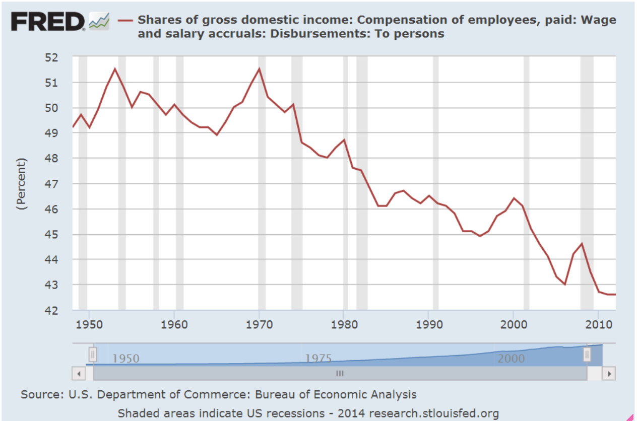
**************************

What is Income?

This week, as I listened to and read discussions of income in the U.S., it became apparent that there are understandable misconceptions of what is being counted when economists tally up the income of a household and the income of a nation.  Update:  Corrected. A 2011 report from the Census Bureau states that household income does include cash benefits before taxes.  EITC payments are not included because they are a reverse tax (Source).  Non-cash benefits like Medicaid, Food Stamps and housing assistance are not included.  These non-cash benefits can easily surpass $1000 per month.

Money income includes earnings, unemployment compensation, workers’ compensation, Social Security, Supplemental Security Income, public assistance, veterans’ payments, survivor benefits, pension or retirement income, interest, dividends, rents, royalties, income from estates and trusts, educational assistance, alimony, child support, cash assistance from outside the household, and other miscellaneous sources.

The national income figures that Thomas Piketty uses in his book do include government transfers.  The 2005 NIPA Guide summarizes what is included in personal income.   IVA and CCAdj are inventory and depreciation adjustments.

Personal income is the sum of compensation of em­ployees, received; 
proprietors’ income with IVA and CCAdj; 
rental income of persons with CCAdj; 
personal income receipts on assets; 
and personal current trans­fer receipts; 
less contributions for government social insurance

Measuring income to determine an aggregate level of well-being within the population is challenging and gives each side ample ammunition in the political debate.  The inclusion and exclusion of various types of benefit, cash and otherwise, leads one side to dismiss the conclusions of the other side and hinders a constructive dialog.
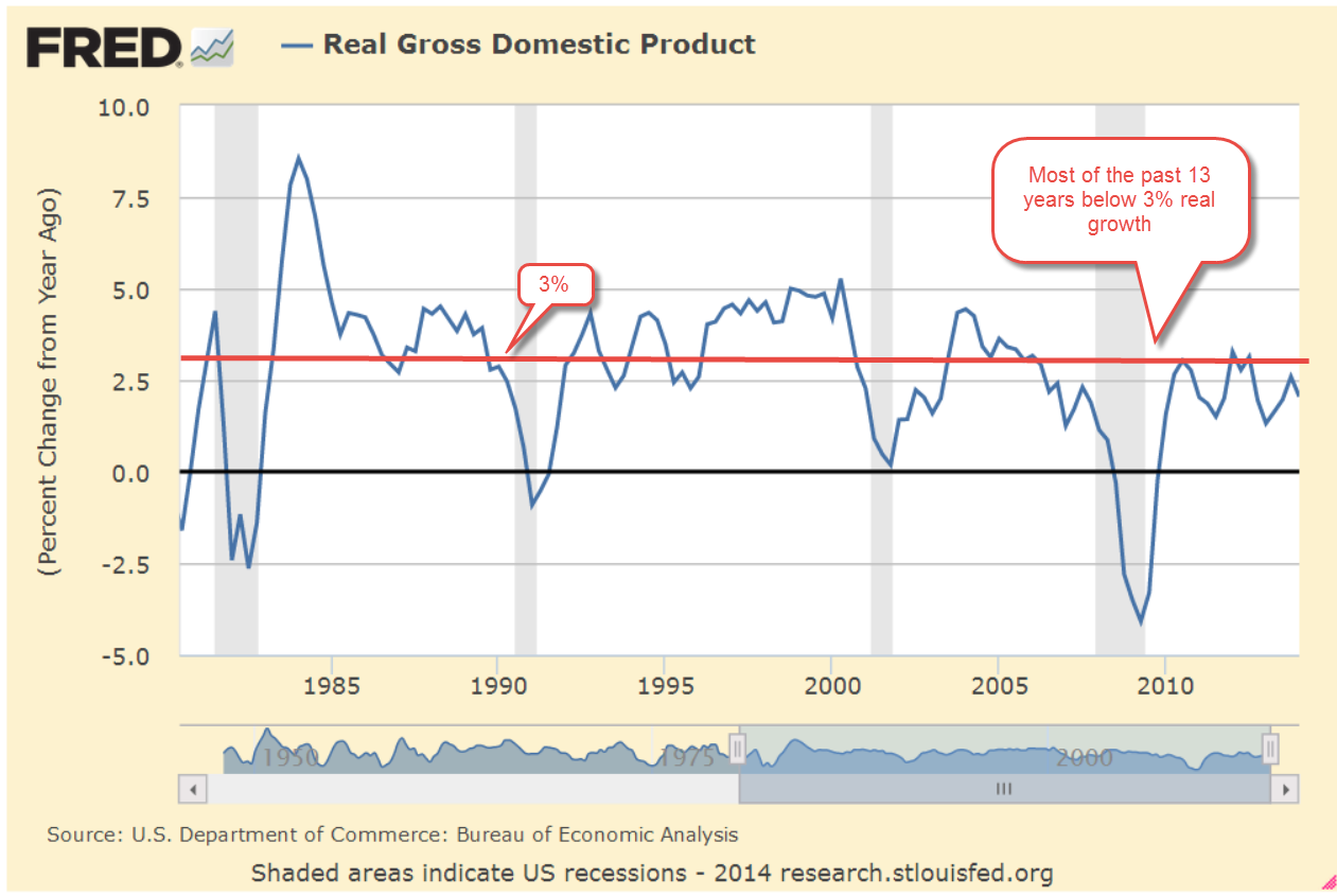
*************************

GDP Growth

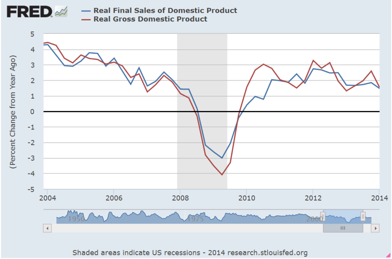
Each month the BEA (Bureau of Economic Analysis) releases a new estimate of the previous quarter’s GDP.  This past week the BEA released the 2nd estimate of 1st Quarter GDP growth, showing an annualized 1% decline.  This was pretty much in line with consensus estimates and the market’s response was rather neutral on the day of the release.  Much of the downturn was ascribed to the particularly harsh winter weather and many economists are projecting a 4% annualized increase in this quarter, a rebound to offset the past quarter’s decline.

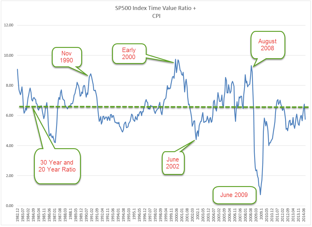
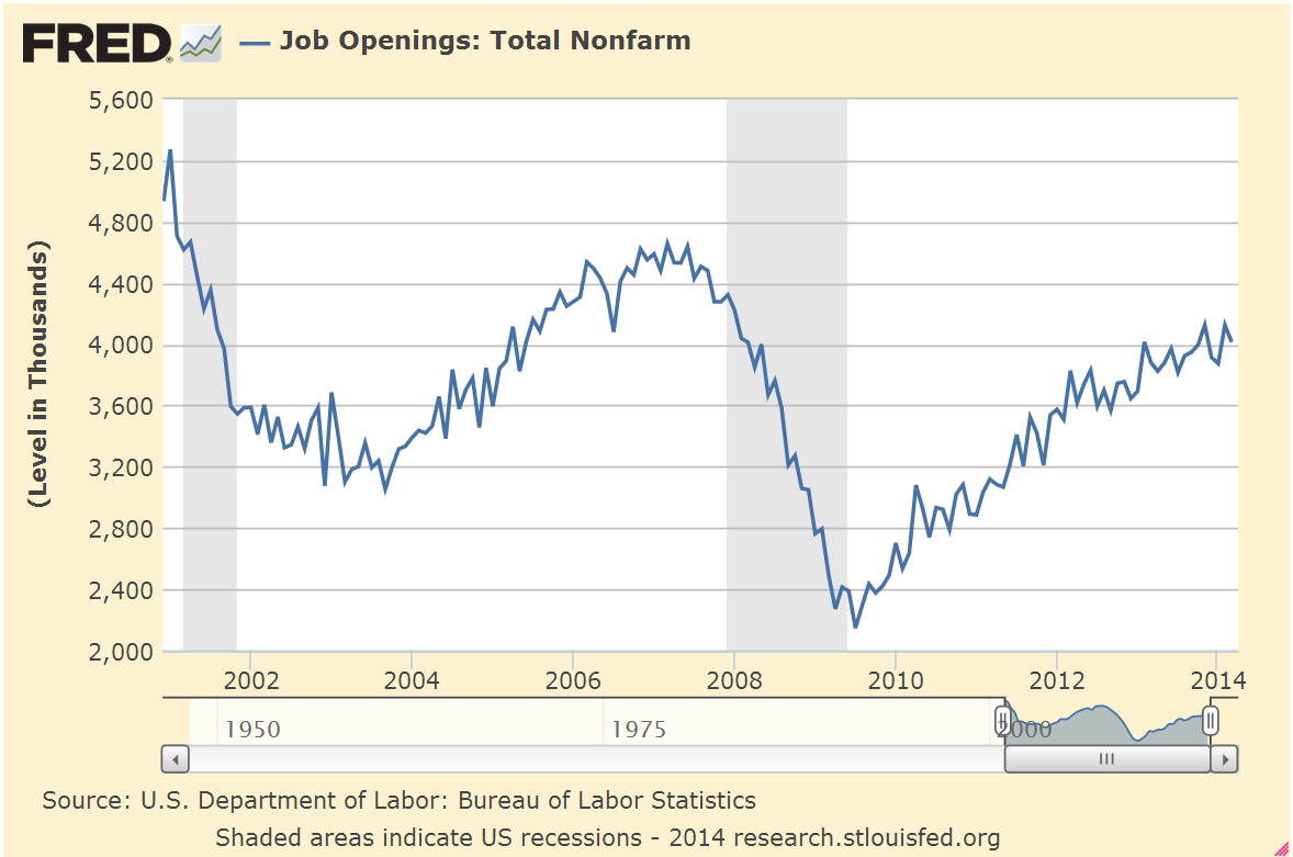
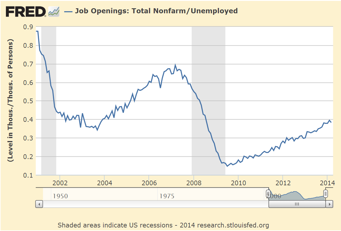
Peering under the hood of the GDP report:  under the category of Private Domestic Investment, residential housing dropped almost 8% (annual rate) in the fourth quarter and another 5% in the first quarter of 2014.  What is more surprising is the almost 2% drop in business investment.  Let me go back to a paper by Ed Leamer that I first wrote about in February.  Mr. Leamer’s thesis is that the sales of new homes first decreases, followed by a decrease in business investment. He found that this 1-2 punch precedes most recessions by about 3 – 4 quarters.  In two cases, it was a false positive.  Perhaps this latest 1-2 punch  is a false positive.  Perhaps it was just the winter weather.  This economy does not feel like a recession is at all imminent. Industrial activity, the labor market and auto sales are strong or expanding. More perplexing to a casual investor might be a summer lurch downward in the market if the economy does not show signs of a correcting rebound.

*********************

Fixed Capital Consumption

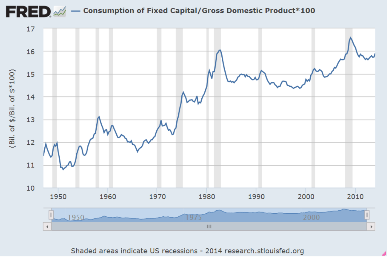
Since 2000, there has been a notable change in economic growth.  It is not often that we see growth above 3% as we did in the 20th century.

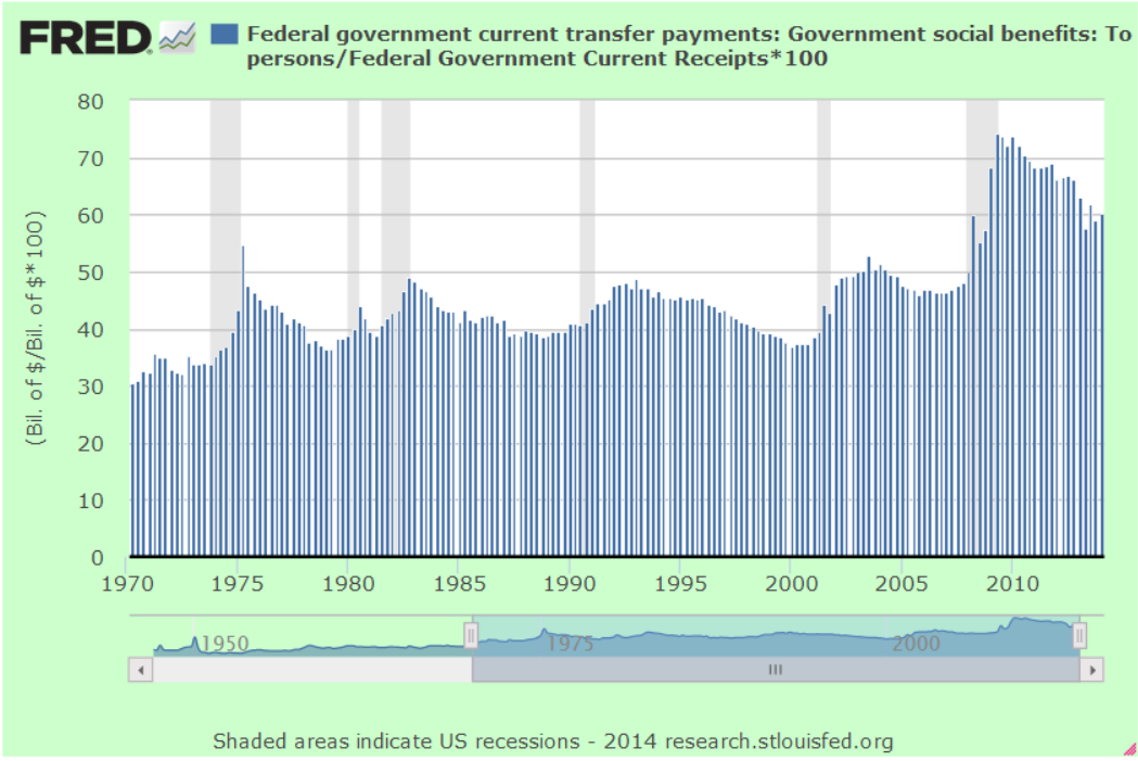
Helping that meager growth rate look – well, less meager – is an item that the BEA adds to GDP called Fixed Capital Consumption.  To the ordinary Joe, this is simply depreciation, but this is not the depreciation that your accountant might have mentioned if you own a small business or rent out part of your home. The depreciation that the BEA calculates is based on the current market price of a piece of equipment, for example, not the actual cost of the item.  As an example, let’s say that Billy and Betty Jones bought a new $20,000 truck for their business and their accountant depreciates it over a 5-year cycle.  To keep it simple, assume that the truck’s depreciation each year is 20%.  That depreciation is based on the cost of the vehicle.  Let’s do it the way the BEA does it (if only!  The IRS does not allow this!).  In year 3, the current market price of a similar vehicle is $24,000.  20% of $24,000 is $4800, higher than the $4000 depreciation based on the cost of the vehicle. In a given year, the amount of depreciation actually reported by companies might be $2 trillion.  The BEA figure will be higher and this is included in Gross Domestic Product.  As a percentage of GDP, depreciation has risen considerably since the early 2000s, driving up reported GDP growth just a smidge.  Below is a chart of the increasing percentage of GDP that is Fixed Capital Consumption.  Almost one of every six dollars of GDP is being allocated to depreciation, a third higher than 1960 rates.

In a low inflation environment, the change in the market prices of equipment and land is muted.  Are capital expenditures becoming obsolete at a faster pace?  Over the past two decades, software and systems development has become an increasing share of non-residential investment.  Rapid changes in technology may be one driver of the acceleration in depreciation.  Wikipedia has a good article on the concept as it is reported in the national accounts.

*************************


Education

As I mentioned last week, I’ll look at a paper I read recently which had some rather startling conclusions. In a paper published in the World Economic Review earlier this year, economists James Galbraith and J. Travis Hale reviewed paycheck and IRS income data to identify state and national trends in income inequality during the past 40+ years.  It comes as no surprise that there is inequality between sectors in the economy, a fact which Galbraith and Hale acknowledge.  Their particular focus was the changes in inequality within and between sectors at the state and national levels.

There are two components to income inequality: 1) wage growth or the lack of it; and 2) employment growth or the lack of it within each sector.  If a particular sector experiences a period of high growth in earnings but jobs decline in that sector, then the gains become more concentrated and inequality between sectors grows.

What Galbraith and Hale found was that the changes in the 1990s and 2000s had one common characteristic: booming sectors of the economy vs. non-booming sectors accounted for most of the growth in income inequality.  Where each decade differed was the change in the sectors that experienced high growth.  The 1990s was marked by a growth spike in information technology, giving rise to out-sized gains to workers in the professional, scientific, and technical fields.   The 2000s was the decade of outsized growth in construction, defense and extractive technologies. Here is a troubling finding of their study: common to both periods is that the number of jobs declined in those sectors that experienced high wage growth.  Higher pay = less job growth. Also common to both decades, until the financial crisis in 2008, was the high growth in the finance and insurance industries.  Problem:  Rising  inequality.  Remedy: More education. The authors acknowledge this common response:

When public discourse admits inequality to be a problem, education is often given as the cure.  According to Treasury Secretary Henry Paulson (2006), for instance, the correct response to rising inequality is to “focus on helping people of all ages pursue first-rate education and retraining opportunities, so they can acquire the skills needed to advance in a competitive worldwide environment.”  This is a view with powerful support among economists. 

But their evidence casts this common conception into doubt:

As we’ve shown, the last two decades have seen significantly slower job growth in the high-earnings-growth sectors than in the economy at large. So even if large numbers of young people do “acquire the skills needed to advance” there is no evidence that the economy will provide them with jobs to suit.  Many will simply end up not using their skills.  Moreover, a strategy of investment in education presupposes advance knowledge of what the education should be for. Years of education in different fields are not perfect substitutes, and it does little good to train too many people for jobs that, in the short space of four or five years, may (and do) fall out of fashion. And experience shows clearly that the population does not know, in advance, what to train for. Rather, education and training have become a kind of lottery, whose winners and losers are determined, ex post, by the behavior of the economy.

Does this mean that parents and grandparents should cash in those college funds for the kids and take a long vacation with the money?  Hardly.  Bureau of Labor Statistics reveal that those with a college education have a significantly greater lifetime income than those without. The findings of this paper imply, however, that the economy and the job market change in ways which none of us can reliably predict.  The wiser course for students might be the same advice financial advisors give to investors: diversify.  If a student is majoring in philosophy, take some business, computer or science courses. Science majors could do with some literature and writing courses as well.

At the start of the 20th Century, 40% of the population was engaged in farming-related jobs.  A century later, less than 2% of jobs are in the agricultural sector.

When I was a teenager, an aunt told me that a reliable bookkeeper could always find a job. That was before the introduction of the computer and accounting programs for small businesses.

The number of librarians has declined about 10% in less than a decade.  In 1990, who could have predicted that?

Records Management, once a clerical job, has evolved into management of many interdependent mediums, complicated by laws and regulations that few could foresee just twenty years. A science major confident in the availability of work in a certain skilled profession might find that the introduction of a qubit computer in 2025 sharply reduces jobs in that profession.

*****************************

Takeaway

As investors, we often think that we can avoid the pain so many of us experienced in 2008 if we pay more attention to economic and corporate indicators.  In hindsight, the graphed data looks so obvious. We ignore now what we didn’t ignore then because we know now what to ignore, making hindsight a marvel of clarity.  The future enables us to filter out the noise of the past.

If China’s housing sector implodes and repercussions of that undermine the U.S. economy, we’ll criticize ourselves for not reading that article on page 24 that detailed the coming crisis.  There will be a graph of some spread in interest rates or some other indicator that we glossed over at the time.  If there is a recession 9 months from now (this is just an ‘if’), we will forget the harsh winter of 2014 that blinded us to the early warning signs.  We will see the decline in 1st quarter GDP together with the decline in disposable personal income as the clearest of warning signs and slap ourselves on the head for missing it.  Some guy will get on the telly and show us how he predicted it all along and we’ll think that we should get his newsletter because this guy knows.

As to our current disputes, the grandchildren of our grandchildren may be puzzled by our concerns with income and wealth inequality.  We remember the first two paragraphs of the Declaration of Independence, which the signers largely agreed to with a few revisions.  The majority of the Declaration is concerned with a list of grievances against the British Empire, which the signers debated vigorously, making numerous amendments to the text.

When did we last have a debate on which metal, gold or silver, should serve as a backing to the currency?  This burning topic of the late 19th Century is of little more than historic interest.

Over a fifty year period in the 19th Century, bankruptcy became less a criminal act and more a civil matter, culminating in the Nelson Act in 1898 which codified our more modern notion of bankruptcy.

With relatively little debate, 19th Century Americans bequeathed their heirs a country dominated by large corporations.  Less by design and more by default, the raising of private capital by corporations seemed to be a convenient solution to the persistent misuse of public funds by corrupt politicians in that century.

We no longer argue, as they did during the Civil War, whether the Federal Government has a responsibility to bury soldiers who have died on the battlefield.

We argue about guns and the meaning of the Second Amendment, which 19th Century Americans thought was non-controversial and not a universal individual right to gun ownership.

A hot topic of debate in the early part of the 20th Century was whether Irish, Italians and other Southern European immigrants were fully evolved humans and were capable of exercising the right to vote.

19th Century Americans argued about the moral validity of slavery.  We don’t.

What is the minimum working age for children?  Is it six or eight years of age?  What should be the legal maximum hours that they can work?  These burning questions of the early 20th Century are dead embers now.

The issues changes, our perspectives change, but we can be sure of one thing: in a hundred years, we will still be arguing as much as we do today and that is oddly reassuring.

Piketty’s Capital

May 25, 2014

No graphs this week!  Awwww!

A few months ago, Thomas Piketty, a French economist, released Capital in the 21st Century, a book that I mentioned to readers back in January before its publication.  Piketty’s book has aroused much interest, praise and denunciation.  What could arouse such fire in the hearts of men, you ask?  Inequality.  We humans are a social bunch and, like our chimpanzee cousins, are especially sensitive to inequality.  “She got more chocolate milk than me!  It’s not fair!” is a familiar lament to many parents.

To understand Piketty’s thesis, let’s review some fundamental concepts of capital and income.
“Income is a flow…the quantity of goods produced and distributed in a given period…Capital is a stock…the total wealth owned at a given point in time.” (p. 50)  Piketty’s thesis is based on a ratio of the capital of a nation to the national income.  His definition of capital is so encompassing that my immediate suspicion was the accuracy of estimates of the total wealth of a nation, a flaw that Piketty acknowledges.

The main thesis of Piketty’s book is: as the capital wealth of a nation accumulates, capital’s share of annual national income increases.  For long periods, the rate of growth of accumulated capital is larger than the growth of the economic output/income of a nation.  The process is self-perpetuating, so that capital takes an ever increasing share of national income.  The higher the capital/ national income ratio the more inequality of wealth and income.  Piketty estimates that, in 2010, the capital/income ratio was 450% for the U.S., a bit above Germany and Canada’s ratios, and far below those of France and Great Britain. Piketty proposes a solution to this inexorable process:  a progressive tax on wealth.  Mount up your steeds, men!  The Marxists are coming!

Wealth = Capital

I’ll begin a review of some criticisms of Piketty’s methodology with a brief primer on some measures of capital.  Economists and accountants often analyze the flow generated by a store of capital, but it is capital that can be more easily counted. In finance, there is a metric called Working Capital Turnover Ratio which calculates the flow of sales from the working capital of a firm, and is used to assess both the value and liquidity of a firm.   Piketty rarely uses the term liquidity in his book, but I think it may be an unstated implication of his work.

ROIC, or Return On Invested Capital, is frequently used to measure how well a firm uses the capital and debt invested in the firm to generate a profit.  These measure net after tax profits as a percentage of the stock of capital and debt in a business.  Piketty also measures flow but it is sales, not profits that is his primary focus.  Profits are of course an intrinsic component of sales since they are that portion of sales income that is left over after all expenses.  The change in real GDP is the percent change in that flow.  Piketty’s concern is the accumulation of the residual of past economic flows, the stock of wealth that he claims earn a greater rate of return than the increase in the annual flow of economic activity.  Capital is a key component of economic growth but Piketty raises concerns that Capital can become too large relative to the flow of economic activity.
  
Hopefully, this brief background will enable the reader to appreciate the criticisms of Piketty’s thesis.  Charles Gave is a forty year veteran of investment management and cofounder of the international investment firm GaveKal.  Coming from the world of finance, Gave understands capital as meaning invested capital or working capital. Keep that in mind as you read Gave’s denunciation of Piketty’s thesis:

The extraordinary thing is that Piketty’s analysis is based on a massive logical error. His thesis runs as follows: if R is the rate of return on invested capital and if G is the growth rate of the economy, since R is greater than G, profits will grow faster than GDP, and the rich will get richer and the poor poorer. This is GIGO (garbage in, garbage out) at its most egregious. Piketty confuses the return on invested capital, or ROIC, with the growth rate of corporate profits, a mistake so basic it is scarcely believable. [Gave’s emphasis]

On page 46 of his book Piketty writes: “In this book, capital is defined as the sum total of nonhuman assets that can be owned and exchanged on some market.”  While this includes invested capital, it is not solely invested capital, for it includes residential real estate, government capital, land and natural resources, some of which are very difficult to value.

In short, Gave read “invested capital” when Piketty wrote just “capital.”  Gave read “corporate profits” when Piketty wrote “return on capital, including profits…” (p. 25).

The economist James Galbraith takes issue with Piketty’s all inclusive  definition of capital: “he conflates physical capital equipment with all forms of money-valued wealth, including land and housing, whether that wealth is in productive use or not.”

Piketty anticipated his critics: “some definitions of ‘capital’ hold that the term should apply only to those components of wealth directly employed in the production process…Capital in all its forms has always played a dual role, as both a store of value and a factor of production.  I therefore decided that it was simpler not to impose a rigid distinction between wealth and capital.” (p. 47) 

Let me rephrase the ” R is greater than G” formula that piqued Gave’s derision.  Picketty uses small ‘r’ and small ‘g’ so I will adhere to that: the annual income r derived from capital, as a percentage of that capital stock, will be more than the annual percentage change in real, or inflation adjusted, income/output g.  As Piketty writes: “the inequality implies that wealth accumulated in the past grows more rapidly than output and wages.”

An example:  In the teeny tiny kingdom of Miniscule, the total nonhuman capital stock at the beginning of this year is $100.  It  generated output/income of $10, or 10%. That is r, the return on capital.  This income from capital was part of Miniscule’s total output/income of $30, an increase of $2 over last year’s income/output of $28. To keep the math simple, let’s pretend there was no inflation or depreciation in that year.  The growth in total income/output is about 7%, or $2 / $28.  That is g, the growth rate of output/income.  To recap,  r = 10%, g = 7%.  “r can be significantly higher for long periods of time than the rate of growth of income and output, g.” (p. 571) Is this true?  That’s what Piketty claims to show.

Like Galbraith, I question Piketty’s inclusion of many different forms of wealth which are difficult to measure.  Piketty acknowledges the difficulties in the appendix to a paper he co-authored with Gabriel Zucman in December 2013, “Capital Is Back” and is included as one of the data sources for his book.  Piketty’s thorough explanation of the shortcomings of capital measurements led me to scratch my head and wonder why he decided to include them.

Piketty has no control over accounting conventions adopted by international bodies, yet I’m sure he and his team will be taken to task for the computation of the data that is the responsibility of the various nations included in the study.  A big shout out to Piketty and his collaborators for making the data available.

Back to our tiny kingdom of Miniscule. What if we missed some capital in our tally?  If the capital stock were closer to $120, not $100, then ‘r’, the return on capital would be 8%, not $10% and approximately the same rate of growth as the economy as a whole.

How accurate are the public, or government, capital computations?  In the U.S., the Comptroller General is responsible for auditing the financial statements of the country as part of the Federal Budget.  For ten years, from 1998 – 2008, Comptroller General David Walker refused to certify the financial statements,  listing a number of accounting problems: inadequate  monetary controls, poorly supported adjustments, outdated computer systems, unsupported cash disbursements, an inability to track internal or external fraud and a poorly documented inventory system.  These flawed financial statements are the basis for the capital computations in Piketty’s book.  In the appendix to Capital Is Back, Piketty explains the methodologies used by different nations.   Implicit in these standards is that public capital is understated in the national accounts.  This undervaluation decreases the capital/income ratio while increasing the r, or rate of return, of the capital stock.  Piketty notes the deviations in the various computations of land capital.  In the U.S. only the value of agricultural land is measured (Appendix p. 15).  A vast store of capital in 770 million acres of range land (Source) , more than half of which is private, is thus uncounted, further inflating the r, or return on capital.  70% of the land surface in the U.S. is devoted to livestock grazing (Source). A fundamental weakness in cross country valuations is the assumption that developed countries are more or less similar in most respects.  Key differences in the composition of economies are  factored out of the models.

Human Capital

Piketty separates capital into two categories: human and non-human, including only that non-human capital that can be traded on a market.  This exclusion of human capital may be an appropriate methodology in an analysis of an agrarian economy but is not so when applied to the developed economies of today which rely much more heavily on the human capital amassed through education. This point has been raised by economists Robert Solow and Robert Gordon and Piketty acknowledges this on page 586, note 35.

What are the implications of including educational capital?

Today a person may spend $40,000 to $150,000 to get a college education and expects an inflation adjusted return on that investment  that is greater than the 4% one could get investing in long term Treasury bills.  Developed economies depend greatly on the capital investment that they make in educating most of the young people in a society.  An educated mind is both a capital investment and a leaseable, if not outright tradeable, commodity.  While an employer can not buy an employee’s brain the way one can buy a machine, an employer does lease the knowledge, the output from that brain, by paying a compensation premium to that employee.  Income data from the Census Bureau, the IRS and the Bureau of Labor Statistics enables us to quantify the implied store of value of a college education.  If Piketty’s expansive definition of capital were to include educational capital, what would the resulting capital/income ratio look like?

The Bureau of Labor Statistics estimates an annual return of approximately $24,000 in 2013 for a bachelor’s degree. In 2011, the Census Bureau estimated the number of people in the U.S. with college degrees at 63 million, or 40% of the workforce.  If we guesstimate an average cost of $50K per degree, that is over $3 trillion of capital investment not counted, almost 20% of the $17 trillion in GDP (BEA News Release)  If we were to use the international standard (System of National Accounts) method of computing the present value of a college degree using an average 4.5% return (p. 572), then the capital value of a college degree over a working period of 35 years is over $400,000 per degree and the total is $26 trillion in uncounted capital, 150% of the nation’s GDP.   That inclusion would add $26 trillion to the $65 trillion capital base of the U.S. (p. 151)

If educational capital were included,  the capital/income ratio in the U.S. in 2010 would rise to 620%, far above the 450% calculated by Piketty’s team.  The higher this ratio, the greater the inequality in income and wealth.  By excluding educational capital, Piketty has understated his thesis.  Like Galbraith, I would exclude land and natural resources that are impossible to value.  Unlike Piketty and Galbraith, I would include educational capital, since it is a productive capital.

If we use the BLS figures and guesstimate that 63 million people with college degrees earn an additional $24K per year, then the share of income attributable to capital would increase by $1.5 trillion, from $4 trillion to $5.5 trillion.  As a share of national income, the income from capital would increase to 38% from 28% (p. 222)  The return on capital, r, would stay about the same at a bit over 6%, and more than twice the growth rate of national income in the U.S.

Liquidity

Piketty does not mention the liquidity of a national economy but implies it.  As the capital of a nation becomes more concentrated in a rather small group of families, individuals, and endowments, the trading of capital takes place within a small pool.  The onset of the 2008 financial crisis revealed that a small coterie of investment firms, sovereign funds and mega-banks traded financial instruments among each other.  Contagion in one class of asset – mortgage backed securities – poisoned the financial pool.  Like a gene pool, diversity is the key to survival.

As capital’s share of national income becomes greater, the buyers of capital as a percent of the population shrinks.  Fewer buyers = lack of liquidity.  A nation does have an abiding interest to reduce threats to the stability of its financial system.  The mobility of capital in the global world of finance may be hiding an underlying lack of liquidity.

Solutions

To offset the increasing accumulation and concentration of wealth, Piketty recommends (p. 517) a progressive wealth tax, ranging from .1% to .5% for most Americans, those with assets of less than 1 million euros, $1.36 million dollars at today’s exchange rate.  Piketty is not done yet.  He notes that the progressive income tax taxes only the income from inherited wealth.  In some countries in Europe, that capital income is exempt from the income tax (p. 496).  Piketty advocates a return to the confiscatory income tax rates of the early half of the 20th century (p. 512 – 513), citing an optimal top tax rate at above 80%.  Bill Gates and Warren Buffett have both pledged to give away most of the billions they have amassed.  Why bother, guys?  If Piketty’s solutions were implemented, the politicians bickering on C-Span every night will take care of that for you guys.  In the U.S. the Constitution would have to be amended if the Federal Government were to enact a wealth tax because the 16th Amendment allows only a tax on incomes.  However, that does not prevent the States from enacting such a tax.

Will a wealth tax solve the problem of growing inequality?  In principle, in a mathematical utopia – the kind of world that economists assume in their models – governments would take corrective action by taxing wealth, thereby offsetting the growing accumulation  and concentration of capital and its increasing share of national income.  Unfortunately, we don’t live in that world.  In the real world, politicians – real people that you and I know – would say “Hey, this is a great excuse to grab more money from the private sector to solve problems!  Solving problems wins votes!  Votes get me re-elected!”  Politicians love problems, and solving them.  That’s why they create so many of them with their policies.

If people think income tax reporting and accounting is a nightmare, wait until they see the wealth tax forms.  Since the rich would pay a progressively higher tax, they would be highly motivated to develop ways of sheltering assets.  The hiding of wealth will become a national pastime.  Gold miners and dealers are shouting “Huzzah!”  Accountants and lawyers will cook up complicated investment vehicles that offer rapid depreciation of assets to reduce the amount of notional wealth one has to report.  Insurance companies will lobby for the purchase of annuities that are then excluded from one’s wealth.  The lobbyists are singing in the streets.  Strike up the band and join the tax parade!

In short, I heartily endorse this proposal just as soon as I sell my house, convert any assets to gold and find a private island in the Caribbean where I can bury my assets in the sand. I do heartily recommend this book, though. The book contains far more that caught my interest than I can touch on – public and private debt and capital, a survey of income taxes in developed countries, to name a few. The author has taken great pains to lay out historical trends in the data, acknowledging and anticipating many objections.  But, like the old country doctor, Dr. Piketty has but one solution. Got a problem?  Add another tax and call me in the morning. I also salute the translator, Arthur Goldhammer, for the flow and grammatical construction of his  English translation.

Next week I’ll look at another disturbing and related topic – education.  A recent analysis suggests that the financial advantage of a college education may be eroding.

Retail Sales, Autos, Sell in May

May 18, 2014

This week I’ll look at sentiment among small business owners, retail and auto sales, and revisit the “Sell in May” idea.

Small Business

Cue the trumpets, clouds part, sun rays stream down upon the green fields.  After almost seven years, sentiment among small business owners broke through the 95 level according to the monthly survey conducted by the National Federation of Independent Businesses (NFIB).  Despite the many positives in this latest survey, hiring plans remain muted.  This unfortunately confirms several other reports – the monthly employment report, JOLTS, disposable income, to mention a few – that indicate a befuddling lack of robust employment gains during this recovery.

********************

Retail Sales

The monthly reports on employment and retail sales probably have the most impact on short term investor sentiment.  Retail sales were flat in April but have rebounded well after the particularly harsh winter.  With a longer term perspective, year over year retail gains are not robust but are still in the healthy zone of 2-1/2%.

Per capita inflation adjusted retail and food service sales are strong.  Rising home prices in the early 2000s drove an upsurge in retail sales, followed by an offsetting plunge as home prices dropped and the financial crisis of 2008 hit consumers hard.  The landslide of employment losses undercut retail sales.

Motor Vehicles sales are particularly strong and are now back to the pre-recession trend line.

However, that recession dip represents millions of vehicles not sold and contributes mightily to the record average age of more than 11 years for vehicles in the U.S. (AutoNews)  As the article noted, better engineering has lengthened the serviceable life of many autos.  There are 247 million registered passenger vehicles and light trucks, more than one for each of the 240 million people in this country over the age of 18 (Census Bureau) According to the industry research firm Motor Intelligence (spreadsheet), April’s year to date passenger car sales have declined 1.8% while sales of light pickups have surged 8.3%.  The particularly harsh winter months probably reduced traffic at car dealerships around the country, but the year-over-year comparison in April was only a 3.6% gain.  The lack of a spring bounce indicates that household income gains are meager.  The rise in sales of light pickups is largely due to a 10% increase in construction spending in the past year.

On an annualized basis, auto sales are approaching 16 million, a level last seen in November 2007 and far above the 10 million vehicle sales in 2009.

The numbers look rather strong but annual sales per capita are at the recession levels of the early 1990s.   Clearly, something has changed.

Better engineering has increased serviceable vehicle life.  Demographic changes may be having an effect. The population is aging and older people who drive less may decide to hang on to their vehicles longer.  A population shift toward urban centers reduces demand for autos.  There is a greater availability of public transportation.  In some areas of the country, an electric scooter or bicycle meets many transportation needs.
Long term shifts in an industry prompt employers to look for opportunities to adjust some part of their strategy or cost structure to meet those changes.  Three weeks ago, Toyota announced that they will move their headquarters from Torrance, CA, in the South Bay area of metro L.A., to Plano, TX.  As the largest employer in Torrance, the city’s economy will surely take a hit. (Daily Breeze)  Toyota joins a list of large employers leaving or reducing their presence in California (article)

************************

Sell in May

The market has flatlined since early March.  Most of the companies in the S&P500 have reported earnings for the first quarter.  68% beat expectations but this has become a highly sophisticated game of managing expectations.  What is notable is that sales growth has slowed.  As I noted a few weeks earlier, labor productivity is poor.  Companies have done a remarkable job of cutting costs to boost profits but it is unclear how much more they can cut.  Last year’s 30% rise in the market has spurred the rise of mergers, or growing profits through economies of scale.

If the market were to decline 10 – 20% from here, some would point to the chart of the S&P500 and say they saw it all along.  “Classic case of a market top,” they would intone.  “Several failed attempts to break through resistance at the 1900 level indicated a major market correction.”  Oh, and they have a newsletter that you can subscribe to.

If the market goes up 10%, a different set of people will proclaim that they saw it all along.  “The market was forming a baseline of support,” they will sagely pronounce.  Each of these people also have a newsletter.

“Sell in May and go away” is an old quip of short term trading.  In 2011, I explored (here and here) the truths and myths behind this old saw. On a long term basis, one earns better returns by disciplined monthly, or quarterly, investing. Still, in a slight majority of the almost 20 years I reviewed, the Sell in May approach had some validity. Let’s look back at the last five years.  Typically an investor would sell the S&P500 and go into long Term Treasuries (TLT).  A more cautious investor might pick a less volatile intermediate bond fund.

In 2013, the SP500 went nowhere from May 1st to September 1st.  Great call by our intrepid investor who took some of her money out of the market and invested in Long Term Treasuries (TLT) in early May.  By early September, however, her investment would have depreciated 13%. Ooops!  Better to have stayed in stocks.

Likewise, in 2012, stocks went nowhere from early May to early September.  Unlike 2013, an investor buying long term Treasuries during that period had a 7% gain BUT if she had waited a week to sell in September, there was no gain.  The gains were a matter of luck.

2011 was the bing-bang year for the Sell in May crowd.  The stock market lost about 12% during the summer while long Treasuries gained 20%.

In 2010, stocks fell 7% during the summer while long Treasuries gained 10%.  During the summer of stocks gained almost 12% while Treasuries changed little.  In short, the strategy worked three summers out of the past five.

Now for a more fundamental approach – investing in companies that are more stable.  Horan Capital Advisors referred to a report from S&P Capital IQ that found that companies in the S&P500 with a low beta offset or reduced any summer market volatility.  Beta is a measure of a stock’s price volatility.  A value of 1 is the volatility of the entire index.  Betas less than 1 mean that a company’s stock price is less volatile than the index.  As volatility of the total market increases, investors tend to seek companies with a more reliable outlook and performance.  The screening criteria produced a mix of companies dominated by those in the consumer discretionary and health care sectors.  Worth a look for investors who buy individual stocks.

Net Worth, Labor Productivity And Political Pay

May 10th, 2014

This week I’ll look at some short term mixed signals in economic activity, and long term trends in labor productivity and household net worth.  In advance of the mid term election season in the U.S., I’ll look at several aspects of the money machine that drives elections.

*****************************
CWPI

For almost a year, I’ve been tracking a composite index, a Constant Weighted Purchasing Index, based on the Purchasing Manager’s Index produced by the Institute for Supply Management (ISM).  Based on key elements of ISM’s manufacturing and non-manufacturing monthly indexes, it is less erratic than the ISM indexes and gives fewer false signals of recession and recovery.  After reaching a low of 53.5 last month, the CWPI of manufacturing and service industries is on the rise again.  During this recovery this index of economic activity has shown a regular wave pattern.  If that continues, we should expect to see four to five months of rising activity before the next lull in late summer or early fall.  Any deviation from that pattern would be cause for concern if falling and optimism if rising.

The winter probably prolonged the recent downturn in the index.  In the manufacturing sector, new orders and employment are strong.  In the services sector, which comprises most of the economy, new orders are strong but employment growth has slowed to a tepid pace.

This week the Bureau of Labor Statistics released their estimate of Productivity growth for the first quarter.  One of the metrics is the per hour growth in productivity, which is key to the overall growth of the economy.  As seen in the chart below, the last time annual productivity growth was above 2% was in the 3rd quarter of 2010.  To show the historical trend, I took the 3 quarter moving average of the year over year growth rate.  We can see a remarkable shift downward in productivity.

Recovery after recessions are marked by a spike in growth above 3% simply because the comparison base during the recession is so weak. What the chart shows is the shift from steady growth of 3% to a much weaker growth pattern since the 2008 recession.  In testimony before the Senate Finance Committee, Fed chairwoman Janet Yellen stated that we may have to adjust our expectations to continuing slow growth.  The erosion of productivity growth has probably prompted concerns in the Fed Open Market Committee.

***************************

JOLTS – Job openings

Continuing on from labor productivity, let’s look at a trend in job openings.  With a month lag, the Bureau of Labor Statistics (BLS) reports on the number of job openings around the country. Preceding a recession, the number of job openings begins to decline.  Recovery is marked by an increase in openings. March’s report showed a slight increase in job openings, near the high of the recovery and closer to late 2005 levels.

When we look at the ratio of job openings to the unemployed, the picture is less encouraging.  The unemployed do not include discouraged job seekers.  If we included those, we the readers might get discouraged.  Almost five years after the official end of the recession, we are barely above the low point of the recession of the early 2000s.

When Fed chairwoman Janet Yellen speaks of weaknesses in the labor market that will require continued central bank support, this is one of the metrics that the Fed is no doubt keeping an eye on.

*****************************

Household Net Worth

For many of us, our net worth includes family, friends, pets, interests and passions but the Federal Reserve doesn’t count these in its quarterly Flow of Funds report.  In early March, the Fed released its annual Flow of Funds report, which includes estimated net worth and debt levels of households, business and governments in the U.S.  Below is a chart of household, business and government debt levels from that report.

Rising stock prices and recovering home values have boosted the net worth of households.

As you can see in the chart below, the percent change in net worth has only significantly dipped below zero in the last two recessions.

The severity of this last dip was due to the falls in both the housing and stock markets.  The curious thing is why earlier stock market drops in the 1970s and early 1980s did not produce a significant percentage drop in household net worth. In those earlier periods, increases in home prices were about 4%, similar to the level of economic growth, and not enough to offset significant drops in the stock market.

So what has changed in the past two recessions?  The introduction of IRA accounts in the 1980s prompted individuals to put more of their savings in the stock market instead of bonds, CDs and savings accounts. Downturns in the stock market in the past two recessions affected household balance sheets to a greater degree.  Inflation was greater during the 1970s, 80s and 90s, raising the value of all assets.  China’s growing dominance in the international market was not a factor in the stock market drop in 2000 – 2003.  It was only admitted to the World Trade Organization in 2001.  In an odd coincidence, the past twenty years and particularly the past 15 years are marked by a growing and pervasive inflence of the internet in all aspects of our lives.

If we chart the change in a broad stock market index like the SP500 along with the percent change in net worth over the past seven years, we see a loose correlation using 40% of the change in the stock market.  Rises and falls in the stock market produce a material change in the paper net worth of households and can significantly lead to a change in “mood” among consumers, something the economist John Maynard Keynes called “animal spirits.”

Because the swelling demographic tide of the Boomer generation has a significant part of their retirement nest egg in the stock market, price movements in the markets have probably had a greater effect on total net worth in the past decade.

************************

Party Favors

Now for everyone’s favorite dinner topic – political contributions.  Who contributed the most to the 2012 Presidential campaign?
a) the evil Koch Bros
b) gambling king Sheldon Adelson who almost single-handedly bankrolled the Newt Gingrich campaign
c) hedge fund billionaire George Soros, the  “Octopus” of liberal causes
d) the socialist commie labor unions.

Answer:  Whatever answer suits your political message or opinion.

On the one hand, campaign contributions can be what economists call a “rich” data set so that an analyst can tease out several conclusions or summaries, sometimes contradictory, from the data set.  On the other hand, some “social welfare” organizations do not have to reveal donor lists.  An investigator wishing to discover the myriad channels of political contributions must don their spelunking equipment before descending into the caverns of political finance.   In some cases private IRS data is released by accident, revealing dense networks linking moneyed individuals.

The Federal Election Commission (FEC) maintains a compilation of individual and group contributions to political campaigns.  OpenSecrets.org , a project of the Center for Responsive Politics, summarizes the data.  There we find that Sheldon and Miriam Adelson contributed $30 million through the Republican Restore Our Future PAC  and $20 million to the Republic PAC American Crossroads.

The Democratic PAC Priorities USA did not have a single donor as generous as the Adelsons.  George Soros ponied up $1 million along with many others, including Hollywood movie mogul Steven Spielberg, but the most generous donor contributed only $5 million, punk change when compared to the Adelson’s commitment to Republican causes and candidates.

In the 2012 Presidential race, the Obama campaign drew in so many more individual contributions than the Romney team that outside spending by political action groups was the only way to close the money gap.  Pony up they did, outspending the Obama campaign $419 million to $131 million. The NY Times summarized the outside spending with links to the various groups.

Despite their relatively low percentage of the work force, labor unions are major contributors to the Democratic effort.  A WSJ article in July 2012 revealed the extent of their political activity.  The bulk of union campaign spending is not reported to the FEC but is  reported to the Labor Dept. In total, unions disclosed that they spent over $200 million per year from 2005 – 2011.  54% of the spending reported to the Labor Dept was on state and local campaigns.

As a block then, are unions the largest contributors to Democratic campaigns?  Some “napkin math” would get us to a guesstimate of  $90 to $100 million a year on national campaigns, so surely they are at the top, aren’t they?  Not so fast, you conclusion jumper, you.

As transparent as the unions are, contributors to Republican causes are not.  Corporate political spending like that of the private U.S. Chamber of Commerce are not disclosed, as are many other corporate political and lobbying efforts.  These are some of the largest corporations in the world with vast resources and a strongly vested interest in policy decisions that will affect their bottom line.  Most of those contributions are hidden.

As this midterm election approaches rest assured, gentle reader, that you can confidently say – no matter what your political persuasion – that you have data to back up your opinion that the other side is buying the election.  You can hold your head high, confident in the soundness of your opinions.  And don’t we all sleep better at night, knowing that we are right?