Employment, Income and GDP

May 4th, 2014

Employment

Private payroll processor ADP estimated job gains of 220K in April and revised March’s estimate 10% higher, indicating an economy that is picking up some steam.  Of course, we have seen this, done that, as the saying goes.  Good job gains in the early months of 2012 and 2013 sparked hopes of a strong resurgence of economic growth followed by OK growth.

New unemployment claims this week were pushing 350K, a bit surprising.  The weekly numbers are a bit volatile and the 4 week average is still rather low at 320K.  In a period of resurgent growth, that four week average should continue to drift downward, not reverse direction. Given the strong corporate profit growth expectations in the second half of the year, there is a curious wariness in the market.  Conflicting data like this keeps buyers on the sidelines, waiting for some confirmation.  CALPERS, the California Employees Pension Fund with almost $200 billion in assets, expressed some difficulty finding value in U.S. equities and is looking abroad to invest new dollars.

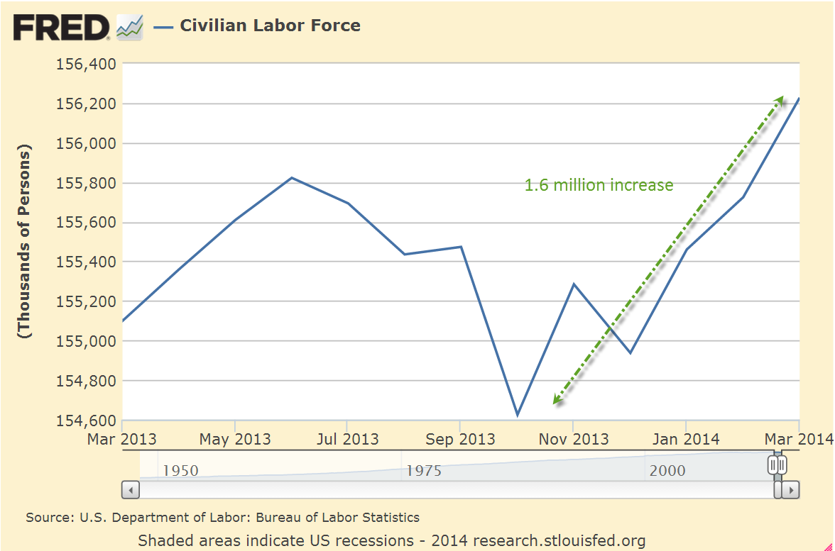
On Friday, the Bureau of Labor Statistics reported job gains of 288K in April, including 15K government jobs.  Most sectors of the economy reported gains but there are several surprises in this report.  The unemployment rate dropped to 6.3% from 6.7% the previous month, but the decline owes much to a huge drop in labor force participation.  After poking through the 156 million mark recently, the labor force shrank more than 800,000 in April, more than wiping out the 500,000 increase in March.

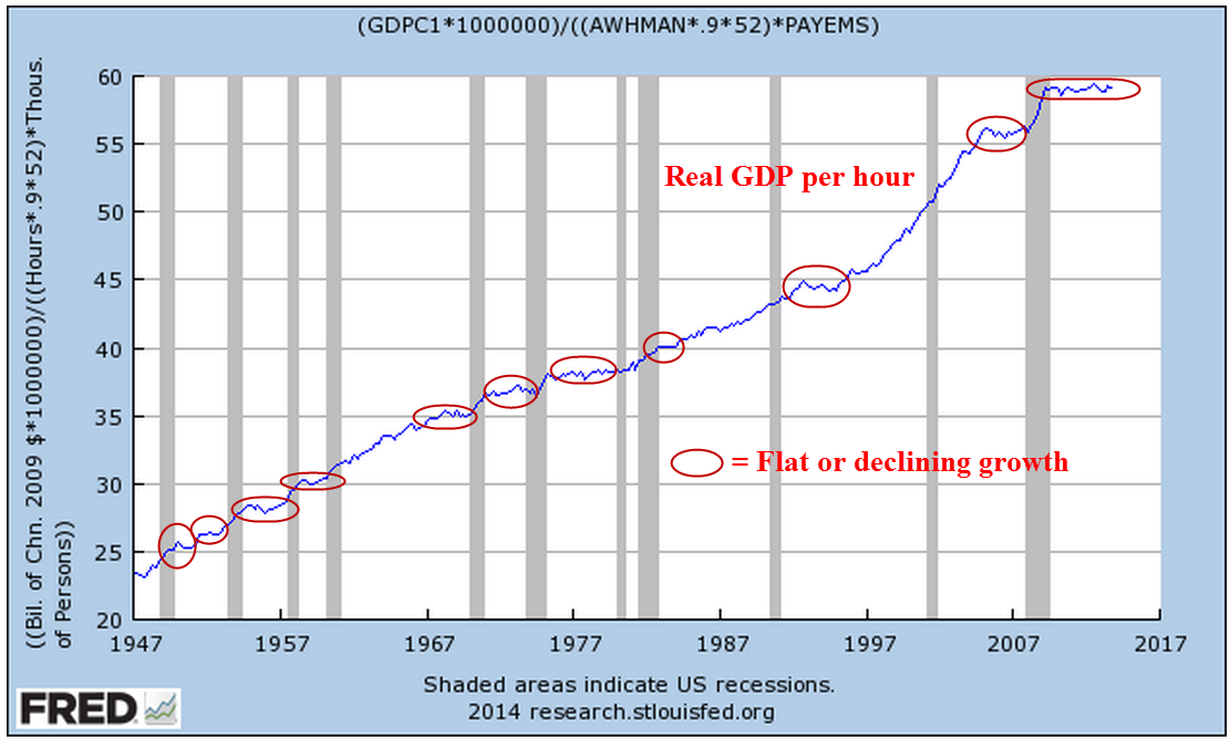
To give recent history some context notice the steady rise in the labor force since the end of World War 2, followed by a flattening of growth in the past six years.

The core work force, those aged 25 – 54 years, finally broke through the 95 million level in January and rose incrementally in February and March.  It was a bit disappointing that employment in this age group dropped slightly this month.

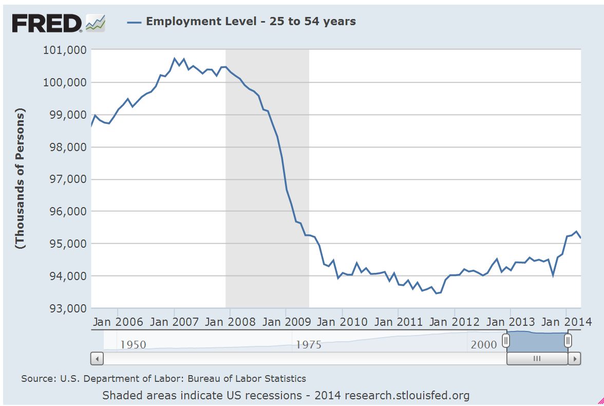
To give this some perspective, look at the employment rate for this age group. Was the strong growth of employment in the core work force largely a Boomer phenomenon unlikely to repeat?  Perhaps this is why the Fed indicated this week that we may have to lower our expectations of growth in the future.

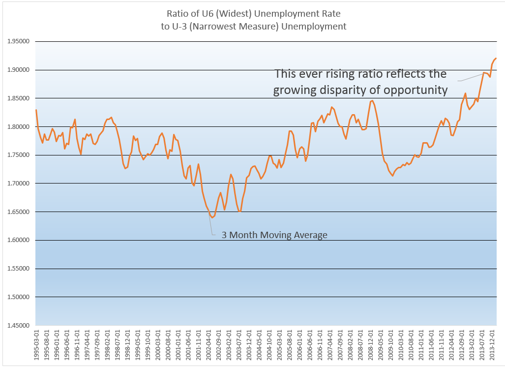
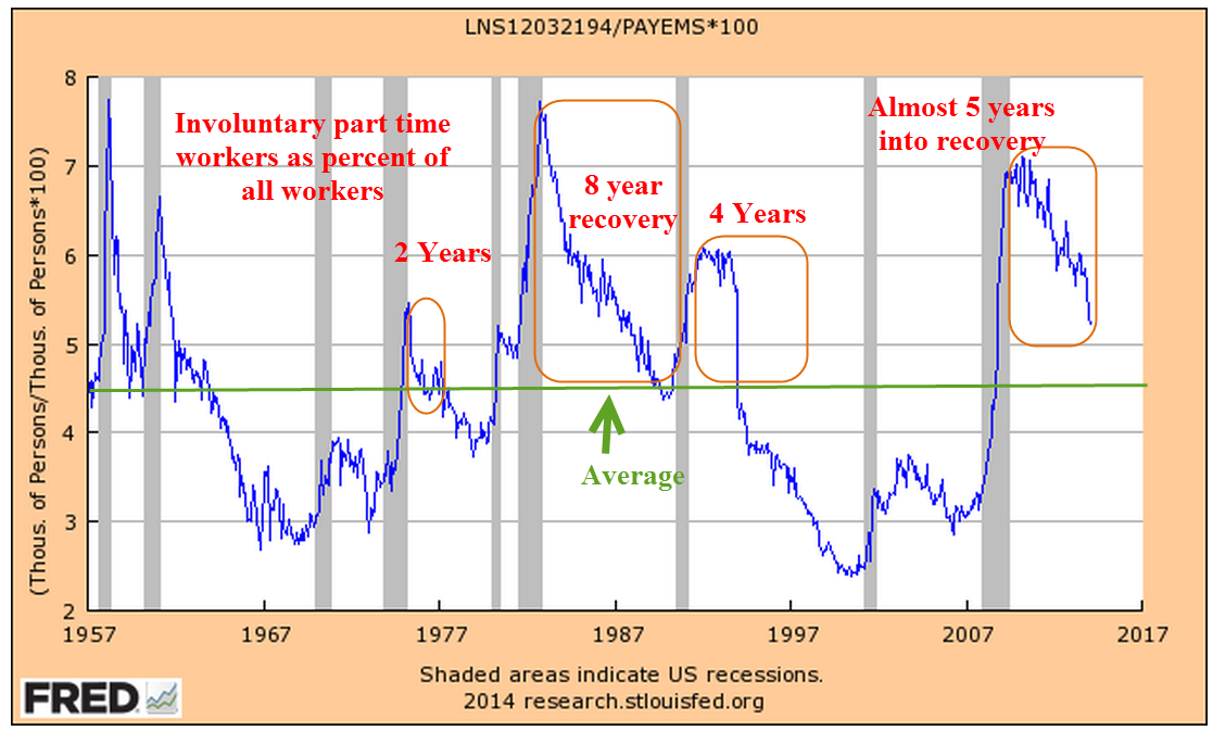
Discouraged job seekers and involuntary part timers saw little change in this latest report.  On the positive side, there was no increase.  On the negative side, these should decline in a growing economy.  There simply isn’t enough growth.  Was the strong pickup in jobs this past month a sign of a resurgent economy?  Was it simply a make up for growth hampered by the exceptional winter?  The answers to these and other questions will become clearer in the future.  My time machine is in the shop.

************************

GDP

Go back with me now to those days of yesteryear – actually, it was last year.  Real GDP growth crossed the 4% line in mid year.  The crowd cheered.  Then the economic engine began to slow down. The initial estimate of fourth quarter growth a few months ago was 3.2%.  The second estimate for that period was revised down to 2.4%, far below a half century’s average of 3%.  This week the final estimate was nudged up a bit to 2.6%, but still below the long term average.

Earlier in the week, the Federal Reserve announced that it will continue its steady tapering of bond buying and that it may have to adjust long term policy to a slower growth model.  The harsh winter makes any analysis rather tentative so we can guess the Fed doesn’t want to get it wrong?

************************

Manufacturing – ISM

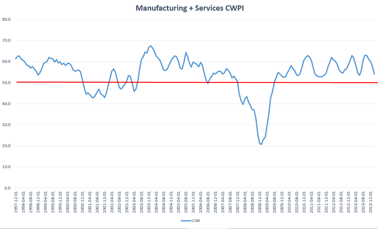
ISM reported an upswing in manufacturing activity in April, approaching the level of strong growth.  The focus will be on the service sector which has been expanding at a modest clip.  I’ll update the CWPI when the ISM Service sector report comes out next week.

************************

Income – Spending

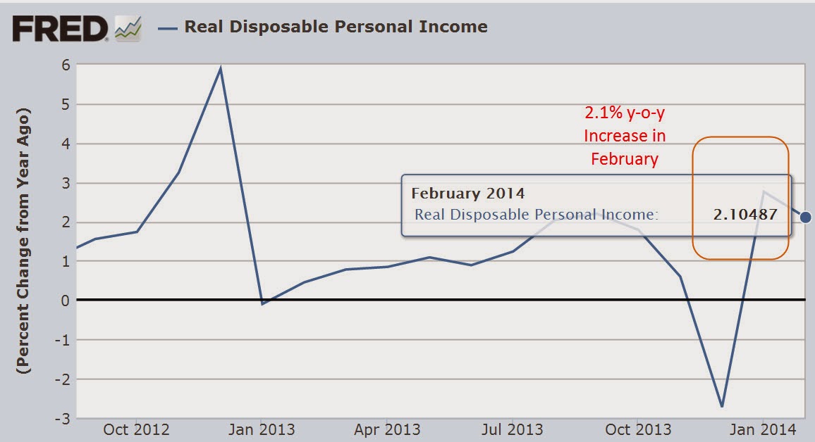
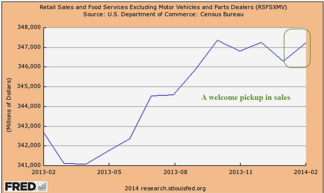
Consumer income and spending showed respectable annual gains of 3.4% and 4.0%.  The BLS reported that earnings have increased 1.9% in the past twelve months. CPI annual growth is a bit over 1% so workers are keeping ahead of inflation, but not by much.   Auto sales remain very strong and the percentage of truck sales is rising toward 60%, a sign of growing confidence by those in the construction and service trades.  Construction spending rose in March .2% and is up over 8% year over year but the leveling off of the residential housing market has clearly had an effect on this sector in the past six months.

***********************************

Conservative and Liberals

While this blog focuses mainly on investing and economics, public policy is becoming an ever increasing part of each family’s economic heatlh, both now and particularly in the future.
Some conservatives say that they endorse policies which strengthen the family yet are against rent control, minimum wage and family leave laws, all of which do support families.  How to explain this apparent contradiction?  A feature of philosophies, be they political, social or economic, is that they have a set of rules.  Some rules may be common to competing philosophies but what distinguishes a conceptual framework or viewpoint is the difference in the ordering of those rules.  The prolific author Isaac Asimov, biologist and science fiction writer, proposed a set of three rules programmed into each robot to safeguard humans.  A robot could not obey the second law if it conflicted with the first.  Robots are rigid; humans are not.  Yet we do construct some ordering of our rules.

A conservative, then, might have a rule that policies that protect the family are good.  But conservatives also have two higher priority rules which honor the sanctity of contract and private property: 1) that government should not interfere in voluntary private contracts, and 2) that private property is not to be taken from private individuals or companies without some compensation, either money or an exchange of a good or service. Through rent control policies, governments interfere in a private contract between landlord and tenant and essentially take money from a landlord and give it to a tenant, a violation of both rules 1 and 2.  Minimum wage and mandatory family leave laws enable a government to interfere in a private contract between employer and employee and essentially transfer money from one to the other, another violation of both rules.

In my state, Colorado, there is no rent control.  Instead, landlords receive a prevailing market price and low income tenants receive housing subsidies and energy assistance.  Under rent control, money is taken from a specific subset of the population, landlords, and given to tenants.  Under housing subsidies, money is taken from general tax revenues of one sort or another and given to tenants.  Of the two systems, housing subsidies seems the fairer but many conservatives object to either policy because the government takes from individuals or companies without any exchange, a violation of rule #2.  All policies like housing subsidies which involve transfers of income from one person to another, are mandatory charity, and violate rule #2.

Liberals want to support families as well but they have a different set of rules that prioritizes the sanctity of the social contract: 1) individuals living in a society have an obligation to the well being of other members of that society, and 2) those with greater means have a greater obligation to the well being of the society.  A government which is representative of the individuals of that society has the responsibility to facilitate the movement of wealth and income among those individuals in order to achieve a more equitable balance of happiness within the society.  Flat tax policies espoused by more conservative individuals violate rule #2.  Libertarian proposals for a much smaller regulatory role for government violate rule #1.

For liberals, both of the above rules are subservient to the prime rule: humans have a greater priority than things.  When the preservation of property rights violates the prime rule, property rights are diminished in preference to the preservation of human well-being.  On the other hand, conservatives view property rights as an integral aspect of being human; to diminish property rights is to diminish an individual’s humanity.

In the centuries old dynamic tension between the individual and the group, the liberal view is more tribal, focusing on the well being of the group.  Liberals sometimes ridicule some tax policies espoused by conservatives as “trickle down economics.”  In a touch of irony, it is liberals who truly believe in a trickle down approach in social and economic policies.  The liberal philosophy seeks to protect society from the natural and sometimes reckless self-interest of the individuals within that society. The conservative viewpoint is concerned more with the protection of the individual from the group, believing that the group will achieve a greater degree of well-being if the individuals are secure in their contracts and property. Conservatives then favor what could be called a bottom up approach to organizing society.

Conservatives honor the social contract but give it a lower priority than private contracts.  Liberals honor private contracts but not if they conflict with the social contract. Most people probably fall somewhere on the scale between the two ends of these philosophies and arguments about which approach is “right” will never resolve the fundamental discord between these two philosophies.

In the coming years, we are going to have to learn to negotiate between these two philosophies or public policy will have little direction or effectiveness.  Negotiating between the two will require an understanding of the ordering of priorities of each ideological camp.

Before the 1970s political candidates were picked by the party bosses in each state, who picked those candidates they thought would appeal to the most party voters in the district.   The present system of promoting political candidates by a primary system within each state has favored candidates who are fervent advocates of a strictly conservative or liberal philosophy, chosen by a small group of equally fervent voters in each state.  The middle has mostly deserted each party, leading to a growing polarization.  Survey after survey reveals that the views of most voters are not as polarized as the candidates who are elected to represent them. A graph from the Brookings Institution shows the increasing polarity of the Congress, while repeated surveys indicate that voters are rather evenly divided.

Spring Fever

April 27th, 2014

Existing Home Sales

Sales of existing homes in March were disappointing, dropping 7.5% year over year.  Some analysts use the 5 million mark as an indication of a healthy housing market.

As a percent of the population, the change in existing home sales is rather small, yet the change of ownership prompts remodeling projects and home furnishing purchases after the sale, spiff ups before the sale, and commissions and fees for real estate professionals at the time of the sale.

As a percent of the total stock of homes, sales are likewise small yet determine the valuation of everyone’s home.  There are concrete consequences: a lowered evaluation of a home’s value might mean that a person cannot get a home equity loan to help start a new business.  As we discovered in this last recession, lowered valuations of a  home can mean that homeowners are upside down on their mortgages.  Low valuations “box in” a homeowner’s choices so that they may feel that they can not move to a nearby town to be closer to a new job.  These cumulative effects can promote a defeatist attitude among homeowners.  In the past several years, many of us recently found that we were worth less – $50K, $100K, $200K – because the value of our homes had dropped.  Even though many of us had no intention of moving, we felt poorer.

The methodology underlying the calculation of the Consumer Price Index (CPI) involves the concept of Owner Equivalent Rent (OER).  The CPI treats home ownership as though the family who owns the home is renting the home to themselves.  In this sense, owning a home is like a owning a U.S. Treasury bond that pays regular interest payments, or coupons.  Until the recent recession, many regarded home ownership as though it were a Treasury bond, unlikely to ever lose value.  Even better than a Treasury bond, a house was likely to gain in value.

Most of us, however, do not think in  terms of OER.  We feel poorer when the value of our home drops by 20%. Likewise, a stock market drop of 20% has a significant effect on the value of our retirement funds.  Even if we do not need that money for 10 years or more, we are poorer on paper and this affects many other buying decisions.

***********************************

Spring Fever

Other economic reports this week offset the negative news on home sales.  The flash, or preliminary, index of manufacturing activity indicates a positive report next week on the sector.  Durable goods orders were strong, reinforcing the signs that manufacturing is on a spring upswing.  New claims for unemployment were a bit above expectations but nothing significant and the 4 week moving average of claims indicates a much improved labor market.

Although UPS and 3M had disappointing earnings or forecasts, industrial giants GM and Caterpillar surprised to the upside, as did tech giants Microsoft and Apple.  Expectations for this earnings season were rather lukewarm but the aggregate earnings growth of the SP500 may come in below 1%.  Some attribute Friday’s drop in the market to accelerating tensions in Ukraine but the market was essentially flat this past week, reflecting a general lack of enthusiasm or worry.

************************************

Buffet Investing Advice

In mid March Warren Buffet got the attention of many when he made a surprising recommendation:

Put 10% of the cash in short-term government bonds and 90% in a very low-cost S&P 500 index fund. I suggest Vanguard’s. (VFINX) I believe the trust’s long-term results from this policy will be superior to those attained by most investors – whether pension funds, institutions, or individuals – who employ high-fee managers.

Doughroller presented some good observations on Buffet’s recommendation.  Also at the same site Rob Berger offers a fresh perspective on the stock – bond allocation mix.

**********************************

Consumer Price Index and College Tuition

In a recent analysis of trends in the various components of the Consumer Price Index, Doug Short presented several graphs of the annualized growth rates of the different components.  It comes as no surprise that medical care costs have risen 70% in the past 13 years.  The real surprise to me was that college tuition costs have shot up almost twice that – 130% in the same period.  Average tuition and fees for an in state student at a public four year college are currently almost $9K per year.

The growth in costs should worry parents with a son or daughter six years away from entering college.  Perhaps they may have planned on $10K – $12K a year.  However, if these growth trends remain as constant in the coming years as they have in the past, tuition and fees will be more like $15K per year when their child begins college.  By the time they graduate – if they graduate within four years – the cost could be $20K per year.  Remember, this doesn’t include any housing costs.  Higher education receives heavy subsidies from each state and the Federal government. So why the skyrocketing tuition costs?  Heavy lobbying, influence in the state capitols in the nation, inefficient and bloated administrative structures, protectionism – these are just a few of the reasons for the escalation in costs.  A spokesman for higher education won’t give those reasons, of course.  She will cite the need to attract quality teachers, investments in new technologies, aging infrastructure that is costly to maintain, and those certainly do contribute to increasing costs.  Higher education is still largely built on a framework that was suited for the sons of the landed gentry in the 18th and early 19th centuries.  As Obama and voters discovered after the 2008 elections, change comes slowly.  Like the tax system, higher education will continue to receive incremental changes, a hodgepodge of patches to fix this and that, to pad the pockets of this interest group or ameliorate a select slice of voters.

Earnings, Revenues and Retail Sales

April 20, 2014

You’re on a date with me, the pickin’s have been lush
And yet before this evenin’ is over you might give me the brush

Luck Be a Lady
from the play Guys and Dolls

Easy money

In opening remarks Tuesday at a Federal Reserve conference in Atlanta, Janet Yellen, head of the Fed, made the case that ongoing weakness in the global economy warranted support from central banks and that she did not anticipate full employment in the U.S. for another two years.  The Fed reported that the economies in all 12 Fed districts improved in March as consumers ventured out of their winter burrows. The stock market rose in each of the four trading days this week, but has still not risen to the level it opened at on Friday, April 11th, when the market dropped 2%.  Disappointing earnings reports restrained enthusiasm sparked by the prospect of continued easy monetary policy from the Fed.

**************************************

Earnings

On Tuesday, discount broker Charles Schwab reported a 58% increase in first quarter profits.  Trading volume was the highest in its history as many individual investors returned to the stock market.

In the tech sector, Intel and IBM reported declining revenues of 1% and 4% respectively.  The stock price of both companies is about the same as it was two years ago.  Intel is trying to transition from its traditional dominance in PC chips as sales of PCs continue to slow.  IBM is undergoing a similar transition from hardware – particularly mainframes – to business software.

Since early 2012, the Technology SPDR ETF,  a broad basket of tech stocks, is up almost 50%.  For an investor who does not have the time to research trends in a particular sector, particularly one as dynamic as the technology sector, buying a representative basket of the sector may be the safer choice.

American Express reported a first quarter drop in revenue of 4%, attributing most of the decline to small business and corporate spending.

Google reported an 8% drop in first quarter revenue from the fourth quarter.  Year over year, revenue rose 10% but investors have realized that the days of 20 – 40% annual revenue gains are probably over.  Since early March, the company’s stock has dropped 12%.

W.W. Grainger sells supplies, parts, equipment and tools to businesses.  Since 2009 revenues have risen almost 50% but sales growth has been meager since the middle of last year.  A few weeks ago, I noted the lack of growth in maintenance and repair employment.  Grainger’s lack of revenue growth and declining spending by businesses at American Express are disturbing indicators that there is a lack of confidence and investment in growth.

The industrial and financial megalith General Electric reported a year over year revenue increase of 2.2% but the company’s revenues have been fairly flat for four years and the stock price is almost 20% below its mid 2007 level.  GE is gradually shedding its financial businesses in order to focus on what it does best – making stuff, big stuff and small stuff.  With a dividend yield of 3.4%, this stock may be worth a more in depth look for investors who buy individual stocks and think that the company can make the transition.  As a side note:  in 2013, GE managed to defer $3.3 billion, or 85%, of its income tax liability, which will no doubt get some attention in the coming election cycle.  What won’t be mentioned is that GE paid over $8 billion in 2011 and 2012.

*************************************

Retail Sales and Household Debt

Retail sales were up a strong 1.1% in March, the most in two years.  Auto sales were particularly strong. Household debt is at the same level as it was in the 1st quarter of 2007 but has been slowly rising in the past year.  The years from the mid 1980s to the mid 2000s is often called the Great Moderation by many economists but the period is marked by an immoderate 8.6% annual growth rate in household debt.  Since the onset of the financial crisis and recession, households have jumped off that runaway train yet today’s levels still reflect a 34 year annualized growth rate of 7%.

With meager growth in personal income, it is unlikely that consumers can afford to rise to those heady and unsustainable growth rates in debt.  However, the percent of income needed to service that debt is at 34 year lows.  Growing consumer confidence and willingness to take on more debt may pull the economy out of the current lackluster growth.

*************************************

Margin Debt

A link on this blog is to the excellent work that Doug Short does.  In case you missed it, here are some graphs he presented on margin debt reported by the NY Stock Exchange, or the amount of money that investors have borrowed against their stock holdings.

I am not sure how reliable this indicator is.  Selling as margin debt starts to drop and buying as it starts rising again has mixed results.  The strategy would have kept a hypothetical investor out of the market during the market downturn in the early 2000s, back into the market in late 2003, out of the market in early 2008, and back into the market in July 2009.  So far, the timing looks great.  Since then, however, the rise and fall in margin debt has signaled some fake outs, so that an investor would have sold during a temporary market disruption, only to buy in later at a higher level.

Oddly enough, the last buy signal in February 2012 coincided with the Golden Cross in late January 2012.  The Golden Cross occurs when the 50 day moving average crosses above the 200 day moving average.

Employment, Obamacare and the Market

April 13, 2014

Nasdaq, Biotech and the Market

The recent declines in the market have come despite positive reports in employment and  manufacturing in the past few weeks.  Nasdaq market is off about 7% from its high on March 6th and some biotech indexes have lost 8% in the past few weeks. A bellwether in the tech industry is Apple whose stock is down about 9% since the beginning of the year, and 4% in the past few weeks.

The larger market, the SP500, has declined about 4% in the past six trading days, prompting the inevitable “the sky is falling” comments on CNBC.  The decline has not even reached the 5% level of what is considered a normal intermediate correction and already the sky is falling. It sells advertising.  The broader market is at about the same level as mid-January.  Ho-hum news like that does not sell advertising.

Both the tech-heavy Nasdaq and the smaller sub-sector of biotech are attractive to momentum investors who ride a wave of sentiment till the wave appears to be turning back out to sea.  In the broader market, expectations for earnings growth are focused on the second half of the year, not this quarter whose results are expected to be rather lackluster.  The 7-1/2% rise in February and early March might have been a bit frothy.

The aluminum company Alcoa kicks off each earnings season.  Because aluminum in used in so many products Alcoa has become a canary in the coal mine, signalling strength or weakness in the global economy.  On Tuesday, Alcoa reported slightly less revenues than forecast but way overshot profit expectations.  This helped stabilize a market that had lost 2.3% in the past two trading days.

On Thursday, the banking giant JPMorgan announced quarterly profit and revenues that were more than 8% below expectations.  Revenues from mortgages dropped a whopping 68% from last year, while interest income from consumer loans and banking fell 25%.  Investors had been expecting declines but not this severe.  JPMorgan’s stock has lost 5% in the past week, giving it a yield of 2.8% but it may need to come down a bit more to entice wary investors.  Johnson and Johnson, which actually makes tangible things that people need, want and buy every week, pays a yield of 2.7%.  Given the choice and assuming a bit of caution, what would you do?

The banking sector makes up about a sixth of the market value of the SP500, competing with the technology sector for first place (Bloomberg) The technology sector has enriched our lives immensely in the past two decades and deserves to have a significant portion of market value.  The financial sector – not so much.  They are like that one in the family that everyone wishes would just settle down and act responsibly.

****************************

Jolts and New Unemployment Claims 

February’s Job Openings report (JOLTS) recorded a milestone, passing the 4 million mark and – finally, after six years – surpassing the number of job openings at the start of the recession.  The number of Quits shows that there still is not much confidence among employees that they can find a better job if they leave their current employment.

New unemployment claims dropped to 300,000 this week; the steadier 4 week average is at 316,000.  As a percent of the workforce, the number of new claims for unemployment is near historic lows, surpassed only by the tech and housing bubbles.

*******************************

Full-time Employee

A 1986 study of Current Population Survey (CPS) data by the Bureau of Labor Statistics (BLS) found that “well over half of employed Americans work the standard [40 hour] schedule.”  The median hours worked by full time employees changed little at just a bit over 40 hours. The average hours worked by full time employees was 42.5.  The study noted that between 1973 and 1985 the number of full time workers who worked 35 to 39 hours actually declined.

A paper published in 2000 by a BLS economist noted that the Current Population Survey (CPS) that the Census Bureau conducts is the more reliable data when compared to the average work week hours that the BLS publishes each month as part of their Establishment Survey of businesses.  The Establishment survey is taken from employment records but does not properly capture the data on people who work more than one job.  In that survey, a person working two part time jobs at 20 hours each is treated as though they were two people working two part time jobs. The CPS treats that person as one person working 40 hours a week.  Writing in 2000, the author noted that the work week had changed little from 1964 – 1999.

Fast forward to 2013 and the BLS reports that full time workers work an average of 42.5 hours, the same as the 1986 study.  More than 68% of workers reported working 40 or more hours a week.

The House recently passed H.R.2575, titled the “Save American Workers Act of 2014” – I’ll bet the people who write the titles for these bills love their jobs.  I always envision several twenty-somethings sitting in a conference room with pizza and some poetic lubricant and having a “Name That Bill” contest.  I digress.  This bill defines a full time employee as one who works on average 40 hours a week, not the 30 hours currently defined under the Affordable Care Act.

When I first started doing research on this I was biased toward a compromise of 35 hours as the definition of a full time employee.  My gut instinct was that fewer full time employees work a 40 hour week than they did 30 years ago.   The data from the BLS doesn’t support my gut instinct.

******************************

Obamacare

A monthly survey of small businesses by NFIB reported an upswing in confidence in March after a fairly severe decline in February.  That’s the good news.  The bad news is that optimism among small business owners can not seem to break the 95 index since 2007.  According to the U.S. Small Business Administration 2/3rds of new jobs come from small businesses. “Since 1990, as big business eliminated 4 million jobs, small businesses added 8 million new jobs.”

This is the first full year that all the provisions of the ACA, aka Obamacare, take effect.  Millions of small businesses around the country who provide health insurance for their employees are getting their annual business health insurance renewal packages.  For twelve years, my small business has provided health care for employees.  When I received the renewal package a few weeks ago, I was disappointed to find several changes that made comparisons with last year’s costs a bit more difficult.  As an aside, this health insurance carrier has always been the most competitive among five prominent health insurance carriers in the state.

Making the comparison difficult was a change in age banding.  What’s that, you ask?  In my state, business health plans were age banded in 5 year increments; e.g. a 50 year old and a 54 year old would pay the same rate for a particular policy.  Now the age banding is in one year increments.  If I compared the cost for a 45 year old employee last year with the rate for a 46 year old employee this year, the rate increase was a modest 5%.  Not bad.  But if I compare a 48 year old employee’s rate last year with a 49 year old employee this year, costs have risen 11%.   The provider for my company no longer offers the same high deductible ($3000) plan we had, offering a choice between an even higher deductible ($4500) plan or one with a much lower deductible ($1200).  Again, this makes the comparison more difficult.   Changes like this make cost planning more difficult and are less likely to encourage small businesses to bother offering health coverage to their employees.

Out of curiosity, I took a look at 2002 prices. The company long ago abandoned the no deductible plan we had in 2002 simply because it became unaffordable – this was while George Bush was President.  A plan similar to the HMO plan we had in 2002 – $20 copay, $50 specialist, $0 routine physical, no deductible, $2000 Max OOP –  now costs 270% what it did 12 years ago, an annual increase of more than 8%.  An HMO plan as generous as the one we had in 2002 is no longer available, so a more accurate comparison is that health insurance has tripled in twelve years.   It is no wonder that many small businesses either offer no health insurance or cap benefits at a certain amount that reduces the affordability and availability of insurance for many employees.

Until the unemployment rate decreases further, employees and job applicants are unlikely to exert much pressure for benefits from small business employers, a far different scenario than the heady days of the mid-2000s when unemployment was low and employers had to bargain to get decent employees.  There is no one single powerful voice for  many small businesses, other than the NFIB,  which makes it unlikely that Congress or state representatives will get their collective heads out of their butts and address the myriad regulatory and cost burdens that are far more onerous on small business owners.  Because of that we can expect incremental employment gains.

Betraying the lack of long term confidence in the economy and in response to employment burdens, employers increasingly turn to temporary workers, who make up less than 2% of the work force.

As an economy recovers from recession, it is normal for job gains to be distributed unevenly so that the increase in temporary workers is far above their share of the workforce.  Employers are understandably cautious and don’t want to make long term commitments.  Gains in temporary employment as a percent of total job gains should decline below 10%, indicating a stabilizing work force.

For the past two decades of recoveries and relatively healthy growth the average percentage is 7.4% (adjusted for census employment).  The percentage finally fell below this average in early 2012, rose back above it for a few months then stayed under the average till January 2013.  Since February of last year, that percentage has been rising again, crossing above the 10% mark in January, an inexorable evaporation of confidence.

For the past year, repair and maintenance employment has flatlined at 1999 levels, indicating a lack of investment in commercial property and production equipment.

Specialty trade contractors in the construction industries are at 1998 levels despite an increase in population of 40 million.

While not alarming these trends indicate an underlying malaise in the workforce  that will continue to hamper solid growth.  Those ambitious and earnest folks in Washington, eager to make a difference and advance their political careers, continue to create more fixes which make the problem worse.  Imagine a car out of gas.  People out here on Main St. are pushing while the politicians keep hopping in the car to figure out what’s wrong, making the car that much more difficult to push.  At this rate, it is going to be slow going.

Employment and Economy Swings Up

April 6th, 2014

Capital Goods

Factory orders, including aircraft, rose in February but general investment spending on capital goods declined.  The leveling off of non-defense capital spending in the past year indicates a lack of certainty among many businesses to commit funds for future growth.

A more panoramic view of the past two decades shows a peaking phenomenon at about $68 billion, one which this recovery has not been able to rise above.

Remember that these peaks are in current dollars and do not take inflation into account.  When adjusted for inflation, the trend is not reassuring.  A significant component of capital goods orders comes from the manufacturing sector – manufacturers ordering capital goods from other manufacturers – whose declining share of the economy puts a damper on growth in this area.

**********************************************
Employment

Modestly strong job gains of almost 200,000 in March sparked hope that the winter doldrums are over. The private payroll processor ADP reported 191,000 private job gains in March, in line with expectations and revised their February job gains from 139,000 to 178,000.  The headline this month was that private sector employment FINALLY surpassed the level in late 2008.

Net gains or losses in government employment have been negligible in the past several months.  State and local governments have been hiring enough to offset the small monthly declines in federal employees. Total non-farm employment is still below 2007 levels but so-o-o-o-o close.

While the unemployment rate stayed unchanged, many more unemployed started looking for work.  A reader writes “I read that the labor force has increased by 1.5 million from Jan-Mar, but that doesn’t jive with the number of people hired over that time.  Am I missing something here?”

The labor force includes both the employed and the unemployed.  Unemployed people, including those who retire, who have not looked for work in the past four weeks are not considered active participants in the labor force.   Whether a person was 50 or 80, if they started looking for work, they would then be counted in the unemployed and in the labor force.

The Bureau of Labor Statistics (BLS) states that:
The basic concepts involved in identifying the employed and unemployed are quite simple:
People with jobs are employed.
People who are jobless, looking for jobs, and available for work are unemployed.
People who are neither employed nor unemployed are not in the labor force.
This definition of the labor force uses the narrowest, or headline, measure of unemployment.  Since the beginning of the year, the labor force has increased 1.3 million, 1.6 million since October.

When people get discouraged, they stop looking for work.  Then a friend says “Hey, ABC company is hiring,” and people start their job hunt again.  In the past quarter, a net 800,000 people have come back into the labor force, despite the record number of people retiring and leaving the work force.

As the economy improves, enrollment in for-profit and community college will continue to decline, accelerating from the 2% decline in 2012 – 2013 (NY Times article)  As students start looking for work, they officially re-enter the labor force.

Retirees: According to PolitiFact 11,000 boomers per day become eligible for Social Security.  Let’s say that only 8,000 per day drop out of the labor force, making a total of about 700,000+ who retired this past quarter.  A job market that can continue to overcome the drag from retirement is a sign of strength.

The Civilian Labor Force Participation Rate is the percentage of (employed + unemployed) / (people who can legally work).  So if the Civilian Labor Force were 150 million and there were 250 million people 16 years and over and not institutionalized, 150/250 = .6 or 60%.  The participation rate is currently at 63%.

**********************************************

CWPI

In the March ISM survey of service sector purchasing managers, employment rebounded strongly from the contracting readings of February.  New orders grew stronger; both of these components get more emphasis in the calculation of the CWPI.

Weighed down by the winter lull, the smoothed composite index of manufacturing and services growth has declined for six months in a row but this should be the bottoming out of this expansionary wave. Barring any April surprises, March’s strength in employment and new orders should lead to an uptick in  the composite in the coming months.

***********************************

Investing

What are the chances an actively managed fund beat its benchmark?  Not good.  An analyst at Standard and Poors compared various indexes that her company produces vs the performance of actively managed funds.  In the past five years, only 28% of large cap actively managed funds beat the benchmark SP500 index.  Some mid cap and real estate funds did much worse; less than 20% beat their benchmarks.  Consider also that actively managed funds carry higher annual fees and/or operating expenses because the fund has to pay for the brain power of active management.

Income and GDP

March 30th, 2014

Business Activity

The Institute for Supply Mgmt (ISM) and Markit Economics are two private companies that survey purchasing managers and release the results in the first week of each month. Toward the end of each month Markit releases what is called a “Flash PMI”, an early indication of activity for the month.  This month’s flash index of manufacturing activity declined slightly but is still showing strong growth.  New orders are showing strong growth at a reading of 58.  The Flash reading of the services sector rose to over 55 but this is a mixed report, with only tepid growth in employment and backlogs actually in a slight contraction.  The most remarkable feature of this report was the 78.1 index of business expectations, an outstandingly optimistic reading. This Flash index gives investors a glimpse of the full survey reports from ISM and Markit that will be released in the first week of next month.

******************************

On the other hand…

The monthly report of durable goods indicates a rather tepid 1-1/2% year over year growth.  This excludes planes, autos, and other transportation orders.  Including those components, there has been no yearly growth.

******************************

Stick with the plan, Stan…

Rising equity and real estate markets have been good for a lot of people. A Bankrate.com blog noted the number of people entering the ranks of millionaires in 2012.  Toward the end of this report was an important lesson: “60 percent of investors worth $5 million or more say they’ll invest in equities this year, while 31 percent of those worth $100,000 to $1 million plan to do the same.”  Hmmm…rich people are not buying into the prophecy prediction analysis that the market will crash this year.  Could they be sticking with a plan that  allocates investments across a variety of assets, including stocks?

*******************************

Personal Income

This week, the Bureau of Economic Analysis (BEA) released February’s estimate of personal income.  Real, or inflation adjusted, disposable personal income (DPI), rose 2.1%, a decline from January’s 2.75% increase but above the 1% that has historically led to recessions.

A few weeks ago I noted that annual DPI had dropped below 1% in 2013.  Contributing to the weak year over year comparison was the high spike in income in the fourth quarter of 2012 when many companies “paid forward” both dividends and bonuses in December in advance of tax increases scheduled for 2013.

While this may have been a contributing factor to the decline, it would be a  mistake to give it too much weight.  The growth in personal income has been relatively weak and it shows in the consumer spending index released this week.  The .1% year over year increase – essentially zero – indicates consumer demand that is too weak to put any upward pressure on prices.  Sensing this, businesses are less likely to invest in growth.  Less investment growth means that employment gains will be modest, which further reinforces modest economic growth.

The stock market trades on profit growth.  Standard and Poors reports that 4th quarter earnings for the companies in the SP500 rose 9.8%, accelerating from the 6.0% growth in the 3rd quarter of 2013.  A moderately improving economy and only modest growth in investment has helped boost profits.  Profits are expected to rise 11% in the second half of 2014.

******************************

GDP

The third estimate of GDP growth in the fourth quarter of last year was 2.6%, in line with consensus estimates.  In her testimony before Senate Finance Committee two weeks ago, Fed chairwoman Janet Yellen noted that we may be in for an extended period of slow growth below the fifty year average of 3%.

Three weeks ago I looked at GDP and the personal savings rate.  This week I’ll look at per hour GDP.  Readers should understand that this is what some economists would call a messy data set.  I have made some assumptions about the number of hours worked per employee.  The BLS publishes average hours worked for manufacturing employees and I made a guesstimate that the average for all workers is about 90% of that.  The number of part time employees who do not work this amount of hours offsets the unreported hours of the self-employed.  I am less concerned about the absolute accuracy of the GDP output per hour worked but that any inaccuracies be fairly consistent.  The trend is more important than the actual numbers.  What can we learn when output per hour flattens or declines?  Below is a graph of sixty five years.

We can see that flat growth tends to precede recessions but there is no definite pattern where we can say with any confidence that a flattening or decline in per hour GDP necessarily precludes a recession.  If we zoom in on the past thirty years, we do notice that the preceding decade has been marked by long periods of flat growth.  More importantly, the recovery from this past recession is marked by the longest period of flat growth in the history of the series.

The summer of 2009 marked the official end of this past recession.  For five years there has been no increase in real GDP per hour worked.  For a few years following a recession in the early 1990s, per hour GDP flattened before taking off in the late 1990s.

Does this flat growth represent a pruning of the economic tree before a surge of new growth? Or does it presage an even worse recession? Is the economy locked inside a limbo of limp growth for years to come, echoing the two decades of little growth in Japan’s economy?  Whatever happens, we can be certain of one thing – the trend and pattern will be so much more obvious in the future simply because we will disregard some past data based on what happens in the future.

As we make investment decisions, we should remember that the “obvious” patterns we see when we look back were much less clear at the time.  Sure there will be investment gurus who tell us that they saw it coming.  We forget that they also saw the depressions of 1994, 1998, 2000, 2004, 2006 and 2011 – the ones that didn’t happen.

Let’s look a bit more closely at recent periods of flat growth.  The recovery from the recession of 1991 was marked by a painfully slow recovery in the job market.  After a 30% rise over three years, the market stumbled.

There’s a story to be told when we look at the growth in the market index and per hour GDP.  Whether it is by coincidence or not, there is a loose response of the market to changes in output.

After another slow recovery from the recession of 2001, the market began to climb in 2004.

But this time the market was not responding to the flattening growth in per hour output.

In the past four years, there has been little growth in output per hour.

But the market has doubled over that time.

Part of that recovery can be attributed to the market simply reversing the decline of 2008 and early 2009, but a good 40% increase in market value can be attributed to the greater share of output that companies have been able to convert to profit. (See last week’s blog)  How long that trend can and will continue is anyone’s guess but we know that it can not go on forever.  Flat revenue growth makes growing profits an ever more difficult task.

The flat growth in per hour output gives us perhaps another insight into the so-so growth in employment.  Without a clear vision of a stimulus that will spur growth, companies are reluctant to commit to plans for an expansion of their work force.

Productivity & GDP

March 23rd, 2014

Industrial Production

The week opened with a positive report on industrial production.  The .8% rise offset Janary’s decline and was the 4th month in which this index has been above the level of late 2007, the onset of the last recession.  To give the reader a sense of historical perspective, this index of industrial production has been produced for almost hundred years.  The average recovery period of civilian production is 2-1/2 years.  This recovery period of this past recession, 6 years, is second only to the  7-1/2 year recovery of the 1930s Depression.  I have excluded the 6-1/2 year post WW2 recovery period from war time production, which doubled production to produce goods and armaments for the war.  If that period is included, the average is 3 years.

Here is a comparison of the recovery periods since 1919.  The back to back dips of 1979 and 1980-83 were, in effect, one long dip lasting 4 years, making it the third worst recovery period of the past one hundred years.

When industrial production takes several years to regain the ground lost during a recession, it is vulnerable to even minor economic weaknesses.  As production recovered from a 7-1/2 year dip during the 1930s Depression, the Federal Reserve tightened money and production slid once again before reviving to produce arms to ship to British and European forces in the early years of World War 2.  Outgoing Federal Reserve chairman Ben Bernanke, a noted scholar of the 1930s Depression, understands the inherent weakness of an economy when production takes several years to recover.  For this reason, he was reluctant to ease up on monetary support until production was clearly and securely recovered.

The new Federal Reserve chairwoman, Janet Yellen, has decades of experience and is well aware of the fragility that is inherent in an economy that experiences a long period of industrial recovery.  This will be one of several factors that the Federal Reserve watches closely for any signs of faltering.  Those who think that the Fed will make any abrupt changes in monetary policy have not been reading the footprints left by the past.

****************************

Productivity

Last August I wrote about the rather slow growth of multi-factorial productivity (MFP) since 2000.  The Bureau of Labor Statistics (BLS) calculates a meager 1% annual rate of growth in that time.  Far down in their historical tables is a revealing trend: Labor’s contribution to production has declined dramatically in the past ten years while capital’s share of inputs has increased.  Capital inputs include equipment, inventories, land and buildings.  In 2011, the most recent year available, labor’s share of input had decreased to 63.9%, far below the 60 year average of 68.1%.

Capital’s share of input had increased to 36.1%, far above the average 31.9%

As I mentioned last August, the headline productivity figures are misleading because they simply divide output by number of hours worked and ignore the contributions of capital to the final output.  As capital’s share of input increases, the contributors of that capital want more return, i.e. profit, on their increased contribution.

In the twelve years from 2000 – 2011, capital’s share of input has increased 20%, from 30% to 36%.  In that same period, after tax profits have grown by 130%, a whopping return on the additional 20% capital invested.  While overall MFP growth has slowed, the mix has changed.

Given such a rich return, we can expect this trend to continue until the growth of profits on ever larger capital investments reaches a plateau and slows.  Until then, labor’s share of productivity gains will be slight, acting as a continuing restraint on family incomes.

*******************************

Existing Home Sales

The 5 million sales of existing homes in 2013 was 9% above 2012 levels but the percentage of cash buyers has increased as well, now making up almost 1/3 of existing homes sales. (National Assn of Realtors).  The percentage of first time buyers declined from 30% in December 2012 to 27% in December 2013. For the past half year sales of existing homes have declined and the latest figures for February show a 7% decline from 2013 levels.

In May 2013, the price of Home Depot’s stock hit $80, a 400% rise from the doldrums of the spring of 2009.  Since then, it has traded in a close range around that price.  In May 2013, the price of the stock was 200% of the 4 year average, an indication that all of the optimism had been baked into the stock price.  It now trades at 160% of the 4 year average, rich but more reasonable if expectations for a continued housing recovery materialize.

In January 2000, the stock broke above $50 and was also trading at almost 250% of it’s 4 year average.  After trading in a range in the high $40s for several months, the stock began to fall.  By mid-June of 2000, the stock traded for 150% of its 4 year average.

The range bound price of Home Depot’s stock price for 8 months now is a good indication that investors have become watchful of the real estate sector, particularly the existing home market.  The percentage of cash buyers has risen 10%, replacing the similar decline in the number of first time home buyers.  Remember that this stalling is taking place at a time when interest rates are near historic lows.

*******************************

Reader questions

A reader posed a few questions about last weeks blog.

When annualized sales rates are down, but annualized inventory rates are up, is that usually because of prior contracts that businesses must accept?  Or is it usually hope for their future?  In other words, is a higher inventory rate a positive sign or a negative one?

When sales are going down and inventories are going up, it means that businesses were not prepared for the change in sales. This ratio measures the amount of surprise.  Businesses will then reduce their orders to factories, wholesalers, etc.  They may decide to reduce any hiring plans.  On the other hand, they might increase their marketing expense.  Look closely at the Inventory to Sales Ratio (ISRATIO) graph from the Fed.  In the early part of the recession in the first quarter of 2008, the ISRATIO moved up a bit, then down in the 2nd quarter but it was still in the subdued normal range of 1.25 to 1.30 established since 2006.  During the summer of 2008, the ISRATIO rose again but it was not until September 2008 that this ratio began it’s several month upward spike as sales crashed.

Re:  Decline in real personal consumption below 2.5% has ALWAYS led to a recession within a year.  Are there any substantive changes in how the economy is run now than in the past?  For example, has the Fed always been involved with quantitative easing like it is now?  Could that easing create a better economic climate despite personal consumption decline?  When we look at the past, are we generally comparing apples to apples?

The fact that a recession has always happened when inflation adjusted personal consumption falls below 2.5% does NOT mean that it will happen this time.  These are indicators, not predictors and we must remember that indicators of past trends are with revised data.  Investors and policy makers must make decisions with the currently available data, before it is fully complete. Personal consumption for 2013 could be revised higher in the coming quarters.  Some revisions happen as much as three years later.  What it does mean is that the Fed will be watching this sign of weakness in the consumer economy and is unlikely to make any dramatic policy changes.

So how do you think our leaders should lead in regards to SS?  Do you think the age should be raised to say 70?  Do you think we will not be able to depend on SS being there throughout our lifetimes?  It must be of great concern to your kids that it may not be there for them, esp. after having contributed over the years.

I think politicians will have to spread the pain on Social Security.  These suggestions are not new.

1) Raise the salary level that is subject to the tax so that more tax is captured from higher salaries.  This years maximum is $117K. (SSA) This is a tough sell.  The ratio of the maximum taxed earnings to the median household income (Census Bureau Table H.6) has gone up from 150% in 1980 to almost 220% in 2012.

Well to do people feel like they are already paying their “fair share.”  Senator Bernie Sanders and other Democrats use the ratio of the maximum taxed earnings to the top 10% of incomes to make the case that the maximum should be as high as $175K.  Computers and the availability of so much data enable policy makers and think tanks to produce whatever data set they want in order to support their conviction.

2)  Raise the employee and employer share of the tax .1% each year for the next five years.  Democrats will not like this one because it raises the burden on lower income families.

3)  Initially raise the social security age by two months each year over the next five years and index it to the growth in the life expectancy of a 65 year old so that the official retirement age is 15 years less than the life expectancy.  In 2025, if the life expectancy is 85 years, then the official retirement age would be 70.  Early retirement should be set at 3 years less than full retirement age.  In this case, early retirement would be 67.

All of these are tough choices and most politicians don’t want to touch them.   Voters are not noted for their prudence and are unlikely to pressure pressure policy makers for more taxes and less benefits. In order to sell these difficult proposals, I would add one more proposal.

4) Guarantee the payout of benefits for ten years, regardless of death.  Each retiree would name beneficiaries for their social security and payments would go to those beneficiaries until the 10 year anniversary that retirement benefits began.  This would incentivize retirees who could afford it to delay the start of their retirement benefits until 70, knowing that their heirs would get at least ten years of benefits. This delay would ease some of the fiscal shock as the boomer generation is now retiring.

Currently, the highest social security benefit is paid to a surviving spouse.  If a man dies with a higher monthly benefit than his wife, then the wife gets the husband’s higher benefit amount each month but loses her benefit.  Under this proposal, the wife would get her benefit and the husband’s benefit plus her benefit if her husband dies within ten years of retirement.  Often, a couple’s income is cut in half or by a third when a spouse dies.  Older women are particularly impacted, finding that they can no longer afford the mortgage or rent in their current housing situation. This feature would enhance the popular understanding that Social Security is like an insurance annuity.  It would help particularly vulnerable older surviving female spouses, an emotionally appealing feature that politicians could sell to voters, thus making it more likely that voters would accept the higher taxes and raised retirement age.  Whether the idea is fiscally sound is something that the Board of Trustees at the SSA could calculate.

Sales, Employment, Social Security

March 15th, 2014

Small business

The monthly survey of small businesses showed an abrupt decline in sentiment, below even the lowest of expectations,  and the sixth report since the beginning of the year to come in below the consensus range.  Two factors led the downward change: lowered sales expectations and hiring plans. The majority of business owners surveyed are reducing, not adding to inventory.  The steady but slowly improving sentiment during 2013 has now weakened.

This reading of optimism among small business owners is indexed to 100 in 1986.  The current survey reading of 91.5 is far above the pessimistic level of 80 that the index sank to in the early part of 2009.  In 2006, sentiment broke below the 95 level and has not risen above that since – eight years of below par sentiment among small business owners.

The lackluster small business report early in the week dampened market activity until the release of February’s retail sales report on Thursday.  The retail sales and employment reports that are released each month probably elicit the most response from the market.  A fall in February’s retail sales might have driven the market down at least 1%.  Instead, the report showed an annualized growth rate of 3.6%, offsetting the weakness in January and December.  Excluding auto sales, which accounts for about 20% of retail sales, total sales have formed a plateau.  Even auto sales were up this past month in spite of the extreme bad weather in parts of the country.  Some see this resilience in the face of the extraordinary weather this winter as an indication of an ever strengthening consumer base, a harbinger of solid economic growth.

The reason for the reduction in inventories indicated by the small business survey was revealed by Thursday’s report of the inventory-sales ratio for January.  Inventories rose at a 4.8% annualized rate versus a 7.2% annualized decline in sales.  January’s ratio of inventory to sales is at the same level as the beginning of the recovery in 2009.  Businesses will be cautious buyers this spring until excess inventories are reduced.

****************************
Employment

The number of unemployment claims declined again this week, bringing the four week average down to approximately 330,000, considered by many to be in the healthy range.  As a percent of the workforce, new unemployment claims are near all time lows.  Enacted in 1993, NAFTA had some small effect on employment but the more consequential impact was the admittance of China into the WTO.  As the relatively more volatile manufacturing employment decreased, so too did the surge in unemployment claims.  Note the reduced volatility of the work force today compared to the 1980s.

As a rule, employees quit jobs when they feel confident that another job is readily available.  The Quits rate has been rising since the official end of the recession in the summer of 2009 but is still relatively weak and declined in January.  The current level is at the lows of the recovery from the recession of the early 2000s.

As a percent of the workforce, however, the level of quits has not even reached the lows of that previous recession.

***************************
Income

Now for a disturbing trend: the decline in disposable income below 1% has always marked the start of a recession.  This annual report from the Bureau of Economic Analysis (BEA) covers the period till the end of 2013 and was not affected by the recent cold weather.

Recent price increases in basic food commodities like milk and cereal nibble away at consumers’ pocketbooks.  An ETF that tracks agricultural commodities is up almost 20% in the last six weeks.

Whenever the growth in real, or inflation-adjusted, personal consumption has declined below 2.5%, the economy has always  gone into recession within the year.  In 2013, consumption growth fell to 2.0%.

Well, maybe this time is different.  Eternal hope, persistent denial. Those of us living in the present too often believe that we belong to an elite club with special rules that those in the past did not enjoy.

**************************

Social Security

Several years ago, the Social Security administration (SSA) estimated that 10,000 people would qualify for benefits each day.  Republican Congressman Eric Cantor and Democratic Senator Ron Wyden are two politicians on opposite sides of the political aisle who mention the 10,000 a day factoid.  The actual number of new retirees per day is actually higher.  Using recent data from the SSA, PolitiFact reported that 11,000 new retirees each day qualify for Social Security.  No one mentions the 4,300 who die and drop off the Social Security rolls (2008 data from the Census Bureau).  This number is likely to increase another 15% as the Boomer population swells into old age; the 1.6 million a year who die is likely to grow to 1.8 million who leave the Social Security system while 4 million become eligible for retirement benefits.  The result is an approximate net increase of 2.2 million beneficiaries each year of the next decade.

For now, let’s leave out the growth in the disability and Medicare programs and focus only on retirement and survivor’s benefits, or OASI.

At an average yearly benefit of $14K the benefits paid by the Social Security Administration rise by $31 billion this year, a 4.6% increase on the approximately $670 billion in Social Security and Survivor’s benefits paid out in 2013 (CBO report).  The relatively small deficit of $60 billion last year will grow into hundreds of billions within the decade.  Congress argues at length over $3 billion; efforts at tackling the really big deficits of Social Security are too often met with blowhard rhetoric, not serious negotiation.

The SSA estimates that “By 2033, the number of older Americans will increase from 45.1 million today to 77.4 million.” (SSA Basic Facts) At an inflation rate of 2.5%, less than the 3% average of the past 50 years, the average $14K annual benefit will grow to $23K by 2033.  Multiply that by 77 million people and the total of benefits that will be paid to seniors in 2033 is close to $1.8 trillion, almost triple the benefits paid in 2013.  

The current elderly count of 45 million people is 14% of today’s population of approximately 313 million.  In 2033, 77 million elderly will be 20% of an estimated population of 382 million.  More people getting paid while fewer people will be paying.  The SSA estimates that a little over 40% of the population who are working will be supporting the 20% of the population that is collecting SS benefits.
Independent Senator Bernie Sanders is fond of reassuring us that the Social Security Trust Funds have plenty of money to pay benefits over the next two decades.  What the trust funds have are I.O.U.s from the U.S. Government’s pool of tax revenues.  Where will the money come from?  Increased taxes. 
Politicians rarely lead.  The art of politics is to look like one is a leader, to position oneself at the front of the herd as it flees the pursuing lions.  In this case, the lions are demographics, and decades of promises, unrealistic assumptions and political cowardice.  The question is whether voters will force the leaders to lead before the lions attack.

Employment, New Orders, CWPI

CWPI (Formerly CWI)

The Constant Weighted Purchasing Index (CWPI) that I introduced last summer was designed to be an early or timely warning system of weakening elements of the economy.  It is based on a 2003 study by economist Rolando Pelaez on the monthly Manufacturing Purchasing Managers Index (PMI) published by the Institute for Supply Management (ISM).  ISM also produces a Non-Manufacturing index for service industries each month but this was not included in the 2003 study.

The CWPI focuses on five factors published by ISM:  employment, new orders, pricing, inventory levels and the timeliness of supplier deliveries.

The CWPI assigns constant weights to the components of both indexes, then combines both of these indexes into a composite, giving more weight to the services sector since it is a larger part of the economy.  Both the CWPI and PMI are indexed so that 50 is neutral; readings above 50 indicate growth; readings below 50 indicate contraction.  In previous months (here and here), I anticipated that the combined manufacturing and services sector index would move into a trough at this time before rising again in March and April of this year.

A longer term chart shows the wave like formation in this expansionary phase that began in the late summer of 2009.

February’s ISM manufacturing index climbed slightly but the non-manufacturing, or services, index slid precipitously, more than offsetting the rise in manufacturing.  Particularly notable was the huge 9% decline in services employment, from strong growth to contraction.  The service sector portion of the CWPI shows a contraction which some blame on the weather.  A slight contraction – a reading just below 50 – can be just noise in the survey data.  The past two times when the employment component of the services sector has dropped below 48, as it did in this latest report, the economy was already in recession; we just didn’t know it till months later.

A close comparison of the current data with the previous two episodes may sound a cautionary tone.   At this month’s reading of 48.6, the CWPI services portion is not showing as severe a contraction as in April 2001 (43.5) and January 2008 (33.1), when the employment component also dropped below 48.

New orders and employment in both portions of the CWPI are given extra weight. In January 2008, new orders and employment both fell dramatically.  The current decline is similar to the onset of the recession beginning in early 2001, when employment declined severely in April but new orders remained about the same.  Let’s isolate just these two factors and weight them proportionate to their respective weights in the services portion of the CWPI.

Notice that the decline below 50 signaled the beginning of the past two recessions.  Here’s the data in a different graph with a bit more detail.

Some cite the historically severe weather in the populous eastern half of the country as the primary cause for the decline in the services sector employment indicator and it well may be.  If so, we should expect to see a rebound in this component in March.  Basing a prediction on one month’s reading of one or two components of an indicator is a bit rash.  However, we often mistakenly attribute weakness in some parts of the economy to temporary factors and discount their importance because they are temporary – or so we think.

In the early part of 2008, many thought that a healthy correction in an overheated housing market was responsible for the slowdown in economic growth.  In the spring of that year, the bailout of bankrupt Bear Stearns, an undercapitalized investment firm which had made some bad bets in the housing market, confirmed the hypothesis that the corrective phase was nearing its end. As weakness continued into the late spring of that year, some blamed temporarily high gasoline and commodity prices for exacerbating the housing correction.  In the fall of 2008, the financial crisis exploded and only then did many realize that the problems with the economy were more than temporary.

In the early part of 2001, a healthy correction to the internet boom was responsible for the slowdown – a temporary state of affairs.  When the horrific events of 9-11 scarred the country’s psyche, the recession was almost over.  Many were not listening to the sucking sound of manufacturing jobs leaving for China or giving enough importance to the increasing competitiveness of the global market.  Employment would not reach the levels of early 2001 till the beginning of 2005.

This time the slowdown in employment and new orders in the services sector may be a temporary response to the severe winter weather.  Let’s hope so.

********************************

Private Sector employment and new unemployment claims

ADP released their February employment report this week and eyes rolled.  January’s benign reading of 175,000 private job gains was so at odds with the BLS’ reported gains of 113,000.  “Oh, wait,” ADP said this week, “we’ve revised  January’s gains down to 127,000.”  In a work force of some 150 million, 50,000 jobs is rather miniscule.  As the chief payroll processor in this country, ADP has touted its robust data collection from a large pool of employers.  A revision of this magnitude leads one to question the robustness and reliability of their methodology, and the timeliness of their data collection.  For its part, the BLS admits that its current data is based on surveys and that each month’s estimate of job gains is largely educated guesswork.  ADP is actually processing the payrolls, which should reduce the amount of guesswork.

Private job gains in February were 10,000 below the consensus 150,000 but this week’s report of new unemployment claims dropped 27,000, bringing the 4 week average down a few thousand.  As a percent of workers, the 4 week average of continuing claims is below the 33 year average and has been since March 2012.  In this case, below average is good.

********************************

Employment – Monthly Labor Report

This week’s labor report from the BLS carried a banner caveat that the cold weather in February may have affected employment data.  With that in mind, the headline job gains of 175K were above expectations for 150K job gains.  The unemployment rate ticked up a bit.  If we average the ADP job gains with the private sector job gains reported by the BLS, we get 150K plus 13K in government jobs added for a total of 163K total jobs.  The year over year growth in the number of workers is above 1%, indicating a labor market healthy enough to preclude recession.

A big plus this year is the growth in the core work force, those aged 25 – 54, which finally surpassed the level at the end of the recession in the summer of 2009. 

However, there are some persistent trends independent of the weather that underscore the challenges that the current labor market is struggling to overcome.

As I pointed out last week, there are several unemployment measures, from the narrowest measure – the headline unemployment rate – to wider measures which include people who are partially employed.  The U-6 rate includes discouraged workers and those who are working part time jobs because they can’t find full time jobs.  For a different perspective, let’s look at the ratio of the widest measure to the narrowest measure. The increase in this ratio reflects a growing disparity in the economic well being of the work force.

Contributing to the rise in this ratio is the persistently high percentage of workers who are involuntary part timers.  Looking back over several decades, we can see that the unwelcome spike in this component of the work force can take a number of years to decline to average levels.  Following the back to back recessions in the early 1980s, levels of involuntary part timers took 8 years to recover to average, then quickly climbed again as the economy sputtered into another recession.  We are almost five years in recovery from this recession and have still not approached average.

There are more discouraged workers today than there were at the end of the recession in the summer of 2009.  Discouraged workers are included in the wider measure of unemployment but not in the narrow headline unemployment figure.

The median duration of unemployment remains at levels not seen since the 1930s Depression.  Someone who becomes unemployed today has a 50-50 chance of still being unemployed four months from now.  That would make a good survey question:  “In your lifetime, have you ever been involuntarily unemployed for four months?”

Despite all the headlines that the housing market is rebounding, the percent of the work force working in construction is barely above historic lows.

A recent report by two economists at the New York branch of the Federal Reserve paints a disappointing job picture for recent college graduates.  On page 5 of their report is this telling graph of a higher percentage of recent college graduates accepting low wage jobs.

Low wage and part time jobs do not enable a graduate to pay back education loans.  Almost two years ago, the total of student loans surpassed the trillion dollar mark.  According to the Dept. of Education, the default rate in 2011 was 10%.  I’ll bet that the current default rate is higher.

******************************

Takeaways

As is often the case, data from one source partially contradicts data from a different source.  The employment decline reported by ISM bears close watching for further signs of weakness.  The yearly growth in jobs reported by the BLS indicates a relatively healthy job market.

The Market and Growth

March 2nd, 2014

SP500
Some pundits have made the case that the stock market is due to fall this year because of the almost 30% rise in prices in 2013.  On the face of it, it seems logical.  If the average rise in the SP500 over the past fifty years is about 8-1/2% and there is a 30% rise in one year, then the market has essentially “used up” more than three years of the average – all in one year.  But the stock market is the net result of billions of buy and sell decisions by human beings.  My experience has taught me that the connection between sense and the behavior of human beings is tenuous, at best.  The Red Carpet walk at the Oscars Award Ceremony is a demonstration of the nonsensical choices that human beings make.  I mean, can you believe the dress that actress is wearing?  And who told that actor he could grow a beard?  PUH-LEEZ!

So I looked at past history and wondered: what is the average yearly return of the SP500 index over the three years following a 20% rise in the market?  As an example, if the market rises 20% in Year #1, what is the 3 year average of yearly returns in Year #4?  The results surprised me – 9.5%.

But wait! you say.  The late nineties were an aberration of irrational exuberance that skews the average.  Removing those two outliers from the data set gives a yearly average of 6.2%.  Add in 2% dividends and the total comes to 8.2%, a respectable return.

But wait!, you say again.  What about the year after the 20% rise?  Surely, the index must compensate for the above average rise the previous year.  In the year after a 20% rise in the market, the average gain was 13.5%.  Again, there were those crazy years of the late nineties so I’ll take them out, leaving an average gain of 3.7%.  Add in the 2% dividend and it easily outpaces the current return on long term bonds.

This year the pundits could be right and the stock market falls.  However, a successful long term investor must learn to play the averages.

*********************************

GDP and Savings

GDP is a measure of the economic output of a nation but what the heck is it?  A recent presentation by Gary Evans, an economics professor at Harvey Mudd College in California, has a number of wonderfully illustrated graphs that may help the casual reader understand the components of GDP and recent trends in the economy.

On January 30th, the Bureau of Economic Analysis (BEA) released their advance estimate of real GDP growth of 3.1% in the 4th quarter.  As more information of December’s slowdown became available in late January and early February, the market began anticipating that the BEA would revise their advance estimate down.  Slower growth might mean further declines in stock prices, right? Instead, the market anticipated that a slowing of growth in the fourth quarter would calm the hand of the Fed in tapering their bond purchases. As a result, the market  rebounded in February, more than making up for January’s decline.  On Friday, the BEA revised their second estimate of fourth quarter growth downward to 2.4%, almost exactly what the market consensus had anticipated and the market finished out a strong month with a small gain.  The BEA attributed the slower growth in the fourth quarter to reductions in federal, state and local government spending and a slowdown in residential housing.

As the BEA revises their methodology, they also revise previously published GDP data.  In the 2013 revision the BEA adjusted their data going back to 1929.  In the past few years, revisions have added about 1/2 trillion dollars to GDP.  Adjustments to the personal savings rate were substantially higher but savings in the past decade have been at historically low levels.  Personal savings are the amount of disposable income, or income after taxes, that families save.  The rate or PSR is the the percentage of their disposable income that they don’t spend.

When people charge purchases that decreases the savings rate.  Conversely, when families pay down their credit purchases that increases the savings rate.  Despite the explosive growth of household debt in the past thirty years,

the savings rate has remained positive, meaning that the people who do save are more than offsetting those who don’t or can’t save.

Let’s take an example of three families:  the Jones family makes $60K in disposable, or after tax income, saves nothing, but increases their debt $8,000 by buying a new car.  Their personal savings rate is $-8K/$60K, or -13.3%.  The Smith Family also has $60K in disposable income, but is frugal and pays down a few loans and saves some money for a total savings of $2K, or 3.3%.   The Williams family has a disposable income of $120K and has net savings of $20K, or 16.7%. Families with higher incomes tend to save proportionately more of that income.  Total disposable income for the three families is $240K.  Total savings is $14K, or 5.8% of disposable income, but that hides the fact that it is the Williams family that is making most of the contribution to that savings rate.

There is another subtle element contributing to this disparity in savings: inflation.  The Consumer Price Index charts the increasing prices of goods and services – spending.  A higher income family that spends less of its income is less affected by changes in the CPI than a lower income family and this helps a higher income family save proportionately more than the lower income family.  The difference is slight but the compounded effect over thirty years is significant.

During the past thirty years, the personal savings rate has steadily declined.

This doesn’t mean that families are saving less as a percentage of their income but that the number of families with net savings are becoming fewer while the number of families with little net savings or negative net savings are becoming more numerous.  The period from 1930 to 1980 was one of relatively more income equality than the period 1980 to the present.  Let’s look again at the chart above.  In the late 1970s, as income equality begins a decades long decline, so too does the personal savings rate.  The ratio of high income families with a relatively high savings rate to lower income families with a low savings rate also declines.

Savings drives investment in the future.  The low savings rate means that future U.S. economic growth must rely ever more on the savings from those in other countries.  Typically savings rates increase as a recession progresses and then the economy recovers.

Notice that the savings rate has stayed relatively steady in the past three years, indicating neither an increasing confidence or caution.  As shown in the table, only the three year period from 1988 – 1990 period showed the same lack of direction.  GDP growth in that period was stronger than it is today but the savings and loan crisis and the stock market crash of October 1987 had diluted the confidence of many.

****************************

New Home Sales
Here’s a head scratcher.  New home sales rebounded almost 10% in January, after falling 13% in December.  Even the figures for December were revised a bit higher.  As I noted last week, the rather flat growth in incomes has become an obstacle to the affordability of homes. December’s Case Shiller 20 city home price index reported a 13.4% annual increase in home prices. January’s rise in home sales was partially aided by sellers willing to make price concessions, resulting in a 2.2% decrease in the median sales price.

****************************

Durable Goods
Orders for durable goods, excluding transportation, were up about 1% this past month. A durable good is something which has a life of 3 years or more.  Cars and furniture are common examples. The year over year gain, a bit over 1% as well, indicates rather slow growth over the past year after adjusting for inflation.  However, several current regional reports of industrial activity indicate a quickening growth at the start of this year.  Reports from Chicago, Philadelphia and Kansas City hold promise that next week’s ISM assessment of manufacturing activity nationally will show a rebound.

As I have noted in blogs of the past few months, the pattern of the CWI index that I have been compiling since last summer indicated a rebound in overall activity in the early spring of this year.  This gauge of manufacturing and non-manufacturing activity is based on the Purchasing Managers Index released each month by ISM.  I suppose a better name for the CWI index would be “Composite PMI.”  Readers are welcome to make some suggestions.

****************************

Unemployment
New unemployment claims rose, approaching the 350K mark, but the 4 week average of new claims is holding steady at 338K.  In past winters the 4 week average has been around 360K.  If new claims remain relatively low during this particularly harsh winter in half of the country, it will indicate an underlying resiliency in the labor market.

Janet Yellen, the new chairwoman of the Federal Reserve, appeared before the Senate Finance Committee this week.  In her response to questions about the dual mandate of the Fed – inflation and employment – she noted that the Fed looks at much more than just the unemployment rate in gauging the health of the labor market.  One of the employment indicators they use is new unemployment claims.

When asked what unemployment rate the Fed considers “full employment,” Ms. Yellen stated that it was in the 5 – 6% range.  One of the Republican Senators asked about the “real” unemployment rate, without specifying what he meant by the word “real.”  Without hesitation and in a neutral tone, Ms. Yellen responded that if the Senator meant the “widest” measure of unemployment, the U-6 rate, that it was about 13%.  The U-6 rate includes discouraged workers and part time workers who want but can not find full time work.

When George Bush was President, “real” meant the narrowest measure of unemployment to a Republican because it was the smallest number.  With a Democrat in the White House, the word “real” now means the widest measure of unemployment to a Republican because it is the largest number.  Democrats employed the same strategy when George Bush was President, preferring the higher U-6 unemployment rate as the “real” rate because it was higher.  I thought that it would be a good response for anyone when confronted by a colleague at work about the “real unemployment rate” that we steer the conversation to more precise and politically neutral words like “widest” and “narrowest.”

****************************
Pensions
A reader sent me a link to a Washington Post article on the pension and budget woes of San Jose, a large city in California.  I am afraid that we will see more of these in the coming decade.  Beginning in the 1990s politicians in state and local governments found an easy solution to wage demands from public workers: make promises.  Wages come out of this year’s budget; pension promises and retiree health care benefits come out of some budget in the distant future.  For an increasing number of governments, the distant future has arrived.

In Colorado, a reporter at the Denver Post noted that the Democratic Governor and the Republican Treasurer are hoping that the state’s Supreme Court will force the public employee’s pension fund, PERA, to open its books. It might surprise some that a public institution like PERA is less transparent than a publicly traded company.  Actuarial analysis estimates are that PERA’s asset base is underfunded by $23 billion, or about $46,000 for each retiree. It was only last year that the trustees of the fund reluctantly lowered its expected returns to 7.5% from 8%.  Assumptions on expected returns, what is called the discount rate, is a major component in analyzing the health of any retirement fund and the money that must be set aside today to pay for tomorrow’s promised benefits.  Many analysts contend that even 7.5% is a rather lofty assumption in this low interest rate environment.

Readers who Google their own state or city and the subject of pensions will likely find similar tales of past political promises and lofty assumptions running headlong against the realities of these past several years.