April 21, 2013
In any lively discussion of public education – its effectiveness, the spending and taxes required – some people bring out their swords, others their shields, and some are armed with both. Armed only with a crayon, I will examine some of these trends.
Let’s look first at higher education spending. The National Center for Education Statistics (NCES) at the U.S. Dept of Education reported that real – that is, inflation adjusted – spending per pupil had increased 233% in the past 31 years, an annual growth rate in real dollars of 2.8%.

NCES reports a slower spending growth in K-12 education – 185% in 28 years, or an annual growth rate of 2.2%.

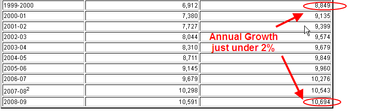
But the annual growth rate during the past decade, 1999 – 2009, has slowed to just under 2%.
When we zoom in on the spending growth during the 1960s and 1970s, we see a real growth rate of 3.6%

What we see in the per pupil data is a gradual slowing down of the real growth rate of spending. Those who claim that there have been spending cuts in education have not looked at the data. There have been no cuts in real spending, only reductions in the rate of growth.
Some decry “austerity” policies recently undertaken in some European countries – the U.K. is an example – claiming that a country pursuing these policies has cut spending. When we look at the spending data, we find that there have been no decreases in real spending, only in the growth of spending. This misconception is common and results from a comparison of what we expect and what happens.
If we have usually received a wage or salary increase of 3% each year, we come to expect a 3% increase. If we get a 2% increase this year, it is 33% less than our expections and feels like a cut. A retiree who has become accustomed to an annual 8% return on her investments, may feel that she has lost money if her investments only gain 5% this year. It does no good to mention that she has really not lost anything.
Let’s get up in our hot air balloons and travel to California, where the size of its economy puts the state above many countries. California has often been the leading edge of trends that spread to the other states. Ed-Data reports that per pupil spending has flattened since the recession started in 2008. In real dollars, there has been NO GROWTH in per pupil spending in the past ten years.
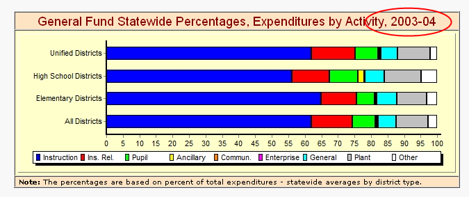
Another complaint from teachers is that money is increasingly being spent on administrative costs, not teaching. In California, teachers still command the lion’s share of spending – more than 60%.

The proportion of teacher spending has remained relatively constant – above 60% – in the past ten years.
What has been growing? On a per pupil basis, “Services and Other Operating Expenses” have grown 4% per year, or 1.8% real annual growth, above the 2.2% annual growth in inflation. Administration expenses have grown at the same rate of inflation so that real growth has been flat. However, spending on teacher salaries has declined in real money at an annual rate of .7%. However, their benefits expenses have grown 1.4% annually in real dollars. Again, most people do not “feel” the cost of a benefit increase. The bottom line to most of us is what we bring home. It does not pay to tell a K-12 teacher that they are actually receiving a slight increase in real total compensation.
In California, as in many states, property taxes are a major component of revenues for K-12 education. Over the past nine years, revenues from property taxes for education have declined 3% annually in real money. For each student, there is $500 less money available from property taxes than it would have been if property tax revenues had kept up with inflation. As a percent of total revenue for K-12 education, property taxes make up a little over 60%.

In 2011-2012, property tax revenues essentially paid teacher salaries. Ten years ago, the percentage of revenues from property taxes was about 6% higher.

Other State revenues have had to make up for the shortfall in property taxes; the gap is about $1000 per student. The problem would be even worse if it were not for the slight decline in students for the past 8 years.

While California faces challenges from declining property tax revenues, what about the rest of the country? Let’s climb back in our data balloon and look at student enrollment throughout the country. The NCES reports the same slight decline in K-12 enrollment. However, they estimate a total 6% growth in K-12 enrollment in this decade.

As K-12 enrollment grew by a little more than 1 million in the 2000s, post secondary education enrollment grew by 6 million, or 37%, to over 21 million. (Source http://nces.ed.gov/fastfacts/display.asp?id=98). The growth rate in older students, those aged 25+ is even faster, rising 42%. In this decade, “NCES projects a rise of 11 percent in enrollments of students under 25, and a rise of 20 percent in enrollments of students 25 and over.”
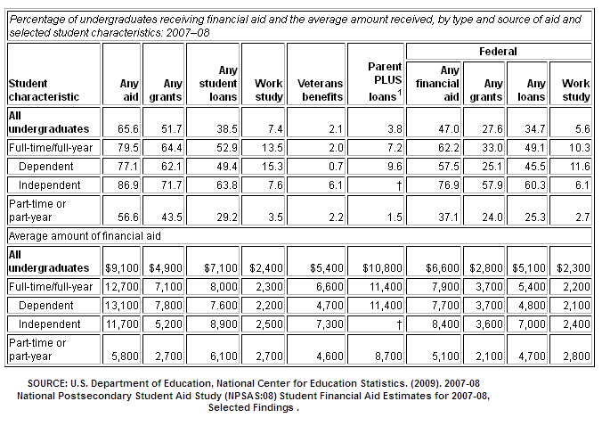
The ratio of K-12 students to post-12 students was 28% in 2000; a decade later, it was 38%. While K-12 enrollment is projected to increase for the rest of the decade, post-12 enrollment is estimated to be much faster. How do these students pay for college? The most recent data from NCES is at the start of the recession; I would guess that the need for aid has grown mightily since then.
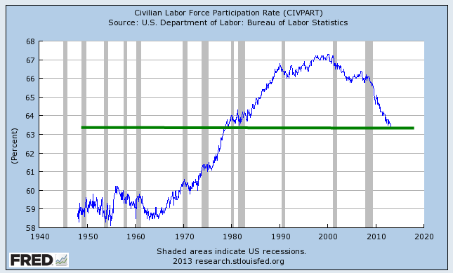
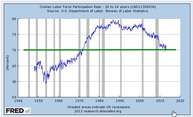
Put all of this in the blender: a declining work force (see my blog two weeks ago), a generational swelling of older people retiring, recovering but not robust state and local revenues, and more demand for K-12 AND post secondary education services. How will politicians react in the midst of so many competing demands for money?
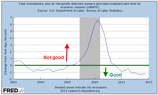
The increasing pressures for money from different segments of the population puts us in the precarious position that we can not afford to go into a recession, an impossible situation since the normal business cycle includes a recession every 7 – 10 years. Europe is already in recession; China’s growth is still robust but slowing; on Friday, India announced a growth rate below 5%, the weakest in four years; in a hopeful sign, Brazil, the economic powerhouse of South America, is projecting GDP growth over 3%, rising up from an anemic 2.7% growth of the past 5 years. (World Bank source)
Slackening demand around the world presents challenges for the U.S. economy, problems that a spastic Congress will only worsen. Y’all be careful out there…