Glootch or Glut?

March 15, 2015

Retail

Indicators of business activity and confidence have all been strong.  The Purchasing Managers Index, the monthly employment report, and the NFIB small business index have shown exceptional strength in the past several months.  A week after a strong employment report came the worrisome news that retail sales declined for the third month.

A 2% drop in auto sales was the primary driver of February’s decline but the lack of demand is evident in the broader economy.  Excluding auto sales this is the second three month period of declining sales since the recovery began.  Following the slump in 2012, the SP500 sagged about 7%.  The market’s response to this slump has been muted so far.

American businesses had hoped that their customers would spend the dollars saved at the gas pump but consumers may be tucking away some of that cash. The slowdown in retail sales may be partly due to the harsh winter in the east, or a lack of income growth.  The strong dollar has made American products more expensive to export so businesses are especially dependent on domestic demand. Since last summer, prices at the wholesale level have declined steadily.  Commodities other than oil are also showing slack demand.

The inventory to sales ratio has climbed abruptly in the last half of the year.  Businesses make their best guess in anticipating future demand.  A capitalist economy is based on the decision making of millions, not a central committee of a few.  If inventories continue to mount, we can expect that businesses will adjust to the new environment and rein in production and expansion plans.

*************************
Retirement

Twenty years ago I read articles on portfolio diversification like this one and was glad that I wasn’t old enough to be concerned about that kind of stuff.  Then one morning I was shaving and noticed that I was developing a slight turkey wattle in my neck, the same thing I had noticed in my Dad. OMG! I was getting old!
A Bankrate.com blog post features a chart of savings goals that a person at each stage of life should have accumulated to ensure that they can maintain their living standard in retirement.  The benchmarks are based on one’s current income.  Many Americans do not even meet these modest goals.  According to the chart, a person making $60K  who retires at 67 should have $500K in savings and investments.  
*************************
Apple
Telephone and radio were the high tech firms of the early 20th century.  In 1916, ATT was added to the Dow Jones Industrial Average (DJIA), acknowledging that the company had become a pillar of the American economy. 
At the close of trading on March 18th, almost a hundred years later, ATT will be dropped from the DJIA and replaced by Apple, a high tech firm of the 21st century.  Apple’s projected earnings growth for this year may cancel out the anticipated negative earnings growth of the DJIA but Apple is a more volatile stock than stodgy ATT so daily price changes in the index are likely to be a bit more dramatic.
*************************
Budgeting
Last week, economist Greg Mankiw wrote a piece in the New York Times explaining the recent change from static to dynamic budget scoring in the new Congress.  These are two different methods for estimating the effects of proposed tax changes on the budget over the following ten years.  Static scoring, the previous system, has been in place for decades and assumes no changes to the economy resulting from the proposed tax changes.  Dynamic scoring estimates changes in GDP and revenues resulting from the tax changes. Several examples illustrate differences between the two types of scoring.  The article is well written and easy to understand without the use of complicated economic models.

Sales, Savings and Volatility

August 17, 2014

This week I’ll take a look at the latest retail sales figures, a less publicized volatility indicator, a comparison of BLS projections of the Labor Force Participation Rate, and the adding up of personal savings.

**********************

Retail Sales

Two economic reports which have a major influence on the market’s mood are the monthly employment and retail sales reports.  After a disappointing but healthy employment report this month, July’s retail sales numbers were disappointing, showing no growth for the second month in a row.  The year-over-year growth is 3.7%, which, after inflation, is about 1.5% real growth.  Excluding auto sales (blue line in the graph below), sales growth is 3.1, or about 1% real growth, the same as population growth.

As we can see in the graph below, the growth in auto sales has kicked in an additional 1/2% in growth during this recovery period. Total growth has been weakening for the past two years despite strong growth in auto sales, a sign of an underlying lack of consumer power.

Real disposable income rebounded in the first six months of this year after negative growth in the last half of 2013 but there does not seem to be a corresponding surge in sales.

*****************************

Labor Force Projections

While we are on the subject of telling the future…

All we need are 8 million more workers in the next two years to meet Labor Force projections made in 2007 by the Bureau of Labor Statistics (BLS).   8 million / 24 months = 300,000 a month net jobs gained. Hmmm…probably not.  In 2007, the BLS forecast slowing growth in the labor force in the decade 2006 – 2016.  Turned out it was a lot slower. Estimates then for 2016 projected a total of 164 million employed and unemployed.  In July 2014, the BLS put the current figure at 156 million employed.  The Great, or at least Big, Recession caused the BLS to revise their forecast a number of times.  The current estimate has a target date of 2022 to hit the magic 164 million.  In other words, we are 6 years behind schedule.

The Participation Rate is the ratio of the Civilian Labor Force to the Civilian Non-Institutional Population aged 16 and above.  The equation might be written:  (E + UI) / A = PR, where E = Employed, UI = Unemployed and Actively Looking for Work, and A = people older than 16 who are not in the military or in prison or in some institution that would prevent them from making a choice whether to work or not.  As people – the A divisor in the equation – live longer, the participation rate gets lower.  It ain’t rocket science, it’s math, as baseball legend Yogi Berra might have said.

The Participation Rate started rising in the 1970s as more women entered the work force, then peaked in the years 1997 – 2000.  Prior to the recession of 2001, the pattern of the participation rate was predictable, declining during an economic downturn, then rising again as the economy recovered.  The recovery after the recession of 2001 was different.  The rate continued to decline even as the economy strengthened.

In 2007, the BLS expected further declines in the rate from a historically high 67% in 2000 to 65.5% in 2016.  In 2012, the rate stood at 63.7%.  Current projections from the BLS estimate that the rate will drop to 61.6% by 2022.

Much of the decline in the participation rate was attributed to demographic causes in the 2007 BLS projections:

“Age, sex, race, and ethnicity are among the main factors responsible for the changes in the labor force participation rate.” (Pg. 38)

Comparing estimates by some smart and well trained people over a number of years should remind us that it is extremely difficult to predict the future.  We may mislead ourselves into thinking that we are better than average predictors.  Our jobs may seem fairly secure until they are not; a 5 year CD will get about 5 – 6% until it doesn’t; the stock market will sell for about 15x earnings until it doesn’t; bonds are safe until they’re not.

The richest people got rich and stay rich because they know how unpredictable the world really is.  They hire managers to shield them – hopefully – from that unpredictability.  They fund political campaigns to provide additional insurance against the willy-nilly of public policy.  They fight for government subsidies to provide a safety cushion, to offset portfolio losses and mitigate risk.  What do many of us who are not so rich do to insure ourselves against volatility?  Put our money in a safe place like a savings account or CD.  In real purchasing power, that costs us 1 – 2%, the difference between inflation and the paltry interest rate paid on those insured accounts.  In addition, we can pay a hidden “insurance” fee of 4% in foregone returns by being out of the stock and bond markets.  We stay safe – and not-rich.  Rich people manage to stay safe – and rich – by not doing what the not-rich people do to stay safe.  Yogi Berra couldn’t have said it better.

***************************

China

For you China watchers out there, Bloomberg economists have compiled a monetary index from several key factors of monetary policy.  After hovering near decade lows, China’s central bank has considerably loosened lending in the past two months.  The chart shows the huge influx of monetary stimulus that China provided in 2009 and 2010 as the developed world tried to climb up out of the pit of the world wide financial crisis.

The tug of war in China is the same as in many countries.  Politicians want growth.  Central banks worry about inflation.  The rise in this index indicates that the central bank is either 1) bowing to political pressure, or 2) feels that inflationary pressures are low enough that they can afford to loosen the monetary reins.  As is often the case with monetary policy, it is probably some combination of the two.

**************************
Personal Savings Rate

Over the past two decades, economists have noted the low level of savings by American workers.  While economists debate methodologies and implications, politicians crank up their spin machines. More conservative politicians cite the low savings rate as an indication of a lack of personal responsibilty.  As workers become ever more dependent on government programs, they do not feel the need to save.  Over on the left side of the political aisle, liberals cite the low savings rate as a sign of the growing divide between the middle class and the rich.  Many families can not afford to save for a house, or their retirement, or put aside money for their children’s education.  We need more programs to correct the economic inequalities, they say.

While there might be some truth in both viewpoints, the plain fact is that the Personal Savings Rate doesn’t measure savings as most of us understand the term.  A more accurate title for what the government calls a savings rate would be “Delayed Consumption Rate.”  The methodology used by the Dept. of Commerce counts whatever is not spent by consumers as savings.  “To consume now or consume later, that is the question.”

If a worker puts money into a 401K each month, the employer’s matching contribution is not counted.  If a consumer saves up for a down payment for a house, that is included in savings.  When she takes money out of savings to buy the house, that is a negative savings.  The house has no value in the “savings” calculation.  Many investors have a large part of their savings in mutual funds through personal accounts and 401K plans at work.  Capital gains in those funds are not counted as savings.  (Federal Reserve paper) In short, it is a poor metric of the aggregate behavior of consumers.  Some economists will point out that the savings rate indicates a level of demand that consumers have in reserve but because a significant portion of saved income is not counted, it fails to properly account for that either.

************************

Volatility – A section for mid-term traders

No one can accurately predict the future but we can examine the guesses that people make about the future.  In his 2004 book The Wisdom of Crowds (excerpt here) James Surowiecki relates a number of studies in which people are asked to guess answers to intractable problems, like how many jelly beans are in a jar.  As would be expected, respondents rarely get it right.  The surprising find was that the average of guesses was remarkably close to the correct answer.

Through the use of option contracts, millions of traders try to guess the market’s direction or insure themselves against a change in price trend.  A popular and often quoted gauge of the fear in the market is the VIX, a statistical measure of the implied volatility of option contracts that expire in the next thirty days.  When this fear index is below 20, it indicates that traders do not anticipate abrupt changes in stock prices.

Less mentioned is the 3 month fear index, VXV (comparison from CBOE). Because of its longer time horizon, it might more properly be called a worry index.  Many casual investors have neither the time, inclination or resources to digest and analyze the many economic and financial conditions that impact the market.  So what could be easier than taking a cue from traders preoccupied with the market?  Below is a historical chart of the 3 month volatility index.

Historically, when this gauge has crossed above the 20 mark for a couple of weeks, it indicates an elevated state of worry among traders.  The 48 month or 4 year average of the index is 19.76.  Currently, we are at a particularly tranquil level of 14.42.

When traders get really spooked, the 10 day average of this anxiety index will climb to nosebleed heights as it did during the financial crisis.  As the market calms down, the average will drift back into the 20s range, an opportunity for a mid-term trader to get cautiously back into the water, alert for any reversal of sentiment.

*********************

Takeaways

Retail sales have flat-lined this summer but y-o-y gains are respectable.  So-so income growth constrains many consumers.  The 3 month volatility index is a quick and dirty summary of the mid-term anxiety level of traders.  A comparison of BLS labor force projections shows the difficulty of making accurate predictions.  The personal savings rate under-counts savings.

Retail Sales and the Stock Market

July 20th, 2014

This week I’ll take a look at the latest retail sales numbers and revisit a familiar valuation metric for the stock market.

*******************

Retail Sales

Retail sales were a bit of a disappointment this week because of a monthly decline in auto sales.  As strong as vehicle sales have been, we can see a pattern that echoes a trend in employment – the best of this post-recession period is near the low of past recessions.  As a percent of the population, the number of cars and light trucks sold is tepid at best.

In total, retail sales gained more than 4% year-over-year but here again we can see a familiar pattern – declining yearly percentage gains.  Periods of rising gains are about half the length of periods of falling gains.  Over the next several months, we would like to see higher highs in the yearly gains.  Further declines, i.e. lower highs, would be a cause for concern.

*************************

Malaysian Airline Disaster

Oil prices had fallen more than 5% over the past three weeks.  The news of an apparent missile strike on a Malaysian passenger jet over a conflict zone in eastern Ukraine sent oil prices up about 2.5% over two days this week before falling back slightly on Friday.  As families mourn the deaths of almost 300 people on the plane, a fusillade of accusations and denials were launched.  Some accuse Russia of launching the missile that struck the passenger jet flying at 33,000 foot altitude, some blame Russian-backed separatists in eastern Ukraine, others hold Ukranian forces accountable.  Economic sanctions already in place against Russia may be broadened.

Unrest in Ukraine, Iraq and Libya puts upward pressure on oil prices but the effect is moderated by a global supply that is able to meet demand with a safety buffer capable of absorbing these geopolitical conflicts.

***************************

Stock Market Valuation

The stock market continues its two year run to try and meet up with the trend channel of the mid-2000s as though the financial crisis never happened.

Last month I wrote about the Shiller CAPE ratio, introduced by economist Robert Shiller in his book Irrational Exuberance. Some writers also refer to the CAPE ratio as PE10 or the Shiller P/E ratio.

Portfolio Visualizer (PV) has a free tool that lets viewers backtest portfolios using various strategies. An optional timing model based on the CAPE ratio flips the allocation of a portfolio from 60% stocks and 40% bonds (60/40) to a 40/60 mix when the CAPE is high, as it is today.  In the model, “high” is a CAPE above 22, but as I wrote last month, the CAPE has averaged 22.91 for the past 30 years.  In the relatively low interest environment of the past thirty years, investors are willing to pay more for stocks.  The 50 year average is 19.57, within the normal range of the timing model. One could make the point that “high” should be set upward about 3 points, which is the spread between the 30 and 50 year averages (22.91 – 19.57).  In that case, the trigger high would be 25.

Below is a chart of the CAPE ratio and the inflation adjusted or real price of the SP500 index.  As you can see we are far below the nosebleed valuation levels of the late 90s and early 2000s.

The current CAPE ratio is about 26, above even the modified high point.  Using this model, an investor with a $500,000 portfolio with $300,000 in stocks and $200,000 in bonds, would sell $100,000 of stocks and buy bonds with the proceeds.  Over the past twelve years, the Shiller model would have generated an 8.44% annual return vs the 7.21% return of a 50/50 balanced portfolio.  I included an additional two years to capture half of the downturn in the early 2000s when stocks lost 43% of their value.  More importantly, the risk adjusted return of the Shiller model is much better than the 50/50 portfolio.

The Shiller model also did better than the 8% annual returns of a crossing strategy. This is a variation of the 50 day/200 day “Golden Cross” strategy, which I wrote about in February 2012, a week or so after the occurrence of the last Golden Cross.  In this monthly variation using the Shiller model, an investor exits the market when the SP500 monthly index drops below its 10 month moving average.

Keep in mind that a backtested portfolio generates higher than actual returns since they often don’t include trading fees, slippage or a real life re-balancing.  In backtest simulations, an investor may re-balance all in one day following the signal day.  While that may be the case sometimes, many investors are not so quick and some financial advisers will recommend making a gradual transition when re-balancing.  Still, backtests can be useful in comparing strategies.

An investor who puts money into the stock market today is – or should be – more concerned about what that money will be worth 5, 10 and 20 years from today when they might need the money for retirement, children’s college, or other events in a person’s lifetime.

There is a definite negative correlation between the CAPE and the 10 year return, without dividends, of an investment in the SP500.  Since World War 2, the correlation is -.70.  Since 1902, the correlation is -.65, reflecting the greater portion of earnings that were paid out as dividends to investors before WW2.  In short, it is likely that an investor will experience lower returns the higher this CAPE ratio.

*****************************

How much can I take each year from the piggy bank?

There is also a Shiller model for sustainable withdrawals from a portfolio based on the CAPE ratio.  You can read about it here.  Keep in mind that this model uses a 30 year horizon for retirement.  The same author, Wade Pfau, has a separate article on the various time horizons used in withdrawal models.

*****************************

Takeaways

Two steps forward, one step back is a familiar trend in this post-recession period.  Retail sales are healthy but below the 5% threshold of a strong upward trend.

Using the Shiller CAPE ratio as a metric of market valuation, stocks are overvalued.

Earnings, Revenues and Retail Sales

April 20, 2014

You’re on a date with me, the pickin’s have been lush
And yet before this evenin’ is over you might give me the brush

Luck Be a Lady
from the play Guys and Dolls

Easy money

In opening remarks Tuesday at a Federal Reserve conference in Atlanta, Janet Yellen, head of the Fed, made the case that ongoing weakness in the global economy warranted support from central banks and that she did not anticipate full employment in the U.S. for another two years.  The Fed reported that the economies in all 12 Fed districts improved in March as consumers ventured out of their winter burrows. The stock market rose in each of the four trading days this week, but has still not risen to the level it opened at on Friday, April 11th, when the market dropped 2%.  Disappointing earnings reports restrained enthusiasm sparked by the prospect of continued easy monetary policy from the Fed.

**************************************

Earnings

On Tuesday, discount broker Charles Schwab reported a 58% increase in first quarter profits.  Trading volume was the highest in its history as many individual investors returned to the stock market.

In the tech sector, Intel and IBM reported declining revenues of 1% and 4% respectively.  The stock price of both companies is about the same as it was two years ago.  Intel is trying to transition from its traditional dominance in PC chips as sales of PCs continue to slow.  IBM is undergoing a similar transition from hardware – particularly mainframes – to business software.

Since early 2012, the Technology SPDR ETF,  a broad basket of tech stocks, is up almost 50%.  For an investor who does not have the time to research trends in a particular sector, particularly one as dynamic as the technology sector, buying a representative basket of the sector may be the safer choice.

American Express reported a first quarter drop in revenue of 4%, attributing most of the decline to small business and corporate spending.

Google reported an 8% drop in first quarter revenue from the fourth quarter.  Year over year, revenue rose 10% but investors have realized that the days of 20 – 40% annual revenue gains are probably over.  Since early March, the company’s stock has dropped 12%.

W.W. Grainger sells supplies, parts, equipment and tools to businesses.  Since 2009 revenues have risen almost 50% but sales growth has been meager since the middle of last year.  A few weeks ago, I noted the lack of growth in maintenance and repair employment.  Grainger’s lack of revenue growth and declining spending by businesses at American Express are disturbing indicators that there is a lack of confidence and investment in growth.

The industrial and financial megalith General Electric reported a year over year revenue increase of 2.2% but the company’s revenues have been fairly flat for four years and the stock price is almost 20% below its mid 2007 level.  GE is gradually shedding its financial businesses in order to focus on what it does best – making stuff, big stuff and small stuff.  With a dividend yield of 3.4%, this stock may be worth a more in depth look for investors who buy individual stocks and think that the company can make the transition.  As a side note:  in 2013, GE managed to defer $3.3 billion, or 85%, of its income tax liability, which will no doubt get some attention in the coming election cycle.  What won’t be mentioned is that GE paid over $8 billion in 2011 and 2012.

*************************************

Retail Sales and Household Debt

Retail sales were up a strong 1.1% in March, the most in two years.  Auto sales were particularly strong. Household debt is at the same level as it was in the 1st quarter of 2007 but has been slowly rising in the past year.  The years from the mid 1980s to the mid 2000s is often called the Great Moderation by many economists but the period is marked by an immoderate 8.6% annual growth rate in household debt.  Since the onset of the financial crisis and recession, households have jumped off that runaway train yet today’s levels still reflect a 34 year annualized growth rate of 7%.

With meager growth in personal income, it is unlikely that consumers can afford to rise to those heady and unsustainable growth rates in debt.  However, the percent of income needed to service that debt is at 34 year lows.  Growing consumer confidence and willingness to take on more debt may pull the economy out of the current lackluster growth.

*************************************

Margin Debt

A link on this blog is to the excellent work that Doug Short does.  In case you missed it, here are some graphs he presented on margin debt reported by the NY Stock Exchange, or the amount of money that investors have borrowed against their stock holdings.

I am not sure how reliable this indicator is.  Selling as margin debt starts to drop and buying as it starts rising again has mixed results.  The strategy would have kept a hypothetical investor out of the market during the market downturn in the early 2000s, back into the market in late 2003, out of the market in early 2008, and back into the market in July 2009.  So far, the timing looks great.  Since then, however, the rise and fall in margin debt has signaled some fake outs, so that an investor would have sold during a temporary market disruption, only to buy in later at a higher level.

Oddly enough, the last buy signal in February 2012 coincided with the Golden Cross in late January 2012.  The Golden Cross occurs when the 50 day moving average crosses above the 200 day moving average.

Retail Sales and Inflation

December 15th, 2013

Retail sales rose .7% in November, posting year over year (y-o-y) gains of almost 5%.  The twenty year average of y-o-y gains is 4.6%.  When we remove the eleven monthly outliers with gains of more than 10% or less than -10%, the average is 5.0%

Now let’s compare the percentage change in GDP with the change in retail sales.

The change in GDP is like a smoothed average of the change in retail sales, so the continuing willingness of consumers to spend is a positive for both GDP growth and the market in the mid-term outlook.

*******************************

In March 2009, incoming President Obama pledged that his administration was going to support small businesses which employ 1/2 the workforce and contribute 40% to GDP. (CBS News article  Note: The article incorrectly states that small businesses employ 70% of the workforce.) A recent report, short and written in plain English, by the Cleveland Federal Reserve compares levels of lending to small businesses in 2013 vs 2007.  Five years after the financial crisis, six years after the start of the recession, loans to small businesses are only 80% of 2007 levels.  Impacting the start up of small companies has been the decline in home values.  Home equity provides the funding for most small business start ups.

A graph from the report illustrates the long term decline of small business lending.  As the banking sector has consolidated over the past twenty years, the mega-banks have less incentive to “take a chance” on small businesses.

As I watch Senate and House hearings on C-Span (yes, I know I have a problem), I am struck by how many members of Congress appear to be on a mission.  While at times Washington seems to be a town of political prostitutes, it may be more accurate to describe it as a town of missionaries.  These dedicated men and women come to Washington with a plan to save the souls of the American people – or at least that’s the way they like to present themselves.  Nancy Pelosi and other prominent Democrats give voice to the plight of the long term unemployed but rarely mention small business owners.  A 50 year old guy who can’t find a job because his skills are out of date is a topic of concern to Democrats.  But what about the 50 year old who can’t start up a business because the drop in housing prices has diminished the equity of many home owners?  Republicans mention small businesses only when bashing Obamacare.  Why has there been so little attention paid to this rather large part of the economy?  Why aren’t the banks being subpoenaed to appear before a Congressional subcommittee?  Many Presidents seem to spend their second terms answering for the broken promises of their first term.  Finally, after eight years, voters turn to a new guy, hoping that this one will be different.  Hope, or foolishness, triumphs in the hearts of voters.

********************************

Now I’ll take a look at a contentious subject, the measurement of inflation.  A comprehensive review of the inflation measurement is far beyond my skills and a blog.  The CPI produced by the Bureau of Labor Statistics is the official measurement of inflation to adjust Social Security payments each year.  I want to come at the subject from a different viewpoint – corporate profits. Starting in 1990, the Bureau of Labor Statistics (BLS) adopted a new way of measuring inflation, introducing what is called a hedonic adjustment. Coincidentally, corporate profits began to surge shortly thereafter.  Below is a graph showing inflation adjusted profits.

Adjusting for population growth, the surge in per capita profits confirms the trend.

As I noted in September, corporate profits as a percent of GDP are at historically high levels.

In a FAQ sheet, the BLS explains their methodology in plain language and refutes the claim that hedonic adjustments have any significant impact on the CPI measurement. I have also discussed another measure of inflation, the PCE deflator.  Here is a working paper by an economist at the Federal Reserve on the PCE measurement.

For years, John Williams of Shadow Government Statistics (SGS) has painstakingly maintained an alternate data set of the CPI.  Here’s a graph from that page to give you an idea.

As you can see, the official measure of inflation is about 2 – 3% below the CPI that Williams produces using the pre-1990 methodology.  Essentially, hedonic adjustments measure inflation after consumers have adjusted to inflationary price pressures.  Let’s say that a family eats steak twice a week.  Steak then goes up in price by 20%.  To stay within their budget, a family might substitute hamburger for one of those meals.  The old method of measuring inflation would capture the 20% rise in the price of steak.  The post-1990 method does not capture all of that rise because it allows for the substitution effect.

Several reasons have been given for the dramatic rise in corporate profits since 1990.  These include globalization, technology, and increased productivity of both labor and capital.  As I wrote about in August, multi-factorial productivity has only increased 12% in the 12 years from 2000 – 2012, an annual gain of less than 1%.  Technological progress occurred in almost every decade of the past century, yet average economic growth is about 3% over those one hundred years – a remarkable consistency.  Globalization has helped and hurt domestic companies, enabling them to reduce costs but also increasing the competition from firms around the world.  Have companies found some magic key in the past twenty years?

The magic key may be the change in the CPI methodology. What if the CPI understates inflationary pressures by 2 – 3% each year?  What effects would that have?  Interest rates would be reduced, lowering the costs of borrowing for companies.  There would be less pressure from labor for wage increases.  These two factors figure heavily in the profits of many large companies. (Interest expense for GE is more than a third of their operating income ).  There is yet another effect: real profits adjusted for this higher inflation rate, would simply not be so dramatic.

Since 1990, per capita corporate profits have risen about 7.6% per year.

Now let’s adjust per capita profits for inflation using the official CPI and a higher inflation rate that is closer to the inflation measures that SGS compiles.

What we see is approximately 3% real growth in per capita profits since 1990.  This is quadruple the .75% growth rate of corporate profits for the thirty year period from 1959 – 1989.

The 30 year average was hurt by the 4% decline in inflation and population adjusted profits during the 1980s.  This decline undermines the conventional narrative that the 1980s were a big growth boom for companies.  The 50 year average of this real profit growth is 2.5%.  As a rule of thumb then, we can guesstimate inflationary pressures on consumers as the nominal rate of profit growth less 2.5%.  Let’s look at a chart I showed earlier.

The 7.6% nominal growth rate of profits less 2.5% gives us an average inflation rate of close to 5% for the past 23 years.  This different methodology lends more credence to the higher CPI calculations that SGS presents. Compare this to the 2.5% average that the BLS calculates for this time period.

Small changes in methodology add up over time.  While this “back of the envelope” method of computing inflation does not meet the rigor that Williams brings to his calculations, it does illustrate the difference in inflationary pressures that many families feel.  Here’s a comparison of the two indexes.

Now comes the juicy part and I will keep my voice low.  There is a conspiracy theory floating around that, in the late 1980s, the politicians in Washington were pressured by businesses to have the BLS revise their methodology to reduce rising labor costs which were hurting profits. Another theory says that Congress wanted to curb the annual CPI increases in Social Security and Medicare payments and secretly ordered the BLS to come up with a way to revise the CPI down.  In 50 years, financial historians may discover that both of these theories have some substance.

Whatever the “real” reason for the change in methodology, those who are dependent on retirement income indexed to the CPI should keep in mind that unmeasured inflationary pressures may eat an additional  2 – 3% out of their retirement savings base and income.

Retail, Housing, The Fed And More

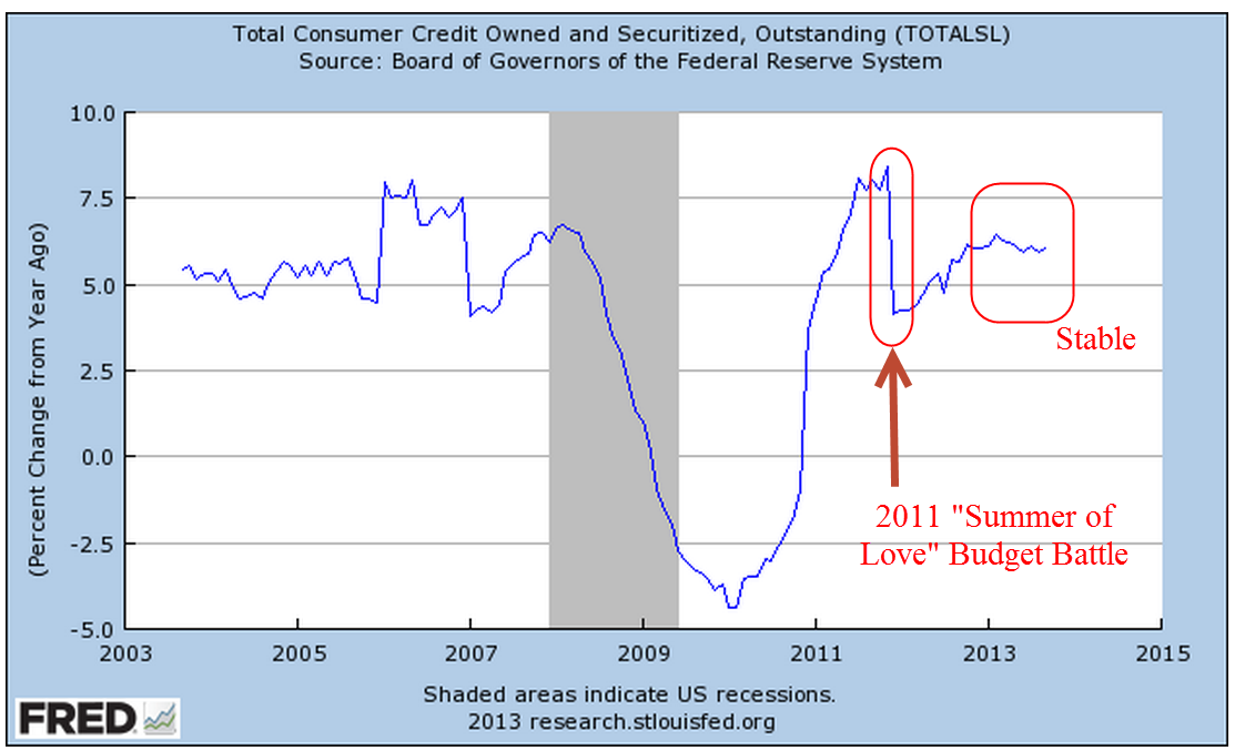
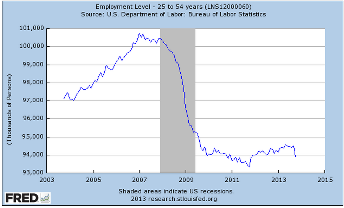
Last week I pointed to several contradictory outlooks for sales in the upcoming holiday season.  Bill McBride at Calculated Risk has several charts on the import and export volume at the port of Los Angeles.  The import data indicates that businesses were buying goods in late summer and the fall in anticipation of a good holiday season.  Both Home Depot and Best Buy reported better than expected earnings on Tuesday but Best Buy’s sales were less than expected.  The company cited increasing pressure from online retailers.  E-Commerce continues to take an ever increasing share of the retail sales market.

Amazon is now making more money selling other vendors’ products than it does its own.  Vendors typically turn over much of the sales, shipping and billing process to Amazon.  Businesses, including mine, are increasingly turning to Amazon for parts or supplies.  Why?  Amazon has become an easy to search portal for so many vendors and the prices are competitive.  Why spend time searching the web for long discontinued parts when Amazon has already done that?  What is even more surprising is the enormous volume of third party items that Amazon now stocks and, surprisingly, the items are received from Amazon, not the vendor.

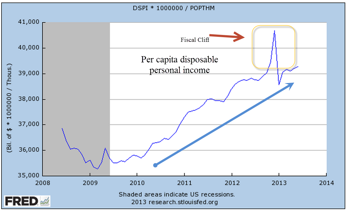
On Wednesday, the monthly report of retail sales showed a .4% month on month gain, causing analysts at Morgan Stanley to reverse their earlier dour opinion of the coming holiday season.  The year over year gain is at 4% but retailers that target lower income consumers are experiencing some difficulties.  J.C. Penney reported sales and earnings that were disappointing.  After an earlier upbeat report from the home improvement chain Home Depot, Lowe’s reported strong sales and earnings, confirming the continuing strength in this sector.  Later in the week, Target issued a disappointing earnings report.  Will the ongoing decline in gas prices leave working class families with enough extra cash in their wallets this Christmas season?  Wal-Mart, Target and J. C. Penney hope so.

**************************
[Revised to clarify the two separate housing indexes below]

 October’s housing market index reading of 54 from the National Assoc of Homebuilders indicated continuing strength in the new home market.  This index is a composite of factors, including sales, inventory, builder expectations and traffic.  The series, like the industrial reports, is indexed so that 50 is the neutral mark, indicating no net growth.  Although the overall index has declined from the summer peak, both sales and expectations are in the strong to robust growth.

The Federal Housing Finance Agency tracks an index of home prices (only).  Major markets on both the east and west coasts are still below the bubble peaks of 2005 – 2006.

From 1983 to 1999, the average house cost 13 to 15 years worth of rent.  This baseline is a good rule of thumb when pricing out houses.  In 2006, at the height of the housing bubble, houses were selling for 25 years worth of the average monthly rental.  Los Angeles experienced a much greater price inflation during the 2000s than either SF or NYC.  Although the nationwide economy is growing steadily but slowly, Los Angeles has responded to the strong growth in manufacturing throughout the country. Asking rents for industrial properties in L.A. are rocketing upward this year, accelerating from the strong three year growth and exceeding the price levels of 2007.

http://www.loopnet.com/xNet/MainSite/Tools/WidgetHTML.aspx?WidgetType=50&CountryCode=US&StateCode=CA&State=California&CityName=Los+Angeles&SiteID=1&TrendTypeID=2&PropertyTypeID=40&ListingType=LEASE&PropertyType=Industrial&TrendType=Asking%20Rent Available Office and Industrial property in the LA area is at multi-year lows.

http://www.loopnet.com/xNet/MainSite/Tools/WidgetHTML.aspx?WidgetType=50&CountryCode=US&StateCode=CA&State=California&CityName=Los+Angeles&SiteID=1&TrendTypeID=5&PropertyTypeID=80&ListingType=LEASE&PropertyType=Office&TrendType=No.%20of%20Spaces

Los Angeles, CA Market Trends

**************************

http://www.loopnet.com/xNet/MainSite/Tools/WidgetHTML.aspx?WidgetType=50&CountryCode=US&StateCode=CA&State=California&CityName=Los+Angeles&SiteID=1&TrendTypeID=5&PropertyTypeID=40&ListingType=LEASE&PropertyType=Industrial&TrendType=No.%20of%20Spaces
The Consumer Price Index released Wednesday showed a tiny decrease in inflation for the month.  The year over year change was 1.7%, indicating that demand at many levels is positive but weak so that there is little pressure on prices.  On Thursday, the Producer Price Index (PPI) confirmed that the supply chain is experiencing very low upward pressure.

***************************

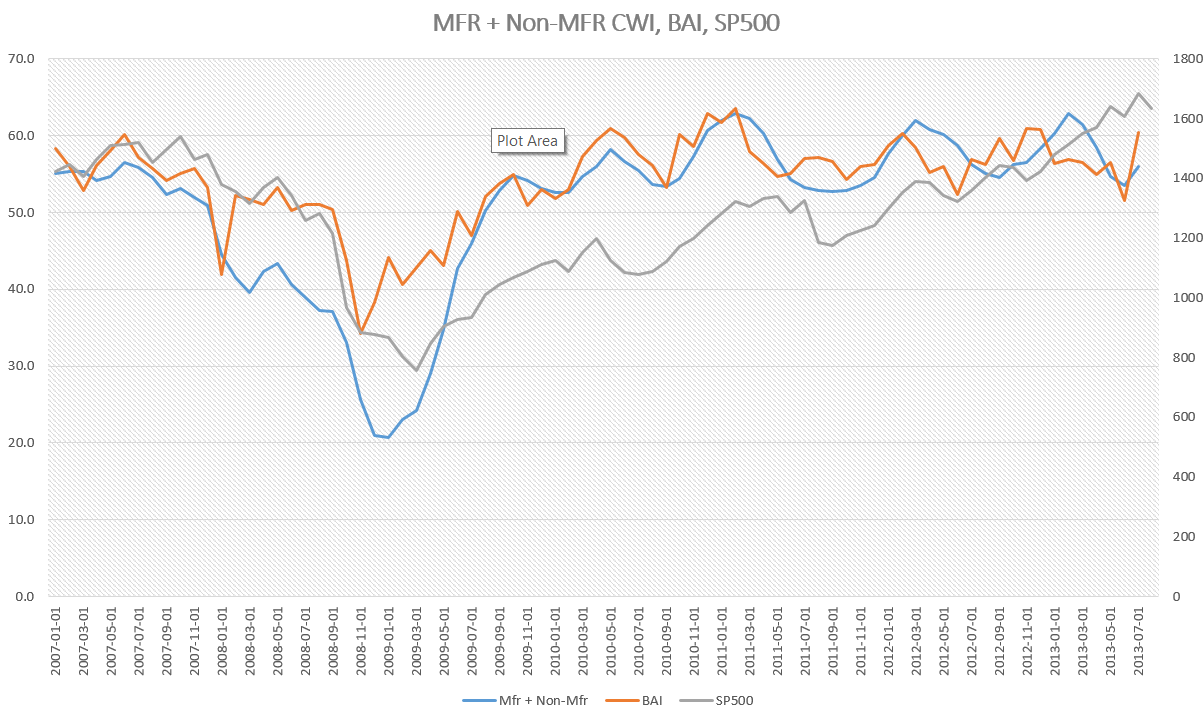
The PMI Flash Index, a preview of the upcoming report on the manufacturing sector, confirmed the continuing growth in the manufacturing sector.

***************************

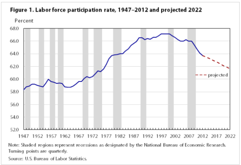
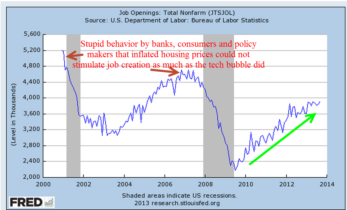
The Job Openings and Labor Turnover Survey (JOLTS) by the BLS was released on Friday.  Unlike the timeliness of the monthly Employment report, this one lags by a month but does provide a more comprehensive analysis of the growth or decline in the labor market.  The BLS surveys employers at the end of the month, September in this case, for job openings and layoffs.  A job opening can be full time, part time, seasonal or temporary so the data can be skewed by seasonality factors.  The longer term trend, though, is apparent.

It may be several more years before job openings reach the level attained during the tech boom of the late ’90s.  Like the gold fever of the mid-19th century, investors poured money into a lot of ventures with little more than a napkin sized business plan.  This pattern of bubble and bust is fairly typical when game changing technologies emerge.  The spread of the telegraph and railroads led to horrific recessions in the late 19th century, culminating in the depression of 1893-94.  The rise of radio in the 1920s prompted speculative fever that contributed mightily to the crash of 1929, setting the stage for the bad monetary policy and haphazaard fiscal policies that fed the depression of the 1930s.  In the 1960s, a rush of investment in airlines and war funding helped fuel a frenzy of speculation that crashed in 1970.

******************************

In Washington this week, the Senate voted to change the rules for Senate confirmation of most executive and judicial appointments, the so called “nuclear option” that requires only a majority vote for confirmation.  This modification of the filibuster rule should have been done ten years ago when then Democratic Senate Minority Leader Tom Daschle led filibusters to block many of George Bush’s appointments.  Since then, the Senate has grown ever more dysfunctional, incapable of even ordering pizza.  Under the elitist filibuster rules, each Senator could act like a despot or one of the “Knights who say ‘Nee’!” in the comic movie “Monty Python and the Holy Grail.”  A Senator representing 300,000 people in Wyoming could nix or delay an executive appointment – this in a country of over 300 million. Sounds a bit like England in the 1770s. A lot of people died in the Revolutionary War so that America would not be a country ruled by a despot, be it a king or a Senator.

*******************************

The rule change makes the confirmation of Janet Yellen as the next chair of the Federal Reserve a near certainty. In a speech at the Cato Institute’s Annual Monetary Conference, Charles Plosser, President of the Philadelphia branch of the Federal Reserve, made a good case for some restraint by the Federal Reserve – not in the amount of debt the Fed purchases but the type of debt:

“[The Federal Reserve’s] purchase [of] specific (non-Treasury) assets amounted to a form of credit allocation, which targets specific industries, sectors, or firms. These credit policies cross the boundary from monetary policy and venture into the realm of fiscal policy.”

Mr. Plosser would rather see politicians, not central bankers, decide which industries to favor through bailouts or loan purchases.  In a democratic republic like ours, if the politicians in Washington want to bailout banks or the housing sector, they can do so by issuing general debt obligations, Treasuries, which the Federal Reserve can buy.  Gridlock in Washington has prevented them from reaching any consensus about these policies, leaving it up to the Federal Reserve to act in their place, to make political decisions which compromises the neutral stance that a central bank should have.

Now, we might say that the result is the same so what’s the big deal?  Knowing that Fed chairman Ben Bernanke would come to the rescue has allowed politicians to not make difficult compromises.  Why should they?   If Congress does less, the Fed does more.  Because it can be so difficult to enact their agenda through the political process, Presidents and political parties turn to the Fed as the fourth branch of government.

Plosser also questions the dual target of both inflation and unemployment that the Fed has assumed as its mandate.  The law states that the Fed should enact monetary policy that is “commensurate” with the “long run potential to increase production.”  Since the recession began in 2008, the Fed has adopted a series of “QE” short term measures designed to decrease unemployment and Plosser’s view is that these are not part of the job description.  Plosser will be a voting member in 2014.  His vote of restraint is unlikely to hold much sway with Janet Yellen, who is ready to keep the cornucopia money machine flowing.

****************************

In the Wall St. Journal’s Washwire Blog, Elizabeth Williamson writes that the White House is conducting a self-assessment in the wake of the health-law launch, “recognizing that administration officials missed warning signs and put too much trust in their management practices.”   What on earth has given this administration any reason to trust their management practices?  Was it their management of the attack on the U.S. consulate in Benghazi in September 2012?  Or perhaps the “red line” that President Obama drew with Syria, promising a military response if Syria used chemical weapons against its own people?  Or the terribly mismanaged mortgage relief program, HAMP, that former Treasury Secretary Tim Geithner put in place?

This is only a partial list of the persistently poor management practices that have marked this administration.  It began with the poor preparation in advance of the March 2009 meeting with the nation’s largest banks, leading Obama and Geithner to offer generous terms to the banks when the banks would have accepted any terms in order to stay alive.  The crafting of the stimulus bill was an example of indecisive leadership and management at one of those rare times in history when both houses of Congress were controlled by the President’s party.  Using a basketball analogy, the administration blew a layup.

Now comes the news that the Obama administration wants to exempt some union health care plans from a “reinsurance tax” – about $63 per person per year – that all plans under the ACA health care law pay.  How will they do this?  By a carefully worded exemption that applies only to self-administered health plans.  A little background.  Many big companies self-insure and hire an administrator like Blue Cross to take care of the details.  Under the Taft-Hartley act passed after World War 2, employers often in the same industry may collectively construct or join what is essentially a health insurance trust, offering their employees insurance through the trust.  These plans are called “Taft-Hartley Multi-employer Health and Welfare Plans” and are really a benefit in the construction trade because they enable smaller employers to offer employees – usually these are unionized employees – a health plan at more affordable rates, taking advantage of the larger pool of insured offered by the trust.  It also enables employees to move from one company to another and retain their health insurance.  The plans are defined as self-administered even though the trust may contract out the details of daily management to a third party.   So here is a plan that fills a need and offers a benefit to both employers and employees.  Labor unions, like everyone else, want special treatment, of course, so they have been lobbying for an exemption from this rather small tax.  In September the Huffington Post reported that the unions were having little success in lobbying for another exemption – the ability of these plans to qualify for subsidies as though they were individual health care plans.

With a history of spineless leadership from an Obama administration that can’t say no but can’t say yes either, unions will continue to press for special treatment.  Finally, even they may get disgusted with an administration that can’t take a stand.

Like the Durango-Silverton narrow gauge train, the stock market chugs up the hill.  Production, sales and employment reports are either strong or not too bad or neutral but not bad.  Short, mid and long term volatility measures are subdued.  Gold has been drifting steadily down, nearing the lows of July.  Of course, some say that the time to get worried is when no one is worried.

The biggest worry for many in the coming week may be a dry turkey, or a heated discussion about politics.  Do pass the sweet potatoes if asked even if that so-and-so relative of yours is dumber than the potato.  Happy Turkey Day!

Trends and Bubbles

November 17, 2013

This week the department store Macy’s reported sales growth that was above forecast.  Same store sales rose 3.5%, about 50% better growth than expected.  Macy’s attracts a higher income customer than Target, J.C. Penney or Wal-Mart.  On Thursday, Wal-Mart announced that their sales had declined for a third quarter in a row.  The holiday season depends on lower and middle working class folks, the kind who shop at Wal-Mart, to open their pockets.  Investment firm Morgan Stanley expects this retail season to be the worst since 2008 when the country was deep in recession. (Source)
What can we learn from a bird’s eye view of the growth in consumer credit?  At 5.6% year over year, it is stable.

Note the response time lag in this series.  The growth in consumer credit did not decline below 5% till months after the recession started.  Despite the loss of hundreds of thousands of jobs in the beginning of 2008, this net job loss represented less than 1% of the work force in mid-2008.  The job loss would mount into the millions but jobs are “sticky,” meaning that a downturn in the economy has a minor effect on most people most of the time.  After the fact, it is easy for us to point at some chart, arch our eyebrows in a knowing glance, and say “We can see the breakdown of the economy beginning here.”

On a long term chart, we can see a reduction in growth swings over the past thirty years.  Relatively flat income growth for a majority of workers has dampened the swings.  While good for household balance sheets, it means that we can expect less economic volatility but also muted growth for the next decade.

Expectations for the holiday season are not reflected in the price of retail stocks.  A basket of retail companies has grown about 40% this year and is up about 70% over two years.  It may be time to take a bit off the table in this sector.

The Consumer Financial Protection Bureau (CFPB) was created a few years ago to act as a watchdog over the credit practices of the largest banks.  On Tuesday, Richard Cordray, Director of the agency appeared before a Senate committee.  He confirmed that the agency collects a lot of anonymized data on 900 million credit card accounts each month as part of its supervisory role.  Questions should be raised whenever any government agency collects data on us.  How is the data protected?  Who has access to the data?  What about my privacy?

Mr. Cordray noted that several other agencies as well as private industry collect this data.  Because the data is anonymized, we are little more than a number to  the agency, but there are several concerns.  Federal agencies have a great deal of legal power, enabling them to get a warrant to access  the data on anyone.  Cordray repeatedly assured the committee that no one at the agency is interested in our personal data but left off one adverb – “now.”  In the aftermath of 9-11, anti-war protestors found themselves turned away at airports or flagged for additional screening.  How did federal agencies know the travel plans of many protestors?  It does not take a team of FBI agents to trace the activities of any citizen when several federal agencies have our monthly financial activity at their fingertips.  Secondly, there is the matter of security.  How many parties does our data go through on its way to the agency?  Where and at what stage in the process of data aggregation is the anonymizing done?  Is our personal credit card info transmitted first to a separate third party anonymizer before being transmitted to the various agencies?  Is the raw data being transmitted to an agency which then anonymizes the data using a third party program or process?  In any case, it was clear that our monthly card transactions are making the rounds in both private industry and various government agencies.

The stock market continues to rise, prompting talk of a bubble.  If you have access, try to read “Is This A Bubble” by Joe Light in this weekend’s edition of the Wall St. Journal.   It is both informative and measured in its assessment.

 In February 2012, I mentioned the Golden Cross which had occurred in late January.  This long term indicator of market sentiment is a crossing of the 50 day moving average of stock market prices above the 200 day average.

Since then the market has risen about 40%.  Man, if I had only taken my own advice and moved all my investments and money into the stock market!  As the market continues to rise, more and more investors catch the “if only” disease and start moving money from safer investments into stocks.  This is why many of us tend to buy high and sell low.  Instead we should stay with the fundamentals of diversify, diversify, and lastly – diversify.  A long term indicator like the Golden Cross is not a signal to dump all of our savings into stocks – unless we are in our 30s and have lots of time before we need the money.  A more sensible approach is to adjust allocation upwards towards stocks and this depends on a person’s age, needs, and fears.  If a person has a 50% stock allocation, with the remaining 50% in bonds and cash (I’ll leave alternate investments out for right now), that indicates a moderate tolerance for risk.  They might shift the allocation to 55% stocks or 60% when they see a Golden Cross.   A person who has a 70% allocation to stocks, indicating a high tolerance for risk, might start adjusting to an 85% to 90% allocation.  Using this more moderate approach, a person would have lightened up their stock allocation in December 2007 when a reverse Golden Cross happened.

So what if someone has been very scared of the stock market and has only 10% of their savings in stocks?  Should they move some money into the market now?  That depends.  If the thought of making even a slight change leads a person to lose sleep, then no.  Should someone change their allocation of stocks from 10% to 50% now?  That is a major allocation change and should be done using dollar cost averaging.  This is a process where one takes money from one investment basket every month and puts it in another investment basket. There is also a psychological advantage to this approach.  As a person’s allocation percentage becomes a bit riskier, they can adjust to the additional risk in a measured way.

Tolerance for risk is a composite of several components:  psychological or emotional, future liquidity needs, age, and assets as well as income sources.  Too often, people think of tolerance for risk as an emotional response only.  While it is true that our emotions can cloud our measured response to risk, it is important to keep in mind that it is only one of the components.

**************

In answer to calls from his own party members, President Obama announced an administrative change to the Affordable Care Act (ACA) that allows those with policies in the individual health care market to retain their policies even if the policies don’t meet the minimum standards of the ACA.  Politicians, pronouncements and podiums – stir them together and voila!  The President’s pronouncement was little more than political cover at this late stage in the transition to Obamacare.  Only if the states allow it and companies decide to offer the plans will an individual policy holder be able to “keep their plan,”  as the President promised on numerous occasions in the past few years.

On Friday, the Energy and Commerce Committee released emails subpoenaed from CMS, the agency that administers Medicare and the ACA.   The emails contradict previous testimony by both CMS head administrator Marilyn Tavenner and HHS Secretary Kathleen Sibelius that only routine problems with the healthcare.gov web site were anticipated before the launch of the web site.  Ms. Tavenner testified that there were enough problems that they decided to delay the implementation of the small business plans on the web site but it appears that the problems went much further and top officials were alerted.

Henry Chao, the deputy CIO at CMS, was made aware of many major security, transactional and design problems with the web site during the summer but decided – or was pressured to decide – that the site would go live on October 1st regardless.  President Obama’s repeated selling point has been what he calls “smart” government. The rollout of the federal health care website has  revealed – once again – that the government in Washington has become too big and too top down to be smart, or effective.  To keep their campaign coffers filled, too many in Washington must placate those companies which fund those coffers, including special favors and bailouts for the elite on Wall Street.  To get the votes, they must placate the poor with programs and promises.

A conflict of interests and a clash of incentives makes most of the Washington crowd ineffective.  Turn on C-Span and watch the faces of the House and Senate Budget Conference (House and Senate).  These are intelligent, committed people who feel the pull of these different puppet masters, those political interests that keep them in their respective seats.   Each one of them earnestly wants to fix the problem – and that is the problem.  Much of the time, they are fixing the previous fixes they implemented.  This approach makes Congress feel important. I would suggest that they do little more than enact incentives and let their constituents craft the solutions.  Sure, the solutions will not be crafted with the superior technical expertise that Washington promises. Instead, they will emerge in a stumbling, hodge-podge way that will disenchant those who believe in the romantic notion of omniscient experts who engineer elegant solutions to social and economic problems.  I hope that one day the Washington elite will let Main St. try to figure out the solutions to some of these problems. We can do better.

Up, Down, Round and Round

November 10th, 2013

Friday’s release of the monthly employment situation showed strong net job gains of 204,000 jobs and big upward revisions to the previously reported gains in August and September. The market should have reacted negatively to these positive numbers (yeh, go figure) in anticipation of the Fed tapering their stimulus program of monthly bond purchases.

But first we must go back to Thursday. The first estimate of real GDP growth in the third quarter came in above even the most optimistic forecasts at 2.8%, about a full percentage point above second quarter growth.  The primary reason for the gains though was the continuing build in inventories.  Inventory building is good in anticipation of robust sales but, as I’ll cover later, consumer spending has not been so robust.  The market reacted to the report with it’s largest daily loss in a few months.

On Friday, the employment report was released an hour before the market opened.  Trading began at the same level as Thursday’s close with little response to the strong job gains.  We can imagine that traders were twittering furiously to each other in the opening hour, trying to gauge the sentiment.  Buy in on strength in the employment numbers or sell on the strength in the employment numbers?  After the initial hesitation, the main index gained continuing momemtum throughout the day, with a final spike at the closing bell.

After digesting some of the numbers in the report, I think that traders realized how weak some of its components were, dimming the probability that the Fed will ease up on the gas pedal.  The Consumer Sentiment Survey, released a half hour after the opening bell, showed a continuing decline.  Within minutes, the market started trading higher.

The first number popping in the employment report is the 702,000 people who dropped out of the labor force.  To put that number in perspective, take a look at the chart below which shows the monthly changes in the labor force for the past ten years.  This is the second worst decline after the decline in December 2009, shortly after the official end of the recession.

This month’s .4% steep drop in the Civilian Force Participation Rate ties the record set in December 2009 when the economy was still on its knees.  The rate has now fallen below the 63% mark, far below the 66% rate of several years ago.

Employment in the core work force aged 25 – 54 actually dropped this past month.  Classifications of employment by age, sex, and education come from the survey of households, not employers, and may have been affected somewhat by the goverment shutdown. But the numbers of the past years show that there has been no recovery for this segment of the population.  In each lifetime, there are stages that last approximately twenty years.  This time of life should be  about building careers, building families, building assets and growing income.  I fear that for too many people in this age group, the slowly growing economy has not been kind.  This affects both a person’s current circumstances and dampens prospects for the future.

The headline job gains and classification of the types of jobs come from a separate survey of employers called the Establishment Survey.  Employers report their payroll count as of the 12th of each month.  Because they received paychecks, federal employees furloughed during the government shutdown in the first two weeks of October were still counted as employed in October.

There were some strong positives as well in this report.  Retailers added 44,000 jobs, above the average gains of 31,000.  This year’s gains have been the strongest in fifteen years.

The gains are about half of the eye-popping gains of the past fifty years, but they indicate a confidence among retailers.  Retail jobs are often the first job of many younger workers, who have endured persistently high unemployment during this recession. Here’s a glance at yearly job gains in the retail sector for the past fifty years.

As the holiday shopping season gets underway, all eyes will turn to the retail sector as an indicator of the consumer’s mood.  The U. of Michigan Consumer Sentiment Survey, released Friday, showed a continuation of an erosion in consumer confidence.  After peaking during the early summer at 85, this index has declined to 72, about the same levels as late 2009 when the economy was particularly weak.  The Expectations component of this survey, which reflects confidence in employment and income, has declined to about 63.  Gas prices have been declining, inflation has been near zero, and stock and home prices have been rising but this survey shows a steady decline in confidence.  The government shutdown probably had some effect on the consumer mood but the budget battles are not over.  This is the 7th inning stretch and few are standing up to sing “America The Beautiful.”

Professional Services and Health Care have been consistent leaders in job growth for the past few years but gains in these sectors have declined.  The unemployment rate notched up to 7.3% from 7.2%.

In a catch up effort after the recent government shutdown, the Dept of Commerce released data on factory orders for both August and September.  While the manufacturing sector as a whole has been strong, the weakness in new orders in these two months indicates a tempering of industrial production in the near future.

When adjusted for inflation, the level of new orders is still below the levels of mid-2008.

If we zoom out ten years, we can see that we at about the same levels as late 2005.

ISM released their monthly non-manufacturing survey, showing sustained and rising strong growth at just over 55, up a point for the previous month.  I’ve updated the CWI that I’ve been tracking  since June of this year.  A three year chart shows that even the troughs are part of a sustained growth pattern.  Furthermore, the span of the troughs keeps getting shorter, indicating a structural growth in the economy.

Let’s look back six years and compare this composite index of economic activity with the market.

The monthly report of personal income and spending released Friday showed less than 1% inflation on a year over year basis.  For the second month, incomes increased at an annualized rate of 6%, yet consumer spending remains sluggish.  The chart below shows the year over year growth in spending for the past twenty years.

A longer term graph shows the current fragility in an economy whose primary component is consumer spending.

Both the manufacturing and non-manufacturing portions of the economy continue to expand.  Employment has risen consistently at a level just above population growth.  Inflation is tame but so is consumer spending.  Income is rising.  Budget battles loom.  Expectations for holiday retails sales increases are modest.  Will the Fed ease or not ease?  The medium to long term outlook is positive, but with a watchful eye on any further declines in the momentum of consumer spending growth. The short term outlook is a bit more chaotic.  We can expect further wiggles in the stock market as traders rend their garments, struggling  with Hamlet’s dilemma: To buy or not buy?  To sell or not sell?

Crises

September 16th, 2013

September marks two anniversaries that we wish had not happened.  One of those is the financial crisis and the meltdown of the economy in September 2008.  In the fourth quarter of 2008, GDP fell about $250 billion.  By itself, this was not a disaster.  However, it came on the heels of a decline in the 2nd quarter and flat growth in the 1st quarter.

Almost overnight, consumers cut back on their spending.  Retail sales dropped $40 billion, a bit more than 10%.

There was little drop in food sales – people gotta eat.  All of the drop was in retail sales excluding food.

Retail sales are less than 3% of GDP.  Contributing to the GDP decline was the 33% fall in auto sales, about $20 billion.

Offsetting the decline in retail sales, however, total Government spending increased $40 billion in the 4th quarter.

Disposable Personal Income (income after taxes) fell $100 billion, about 1%, but was still on a healthy upward trajectory during the year preceding the crisis.

We routinely import more goods and services than we export.  In the national accounts of domestic production, imports are naturally treated as a negative number, while exports are positive. The difference, called net exports, is negative and reduces GDP.  For all of 2008, we had about the same net exports as 2007.

Gross Private Domestic Investment declined $200 billion or 9% over the year.  This includes investments in buildings, equipment and housing.  Housing accounted for $150 billion of the change.

The TV news media, a visual medium, focuses on crises because it is not well suited for more thoughtful analysis.  On camera interviews in a crisis do not have to be very detailed or accurate.  Viewers understand that it is a crisis.  But viewers are also an impatient bunch with trigger fingers on their remote controls. Video footage has to be loaded, sequenced and edited.  On air interviews and several short video clips run repeatedly during a news hour will have to do.  The recent flooding in Colorado is a reminder that there is only so much video footage available.  TV stations simply reran the same sequences over and over.  On the 9 PM local news, the station featured an on site reporter in front of a driveway heaped full with damaged belongings and furniture.  At 10 PM, a different local station featured their reporter in front of the same house.

In September 2008, the media focused on the financial crisis and the implosion of stock prices.  When the stock market opens up on a September morning 300 points down, what else is there to cover?  It is important to understand that the economy is a big organism with a lot of moving parts.  The housing decline was already two years old before the financial crisis hit in September 2008.

Fast forward to this September.  A day ahead of the ISM Manufacturing report on September 4th came the news that China’s manufacturing sector has strengthened, a positive note in the Asian region where capital outflows from emerging nations have weakened the economies of other nations.  The prospect of higher interest rates in the U.S. has sparked a change in money flows to the U.S., strengthening the dollar against the currencies of emerging countries.  This change in flows promises to put pressure on companies in developed nations who had earlier borrowed money in U.S. dollars to take advantage of low interest rates.  The stream of capital follows the deepest channel.  The combination of risk and reward in each country can largely determine the depth of the channel.  Countries can, by central bank policy or law, control the flows of foreign investment into and out of their country.  China and India exercise some degree of control in an attempt to maintain some stability in their economies.  Like other developed nations, the U.S. has few controls.  In the run up of the housing bubble, foreign flows into the U.S. provided the impetus for investment banks like Goldman Sachs to initiate and bundle many thousands of mortgages into tradable financial products that met the demand by foreign investors.

Manufacturing data in the Eurozone was a big positive with several countries recording their strongest growth in over two years.  The Purchasing Managers Indexes (PMI) are not strong but are showing some expansion, a turn about from the slight contraction or neutral growth of the past two years.   The fragile economic growth of the Eurozone has been exacerbated by the concentration of growth in France and Germany, particularly Germany.  Recent strong gains in some of the peripheral countries, those in the former Communist bloc and southern Europe, suggest that economic activity is becoming more dispersed.  Dramatic differences in the economies of countries that share the same currency make the setting of monetary policy difficult and it is hoped that more even growth will take pressure off central banks in the Eurozone.

At an overall reading of 55.7, the ISM Manufacturing report released a week ago Tuesday showed even stronger growth than the previous month’s index of 55.4.  50 is the neutral mark that indicates neither expansion or contraction of manufacturing activity.  New orders began a worrisome decline in  the latter part of 2012 that persisted into the spring of this year, and the turnaround of the past few months forecasts a healthy manufacturing sector for the next several months.  Levels above 60 in any of the components of this index indicate robust growth;  both new orders and production are above that mark.

A few days later ISM reported their Non-Manufacturing composite was 58.6, indicating strong expansion in service industries which make up the bulk of the economy.  The Business Activity index came in at a robust 62.2.  ISM also reported that their figures for June had an incorrect seasonal adjustment.  The New Orders Index for June was revised up a significant 2%.  Prices were revised up 4.3%.  Other changes were relatively insignificant.

The constant weighted index I have been tracking smooths the ISM data so that it responds less strongly to one month’s data but it is showing strong upward movement in both manufacturing and non-manufacturing.

The Commerce Dept reported last Friday that Retail Sales continue to grow at a modest pace.  However, let’s look at retail sales as a percent of disposable income.  Consumers are still cautious.

Speaking of disposable income.  As we import more and export less, disposable income as a percent of GDP continues to rise.  This percentage rises sharply at the onset of recessions.  It is a bit troublesome that the 40 year trend is rising.

Investment, Savings and Income

August 18th, 2013

Gross Private Domestic Investment (GPDI) consists of capital spending on factories and equipment, improvements in rental properties, and changes in inventory.  Changes in GPDI reflect expectations by the business community.  Companies and landlords continue to increase investment after the precipitous fall of 2008.  Below is the long term view.

Let’s zoom in on the past five years to show some comparisons.  In 2010 there was a slight decline in investment.  In 2011 and 2012 came short periods of a levelling off of investment.  So far this year, the trend is upward.

l

Declines in investment accompany recessions but do not consistently precede recessions.  However, declines in the year over year (y-o-y) percent change do signal an aggregate caution among businesses.  The attentive investor would do well to notice these signals.  Investment growth remains positive.

Percentage changes in investment and the market loosely track each other, as we can see below.  Both investment and the market ride on anticipation of future business conditions but the market reacts and overreacts much more than investment. I dampened the percent change of the market to show a bit more clearly both the correlation and the divergences.

The y-o-y gain in investment has been positive since the latter part of 2009, indicating that business owners and managers have enough confidence in future business to increase their investment. A key component of the business landscape is the willingness of consumers to buy.  This past Tuesday came the monthly report on Retail Sales showing a .2% monthly gain for total retail sales, including food services.  At an annualized growth rate of 2.4%, sales  are positive but annualized gains of 3% or more would indicate strong consumer demand.  So far this year, earlier forecasts of negative real retail sales growth in response to sequestration policies have proved unfounded.  Below I’ve excluded the food services component which accounts for approximately 10% of retail sales.

When we look at retail sales as a percent of GDP, the total economic activity of the country, retail sales excluding food is still below 20 year averages.

Adjusting for inflation and population, we can see that it is food services that continues to show strong growth over a two decade period.  While the recession put a dent in that growth, it is more than 25% higher than it was two decades ago.

Each month the U. Of Michigan releases a consumer sentiment survey.  This past Friday’s report showed a surprising fall in sentiment from 85 to 80.

In the U.S. we can take a rough reading of the willingness of consumers to spend by looking at savings patterns – we don’t save as much.

We are down below a 5% savings rate again, indicating that people are confident enough to spend most of their income.  That is one reading.  Another is that many households have responded to the increase in the Social Security tax this year by reducing their savings.  The lack of savings by Americans has a long history.  Before the Social Security Act was passed in the 1930s, George Washington Carver wrote: “We have become ninety-nine percent money mad. The method of living at home modestly and within our income, laying a little by systematically for the proverbial rainy day which is due to come, can almost be listed among the lost arts. ”  Perhaps that is why some felt that Americans had to be put on a mandatory retirement program called Social Security.

The upward spike in savings at the end of 2012 has been attributed to higher dividend payouts and bonuses in anticipation of the “Fiscal Cliff” in 2013.  Per capita Disposable Personal Income continues its subdued but steady march upward, also rising dramatically in the last part of 2012 as a one time anomaly before the onset of higher taxes and sequestration.

On an inflation-adjusted basis, we are 10% higher than we were ten years ago.

But a longer term picture is a bit more sobering.  The decades longs rising trend of real income has clearly plateaued since the recession began at the end of 2007, over five years ago.

The recession has been a sobering experience for everyone, including the business community. While the growth signs are mildly positive, an underlying watchfulness seems to be the order of the day.