A Choice of Money

July 30, 2017

Gresham’s law states that an overvalued form of money will drive out an undervalued form of money. Let’s say that both gold and silver are accepted as money and the government fixes a ratio of 1:20 between the two metals. One ounce of gold thus equals twenty ounces of silver. Let’s say that people and businesses hold ten times as much silver as gold. The exchange ratio that the government has set is higher than the ratio of the stores of the two metals. Gold is overvalued. Gresham’s law states that people will start using gold as an exchange medium to the extent that eventually silver will be driven out of circulation.

I wanted to explore this concept and substitute two things that are not currencies or commodities: liquidity and debt.  Liquidity is today’s money.  Debt is tomorrow’s money. Today’s money is stable and available.  Tomorrow’s money is not. As soon as money is loaned, it can’t be readily converted to cash.  It’s future money.

Gresham’s law is about people’s preferences and the value of money.  When millions of individual circumstances are added up,  a preference for liquidity or debt emerges. When tomorrow’s money is overvalued, people use it, and drive down the use of present money. “Don’t save up to buy what you want.  Buy it now with future money.  Here I’ve got some,” say businesses and banks.

Let’s look at two representations of present and future money.  M2 is a broad measure of the money supply that includes cash, checking and savings accounts, as well as money market accounts and CDs that can be quickly converted to cash. Future money is the amount of business and household debt.

During recessions (gray areas in the chart below), M2, the numerator in the ratio, goes up and debt goes down. Economists call this a greater preference for liquidity. Banks are more reluctant to lend money, which tightens credit and restrains the growth of debt.  People charge less and stick more money in checking and savings. Businesses don’t borrow to expand their operations and keep more cash on hand to pay present obligations.

In the chart below, I chart the ratio of the yearly change in today’s money, or what the Federal Reserve calls M2 money, and tomorrow’s money, the amount of business and consumer debt.

M2DebtCLIRatio1960-2007

In the recessions of the 1970s and 1980s, the graph shows what I would expect. There was a greater preference for liquidity and the ratio of present to future money rose above 1, a clear sign that people and businesses were worried about the future.  As the recessions ended, the ratio declined as debt, the denominator in the fraction, grew at a faster rate than M2 money, the numerator. The recessions of the early 1990s and early 2000s were fairly mild in comparison and the uptick in a preference for liquidity was mild.

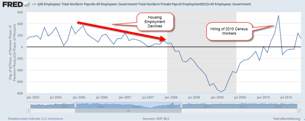
The chart ends in 2007, just before the recession and financial crisis. Let’s now turn to that period. During the early part of 2008, the ratio began to climb to 1, indicating that people and businesses were preferring liquidity over debt. During the first six months of 2008, 700,000 jobs had been lost but this was only 1/2% of the workforce. Almost 300,000 of those lost jobs were in construction, which had become overheated by the building of so many homes. Retail sales growth had gone flat but was probably just a pause in the normal course of the business and credit cycle. Not to worry.

Then a funny thing happened to the economic engine of the country, something that had never happened before in post-WW2 America. The ratio spiked upward, registering nosebleed readings.

M2DebtCLIRatio2006-2008

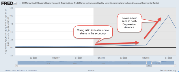
The preference for present money continued upward but the change in debt, the bottom number in the ratio, plunged downward and this drove the ratio higher. The Federal Reserve began buying some of this debt until it held about $2 trillion.

Debt2008-2010

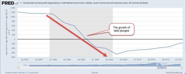
As the change in debt turned negative, the ratio turned negative, a post Depression first. Month after month, old debts soured.  People and businesses shunned new debt. People who were saving more of today’s money were being offset by those who had to tap their savings accounts to make up for lost income. Toward the end of 2008, the economy lost as many jobs each month as it lost in total for the first six months of 2008. Retail sales dropped a few percent each month.

M2DebtCLIRatio2008-2011

Like a car whose brakes have failed, the ratio continued its downward slide. In a program called Quantitative Easing (QE_, the Federal Reserve began buying more debt in an effort to get this ratio into the positive zone.

By the middle of 2012, the ratio broke into the positive zone as debt stopped contracting. The preference for liquidity was strikingly high, going up above 8, more than three times higher than the 2.5 level of the 1980s recession.

M2DebtCLIRatio2012-2014

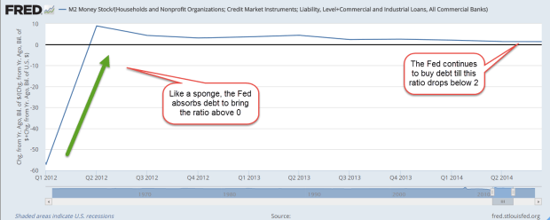
The Federal Reserve continued to buy debt as the economy staggered to its feet.  In 2013, the stock market finally surpassed its inflation adjusted value at the start of the recession.  In the early part of 2014, the ratio of liquidity to debt, of present money to future money, finally fell below 2. At mid-2014, the Fed had accumulated $4.5 trillion in debt, $3.7 trillion of which had been added during the financial crisis. After 6-1/2 years, the number of people employed finally rose above its pre-recession level.  The Fed ended its debt buying program.

So where do we stand today? The stock market and house prices continue to make new highs but the current reading of this ratio show that people continue to prefer today’s money over tomorrow’s money.

M2DebtCLIRatio2014-2017

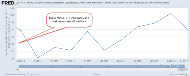
In short, the economy is still healing. During the expanding economy of the 1960s, the ratio was a bit over 1 for half the decade.  People who had grown up during the Depression were understandably a bit cautious. However, both present and future money grew at a steady rate during the 1960s. Today’s households and businesses have been scarred by the financial crisis and are cautious.  Into this cautious confidence, the Fed has a lot of debt to unload.  It must maintain a balance between money preferences as it feeds the debt it bought during the crisis back into the economy.

Reading the Signs

July 23, 2017

This week I begin with market volatility, or VIX, an index that reflects the price range of short term options on the SP500 index. As I wrote last week, the market has been on a wonderful ride down the river. The waters are strong but calm. No nasty rocks that might upset my raft. As Alfred E. Neuman of Mad Magazine asked, “What, me worry?”

How low can volatility go? The VIX is below 10, a level not seen since a brief moment in November 1993. The market makes new highs while volatility makes historic lows. Some warn of impending doom as though the market were the Titanic. Others predict Dow 30,000.

I’ll look at a 20 year period of both the VIX and the SP500 index, from 1990 to 2010. (If you are reading this on a cell phone, the few charts below will be more easily viewed by turning the phone sideways.) The period is marked by 3 strong price trends: 1) the extraordinary price rise in the late 1990s during the dot-com boom; 2) the 50% fall in prices from 2000 – 2003 as the bubble punctured and investment declined; and 3) the recession and financial crisis that began in 2008.

According to models, volatility should move inversely to stocks.  When one zigs, the other zags. By inverting a chart of volatility, I should see a volatility pattern that is somewhat similar to the pattern of SP500 index prices. I’ve added a chart of correlation between the two. I should expect to see a correlation of greater than 50 if things go according to the model.

For most of the twenty years, I do see what we expect. It’s those periods of unusual moves in the SP500 that the relationship breaks down. There is no consistency when the correlation breaks the model.

SPYVIXCorrelation
The green circle highlights the run up in prices of the dot-com boom. If I were to try to form a rule based solely on this mid-1990s behavior, I might say that when the VIX doesn’t behave inversely to prices, I should anticipate a run up in prices.

I’ll now take a look at the financial crisis years 2007 – 2009, the second red circle above. Just as in the late 1990s, the correlation veered away from expectations but this time prices moved in the opposite direction, falling 50%.  So much for my rule making.

The behavior is more complicated still when I look at the correlation pattern in the early 2000s.  The correlation wandered away from what I expected but never fell into the negative, yet prices also fell 50%.

Short-term options on the direction of the SP500 may offer no consistent clues to the long-term casual investor. But then again….maybe I should go long – averages, that is.

Below is a chart of SPY, a popular ETF that mimics the SP500.  Visual presentations can help me digest a lot of information and relationships. I have divided SPY by the VIX to get a ratio. If the top part of the fraction is supposed to go up when the bottom part of the fraction goes down, the resulting ratio should emphasize any price moves. Here I see a bit more predictability if I concentrate on the 12 and 24 month averages and disregard the noise. There is a lot of noise.

SPY-VIX1995-2017

The 12 month average (blue) runs higher than the 24 month average (green) in upturns and lower during downturns. The transitions may not always be as evident until I turn to the noise. When the current ratio runs below the 12 month average for several months, a downturn is likely. The opposite is true for an upturn. Here’s a chart with these turning points highlighted.

SPY-VIXTurnPoints

Some readers may occasionally want to check this pattern on their own. Without an account at stockcharts.com, someone can still call up weekly charts for free. Type in SPY:$VIX and call up the default daily chart. Above the chart, select the weekly button, then click the Update button to the right. Below the graph, change the default 200 day average to 100 and click Update. You should get a chart similar to the one below.

SPY-VIXWeeklyTurnPts

I have highlighted the turning points. Notice that there is a fairly consistent pattern. For the not so casual investors, you can bring up a daily chart and see similar turning points.

We have not had a 5% price correction in stocks for the past year. Here’s a chart showing twenty years of average performance during the year. We should not be surprised if we see a correction in the next few months but this market continues to befuddle even the most experienced investors.

Across the plains of Africa, the annual migration of wildebeest has crossed into Kenya. To tourists riding in jeeps through the grasslands, the movements of these animals may seem quite random and fragmented.  Tourists riding in hot air balloons above the plains can see the relationship between geography and the animals.  They can see the patterns of movement as the wildebeest follow the valleys and cross the rivers through the grasslands.  Likewise, a few charts of price and volatility can help us visually understand some part of investor behavior.

River Rafting

July 15, 2017

After a good year of snowfall in the Rockies, the rivers run strong. A popular spot for rafting is the Colorado River as it runs through the dramatic scenery of the Glenwood Canyon in western Colorado. Investing is a lot like rafting. We can’t control the amount of snowfall, the change in elevation, where the rocks are or the streams that feed into the river.

Our individual and group behavior on the river can help or hinder our progress. In a good year, rafting companies charge more for a rafting adventure. As more people come onto the river, we must pause in quiet water at the river’s side to give a safe distance between rafts. This crowding effect is made worse by stretches of river that require more caution to navigate. We can steer right or left to avoid some rocks but we are largely at the mercy of the river and each other.

Since the budget crisis in the late summer of 2011, the stock market has enjoyed a fairly strong run, more than doubling since that time. The financial crisis nine years ago was like a winter of extraordinarily deep snowfall. The Fed has kept interest rates abnormally low to thaw that snow, and equity investors have had a wonderful ride.

The Federal Reserve has committed to a series of gradual rate increases. Despite the low rates, people continue to pour their extra money into savings accounts and CDs. Wells Fargo is paying almost 1% below the Fed discount rate on their savings accounts. Why? As long as their customers are willing to accept savings rates of .3%, Wells Fargo has no incentive to raise rates. Discover, Goldman Sachs, American Express, Ally and Synchrony are paying about 1.15%, the Fed rate. (Bankrate) Savings account balances are near $9 trillion, more than double the balances in late 2007 before the recession began. The fear lingers.  Many people stand on the shore, too cautious to ride the river’s tumble and flow.

Until 2015, retail sector stocks (XRT) have been on a fast raft, quintupling from the market lows of March 2009. Over the past two years they have drifted into a side pool, losing about 20%. This year the stocks have been quite volatile as investors gamble on the future of the retail industry. Will Amazon continue to take sales from traditional brick and mortar stores?

June’s retail sales (RSXFS) were disappointing. Year over year growth was 3%, less than the 5 year average of 3.3%, and far below the near 5% growth of the 1st quarter. Excluding auto sales and auto parts (RSFSXMV), annual growth was only 2.4%, a 1/2% below the five year average and half of the 1st quarter rate.

The Trump administration and the Republican Congress have aimed for 3% real – inflation adjusted, that is – GDP growth. In an economy that depends so heavily on consumer sentiment, slowing retail sales will make that growth goal difficult to achieve.

For now, the sun is shining, the river is running strong and I am enjoying myself.  As long as I don’t look around the next bend in the river, everything looks fine!


Package Me

July 9, 2017

Two weeks ago I looked at a long term trend of consolidation and concentration. Technology companies now dominate the top spots in the SP500, the number of retail outlets is shrinking, the number of banks is dwindling, and the population itself is concentrating in urban areas. This week, I’ll look at a companion trend – categorization.

The essential business model of some leading technology companies is the selling of advertising to us and the selling of us – our interests and choices – to other companies. We are the consumers and the products. We are the components of the business models of companies like Facebook (FB) and Google.

A business model is a plan to provide and capture value. FB and Google provide value by connecting us to each other and to a vast trove of information, most of which we ourselves provide. FB and Google capture value by selling us. To sell us, the unique composite of all of our choices must be packaged into algorithmic categories.

We consume information and we are information. We are part of the network of information. When I travel, Google Maps tells me where I am and how to get where I want to go. Where is a grocery or sporting goods store along the way? Google knows. Within hours, Google has sold that information to companies who offer me deals on hotels and restaurants. I am part of the network.

Listen to a forty year old song from Pink Floyd, Welcome to the Machine. It is a cynical vision of being absorbed into the dream machine of the entertainment industry. This is a brave new world of information – and maybe some disinformation and some anger and scams and sexploitation but I want to focus on the positive.

As I drive to work or the store, I give a wave to the mobile purchasing unit in the car next to me. Hi, neighbor! I don’t mind that my entertainment, dining and transportation choices are for sale. I do mind that my political and religious beliefs are packaged and sold like commodities. That is the price that I pay for being in the information club.

Talking about travel….annualized sales of autos and light trucks has fallen below 17 million for several months now. On a per capita basis, sales never reached the levels of past economic recoveries. We are buying about 5 cars for each 100 people, and that is less than the 5.8 cars we have bought in previous periods of economic strength. The auto industry would have to sell almost 19 million cars and light trucks each year to meet those per capita levels.

AutoSalesPerPop

I heard someone remark that cars are becoming like appliances. As I drive down the highway, I see that there are only a few body styles. Engineers have gradually perfected those designs that minimize wind resistance in order to increase gas mileage enough to meet EPA requirements. I drove next to a Ford Fairlane 500, a boat of a car from the era when car designers and advertising guys – always guys – teamed up and let their creative juices flow. Those were the days when a car was a signature. Now I drive down the highway in a category of vehicle. Hey, ma, look at me!

In order to sell me stuff, Google and FB need my attention. Unfortunately, I must devote a lot of my attention to driving. As a mobile purchasing unit, this is an unproductive use of my attention. A self-driving car will be the final step in the appliancification of the automobile. “Google, when will I arrive at work?” “In approximately 8 minutes.” Beam me up, Scotty.

Over a million people in the U.S. die in automobile accidents each year, and approximately 10% of the entire population are injured in a year. The major car companies have committed to having a driverless car by 2020 or soon after. The cost to add driverless capabilities is only a few thousand dollars. Some research companies are predicting (Motley Fool article) a gradual transition to driverless cars with 10% being fully autonomous in 15 years.

I think that the changeover will happen more quickly because Google and FB need my attention. Thousands of vendors want the dollars in my pocket to join the network. For the next 10 minutes only I can get a deal on a fresh pastry and a coffee at the Starbucks just down the street. Say or press “Yes” to accept this deal and my car will drive itself into the Starbucks’ drive-up lane.  Would I like to order ahead?  The car can do that for me. Well, sure.  Hey, I like this new world.

I wrote about consolidation and concentration a few weeks ago. Soon to come will be an integration to package us as mobile purchasing units. A big technology company could partner with or absorb a finance company to help me buy a driverless car in order to market to me. Google could subsidize a better interest rate on my auto loan or lease as a cost of packaging my choices to other vendors. I hear the sound of dollar bills stirring in my pocket. They want to be part of the network as well.

Next week, the stream and the pool…

Healthcare Quicksand

July 2, 2017

Last week I looked at the ten year anniversary of the iPhone. This week I’ll take a brief holiday look at a five year anniversary.

In June 2012 the Supreme Court ruled on the constitutionality of Obamacare. As expected, the vote was a close 5-4 decision. Many Republicans expected the five conservative justices to overturn the ACA on the grounds that the Federal government could not force people to buy insurance. John Roberts, the head justice on the court, sided with fellow conservative justices on this position at first, but the arguments of the liberal justices convinced Roberts that, regardless of the language in the ACA, the penalty for not having health insurance was a tax no matter what it was called. Roberts’ vote was the deciding vote in upholding the constitutionality of the act.

This interpretation was not without precedent. In 1937, the cout ruled that the Federal government could force people to pay Social Security insurance premiums. The reasoning was the same. Payments could be called an insurance premium or a penalty or an incentive. No matter the language that legislators used, the payments were a tax and well within the rights of the Federal government.

In 2012, Republicans released a position paper on healthcare legislation. The key features were: Affordable and accessible, no refusal of insurance based on pre-existing conditions, and allow people to keep the plan they have. Five years later, Republicans hold the Presidency, House and Senate, and are discovering the difficulties of implementing those simply stated principles.

Health care is almost 20% of the nation’s economy. There are many stakeholders. They are vocal and well funded. Because Republicans do not have a 60 vote majority in the Senate, the legislation must conform to budget rules that will permit a simple majority vote. In 2009, the Democrats had a 60 seat majority when they began the process of crafting the ACA and found that they had to make a lot of compromises. When Massachusetts Senator Ted Kennedy died in August 2009 and Republican Scott Brown won the special election to replace Kennedy, the Democrats lost their filibuster proof majority and had to make more compromises to get the ACA passed.

For seven years Republicans in both the Senate and House have run quite successfully on repealing Obamacare. Strong and principled opposition to the ACA has become less fervent.  Senators must appeal to a broader constituency than House members.  Some were reluctant to vote for legislation that could jeopardize the availability of health care for vulnerable seniors, children and low income families.

Senate Majority Leader Mitch McConnell had set a deadline for a Senate vote before legislators went to their home districts for the July 4th holiday but could not assemble the votes needed to pass the legislation. McConnell is still committed to the joint task of repeal and replace. He has rejected calls from some in his party to pass a repeal bill now and continue to work on replacement legislation.

There remain more legislative hurdles in the next few months but the most pressing is the raising of the debt limit.  The Treasury is already doing a few accounting tricks to pay bills but has notified Congress that even those tricks will no longer suffice by October.  For now, the market continues to shrug.

Last week I finished up with a teaser and I hope to have that fully developed by next week. For now, Happy Independence Day!

A Decade Of Change

June 25. 2017

This week I will review a decade of change to help illustrate a fundamental fact about investing:  most of us are clueless about the future because we are bound by comfortable habits of thinking.

Ten years ago this month, June 2007, Apple launched the iPhone. The touch screen was innovative but I found the keyboard had a lack of responsiveness. The ability to use the internet was cool but the connection was slow. There was no camera built into the phone. Cameras took pictures, not phones.  Apple did not introduce the App Store till July 2008 so users got whatever Apple thought they needed. Apple controlled both the hardware and software. People stood in line when the first phone was released because Apple people are a little bit nuts. The phone was suitable for geeks who had money to burn.  Or so it seemed.

Phones were tools, not toys. People who used their phones for work used a Blackberry, a phone with a keyboard that kicked butt over the iPhone and had a great email interface to boot. The low cost workhorse phones were Nokia models. They stood up to daily wear and tear and the little screen was adequate for reading text messages.

The previous year, a relatively new company called Facebook notched 12 million monthly users (Guardian) and their user count was growing fast. Facebook was a social networking site for people who had time on their hands and the desire to connect with their friends. A passing fancy for the kids, no doubt, just like rock and roll was to an earlier generation of parents.  Or so it seemed.

That same year, the internet search company Google developed a beta version of a phone operating system (OS) that could compete with Apple’s iOS.  In the fall of 2008, a year later, Google released version 1 of the OS.  It was built with an open source code that Google called Android. That same month, the wheels came off the global economy. As millions of people lost their jobs, they worried more about paying their bills than a phone operating system.  By November 2008, both Google and Apple had lost half of the value they had in the summer.  Blackberry lost 2/3rds of its value.

In June 2009, two years after the launch of the iPhone, the electronics division of the conglomerate Samsung introduced the Galaxy smartphone.  The phone used the new Android OS and, to compete with Apple’s App Store, hundreds of apps were available for the phone.

Clickety-click as we turn the time dial to the present.  At $10, Blackberry’s stock sells for 7% of its price in June 2008.  Hillary Clinton likes her Blackberry but too many people switched. Until the fourth quarter of 2016, Samsung sold more phones than Apple, but Apple makes more profit on their phones and is the largest company by market capitalization.   Since the iPhone launch Apple’s stock price has soared 900%. Together the two companies account for almost half of all smartphones. They have become wearable computers and cameras and music players and podcast devices.

The iPod was the marriage of a CD player and a portable radio – a consolidation of two functions. Following its introduction in 2001, the iPod became the dominant music player.  Umpteen million songs were available on the device through the iTunes store.  In April 2007, Apple announced that they had sold 100 million iPods in 5-1/2 years, and by the end of 2014, that figure stood at 390 million.  But smartphone users were now using their phones to play music.  In 2014, sales of the iPod fell by half to 15 million. In 2015, Apple stopped reporting the number of iPods sold.  Consolidation had been the key to the iPods success and its demise.

The iPhone and the various Android models of smartphones have depended on increasing network availability and quality – “can you hear me now?” – and the thousands, or millions, of apps available for the phones. I can read email on my phone as well as my newspaper, a book or magazine. Students can read their textbooks on their phones. In addition to music, I can listen to podcasts or radio stations from far away.

The sophistication and accuracy of Google maps is science fiction made fact. I was recently in the middle of beautiful Idaho. The topographic map published a few years ago indicated that a particular county road was improved but unpaved. Google maps marked the road as paved for about ten miles. Google was right. Portions of Nevada that were blurred a few years ago on Google maps now show roads that lead to where? Maybe some alien city in the middle of the desert.

As I mentioned last week, the top 5 companies in the SP500 are tech companies. Ten years ago, the top 5 were Wal-Mart, Exxon, GM, Chevron and ConocoPhillips (Fortune), a mix of retail, automotive and oil sectors. Now there is only one sector at the top: technology. As a rule, concentration is not a good thing.

Let’s turn from tech to banks.  Since 2007, America has lost a third of its banks, a continuation of a trend that began after the Savings and Loan crisis in the late 1980s. The number of commercial banks in the U.S. is about a third of what it was in 1990. New York has lost half of its banks in that time. California has lost about 60% of its banks. You can check your state at the Federal Reserve Database  and search for [postal abbreviation for state]NUM. As an example, Colorado is CONUM. New York is NYNUM. California is CANUM. The U.S. figures I mentioned earlier come from the series USNUM.

Consolidation is spreading throughout the economy. In the last 12 months, more retail stores closed than during 2008, the year of the financial crisis. The stocks of the retail sector (XRT) have fallen 20% from their highs.

Adding to the pressure on brick and mortar retail stores, Amazon recently announced that they were buying Whole Foods. Amazon’s sales have grown by more than 1000% since 2007, and America’s stores have felt the pain.

The consolidation in the retail space has been going on since the 2001 recession and the demise of the dot-com boom. The population has grown 14% since then but the number of employees in retail has grown less than 3%. Inflation adjusted sales per employee have grown by 61% in the past 16 years but the inflation adjusted wages of retail workers have declined 1%.

We ourselves are concentrating. For the first time in the nation’s history, more people live in urban areas than rural areas. That concentration has pushed home prices up in the larger metropolitan areas. The S&P/Case-Shiller 20 city home price index has doubled since 2000, easily outpacing the 45% gain in prices, averaging 2% better than inflation.
Smaller cities and rural areas have not done as well. Below is a 40 year chart of inflation adjusted residential prices for all of the U.S. The average yearly gain is 1.7% above the inflation rate, slightly below the 20 city gains of the past 16 years. But the ten year average tells a story of crisis, erratic recovery and migration. The 20 city price index has lost only 1/4% per year since the highs of 2007. The country as a whole has lost 2% per year.

ResPricePctGain

(Sources: National sources, BIS Residential Property Price database)

Where will this consolidation lead?
Less competition
Less responsiveness to customer needs
More political power to create a regulatory environment which guards against competition.

//////////////////////////////

Performance

Mutual funds and ETFs usually specify their historical performance for several time frames, i.e. 1 year, 3 year, 5 year, 10 year, Lifetime. Four years ago, I noted the diffiiculties of getting a reasonable appraisal of performance if the comparison period begins with a trough in price and ends near a peak.

It is best to disregard the five year performance of many large cap stock funds this year because they include the 13% gain of 2012 and the 33% gain of 2013. A more honest appraisal is the ten year performance. Comparisons start in 2007, near the highs of the market before the start of the 2007-2009 recession and the financial crisis.

Vanguard’s SP500 index fund VFINX reports a ten year average annual return of 7.39%.  Their blended corporate bond fund VBMFX has an annual return of 4.12% over the past ten years.  If I had nothing but these two funds in my portfolio since 2007, my portfolio of 60% stocks, 40% bonds would have gained about 6.1%.  With a conservative allocation of 40% stocks, 60% bonds the annual return was about 5.5%.  The .6% percent difference in returns is slight but it adds up over ten years.  In the first case, a $100,000 portfolio would have grown to $181,000.  In the second case, about $171,000.

Let’s compare those returns to two actively managed blended funds that Vanguard offers.  VWINX is a balanced fund oriented toward income.  The mix is about 40% stocks, 60% bonds and it has earned 6.7% per year over the past ten years.  The Wellington fund VWELX has a mix of 65% stocks, 35% bonds and cash and earned 7.13% each year since 2007.  Both funds have fees that are slightly higher than Vanguard’s index funds but are relatively low at .22% and .25%.  Depending on allocation preference, either fund could serve as a core “gone fishing” fund.  You can use these as a basis for comparison with products that your fund company offers.

Next week I’ll put my ear to the ground and listen for….

High Optimism

June 18, 2017

Last week I looked at two simple rules: 1) don’t bet on which chicken will lay the most eggs, and 2) don’t put all your eggs in one basket. This week I will look at index averages and I promise I won’t mention chickens.  Lastly, I will look at a metric that disturbs me.

When I first started investing in Vanguard’s SP500 index mutual fund VFINX, I thought I was buying the average performance of the top 500 companies in America. Like many index funds, VFINX is weighted by market capitalization. With this methodology, a relatively small number of companies have more influence on the movement in the index than their numbers might warrant.

Let’s turn to Vanguard’s breakdown of the top ten stocks in their VFINX fund. These ten stocks are household names, including Apple, Microsoft, Google (Alphabet), Amazon, and Facebook. These five tech stocks are 1% of the 500 companies in the index but make up 13% of the fund. The ten companies make up 20% of the fund.

For investors who want to cast a wider net, there is an alternative: equal weighted funds. Guggenheim’s RSP is an equal weighted ETF first offered in 2003. Using Portfolio Visualizer, I started off in 2004 with $100,000 and invested $500 a month. Despite the higher expense ratio, RSP had a better return, besting a conventional market cap index by 1% annually.

VFINXVsRSP

Why does RSP outperform VFINX?  Funds that mimic the SP500 are heavily weighted to large cap stocks. Equal weight funds have a greater percentage of mid-cap companies which may outperform large caps in a particular decade but that outperformance may come at a price: volatility.

Standard deviation is a statistical measure of the zig and zag of a data series, like measuring how much a drunk veers as he stumbles along his chosen path. The standard deviation (Stdev column above) of RSP is slightly higher than VFINX, and the maximum drawdown of RSP is almost 5% higher during the 2008-2009 financial crisis.  The Sharpe ratio is a measure of risk adjusted return, and the higher the better. As we can see in the Sharpe column, the two strategies are within a few decimal points.  In the past 13 years, an equal weighted strategy produced higher returns with only a slightly higher risk.

If I want to mimic some of the diversity of an equal weight index, I can spread out my investment dollars among large-cap, mid-cap and small-cap funds. As SP500 index products, neither RSP or VFINX includes small cap stocks, but let’s add a small percentage into our mix.

Into my comparison of strategies, I’ve added a portfolio with a 40% allocation to VFINX, 40% to VIMSX, a mid-cap Vanguard index fund, and 20% to VISVX, a Vanguard-small cap value index fund. The performance is almost as good as the equal weight RSP and the Sharpe ratio, or risk adjusted return, is similar.

VFINXVsRSPVsMix

In 2011, Vanguard published an analysis (PDF) of various approaches to indexing that may be of interest to those who want to dive into the topic.

//////////////////////

Household Net Worth

Let’s turn from indexing strategies to stock market valuation. We base our expectations of the future on the recent past. Those expectations are the primary driver of valuation. If we expected an affordable self-driving car in the next few years, the current value of today’s cars would be lower.

I have written before about a store of value compared to a flow of value. Savings are a store of value. Income is a flow. The historical ratio of wealth (store) to income (flow) reveals a trend that should give us caution.  The Federal Reserve charts estimates of  both household wealth and disposable income. The current ratio of wealth to income is now higher than the peaks in 2006 and 2000 when the real estate and dot-com booms inflated wealth valuations.

HouseholdNetWorthPctIncome

The current ratio is far above the 70 year average but a moving ten year average of the ratio may better reflect trends in investment allocation over the past few decades. Using this metric, today’s ratio is still very high. Rarely does the wealth-income ratio vary by more than 10% from its 10 year average.

When the wealth-income ratio dips as low as 90% of its ten year average, extreme pessimism reigns, as in the early 1970s.  A ratio that is 10% more than the ten year average indicates extreme optimism as in the late 1990s, mid-2000s and now. Today’s ratio is 13% above its ten year average.

In early 2000, the ratio was 16% above its ten year average when the enthusiasm of dot-com expectations began to deflate and the price of the SP500 fell from its lofty heights. The ratio reached 14% above its ten year average in 2005 and remained above 10% till mid-2007 when the first cracks in the housing crisis began to surface and the SP500 said goodbye to its peak.

A picture is worth a 1000 words so here’s a chart of the Household Wealth to Income ratio divided by its ten year average. I have highlighted the periods of extreme pessimism and optimism.

HouseholdWealthRatio10Year

If history is any guide, the ratio of wealth to income can stay elevated for a few years. The “haves” keep trading with each other in a game of muscial chairs until people begin to leave the game and move their dollars into other assets, other markets, or bonds and cash. Unfortunately, many slow moving casual investors are left in the game with deteriorated portfolio values.

Economist Robert Shiller, author of Irrational Exuberance and developer of the long term CAPE ratio, recommended a strategy of shifting allocation in response to periods of exuberance and pessimism.  When valuations were historically low or average, an investor might allocate 60% or more of their portfolio to stocks.  As valuations became overextended, an investor might shift their stock allocation to 40%.  The investor is not trying to predict the future. The portfolio remains balanced but the stock and bond weights within the portfolio changes.

Using this wealth-income ratio as a guide, the casual investor might gradually implement an allocation shift toward safety in the coming year.

The Price of Mispricing

June 11, 2017

In an April 2016 Gallup poll  52% of Americans said that they had some stocks in their portfolio. In this annual survey, the two decade high occurred in 2007 when 65% of those surveyed said stocks were a part of their savings. Asked what they thought was the safest long term investment, surveyed respondents answered: stocks/mutual funds. The stock market hit a high in the fall that year.

Turn the dial to April 2008. The market had declined 10% from its October 2007 high but there was still five months to go till the onset of the financial crisis in September. Americans surveyed by Gallup said that savings and CDs were the safest (Poll ). At that time, a 5 year CD was paying 3.7% according to Bankrate . What happened to turn sentiment from rather risky stocks to safe cash and CDs? The decline in the SP500 might have been responsible. A more likely cause was the recent headlines concerning the failure of the investment firm Bear Stearns. The Fed provided a temporary bailout, then arranged a sale of the firm to JPMorgan Chase.

When real estate prices were rising in the early 2000s, people thought real estate was the safest long term investment. Each of us should ask ourselves an honest question. Do I treat relatively short term shifts in asset pricing as though they were long term trends?

Here’s another thought. Do we mentally treat changes in asset pricing as though it were cash income? If I see that the value of my stock portfolio has gone up $10,000 since my last quarterly statement, do I think of that as kind of a dividend reward for my willingness to take a bit of a risk? The statement confirms that I’m a prudent investor. Do I mentally “pocket”  that $10,000 as though someone had sent me a check?

On the other hand, if my statement shows a decrease in value, I have not only lost money but now I may question my prudence. Am I taking too much risk? I might even think that “the market” is wrong. Can I trust a market that could be wrong? What if there’s another financial crisis? Should I sell my stocks and put the money in CDs? A 5 year CD is only paying a little bit above 2% but at least I won’t lose any money.

Let’s crawl out of our heads and into the pages of history. In the early 1950s, two people published ideas that have come to dominate the investment industry.

In 1951, John Bogle wrote his Princeton college thesis “The Economic Role of the Investment Company.” The paper was an in-depth analysis of mutual funds, a product that was less than 30 years old. (Excerpts). At that time, only 8% of individual investors owned stocks.

Two decades later, Mr. Bogle would go on to found Vanguard, the giant of index mutual funds.  Contrary to the founding principle of Vanguard, Bogle’s 1951 paper did not champion indexing.  In Chapter 1, he objected to the portrayal of a mutual fund as settling for the average returns of an index of stocks.  Bogle touted the active management that a mutual fund provided to an investor.  In a quarter century after he wrote the paper, Mr. Bogle’s conviction in the superiority of active management shifted toward passive indexing. Indexing is the averaging of the decisions of all the buyers and sellers in a particular marketplace.

When Bogle wrote his paper, two types of funds competed for an investor’s attention. The earliest funds were closed end (CEF) and date back to the middle of the 19th century. The Adams Diversified Equity Fund was founded in 1854 and continues to trade today under the symbol ADX. After the initial offering a CEF is closed to new investors. The shares continue to trade on the market like a company stock but investors can no longer buy or redeem shares with the company that manages the fund.

A mutual fund is an open end product, meaning that the fund is open to new investors and investors can redeem their shares at any time. The early mutual funds touted this feature but it was not statutory until the enactment of the Investment Act of 1940.

When Bogle wrote his thesis, the market was still in what is called a secular bear market. The beginning of this period was marked by the brutal crash of 1929 and would not end till 1953, when the price of the SP500 finally rose above the highs set in 1929. The 1920s had been a decade of rapid growth in the new radio industry and manufacturing. The automobile and stock markets were fueled by easy credit. In response to this short era of explosive growth, investors elevated their long term expectations. From 1926 to 1929 the stock market doubled in price, a rapid mispricing that finally corrected in the October crash of 1929.

In 1951, Bogle summarized the previous two decades:
“The depression and the great capital losses to investors which resulted from it caused a greater desire for safety of principal, but gradually confidence in stocks (and especially in a diversified group of them) returned, and during the same period bond rates fell. The combination of high income and safe principal thus shifted in favor of the common stock element. In spite of the fact that many funds urge that part of the investor’s capital should be devoted to bonds, after he has cash reserves and insurance needs filled, it seems doubtful that this advice has been widely followed. “[my emphasis]

In his analysis, Bogle identified several metrics that gave open-end mutual funds superiority over closed-end funds: prudent management to keep the fund attractive to new investors, diversification, liquidity, and income.

Bogle concluded his thesis with a caution that is timeless: “That the market will fluctuate is certain, and merely because it has experienced a general upward trend in the decade of the investment company’s greatest growth may have made many investors fail to realize that the share value, like the market, is liable to decline.”

He looked toward the future of mutual funds, and expressed what would become the business plan of Vanguard: “perhaps [the mutual fund industry’s] future growth can be maximized by concentration on a reduction of sales loads and management fees.”

In the past 15 years, only 15% of active large cap managers have beat the returns of the SP500 index.  The performance is even weaker for small cap stock managers.  Only 11% beat their index.  Individual investors have withdrawn money from actively managed funds and put that money to work in their passive counterparts.  As more money flows to index funds, the danger is that those funds will be averaging the decisions of a smaller pool of active managers. That objection is raised by advocates for active management but it seems unlikely that the pool of active managers will diminish to the point that a few remaining managers will essentially control the direction of the market.  Although recent flows of money have favored passive indexing, actively managed mutual funds and ETFs still control two-thirds of all assets (Morningstar).

In the following year, Harry Markowitz, a graduate student at the University of Chicago, wrote a paper titled “Portfolio Selection” which proposed a systemic approach to diversification called Modern Portfolio Theory. Bogle had noted the prudent rule of thumb that an investor should devote some capital to bonds as well as stocks to stabilize a portfolio. Markowitz mathematized this rule of thumb. The key to portfolio stability was a strategy of asset selection that minimized risk in the face of uncertainty. Any two assets, not just stocks and bonds, that were normally non-correlated would provide stability. When one asset zigged in value, the other asset zagged. Both assets could be risky but if one asset responded opposite the other, then the net effect of owning both assets was to lower the risk.

The key word in any talk of historical correlation is “normal.” There is no theory which can explain investor trauma, a total lack of confidence in most assets. In October 2008, every asset but one fell. Both stocks and gold fell 16%, commodities sank 25% and REITs fell a whopping 32%. Even bonds, a safe haven in times of uncertainty, fell 3%. In a world where every asset class was losing value, investors bought short term Treasuries, which rose 1%, but avoided long term Treasuries, which declined 2%. There was no safety to be found outside of the U.S. Emerging markets fell 26%, European stocks sank 23% and international real estate nose dived 32%.

But the correlation in normally non-correlated assets could not last. During the following two months, bonds rose 9%, and gold shot up 20%. Stable or defensive stocks like health care continued to lose value but at a slower pace. Some investors stepped in to pick up quality stocks at bargain prices. The stock market continued to stagger to a bottom until the passage of the American Recovery and Reinvestment Act in February 2009, soon after the inauguration of Barack Obama.

50% market repricings are relatively infrequent. That we experienced two such events in less than a decade in the 2000s caused millions of investors to abandon risky assets entirely. The SP500 index did not recover the ground lost till January 2013, more than five years after the high set in October 2007. The recovery after the dot-com bubble burst in 2000 lasted a similar time, 5-1/2 years.

When was the last time we had back to back severe downturns? We need to turn the dial back to the fall of 1968 when the market began a 1-1/2 year decline of 33%. After a few years of recovery, stocks fell again. Provoked by the Arab-Israeli war, the oil embargo and high inflation, the market began a repricing in 1973. The recovery lasted almost seven years.

In 1975, Bogle founded Vanguard, what some called “Bogle’s Folly.”  Four years later, the SP500 was barely above its high in 1968. Investors had so little confidence in stocks as a long term investment that, in August 1979, Business Week declared that stocks were dead. Since that declaration, the price of the SP500 has gained about 8-1/2% annually.  Add in 2 – 3% in dividends and the total return exceeds 10% annually.

Bogle and Markowitz have had a profound influence on the investment industry by developing two deceptively simple ideas for investors who can’t know the future.  Bogle’s thought: don’t bet on which chicken can lay the most eggs.  The complimentary idea from Markowitz: don’t put all your eggs in one basket.

Next week – what’s so special about market averages?  They’re not your average average.

The Unemployment Delinquency Cycle

June 4, 2017

I’m scratching my head. No, it’s not dandruff. The BLS released their estimate of job gains in May and it was 100,000 less than the ADP estimate of private payroll growth. We’d all like to see these two monthly estimates track each other closely, which they tend to do. In an economy with 146 million workers, a 100,000 jobs is only 7/100ths of a percent, but this discrepancy comes just two months after a HYUUUGE spread of 200,000 job gains in the March estimates.

A simple solution to multiple surveys? I average them. The result is 191,000 job gains in May, close to that healthy growth threshold of 200,000. In the chart below I’ve shown the average of the two estimates for the past five years and highlighted the downward trend of the peaks. Reasons include a decline in oil and gas industry jobs, and a natural feature of a mature recovery.

PayemsADPAvg

We saw the same pattern of declining job gains from the early part of 2006 through late 2007 before the average dipped below zero. Boosted by a hot housing market in the early part of the decade, construction employment began to cool in 2006.

PayemsADPAvg2002-2010

Some areas of the country are particularly hot. Denver’s 2.1% unemployment rate is absurdly low as is the state’s rate of 2.3%. Both are at historic lows, less than the go-go years of the dot-com boom. Colorado’s rate is the lowest among the 50 states (BLS). While income inequality has been rising in other hot metro areas like San Francisco, it has fallen in the Denver metro area.

There is a downside to strong growth. Back in “ye olden days,” like the 1970s and 1980s, I was introduced to a rule of thumb. It stuck with me because it seemed too simple. Here’s the rule: whenever the unemployment rate gets below 5% in an area, the price of some key component of  the economy is rising much faster than its long term average.   Lower unemployment leads to a mispricing of some asset.

Let’s turn to the other component of this credit cycle: loan delinquency.  The institutions who loan money expect that a certain percentage of borrowers will default. Lenders include the cost of those defaults when they calculate interest rates and loan service fees. The non-defaulting borrowers pay for the defaulters. During recessions, the delinquency rate on consumer loans usually rises above 4%. When unemployment is low and growth is strong, the delinquency rate goes below 3%.  Lower delinquency leads to a mispricing of credit risk.

Let’s review these two mispricings. The price of an asset is a price on some future flow of use or income that will come from the asset.  The interest rate on a loan is the price of money and the price of risk.  Let’s put these two mispricing together and we have another rule of thumb: as the difference, or spread, between the unemployment rate and the delinquency rate on consumer loans gets closer to zero, the more likely that the economy is overheating. A rising spread indicates a coming recession because unemployment responds faster than the delinquency rate to economic decline and increases at a faster rate. The spread changes direction and grows.

UnemployDelinquencySpread

Here’s the process. As the unemployment rate decreases, lending terms and loan criteria become more favorable. When we buy stuff on credit, we commit a portion of our future income stream to a creditor. When an economy begins to decline and unemployment increases, some income streams become a trickle or stop altogether. A loan payment is missed, then another, and those in more fragile economic circumstances default on their loans.

As the delinquency rate rises, lending policies begin to tighten again, making it more difficult to qualify for loans. Many businesses depend on the flow of credit, so this tightening causes a decline in sales, which causes businesses to lay off a few more people, which further increases both the unemployment rate and the delinquency rate. This reinforces the downward trend.

The NBER is the official arbiter of the beginning and end of recessions but often doesn’t set these dates until several years later.  This change in the direction of the spread is a timely indicator of trouble ahead. An understanding of the credit cycle is crucial to an understanding of the business cycle, which influences the prices of our non-cash assets.

Next week I’ll take a look at the cycle of asset pricing.

A Proposal

May 28, 2017

The Republican led Congress has promised tax reform in the coming year.  This week I’ll introduce an income tax program that I think will clarify the debate.

Let me begin with those on the left side of the political aisle who talk about the rich paying their fair share.  The kernel of the Democratic social plan is a promise to take care of the poor by giving them benefits. Even if I don’t get any of those benefits, I like voting for politicians who help out the poor because I’m a good person.

If I ask House Minority Leader Nancy Pelosi or Senate Minority Leader Chuck Schumer “Where should the money come from?” they answer “People with too much money.” Nancy and Chuck know which people have enough money and which ones have too much.

BBLR has long been a rallying cry for those on the right. The acronym means “broaden the base, lower the rate.” As Majority Leader in the House and as Vice-Presidential candidate, Paul Ryan has espoused this philosophy. Here is a PolitiFact article on the issue during the 2012 presidential race. Tax reform champion Grover Norquist has advocated for the same principle.

The term “broaden the base” means to have more people paying at least some income tax so that they have skin in the game, so to speak. In a very progressive tax system, people who pay little or no taxes will vote for politicians who promise them benefits. After all, it is OPM, or other people’s money. In Democratic circles, BBLR stands for a mean tax system. Here’s the debate between Nancy and Chuck on the political left, and Paul and Grover on the right:

Paul and Grover: A minority of people are being forced to pay for federal programs that benefit other people who pay almost nothing into the system.  Those people will vote for more programs because it costs them nothing.

Nancy and Chuck: Republicans are bad people because they want to tax poor people. Poor people already pay Social Security and Medicare taxes so they are paying into the system.

Paul and Grover: Medicare and Social Security taxes are essentially forced saving programs that will return that money to the taxpayer in the future. Payroll taxes do not support the other functions and expenses of government like defense and the justice system.

Nancy and Chuck: Those taxes all go into the same pot.

Paul and Grover: Democrats have always been careful to separate Social Security and Medicare programs in their rhetoric. You champion the preservation of these programs as though they are separate. You can’t have it both ways. Either they are separate or they are not.

Nancy and Chuck: You Republicans are really mean and you are pawns of rich people.

These debates usually end in name calling, particularly during election season.  Some of the rhetoric is political branding but each side remains convinced that their way is the best way.

Let’s turn to recent history and take the chance that facts might get in our way. The non-partisan Congressional Budget Office (CBO) routinely analyzes proposed House and Senate laws for their estimated impact on the budget. In this report the CBO separated income, government transfers and taxes paid into income quintiles. (Click here if you want to know more about a quintile).

CBOIncTaxQuintile2013

In the table above, the lowest and highest quintiles received the least amount of money in government transfer payments like Social Security. The highest quintile had ten times more before-tax income than the lowest quintile but paid 87 times more tax than the lowest quintile. Notice that the CBO analysis includes all taxes paid to the federal government, including Social Security and Medicare.

Pretend you are a reporter. Ask House Minority leader Nancy Pelosi “How much more should the rich pay than the poor, Ms. Pelosi? If 87 times is not fair, what is fair? 100 times? 200 times?” Each of us is an expert on what “fair” means.

In the past 35 years, despite all the rhetoric, state and federal policies have had only a small effect on income inequality. The GINI index is a standardized measure of the inequality in a data set. The scale runs from zero, perfect equality, to one, or perfect inequality. The CBO report showed a 35 year history of the separate effects of benefit and tax policies on inequality. In 1980, tax policy reduced inequality by 10%. 35 years later, the reduction was 9%. Despite major tax reform in 1986, the tax increases of the early 1990s and the tax decreases of the early 2000s, tax policy has had little to no effect on inequality.

CBOGiniIndexChange

Changes in social policy that directs government transfer payments have helped ease inequality in the past 35 years, but the CBO analysis finds the combined change from tax and benefit policies negligible. They reduced inequality by 25% in 1979. 35 years later the total reduction was 26%. The difference could be a measuring error.

Tax reform is tough because it involves contentious issues. We argue about tax rates and the income brackets for those rates. We argue about deductions and tax credits. Like pornography, we may not be able to define “fair” but each of us knows it when we see it. We can agree on what “cat” means but not “fair.”

I propose something different, something that will give us less to argue about. Let’s recognize that there are socio-economic classes and assign a portion of federal tax revenues to each income quintile. Using the CBO’s analysis, the 1st and lowest quintile paid 8/10ths of 1% into the kitty. It is such an insignificant amount that we might has well make it zero. What this means is that poor people would pay no income tax and no payroll tax. Paul Ryan led the effort on last year’s Better Way tax proposal which included the same concept:  poor people should pay nothing.

If we can agree on that, we have four things left to argue about: the percentages that each of the remaining four quintiles would pay. Let’s begin the discussion by looking at the CBO analysis of the federal revenue “pie” in 2013.. The second lowest income quintile #2 paid 4% of total individual federal income and payroll taxes, the middle quintile paid 9%, quintile #4 paid 17-1/2%, and the top #5 quintile paid 69-1/2%. I rounded the percentages.

There will be a fight over these percentages but we will be fighting over four concrete numbers, not 100 million interpretations of what the word “fair” means as it relates to thousands of pages of tax code. Once that portioning is settled, a bipartisan committee representing each quintile can argue over the details of how they raise their portion of the anticipated revenue.

Taxpayers in the highest quintile may want tax breaks for angel investors who invest in early startup companies. Sounds like a worthy cause. The members of that quintile’s committee can argue amongst themselves as to whether they can afford to carve out tax breaks for that subgroup and still raise the required revenues. Should some of the income of hedge fund managers be taxed at a lower rate like capital gains? Under the current tax system, that is an emotional issue. Why should those guys get a special interest tax break? Under this proposal, I don’t care because I’m not in that quintile. A hot button issue turns into a yawner for most Americans.

A majority of taxpayers in the middle quintile might want the mortgage interest deduction. Those people can put political pressure on that quintile’s committee members to include that carve out. The majority in the next lower quintile might prefer tax breaks on child care. Should capital gains be taxed at a lower rate? This group has little in the way of capital gains so they might prefer that all income be taxed the same. Those in the lowest three quintiles who pay small tax percentages might be attracted to the simple grade school arithmetic used by some states to calculate their state income tax. Adjusted gross Income x 10% = $tax, as an example. Tax filing made simple.

Could this proposal make the tax code more complicated than it already is? Yes, but most of the complications won’t affect each person. Under the current system, my tax software asks me questions about tax credits and situations that have nothing to do with me or my family. Why? Because all of the tax code applies in theory to all of us. Under this proposal, my tax software would know what quintile I was in and the tax rules that applied to me and my family.

But what if people move from one quintile to another? How will they plan? Incomes do change. A person gets a raise, a better job, goes to school, loses a job or retires. A simple rule would help: a person’s quintile this tax year is based on their income the previous year.

The setting of the quintile brackets could be done by another simple rule. The IRS can not provide summaries and analysis of tax data for a particular tax year till about two years have passed. Each year we could adjust the income brackets of each quintile by the annual inflation rate based on the most recent tax year data available.  Families with fairly predictable income will know in advance what their tax expense will be in the coming year.

What about the Earned Income Tax Credit (EITC) program for poor people? This program largely offsets the payroll taxes that poor people pay with tax credits paid directly by a person’s employer. The program is fraught with abuse. Under this proposal, payroll taxes for the lowest income workers are eliminated so the offsetting tax credits aren’t needed.

Will those workers in the lowest quintile still be eligible for Social Security?  Sure.  There is still a record of their labor income, which is the basis for determining Social Security payment amounts.

Tax reform has come infrequently because the tax code tries to be all things to all people. The top 40% pay most of the individual income taxes so naturally they lobby for special interest tax breaks which are slipped quietly into the tax code.  Under this proposal, those special interests can lobby all they like, just as long as they meet their revenue targets.

Is it fair that someone making a half a million dollars gets a tax break on their vacation home on the Outer Banks in North Carolina? Of course not. Under the current system, I get angry about that. Under this proposal, I simply don’t care. If that person is getting a break, some other equally rich person is having to pay for that tax break. None of my business.

As it is now, we struggle to understand the various tax proposals. Politicians talk in non-specific terms about what is fair, or they speak in slogan tax talk like BBLR. Tax reform rhetoric has become a rallying cry to get out the vote.

This proposal will not stop the political fights. We will continue to debate the amount of  federal spending, the role of government and what tax revenues should be spent on. We will fight bitterly about the percentages of tax revenue expected from each quintile. But this proposal will direct the debate to specific percentages that most of us can understand. So let’s put on our debating gloves and get into it!