Capital Goods and New Claims

March 3rd, 2013

This past week came a number of positive economic reports.  The first one I will look at is the Durable Goods Orders, which indicate a willingness by consumers and businesses to commit money now to buy stuff that will last for several years.  A critical component of this index is capital goods, durable goods like machinery which produce more goods and services.  As a key indicator of business confidence in the future, it is one of the trends I watch. (See Predictions and Indicators)

Until the past few months, this component has been particularly weak, warning of recession.  Resolution of the “fiscal cliff” issue at the beginning of the year has sparked more optimism and it shows in the new orders for capital goods.  This deep a decline in the year over year percentage change has been followed with an uptick in the past, only to fall into recession.

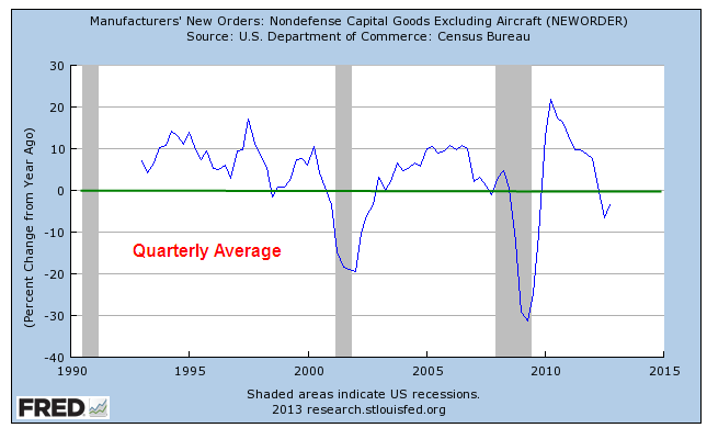
When we smooth out the monthly data with quarterly averages, the trend is still in negative territory.

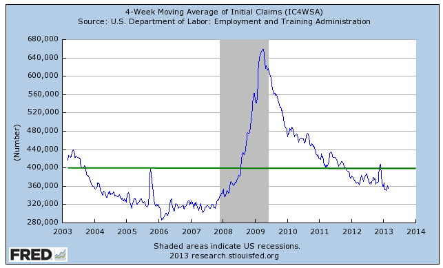
Every week the Bureau of Labor Statistics issues a report on the number of New Unemployment Claims.  This past week, the BLS reported a lower than expected number of 341,000, a drop of 22,000 from the week before. Numbers of more than 400,000 are a major concern.  The weekly series can be volatile; most analysts look at the 4 week moving average to get a better gauge of the trend. 

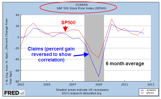
As with many data series, I am interested in the year over year (y-o-y) percentage change in the data.  Because the SP500 index is a volatile series, I’ve smoothed out the data to a 6 month average to show the negative correlation between stock prices and  new unemployment claims. 

In other words, when unemployment claims go up, the stock market goes down.  This particular data series is good when it is low, bad when it is high so I reverse the percentage change to show its correlation with the SP500. 

On a quarterly basis, this negative correlation has proved to be a reliable trading signal for the longer term investor.  When the y-o-y percentage change in new unemployment claims crosses above the SP500 change, sell.  When the claims change crosses below the SP500 change, it’s safe to buy.

Again, this strategy is for the long term investor who is more concerned with major structural changes in the economy that can cause a significant dent in her savings.  Using this strategy she will not maximize her gains but she will avoid major losses and it does not require that she check her stock portfolio more than four times a year.  An investor using this strategy for the past twenty something years would have bought in the first week of Oct. 1990 and been in the market during the 1990s as the index climbed, then stalled in the mid 1990s, then climbed again.  She would have sold in the first week of Jan. 2001, missing most of the market drop for the next several years.  She would have re-entered the market in the first week of October 2003 and sold again in the first week of April 2008, just before the financial meltdown in September of that year.  She would have bought again in the first week of January 2010 and would still be in the market.

For the long term investor who does not want to devote a part of their lives to reading financial news or watching CNBC, it is often difficult to separate the “noise” – the weekly headlines and economic reports – from the real motion or trend.  This indicator is a low maintenance signal for that investor.

P.S.  You can get this report yourself without much trouble. 
Enter “Fred New Claims” into your browser’s search bar. 
The first link should be “Unemployment Insurance Weekly Claims Report – FRED” at the Federal Reserve.

Click the link, then select the first series “4-Week Moving Average of Initial Claims”. 
When the graph displays, click Edit Graph in the lower left below the graph.
Select the 10 Years range radio button. 
In the Frequency field below the graph, select “Quarterly” and leave the Aggregation method at the default setting of “Average”. 
In the Units field below that, select “Percent Change From Year Ago”. 

(Adding the SP500 stock market index)
Below the “Redraw Graph” button, select the blue bar Add Data Series
Leave the New Line button selected.
In the Search field, type SP500 and select the default SP500 index.  The graph will redraw automatically but it will make little sense at this point until we edit the settings for the SP500 index. 
Select the 10 Year range button for the SP500.  Make sure you are editing the SP500 data graph and not the New Claims indicator. 
Change the Frequency field to “Quarterly” just as you did for the New Claims. 
Change the Units field to  “Percent Change From Year Ago” just as you did with New Claims. 
Click the Redraw Graph button and voila!

Fill ‘er up!

February 23, 2013

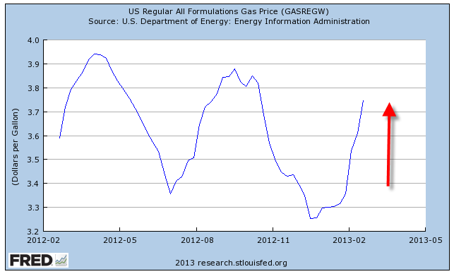
Most of us with cars have noticed the rather dramatic increase in gas prices since the beginning of the year.  I’ll use the all formulations series, which is about 8 – 10 cents cheaper than what a family might pay at the pump.

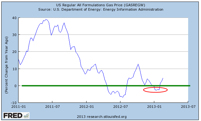
A reason given for the upsurge in prices is that this is a normal seasonal change as refineries shut down to make the change over from a winter gas formulation to a summer gas formulation.  Heavier volatile organic compounds are removed from gas during the summer months to reduce smog.  The resultant decrease in supply therefore leads to an increase in price.  It’s Econ 101.  If that were true, then the year-over-year percent change would be relatively minor at this time of year.  In one of those contradictory anomalies, this year is the only year that the refinery change-over explanation actually fits.  Price changes over the same months in 2012 have been minor.  Notice that in other years, price increases in the early months contradicted the theory.

The change has been particularly noticeable because gas prices decreased to near $3 a gallon toward the end of 2012.  In the Denver area, prices dropped below $3 a gallon, prompting comments in idle conversation.  The average driver uses about 10 gallons a week but out west, where driving distances are greater, that average gas consumption is probably closer to 15 – 17 gallons.  The difference between $3 gas and $4 gas can mean a weekly gas “tax” of $15 or more.  For those of us who use a vehicle for work, the difference can be $30 or more.

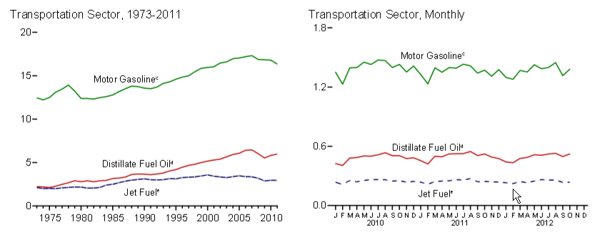
Since the recession began in 2007, our use of gasoline has decreased, ending a multi-decade rise in overall gasoline consumption (EIA Source)

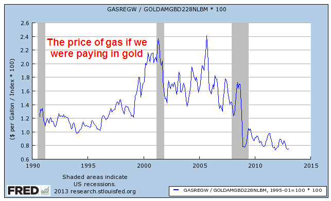
However, since the late nineties average gas prices are rising and have become quite volatile.  So why?  Our gasoline use was increasing during the nineties but prices were flat at a little over a $1 a gallon. Why the big increase in the past 10 – 15 years?  If one were buying gasoline with gold, the price has fallen over the past two decades.

If our consumption has levelled off in the past few years and we are producing more oil in this country, why has the price of gasoline stayed pretty consistently above $3 a gallon?

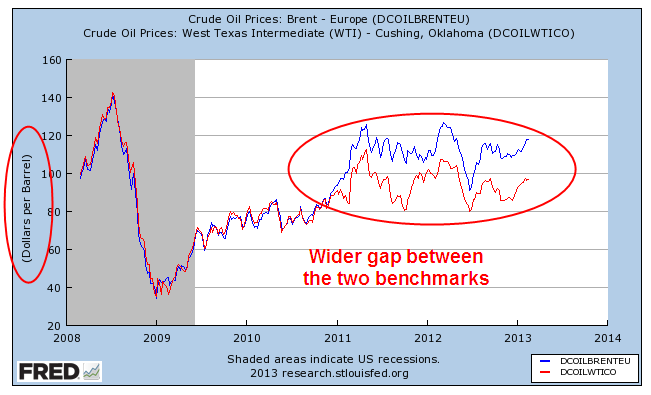
The three main variations of crude oil are heavy (Venezuela, for example), medium (North Sea and MidEast) and light (Texas). The benchmark for medium grade is Brent Crude; for light grade it is West Texas Intermediate (WTI). The two benchmarks have traditionally moved in tandem with Brent Crude trading about $2 above WTI.  Over the past few years, the difference in price between the two benchmarks has widened considerably.  “Fracking” has led to an upsurge in domestic production; production in the North Sea has been steadily declining; tensions in the MidEast and North Africa have contributed a risk premium to medium crude produced in the region.

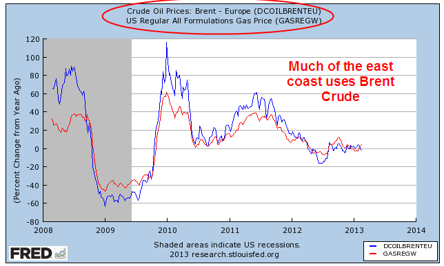
Refineries are set up to process a particular type. Most east coast refineries process Brent Crude; higher transportation costs of domestically produced crude oil over land made it more cost efficient for eastern refineries to import oil from overseas.  Since the majority of the U.S. population lives in the eastern U.S., the majority of the American people use imported gas.  Gas prices move in tandem with the spot price of Brent crude.

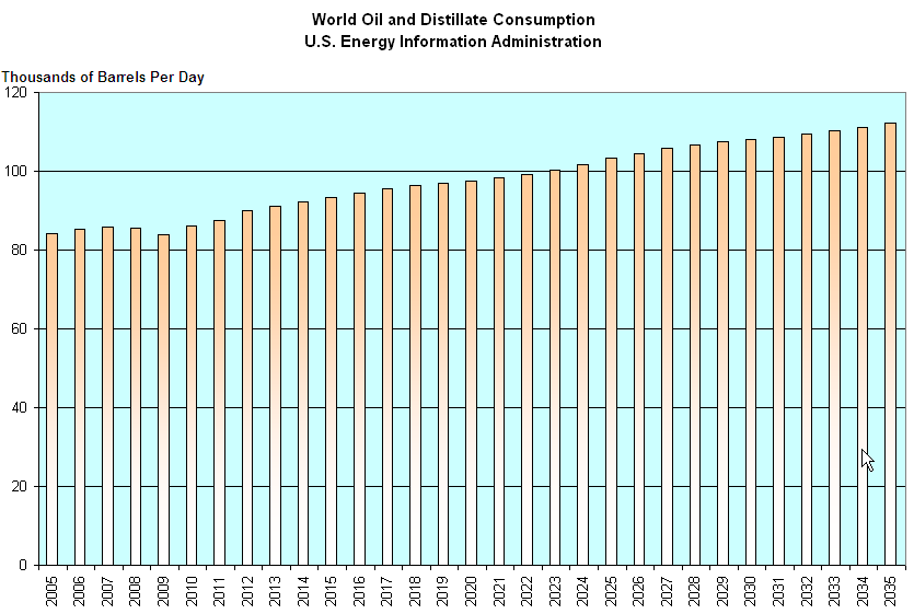
While U.S. oil consumption has declined, world consumption has been rising.

The U.S. Energy Information Administration projects  a slow, steady rise in oil consumption over the next two decades as the standard of living improves.

No magic wand will cause gas prices to decline.  Crude oil and its derivative products are a world commodity and can be shipped inexpensively in large tankers all around the world.

Last week I wrote about the long term trend in federal debt; that it was not a “New Normal” but a continuation of the same old normal of the past several decades.  The continued rise in oil prices is another trend that has become a fixture of our daily lives and will continue to eat at the dollars in our pocketbooks for the foreseeable future.

The Law of Averages

February 17th, 2013

The spending sequester, or sequestration, set to take effect March 1st is a series of automatic and indiscriminate spending cuts that was part of the “Grand Bargain” compromise between President Obama, together with a Democratically led Senate, and the House Republicans in the Budget Control Act of August 2011.  The agreeement was rather like a Sword of Damocles, a chopping of spending programs cherished by one party or the other.  The term “sequester” means that there will be some actual spending cuts, not the usual budget and appropriations gimmicks that Congress is fond of. The unpalatable cuts to both defense spending and social programs were supposed to be an incentive for both parties in Congress to come to an agreement on deficit reduction as a condition of raising the debt limit.  It was hoped that the 2012 election would decide which party’s priorities would take precedence and the dominant party could then pass legislation to avoid or modify the sequester.  Instead, the election left the balance of power unchanged.  Republicans had dismissed the probability of the Democrats winning a majority in the House.  There were just too many seats that the Democrats need to gain to accomplish that.  Hoping to take the Presidency and having a good chance of taking control of the Senate in the 2012 elections, Republican lawmakers agreed to the sequester. The 2010 post-census election had put Republicans in charge of crafting voting districts, which enabled them to retain a majority in the House despite losing the total popular vote for House seats in the 2012 election. Several key Senatorial races imploded when Republican candidates made ill-advised (to be charitable) remarks.  Instead of gaining control of the Senate, Republicans lost two Senate seats.  Despite the high unemployment rate and the poor to middling economy, President Obama won re-election.

After navigating a mind numbing maze of previous law and baseline budget projections to arrive at actual spending reduction goals, the sequester will reduce defense spending by $55 billion and non-defense spending by $38 billion in 2013.  While this sounds like a lot of money, this is just 2.4% of the estimated $3.8 trillion in total federal spending in 2013 or a mere .6% of the estimated $16 trillion of this country’s GDP.  This past week the Democratically controlled Senate revealed a plan that would avoid the sequester for 2013.  The plan achieves deficit reduction goals with spending cuts and revenue increases but the revenue increases will probably be unwelcome to the Republican majority in the House.  Despite the rhetoric of calamity coming from either side of the aisle, both parties are anticipating that the sequester will probably take effect in two weeks.

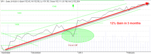
Since mid November the SP500 has risen 12%; except for a sharp decline in the last week of the year in response to fears of the fiscal cliff, the market has climbed steadily.  The market has been largely ignoring the upcoming sequestration. 
More concerning to some is the slowdown in Europe, where the Eurozone economy has contracted for 4 quarters in a row.  Even Germany, the manufacturing and export stalwart of the Eurozone, saw a .6% contraction in the final quarter of 2012.

For many decades, the two prominent parties have been fighting an ideological battle over the role of the Federal government.  The Democratic Party regards the Federal government as largely beneficial and wants a greater role for the Federal government.  They have ushered in many social programs including Social Security, Medicare and Medicaid, programs that are largely on autopilot, beyond the reach of the Appropriations Committee in the House, where a select few can make the law by deciding which programs and federal agencies receive funding.  The philosophy of the Republican Party is that the Federal government is intrinsically a burden and therefore deserves a smaller role.  The Republican Party was out of power in the House for forty years until 1994; as a result, their role consisted largely of blocking or modifying Democratic Party ambitions.  Except for four years from 2007 – 2011, they have controlled the House since 1994 yet often conduct themselves as the opposition party that they were for much of the latter part of the 20th century.

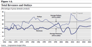
In the tug of war between these two ideologies, the budget has suffered.  A recent report by the non-partisan Congressional Budget Office (CBO) contains a graph of Federal revenue and outlays and their long term averages which clearly pictures the “scrimmage” of ideologies between two yardlines, marked 18% and the 21%.  Republican politicians, together with conservative talk show hosts and commentators, speak of the “traditional” role of the Federal government at 18% of GDP.  This is simply the average of Federal revenues, not its role, for the past fifty years. Revenues have been, on average, 3% below that of Federal spending, which has averaged 21% of GDP.  The “traditional” role of the federal government, then, is to have an average annual deficit of about 3% of GDP.  In a $16 trillion economy, that average deficit is $500 billion.
Republicans simply can not say “no” to the Defense Dept; at times, they have forced spending programs on the Defense Dept that it doesn’t want.  The Democratic Party has become the champion of a hodge podge of Federal social welfare programs.  Neither party proposes taxes that will actually pay for the spending.  For all the Democratic rhetoric about taxing the rich, there simply aren’t enough rich people to pay for that average $500 billion deficit.  Large corporations continue to dominate both parties.  Campaign laws in most states as well as the federal government permit no fundraising in government buildings.  Almost every day, the members of the House and Senate must leave the government building where they work in order to do the daily drudgery of promising favorable legislation to corporations and associations in return for campaign contributions. 

We are still way above the 3% deficit average of the past fifty years.  The CBO projects that this year’s deficit will be 5.2% of GDP, almost half of the 10% deficit in 2009.

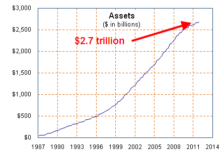
Over the next two decades, that 3% budget deficit average is about to grow larger.  For the past fifty years, the demographic bulge known as the Boomers have been paying into Social Security.  Those taxes have exceeded payments in most years, reducing overall Federal government deficits by .6% of GDP each year (Table 1.2 OMB historical tables, 2013 Budget).  Those surpluses have masked the reality that average annual Federal deficits, excluding Social Security, have been about 3.6% of GDP.  In a $16 trillion economy, that is close to $600 billion.  As the Boomers retire over the next twenty years and are collecting Social Security payments, add in another $100 billion a year as the Boomers draw down the $2.7 trillion dollar Social Security surplus they have built up.

We’re now up to a $700 billion annual deficit based on revenue and spending patterns over the past fifty years.  As the total Federal debt grows, so will the interest costs on that debt.  Over the past seventy years, interest costs have averaged 1.8% of GDP, almost 30% higher than the 1.4% of the past few years (Table 3.1 OMB 2013 Budget)  Ballooning debt levels and rising interest rates could easily add another $100 billion to annual deficits.  We’re now up to $800 billion and growing, based on historical averages.

Republicans will continue to call for spending cuts – it’s their brand.  Democrats will call for more programs and more taxes – but not on the poor and middle class – that’s their brand.  The political and economic tug of war will continue, meaning that uncertainty will be the new normal.  Uncertainty usually leads to lower economic growth which exacerbates social and political tensions which leads to more uncertainty until eventually there will be another crisis. 

In preparation for a cycle of uncertainty and crisis, the prudent investor might ask “What’s my backup plan?”  If you are lucky enough to have a defined benefit pension plan with the company you work for, what is your backup plan if that “defined” benefit is “redefined.”  Well, you might be thinking, my company is so large and dominant in its market that such a possibility is unlikely.  Tell that to the employees of United Airlines, a dominant player in its industry, who lost part, or in some cases, more than half of their benefits when United Airlines shed part of its pension obligations in bankruptcy court.

In the mid nineties, IBM converted its defined benefit plan to a “cash balance” plan, effectively lowering the pension amounts due older workers.  After seven years, a contested lower court decision and a victorious appeal, IBM won their right to do this.  IBM and other large companies have lots of lawyers and accountants trying to figure out legal ways to reduce their liabilities.  How many lawyers and accountants do you have? 

A March 6, 2012 article in the Wall St. Journal reported that “Business groups are urging Congress to let employers put less money into their pension funds, saying that exceptionally low interest rates are forcing them to set aside too much cash.”  I’ll bet your company has more lobbyists in Washington than you do.

These past few years have been a wake up call for those who worked, diligently saved and invested, planning on a certain retirement income based on historical returns of various investments in the stock, bond and CD markets.  Too many people discovered that their backup plan was either to keep working or go back to work, a fact supported by the monthly household survey from the Bureau of Labor Statistics. 

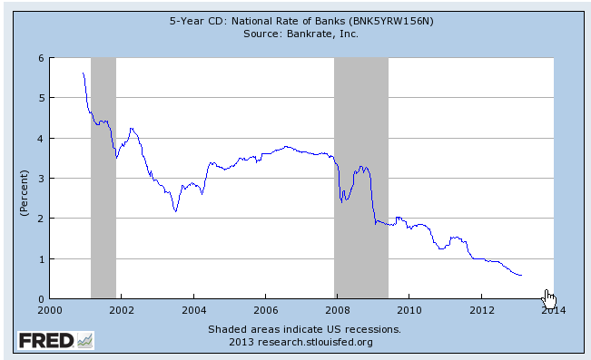
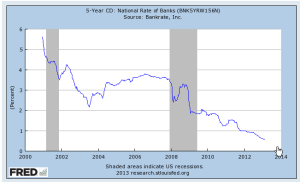
Many retirees built CD “ladders” in federally insured certificates of deposit that paid 4 – 5% interest or more, offering them the safety of their principal and a steady income.  With interest rates for CDs at 1% or less, many retirees have either had to find more risky investments or simply spend less or – there’s that backup plan again – go back to work to make up the difference.
Then there are the folks who planned on selling their home, downsizing and using the difference as an income stream in their retirement years.  Now they wait, hoping that housing values will return to the lofty levels of the mid-2000s or – backup plan again – keep working.

Some people think that the past few years have been an aberration and are waiting for things to get back to normal, or average.  What I’ve tried to show is what those averages have been for the past fifty years and that those averages are better than what we can plan on for the next twenty years.  We certainly can not plan on a vague hope that the folks in Washington will find either a solution or a compromise to a problem that has remained unresolved for the past half century and will continue to worsen in the next two decades.
GDP, Profits and Labor

Feb. 2nd, 2013

A lot to cover this week – the monthly labor report and the Dow Industrial Average breaks the psychological mark of 14,000.  Let’s cover the stock market rise because that will give us some context for the labor report.

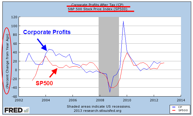
The stock market rises and falls on the prospect for the rise and fall in corporate profits.  For the past year, profits have been healthy, increasing year over year by 15-20%.

The stock market is a compilation of attempts to anticipate these profit changes by six months or so. Sometimes it guesses wrong, sometimes it guesses right but the market loosely follows the trend in profits.

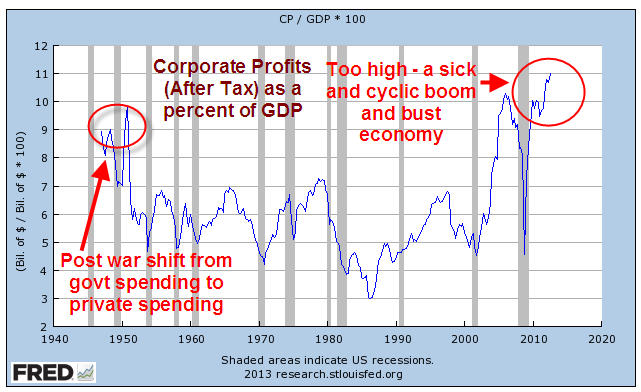
As a percent of GDP, corporate profits have reached a record high and this growing share of the economy is largely responsible for the doubling of the SP500 in the past three years.

There can be too much of  a good thing and this may be it.  An economy becomes unstable as one segment of the economy accumulates a greater share of the pie.

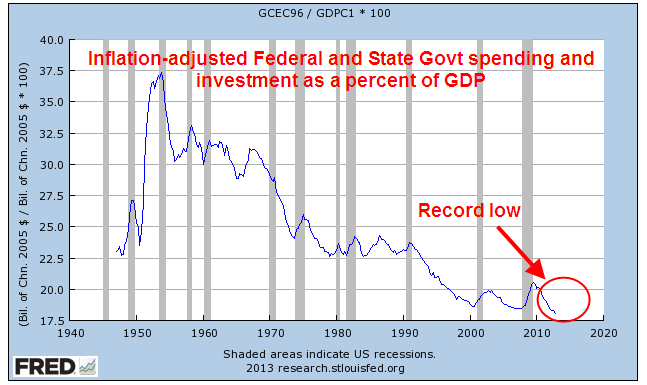
Facts are the nemesis of partisan hacks who simply disregard any information that does not fit with their model of how the universe works.  Data on government spending and investment contradict those who complain that government has too much of a share of the economy; it is now at historic lows.

This includes government at all levels: federal, state and local.  Reductions in government spending continue to act as a drag on both GDP and employment growth. What gives some people the sense that government spending is a larger percentage of the economy are transfer payments, like Social Security.  Neither the calculation of GDP or government spending includes these transfer payments, so the percent of government spending in relation to GDP as shown in the chart above is a truer picture of government’s role in the economy. 

Speaking of GDP – this past week came the first estimate of GDP growth for the fourth quarter of 2012.  The headline number was negative growth of 1/10th of a percent on an annualized basis.

Two quarters of negative growth usually mark the beginning of a recession.  Concern over this negative growth led to small losses in the stock market at mid-week as investors grew concerned about the January labor report, which was released Friday.  The negative growth was largely due to a severe reduction in defense spending and exports.  As a whole, the private economy grew at an annualized rate of 3.6%, a strength that helped moderate any market declines in mid week.

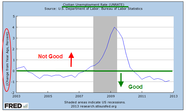
When the Bureau of Labor Statistics released their monthly labor report this past Friday, the headline job increase of 157,000+ and an unemployment rate stuck at 7.9% did not calm investors’ fears.  The year over year percent change in unemployment is still in positive territory.

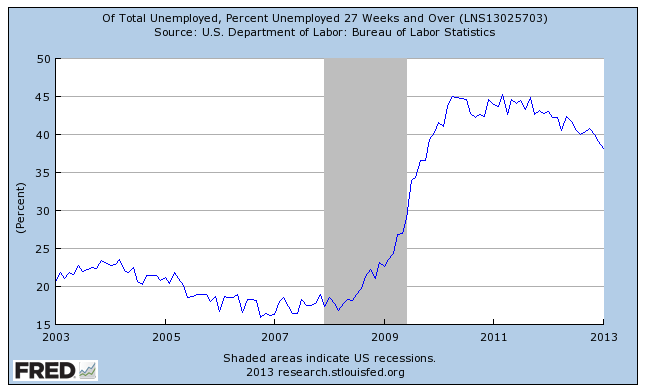
The numbers of long term unemployed as a percent of total unemployment ticked down but remains stubbornly high at about 38% (seasonally adjusted)

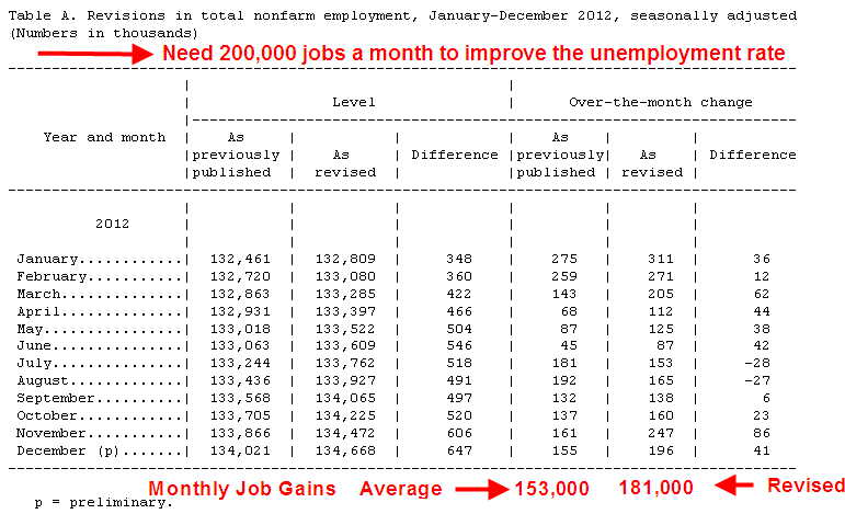
What prompted Friday’s relief rally in the market were the revisions in the previous months’ employment gains.  As more data comes in, the BLS revises previous months’ estimates.  This month also included end of the year population control adjustments.

November’s gains were revised from +161,000 to +247,000; December’s gains were raised from +155,000 to +196,000.  For all of 2012, the revisions added up to additional job gains of 336,000, raising average monthly job gains for 2012 to 181,000 – near the benchmark of 200,000 needed to make a dent in the unemployment rate.  Previous decreases in the unemployment rate have been largely the result of too many people giving up looking for work and simply not being counted as unemployed.

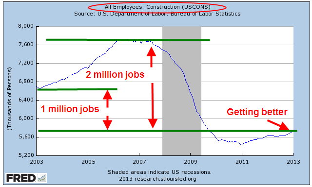
Overall, the labor report put the kibosh on any fears of recession and the stock market responded with a rally of just over 1%.  Construction jobs continued their recent gains but employment levels are one million jobs fewer than the post-recession lows of 2003 and two million jobs less than the 2006 peak of the housing bubble.

The core work force aged 25-54 continues to struggle along.

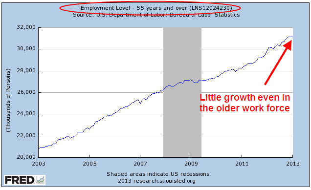
The older work force has garnered much of the gains in the past year but this month was flat.

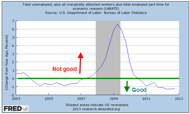
The larger group of workers counted as unemployed or underemployed, what is called the U-6 Rate, remained unchanged as did the year over year percent change. 

As the stock market continues to rise, retail investors have reversed course and have started to put more money into the stock market.  Sluggish but steady GDP and employment growth has prompted the Federal Reserve to continue its program of buying bonds every month, which tends to push up stock market values.  The Fed can continue this program as long as the sluggish pace keeps inflation in check and below the Fed’s target rate of 2.5%. 

In the short run, it is a good idea to follow the maxim of “Don’t Fight the Fed.”  What is of some concern is the long term picture.  Below is a 30 year chart of the SP500 index, marked in 10 year periods with two trend lines based on the first decade, one trend line (with the arrow) a bit more positive than the other. 

The market has changed in the past two decades.  The bottoms in 2002, 2003, 2010, 2011 were simply a return to trend, a return to sanity.  The downturn of late 2008 – early 2009 was the only downturn that broke below trend; truly, an overcorrection. Among the changes of the past two decades is a Federal Reserve that, some say, has helped drive these erratic asset bubbles by making aggessive interest rate moves, then keeping interest rates at low levels for a prolonged period of time.  Whether and how much the Fed’s interest rate policies contribute to stock market valuations is a matter of much vigorous discussion.  Whatever the causes are, it is important to recognize that over two decades the market has shifted into a jagged, cyclic investment.  The long term investor who has a ten year time frame before they might need some of the money invested in the stock market can be reasonably certain that they will be able to get most of their money back if not make a healthy profit.  For those with a shorter time horizon like five years, they will need to monitor the financial and economic markets a bit more closely or hire someone to do it for them.  This is especially true when one is buying at current market levels which are above trend.
Happy Days

January 27th, 2013

This past week, Republicans in the House passed a bill to delay the raising of the debt ceiling till May.  The S&P500 crossed 1500, nearing the high of 1550 it set in October 2007.  This past week, money flowing into equity mutual funds finally surpassed the flows into bond funds (Lipper Source)

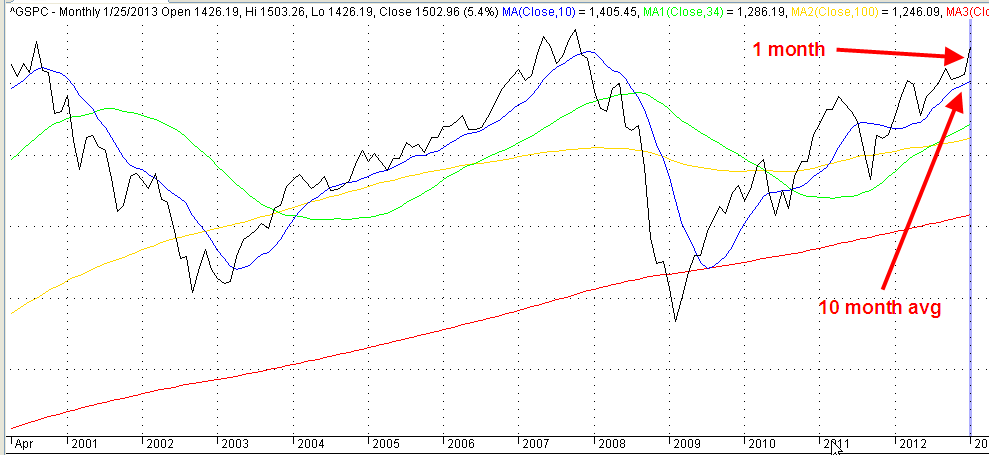
As the saying goes, “The trend is your friend.”  When the current month of the SP500 index is above the ten month average, it’s a good idea to stay in the market.

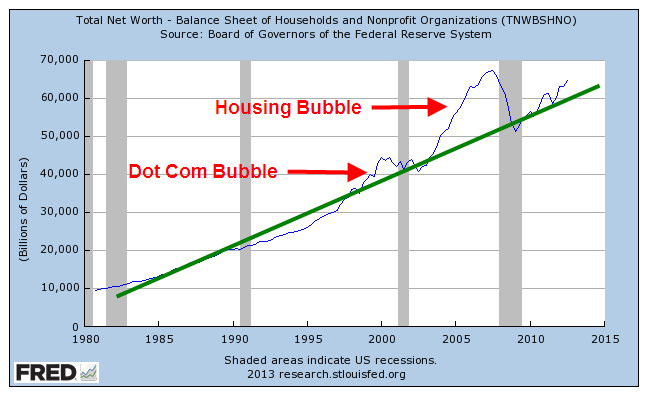
So, happy days are here again!  Well, not quite.  Household net worth is still climbing but has not reached the 2007 peak.

But when we step back and look at the past thirty years, household net worth is better than trend.

Asset bubbles overly inflate and deflate net worth, which includes the valuation of assets like stocks and homes.  An asset bubble is like a Ponzi scheme in that those who get in toward the end, before the bubble bursts, often suffer the worst.

CredAbility, a non-profit credit counseling service, produces a Consumer Distress score that evaluates five categories that have a significant effect on a consumer’s financial stability: employment, housing, credit, the household budget and Net Worth. It has only just broken out of the unstable range into the bottom of the frail range.

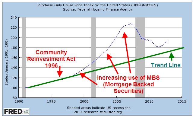
The Federal Housing Finance Administration (FHFA) released their House Price index a few days ago.  This price gauge is indexed so that 1991 prices equal $100. The index, which does not include refinancing, came in at $193, or just about 3% per year.  Although housing prices are still depressed from the heights of the housing bubble they are still above the CPI inflation index since 1991.  Housing prices generally rise about 3% – 4% per year, depending on what part of the country you live. 

When we look back twenty years, we can see that housing prices are, in fact, above a sustainable trend line established before the Community Reinvestment Act and the advent of mortgage securitization, both of which undermined rational underwriting standards.

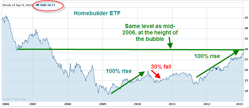
Nationally, we are close to sustainable price trend but still a bit inside the bubble.  Sensing that home prices may have hit bottom, Home Builder stocks as a group are up about 50% in the past year.  Think that’s good?  They rose almost 100% from the spring of 2009 to the spring of 2010, only to fall back again. 
Tight credit, rigid underwriting standards and a still frail consumer will present challenges to the housing market as it climbs slowly out of the doldrums of the past few years.

Predictions and Indicators

January 20th, 2013

I was talking with someone this week who thought that, this year or next, the financial world would melt down.  This week someone else asked what I thought was going to happen this year.  The S&P 500 index is approaching the highs of 2007.  Is this a good time to invest in stocks?

I don’t know.  In the early 1970s, Alan Greenspan, who would become head of the Federal Reserve in the late 80s, called for a bull market just a few months before the market imploded and lost almost half its value.  Recently released minutes of meetings of the Federal Reserve in 2007 showed that some members were worried about contagion from the decline of the housing market to the rest of the economy but the overall sentiment was that housing and employment weakness was a needed and normal correction to an economy that had gotten a bit too frothy.  No melt down anticipated there.

All any of us can know is what has happened and even that knowledge is imperfect.  Regulators who are privy to information that might spook the markets often conceal that information and hope to contain the damage.  Brokers and managers at large investment houses actually help build bubbles, skimming off fees and derivatives profits in the process.

With an imperfect assessment of the recent events, and a non-existent knowledge of the future, investors face the choice of putting their savings under the mattress or sending out their vulnerable savings into the economic fog.

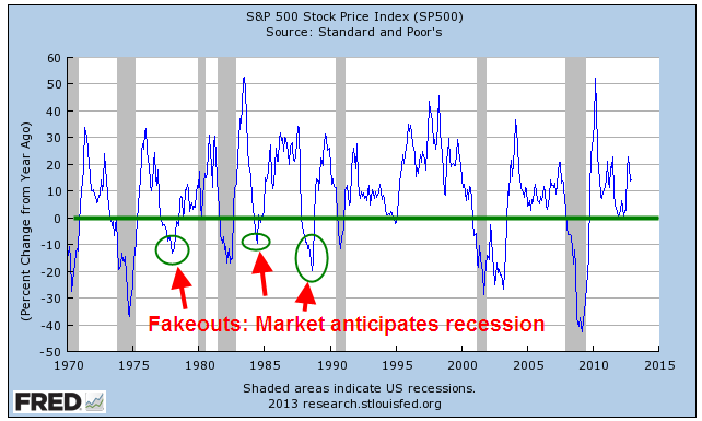
Over the past few years, I’ve looked at several indicators that have been fairly reliable foreshadowings of coming recessions.  Before I look at those, let’s look at the big daddy indicator: the stock market.  Over the course of a week, millions of buyers and sellers try to anticipate the direction of the economy and corporate profits.  The majority of the time the market does anticipate these downturns but we need to look beyond the main index, the S&P500.  Instead we look at the year-over-year percent change in the index.  Below is a monthly chart of that percentage change.

The percent change drops below zero when the majority of investors do not believe that the market will increase over the next year.  You may also notice that it is a good time to buy the market when the y-o-y percent change declines 15-20%.

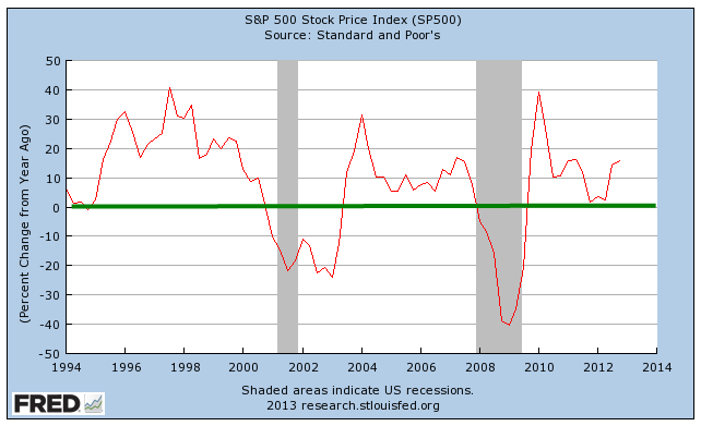
When we look at the past twenty years, the lack of confidence has been a reliable indicator of the past two recessions.  The graph below is the y-o-y percent change in a quarterly average of the S&P500.

These charts are easily available at the Federal Reserve database, FRED.  Just type in “Fred SP500” into your search engine and the top result will probably be a link to a chart of the index.  (Link here ) Click the “Edit Graph” button below the chart, then change the Frequency under the resulting graph to Monthly or Quarterly to smooth out the graph.  Just below the Frequency field is a drop down list of what you want to chart.  Select “Percent Change from Year Ago”, then click “Redraw Graph”.  Fred does all the work for you.

As of right now, the majority of investors are somewhat hopeful that there will be an increase in the index in the coming months. 

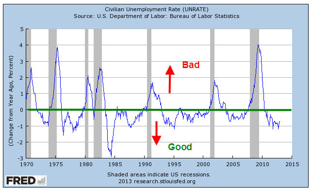
Another indicator I look at is the y-o-y percent change in the unemployment rate (UNRATE).  This is the headline number that comes out each month.  When the percentage change goes above 0, it’s probably not the best time to putting more money to work in the market.

Although the unemployment rate is still high, the yearly percent change is healthy.  As someone quipped, “It’s not the fall that kills ya, it’s the change in speed when ya hit the pavement.”  The change in each of these indicators is the key aspect to focus on.

Entering “Fred Unemployment” into a search engine should bring up as the top result a link to the unemployment chart.  Follow the instructions I gave for the SP500 and Mr. Fred will do all the number crunching.

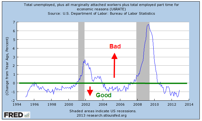
Looking at a broader index of unemployment, the U-6 rate, gives no indication of near term economic decline.  Below is the percent change in that index.

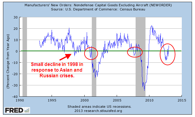
Another indicator is New Orders in Nondefense Capital Goods Excluding Aircraft.  As I noted the past few months, this has been worrisome.  We don’t have sixty years of data for this indicator but a decline in the y-o-y percent change in new orders has foreshadowed the past two recessions.  Recent monthly gains give some hope but the decline in equipment investment shows a lack of business confidence for the near term future.

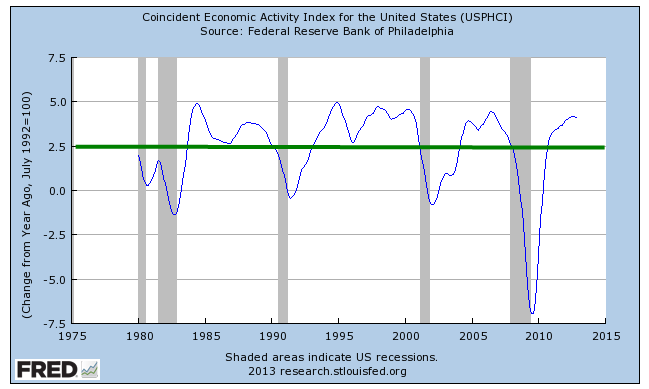
The last index I look at is a composite indicator put together by the National Bureau of Economic Research, NBER, the agency that makes the official calls on the start and end of recessions.  The Coincident Economic Index combines employment, personal income, industrial production, and manufacturing and trade sales.   In a healthy or at least muddling along economy, the percent change should stay above 2.5%.

You can access this by typing “Fred Coincident” into a search engine and the top result should be the graph for this indicator.  Follow the same instructions as above to show the percent change.

Except for New Orders there does not appear to be anything immediately worrisome.  According to Standard and Poors, (the S&P in the name of the S&P500 index), estimated operating earnings for 2013 are about $112 (Source).  At a 15.0 P/E ratio, that would put fair value of the SP500 at 1680, or 13% above its current level of 1486.  The problem is that the estimates of 2013 earnings have been drifting down from $118 last March.

For the past few years there has been a pattern of declining earnings estimates.  Something seems to be getting the way of early optimistic forecasts.  However, even if operating earnings were to actually come in at $100 for 2013, an investor with a ten year or more time horizon couldn’t say that she had overpaid at current market levels.

A favorite theme of 1950s sci-fi movies was the underwater creatures who had been turned by nuclear radiation into a gigantic monsters lurking on the seabed.  The tranquil calm surface of the water gave no hint of the monster swimming beneath the surface.  Then came an upswelling of water seen from the shore, a crashing crest of wave and the creature erupted from the liquid depths. For many investors, there may be that same sense of foreboding.  European banks loaded up on government debt; the Federal Reserve buying the majority of newly issued U.S. debt this past year; trillion dollar U.S. deficits; persistently high unemployment;  perhaps that is why there is so much cash floating around. 

The MZM money stock includes cash, checking accounts, savings accounts and other demand type accounts, money market funds and traveler’s checks; in short, it is money that people can demand now.  The percentage change has moderated recently and shows neither confidence or fear, of investors not knowing whether to step left or right.

For the long term investor, a showdown over raising the debt ceiling in the next few months may present another buying opportunity before the April 15th deadline to make IRA contributions for the 2012 year.

Four Foundations

Over the next two months, there will be much debate over spending cuts as the debt limit ceiling approaches in late February.  For the past four years, the Federal Government has been running $1 trillion annual deficits.

Deficits are the annual shortfall; debt is the cumulative amount of those annual deficits.  The total debt of the Federal Government, including money owed to the Social Security trust funds, is over $16 trillion, and is now more than the annual GDP, the sum of all economic activity in the country.

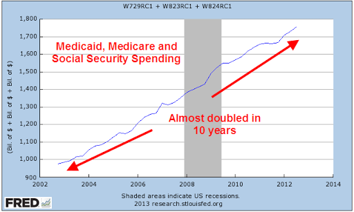
Republicans contend that the real problem with the budget is entitlement spending: Medicare, Social Security and Medicaid are the largest programs.  In the past ten years, spending on these three programs has almost doubled and now consumes 47% of the total Federal spending budget.

Spending increases on these programs will escalate now that the first wave of the Boomer generation has reached retirement age.  Too many rigid ideologues in the Democratic Party defiantly defend every penny of this spending.

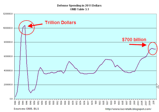
On the other hand, defense spending is near WW2 levels.  On an annual basis, the current $700 billion we spend on defense is far less than the inflation adjusted levels of $1 trillion we spent at the height of WW2.

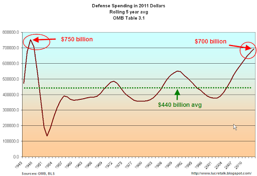
Wars may be won or lost at their peaks but the spending occurs over several years.  When we look at a moving five year average of defense spending, we are near the average of WW2.

Judging by the amount of money we are spending, we are fighting the third World War.  Yes, it’s a dangerous world but is it as dangerous as the state of the world during WW2?  Has Al-Qaeda, a loose coalition of stateless forces, subjugated Europe as Hitler’s armies did?  Is the threat of Iran comparable to the domination of Japan over the eastern seaboard of Asia during WW2? 

In the late 50s, President and former General Eisenhower warned that the military industrial complex would invade the halls of Washington.  Preparedness is prudence, but Eisenhower knew firsthand that the industry peddles a self-serving culture of fear to those in Washington.  As high military spending becomes entrenched in the federal budget, regions of the country become dependent on the defense industry; those people send  politiicans to Washington to vote for more military spending and the spending cycle spirals upwards.

Each year, we are spending about $250 billion more than the 70 year average of military spending.  Unlike the spike of WW2 spending, the recent five year average has surged upwards like a wave – a wave that is drowning this country in debt.  As troubling as this is, we must remember that we are running $1 trillion deficits – four times the excess amount of military spending.  Those who say that we can balance the budget by cutting defense spending simply have not looked closely at the data.  We can not balance the budget by cutting only entitlement spending or only defense spending.  Even when we combine the two, we still can not balance the budget.

Which brings us to receipts, a gentle euphemism for taxes.  Economic bubbles inflate the amount of tax revenue to the government but the resulting lack of revenues after the bubble bursts outweighs the increased revenue while the bubble was building.

When we run a projection of revenues using more sustainable averages based on longer term trends, we come up with an optimized $3 trillion in revenues for the current year, still leaving us $600 billion short of current spending. 

The solution then is a mix of four factors: more revenue from 1) economic growth and 2) tax reform; less spending for both 3) defense and the 4) social safety net.  These are not easy choices, particularly when partisans vigorously defend a particular program as though it were the last stand at the Alamo.

Laboring But Not Delivering

January 6th, 2013

No change in employment picture.  Same old, same old.  Go back to sleep.

Although the main message of the latest BLS monthly employment survey is little or no change, there are some interesting trends we can look at.    First the ho-hum stuff – stay with me for a paragraph or two.  Job gains of 155,000 this past month was essentially the average of the past twelve months; it is enough just to keep up with population growth.  The unemployment rate, number of jobless, long term unemployed, participation rate, employment-population ratio and number of involuntary part-timers all were essentially unchanged.  Can’t get more sleepy than that – but stable.

Health care employment continues to zoom upwards, gaining 45,000 this month and averaging over 28,000 monthly in 2012.  Over 2/3rds of the gains this month were in ambulatory care and nursing homes.

We are eating and drinking out at about the same pace as we did in 2011.  Food services and drinking places added an average of 24,000 workers per month this year, same as the previous year.

20% of the job gains this month were in Construction but the industry is still flat.

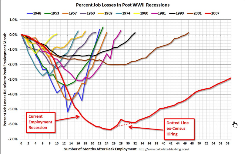
Now here comes the interesting stuff.  Bill McBride at his Calculated Risk blog for this past week has a chart of job recoveries after recessions.  This blog  is one I read regularly and is on my recommended blog list.  Check it out if you have not already done so.

The graph is measuring the job losses from a previous peak; in the past two recessions those employment peaks before the recession took hold were largely caused by bubbles in tech and real estate.  I wanted to get a more reasonable baseline to measure change.  Below is a 75 year graph of the rolling five year average of employment in this country.  It dramatically shows just how weak the job market has been – depression era weak.

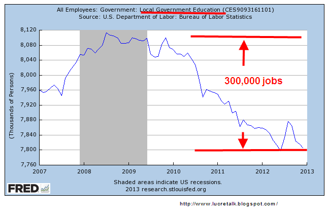
What surprised me in this past month’s report was the further loss of 13,000 jobs in the government sector.  I was expecting few job losses, even perhaps a small gain.  When we look a little closer, it gets interesting.  Since the beginning of 2010, 300,000 teachers, administrators and other workers in local government (these are primarily K-12 schools) have been laid off.

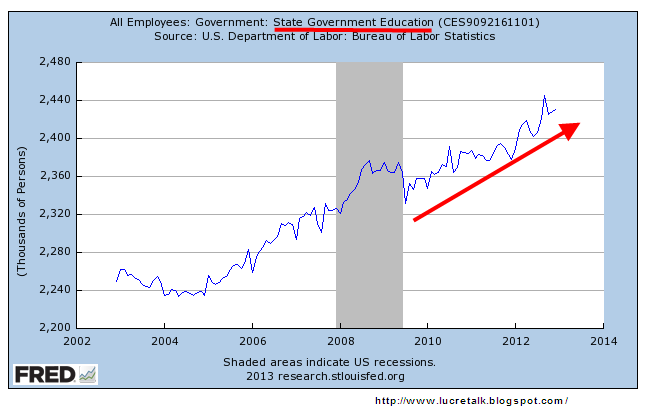
We would expect at least some layoffs at the state education level, which consist mostly of colleges, including community colleges, and universities.  Not so.  Employment has continued to rise.

As property valuations have decreased, so have the taxes based on those valuations.  The states have taken their share of the taxes and left local county, city and village authorities to wrestle with the budget challenges.  Many K-12 teachers have been laid off as a result.

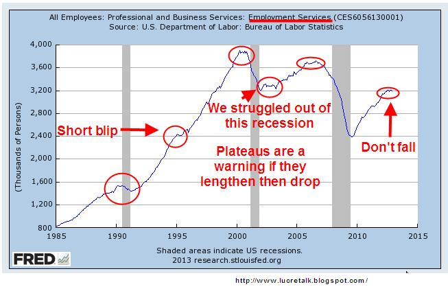
Now I’ll look at some cautionary signs.  Professional and Business Services has seen fairly strong employment gains and employment in this area has reached its prerecession peak.

There is one subcategory, Employment Services, that can often serve as a harbinger of weakness or downturn.  These are the guys whom companies hire to do the hiring.  When employment at these services weaken or fall, there may be something going bad in the fridge.

Another employment indicator is the maintenance and service of buildings.  When stores, industrial spaces and office buildings are vacant or slow, there is less to do.  Doing business takes some wear and tear on buildings.  Less business, less wear and tear.

This a truly historic downturn in both the economy and employment.  The lack of reliable, or at least comparable, data during the 1930s depression and earlier severe recessions make it difficult to do a proper assessment but we can say – to use a technical term – its a doozer.  When I hear someone comparing this recession to the 1980s and advocating, with the assertive crystal clarity that only the uninformed can summon up, that the same policies that got us out of the recession of the early 1980s will get us out of this extended recession, I know I am listening to a fool.  When I hear someone firmly pronounce that pumping vast amounts of federal money into the economy, the tactic tried with arguable success during the 1930s Depression, will solve the problem, that is the chatter of another fool.

Heathens and Wizards

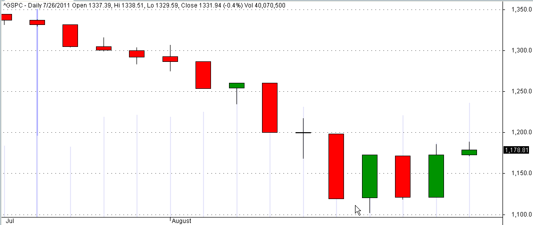
During negotiations over raising the debt ceiling from July 26th to August 8th, 2011 the S&P500 fell 16%.  The index fell only 1% in the first week of negotiations as it looked like President Obama and Republican Majority Leader John Boehner might strike a deal.  Then the bottom fell out.

In the week of trading since budget talks intensified on Dec. 20th, 2012 the S&P500 has lost 2%. 

Investors are worried but hopeful that Congress and the President can come to some resolution before tax increases and spending cuts automatically take effect on January 1st.  Housing and automobile sales are showing renewed strength; the yearly increase in Christmas shopping was a disappointment but the underlying fundamentals of the economy give reason for cautious optimism.

The rapid decline in last year’s stock market should serve as an example to investors in today’s market.  For the long term investor, a further decline of 5 – 15% will present some buying opportunities – time to make that IRA contribution or to put some sidelined cash to work.

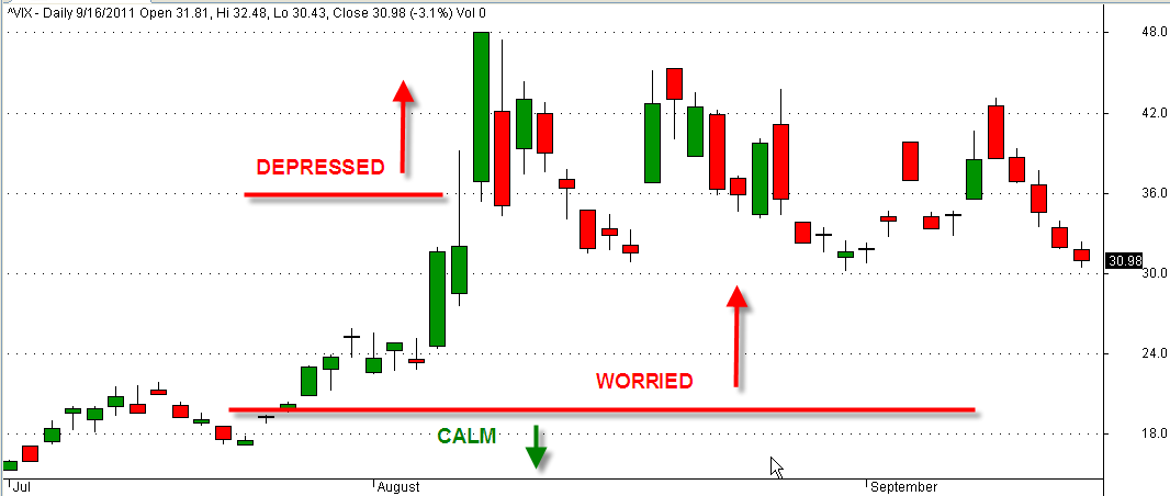
The volatility index, or VIX, measures the relative uncertainty of the broader market using a formula that analyzes the bid -ask spreads of option contracts, which are promises to buy or sell stocks in the future.  When the markets are fairly calm, the VIX index is under 18 – 20.  As markets melted down in October 2008, the VIX rose to 80.  So, 16 is pretty good; 80 is real bad. In the last week of July 2011, this index jumped 20%, then skyrocketed to 48 in the first week of August.

This past week, the VIX went up from the calm range of 18 to 23, indicating the underlying worry.

Last week I wrote about the debate over which inflation measure to use, the CPI or deflator.  If you hear about “chained dollars” or “chained CPI”, it is the deflator that they are referring to.  The difference between the two yardsticks is $3 – $5 per month in a $1000 Social Security check.  This afternoon, Senate Majority Leader Harry Reid walked away from negotiations over this issue.  As I write this in the afternoon of Sunday, Dec. 30th, Senator John McCain has announced that Republican Senators have just taken this issue off of the table.  We can expect that the issue will come up again in the coming negotiations over the raising of the debt ceiling.

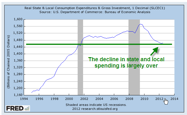
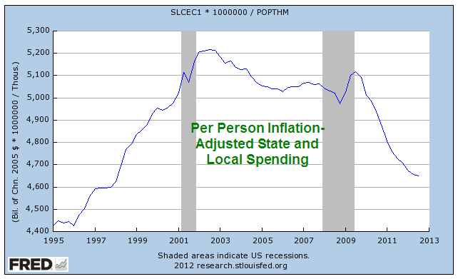
For the past several years, Republicans both in Congress and at the state level have targeted the growth in state and local spending.  This campaign of austerity, as Democrats call it, or fiscal common sense, as some Republicans call it, has won Republicans the governerships of thirty states.  Most of that spending growth has been curbed.

On a per person basis, inflation adjusted spending is at the same level as the mid 1990s.

For states, this return to mid 1990s spending levels has meant cuts in services to their residents.  Medicaid spending takes an increasingly larger portion of state budgets; because states can not run budget deficits, reductions have to be targeted toward education and infrastructure spending.  In 2011, Medicaid spending averaged 25% of state budgets, more than the 20% spent on education (Reuter’s source)

While Republicans dominated the Congress and Presidency in the early 2000s, they showed little concern for the growth in what they call entitlements, programs like Medicare and Social Security.  Instead, they increased entitlement programs, adding a Medicare drug benefit program.  Since they lost their Congressional dominance in 2006,  Republicans have become more cost conscious – and the next targets are entitlements.  Most seniors who have paid into Medicare and Social Security all their lives do not consider these programs as “entitlements.”  It is a dog whistle word that Republican politicians use to call out to their pack.

Democrats look and look and look but simply can not find any cuts that they can make to the social safety net.  Under the rubric of compassion, the Democratic strategy consists primarily of buying votes with ever more social welfare programs.  In the Democrat view, a government and its citizens are in a partnership.  Republicans rightly point out the dangers in any partnership where one partner, the government, holds all the power.  Despite all the rhetoric about limited government, Republicans are advocates of a different kind of partnership between government and corporations whose political contributions are essentially kickbacks for contracts with the federal government and a more relaxed regulatory environment.

Supposedly vigilant Republicans get out their spending cleavers but can not find any cuts they can make in current defense spending.   The operative word here is “current.”  The Defense Dept lives in a budget bubble that most of us would envy because it has little economic responsibility for soldiers once they leave the service.  Most rehabilitation, medical, housing, retraining and other services that the soldier is entitled to or need are no longer born by the defense department. Congress “dumps” these costs on the Human Services department, routinely targeted by Republicans for spending reductions.  In inflation adjusted dollars, we are currently spending 30% more on defense that we spent during the Vietnam War years, 25% more than during the military buildup of the Reagan years.

At the beginning of this century, we have two parties whose allegiances prevent them from coming to any meaningful compromise.  Tax policy is riddled with temporary tax cuts to promote various social causes. Special interest groups and wealthy taxpayers nibble away at tax legislators, creating a swiss cheese of fairness. Budget planning is a legerdemain practiced by a small coterie of heathens and wizards in budget committees; under current budget rules, there are few reductions in spending, only reductions in projected increases in spending.  Imagine that your family budgets for a 3% yearly increase in your utility bills.  One year, the utility company has no rate increase.  Your family claims that they have cut spending on utilities.

The Defense Dept has no long term accountability for the care of their soldiers.  The Human Resources Departments have no accountability for increases in health care spending; they are on automatic pilot.  Congress has no accountability for passing a budget; they have not done so for six years yet continue to get paid.  Bankers risk huge amounts of money that threaten the savings of millions; the company pays a relatively small fine and the individuals responsible suffer no criminal prosecution because of the difficulty and expense of such trials. The public senses that the political party system is morally bankrupt; that the leaders and representatives of this country are unable to break out of the cycle of partisan brinkmanship; that many representatives are bought and paid for; that most of the public has been left out of the deal. 

The public will either find a way to reclaim their authority over the political process of governing or be left standing helplessly on the sidelines while the two parties scrimmage at midfield, both parties having lost sight of either the goal or the audience.  Political advantage has become their goal.  Party leaders enforce a rigid heirarchy of committee assignments, rewarding those in the party who comply while shrugging off those who might compromise.  Gerrymandered districts ensure that many representatives are accountable only to the more rigid ideologies of their district;  their sole challenge comes from extremists in their own party. 

Maybe this time is different.  Maybe not.  Slowly and finally, the social, economic and political order cracks; the public votes in the most extreme elements who promise to restore order and principle or their version of fairness.  What they bring is despotism.

But that could be many years in the future.  For now, we salute the New Year!

CPI and Wages

Dec. 24th, 2012

Merry Christmas, Everyone!

This is part two of a look at the CPI, comparing the price index to wage growth.  Part 1 is here

In the years 1947-1980, the average hourly earnings of production workers rose 6.08% annually while the CPI grew 4.03% (Source)  In effect, earnings rose 2% higher than prices.   Since 1980, earnings have risen 3.55% annually as the CPI rose 3.29%, giving workers a real growth rate of less that a 1/3rd of 1%.

The rise in worker productivity fueled gains in worker compensation until the past fifteen years.  Below is a chart of real, that is inflation-adjusted, compensation and productivity.

Increased Productivity means more profits.  For several decades in the post-WW2 economy, workers shared in those profits.  After the recession of 1982-1984, workers’ share of the increase in output slowly decreased.  As incomes barely kept up with inflation, workers tapped the equity in their houses.

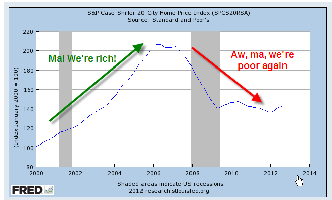
Low interest rates, poor underwriting standards, lax regulations and a feeding frenzy by both home buyers and banks fueled a binge in home prices, followed by the hangover that started in 2007.  Only now is the housing market struggling up out of a torpor that has lasted for several years.

Before the housing bust, magical thinking led many to believe that the rise in home equity was a sure fire way to riches.  Over a century’s worth of data shows that housing prices tend to rise about the same as the CPI.  Housing prices have finally bottomed out at about the same level as the long term trend line of CPI growth.

The boom and bust upended the lives of a lot of people and the repercussions of that “hump” will continue as banks continue to foreclose on home owners whose incomes have flattened or declined. The recovery in the housing market will help some home owners but the real problem is unemployment, underemployment and the decreasing share of workers’ share of the profits from productivity gains.  Until the labor market heals, the housing market will not fully heal.

Those who do have savings have become cautious.  Since 2006, investors have taken $572 billion out of stocks and put $767 billion in bonds, a move to safety – or so many retail investors think.  For decades, home prices never fell – until they did.  For over thirty years, bond prices have been rising, giving many retail investors the feeling that bonds are safe – until they are not.

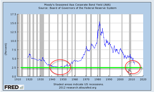
Companies have been selling record amounts of corporate bonds into this cheap – for companies – bond market.  As this three decade long upward trend in bond prices begins to turn, bond prices can fall sharply as investors turn from bonds to stocks and other investments.  We are approaching the lows of interest yields on corporate bonds not seen since WW2.  Investors are loaning companies money at record low rates and companies are sucking up all that they can while they can.  Sounds a lot like home buying in the middle of the last decade, doesn’t it?

Y’all be careful out there, ya hear?